#FF8200 Color
Your all-in-one color resource. Download hex background images, Adobe swatches (ASE), PDF color sheets, and SVG files. Explore palettes, harmonies, accessibility, conversions, and professional exports — designed for designers, developers, and color perfectionists.
This vibrant orange, #FF8200, embodies the energy of a sunrise, a burst of optimism and warmth. It evokes feelings of excitement, enthusiasm, and creativity, like the first rays of light hitting the horizon. Its reminiscent of the vibrant hues of a desert dawn or the fiery glow of a hearth, suggesting both energy and comfort. This color creates a stimulating and inviting atmosphere, perfect for spaces where socialization and activity are encouraged. In design, it can be used to draw attention, stimulate appetite, and inject a sense of playfulness or luxury. Culturally, it can represent passion, ambition, and the promise of new beginnings, often associated with power and leadership. Visually matched named color: Fiery Sunrise.
PANTONE 151 C
Choose Color
Selected Color
Recent Colors
Color Details
Similar Ink Alternatives for #FF8200 color Alternative print inks for reproducing #FF8200 background image with a similar visual appearance.
Disclaimer: The visually matched ink reference is an independent approximation intended as a guide only. Please be advised that this pantone colors is only intended as a guide, Actual colours will depend on screen calibration variances. The print ink suggestions provided are independent visual approximations and are not affiliated with or endorsed by Pantone LLC. For official color specifications, conversion factors, and comprehensive color system information, please visit Pantone Connect. Official Pantone products can be purchased at pantone.com.
Color Previews for #000000 See how this color looks as a background or as text.
Complete Guide to Your Color Laboratory
Everything you need to know about this professional color toolkit.
Use the Color Picker at the top to select any color. All modules below update instantly.
Workflow: Pick a color → Explore palettes & data → Download what you need (PDF, Image, or Adobe ASE).
Color Details — Your color in all formats: HEX, RGB, RGBA, HSL, HSLA, HSV, CMYK, CIELab, Hunter-Lab, XYZ, Yxy, YUV. One-click copy.
Color Psychology — Emotional impact, cultural meanings, physiological effects, branding applications, and historical significance.
Named Colors — Find official color names (HTML/CSS, Pantone) that match your selection with similarity percentages.
Light & Dark Shades
80-step gradient from black to white. Perfect for button states and component systems.
Tints
Color mixed with white → lighter, pastel variations for backgrounds and disabled states.
Monochromatic — 11 curated tints/shades from one color. Production-ready for design systems.
- Complementary — Opposite on wheel (180°). High contrast.
- Analogous — Neighbors (±30°). Harmonious flow.
- Triadic — Three colors (120° apart). Vibrant, balanced.
- Split-Complementary — Base + two near-complements. Softer contrast.
- Tetradic/Square — Four colors. Complex, maximum variety.
- Neutral — Desaturated versions. Subtle, sophisticated.
15 Professional Variations — Monochromatic, Analogous, Complementary, Warm/Cool/Earth Tones, Pastel, Vibrant, High Contrast, and more.
Color Infusion — 10 palettes showing your color morphing into each major hue. Find bridge colors.
Similar Colors — 60+ colors generated via CIELAB Delta E matching. Unexpected harmonious combinations.
18 Ready-to-Use Gradients — Complementary, Analogous, Triadic, Tint/Shade progressions, and more.
Downloads: PNG (2560×1440), CSS (production-ready code), SVG (scalable vector).
WCAG Contrast Checker — Tests your color against white, black, and custom colors for AA (4.5:1) and AAA (7:1) compliance. Large text thresholds included.
Harmony & Accessibility Guide — Tests against 10 canonical hues. Shows which pairs are both beautiful AND WCAG-compliant for text.
PNG/JPG — High-res images for presentations and mood boards.
PDF — Print-ready reports for clients and teams.
Adobe ASE — Direct import to Photoshop, Illustrator, InDesign, XD.
CSS/SVG — Gradients only. Production-ready code and vectors.
Color Science: Industry-standard conversions (HSL, CIELAB, CMYK, XYZ). WCAG 2.1 luminance formula. Delta E (ΔE76) for perceptual matching.
Direct Links: Share colors via icolorpalette.com/color/ff5733 or icolorpalette.com/color/red
Issues? Refresh the page, wait for rendering, try another browser, or check console (F12) for errors.
Printing Guide for #ff8200 Background Image
Use PANTONE 151 C as a visually matched ink reference when printing this background image.
To print the #ff8200 background image from our site, consider using PANTONE 151 C as a visually matched ink reference.
Download the background image, then provide this reference code to your print vendor to help achieve accurate color reproduction.
The visually matched ink reference for the #ff8200 background image is PANTONE 151 C.
This color is commonly described as Fiery Sunrise.
This vibrant orange, #FF8200, embodies the energy of a sunrise, a burst of optimism and warmth. It evokes feelings of excitement, enthusiasm, and creativity, like the first rays of light hitting the horizon. Its reminiscent of the vibrant hues of a desert dawn or the fiery glow of a hearth, suggesting both energy and comfort. This color creates a stimulating and inviting atmosphere, perfect for spaces where socialization and activity are encouraged. In design, it can be used to draw attention, stimulate appetite, and inject a sense of playfulness or luxury. Culturally, it can represent passion, ambition, and the promise of new beginnings, often associated with power and leadership.
We provide PANTONE 151 C as a visually matched ink reference to help you reproduce the #ff8200 background image accurately in professional printing.
This reference code helps print vendors achieve consistent color output across different printing equipment and materials.
After downloading the #ff8200 background image from our site:
- Include the visually matched ink reference PANTONE 151 C in your print order notes
- Inform your print vendor that this is your target color reference
- Request a proof print to verify the Fiery Sunrise color appearance before full production
The #ff8200 background image with PANTONE 151 C as visually matched ink reference can be used for:
- Posters, banners, and backdrops
- Business cards, brochures, and flyers
- Packaging, labels, and stickers
- Signage and promotional materials
This is an independent visual approximation.
While PANTONE 151 C closely matches the #ff8200 background image color, variations may exist between screen display and printed output.
We recommend requesting a proof print to verify the final appearance.
This vibrant orange, #FF8200, embodies the energy of a sunrise, a burst of optimism and warmth. It evokes feelings of excitement, enthusiasm, and creativity, like the first rays of light hitting the horizon. Its reminiscent of the vibrant hues of a desert dawn or the fiery glow of a hearth, suggesting both energy and comfort. This color creates a stimulating and inviting atmosphere, perfect for spaces where socialization and activity are encouraged. In design, it can be used to draw attention, stimulate appetite, and inject a sense of playfulness or luxury. Culturally, it can represent passion, ambition, and the promise of new beginnings, often associated with power and leadership.
Understanding these associations helps ensure the #ff8200 background image aligns with your intended message and brand impact.
Important Information
The visually matched ink reference is an independent approximation intended as a guide only.
Actual printed colors may vary depending on screen calibration, substrate material, ink type, and printing equipment used.
For official color specifications and certified color standards, visit Pantone Connect.
Official color guides and swatch books can be purchased from pantone.com.
Pantone 151 C Color: Fiery Orange | #FF8200
Introduction:
Fiery Orange, also known as Pantone 151 C, is a vibrant and intense color that exudes energy and excitement. With its warm tone and high saturation, it grabs attention and radiates a sense of passion and enthusiasm.
Historical Significance:
Key moments in history: Throughout history, Fiery Orange has been used to symbolize power and courage. In ancient cultures, it was often associated with the sun and fire, representing strength and vitality. In the 20th century, Fiery Orange became popular in the pop art movement, as artists embraced its bold and vibrant nature to make a statement.
Symbolism and Meaning:
Symbolism in various cultures: Fiery Orange is often associated with warmth, enthusiasm, and creativity. In some cultures, it signifies good luck and happiness. It is also linked to the seasons of autumn and harvest, representing abundance and change. In psychological studies, the color is said to evoke feelings of excitement and stimulation.
Fiery Orange in Fashion:
Impact on fashion trends: Fiery Orange has made its mark in the fashion industry as a bold and daring color choice. It adds a vibrant pop to outfits and is often seen in statement pieces and accessories. Designers use Fiery Orange to create eye-catching and energetic looks, capturing the attention of fashion enthusiasts.
Fiery Orange in Graphic Design:
Significance in design aesthetics: Fiery Orange is widely utilized in graphic design to convey energy, excitement, and a sense of urgency. It is often used to highlight key elements and create a focal point in designs. The high contrast and intensity of Fiery Orange make it an effective color choice for creating impactful visuals and branding.
Color Combinations:
Potential color combinations: Fiery Orange pairs well with contrasting colors such as navy blue, deep purple, and emerald green. It also complements warm tones like yellow and red. When combined with neutrals like black and white, Fiery Orange stands out and adds a vibrant touch to any color palette.
Nature’s Palette:
Natural occurrences: Fiery Orange can be seen in various natural elements such as vibrant flowers like marigolds and tulips, sunsets, and autumn foliage. These natural occurrences showcase the radiant and warm characteristics of the color in the beauty of the natural world.
Artistic Representations:
Usage in art: Artists have utilized Fiery Orange in various forms of art to evoke a sense of energy and intensity. It has been used in abstract paintings, contemporary sculptures, and vibrant installations, creating visually striking and expressive artworks.
Movies and Cinematic Landscapes:
Setting the tone in movies: Fiery Orange is often used in movies to create a vibrant and energetic atmosphere. It is commonly seen in visually captivating scenes, such as sunsets, fiery explosions, and intense action sequences, adding excitement and intensity to cinematic landscapes.
Products and Commercial Appeal:
Brands associated with Fiery Orange: Many popular products and brands incorporate Fiery Orange in their branding. It is often used to convey a sense of energy, adventure, and creativity. From sports brands to tech gadgets, Fiery Orange adds a vibrant and dynamic touch, attracting consumers with its eye-catching appeal.
National Symbols and Significance:
Cultural significance: In some cultures, Fiery Orange holds cultural or national significance. It may represent elements like national pride, cultural celebrations, or festivals. The color's vibrant and energetic qualities make it a fitting representation of the spirit and passion of a community.
The Psychological and Emotional Impact:
Psychological influence: Fiery Orange elicits strong emotional responses, often associated with excitement, enthusiasm, and inspiration. It can evoke feelings of passion, warmth, and optimism. The color's intensity stimulates energy and encourages action, making it an effective choice in environments where productivity and motivation are desired.
Conclusion:
Fiery Orange, Pantone 151 C, is a color that commands attention and exudes passion. With its historical significance, symbolic associations, and impact on various creative fields, it remains a timeless and vibrant choice. Whether in fashion, graphic design, or artistic expressions, Fiery Orange continues to captivate and inspire.
Pantone 151 C Color | Hex color Code #ff8200 Image & Artwork
Download high-quality assets for your projects.

#ff8200 Color Schemes
Download Color Schemes
#ff8200 Color Shades
Download Color Shades
Pantone 151 C Color | Hex color Code #ff8200 Solid Color Background
Download Solid Color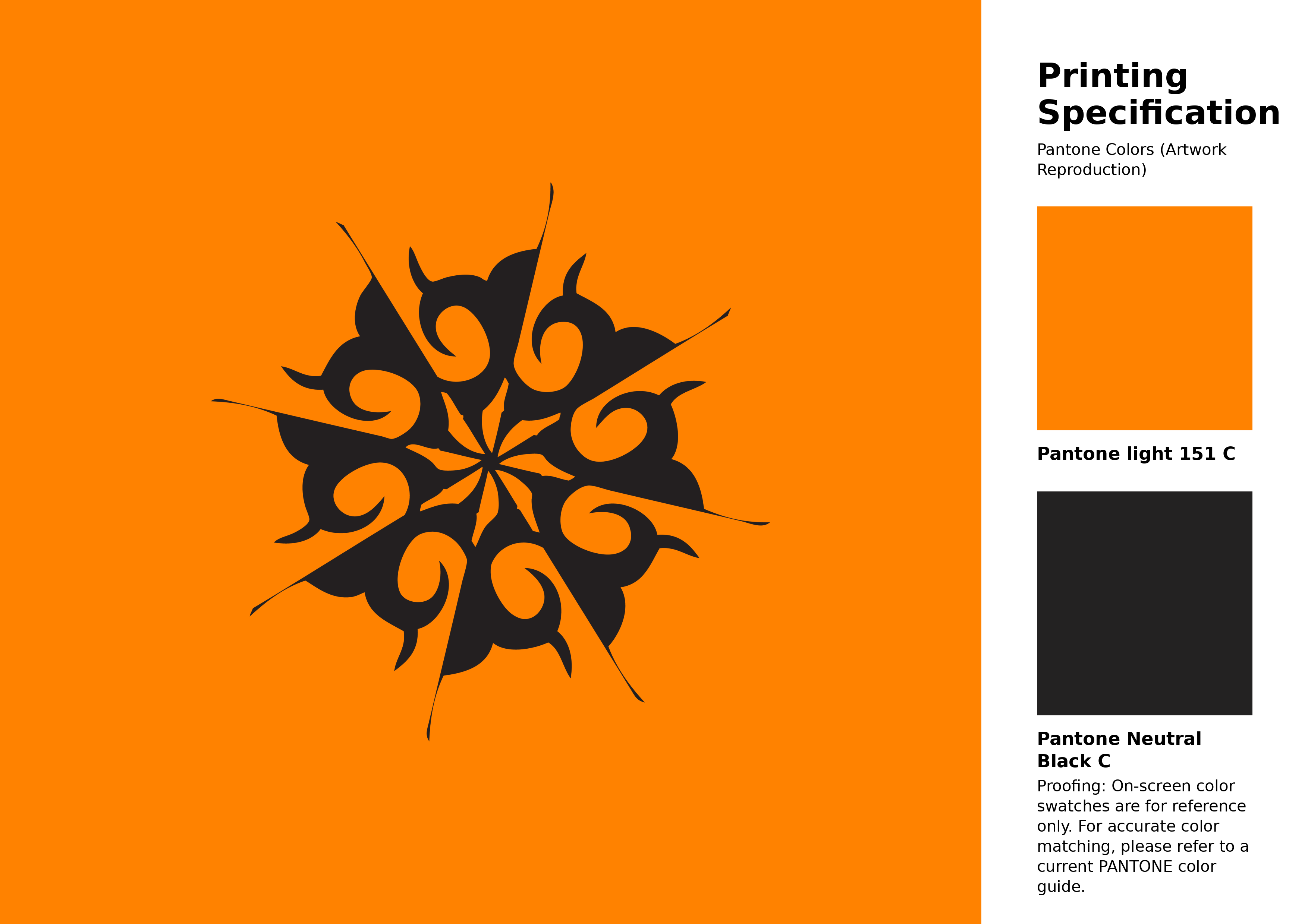
#ff8200 Pantone 151 C Color | Hex color Code #ff8200 Artwork Image (PNG)
Download Artwork (PNG)#ff8200 Pantone 151 C Color | Hex color Code #ff8200 Artwork Vector (PDF)
Download Artwork (PDF)#ff8200 Pantone 151 C Color | Hex color Code #ff8200 Artwork Vector (SVG)
Download Artwork (SVG)
#ff8200 Pantone 151 C Color | Hex color Code #ff8200 Pantone Swatch Artwork
Download Artwork Swatch
#ff8200 Pantone 151 C Color | Hex color Code #ff8200 Gradient Artwork (PNG)
Download Gradient (PNG)#ff8200 Pantone 151 C Color | Hex color Code #ff8200 Gradient Artwork (SVG)
Download Gradient (SVG)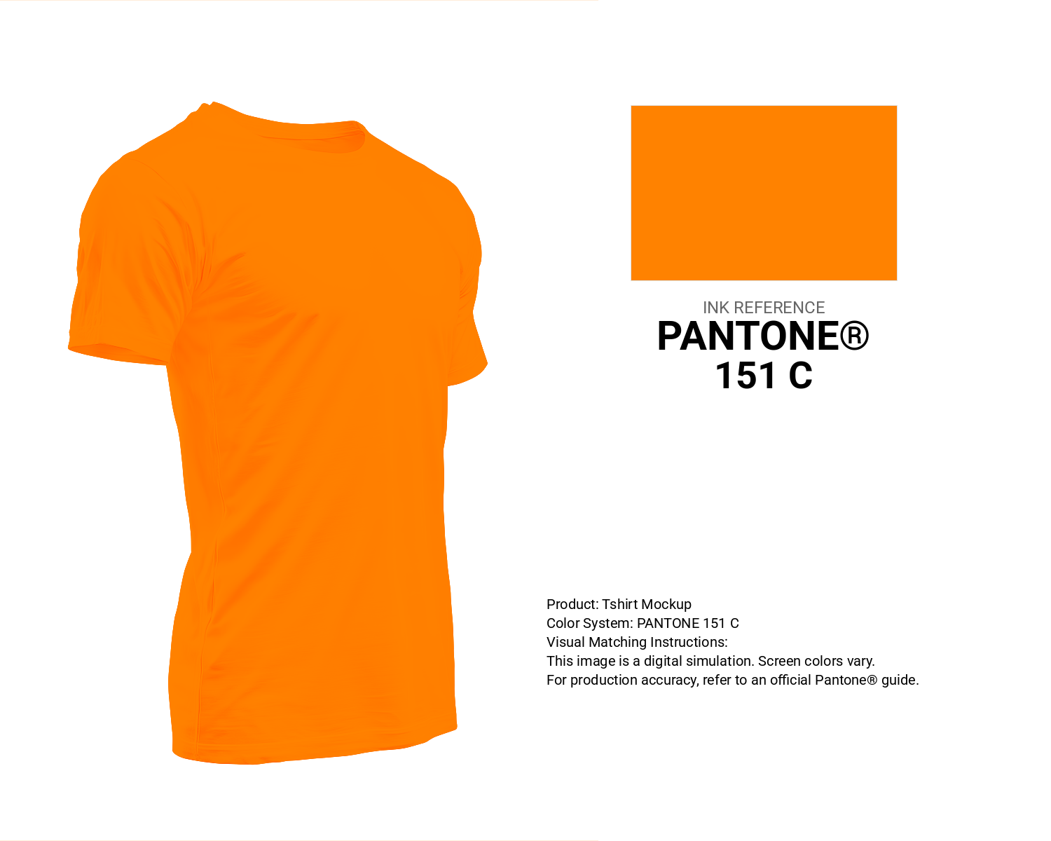
#ff8200 Pantone 151 C Color | Hex color Code #ff8200 T-Shirt Mockup
Download T-Shirt Mockup
#ff8200 Pantone 151 C Color | Hex color Code #ff8200 Printing Artwork Pantone Reference
Download Pantone Printing ReferenceRelated Color Palettes
- Midnight Blue and Orange •
- Gold and Dark Orange •
- Orange and Dark Slate Gray •
- Red and OrangeRed •
- Dark Orange and Dim Gray •
- Olive Drab and Orange •
- Dark Green and OrangeRed •
- Dark Orange and Saddle Brown •
- OrangeRed and Dark Red •
- Goldenrod and Dark Orange •
- Orange and Goldenrod •
- OrangeRed and Tomato •
- Fire Brick and OrangeRed •
- Maroon and Dark Orange •
- Orange and Rosy Brown
Color Palette Collection

25 Sunset Color Schemes
25 color palettes with 125 colors.

135 Black / Dark Color Palettes
135 color palettes with 675 colors.

70 Winter Color Palette
70 color palettes with 350 colors.

786 Popular Color Palettes
786 color palettes with 3930 colors.