#EBA607 Color
Your all-in-one color resource. Download hex background images, Adobe swatches (ASE), PDF color sheets, and SVG files. Explore palettes, harmonies, accessibility, conversions, and professional exports — designed for designers, developers, and color perfectionists.
#EBA607 evokes feelings of warmth, optimism, and energy. It's reminiscent of a late summer afternoon, fields of ripe wheat ready for harvest, and the radiant glow of the sun. Psychologically, it stimulates happiness, cheerfulness, and a sense of well-being. The color creates a mood of inviting comfort and gentle abundance. It is well suited for spaces where creativity and collaboration are encouraged, or where a welcoming and positive atmosphere is desired. This color could be used in interior design to add a touch of rustic elegance, or in branding to convey trustworthiness and reliability. It carries a feeling of natural wealth and established prosperity. Visually matched named color: Golden Harvest Sun.
PANTONE P 14-8 C
Choose Color
Selected Color
Recent Colors
Color Details
Similar Ink Alternatives for #EBA607 color Alternative print inks for reproducing #EBA607 background image with a similar visual appearance.
Disclaimer: The visually matched ink reference is an independent approximation intended as a guide only. Please be advised that this pantone colors is only intended as a guide, Actual colours will depend on screen calibration variances. The print ink suggestions provided are independent visual approximations and are not affiliated with or endorsed by Pantone LLC. For official color specifications, conversion factors, and comprehensive color system information, please visit Pantone Connect. Official Pantone products can be purchased at pantone.com.
Color Previews for #000000 See how this color looks as a background or as text.
Complete Guide to Your Color Laboratory
Everything you need to know about this professional color toolkit.
Use the Color Picker at the top to select any color. All modules below update instantly.
Workflow: Pick a color → Explore palettes & data → Download what you need (PDF, Image, or Adobe ASE).
Color Details — Your color in all formats: HEX, RGB, RGBA, HSL, HSLA, HSV, CMYK, CIELab, Hunter-Lab, XYZ, Yxy, YUV. One-click copy.
Color Psychology — Emotional impact, cultural meanings, physiological effects, branding applications, and historical significance.
Named Colors — Find official color names (HTML/CSS, Pantone) that match your selection with similarity percentages.
Light & Dark Shades
80-step gradient from black to white. Perfect for button states and component systems.
Tints
Color mixed with white → lighter, pastel variations for backgrounds and disabled states.
Monochromatic — 11 curated tints/shades from one color. Production-ready for design systems.
- Complementary — Opposite on wheel (180°). High contrast.
- Analogous — Neighbors (±30°). Harmonious flow.
- Triadic — Three colors (120° apart). Vibrant, balanced.
- Split-Complementary — Base + two near-complements. Softer contrast.
- Tetradic/Square — Four colors. Complex, maximum variety.
- Neutral — Desaturated versions. Subtle, sophisticated.
15 Professional Variations — Monochromatic, Analogous, Complementary, Warm/Cool/Earth Tones, Pastel, Vibrant, High Contrast, and more.
Color Infusion — 10 palettes showing your color morphing into each major hue. Find bridge colors.
Similar Colors — 60+ colors generated via CIELAB Delta E matching. Unexpected harmonious combinations.
18 Ready-to-Use Gradients — Complementary, Analogous, Triadic, Tint/Shade progressions, and more.
Downloads: PNG (2560×1440), CSS (production-ready code), SVG (scalable vector).
WCAG Contrast Checker — Tests your color against white, black, and custom colors for AA (4.5:1) and AAA (7:1) compliance. Large text thresholds included.
Harmony & Accessibility Guide — Tests against 10 canonical hues. Shows which pairs are both beautiful AND WCAG-compliant for text.
PNG/JPG — High-res images for presentations and mood boards.
PDF — Print-ready reports for clients and teams.
Adobe ASE — Direct import to Photoshop, Illustrator, InDesign, XD.
CSS/SVG — Gradients only. Production-ready code and vectors.
Color Science: Industry-standard conversions (HSL, CIELAB, CMYK, XYZ). WCAG 2.1 luminance formula. Delta E (ΔE76) for perceptual matching.
Direct Links: Share colors via icolorpalette.com/color/ff5733 or icolorpalette.com/color/red
Issues? Refresh the page, wait for rendering, try another browser, or check console (F12) for errors.
Printing Guide for #eba607 Background Image
Use PANTONE P 14-8 C as a visually matched ink reference when printing this background image.
To print the #eba607 background image from our site, consider using PANTONE P 14-8 C as a visually matched ink reference.
Download the background image, then provide this reference code to your print vendor to help achieve accurate color reproduction.
The visually matched ink reference for the #eba607 background image is PANTONE P 14-8 C.
This color is commonly described as Golden Harvest Sun.
#EBA607 evokes feelings of warmth, optimism, and energy. It's reminiscent of a late summer afternoon, fields of ripe wheat ready for harvest, and the radiant glow of the sun. Psychologically, it stimulates happiness, cheerfulness, and a sense of well-being. The color creates a mood of inviting comfort and gentle abundance. It is well suited for spaces where creativity and collaboration are encouraged, or where a welcoming and positive atmosphere is desired. This color could be used in interior design to add a touch of rustic elegance, or in branding to convey trustworthiness and reliability. It carries a feeling of natural wealth and established prosperity.
We provide PANTONE P 14-8 C as a visually matched ink reference to help you reproduce the #eba607 background image accurately in professional printing.
This reference code helps print vendors achieve consistent color output across different printing equipment and materials.
After downloading the #eba607 background image from our site:
- Include the visually matched ink reference PANTONE P 14-8 C in your print order notes
- Inform your print vendor that this is your target color reference
- Request a proof print to verify the Golden Harvest Sun color appearance before full production
The #eba607 background image with PANTONE P 14-8 C as visually matched ink reference can be used for:
- Posters, banners, and backdrops
- Business cards, brochures, and flyers
- Packaging, labels, and stickers
- Signage and promotional materials
This is an independent visual approximation.
While PANTONE P 14-8 C closely matches the #eba607 background image color, variations may exist between screen display and printed output.
We recommend requesting a proof print to verify the final appearance.
#EBA607 evokes feelings of warmth, optimism, and energy. It's reminiscent of a late summer afternoon, fields of ripe wheat ready for harvest, and the radiant glow of the sun. Psychologically, it stimulates happiness, cheerfulness, and a sense of well-being. The color creates a mood of inviting comfort and gentle abundance. It is well suited for spaces where creativity and collaboration are encouraged, or where a welcoming and positive atmosphere is desired. This color could be used in interior design to add a touch of rustic elegance, or in branding to convey trustworthiness and reliability. It carries a feeling of natural wealth and established prosperity.
Understanding these associations helps ensure the #eba607 background image aligns with your intended message and brand impact.
Important Information
The visually matched ink reference is an independent approximation intended as a guide only.
Actual printed colors may vary depending on screen calibration, substrate material, ink type, and printing equipment used.
For official color specifications and certified color standards, visit Pantone Connect.
Official color guides and swatch books can be purchased from pantone.com.
Pantone P 14-8 C Color: Vibrant Sunrise | #EBA607
Introduction:
Vibrant Sunrise is a warm and energetic color that exudes enthusiasm and positivity. Its vibrant and golden tone adds a touch of excitement and radiance to any visual composition.
Historical Significance:
Golden Age of Art: During the Renaissance period, Vibrant Sunrise was widely used by artists to symbolize divine light and spiritual enlightenment. It adorned numerous religious artworks, showcasing its association with purity and transcendence.
The Roaring Twenties: In the 1920s, Vibrant Sunrise became synonymous with the Jazz Age and the glamorous lifestyle of the time. It was prominently featured in fashion, interior design, and the iconic Art Deco movement.
The Psychedelic Era: In the 1960s and 1970s, Vibrant Sunrise represented the counterculture movement, freedom, and self-expression. It was embraced by the hippie culture and featured in psychedelic art and fashion.
Symbolism and Meaning:
Optimism and Happiness: Vibrant Sunrise is often associated with joy, optimism, and a positive outlook on life. It symbolizes new beginnings, enthusiasm, and the energy of the rising sun.
Success and Wealth: In many cultures, Vibrant Sunrise represents prosperity, abundance, and good fortune. Its golden hue is reminiscent of precious metals and signifies material wealth.
Vibrant Sunrise in Fashion:
Elegant and Bold: Vibrant Sunrise is a popular choice in both casual and formal wear. It adds a touch of sophistication and warmth to outfits, making it a versatile color for various fashion styles and occasions.
Statement Pieces: Vibrant Sunrise is often used as an accent color in accessories and statement pieces. It adds a vibrant pop and catches attention, making the wearer stand out in a crowd.
Vibrant Sunrise in Graphic Design:
Attracting Attention: Vibrant Sunrise is an eye-catching color that can be used to draw attention to certain elements in graphic design. It can be used strategically to highlight key information or create a focal point.
Energetic and Engaging: Vibrant Sunrise adds a sense of energy and excitement to graphic designs. It can evoke positive emotions and create a dynamic visual experience for viewers.
Color Combinations:
Complementary Colors: Vibrant Sunrise pairs well with complementary colors like deep blues, purples, and earthy browns. This combination creates a striking contrast and visual balance.
Analogous Colors: Vibrant Sunrise can be combined with analogous colors such as warm oranges and deep yellows. This creates a harmonious color scheme with a vibrant and energetic feel.
Nature’s Palette:
Autumn Splendor: Vibrant Sunrise is reminiscent of the golden hues of autumn. It can be found in the changing colors of leaves, creating a warm and inviting atmosphere in nature.
Sunsets and Sunrises: Vibrant Sunrise captures the vibrant colors of a sunrise or sunset, with its golden tones reflecting the beauty of the sky during these magical moments.
Artistic Representations:
Gilded Masterpieces: Throughout art history, Vibrant Sunrise has been used to create a sense of opulence and grandeur. It was often used in religious paintings and portraits of royalty.
Expressionism: Vibrant Sunrise has been utilized by expressionist artists to evoke intense emotions and convey the energetic essence of the subject.
Movies and Cinematic Landscapes:
Golden Style of Hollywood: Vibrant Sunrise has been a favorite in Hollywood films, evoking glamour, elegance, and a touch of nostalgia. It often sets the tone for classic movie scenes and iconic cinematic moments.
Adventure and Fantasy: Vibrant Sunrise is frequently used in fantasy and adventure films to create a sense of wonder and magic. It symbolizes new beginnings and exciting journeys.
Products and Commercial Appeal:
Luxury and Elegance: Many luxury brands incorporate Vibrant Sunrise in their branding to signify opulence, quality, and exclusivity. It adds a sense of sophistication and allure to their products.
Food and Beverages: Vibrant Sunrise is often used in the packaging of gourmet foods and beverages to create an appetite appeal. Its warm and inviting tone stimulates the senses.
National Symbols and Significance:
Imperial Power: In many cultures, Vibrant Sunrise is associated with power, wealth, and royalty. It is often used in national flags, emblems, and official ceremonies to symbolize the country's strength and prestige.
Spirituality and Enlightenment: Vibrant Sunrise holds spiritual significance in various religions and belief systems. It represents enlightenment, divine energy, and the awakening of the soul.
The Psychological and Emotional Impact:
Positivity and Happiness: Vibrant Sunrise has a positive psychological impact, evoking feelings of happiness, joy, and optimism. It can improve mood and uplift spirits.
Confidence and Success: Vibrant Sunrise can boost self-confidence and inspire success-driven behavior. It encourages individuals to take risks and seize opportunities.
Conclusion:
Vibrant Sunrise, with its rich historical significance, symbolism, and positive impact, continues to be a timeless and captivating color. Its warm and energetic nature makes it a versatile choice across various industries, from fashion and design to art and cinematography.
Pantone P 14-8 C Color | Hex color Code #eba607 Image & Artwork
Download high-quality assets for your projects.

#eba607 Color Schemes
Download Color Schemes
#eba607 Color Shades
Download Color Shades
Pantone P 14-8 C Color | Hex color Code #eba607 Solid Color Background
Download Solid Color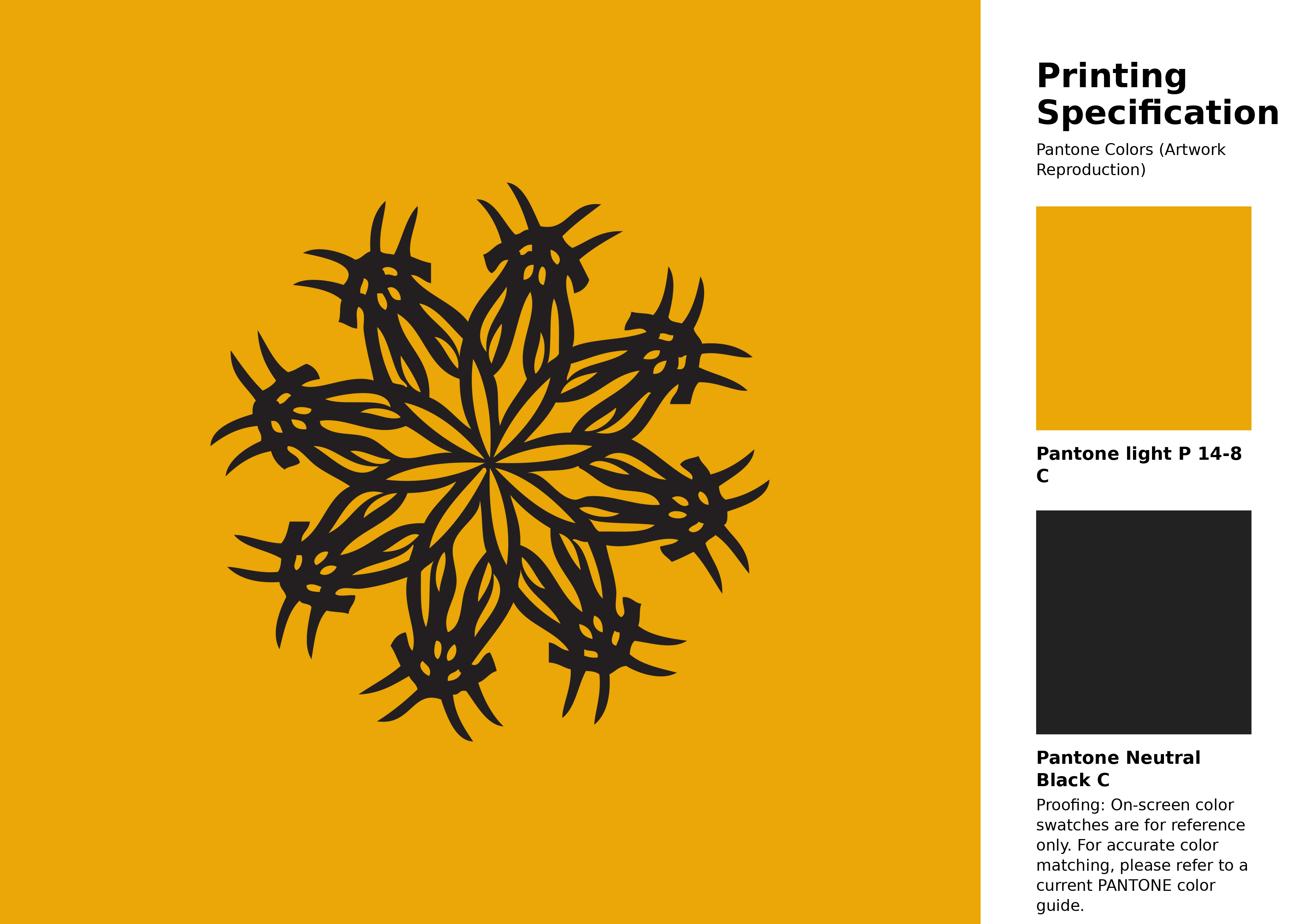
#eba607 Pantone P 14-8 C Color | Hex color Code #eba607 Artwork Image (PNG)
Download Artwork (PNG)#eba607 Pantone P 14-8 C Color | Hex color Code #eba607 Artwork Vector (PDF)
Download Artwork (PDF)#eba607 Pantone P 14-8 C Color | Hex color Code #eba607 Artwork Vector (SVG)
Download Artwork (SVG)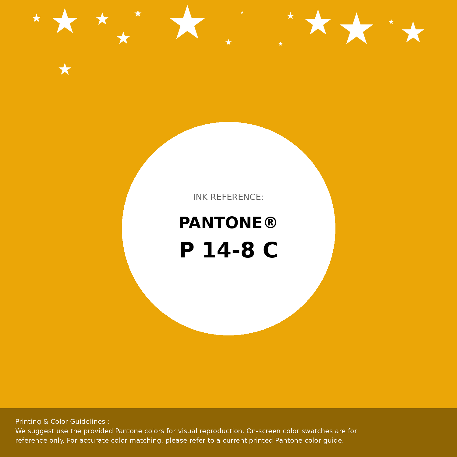
#eba607 Pantone P 14-8 C Color | Hex color Code #eba607 Pantone Swatch Artwork
Download Artwork Swatch
#eba607 Pantone P 14-8 C Color | Hex color Code #eba607 Gradient Artwork (PNG)
Download Gradient (PNG)#eba607 Pantone P 14-8 C Color | Hex color Code #eba607 Gradient Artwork (SVG)
Download Gradient (SVG)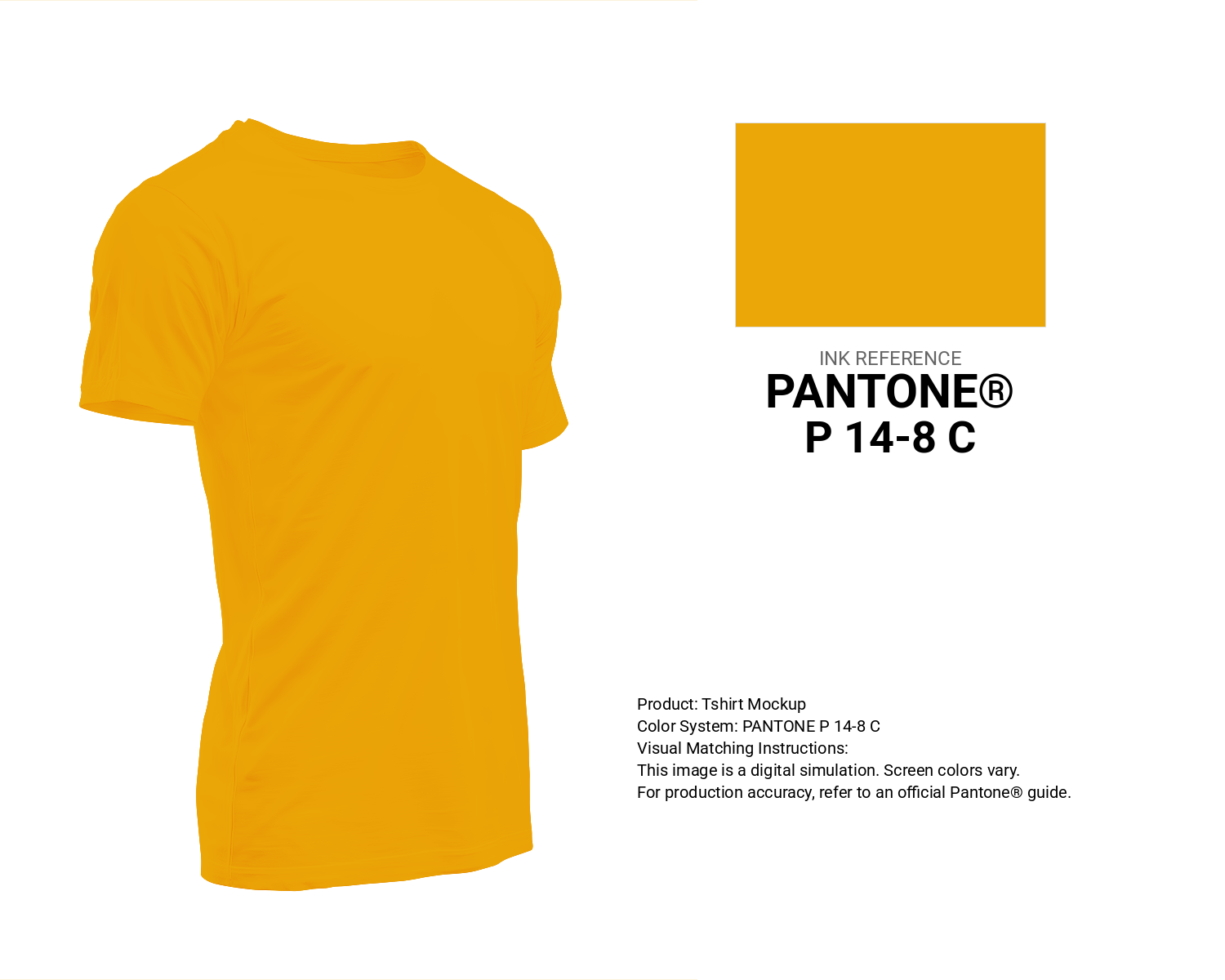
#eba607 Pantone P 14-8 C Color | Hex color Code #eba607 T-Shirt Mockup
Download T-Shirt Mockup
#eba607 Pantone P 14-8 C Color | Hex color Code #eba607 Printing Artwork Pantone Reference
Download Pantone Printing ReferenceRelated Color Palettes
- Brown and Dark Orange •
- Orange and Dark Khaki •
- OrangeRed and OrangeRed •
- Chocolate and Dark Orange •
- Sandy Brown and Orange •
- Orange and Dark Sea Green •
- Dark Olive Green and Orange •
- Goldenrod and OrangeRed •
- OrangeRed and Maroon •
- Crimson and Orange •
- Orange and Black •
- Goldenrod and Dark Orange •
- Dark Red and Orange •
- Gold and Dark Orange •
- Dark Orange and Gold
Color Palette Collection

366 Bright Color Palettes
366 color palettes with 1830 colors.

31 Royal Blue Color Palette
31 color palettes with 155 colors.

26 Pastel Color Schemes
26 color palettes with 130 colors.

46 Indigo Color Palettes
46 color palettes with 230 colors.