#FF7F32 Color
Your all-in-one color resource. Download hex background images, Adobe swatches (ASE), PDF color sheets, and SVG files. Explore palettes, harmonies, accessibility, conversions, and professional exports — designed for designers, developers, and color perfectionists.
This fiery orange-red evokes the warmth and intensity of a setting sun. It brings feelings of passion, energy, and excitement, reminiscent of a vibrant sunset or a blazing bonfire. The color creates a lively and dynamic mood, perfect for spaces that need to feel energizing or dramatic. It might be used in design for accent walls, bold furniture pieces, or to highlight key elements in a room. In some cultures, red is associated with celebration and good fortune, while orange often signifies creativity and enthusiasm. Visually matched named color: Sunset Ember.
PANTONE 1575 C
Choose Color
Selected Color
Recent Colors
Color Details
Similar Ink Alternatives for #FF7F32 color Alternative print inks for reproducing #FF7F32 background image with a similar visual appearance.
Disclaimer: The visually matched ink reference is an independent approximation intended as a guide only. Please be advised that this pantone colors is only intended as a guide, Actual colours will depend on screen calibration variances. The print ink suggestions provided are independent visual approximations and are not affiliated with or endorsed by Pantone LLC. For official color specifications, conversion factors, and comprehensive color system information, please visit Pantone Connect. Official Pantone products can be purchased at pantone.com.
Color Previews for #000000 See how this color looks as a background or as text.
Complete Guide to Your Color Laboratory
Everything you need to know about this professional color toolkit.
Use the Color Picker at the top to select any color. All modules below update instantly.
Workflow: Pick a color → Explore palettes & data → Download what you need (PDF, Image, or Adobe ASE).
Color Details — Your color in all formats: HEX, RGB, RGBA, HSL, HSLA, HSV, CMYK, CIELab, Hunter-Lab, XYZ, Yxy, YUV. One-click copy.
Color Psychology — Emotional impact, cultural meanings, physiological effects, branding applications, and historical significance.
Named Colors — Find official color names (HTML/CSS, Pantone) that match your selection with similarity percentages.
Light & Dark Shades
80-step gradient from black to white. Perfect for button states and component systems.
Tints
Color mixed with white → lighter, pastel variations for backgrounds and disabled states.
Monochromatic — 11 curated tints/shades from one color. Production-ready for design systems.
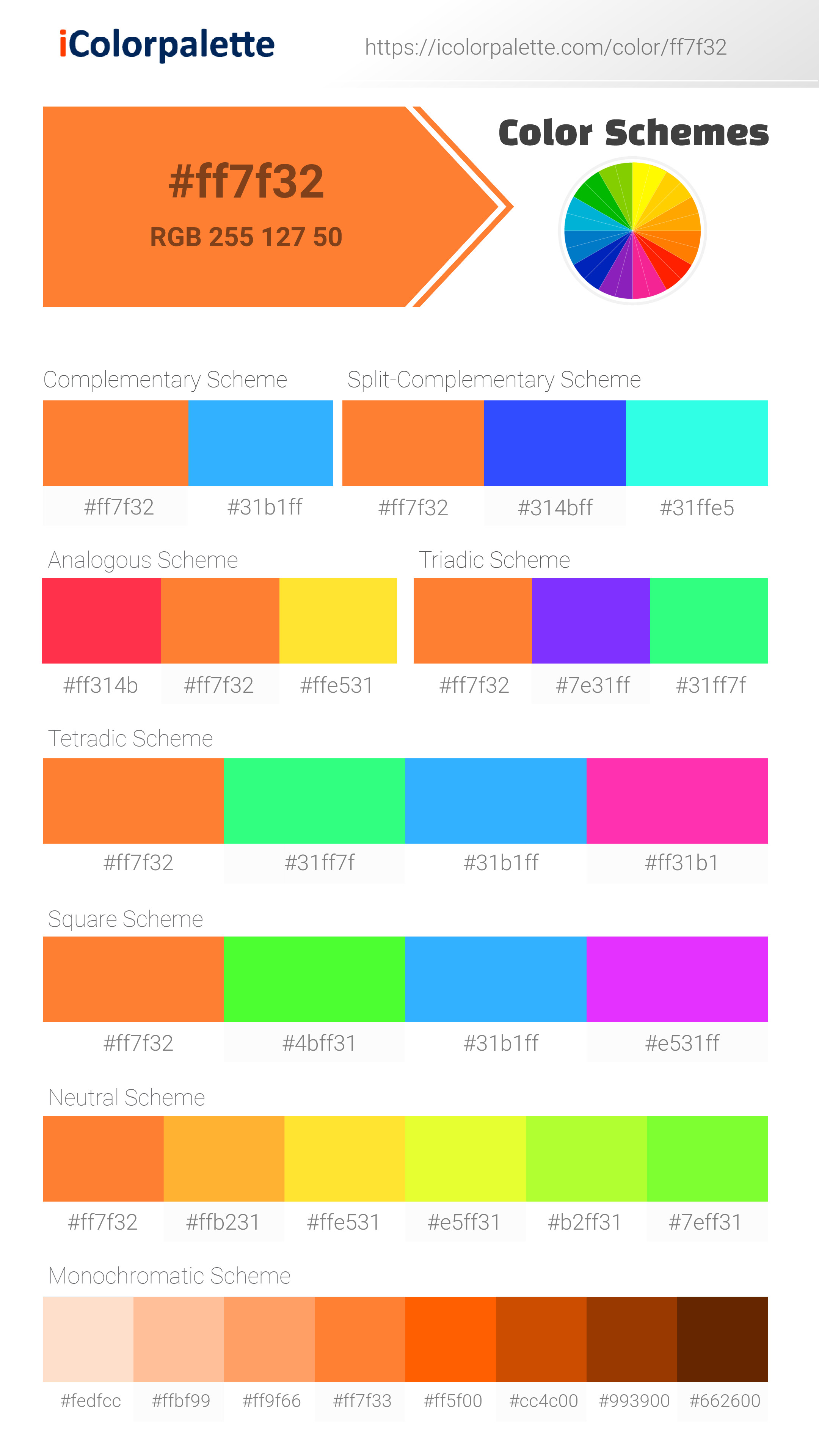
- Complementary — Opposite on wheel (180°). High contrast.
- Analogous — Neighbors (±30°). Harmonious flow.
- Triadic — Three colors (120° apart). Vibrant, balanced.
- Split-Complementary — Base + two near-complements. Softer contrast.
- Tetradic/Square — Four colors. Complex, maximum variety.
- Neutral — Desaturated versions. Subtle, sophisticated.
15 Professional Variations — Monochromatic, Analogous, Complementary, Warm/Cool/Earth Tones, Pastel, Vibrant, High Contrast, and more.
Color Infusion — 10 palettes showing your color morphing into each major hue. Find bridge colors.
Similar Colors — 60+ colors generated via CIELAB Delta E matching. Unexpected harmonious combinations.
18 Ready-to-Use Gradients — Complementary, Analogous, Triadic, Tint/Shade progressions, and more.
Downloads: PNG (2560×1440), CSS (production-ready code), SVG (scalable vector).
WCAG Contrast Checker — Tests your color against white, black, and custom colors for AA (4.5:1) and AAA (7:1) compliance. Large text thresholds included.
Harmony & Accessibility Guide — Tests against 10 canonical hues. Shows which pairs are both beautiful AND WCAG-compliant for text.
PNG/JPG — High-res images for presentations and mood boards.
PDF — Print-ready reports for clients and teams.
Adobe ASE — Direct import to Photoshop, Illustrator, InDesign, XD.
CSS/SVG — Gradients only. Production-ready code and vectors.
Color Science: Industry-standard conversions (HSL, CIELAB, CMYK, XYZ). WCAG 2.1 luminance formula. Delta E (ΔE76) for perceptual matching.
Direct Links: Share colors via icolorpalette.com/color/ff5733 or icolorpalette.com/color/red
Issues? Refresh the page, wait for rendering, try another browser, or check console (F12) for errors.
Printing Guide for #ff7f32 Background Image
Use PANTONE 1575 C as a visually matched ink reference when printing this background image.
To print the #ff7f32 background image from our site, consider using PANTONE 1575 C as a visually matched ink reference.
Download the background image, then provide this reference code to your print vendor to help achieve accurate color reproduction.
The visually matched ink reference for the #ff7f32 background image is PANTONE 1575 C.
This color is commonly described as Sunset Ember.
This fiery orange-red evokes the warmth and intensity of a setting sun. It brings feelings of passion, energy, and excitement, reminiscent of a vibrant sunset or a blazing bonfire. The color creates a lively and dynamic mood, perfect for spaces that need to feel energizing or dramatic. It might be used in design for accent walls, bold furniture pieces, or to highlight key elements in a room. In some cultures, red is associated with celebration and good fortune, while orange often signifies creativity and enthusiasm.
We provide PANTONE 1575 C as a visually matched ink reference to help you reproduce the #ff7f32 background image accurately in professional printing.
This reference code helps print vendors achieve consistent color output across different printing equipment and materials.
After downloading the #ff7f32 background image from our site:
- Include the visually matched ink reference PANTONE 1575 C in your print order notes
- Inform your print vendor that this is your target color reference
- Request a proof print to verify the Sunset Ember color appearance before full production
The #ff7f32 background image with PANTONE 1575 C as visually matched ink reference can be used for:
- Posters, banners, and backdrops
- Business cards, brochures, and flyers
- Packaging, labels, and stickers
- Signage and promotional materials
This is an independent visual approximation.
While PANTONE 1575 C closely matches the #ff7f32 background image color, variations may exist between screen display and printed output.
We recommend requesting a proof print to verify the final appearance.
This fiery orange-red evokes the warmth and intensity of a setting sun. It brings feelings of passion, energy, and excitement, reminiscent of a vibrant sunset or a blazing bonfire. The color creates a lively and dynamic mood, perfect for spaces that need to feel energizing or dramatic. It might be used in design for accent walls, bold furniture pieces, or to highlight key elements in a room. In some cultures, red is associated with celebration and good fortune, while orange often signifies creativity and enthusiasm.
Understanding these associations helps ensure the #ff7f32 background image aligns with your intended message and brand impact.
Important Information
The visually matched ink reference is an independent approximation intended as a guide only.
Actual printed colors may vary depending on screen calibration, substrate material, ink type, and printing equipment used.
For official color specifications and certified color standards, visit Pantone Connect.
Official color guides and swatch books can be purchased from pantone.com.
Pantone 1575 C Color: Vibrant Blaze | #FF7F32
Introduction:
Vibrant Blaze is a vivid and energetic color. It exudes warmth and radiance, making it visually appealing and eye-catching.
Historical Significance:
Key moments in history: Vibrant Blaze has been prominently used in various historical events, such as the vibrant banners used during the French Revolution and the fiery colors seen in ancient Chinese ceramics and artwork.
Symbolism and Meaning:
Symbolism: Vibrant Blaze is often associated with passion, energy, and excitement. It symbolizes warmth, creativity, and boldness in different cultures and contexts.
Vibrant Blaze in Fashion:
Impact on fashion: Vibrant Blaze is a popular choice in fashion, especially during the autumn season. It adds a touch of warmth and vibrancy to outfits and can make a bold fashion statement.
Vibrant Blaze in Graphic Design:
Significance in design aesthetics: Vibrant Blaze is often used in graphic design to create bold and eye-catching visuals. It can evoke a sense of excitement and energy, making it ideal for attention-grabbing designs and branding.
Color Combinations:
Potential color combinations: Vibrant Blaze pairs well with complementary colors such as deep blues and vibrant oranges. It also works well with neutrals like white and gray, creating a striking contrast.
Nature’s Palette:
Natural occurrences: Vibrant Blaze can be found in nature in the fiery hues of a sunset, the vibrant petals of marigold flowers, and the autumn foliage of maple trees.
Artistic Representations:
Usage in art: Vibrant Blaze has been used by various artists to capture energy and intensity. It can be seen in vibrant abstract paintings, fiery landscapes, and expressive portraits.
Movies and Cinematic Landscapes:
Movies and scenes: Vibrant Blaze is often used in movies to set a passionate or intense tone. It can be seen in fiery explosions, dramatic sunsets, and intense action sequences.
Products and Commercial Appeal:
Popular products and brands: Vibrant Blaze is commonly used in the branding of products related to energy, creativity, and passion. It is often seen in sports brands, fiery food products, and vibrant cosmetics.
National Symbols and Significance:
Cultural significance: In some cultures, Vibrant Blaze is associated with celebration, vitality, and good luck. It can be seen in national flags, traditional costumes, and festive decorations.
The Psychological and Emotional Impact:
Influence on emotions: Vibrant Blaze is known to evoke feelings of passion, excitement, and enthusiasm. It can energize and motivate individuals, stimulating creativity and boldness.
Conclusion:
Vibrant Blaze, with its historical significance, symbolic meaning, and visual impact, is a color that represents energy, excitement, and creativity. Whether used in fashion, graphic design, or art, it adds a vibrant touch to any visual representation.
Pantone 1575 C Color | Hex color Code #ff7f32 Image & Artwork
Download high-quality assets for your projects.
#ff7f32 Color Schemes
Download Color Schemes
#ff7f32 Color Shades
Download Color Shades
Pantone 1575 C Color | Hex color Code #ff7f32 Solid Color Background
Download Solid Color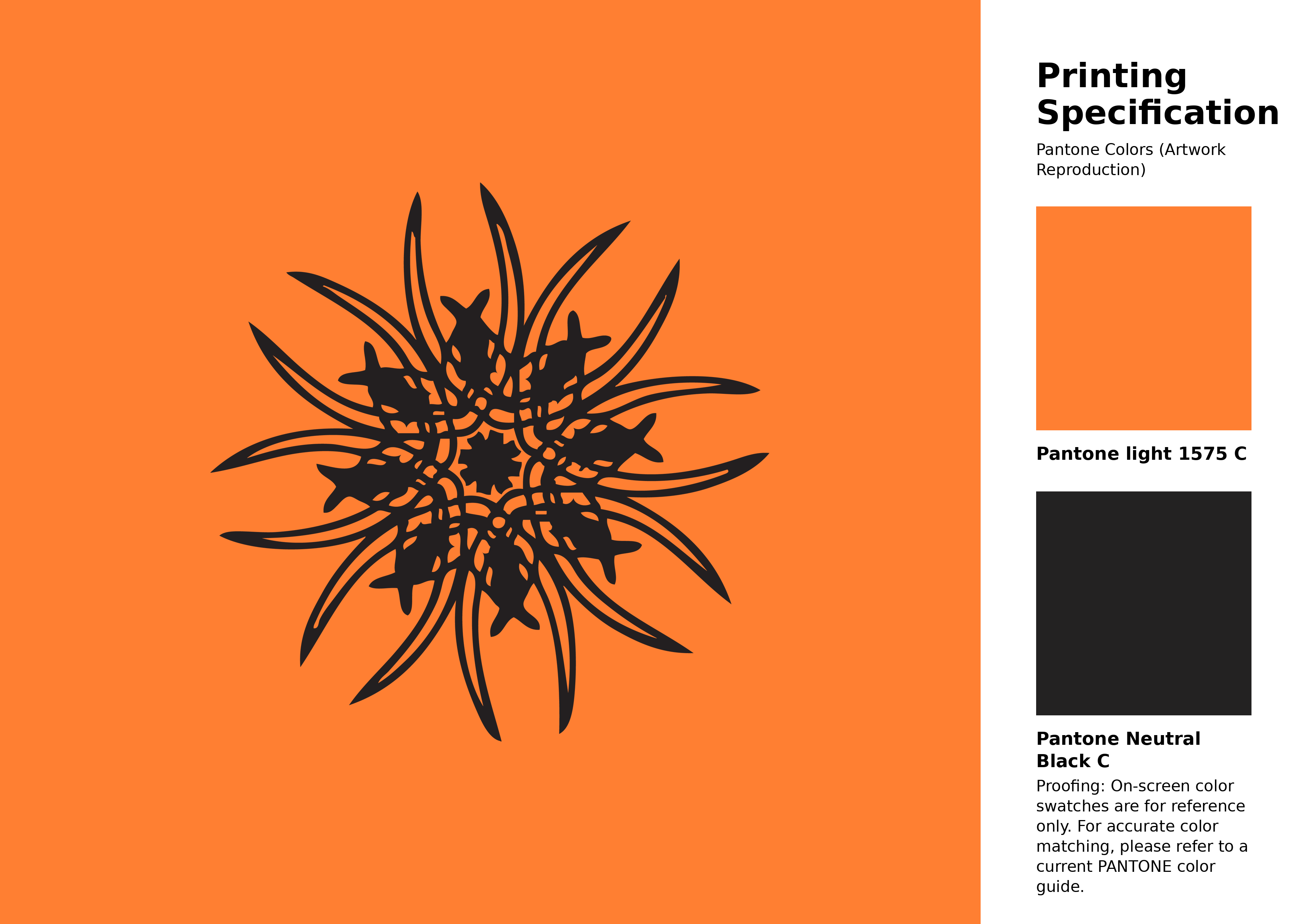
#ff7f32 Pantone 1575 C Color | Hex color Code #ff7f32 Artwork Image (PNG)
Download Artwork (PNG)#ff7f32 Pantone 1575 C Color | Hex color Code #ff7f32 Artwork Vector (PDF)
Download Artwork (PDF)#ff7f32 Pantone 1575 C Color | Hex color Code #ff7f32 Artwork Vector (SVG)
Download Artwork (SVG)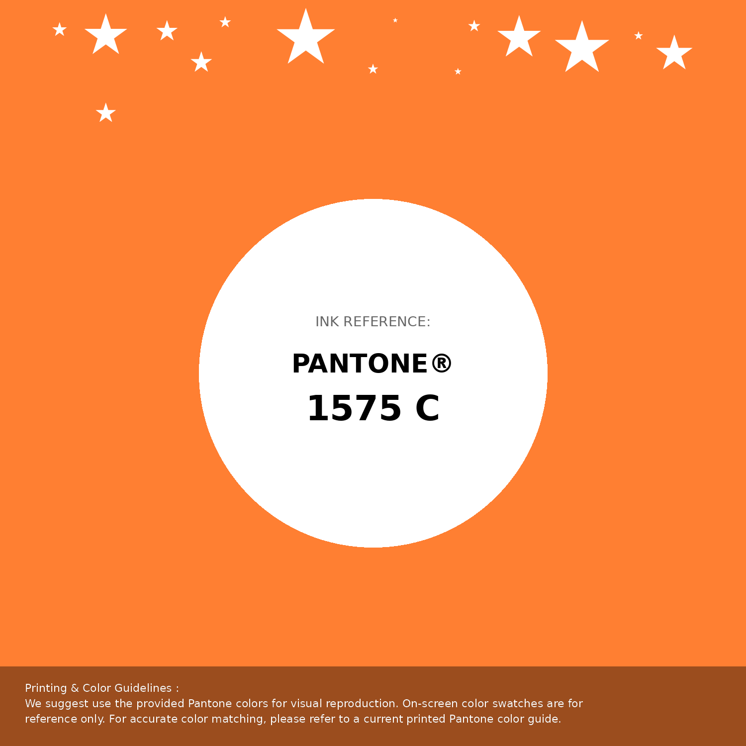
#ff7f32 Pantone 1575 C Color | Hex color Code #ff7f32 Pantone Swatch Artwork
Download Artwork Swatch
#ff7f32 Pantone 1575 C Color | Hex color Code #ff7f32 Gradient Artwork (PNG)
Download Gradient (PNG)#ff7f32 Pantone 1575 C Color | Hex color Code #ff7f32 Gradient Artwork (SVG)
Download Gradient (SVG)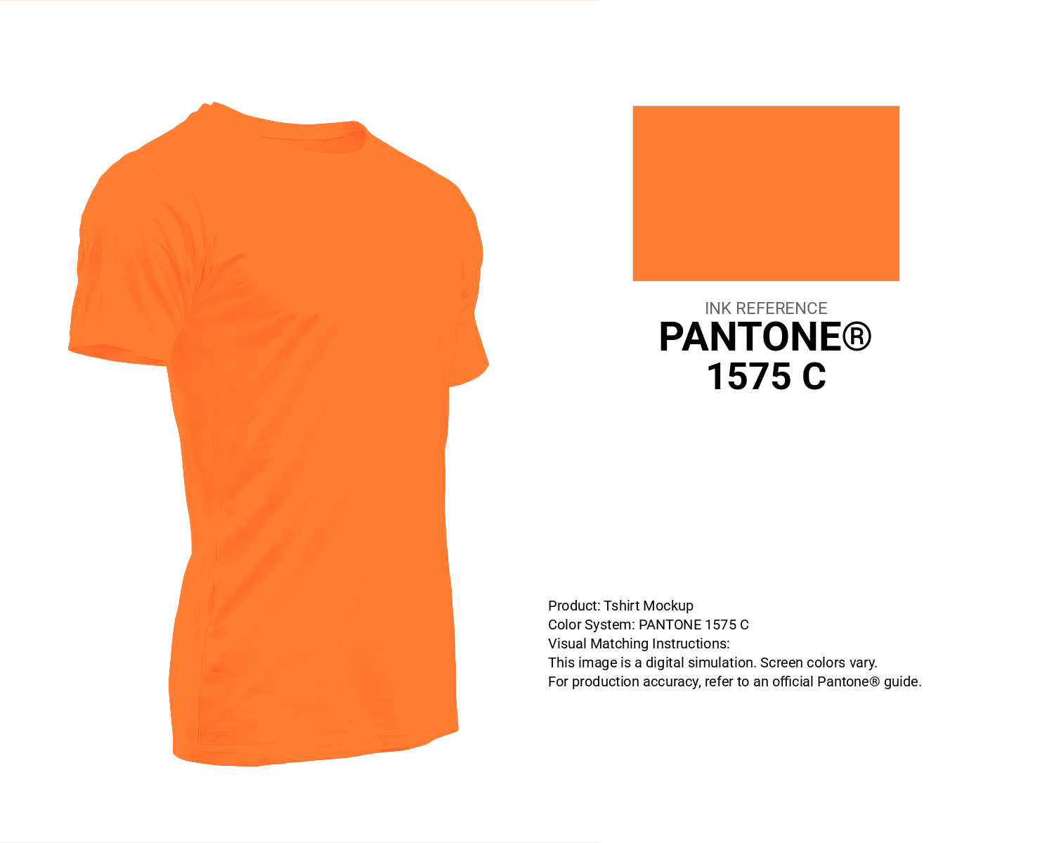
#ff7f32 Pantone 1575 C Color | Hex color Code #ff7f32 T-Shirt Mockup
Download T-Shirt Mockup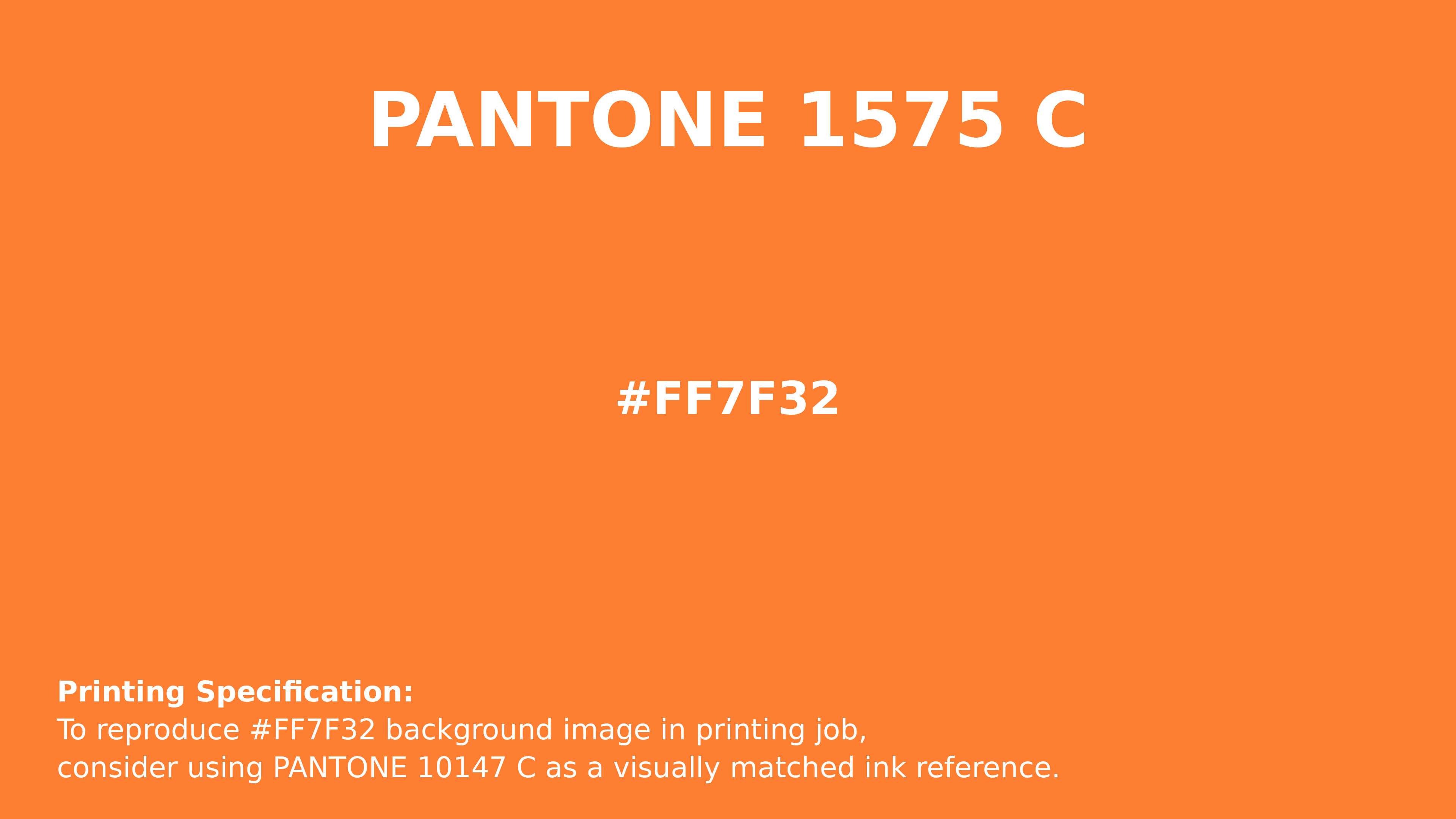
#ff7f32 Pantone 1575 C Color | Hex color Code #ff7f32 Printing Artwork Pantone Reference
Download Pantone Printing ReferenceRelated Color Palettes
- OrangeRed and Crimson •
- Orange and Orange •
- Dark Orange and Dark Olive Green •
- Orange and Beige •
- Gold and Dark Orange •
- OrangeRed and Maroon •
- Orange and Olive Drab •
- Sienna and OrangeRed •
- Orange and Dark Orange •
- OrangeRed and Dark Orange •
- Orange and Midnight Blue •
- Dark Slate Gray and Orange •
- Orange and Tomato •
- OrangeRed and Dark Khaki •
- Tomato and Orange
Color Palette Collection

42 Green Color Schemes
42 color palettes with 210 colors.

50 Color Palettes inspired by Sky
50 color palettes with 250 colors.

Light Blue Palettes to Enhance Your Design
13 color palettes with 65 colors.
33 Nature Inspired Color Schemes
33 color palettes with 165 colors.