#ED8B00 Color
Your all-in-one color resource. Download hex background images, Adobe swatches (ASE), PDF color sheets, and SVG files. Explore palettes, harmonies, accessibility, conversions, and professional exports — designed for designers, developers, and color perfectionists.
This vibrant orange-red evokes the fiery glow of a setting sun, painting the sky in hues of warmth and passion. It sparks feelings of energy, excitement, and enthusiasm. The color suggests a sense of adventure and the beauty of transformation. It might remind one of a crackling bonfire, autumn leaves, or the fiery intensity of a sunset. In design, it could be used to create a warm and inviting atmosphere, perfect for a dining room or a space meant to energize. It could also denote a sense of boldness and confidence. Visually matched named color: Sunset Ember.
PANTONE 144 C
Choose Color
Selected Color
Recent Colors
Color Details
Similar Ink Alternatives for #ED8B00 color Alternative print inks for reproducing #ED8B00 background image with a similar visual appearance.
Disclaimer: The visually matched ink reference is an independent approximation intended as a guide only. Please be advised that this pantone colors is only intended as a guide, Actual colours will depend on screen calibration variances. The print ink suggestions provided are independent visual approximations and are not affiliated with or endorsed by Pantone LLC. For official color specifications, conversion factors, and comprehensive color system information, please visit Pantone Connect. Official Pantone products can be purchased at pantone.com.
Color Previews for #000000 See how this color looks as a background or as text.
Complete Guide to Your Color Laboratory
Everything you need to know about this professional color toolkit.
Use the Color Picker at the top to select any color. All modules below update instantly.
Workflow: Pick a color → Explore palettes & data → Download what you need (PDF, Image, or Adobe ASE).
Color Details — Your color in all formats: HEX, RGB, RGBA, HSL, HSLA, HSV, CMYK, CIELab, Hunter-Lab, XYZ, Yxy, YUV. One-click copy.
Color Psychology — Emotional impact, cultural meanings, physiological effects, branding applications, and historical significance.
Named Colors — Find official color names (HTML/CSS, Pantone) that match your selection with similarity percentages.
Light & Dark Shades
80-step gradient from black to white. Perfect for button states and component systems.
Tints
Color mixed with white → lighter, pastel variations for backgrounds and disabled states.
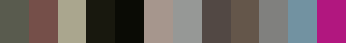
Monochromatic — 11 curated tints/shades from one color. Production-ready for design systems.
- Complementary — Opposite on wheel (180°). High contrast.
- Analogous — Neighbors (±30°). Harmonious flow.
- Triadic — Three colors (120° apart). Vibrant, balanced.
- Split-Complementary — Base + two near-complements. Softer contrast.
- Tetradic/Square — Four colors. Complex, maximum variety.
- Neutral — Desaturated versions. Subtle, sophisticated.
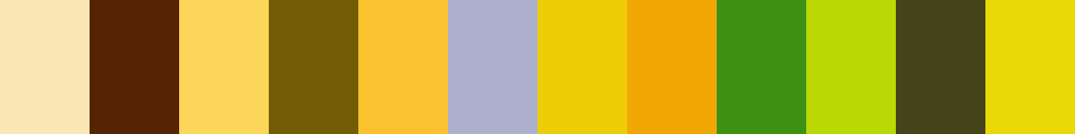
15 Professional Variations — Monochromatic, Analogous, Complementary, Warm/Cool/Earth Tones, Pastel, Vibrant, High Contrast, and more.
Color Infusion — 10 palettes showing your color morphing into each major hue. Find bridge colors.
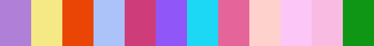
Similar Colors — 60+ colors generated via CIELAB Delta E matching. Unexpected harmonious combinations.
18 Ready-to-Use Gradients — Complementary, Analogous, Triadic, Tint/Shade progressions, and more.
Downloads: PNG (2560×1440), CSS (production-ready code), SVG (scalable vector).
WCAG Contrast Checker — Tests your color against white, black, and custom colors for AA (4.5:1) and AAA (7:1) compliance. Large text thresholds included.
Harmony & Accessibility Guide — Tests against 10 canonical hues. Shows which pairs are both beautiful AND WCAG-compliant for text.
PNG/JPG — High-res images for presentations and mood boards.
PDF — Print-ready reports for clients and teams.
Adobe ASE — Direct import to Photoshop, Illustrator, InDesign, XD.
CSS/SVG — Gradients only. Production-ready code and vectors.
Color Science: Industry-standard conversions (HSL, CIELAB, CMYK, XYZ). WCAG 2.1 luminance formula. Delta E (ΔE76) for perceptual matching.
Direct Links: Share colors via icolorpalette.com/color/ff5733 or icolorpalette.com/color/red
Issues? Refresh the page, wait for rendering, try another browser, or check console (F12) for errors.
Printing Guide for #ed8b00 Background Image
Use PANTONE 144 C as a visually matched ink reference when printing this background image.
To print the #ed8b00 background image from our site, consider using PANTONE 144 C as a visually matched ink reference.
Download the background image, then provide this reference code to your print vendor to help achieve accurate color reproduction.
The visually matched ink reference for the #ed8b00 background image is PANTONE 144 C.
This color is commonly described as Sunset Ember.
This vibrant orange-red evokes the fiery glow of a setting sun, painting the sky in hues of warmth and passion. It sparks feelings of energy, excitement, and enthusiasm. The color suggests a sense of adventure and the beauty of transformation. It might remind one of a crackling bonfire, autumn leaves, or the fiery intensity of a sunset. In design, it could be used to create a warm and inviting atmosphere, perfect for a dining room or a space meant to energize. It could also denote a sense of boldness and confidence.
We provide PANTONE 144 C as a visually matched ink reference to help you reproduce the #ed8b00 background image accurately in professional printing.
This reference code helps print vendors achieve consistent color output across different printing equipment and materials.
After downloading the #ed8b00 background image from our site:
- Include the visually matched ink reference PANTONE 144 C in your print order notes
- Inform your print vendor that this is your target color reference
- Request a proof print to verify the Sunset Ember color appearance before full production
The #ed8b00 background image with PANTONE 144 C as visually matched ink reference can be used for:
- Posters, banners, and backdrops
- Business cards, brochures, and flyers
- Packaging, labels, and stickers
- Signage and promotional materials
This is an independent visual approximation.
While PANTONE 144 C closely matches the #ed8b00 background image color, variations may exist between screen display and printed output.
We recommend requesting a proof print to verify the final appearance.
This vibrant orange-red evokes the fiery glow of a setting sun, painting the sky in hues of warmth and passion. It sparks feelings of energy, excitement, and enthusiasm. The color suggests a sense of adventure and the beauty of transformation. It might remind one of a crackling bonfire, autumn leaves, or the fiery intensity of a sunset. In design, it could be used to create a warm and inviting atmosphere, perfect for a dining room or a space meant to energize. It could also denote a sense of boldness and confidence.
Understanding these associations helps ensure the #ed8b00 background image aligns with your intended message and brand impact.
Important Information
The visually matched ink reference is an independent approximation intended as a guide only.
Actual printed colors may vary depending on screen calibration, substrate material, ink type, and printing equipment used.
For official color specifications and certified color standards, visit Pantone Connect.
Official color guides and swatch books can be purchased from pantone.com.
Pantone 144 C Color: Vibrant Amber | #ED8B00
Introduction:
Vibrant Amber, also known as Pantone 144 C, is a bright and energetic color. It exudes warmth and stands out with its vibrant hue.
Historical Significance:
Significant Uses: Throughout history, Vibrant Amber has been prominently used in decorative arts and architecture, particularly during the Art Deco period of the 1920s and 1930s. Its rich and warm tone added a touch of opulence to buildings, furniture, and decorative objects.
Symbolic Meanings: In ancient civilizations, such as Egyptian and Roman cultures, amber was associated with the sun and believed to possess magical and healing properties. It was often used in jewelry and amulets as a symbol of protection and prosperity.
Symbolism and Meaning:
Cultural Symbolism: Vibrant Amber is often associated with warmth, energy, and positivity. It symbolizes creativity, inspiration, and fearlessness. In some cultures, it is also associated with wealth and abundance.
Vibrant Amber in Fashion:
Influencing Styles: Vibrant Amber has a strong presence in the fashion world, particularly during the autumn season. It is often used in clothing, accessories, and makeup to add a pop of color and create warm and inviting looks.
Vibrant Amber in Graphic Design:
Aesthetic Impact: In graphic design, Vibrant Amber is often used to create contrast and add energy to designs. It can evoke a sense of excitement and grab attention, making it a popular choice for branding and packaging.
Color Combinations:
Possible Combinations: Vibrant Amber pairs well with contrasting colors such as deep navy, rich burgundy, and olive green. It can also be combined with earthy tones like terracotta and sandy beige for a warm and harmonious palette.
Nature’s Palette:
In Nature: Vibrant Amber can be found in various natural occurrences, such as the golden tones of autumn leaves, the fiery glow of a sunset, and the vibrant petals of marigold flowers. It represents the warmth and beauty of the natural world.
Artistic Representations:
In Art: Vibrant Amber has been widely used by artists to depict warmth, energy, and vibrancy. It can be seen in vibrant paintings, stained glass windows, and sculptures, adding a dynamic and uplifting element to the artworks.
Movies and Cinematic Landscapes:
Setting the Mood: Vibrant Amber is often used in movies and cinematic landscapes to create a warm and nostalgic atmosphere. It can be seen in sunset scenes, cozy interiors, and scenes depicting autumn or desert landscapes.
Products and Commercial Appeal:
Popular Brands: Vibrant Amber is often used in branding and product design to create a bold and energetic image. It can be found in logos, packaging, and advertisements of various companies in industries ranging from food and beverages to fashion and cosmetics.
National Symbols and Significance:
Cultural Significance: In some cultures, Vibrant Amber holds national or cultural significance. For example, in Lithuania, amber is considered the national gemstone and symbolizes the country's rich history and natural resources.
The Psychological and Emotional Impact:
Emotional Influence: Vibrant Amber can evoke feelings of warmth, happiness, and excitement. It can boost energy levels and stimulate creativity. Additionally, it is believed to have a positive impact on mood and can alleviate feelings of depression or anxiety.
Conclusion:
Vibrant Amber, with its rich and energetic hue, has a significant presence in various aspects of life, including fashion, design, art, and cultural symbolism. Its warm and vibrant nature adds a touch of positivity and energy to any context, making it a timeless and versatile color.
Pantone 144 C Color | Hex color Code #ed8b00 Image & Artwork
Download high-quality assets for your projects.

#ed8b00 Color Schemes
Download Color Schemes
#ed8b00 Color Shades
Download Color Shades
Pantone 144 C Color | Hex color Code #ed8b00 Solid Color Background
Download Solid Color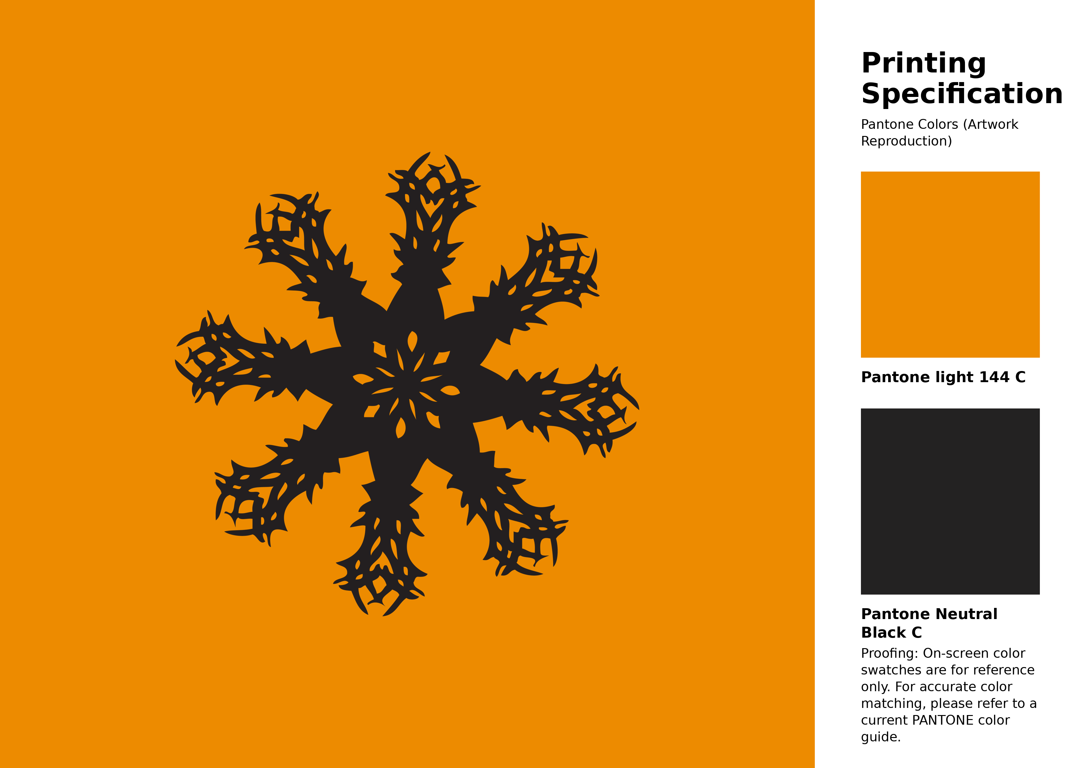
#ed8b00 Pantone 144 C Color | Hex color Code #ed8b00 Artwork Image (PNG)
Download Artwork (PNG)#ed8b00 Pantone 144 C Color | Hex color Code #ed8b00 Artwork Vector (PDF)
Download Artwork (PDF)#ed8b00 Pantone 144 C Color | Hex color Code #ed8b00 Artwork Vector (SVG)
Download Artwork (SVG)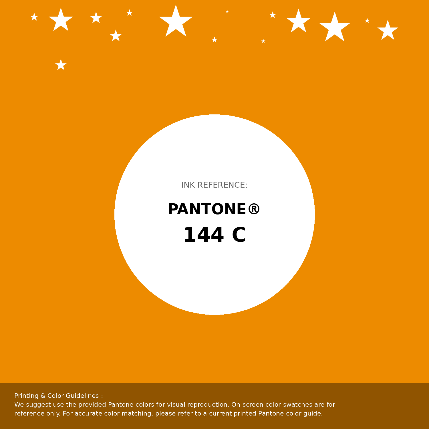
#ed8b00 Pantone 144 C Color | Hex color Code #ed8b00 Pantone Swatch Artwork
Download Artwork Swatch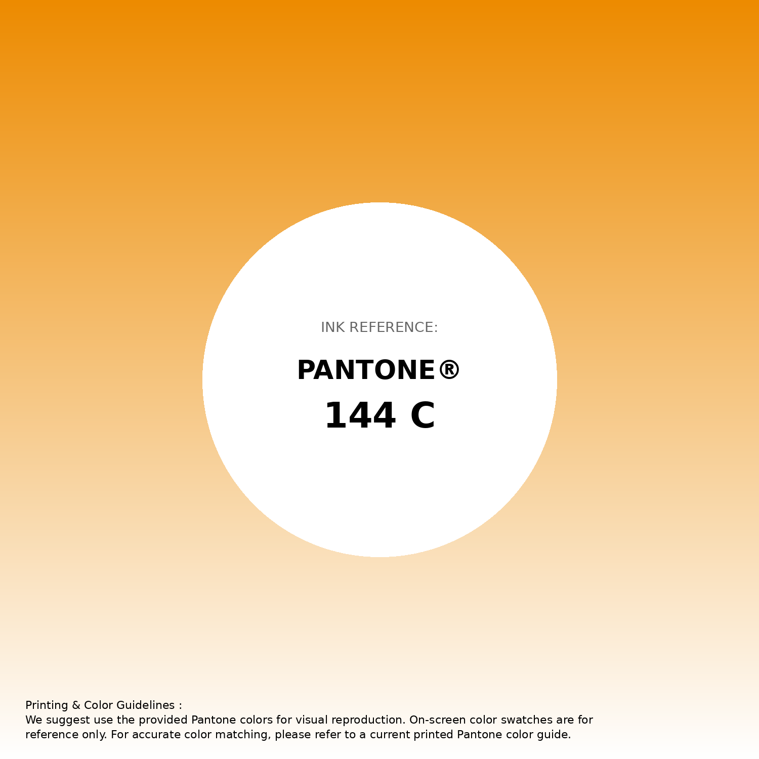
#ed8b00 Pantone 144 C Color | Hex color Code #ed8b00 Gradient Artwork (PNG)
Download Gradient (PNG)#ed8b00 Pantone 144 C Color | Hex color Code #ed8b00 Gradient Artwork (SVG)
Download Gradient (SVG)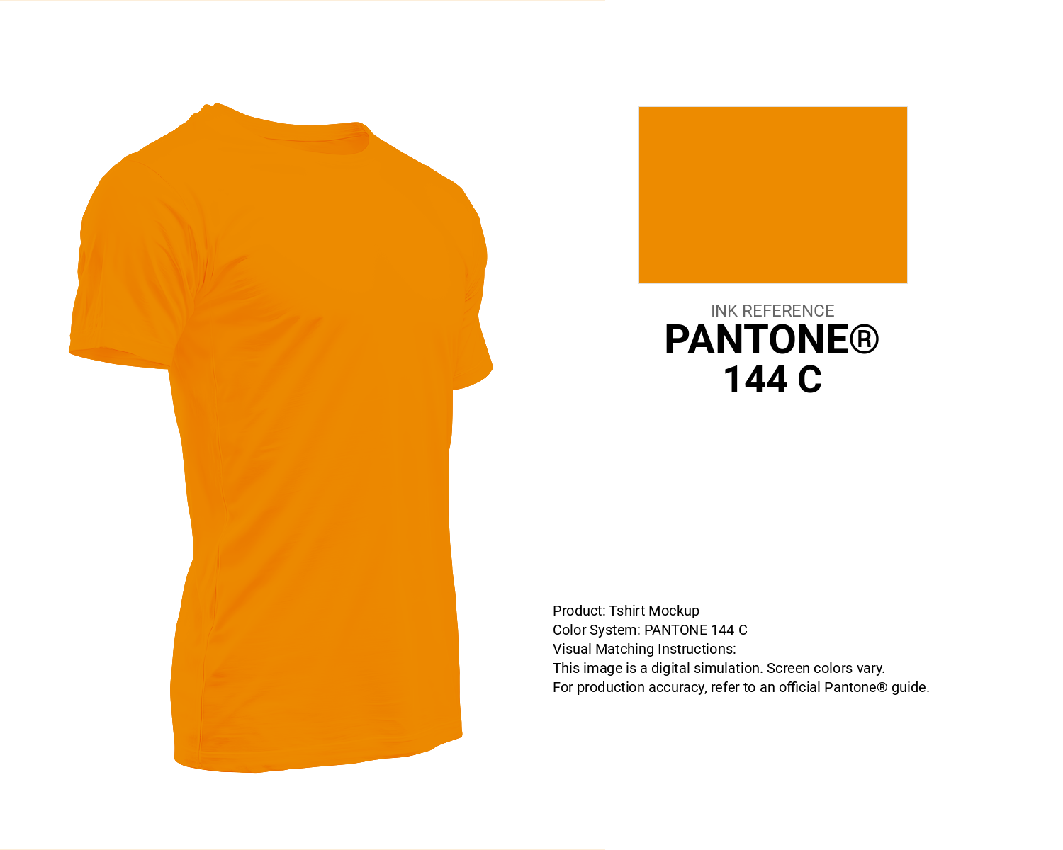
#ed8b00 Pantone 144 C Color | Hex color Code #ed8b00 T-Shirt Mockup
Download T-Shirt Mockup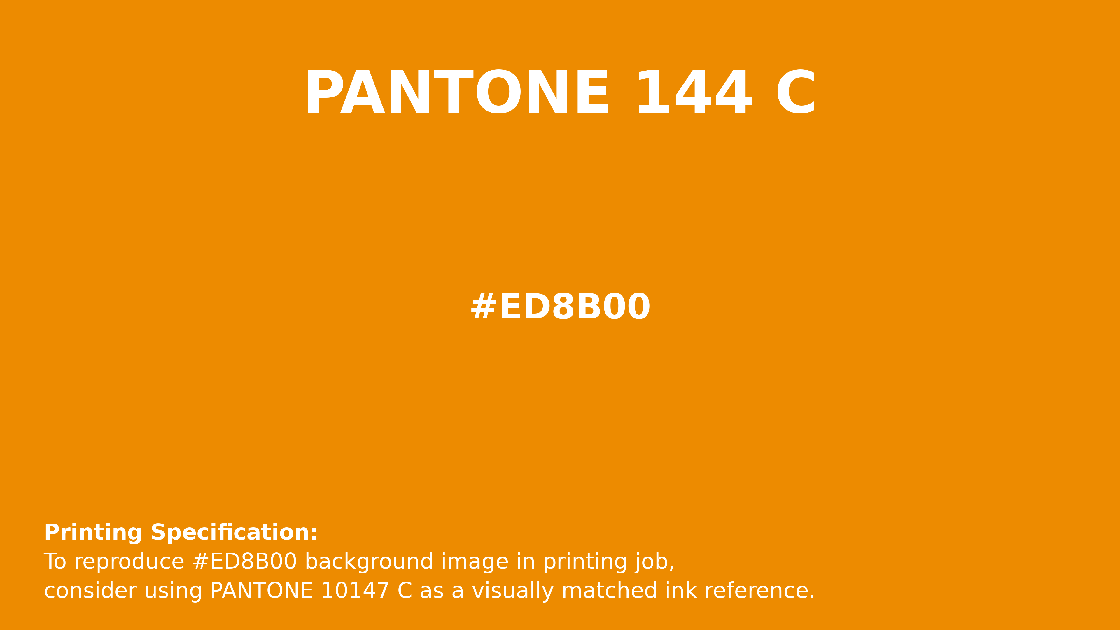
#ed8b00 Pantone 144 C Color | Hex color Code #ed8b00 Printing Artwork Pantone Reference
Download Pantone Printing ReferenceRelated Color Palettes
- Dark Khaki and OrangeRed •
- Peach Orange •
- Tan and OrangeRed •
- Dark Goldenrod and OrangeRed •
- Dark Orange and OrangeRed •
- Outrageous Orange •
- Dark Orange and Sienna •
- Sandy Brown and Orange •
- Dark Khaki and Orange •
- Dark Orange and Maroon •
- Dark Red and Orange •
- OrangeRed and Saddle Brown •
- OrangeRed and Olive Drab •
- OrangeRed and Black •
- Orange and Maroon
Color Palette Collection
My color palette 1
863 color palettes with 4315 colors.
ERGO
1 color palettes with 5 colors.
117 Yellow Color Palettes
117 color palettes with 585 colors.

20 Pink Color Schemes
20 color palettes with 100 colors.