#E10600 Color
Your all-in-one color resource. Download hex background images, Adobe swatches (ASE), PDF color sheets, and SVG files. Explore palettes, harmonies, accessibility, conversions, and professional exports — designed for designers, developers, and color perfectionists.
This fiery, intense red-orange evokes passion, energy, and excitement. It's reminiscent of a blazing sunset, a bonfire's heart, or the vibrant hues of a tropical bird. The color creates a dynamic, bold, and sometimes aggressive mood. It can be stimulating and invigorating, yet also potentially overwhelming. In design, it can be used to create a powerful focal point or to energize a space, but should be used cautiously due to its intensity. In some cultures, red can symbolize good fortune and celebration. Visually matched named color: Crimson Blaze.
PANTONE 2347 C
Choose Color
Selected Color
Recent Colors
Color Details
Similar Ink Alternatives for #E10600 color Alternative print inks for reproducing #E10600 background image with a similar visual appearance.
Disclaimer: The visually matched ink reference is an independent approximation intended as a guide only. Please be advised that this pantone colors is only intended as a guide, Actual colours will depend on screen calibration variances. The print ink suggestions provided are independent visual approximations and are not affiliated with or endorsed by Pantone LLC. For official color specifications, conversion factors, and comprehensive color system information, please visit Pantone Connect. Official Pantone products can be purchased at pantone.com.
Color Previews for #000000 See how this color looks as a background or as text.
Complete Guide to Your Color Laboratory
Everything you need to know about this professional color toolkit.
Use the Color Picker at the top to select any color. All modules below update instantly.
Workflow: Pick a color → Explore palettes & data → Download what you need (PDF, Image, or Adobe ASE).
Color Details — Your color in all formats: HEX, RGB, RGBA, HSL, HSLA, HSV, CMYK, CIELab, Hunter-Lab, XYZ, Yxy, YUV. One-click copy.
Color Psychology — Emotional impact, cultural meanings, physiological effects, branding applications, and historical significance.
Named Colors — Find official color names (HTML/CSS, Pantone) that match your selection with similarity percentages.
Light & Dark Shades
80-step gradient from black to white. Perfect for button states and component systems.
Tints
Color mixed with white → lighter, pastel variations for backgrounds and disabled states.
Monochromatic — 11 curated tints/shades from one color. Production-ready for design systems.
- Complementary — Opposite on wheel (180°). High contrast.
- Analogous — Neighbors (±30°). Harmonious flow.
- Triadic — Three colors (120° apart). Vibrant, balanced.
- Split-Complementary — Base + two near-complements. Softer contrast.
- Tetradic/Square — Four colors. Complex, maximum variety.
- Neutral — Desaturated versions. Subtle, sophisticated.
15 Professional Variations — Monochromatic, Analogous, Complementary, Warm/Cool/Earth Tones, Pastel, Vibrant, High Contrast, and more.
Color Infusion — 10 palettes showing your color morphing into each major hue. Find bridge colors.
Similar Colors — 60+ colors generated via CIELAB Delta E matching. Unexpected harmonious combinations.
18 Ready-to-Use Gradients — Complementary, Analogous, Triadic, Tint/Shade progressions, and more.
Downloads: PNG (2560×1440), CSS (production-ready code), SVG (scalable vector).
WCAG Contrast Checker — Tests your color against white, black, and custom colors for AA (4.5:1) and AAA (7:1) compliance. Large text thresholds included.
Harmony & Accessibility Guide — Tests against 10 canonical hues. Shows which pairs are both beautiful AND WCAG-compliant for text.
PNG/JPG — High-res images for presentations and mood boards.
PDF — Print-ready reports for clients and teams.
Adobe ASE — Direct import to Photoshop, Illustrator, InDesign, XD.
CSS/SVG — Gradients only. Production-ready code and vectors.
Color Science: Industry-standard conversions (HSL, CIELAB, CMYK, XYZ). WCAG 2.1 luminance formula. Delta E (ΔE76) for perceptual matching.
Direct Links: Share colors via icolorpalette.com/color/ff5733 or icolorpalette.com/color/red
Issues? Refresh the page, wait for rendering, try another browser, or check console (F12) for errors.
Printing Guide for #e10600 Background Image
Use PANTONE 2347 C as a visually matched ink reference when printing this background image.
To print the #e10600 background image from our site, consider using PANTONE 2347 C as a visually matched ink reference.
Download the background image, then provide this reference code to your print vendor to help achieve accurate color reproduction.
The visually matched ink reference for the #e10600 background image is PANTONE 2347 C.
This color is commonly described as Crimson Blaze.
This fiery, intense red-orange evokes passion, energy, and excitement. It's reminiscent of a blazing sunset, a bonfire's heart, or the vibrant hues of a tropical bird. The color creates a dynamic, bold, and sometimes aggressive mood. It can be stimulating and invigorating, yet also potentially overwhelming. In design, it can be used to create a powerful focal point or to energize a space, but should be used cautiously due to its intensity. In some cultures, red can symbolize good fortune and celebration.
We provide PANTONE 2347 C as a visually matched ink reference to help you reproduce the #e10600 background image accurately in professional printing.
This reference code helps print vendors achieve consistent color output across different printing equipment and materials.
After downloading the #e10600 background image from our site:
- Include the visually matched ink reference PANTONE 2347 C in your print order notes
- Inform your print vendor that this is your target color reference
- Request a proof print to verify the Crimson Blaze color appearance before full production
The #e10600 background image with PANTONE 2347 C as visually matched ink reference can be used for:
- Posters, banners, and backdrops
- Business cards, brochures, and flyers
- Packaging, labels, and stickers
- Signage and promotional materials
This is an independent visual approximation.
While PANTONE 2347 C closely matches the #e10600 background image color, variations may exist between screen display and printed output.
We recommend requesting a proof print to verify the final appearance.
This fiery, intense red-orange evokes passion, energy, and excitement. It's reminiscent of a blazing sunset, a bonfire's heart, or the vibrant hues of a tropical bird. The color creates a dynamic, bold, and sometimes aggressive mood. It can be stimulating and invigorating, yet also potentially overwhelming. In design, it can be used to create a powerful focal point or to energize a space, but should be used cautiously due to its intensity. In some cultures, red can symbolize good fortune and celebration.
Understanding these associations helps ensure the #e10600 background image aligns with your intended message and brand impact.
Important Information
The visually matched ink reference is an independent approximation intended as a guide only.
Actual printed colors may vary depending on screen calibration, substrate material, ink type, and printing equipment used.
For official color specifications and certified color standards, visit Pantone Connect.
Official color guides and swatch books can be purchased from pantone.com.
Pantone 2347 C Color: Bold Red | #E10600
Introduction:
Bold Red (Pantone 2347 C) is a vibrant and intense shade of red. It exudes energy and passion, making it a powerful color choice in various applications.
Historical Significance:
Key Moments in History: Bold Red has been prominently used throughout history, notably in political campaigns, revolutionary movements, and artistic expressions. It evokes strong emotions and captures attention, making it an effective tool for conveying messages of power, revolution, and change.
Symbolism and Meaning:
Symbolism and Meaning: Bold Red typically symbolizes passion, love, anger, and courage. It is associated with strong emotions and can convey excitement, danger, and attraction. In different cultures, it may also represent luck, joy, or celebration.
Bold Red in Fashion:
Impact on Fashion: Bold Red is a popular color in the fashion world. It is often used in statement pieces, evening wear, and accessories to make a bold and confident statement. Red dresses, red shoes, and red lipstick are iconic fashion choices that symbolize power and sensuality.
Bold Red in Graphic Design:
Significance in Graphic Design: Bold Red is widely used in graphic design to create impactful visuals. Its vibrant and attention-grabbing nature allows it to communicate passion, urgency, and importance. It is often used in logos, advertisements, and packaging designs to evoke emotional responses from viewers.
Color Combinations:
Potential Color Combinations: Bold Red pairs well with various colors, such as white, black, gold, and silver. It can create striking contrasts or elegant combinations, depending on the desired effect. Some examples include Bold Red and White for a classic and clean look, or Bold Red and Gold for a luxurious and glamorous aesthetic.
Nature’s Palette:
Natural Occurrences: Bold Red is often found in nature, particularly in vibrant flowers like roses, poppies, and tulips. It can also be seen in fiery sunsets, autumn foliage, and the feathers of certain birds. Its presence in nature signifies vitality, passion, and the changing seasons.
Artistic Representations:
Artistic Usage: Bold Red has been used extensively in art throughout history. Its vivid hue and emotional associations make it a favorite choice for artists seeking to convey intense emotions or make a powerful statement. It is often used to depict love, desire, and conflict in paintings, sculptures, and mixed media works.
Movies and Cinematic Landscapes:
Cinematic Impact: Bold Red is frequently used in movies to set the mood and create impactful visuals. It can convey passion, danger, or intensity. From the iconic red dress in "Pretty Woman" to the blood-soaked scenes in "Pulp Fiction," Bold Red plays a significant role in defining the atmosphere of many memorable film moments.
Products and Commercial Appeal:
Popular Products and Brands: Bold Red is often used by brands to create eye-catching and memorable product packaging or logos. Some examples include Coca-Cola, Ferrari, and Louboutin, which utilize Bold Red as a signature color to represent energy, elegance, and luxury.
National Symbols and Significance:
National Symbols: Bold Red is often associated with national flags and symbols. For example, it represents strength and bravery in the flags of countries like China and Japan. In the United States, it is associated with passion, love, and patriotism.
The Psychological and Emotional Impact:
Pyschological Influence: Bold Red has a profound psychological and emotional impact. It can evoke strong feelings of passion, excitement, or anger. It is known to increase heart rate and stimulate energy. However, excessive exposure to Bold Red may also evoke feelings of anxiety or aggression in some individuals.
Conclusion:
Bold Red (Pantone 2347 C) is a visually striking color that has been historically significant and widely used in various contexts. Its vibrant and energetic nature appeals to our emotions and symbolizes passion, love, and power. From fashion to graphic design, Bold Red leaves a lasting impression and continues to be a timeless color choice.
Pantone 2347 C Color | Hex color Code #e10600 Image & Artwork
Download high-quality assets for your projects.

#e10600 Color Schemes
Download Color Schemes
#e10600 Color Shades
Download Color Shades
Pantone 2347 C Color | Hex color Code #e10600 Solid Color Background
Download Solid Color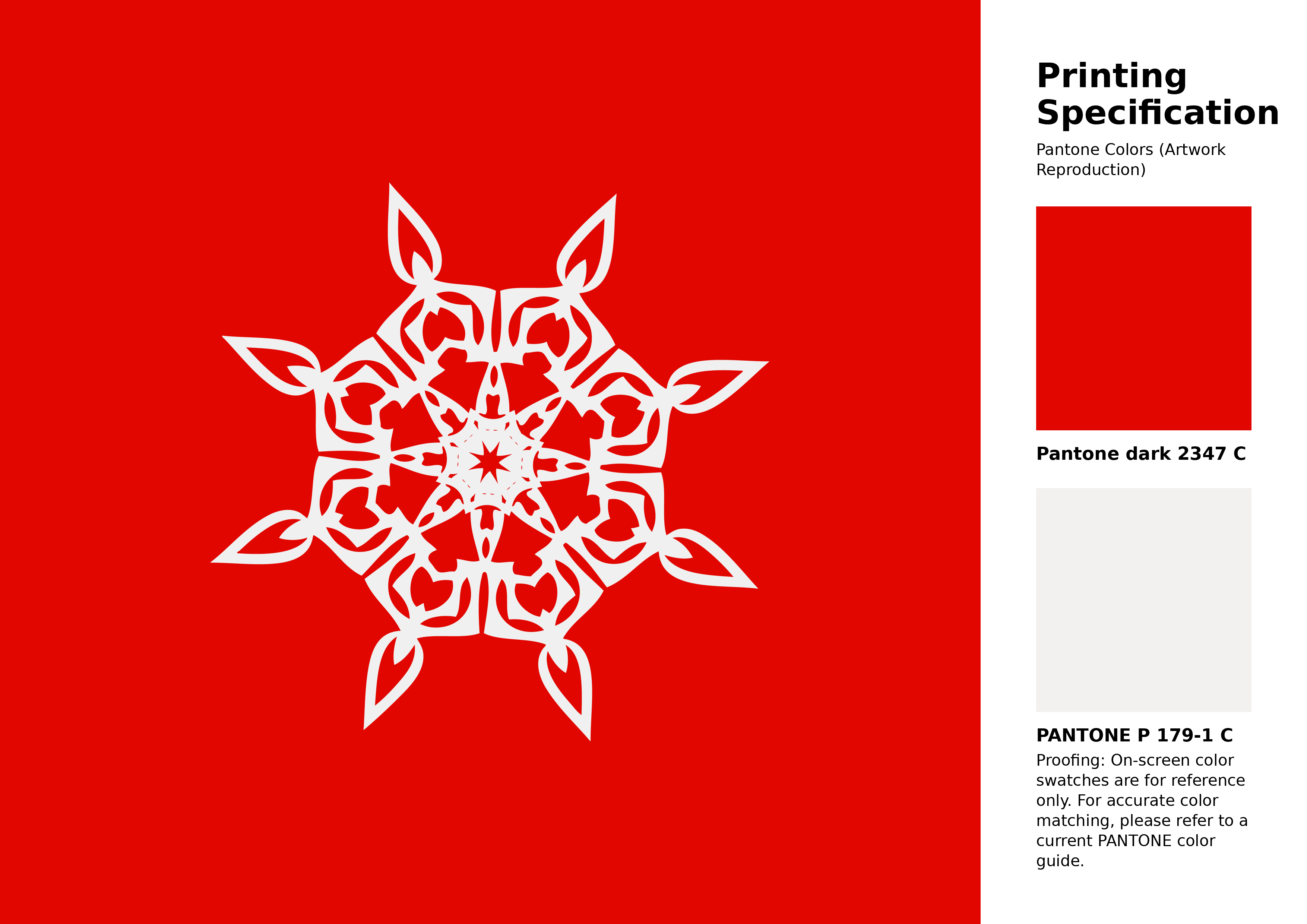
#e10600 Pantone 2347 C Color | Hex color Code #e10600 Artwork Image (PNG)
Download Artwork (PNG)#e10600 Pantone 2347 C Color | Hex color Code #e10600 Artwork Vector (PDF)
Download Artwork (PDF)#e10600 Pantone 2347 C Color | Hex color Code #e10600 Artwork Vector (SVG)
Download Artwork (SVG)
#e10600 Pantone 2347 C Color | Hex color Code #e10600 Pantone Swatch Artwork
Download Artwork Swatch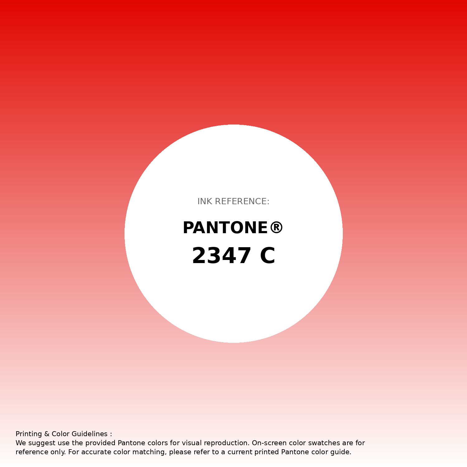
#e10600 Pantone 2347 C Color | Hex color Code #e10600 Gradient Artwork (PNG)
Download Gradient (PNG)#e10600 Pantone 2347 C Color | Hex color Code #e10600 Gradient Artwork (SVG)
Download Gradient (SVG)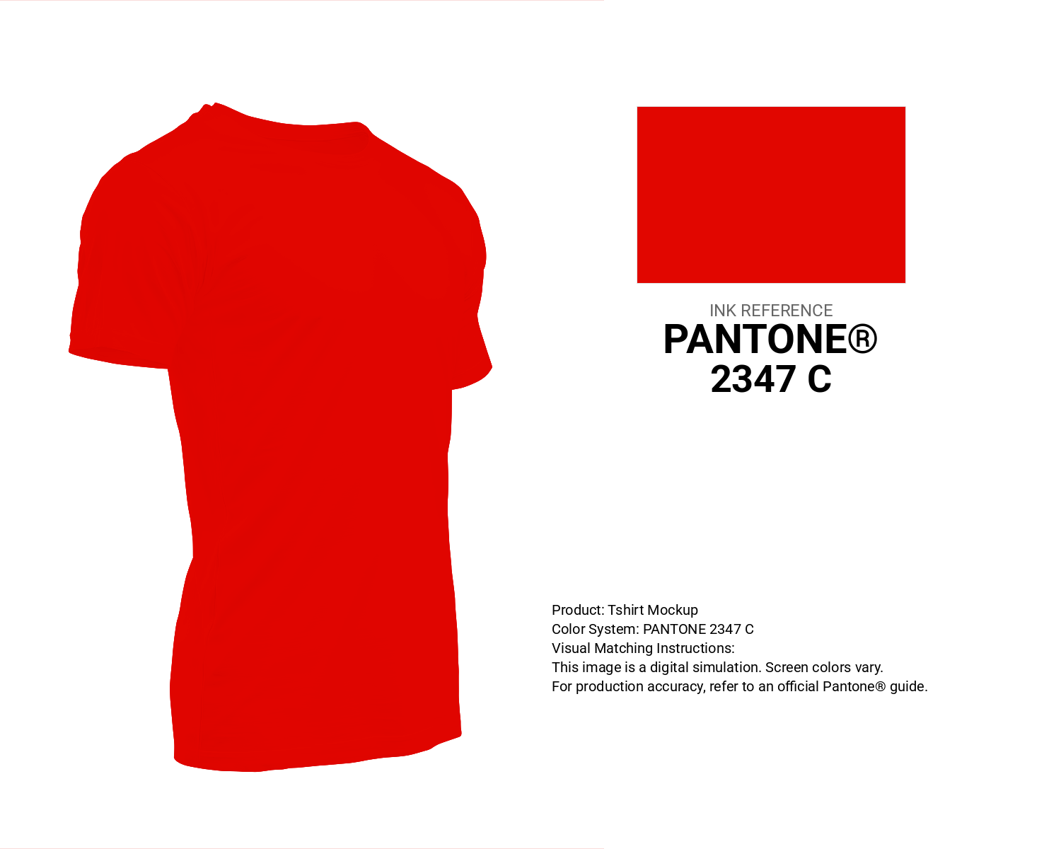
#e10600 Pantone 2347 C Color | Hex color Code #e10600 T-Shirt Mockup
Download T-Shirt Mockup
#e10600 Pantone 2347 C Color | Hex color Code #e10600 Printing Artwork Pantone Reference
Download Pantone Printing ReferenceRelated Color Palettes
- Gray and Pale Violet Red •
- Medium Violet Red and Plum •
- Midnight Blue and Indian Red •
- Black and Red •
- Dark Red and Gold •
- Wheat and Indian Red •
- Dark Red and Brown •
- Dark Red and Tan •
- Dark Khaki and Pale Violet Red •
- Medium Violet Red •
- Medium Violet Red and Hot Pink •
- Silver and Indian Red •
- Chocolate and Dark Red •
- OrangeRed and Olive Drab •
- Medium Violet Red and Crimson
Color Palette Collection

25 Blue Color Palettes
25 color palettes with 125 colors.

50 Color Palettes inspired by Sky
50 color palettes with 250 colors.

49 Beautiful curated Color Schemes For Your Next Design Project
49 color palettes with 245 colors.

366 Bright Color Palettes
366 color palettes with 1830 colors.