#FF7276 Color
Your all-in-one color resource. Download hex background images, Adobe swatches (ASE), PDF color sheets, and SVG files. Explore palettes, harmonies, accessibility, conversions, and professional exports — designed for designers, developers, and color perfectionists.
This vibrant, reddish-pink hue evokes a sense of passion, excitement, and energy. It conjures images of a fiery sunset, the vibrant colors of a tropical flower, or the blush of a blushing cheek. The color feels warm and invigorating, yet also slightly assertive. It creates a dynamic and engaging atmosphere. In design, it might be used to highlight a focal point, energize a room, or add a touch of drama. The bold color could be used in a bedroom to stimulate passion or in a restaurant to create a lively ambiance. Visually matched named color: Fiery Sunset.
PANTONE 805 C
Choose Color
Selected Color
Recent Colors
Color Details
Similar Ink Alternatives for #FF7276 color Alternative print inks for reproducing #FF7276 background image with a similar visual appearance.
Disclaimer: The visually matched ink reference is an independent approximation intended as a guide only. Please be advised that this pantone colors is only intended as a guide, Actual colours will depend on screen calibration variances. The print ink suggestions provided are independent visual approximations and are not affiliated with or endorsed by Pantone LLC. For official color specifications, conversion factors, and comprehensive color system information, please visit Pantone Connect. Official Pantone products can be purchased at pantone.com.
Color Previews for #000000 See how this color looks as a background or as text.
Complete Guide to Your Color Laboratory
Everything you need to know about this professional color toolkit.
Use the Color Picker at the top to select any color. All modules below update instantly.
Workflow: Pick a color → Explore palettes & data → Download what you need (PDF, Image, or Adobe ASE).
Color Details — Your color in all formats: HEX, RGB, RGBA, HSL, HSLA, HSV, CMYK, CIELab, Hunter-Lab, XYZ, Yxy, YUV. One-click copy.
Color Psychology — Emotional impact, cultural meanings, physiological effects, branding applications, and historical significance.
Named Colors — Find official color names (HTML/CSS, Pantone) that match your selection with similarity percentages.
Light & Dark Shades
80-step gradient from black to white. Perfect for button states and component systems.
Tints
Color mixed with white → lighter, pastel variations for backgrounds and disabled states.
Monochromatic — 11 curated tints/shades from one color. Production-ready for design systems.
- Complementary — Opposite on wheel (180°). High contrast.
- Analogous — Neighbors (±30°). Harmonious flow.
- Triadic — Three colors (120° apart). Vibrant, balanced.
- Split-Complementary — Base + two near-complements. Softer contrast.
- Tetradic/Square — Four colors. Complex, maximum variety.
- Neutral — Desaturated versions. Subtle, sophisticated.
15 Professional Variations — Monochromatic, Analogous, Complementary, Warm/Cool/Earth Tones, Pastel, Vibrant, High Contrast, and more.
Color Infusion — 10 palettes showing your color morphing into each major hue. Find bridge colors.
Similar Colors — 60+ colors generated via CIELAB Delta E matching. Unexpected harmonious combinations.
18 Ready-to-Use Gradients — Complementary, Analogous, Triadic, Tint/Shade progressions, and more.
Downloads: PNG (2560×1440), CSS (production-ready code), SVG (scalable vector).
WCAG Contrast Checker — Tests your color against white, black, and custom colors for AA (4.5:1) and AAA (7:1) compliance. Large text thresholds included.
Harmony & Accessibility Guide — Tests against 10 canonical hues. Shows which pairs are both beautiful AND WCAG-compliant for text.
PNG/JPG — High-res images for presentations and mood boards.
PDF — Print-ready reports for clients and teams.
Adobe ASE — Direct import to Photoshop, Illustrator, InDesign, XD.
CSS/SVG — Gradients only. Production-ready code and vectors.
Color Science: Industry-standard conversions (HSL, CIELAB, CMYK, XYZ). WCAG 2.1 luminance formula. Delta E (ΔE76) for perceptual matching.
Direct Links: Share colors via icolorpalette.com/color/ff5733 or icolorpalette.com/color/red
Issues? Refresh the page, wait for rendering, try another browser, or check console (F12) for errors.
Printing Guide for #ff7276 Background Image
Use PANTONE 805 C as a visually matched ink reference when printing this background image.
To print the #ff7276 background image from our site, consider using PANTONE 805 C as a visually matched ink reference.
Download the background image, then provide this reference code to your print vendor to help achieve accurate color reproduction.
The visually matched ink reference for the #ff7276 background image is PANTONE 805 C.
This color is commonly described as Fiery Sunset.
This vibrant, reddish-pink hue evokes a sense of passion, excitement, and energy. It conjures images of a fiery sunset, the vibrant colors of a tropical flower, or the blush of a blushing cheek. The color feels warm and invigorating, yet also slightly assertive. It creates a dynamic and engaging atmosphere. In design, it might be used to highlight a focal point, energize a room, or add a touch of drama. The bold color could be used in a bedroom to stimulate passion or in a restaurant to create a lively ambiance.
We provide PANTONE 805 C as a visually matched ink reference to help you reproduce the #ff7276 background image accurately in professional printing.
This reference code helps print vendors achieve consistent color output across different printing equipment and materials.
After downloading the #ff7276 background image from our site:
- Include the visually matched ink reference PANTONE 805 C in your print order notes
- Inform your print vendor that this is your target color reference
- Request a proof print to verify the Fiery Sunset color appearance before full production
The #ff7276 background image with PANTONE 805 C as visually matched ink reference can be used for:
- Posters, banners, and backdrops
- Business cards, brochures, and flyers
- Packaging, labels, and stickers
- Signage and promotional materials
This is an independent visual approximation.
While PANTONE 805 C closely matches the #ff7276 background image color, variations may exist between screen display and printed output.
We recommend requesting a proof print to verify the final appearance.
This vibrant, reddish-pink hue evokes a sense of passion, excitement, and energy. It conjures images of a fiery sunset, the vibrant colors of a tropical flower, or the blush of a blushing cheek. The color feels warm and invigorating, yet also slightly assertive. It creates a dynamic and engaging atmosphere. In design, it might be used to highlight a focal point, energize a room, or add a touch of drama. The bold color could be used in a bedroom to stimulate passion or in a restaurant to create a lively ambiance.
Understanding these associations helps ensure the #ff7276 background image aligns with your intended message and brand impact.
Important Information
The visually matched ink reference is an independent approximation intended as a guide only.
Actual printed colors may vary depending on screen calibration, substrate material, ink type, and printing equipment used.
For official color specifications and certified color standards, visit Pantone Connect.
Official color guides and swatch books can be purchased from pantone.com.
Pantone 805 C Color: Creative Coral | #FF7276
Introduction:
Creative Coral, represented by the Pantone 805 C Color, is a vibrant and eye-catching shade of coral. Its intense hue and warm undertones make it a captivating choice for design projects.
Historical Significance:
Key Moments in History: Creative Coral has been prominent in the fashion industry, particularly during the 1950s and 1960s. It was a popular color choice for clothing and accessories, giving off an energetic and playful vibe.
Symbolism and Meaning:
Symbolism and Meaning: In various cultures, Creative Coral is often associated with love, passion, and energy. It represents warmth, excitement, and happiness.
Pantone 805 C Color in Fashion:
Pantone 805 C Color in Fashion: The vibrant and playful nature of Creative Coral has made it a popular choice in the fashion industry. It is often used in clothing, accessories, and even makeup, adding a bold and energetic touch to any outfit.
Pantone 805 C Color in Graphic Design:
Pantone 805 C Color in Graphic Design: Creative Coral carries a strong visual impact in design aesthetics and branding. Its vibrant and warm tone can evoke excitement and catch the attention of viewers. It is often used to create bold and eye-catching designs.
Color Combinations:
Color Combinations: Creative Coral pairs well with various colors, including navy blue, mint green, and soft pink. These combinations create a harmonious contrast and add depth to any design.
Nature's Palette:
Nature's Palette: Creative Coral can be found in the vibrant petals of certain flowers such as coral roses and tropical hibiscus. It also appears in the sunset's warm hues and the breathtaking shades found in coral reefs.
Artistic Representations:
Artistic Representations: Creative Coral has been used by artists in various forms of art, including paintings, sculptures, and photography. It adds a vibrant and energetic element to artistic compositions.
Movies and Cinematic Landscapes:
Movies and Cinematic Landscapes: Creative Coral often sets the tone or mood in movies with its energetic and lively presence. It can be seen in beach scenes, summer-themed films, and romantic comedies.
Products and Commercial Appeal:
Products and Commercial Appeal: Many popular products and brands have embraced Creative Coral in their branding and packaging. From fashion and beauty to home decor, this vibrant color adds a modern and energetic appeal to products.
National Symbols and Significance:
National Symbols and Significance: While Creative Coral may not be directly associated with any particular national symbol, its warm and lively nature resonates with cultures that celebrate vibrant festivities and joyous occasions.
The Psychological and Emotional Impact:
The Psychological and Emotional Impact: Creative Coral can evoke a range of emotions and perceptions psychologically. It is known to inspire feelings of warmth, happiness, and excitement. It can also symbolize passion and creativity.
Conclusion:
Creative Coral, represented by Pantone 805 C Color, holds a rich historical significance in the fashion industry and is widely recognized for its vibrant and energetic appeal. In nature, art, and design, this color captures attention, inspires emotions, and adds a touch of excitement to various creative endeavors.
Pantone 805 C Color | Hex color Code #ff7276 Image & Artwork
Download high-quality assets for your projects.

#ff7276 Color Schemes
Download Color Schemes
#ff7276 Color Shades
Download Color Shades
Pantone 805 C Color | Hex color Code #ff7276 Solid Color Background
Download Solid Color
#ff7276 Pantone 805 C Color | Hex color Code #ff7276 Artwork Image (PNG)
Download Artwork (PNG)#ff7276 Pantone 805 C Color | Hex color Code #ff7276 Artwork Vector (PDF)
Download Artwork (PDF)#ff7276 Pantone 805 C Color | Hex color Code #ff7276 Artwork Vector (SVG)
Download Artwork (SVG)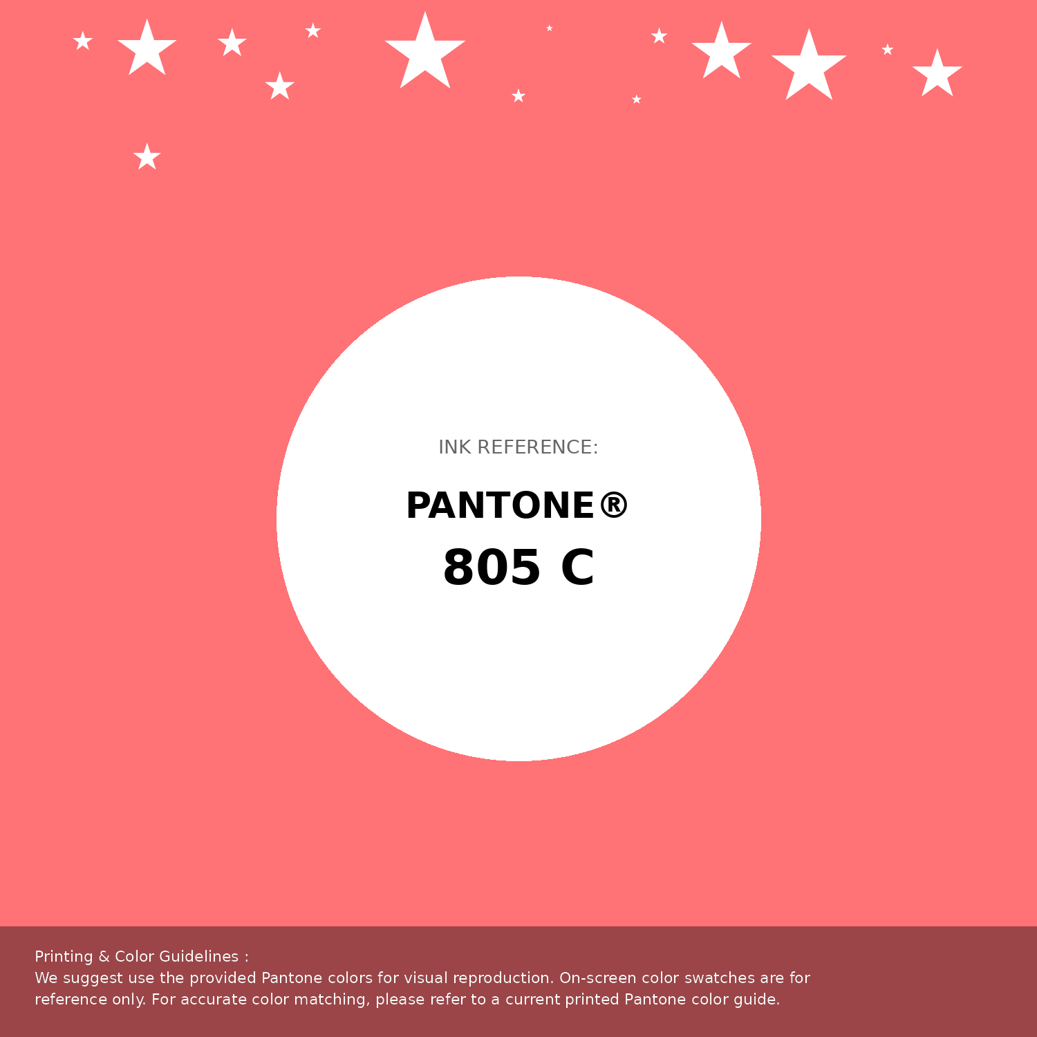
#ff7276 Pantone 805 C Color | Hex color Code #ff7276 Pantone Swatch Artwork
Download Artwork Swatch
#ff7276 Pantone 805 C Color | Hex color Code #ff7276 Gradient Artwork (PNG)
Download Gradient (PNG)#ff7276 Pantone 805 C Color | Hex color Code #ff7276 Gradient Artwork (SVG)
Download Gradient (SVG)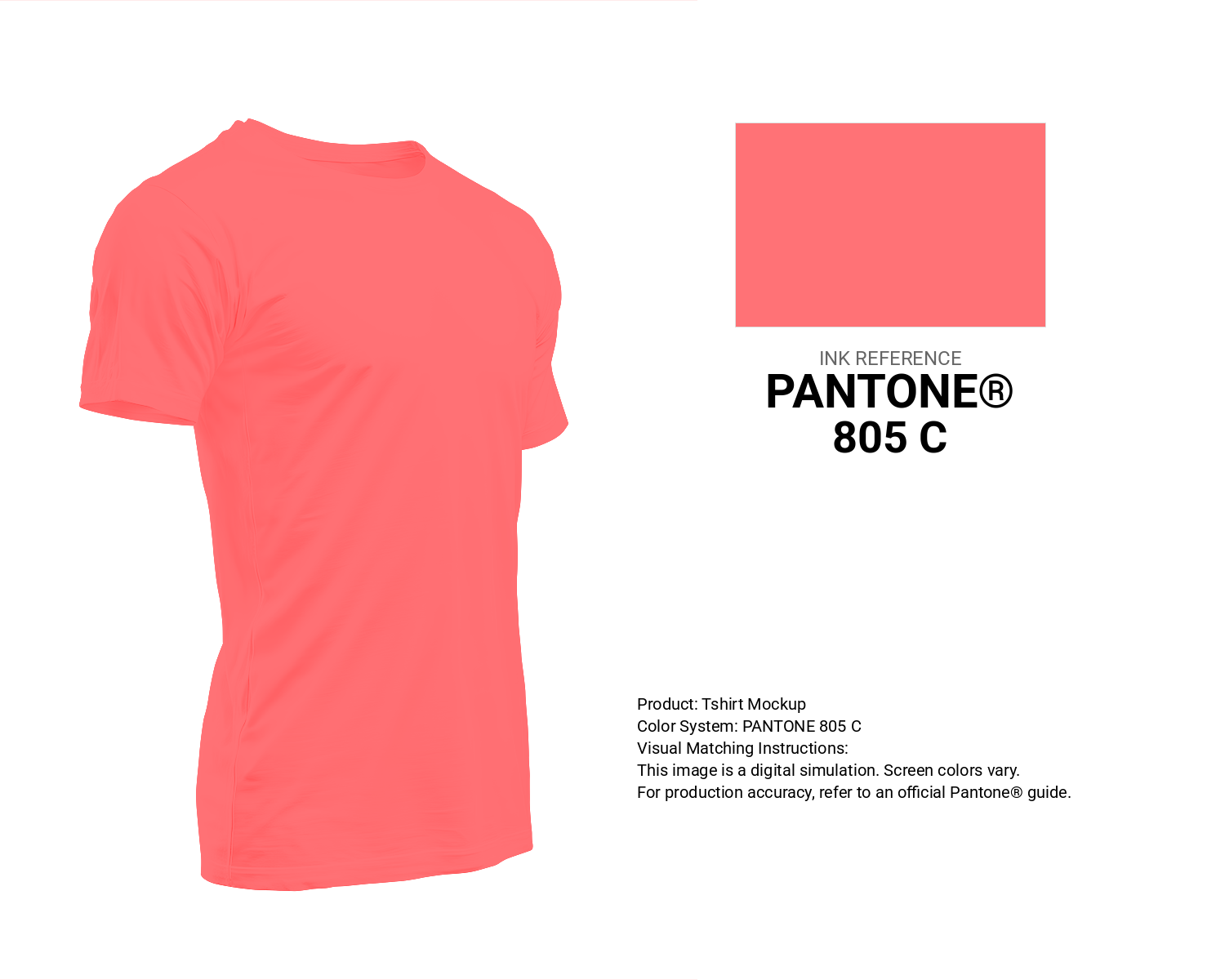
#ff7276 Pantone 805 C Color | Hex color Code #ff7276 T-Shirt Mockup
Download T-Shirt Mockup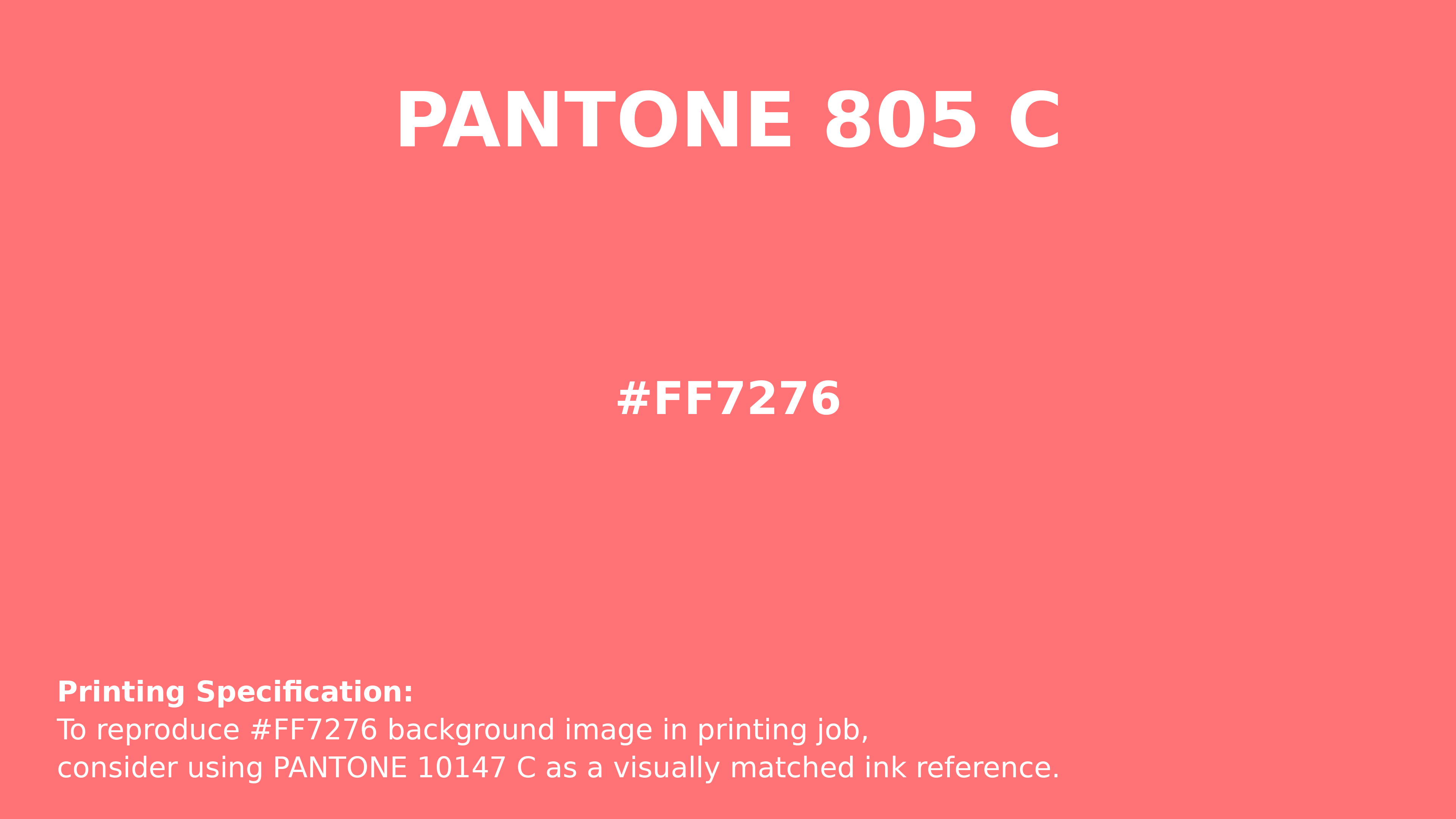
#ff7276 Pantone 805 C Color | Hex color Code #ff7276 Printing Artwork Pantone Reference
Download Pantone Printing ReferenceRelated Color Palettes
- Red Color Palettes • Green Color Palettes • Purple Color Palettes • Pink Color Palettes • Orange Color Palettes • Blue Color Palettes • Yellow Color Palettes • Brown Color Palettes • Gray Color Palettes • Beige Color Palettes • Turquoise Color Palettes
Color Palette Collection

50 Beige Color Palettes
50 color palettes with 250 colors.

38 Beautiful Color Palettes
38 color palettes with 190 colors.
46 Flower Inspired Color Schemes
46 color palettes with 230 colors.

49 Green Color Combinations
49 color palettes with 245 colors.