#F4364C Color
Your all-in-one color resource. Download hex background images, Adobe swatches (ASE), PDF color sheets, and SVG files. Explore palettes, harmonies, accessibility, conversions, and professional exports — designed for designers, developers, and color perfectionists.
#F4364C is a vibrant, intense red-pink hue. It immediately evokes feelings of strong passion, excitement, and even a touch of aggression. The color's boldness suggests energy and confidence, but also a potential for danger or urgency. It reminds one of a fiery sunset, a passionate kiss, or perhaps a blooming poppy field. The mood is dramatic and attention-grabbing, making it unsuitable for calming environments. In design, it works well as an accent color to draw the eye and convey importance or excitement. It might be used for branding products associated with energy, love, or even warning signals. Culturally, red has strong associations with love, passion, and sometimes anger or danger across many cultures. Visually matched named color: Crimson Passion.
PANTONE 1787 C
Choose Color
Selected Color
Recent Colors
Color Details
Similar Ink Alternatives for #F4364C color Alternative print inks for reproducing #F4364C background image with a similar visual appearance.
Disclaimer: The visually matched ink reference is an independent approximation intended as a guide only. Please be advised that this pantone colors is only intended as a guide, Actual colours will depend on screen calibration variances. The print ink suggestions provided are independent visual approximations and are not affiliated with or endorsed by Pantone LLC. For official color specifications, conversion factors, and comprehensive color system information, please visit Pantone Connect. Official Pantone products can be purchased at pantone.com.
Color Previews for #000000 See how this color looks as a background or as text.
Complete Guide to Your Color Laboratory
Everything you need to know about this professional color toolkit.
Use the Color Picker at the top to select any color. All modules below update instantly.
Workflow: Pick a color → Explore palettes & data → Download what you need (PDF, Image, or Adobe ASE).
Color Details — Your color in all formats: HEX, RGB, RGBA, HSL, HSLA, HSV, CMYK, CIELab, Hunter-Lab, XYZ, Yxy, YUV. One-click copy.
Color Psychology — Emotional impact, cultural meanings, physiological effects, branding applications, and historical significance.
Named Colors — Find official color names (HTML/CSS, Pantone) that match your selection with similarity percentages.
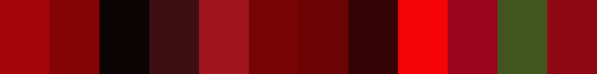
Light & Dark Shades
80-step gradient from black to white. Perfect for button states and component systems.
Tints
Color mixed with white → lighter, pastel variations for backgrounds and disabled states.
Monochromatic — 11 curated tints/shades from one color. Production-ready for design systems.
- Complementary — Opposite on wheel (180°). High contrast.
- Analogous — Neighbors (±30°). Harmonious flow.
- Triadic — Three colors (120° apart). Vibrant, balanced.
- Split-Complementary — Base + two near-complements. Softer contrast.
- Tetradic/Square — Four colors. Complex, maximum variety.
- Neutral — Desaturated versions. Subtle, sophisticated.
15 Professional Variations — Monochromatic, Analogous, Complementary, Warm/Cool/Earth Tones, Pastel, Vibrant, High Contrast, and more.
Color Infusion — 10 palettes showing your color morphing into each major hue. Find bridge colors.
Similar Colors — 60+ colors generated via CIELAB Delta E matching. Unexpected harmonious combinations.
18 Ready-to-Use Gradients — Complementary, Analogous, Triadic, Tint/Shade progressions, and more.
Downloads: PNG (2560×1440), CSS (production-ready code), SVG (scalable vector).
WCAG Contrast Checker — Tests your color against white, black, and custom colors for AA (4.5:1) and AAA (7:1) compliance. Large text thresholds included.
Harmony & Accessibility Guide — Tests against 10 canonical hues. Shows which pairs are both beautiful AND WCAG-compliant for text.
PNG/JPG — High-res images for presentations and mood boards.
PDF — Print-ready reports for clients and teams.
Adobe ASE — Direct import to Photoshop, Illustrator, InDesign, XD.
CSS/SVG — Gradients only. Production-ready code and vectors.
Color Science: Industry-standard conversions (HSL, CIELAB, CMYK, XYZ). WCAG 2.1 luminance formula. Delta E (ΔE76) for perceptual matching.
Direct Links: Share colors via icolorpalette.com/color/ff5733 or icolorpalette.com/color/red
Issues? Refresh the page, wait for rendering, try another browser, or check console (F12) for errors.
Printing Guide for #f4364c Background Image
Use PANTONE 1787 C as a visually matched ink reference when printing this background image.
To print the #f4364c background image from our site, consider using PANTONE 1787 C as a visually matched ink reference.
Download the background image, then provide this reference code to your print vendor to help achieve accurate color reproduction.
The visually matched ink reference for the #f4364c background image is PANTONE 1787 C.
This color is commonly described as Crimson Passion.
#F4364C is a vibrant, intense red-pink hue. It immediately evokes feelings of strong passion, excitement, and even a touch of aggression. The color's boldness suggests energy and confidence, but also a potential for danger or urgency. It reminds one of a fiery sunset, a passionate kiss, or perhaps a blooming poppy field. The mood is dramatic and attention-grabbing, making it unsuitable for calming environments. In design, it works well as an accent color to draw the eye and convey importance or excitement. It might be used for branding products associated with energy, love, or even warning signals. Culturally, red has strong associations with love, passion, and sometimes anger or danger across many cultures.
We provide PANTONE 1787 C as a visually matched ink reference to help you reproduce the #f4364c background image accurately in professional printing.
This reference code helps print vendors achieve consistent color output across different printing equipment and materials.
After downloading the #f4364c background image from our site:
- Include the visually matched ink reference PANTONE 1787 C in your print order notes
- Inform your print vendor that this is your target color reference
- Request a proof print to verify the Crimson Passion color appearance before full production
The #f4364c background image with PANTONE 1787 C as visually matched ink reference can be used for:
- Posters, banners, and backdrops
- Business cards, brochures, and flyers
- Packaging, labels, and stickers
- Signage and promotional materials
This is an independent visual approximation.
While PANTONE 1787 C closely matches the #f4364c background image color, variations may exist between screen display and printed output.
We recommend requesting a proof print to verify the final appearance.
#F4364C is a vibrant, intense red-pink hue. It immediately evokes feelings of strong passion, excitement, and even a touch of aggression. The color's boldness suggests energy and confidence, but also a potential for danger or urgency. It reminds one of a fiery sunset, a passionate kiss, or perhaps a blooming poppy field. The mood is dramatic and attention-grabbing, making it unsuitable for calming environments. In design, it works well as an accent color to draw the eye and convey importance or excitement. It might be used for branding products associated with energy, love, or even warning signals. Culturally, red has strong associations with love, passion, and sometimes anger or danger across many cultures.
Understanding these associations helps ensure the #f4364c background image aligns with your intended message and brand impact.
Important Information
The visually matched ink reference is an independent approximation intended as a guide only.
Actual printed colors may vary depending on screen calibration, substrate material, ink type, and printing equipment used.
For official color specifications and certified color standards, visit Pantone Connect.
Official color guides and swatch books can be purchased from pantone.com.
Pantone 1787 C Color: Bold Red | #F4364C
Introduction:
Bold Red, also known as Pantone 1787 C, is a vibrant and eye-catching color. Its intense shade instantly grabs attention and creates a powerful visual impact.
Historical Significance:
Key moments in history: Bold Red has been prominently used in various historical events and cultural celebrations. It has been associated with passion, strength, and vitality, making it a popular choice for important occasions and ceremonies.
Influential figures: Throughout history, many iconic figures have incorporated Bold Red in their branding or personal style, further solidifying its significance and impact on popular culture.
Symbolism and Meaning:
Symbolism: Bold Red symbolizes passion, love, and energy. It evokes strong emotions and often represents power and importance in many cultures. Its vibrant hue is also associated with excitement and life.
Meaning: In various contexts, Bold Red can represent intensity, courage, and determination. It is a color that demands attention and signifies a strong presence. Its boldness conveys confidence and expression.
Bold Red in Fashion:
Impact on styles and trends: Bold Red has always been a staple in the fashion industry. It is often used to create statement pieces and add a vibrant touch to outfits. It exudes confidence and can make a bold fashion statement.
Influential designers: Many renowned fashion designers have incorporated Bold Red into their collections, showcasing the color's timeless appeal and ability to make a strong visual impact.
Bold Red in Graphic Design:
Significance in design aesthetics: Bold Red is widely used in graphic design to create attention-grabbing visuals. Its vibrant hue instantly captures the viewer's attention and adds energy to any design. It is often used to highlight important elements or evoke strong emotions.
Branding and visual impact: Many brands incorporate Bold Red into their logos and branding materials to create a strong and memorable visual identity. It helps convey a sense of passion, power, and confidence.
Color Combinations:
Potential color combinations: Bold Red can be paired with various colors to create striking and visually appealing combinations. Some popular combinations include Bold Red and white for a classic and clean look, Bold Red and gold for a luxurious feel, and Bold Red and turquoise for a vibrant and energetic combination.
Nature’s Palette:
Natural occurrences: Bold Red can be found in various natural elements such as flowers, sunsets, and autumn foliage. It adds vibrancy to nature and represents energy and passion.
Artistic Representations:
Usage in art: Bold Red has been used by artists throughout history to convey strong emotions, passion, and intensity. It often serves as a focal point in artworks and adds a dynamic element to the visual composition.
Movies and Cinematic Landscapes:
Tone-setting color: Bold Red is often used in movies and cinematic landscapes to set the tone or mood of a scene. It can be used to represent passion, danger, or excitement, depending on the context.
Products and Commercial Appeal:
Popular products and brands: Many products and brands incorporate Bold Red in their designs and packaging to create a strong visual appeal. It grabs the attention of consumers and conveys a sense of quality and importance.
National Symbols and Significance:
Cultural and national significance: In some cultures, Bold Red is associated with important national symbols and events. It can represent patriotism, valor, and national identity.
The Psychological and Emotional Impact:
Influence on emotions and perceptions: Bold Red has a psychological and emotional impact on people. It can evoke passion, excitement, and intensity. It stimulates energy and can create a sense of urgency.
Conclusion:
Bold Red, or Pantone 1787 C, is a color with a rich historical significance and timeless appeal. It symbolizes passion, power, and energy. Whether used in fashion, graphic design, or art, Bold Red makes a bold statement and leaves a lasting impression.
Pantone 1787 C Color | Hex color Code #f4364c Image & Artwork
Download high-quality assets for your projects.

#f4364c Color Schemes
Download Color Schemes
#f4364c Color Shades
Download Color Shades
Pantone 1787 C Color | Hex color Code #f4364c Solid Color Background
Download Solid Color
#f4364c Pantone 1787 C Color | Hex color Code #f4364c Artwork Image (PNG)
Download Artwork (PNG)#f4364c Pantone 1787 C Color | Hex color Code #f4364c Artwork Vector (PDF)
Download Artwork (PDF)#f4364c Pantone 1787 C Color | Hex color Code #f4364c Artwork Vector (SVG)
Download Artwork (SVG)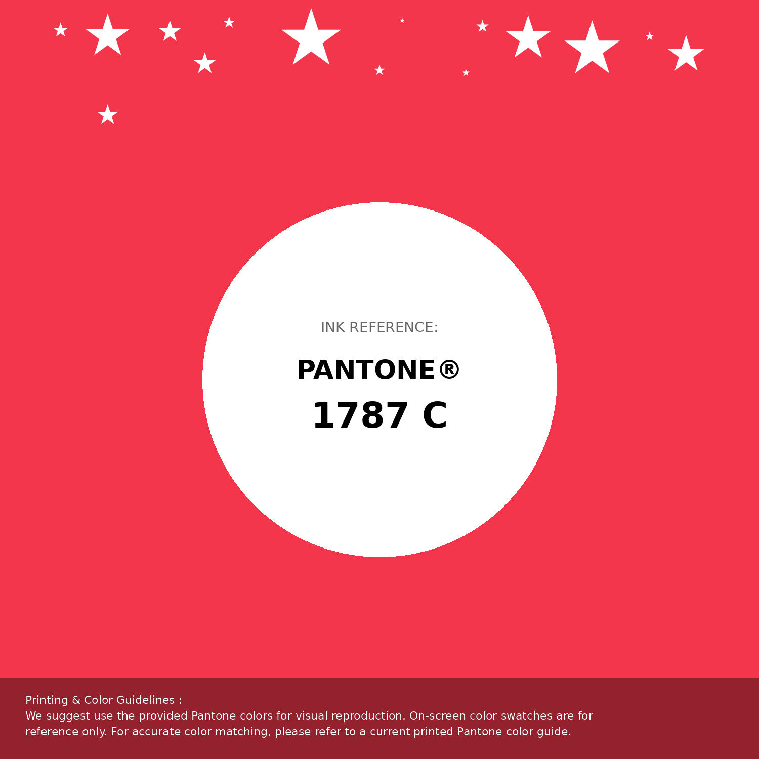
#f4364c Pantone 1787 C Color | Hex color Code #f4364c Pantone Swatch Artwork
Download Artwork Swatch
#f4364c Pantone 1787 C Color | Hex color Code #f4364c Gradient Artwork (PNG)
Download Gradient (PNG)#f4364c Pantone 1787 C Color | Hex color Code #f4364c Gradient Artwork (SVG)
Download Gradient (SVG)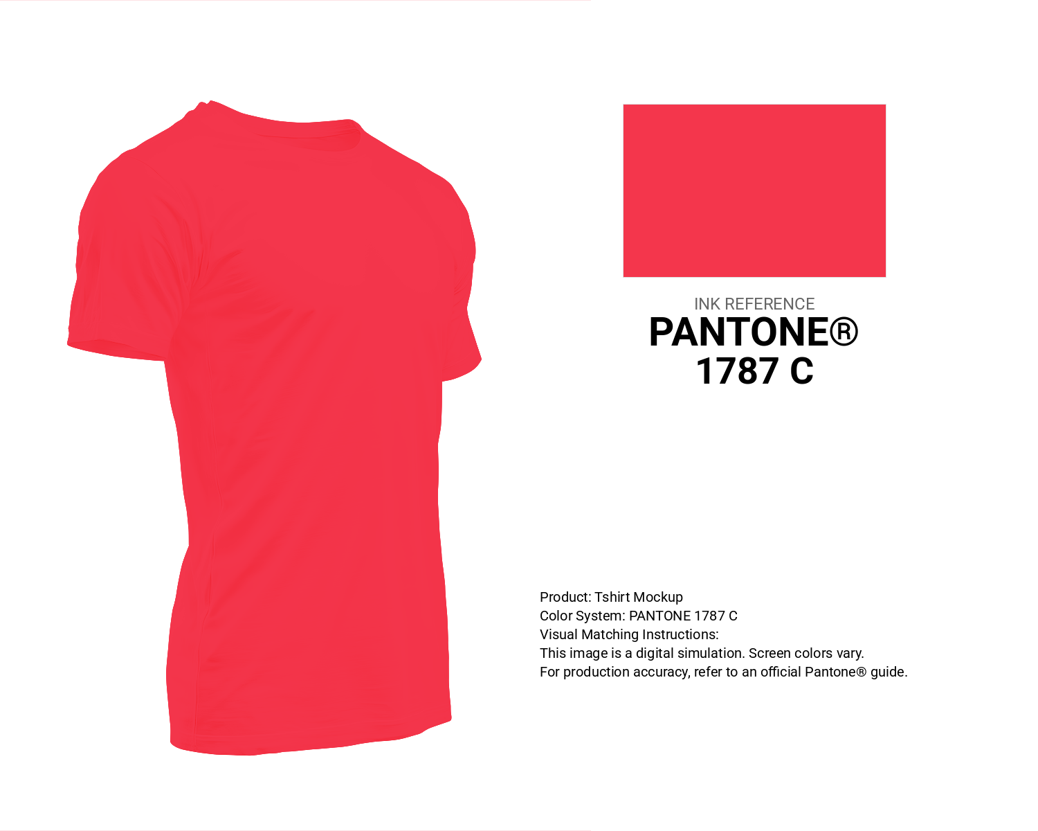
#f4364c Pantone 1787 C Color | Hex color Code #f4364c T-Shirt Mockup
Download T-Shirt Mockup
#f4364c Pantone 1787 C Color | Hex color Code #f4364c Printing Artwork Pantone Reference
Download Pantone Printing ReferenceRelated Color Palettes
- Red Color Palettes • Green Color Palettes • Purple Color Palettes • Pink Color Palettes • Orange Color Palettes • Blue Color Palettes • Yellow Color Palettes • Brown Color Palettes • Gray Color Palettes • Beige Color Palettes • Turquoise Color Palettes
Color Palette Collection

66 Brown Color Palettes
66 color palettes with 330 colors.

25 Blue Color Palettes
25 color palettes with 125 colors.
My Red Color Palettes
20 color palettes with 100 colors.

366 Bright Color Palettes
366 color palettes with 1830 colors.