#B7B8B9 Color
Your all-in-one color resource. Download hex background images, Adobe swatches (ASE), PDF color sheets, and SVG files. Explore palettes, harmonies, accessibility, conversions, and professional exports — designed for designers, developers, and color perfectionists.
This evokes feelings of neutrality, balance, and quiet strength. It has a sense of timelessness, reminiscent of ancient stone structures or a cloudy sky. It can promote feelings of calm and stability, suggesting practicality and efficiency. In design, it provides a versatile background or accent color, suitable for both modern and classic aesthetics. It is associated with sophistication. Visually matched named color: Silvered Stone.
PANTONE COOL GRAY 4 U
Choose Color
Selected Color
Recent Colors
Color Details
Similar Ink Alternatives for #B7B8B9 color Alternative print inks for reproducing #B7B8B9 background image with a similar visual appearance.
Disclaimer: The visually matched ink reference is an independent approximation intended as a guide only. Please be advised that this pantone colors is only intended as a guide, Actual colours will depend on screen calibration variances. The print ink suggestions provided are independent visual approximations and are not affiliated with or endorsed by Pantone LLC. For official color specifications, conversion factors, and comprehensive color system information, please visit Pantone Connect. Official Pantone products can be purchased at pantone.com.
Color Previews for #000000 See how this color looks as a background or as text.
Complete Guide to Your Color Laboratory
Everything you need to know about this professional color toolkit.
Use the Color Picker at the top to select any color. All modules below update instantly.
Workflow: Pick a color → Explore palettes & data → Download what you need (PDF, Image, or Adobe ASE).
Color Details — Your color in all formats: HEX, RGB, RGBA, HSL, HSLA, HSV, CMYK, CIELab, Hunter-Lab, XYZ, Yxy, YUV. One-click copy.
Color Psychology — Emotional impact, cultural meanings, physiological effects, branding applications, and historical significance.
Named Colors — Find official color names (HTML/CSS, Pantone) that match your selection with similarity percentages.
Light & Dark Shades
80-step gradient from black to white. Perfect for button states and component systems.
Tints
Color mixed with white → lighter, pastel variations for backgrounds and disabled states.
Monochromatic — 11 curated tints/shades from one color. Production-ready for design systems.
- Complementary — Opposite on wheel (180°). High contrast.
- Analogous — Neighbors (±30°). Harmonious flow.
- Triadic — Three colors (120° apart). Vibrant, balanced.
- Split-Complementary — Base + two near-complements. Softer contrast.
- Tetradic/Square — Four colors. Complex, maximum variety.
- Neutral — Desaturated versions. Subtle, sophisticated.
15 Professional Variations — Monochromatic, Analogous, Complementary, Warm/Cool/Earth Tones, Pastel, Vibrant, High Contrast, and more.
Color Infusion — 10 palettes showing your color morphing into each major hue. Find bridge colors.
Similar Colors — 60+ colors generated via CIELAB Delta E matching. Unexpected harmonious combinations.
18 Ready-to-Use Gradients — Complementary, Analogous, Triadic, Tint/Shade progressions, and more.
Downloads: PNG (2560×1440), CSS (production-ready code), SVG (scalable vector).
WCAG Contrast Checker — Tests your color against white, black, and custom colors for AA (4.5:1) and AAA (7:1) compliance. Large text thresholds included.
Harmony & Accessibility Guide — Tests against 10 canonical hues. Shows which pairs are both beautiful AND WCAG-compliant for text.
PNG/JPG — High-res images for presentations and mood boards.
PDF — Print-ready reports for clients and teams.
Adobe ASE — Direct import to Photoshop, Illustrator, InDesign, XD.
CSS/SVG — Gradients only. Production-ready code and vectors.
Color Science: Industry-standard conversions (HSL, CIELAB, CMYK, XYZ). WCAG 2.1 luminance formula. Delta E (ΔE76) for perceptual matching.
Direct Links: Share colors via icolorpalette.com/color/ff5733 or icolorpalette.com/color/red
Issues? Refresh the page, wait for rendering, try another browser, or check console (F12) for errors.
Printing Guide for #b7b8b9 Background Image
Use PANTONE COOL GRAY 4 U as a visually matched ink reference when printing this background image.
To print the #b7b8b9 background image from our site, consider using PANTONE COOL GRAY 4 U as a visually matched ink reference.
Download the background image, then provide this reference code to your print vendor to help achieve accurate color reproduction.
The visually matched ink reference for the #b7b8b9 background image is PANTONE COOL GRAY 4 U.
This color is commonly described as Silvered Stone.
This evokes feelings of neutrality, balance, and quiet strength. It has a sense of timelessness, reminiscent of ancient stone structures or a cloudy sky. It can promote feelings of calm and stability, suggesting practicality and efficiency. In design, it provides a versatile background or accent color, suitable for both modern and classic aesthetics. It is associated with sophistication.
We provide PANTONE COOL GRAY 4 U as a visually matched ink reference to help you reproduce the #b7b8b9 background image accurately in professional printing.
This reference code helps print vendors achieve consistent color output across different printing equipment and materials.
After downloading the #b7b8b9 background image from our site:
- Include the visually matched ink reference PANTONE COOL GRAY 4 U in your print order notes
- Inform your print vendor that this is your target color reference
- Request a proof print to verify the Silvered Stone color appearance before full production
The #b7b8b9 background image with PANTONE COOL GRAY 4 U as visually matched ink reference can be used for:
- Posters, banners, and backdrops
- Business cards, brochures, and flyers
- Packaging, labels, and stickers
- Signage and promotional materials
This is an independent visual approximation.
While PANTONE COOL GRAY 4 U closely matches the #b7b8b9 background image color, variations may exist between screen display and printed output.
We recommend requesting a proof print to verify the final appearance.
This evokes feelings of neutrality, balance, and quiet strength. It has a sense of timelessness, reminiscent of ancient stone structures or a cloudy sky. It can promote feelings of calm and stability, suggesting practicality and efficiency. In design, it provides a versatile background or accent color, suitable for both modern and classic aesthetics. It is associated with sophistication.
Understanding these associations helps ensure the #b7b8b9 background image aligns with your intended message and brand impact.
Important Information
The visually matched ink reference is an independent approximation intended as a guide only.
Actual printed colors may vary depending on screen calibration, substrate material, ink type, and printing equipment used.
For official color specifications and certified color standards, visit Pantone Connect.
Official color guides and swatch books can be purchased from pantone.com.
Pantone Cool Gray 4 U Color: Cool Gray | #B7B8B9
Introduction:
Pantone Cool Gray 4 U Color is a cool gray shade that exudes a sense of sophistication and elegance. Its neutral undertones make it a versatile choice for various design projects.
Historical Significance:
Key Moments in History: Pantone Cool Gray 4 U Color has been prominently used in architecture and interior design, especially during the minimalist and modernist movements of the mid-20th century. It became synonymous with the sleek and understated aesthetic of that era.
Other Historical Significance: In the fashion industry, Pantone Cool Gray 4 U Color has been embraced as a classic and timeless hue. It has been seen in iconic designs by renowned fashion houses, adding a sense of elegance and refinement.
Symbolism and Meaning:
Symbolism: Pantone Cool Gray 4 U Color typically symbolizes sophistication, professionalism, and neutrality. It is often associated with modern and minimalist design.
Pantone Cool Gray 4 U Color in Fashion:
Impact in Fashion: Pantone Cool Gray 4 U Color is a popular choice in fashion due to its timeless and versatile nature. It can be used as a base color or as an accent to create a sleek and sophisticated look.
Pantone Cool Gray 4 U Color in Graphic Design:
Significance in Design: Pantone Cool Gray 4 U Color is often used in graphic design to create a modern and minimalist aesthetic. Its neutral undertones allow it to complement various other colors and convey a sense of elegance and sophistication.
Color Combinations:
Potential Color Combinations: Pantone Cool Gray 4 U Color pairs well with other neutrals such as white, black, and beige. It can also be combined with bold and vibrant colors like red or blue to create a striking contrast.
Nature’s Palette:
Natural Occurrences: Pantone Cool Gray 4 U Color can be seen in natural occurrences such as the color of stones, pebbles, or certain types of cloud formations. Its presence in nature evokes a sense of calmness and serenity.
Artistic Representations:
Usage in Art: Artists have used Pantone Cool Gray 4 U Color to create minimalist and abstract compositions. Its understated nature allows it to emphasize form and texture.
Movies and Cinematic Landscapes:
Influential Movies: Pantone Cool Gray 4 U Color is often used in movies to create a sense of sophistication and elegance in set design. It can be found in scenes depicting modern and minimalist interiors or sleek cityscapes.
Products and Commercial Appeal:
Brands and Products: Many premium brands and products utilize Pantone Cool Gray 4 U Color in their branding to convey a sense of luxury and sophistication. It is often associated with high-end technology, fashion, and lifestyle products.
National Symbols and Significance:
Cultural Significance: Pantone Cool Gray 4 U Color does not hold any specific national or cultural significance; however, it is universally recognized as a sophisticated and timeless hue.
The Psychological and Emotional Impact:
Psychological Impact: Pantone Cool Gray 4 U Color has a calming and soothing effect on the mind. It evokes feelings of tranquility, professionalism, and elegance.
Conclusion:
In conclusion, Pantone Cool Gray 4 U Color is a versatile and timeless hue that exudes sophistication and elegance. It has a rich historical significance in architecture, interior design, and fashion. Its symbolism and meaning are associated with professionalism, neutrality, and modern aesthetics. In various fields, such as graphic design and art, it is valued for its ability to create a minimalist and refined visual impact. Pantone Cool Gray 4 U Color can be used in combination with other colors to create striking contrasts or as a base color to convey a sense of serenity and elegance. Its emotional and psychological impact is calming and soothing, making it a popular choice for creating harmonious design compositions.
Pantone Cool Gray 4 U Color | Hex color Code #b7b8b9 Image & Artwork
Download high-quality assets for your projects.

#b7b8b9 Color Schemes
Download Color Schemes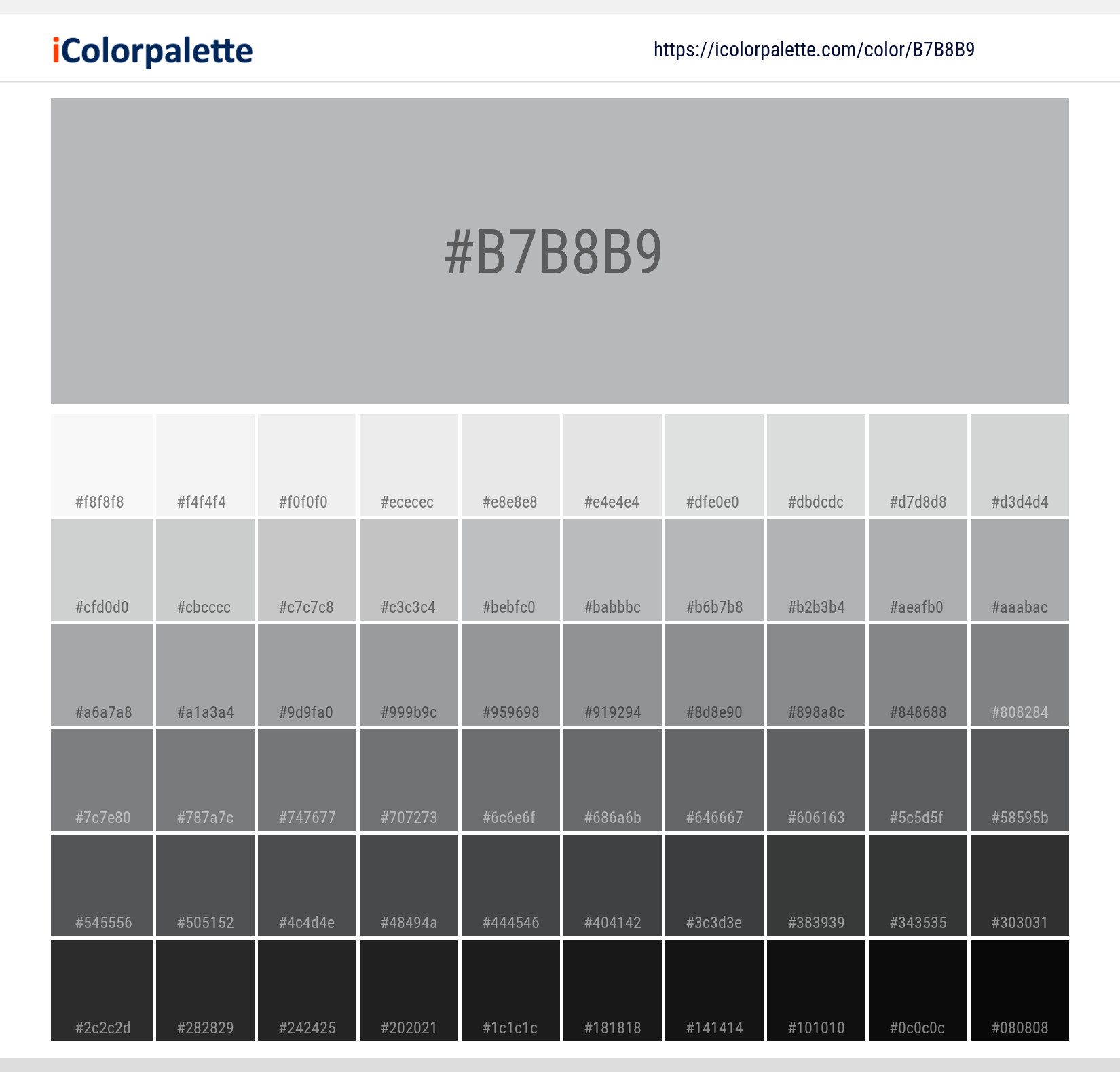
#b7b8b9 Color Shades
Download Color Shades
Pantone Cool Gray 4 U Color | Hex color Code #b7b8b9 Solid Color Background
Download Solid Color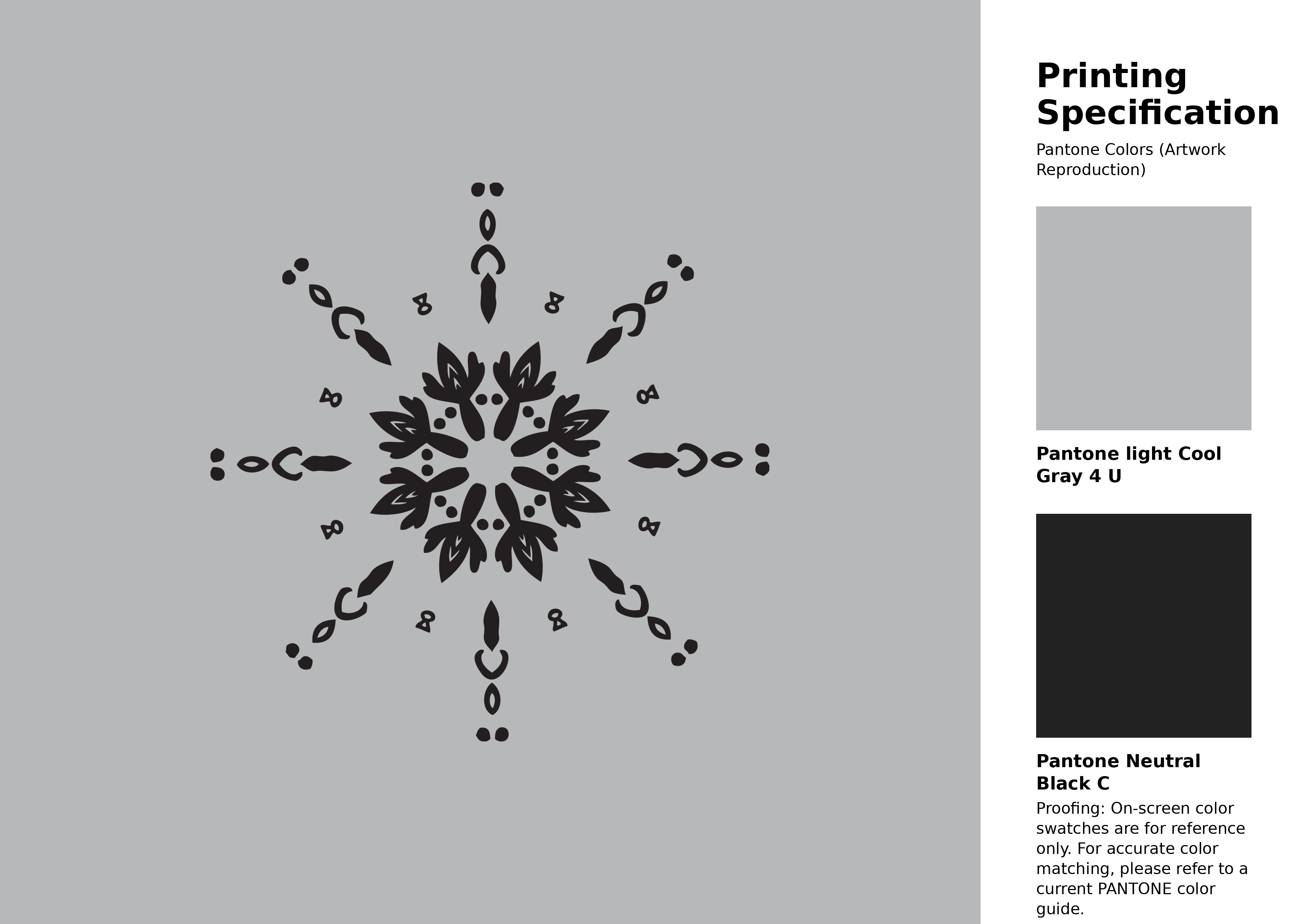
#b7b8b9 Pantone Cool Gray 4 U Color | Hex color Code #b7b8b9 Artwork Image (PNG)
Download Artwork (PNG)#b7b8b9 Pantone Cool Gray 4 U Color | Hex color Code #b7b8b9 Artwork Vector (PDF)
Download Artwork (PDF)#b7b8b9 Pantone Cool Gray 4 U Color | Hex color Code #b7b8b9 Artwork Vector (SVG)
Download Artwork (SVG)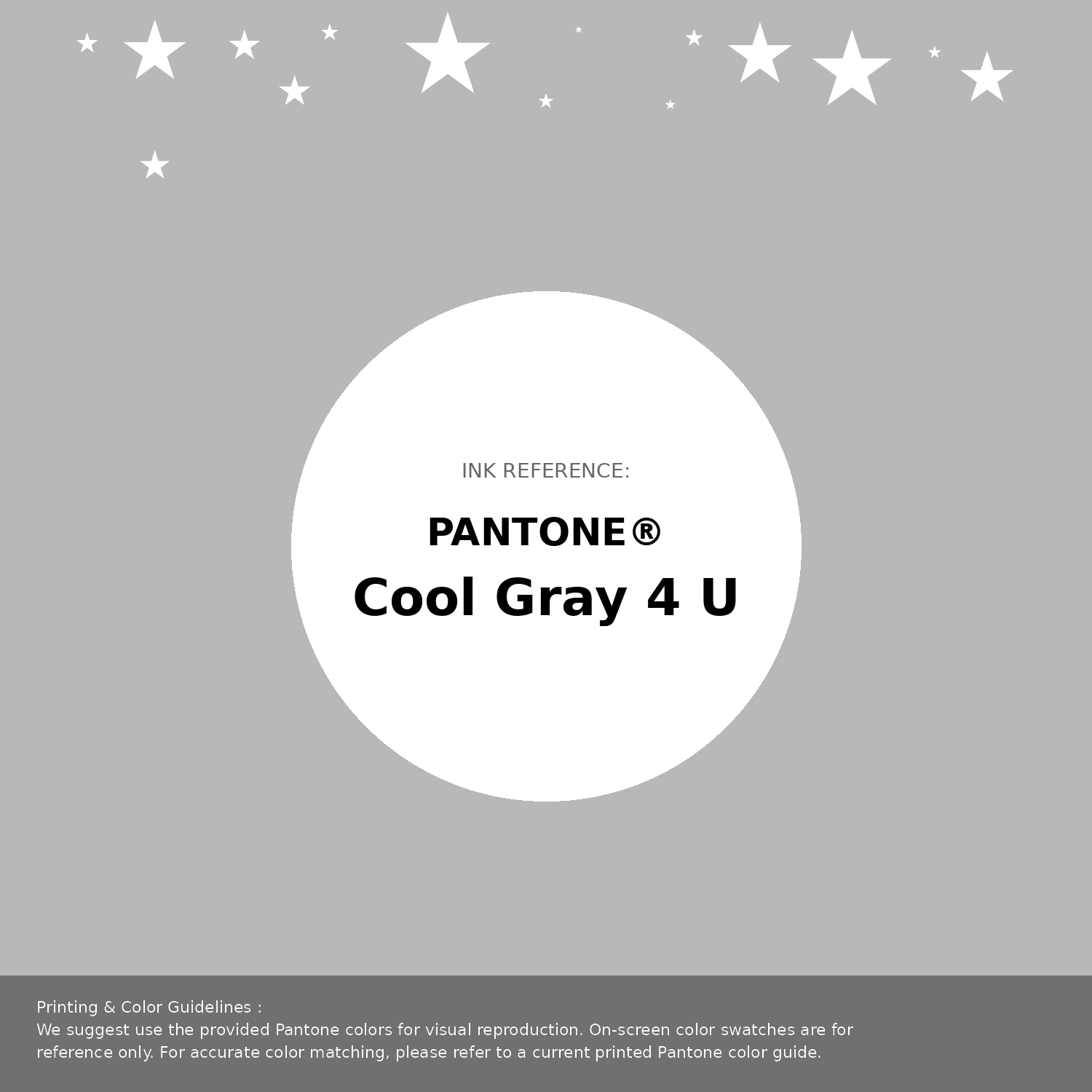
#b7b8b9 Pantone Cool Gray 4 U Color | Hex color Code #b7b8b9 Pantone Swatch Artwork
Download Artwork Swatch
#b7b8b9 Pantone Cool Gray 4 U Color | Hex color Code #b7b8b9 Gradient Artwork (PNG)
Download Gradient (PNG)#b7b8b9 Pantone Cool Gray 4 U Color | Hex color Code #b7b8b9 Gradient Artwork (SVG)
Download Gradient (SVG)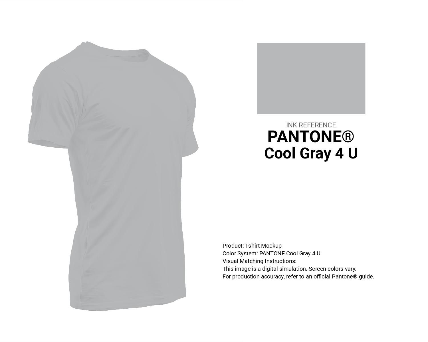
#b7b8b9 Pantone Cool Gray 4 U Color | Hex color Code #b7b8b9 T-Shirt Mockup
Download T-Shirt Mockup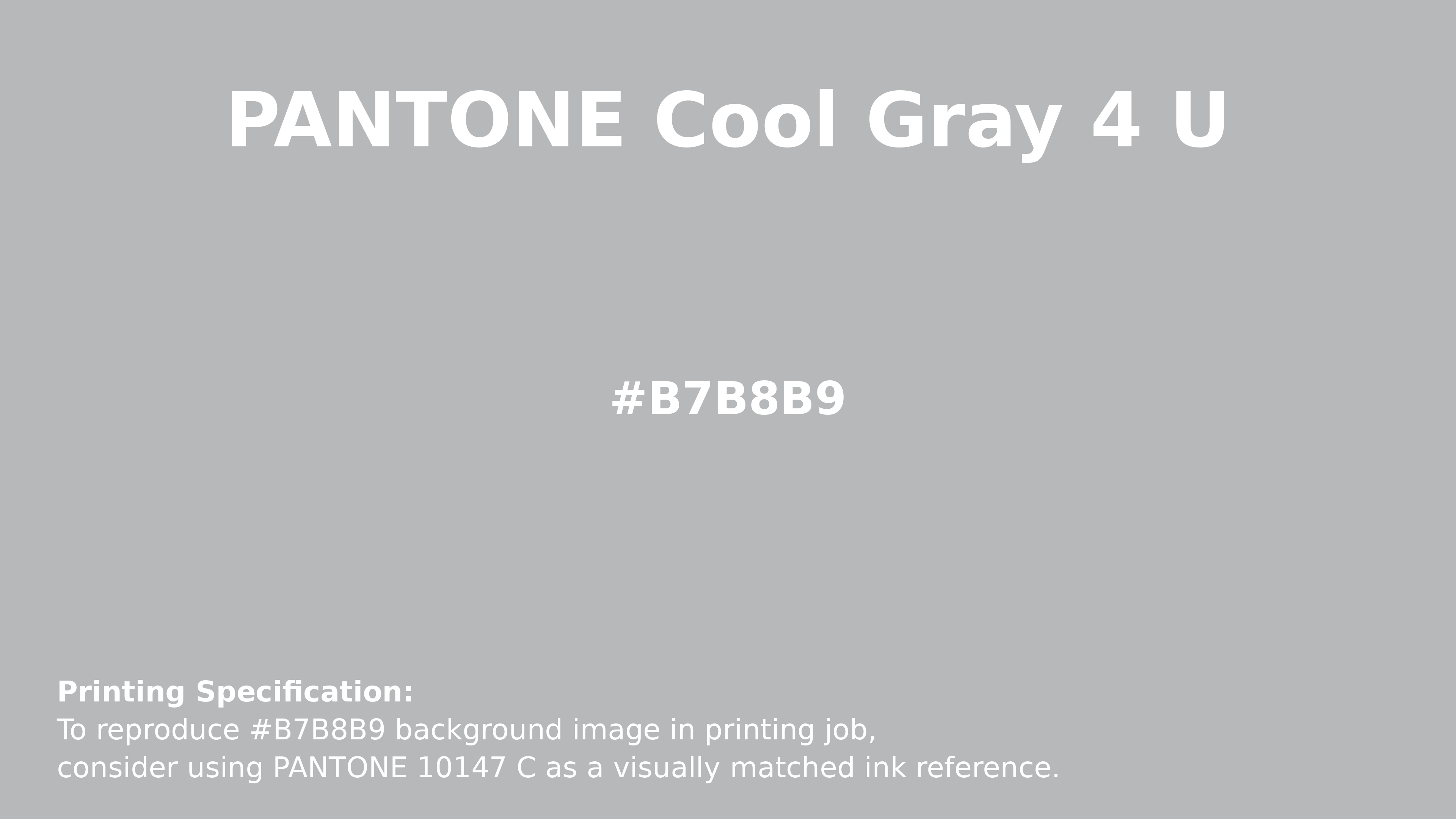
#b7b8b9 Pantone Cool Gray 4 U Color | Hex color Code #b7b8b9 Printing Artwork Pantone Reference
Download Pantone Printing ReferenceRelated Color Palettes
- Deep Pink and Sandy Brown •
- Hot Pink and Pale Violet Red •
- Pink Swan •
- Beige and Light Pink •
- Oriental Pink •
- New York Pink •
- Light Pink and Dark Sea Green •
- Cavern Pink •
- Deep Pink and Dark Olive Green •
- Lavender Pink •
- Dim Gray and Hot Pink •
- Black and Deep Pink •
- Cannon Pink •
- Light Pink and Salmon •
- Deep Pink and Black
Color Palette Collection

89 Blue Color Palettes
89 color palettes with 445 colors.
Light color Palettes
9 color palettes with 45 colors.
65 Red Color Palettes
65 color palettes with 325 colors.

45 Gold Color Palettes
45 color palettes with 225 colors.