#78D64B Color
Your all-in-one color resource. Download hex background images, Adobe swatches (ASE), PDF color sheets, and SVG files. Explore palettes, harmonies, accessibility, conversions, and professional exports — designed for designers, developers, and color perfectionists.
#78D64B is a vibrant, yet calming, yellowish-green. It evokes feelings of freshness, growth, and renewal, strongly reminiscent of a lush spring meadow bathed in sunlight. The color suggests vitality, optimism, and a sense of hope. It reminds one of new beginnings, blossoming flowers, and the awakening of nature after a long winter. The mood it creates is cheerful and uplifting, yet peaceful and serene. In design, it could be used to create a feeling of spaciousness and tranquility, perhaps in a living room or a child's bedroom. Its association with nature makes it suitable for environmentally conscious brands or products. Culturally, green often symbolizes growth, prosperity, and harmony. Visually matched named color: Spring Meadow.
PANTONE 7488 C
Choose Color
Selected Color
Recent Colors
Color Details
Similar Ink Alternatives for #78D64B color Alternative print inks for reproducing #78D64B background image with a similar visual appearance.
Disclaimer: The visually matched ink reference is an independent approximation intended as a guide only. Please be advised that this pantone colors is only intended as a guide, Actual colours will depend on screen calibration variances. The print ink suggestions provided are independent visual approximations and are not affiliated with or endorsed by Pantone LLC. For official color specifications, conversion factors, and comprehensive color system information, please visit Pantone Connect. Official Pantone products can be purchased at pantone.com.
Color Previews for #000000 See how this color looks as a background or as text.
Complete Guide to Your Color Laboratory
Everything you need to know about this professional color toolkit.
Use the Color Picker at the top to select any color. All modules below update instantly.
Workflow: Pick a color → Explore palettes & data → Download what you need (PDF, Image, or Adobe ASE).
Color Details — Your color in all formats: HEX, RGB, RGBA, HSL, HSLA, HSV, CMYK, CIELab, Hunter-Lab, XYZ, Yxy, YUV. One-click copy.
Color Psychology — Emotional impact, cultural meanings, physiological effects, branding applications, and historical significance.
Named Colors — Find official color names (HTML/CSS, Pantone) that match your selection with similarity percentages.
Light & Dark Shades
80-step gradient from black to white. Perfect for button states and component systems.
Tints
Color mixed with white → lighter, pastel variations for backgrounds and disabled states.
Monochromatic — 11 curated tints/shades from one color. Production-ready for design systems.
- Complementary — Opposite on wheel (180°). High contrast.
- Analogous — Neighbors (±30°). Harmonious flow.
- Triadic — Three colors (120° apart). Vibrant, balanced.
- Split-Complementary — Base + two near-complements. Softer contrast.
- Tetradic/Square — Four colors. Complex, maximum variety.
- Neutral — Desaturated versions. Subtle, sophisticated.
15 Professional Variations — Monochromatic, Analogous, Complementary, Warm/Cool/Earth Tones, Pastel, Vibrant, High Contrast, and more.
Color Infusion — 10 palettes showing your color morphing into each major hue. Find bridge colors.
Similar Colors — 60+ colors generated via CIELAB Delta E matching. Unexpected harmonious combinations.
18 Ready-to-Use Gradients — Complementary, Analogous, Triadic, Tint/Shade progressions, and more.
Downloads: PNG (2560×1440), CSS (production-ready code), SVG (scalable vector).
WCAG Contrast Checker — Tests your color against white, black, and custom colors for AA (4.5:1) and AAA (7:1) compliance. Large text thresholds included.
Harmony & Accessibility Guide — Tests against 10 canonical hues. Shows which pairs are both beautiful AND WCAG-compliant for text.
PNG/JPG — High-res images for presentations and mood boards.
PDF — Print-ready reports for clients and teams.
Adobe ASE — Direct import to Photoshop, Illustrator, InDesign, XD.
CSS/SVG — Gradients only. Production-ready code and vectors.
Color Science: Industry-standard conversions (HSL, CIELAB, CMYK, XYZ). WCAG 2.1 luminance formula. Delta E (ΔE76) for perceptual matching.
Direct Links: Share colors via icolorpalette.com/color/ff5733 or icolorpalette.com/color/red
Issues? Refresh the page, wait for rendering, try another browser, or check console (F12) for errors.
Printing Guide for #78d64b Background Image
Use PANTONE 7488 C as a visually matched ink reference when printing this background image.
To print the #78d64b background image from our site, consider using PANTONE 7488 C as a visually matched ink reference.
Download the background image, then provide this reference code to your print vendor to help achieve accurate color reproduction.
The visually matched ink reference for the #78d64b background image is PANTONE 7488 C.
This color is commonly described as Spring Meadow.
#78D64B is a vibrant, yet calming, yellowish-green. It evokes feelings of freshness, growth, and renewal, strongly reminiscent of a lush spring meadow bathed in sunlight. The color suggests vitality, optimism, and a sense of hope. It reminds one of new beginnings, blossoming flowers, and the awakening of nature after a long winter. The mood it creates is cheerful and uplifting, yet peaceful and serene. In design, it could be used to create a feeling of spaciousness and tranquility, perhaps in a living room or a child's bedroom. Its association with nature makes it suitable for environmentally conscious brands or products. Culturally, green often symbolizes growth, prosperity, and harmony.
We provide PANTONE 7488 C as a visually matched ink reference to help you reproduce the #78d64b background image accurately in professional printing.
This reference code helps print vendors achieve consistent color output across different printing equipment and materials.
After downloading the #78d64b background image from our site:
- Include the visually matched ink reference PANTONE 7488 C in your print order notes
- Inform your print vendor that this is your target color reference
- Request a proof print to verify the Spring Meadow color appearance before full production
The #78d64b background image with PANTONE 7488 C as visually matched ink reference can be used for:
- Posters, banners, and backdrops
- Business cards, brochures, and flyers
- Packaging, labels, and stickers
- Signage and promotional materials
This is an independent visual approximation.
While PANTONE 7488 C closely matches the #78d64b background image color, variations may exist between screen display and printed output.
We recommend requesting a proof print to verify the final appearance.
#78D64B is a vibrant, yet calming, yellowish-green. It evokes feelings of freshness, growth, and renewal, strongly reminiscent of a lush spring meadow bathed in sunlight. The color suggests vitality, optimism, and a sense of hope. It reminds one of new beginnings, blossoming flowers, and the awakening of nature after a long winter. The mood it creates is cheerful and uplifting, yet peaceful and serene. In design, it could be used to create a feeling of spaciousness and tranquility, perhaps in a living room or a child's bedroom. Its association with nature makes it suitable for environmentally conscious brands or products. Culturally, green often symbolizes growth, prosperity, and harmony.
Understanding these associations helps ensure the #78d64b background image aligns with your intended message and brand impact.
Important Information
The visually matched ink reference is an independent approximation intended as a guide only.
Actual printed colors may vary depending on screen calibration, substrate material, ink type, and printing equipment used.
For official color specifications and certified color standards, visit Pantone Connect.
Official color guides and swatch books can be purchased from pantone.com.
Pantone 7488 C Color: Vibrant Green | #78D64B
Introduction:
Vibrant Green (#78D64B) is a fresh and lively color that captures attention with its bright and vibrant appearance. It evokes feelings of energy, growth, and positivity. With its strong presence and bold hue, Vibrant Green is often associated with nature and the environment.
Historical Significance:
Key Moments in History: Vibrant Green has been prominently used throughout history in various cultural and artistic movements. One notable instance is its presence in medieval tapestries, where it symbolized fertility and abundance.
Symbolism and Meaning:
Symbolism: In different cultures, Vibrant Green represents renewal, harmony, and balance. It is often associated with nature and growth, symbolizing new beginnings and fresh opportunities.
Vibrant Green in Fashion:
Fashion Impact: Vibrant Green has a strong influence on the fashion world, especially during the spring and summer seasons. It is often used in clothing and accessories to add a pop of color and convey a sense of vitality and vibrancy.
Vibrant Green in Graphic Design:
Design Impact: Vibrant Green is commonly used in graphic design to grab attention and create a sense of freshness and nature. It is often used in branding and advertising to convey a vibrant and energetic message.
Color Combinations:
Potential Color Combinations: Vibrant Green pairs well with other vibrant and complementary colors such as yellow, turquoise, and purple. The combination of Vibrant Green and yellow creates a refreshing and playful palette, while the mix of Vibrant Green and turquoise evokes a tropical and serene atmosphere.
Nature's Palette:
Natural Occurrences: Vibrant Green is commonly found in various elements of nature, from lush foliage and vibrant flowers to the vibrant feathers of birds. It is a color that represents life and vitality in the natural world.
Artistic Representations:
Artistic Usage: Vibrant Green has been widely used in various forms of art throughout history. It can be seen in paintings, sculptures, and other artistic mediums as a symbol of nature and vitality.
Movies and Cinematic Landscapes:
Movies and Scenes: Vibrant Green often sets the tone and mood in cinematic landscapes. It is commonly used to depict lush environments, fantasy worlds, and scenes of growth and rejuvenation.
Products and Commercial Appeal:
Popular Products: Vibrant Green is commonly used in branding for products that convey a sense of freshness, eco-friendliness, and vitality. It is often associated with health and wellness, as well as natural and organic products.
National Symbols and Significance:
Significance: Vibrant Green is a color often associated with national symbols, such as the flag or emblems of countries. It represents the natural landscapes and aspirations of the nation.
The Psychological and Emotional Impact:
Psychological Impact: Vibrant Green has a positive psychological impact, evoking feelings of freshness, optimism, and growth. It can inspire creativity, uplift moods, and create a sense of harmony and balance.
Conclusion:
Vibrant Green (#78D64B) is a color that exudes energy and vitality. Its historical significance, symbolism, and impact across various fields make it a versatile and captivating color. Whether used in fashion, graphic design, or as a representation of nature, Vibrant Green continues to inspire and evoke a sense of freshness and growth.
Pantone 7488 C Color | Hex color Code #78d64b Image & Artwork
Download high-quality assets for your projects.

#78d64b Color Schemes
Download Color Schemes
#78d64b Color Shades
Download Color Shades
Pantone 7488 C Color | Hex color Code #78d64b Solid Color Background
Download Solid Color
#78d64b Pantone 7488 C Color | Hex color Code #78d64b Artwork Image (PNG)
Download Artwork (PNG)#78d64b Pantone 7488 C Color | Hex color Code #78d64b Artwork Vector (PDF)
Download Artwork (PDF)#78d64b Pantone 7488 C Color | Hex color Code #78d64b Artwork Vector (SVG)
Download Artwork (SVG)
#78d64b Pantone 7488 C Color | Hex color Code #78d64b Pantone Swatch Artwork
Download Artwork Swatch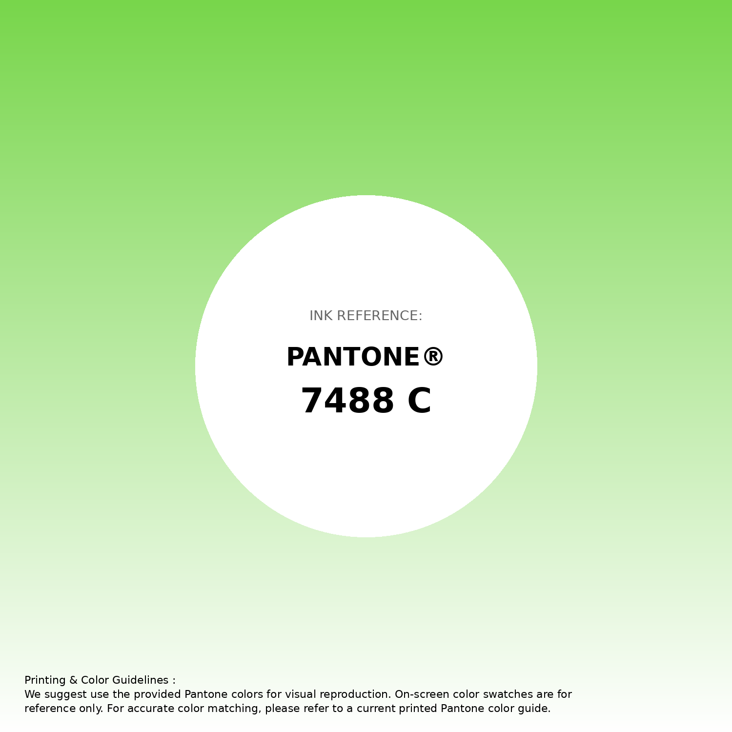
#78d64b Pantone 7488 C Color | Hex color Code #78d64b Gradient Artwork (PNG)
Download Gradient (PNG)#78d64b Pantone 7488 C Color | Hex color Code #78d64b Gradient Artwork (SVG)
Download Gradient (SVG)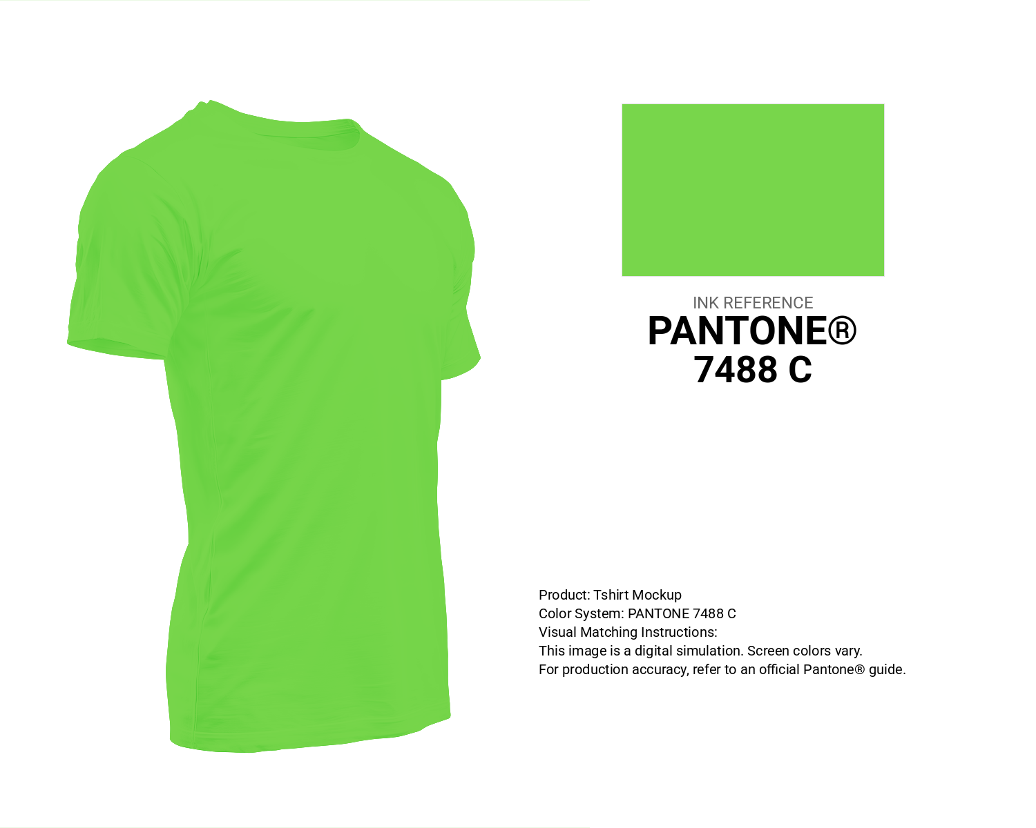
#78d64b Pantone 7488 C Color | Hex color Code #78d64b T-Shirt Mockup
Download T-Shirt Mockup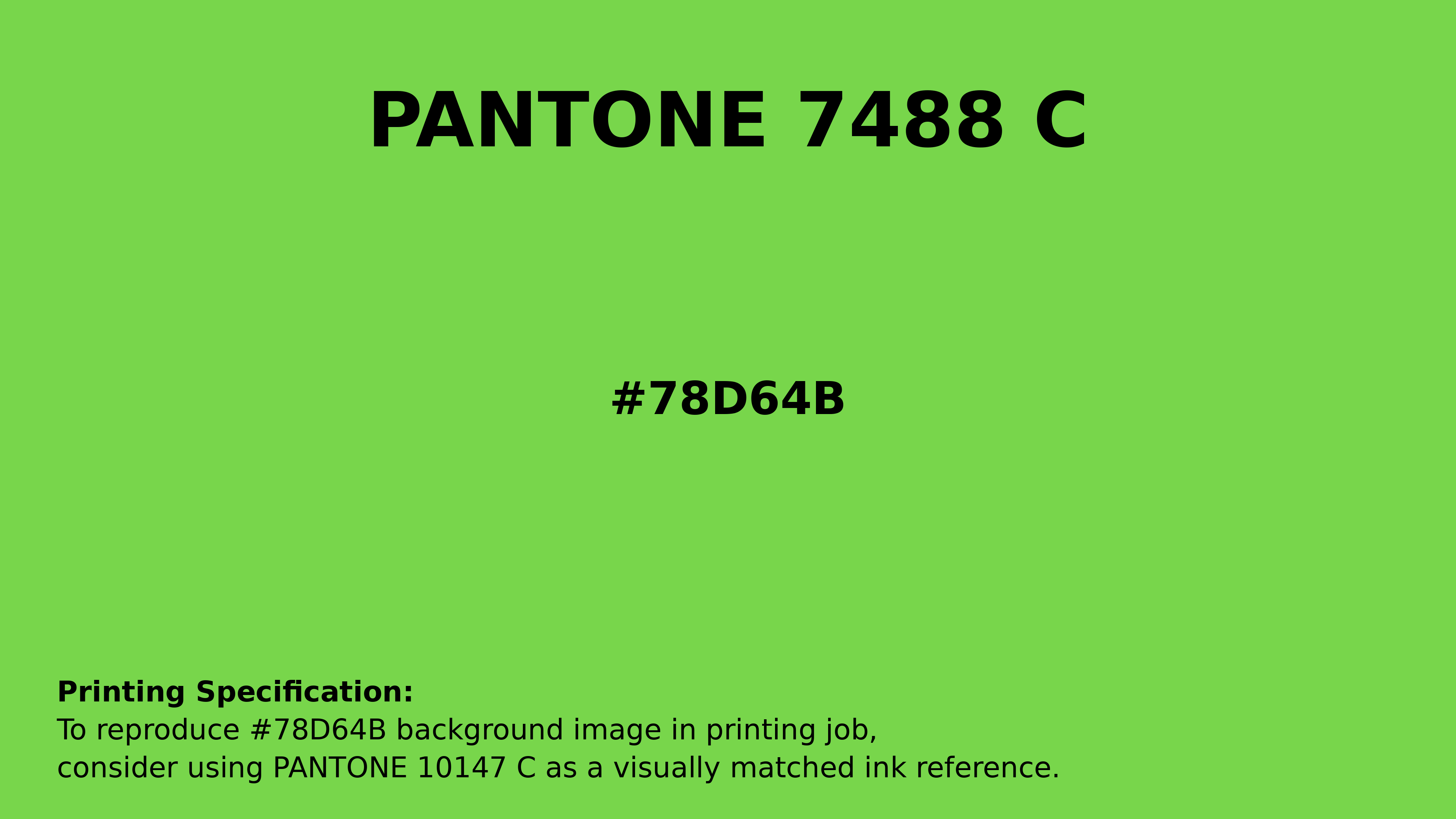
#78d64b Pantone 7488 C Color | Hex color Code #78d64b Printing Artwork Pantone Reference
Download Pantone Printing ReferenceRelated Color Palettes
- Midnight Blue and Gray •
- Light Slate Gray and SkyBlue •
- Dim Gray and Light Sea Green •
- Dusty Gray and Dusty Gray •
- Thistle and Slate Gray •
- Medium Turquoise and Light Slate Gray •
- Brown and Light Slate Gray •
- Light Steel Blue and Light Slate Gray •
- Dark Slate Gray and Dark Turquoise •
- Rosy Brown and Dim Gray •
- Midnight Blue and Dim Gray •
- Dim Gray and Pale Turquoise •
- Waikawa Gray •
- Rosy Brown and Light Slate Gray •
- Gray and Dark Slate Blue
Color Palette Collection
My color palette 1
863 color palettes with 4315 colors.

32 Sky Color Schemes
32 color palettes with 160 colors.

100 Rose Flower Nature Color Palettes
100 color palettes with 500 colors.
23 Light Blue Color Schemes
23 color palettes with 115 colors.