#5E8AB4 Color
Your all-in-one color resource. Download hex background images, Adobe swatches (ASE), PDF color sheets, and SVG files. Explore palettes, harmonies, accessibility, conversions, and professional exports — designed for designers, developers, and color perfectionists.
The hex code #5E8AB4 evokes a feeling of calm and serenity, reminiscent of a tranquil seafoam on a gently lapping shore. The muted blue-green hue suggests peacefulness and tranquility, with subtle undertones of both stability (blue) and growth (green). It evokes a sense of freshness and cleanliness, reminding one of a clear spring day or a cool, refreshing breeze. The color creates a soothing and relaxing atmosphere, ideal for spaces designed for rest and recuperation. In design, it could be used to create a calming and inviting ambiance in bedrooms, bathrooms, or spas. Its gentle nature suggests reliability and trustworthiness, though it lacks the vibrancy to be overly exciting. The color's association with nature lends itself to designs emphasizing natural harmony and a connection to the environment. It lacks strong cultural or symbolic meanings beyond its inherent peaceful connotations. Visually matched named color: Tranquil Seafoam.
PANTONE 646 C
Choose Color
Selected Color
Recent Colors
Color Details
Similar Ink Alternatives for #5E8AB4 color Alternative print inks for reproducing #5E8AB4 background image with a similar visual appearance.
Disclaimer: The visually matched ink reference is an independent approximation intended as a guide only. Please be advised that this pantone colors is only intended as a guide, Actual colours will depend on screen calibration variances. The print ink suggestions provided are independent visual approximations and are not affiliated with or endorsed by Pantone LLC. For official color specifications, conversion factors, and comprehensive color system information, please visit Pantone Connect. Official Pantone products can be purchased at pantone.com.
Color Previews for #000000 See how this color looks as a background or as text.
Complete Guide to Your Color Laboratory
Everything you need to know about this professional color toolkit.
Use the Color Picker at the top to select any color. All modules below update instantly.
Workflow: Pick a color → Explore palettes & data → Download what you need (PDF, Image, or Adobe ASE).
Color Details — Your color in all formats: HEX, RGB, RGBA, HSL, HSLA, HSV, CMYK, CIELab, Hunter-Lab, XYZ, Yxy, YUV. One-click copy.
Color Psychology — Emotional impact, cultural meanings, physiological effects, branding applications, and historical significance.
Named Colors — Find official color names (HTML/CSS, Pantone) that match your selection with similarity percentages.
Light & Dark Shades
80-step gradient from black to white. Perfect for button states and component systems.
Tints
Color mixed with white → lighter, pastel variations for backgrounds and disabled states.
Monochromatic — 11 curated tints/shades from one color. Production-ready for design systems.
- Complementary — Opposite on wheel (180°). High contrast.
- Analogous — Neighbors (±30°). Harmonious flow.
- Triadic — Three colors (120° apart). Vibrant, balanced.
- Split-Complementary — Base + two near-complements. Softer contrast.
- Tetradic/Square — Four colors. Complex, maximum variety.
- Neutral — Desaturated versions. Subtle, sophisticated.
15 Professional Variations — Monochromatic, Analogous, Complementary, Warm/Cool/Earth Tones, Pastel, Vibrant, High Contrast, and more.
Color Infusion — 10 palettes showing your color morphing into each major hue. Find bridge colors.
Similar Colors — 60+ colors generated via CIELAB Delta E matching. Unexpected harmonious combinations.
18 Ready-to-Use Gradients — Complementary, Analogous, Triadic, Tint/Shade progressions, and more.
Downloads: PNG (2560×1440), CSS (production-ready code), SVG (scalable vector).
WCAG Contrast Checker — Tests your color against white, black, and custom colors for AA (4.5:1) and AAA (7:1) compliance. Large text thresholds included.
Harmony & Accessibility Guide — Tests against 10 canonical hues. Shows which pairs are both beautiful AND WCAG-compliant for text.
PNG/JPG — High-res images for presentations and mood boards.
PDF — Print-ready reports for clients and teams.
Adobe ASE — Direct import to Photoshop, Illustrator, InDesign, XD.
CSS/SVG — Gradients only. Production-ready code and vectors.
Color Science: Industry-standard conversions (HSL, CIELAB, CMYK, XYZ). WCAG 2.1 luminance formula. Delta E (ΔE76) for perceptual matching.
Direct Links: Share colors via icolorpalette.com/color/ff5733 or icolorpalette.com/color/red
Issues? Refresh the page, wait for rendering, try another browser, or check console (F12) for errors.
Printing Guide for #5e8ab4 Background Image
Use PANTONE 646 C as a visually matched ink reference when printing this background image.
To print the #5e8ab4 background image from our site, consider using PANTONE 646 C as a visually matched ink reference.
Download the background image, then provide this reference code to your print vendor to help achieve accurate color reproduction.
The visually matched ink reference for the #5e8ab4 background image is PANTONE 646 C.
This color is commonly described as Tranquil Seafoam.
The hex code #5E8AB4 evokes a feeling of calm and serenity, reminiscent of a tranquil seafoam on a gently lapping shore. The muted blue-green hue suggests peacefulness and tranquility, with subtle undertones of both stability (blue) and growth (green). It evokes a sense of freshness and cleanliness, reminding one of a clear spring day or a cool, refreshing breeze. The color creates a soothing and relaxing atmosphere, ideal for spaces designed for rest and recuperation. In design, it could be used to create a calming and inviting ambiance in bedrooms, bathrooms, or spas. Its gentle nature suggests reliability and trustworthiness, though it lacks the vibrancy to be overly exciting. The color's association with nature lends itself to designs emphasizing natural harmony and a connection to the environment. It lacks strong cultural or symbolic meanings beyond its inherent peaceful connotations.
We provide PANTONE 646 C as a visually matched ink reference to help you reproduce the #5e8ab4 background image accurately in professional printing.
This reference code helps print vendors achieve consistent color output across different printing equipment and materials.
After downloading the #5e8ab4 background image from our site:
- Include the visually matched ink reference PANTONE 646 C in your print order notes
- Inform your print vendor that this is your target color reference
- Request a proof print to verify the Tranquil Seafoam color appearance before full production
The #5e8ab4 background image with PANTONE 646 C as visually matched ink reference can be used for:
- Posters, banners, and backdrops
- Business cards, brochures, and flyers
- Packaging, labels, and stickers
- Signage and promotional materials
This is an independent visual approximation.
While PANTONE 646 C closely matches the #5e8ab4 background image color, variations may exist between screen display and printed output.
We recommend requesting a proof print to verify the final appearance.
The hex code #5E8AB4 evokes a feeling of calm and serenity, reminiscent of a tranquil seafoam on a gently lapping shore. The muted blue-green hue suggests peacefulness and tranquility, with subtle undertones of both stability (blue) and growth (green). It evokes a sense of freshness and cleanliness, reminding one of a clear spring day or a cool, refreshing breeze. The color creates a soothing and relaxing atmosphere, ideal for spaces designed for rest and recuperation. In design, it could be used to create a calming and inviting ambiance in bedrooms, bathrooms, or spas. Its gentle nature suggests reliability and trustworthiness, though it lacks the vibrancy to be overly exciting. The color's association with nature lends itself to designs emphasizing natural harmony and a connection to the environment. It lacks strong cultural or symbolic meanings beyond its inherent peaceful connotations.
Understanding these associations helps ensure the #5e8ab4 background image aligns with your intended message and brand impact.
Important Information
The visually matched ink reference is an independent approximation intended as a guide only.
Actual printed colors may vary depending on screen calibration, substrate material, ink type, and printing equipment used.
For official color specifications and certified color standards, visit Pantone Connect.
Official color guides and swatch books can be purchased from pantone.com.
Pantone 646 C Color: Creative Blue | #5E8AB4
Introduction:
Creative Blue, also known as Pantone 646 C, is a vibrant shade of blue. It is visually appealing and evokes a sense of creativity and adventure.
Historical Significance:
In the 19th century, Creative Blue gained prominence in the art world, with artists using it as a primary color in their works. It also played a significant role in the Impressionist movement, where it was often used to depict landscapes and water scenes. Over time, Creative Blue has become a popular choice in various fields, including fashion and graphic design.
Symbolism and Meaning:
Creative Blue typically symbolizes trust, intelligence, and serenity. In different cultures, it is associated with qualities such as loyalty, stability, and depth. The color is often used to represent calmness and reliability.
Creative Blue in Fashion:
Creative Blue is a popular color in the fashion industry, often seen in clothing and accessories. It is known for its versatility and ability to complement various skin tones. The color is often used in formal attire, as it exudes elegance and sophistication.
Creative Blue in Graphic Design:
Creative Blue holds significance in graphic design as it is a versatile color that can be used to create a sense of professionalism and trust. It is often used in branding, logos, and website designs to establish a strong visual impact.
Color Combinations:
Creative Blue pairs well with colors such as white, gray, and silver. These combinations create a clean and sophisticated look. Another popular combination is Creative Blue with shades of yellow or orange, creating a vibrant and energetic feel.
Nature’s Palette:
In nature, Creative Blue can be found in various flowers, such as bluebells and forget-me-nots. It can also be seen in the blue waters of oceans and lakes. The color is often associated with tranquility and the beauty of nature.
Artistic Representations:
Throughout history, artists have utilized Creative Blue in their paintings to create depth and evoke emotions. It has been used to portray the sky, water, and various other elements of nature. The color adds a sense of tranquility and serenity to artistic compositions.
Movies and Cinematic Landscapes:
Creative Blue often sets the tone and mood in movies and cinematic landscapes. It is frequently used to depict calm and peaceful scenes or to symbolize mystery and intrigue. Movies like "The Grand Budapest Hotel" and "Blue Velvet" effectively use Creative Blue to establish the atmosphere.
Products and Commercial Appeal:
Various products and brands incorporate Creative Blue in their branding to convey trustworthiness and reliability. It is often used in technology, finance, and healthcare industries to establish a sense of professionalism and expertise.
National Symbols and Significance:
In some cultures, Creative Blue holds national or cultural significance. It can represent patriotism, national pride, or be associated with specific traditions and ceremonies.
The Psychological and Emotional Impact:
Creative Blue has a calming and soothing effect on emotions. It can help reduce stress and anxiety, promoting feelings of tranquility and relaxation. The color also stimulates mental clarity and encourages creative thinking.
Conclusion:
Creative Blue, or Pantone 646 C, holds historical significance and is widely recognized for its timeless appeal. It symbolizes trust, intelligence, and serenity, making it a versatile color in various industries. Whether used in fashion, graphic design, or artistic representations, Creative Blue has a lasting impact on visual aesthetics and emotional perception.
Pantone 646 C Color | Hex color Code #5e8ab4 Image & Artwork
Download high-quality assets for your projects.

#5e8ab4 Color Schemes
Download Color Schemes
#5e8ab4 Color Shades
Download Color Shades
Pantone 646 C Color | Hex color Code #5e8ab4 Solid Color Background
Download Solid Color
#5e8ab4 Pantone 646 C Color | Hex color Code #5e8ab4 Artwork Image (PNG)
Download Artwork (PNG)#5e8ab4 Pantone 646 C Color | Hex color Code #5e8ab4 Artwork Vector (PDF)
Download Artwork (PDF)#5e8ab4 Pantone 646 C Color | Hex color Code #5e8ab4 Artwork Vector (SVG)
Download Artwork (SVG)
#5e8ab4 Pantone 646 C Color | Hex color Code #5e8ab4 Pantone Swatch Artwork
Download Artwork Swatch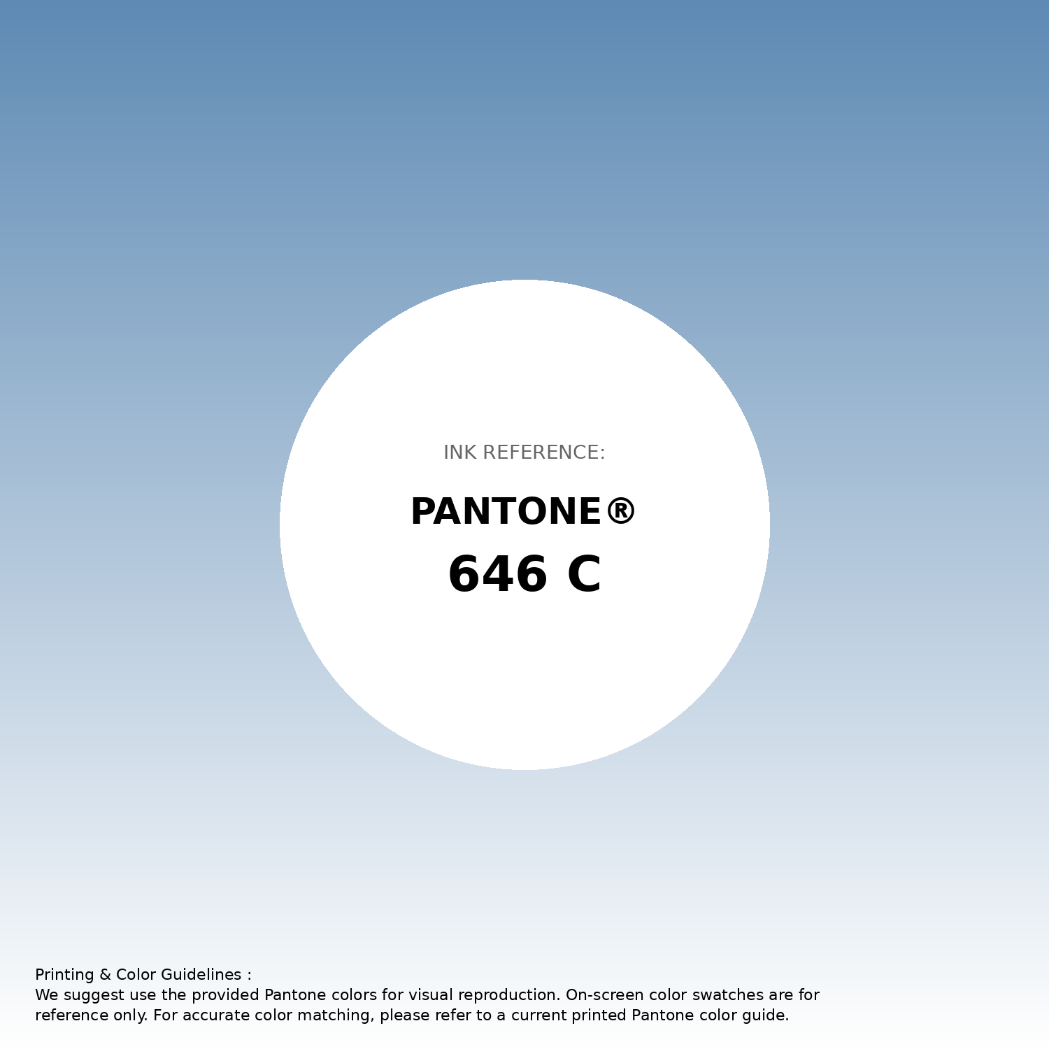
#5e8ab4 Pantone 646 C Color | Hex color Code #5e8ab4 Gradient Artwork (PNG)
Download Gradient (PNG)#5e8ab4 Pantone 646 C Color | Hex color Code #5e8ab4 Gradient Artwork (SVG)
Download Gradient (SVG)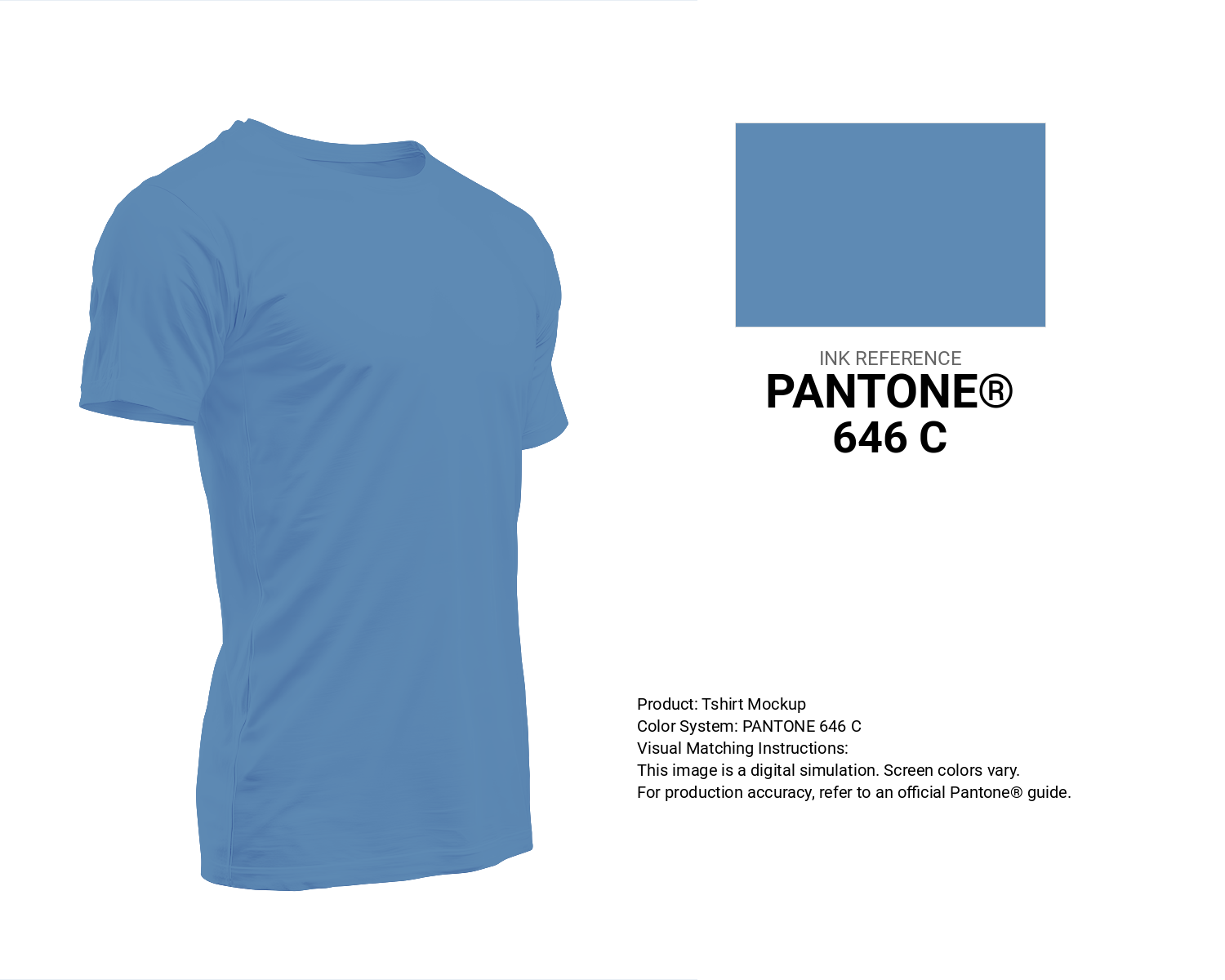
#5e8ab4 Pantone 646 C Color | Hex color Code #5e8ab4 T-Shirt Mockup
Download T-Shirt Mockup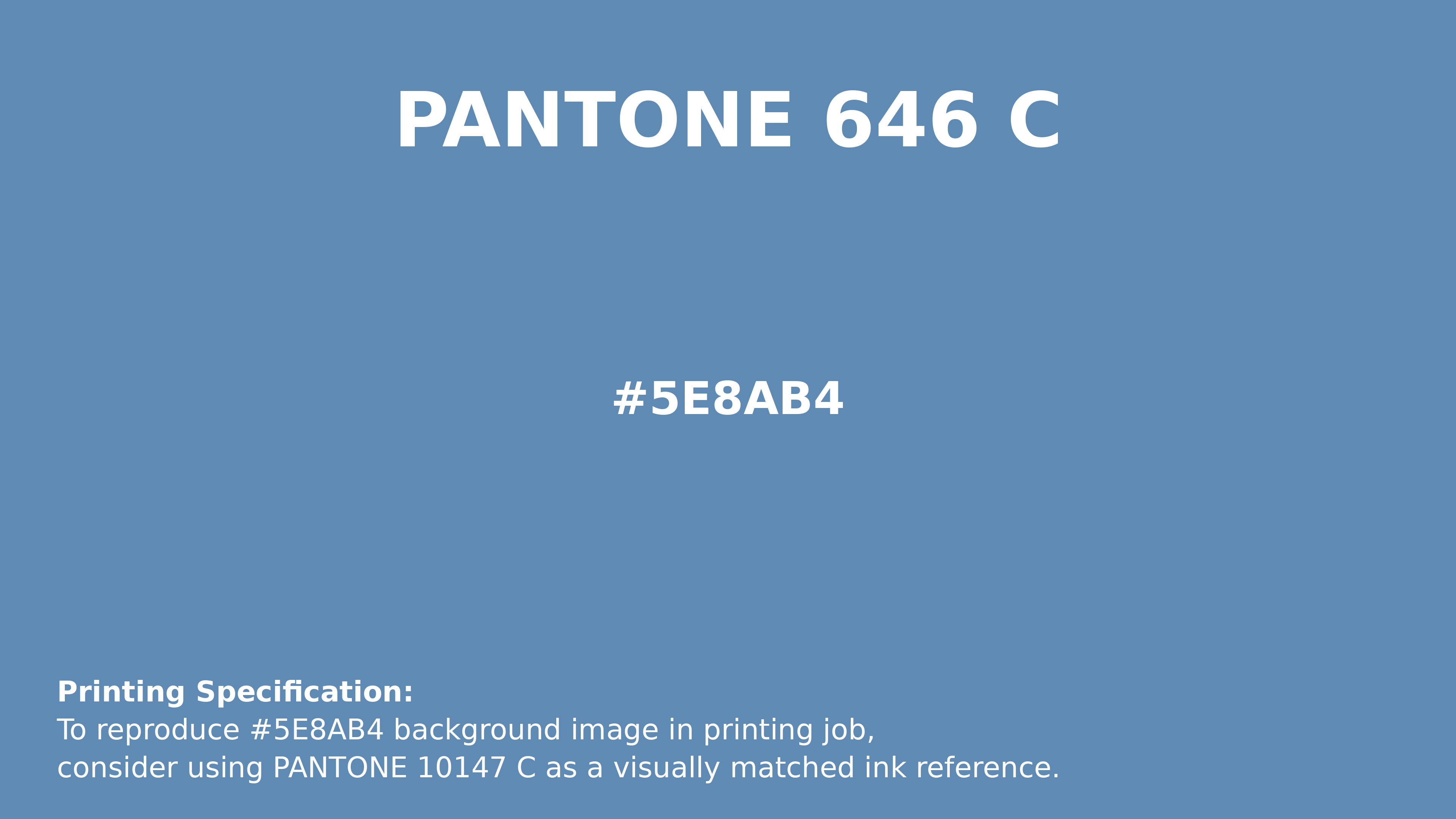
#5e8ab4 Pantone 646 C Color | Hex color Code #5e8ab4 Printing Artwork Pantone Reference
Download Pantone Printing ReferenceRelated Color Palettes
- Royal Blue and Slate Gray •
- Teal and Dark Slate Gray •
- Black and Gray •
- Orange and Dark Slate Gray •
- Dim Gray and Light Gray •
- Slate Gray and Powder Blue •
- Light Gray and Chocolate •
- Light Gray and Brown •
- Dark Gray and Cadet Blue •
- Steel Blue and Dark Gray •
- Dark Gray and Dark Slate Gray •
- Silver and Slate Gray •
- Dark Slate Gray and Medium Turquoise •
- Dark Salmon and Dark Slate Gray •
- Light Coral and Dim Gray
Color Palette Collection
Chardon
1 color palettes with 5 colors.

45 Gold Color Palettes
45 color palettes with 225 colors.

20 Pink Color Schemes
20 color palettes with 100 colors.

Child Theme Colors
5 color palettes with 25 colors.