#5B7F95 Color
Your all-in-one color resource. Download hex background images, Adobe swatches (ASE), PDF color sheets, and SVG files. Explore palettes, harmonies, accessibility, conversions, and professional exports — designed for designers, developers, and color perfectionists.
This color, #5B7F95, evokes a sense of calm and quiet contemplation, like gazing into a tranquil ocean or a deep, clear lake. It combines the stability of blue with the grounding of green, creating a balanced and harmonious feeling. It stirs emotions of serenity, trust, and intellectual curiosity, reminding one of vast, open spaces, the cool embrace of a shaded forest, or the introspection of a quiet evening. This color creates a mood of introspection and invites one to relax and unwind. It would be perfect for spaces designed for focus, such as a study or home office, or for areas promoting relaxation, like a bedroom or living room. In design, it suggests reliability, sophistication, and a connection to nature, often used in corporate branding to convey trustworthiness or in interiors to create a peaceful and balanced atmosphere. Visually matched named color: Serene Azure Depths.
PANTONE 5415 C
Choose Color
Selected Color
Recent Colors
Color Details
Similar Ink Alternatives for #5B7F95 color Alternative print inks for reproducing #5B7F95 background image with a similar visual appearance.
Disclaimer: The visually matched ink reference is an independent approximation intended as a guide only. Please be advised that this pantone colors is only intended as a guide, Actual colours will depend on screen calibration variances. The print ink suggestions provided are independent visual approximations and are not affiliated with or endorsed by Pantone LLC. For official color specifications, conversion factors, and comprehensive color system information, please visit Pantone Connect. Official Pantone products can be purchased at pantone.com.
Color Previews for #000000 See how this color looks as a background or as text.
Complete Guide to Your Color Laboratory
Everything you need to know about this professional color toolkit.
Use the Color Picker at the top to select any color. All modules below update instantly.
Workflow: Pick a color → Explore palettes & data → Download what you need (PDF, Image, or Adobe ASE).
Color Details — Your color in all formats: HEX, RGB, RGBA, HSL, HSLA, HSV, CMYK, CIELab, Hunter-Lab, XYZ, Yxy, YUV. One-click copy.
Color Psychology — Emotional impact, cultural meanings, physiological effects, branding applications, and historical significance.
Named Colors — Find official color names (HTML/CSS, Pantone) that match your selection with similarity percentages.
Light & Dark Shades
80-step gradient from black to white. Perfect for button states and component systems.
Tints
Color mixed with white → lighter, pastel variations for backgrounds and disabled states.
Monochromatic — 11 curated tints/shades from one color. Production-ready for design systems.
- Complementary — Opposite on wheel (180°). High contrast.
- Analogous — Neighbors (±30°). Harmonious flow.
- Triadic — Three colors (120° apart). Vibrant, balanced.
- Split-Complementary — Base + two near-complements. Softer contrast.
- Tetradic/Square — Four colors. Complex, maximum variety.
- Neutral — Desaturated versions. Subtle, sophisticated.
15 Professional Variations — Monochromatic, Analogous, Complementary, Warm/Cool/Earth Tones, Pastel, Vibrant, High Contrast, and more.
Color Infusion — 10 palettes showing your color morphing into each major hue. Find bridge colors.
Similar Colors — 60+ colors generated via CIELAB Delta E matching. Unexpected harmonious combinations.
18 Ready-to-Use Gradients — Complementary, Analogous, Triadic, Tint/Shade progressions, and more.
Downloads: PNG (2560×1440), CSS (production-ready code), SVG (scalable vector).
WCAG Contrast Checker — Tests your color against white, black, and custom colors for AA (4.5:1) and AAA (7:1) compliance. Large text thresholds included.
Harmony & Accessibility Guide — Tests against 10 canonical hues. Shows which pairs are both beautiful AND WCAG-compliant for text.
PNG/JPG — High-res images for presentations and mood boards.
PDF — Print-ready reports for clients and teams.
Adobe ASE — Direct import to Photoshop, Illustrator, InDesign, XD.
CSS/SVG — Gradients only. Production-ready code and vectors.
Color Science: Industry-standard conversions (HSL, CIELAB, CMYK, XYZ). WCAG 2.1 luminance formula. Delta E (ΔE76) for perceptual matching.
Direct Links: Share colors via icolorpalette.com/color/ff5733 or icolorpalette.com/color/red
Issues? Refresh the page, wait for rendering, try another browser, or check console (F12) for errors.
Printing Guide for #5b7f95 Background Image
Use PANTONE 5415 C as a visually matched ink reference when printing this background image.
To print the #5b7f95 background image from our site, consider using PANTONE 5415 C as a visually matched ink reference.
Download the background image, then provide this reference code to your print vendor to help achieve accurate color reproduction.
The visually matched ink reference for the #5b7f95 background image is PANTONE 5415 C.
This color is commonly described as Serene Azure Depths.
This color, #5B7F95, evokes a sense of calm and quiet contemplation, like gazing into a tranquil ocean or a deep, clear lake. It combines the stability of blue with the grounding of green, creating a balanced and harmonious feeling. It stirs emotions of serenity, trust, and intellectual curiosity, reminding one of vast, open spaces, the cool embrace of a shaded forest, or the introspection of a quiet evening. This color creates a mood of introspection and invites one to relax and unwind. It would be perfect for spaces designed for focus, such as a study or home office, or for areas promoting relaxation, like a bedroom or living room. In design, it suggests reliability, sophistication, and a connection to nature, often used in corporate branding to convey trustworthiness or in interiors to create a peaceful and balanced atmosphere.
We provide PANTONE 5415 C as a visually matched ink reference to help you reproduce the #5b7f95 background image accurately in professional printing.
This reference code helps print vendors achieve consistent color output across different printing equipment and materials.
After downloading the #5b7f95 background image from our site:
- Include the visually matched ink reference PANTONE 5415 C in your print order notes
- Inform your print vendor that this is your target color reference
- Request a proof print to verify the Serene Azure Depths color appearance before full production
The #5b7f95 background image with PANTONE 5415 C as visually matched ink reference can be used for:
- Posters, banners, and backdrops
- Business cards, brochures, and flyers
- Packaging, labels, and stickers
- Signage and promotional materials
This is an independent visual approximation.
While PANTONE 5415 C closely matches the #5b7f95 background image color, variations may exist between screen display and printed output.
We recommend requesting a proof print to verify the final appearance.
This color, #5B7F95, evokes a sense of calm and quiet contemplation, like gazing into a tranquil ocean or a deep, clear lake. It combines the stability of blue with the grounding of green, creating a balanced and harmonious feeling. It stirs emotions of serenity, trust, and intellectual curiosity, reminding one of vast, open spaces, the cool embrace of a shaded forest, or the introspection of a quiet evening. This color creates a mood of introspection and invites one to relax and unwind. It would be perfect for spaces designed for focus, such as a study or home office, or for areas promoting relaxation, like a bedroom or living room. In design, it suggests reliability, sophistication, and a connection to nature, often used in corporate branding to convey trustworthiness or in interiors to create a peaceful and balanced atmosphere.
Understanding these associations helps ensure the #5b7f95 background image aligns with your intended message and brand impact.
Important Information
The visually matched ink reference is an independent approximation intended as a guide only.
Actual printed colors may vary depending on screen calibration, substrate material, ink type, and printing equipment used.
For official color specifications and certified color standards, visit Pantone Connect.
Official color guides and swatch books can be purchased from pantone.com.
Pantone 5415 C Color: Serene Depths | #5B7F95
Introduction:
Serene Depths, also known as Pantone 5415 C, is a color that exudes calmness and tranquility. Its deep blue hue is reminiscent of the serene depths of the ocean, bringing a sense of peace and relaxation.
Historical Significance:
The color Serene Depths has been prominently used in various historical moments. For example, it was often seen in ancient Egyptian art, symbolizing the river Nile and its life-giving properties. In modern times, it has been used in memorial tributes to honor those who have lost their lives at sea.
Symbolism and Meaning:
Serene Depths is typically symbolized as a color of peace, calmness, and introspection. In different cultures, it can also represent wisdom, infinity, and spiritual depth.
Serene Depths in Fashion:
Serene Depths has a significant impact on fashion styles and trends. It is often used in elegant evening wear, adding a touch of sophistication and mystery to the garments. It also pairs well with metallic accents, creating a sense of opulence.
Serene Depths in Graphic Design:
The color Serene Depths holds great significance in graphic design. Its deep blue shade is often used to evoke a sense of trust and reliability in branding and corporate designs. It is also commonly utilized in designs related to travel and nature, creating a sense of tranquility and connection to the natural world.
Color Combinations:
Serene Depths pairs well with complementary colors such as sandy beige (#F5E6CB) and creamy white (#FDF6E3), creating a beach-inspired palette. It also works well with shades of green such as moss green (#9AB87A) and olive (#6B8E23), evoking a sense of harmony and connection with nature.
Nature’s Palette:
Serene Depths can be found in the natural world in various forms. It can be seen in the vibrant blue petals of some flowers, such as the delphinium and hydrangea. It also mirrors the color of calm, still bodies of water like lakes and lagoons.
Artistic Representations:
Throughout history, Serene Depths has been used in various forms of art. It can be found in famous paintings depicting seascapes and water scenes, capturing the tranquility and beauty of the color. Additionally, many abstract artists utilize this shade to evoke a sense of depth and introspection in their artwork.
Movies and Cinematic Landscapes:
Serene Depths sets the tone and mood in many movies and cinematic landscapes. From underwater sequences in films like "Finding Nemo" to the haunting blue hues of "The Shape of Water," this color creates a sense of mystery and fascination.
Products and Commercial Appeal:
Various products and brands are associated with the color Serene Depths. It is often used in cosmetics and skincare products that aim to create a sense of relaxation and rejuvenation. It is also commonly found in home decor items, such as bedding and curtains, to create a serene and peaceful atmosphere.
National Symbols and Significance:
Serene Depths holds national and cultural significance in some countries. For example, it can represent the vastness and power of the ocean in coastal nations, symbolizing their connection to the sea. In other cultures, it may represent peace and tranquility, reflecting the values of the nation.
The Psychological and Emotional Impact:
The color Serene Depths has a soothing and calming effect on emotions and perceptions. It can help reduce stress and anxiety, promoting a sense of tranquility and relaxation. Its deep blue hue also evokes a feeling of depth and introspection, encouraging contemplation and self-reflection.
Conclusion:
In conclusion, Serene Depths, also known as Pantone 5415 C, is a color that embodies tranquility, depth, and peace. Its historical significance, symbolism, and versatile use in various fields make it a timeless and impactful choice in design and aesthetics.
Pantone 5415 C Color | Hex color Code #5b7f95 Image & Artwork
Download high-quality assets for your projects.

#5b7f95 Color Schemes
Download Color Schemes
#5b7f95 Color Shades
Download Color Shades
Pantone 5415 C Color | Hex color Code #5b7f95 Solid Color Background
Download Solid Color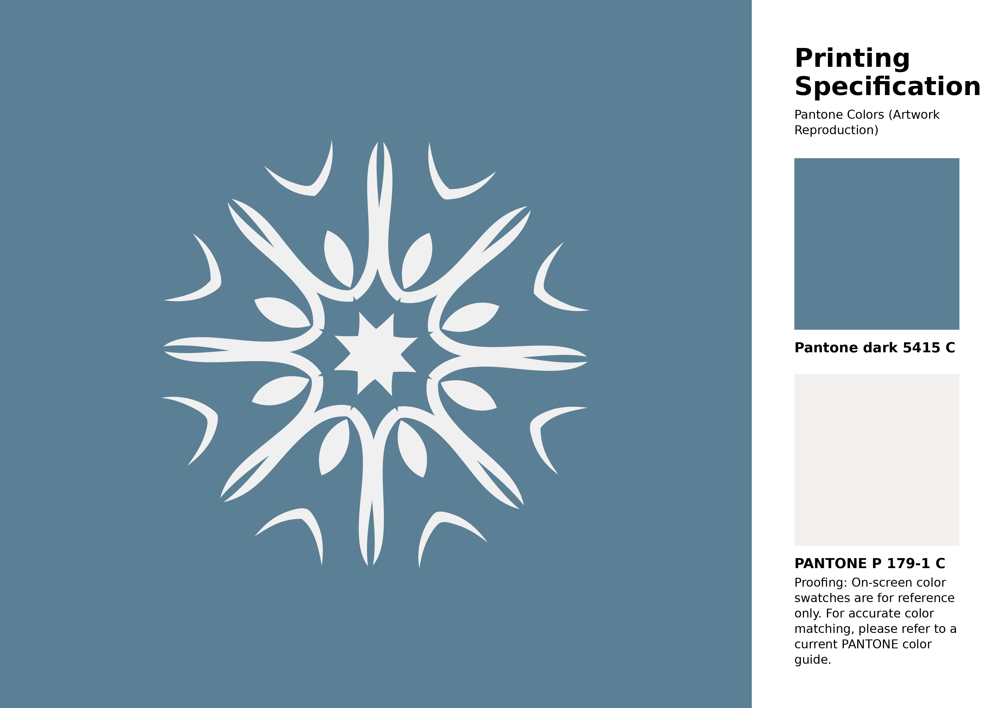
#5b7f95 Pantone 5415 C Color | Hex color Code #5b7f95 Artwork Image (PNG)
Download Artwork (PNG)#5b7f95 Pantone 5415 C Color | Hex color Code #5b7f95 Artwork Vector (PDF)
Download Artwork (PDF)#5b7f95 Pantone 5415 C Color | Hex color Code #5b7f95 Artwork Vector (SVG)
Download Artwork (SVG)
#5b7f95 Pantone 5415 C Color | Hex color Code #5b7f95 Pantone Swatch Artwork
Download Artwork Swatch
#5b7f95 Pantone 5415 C Color | Hex color Code #5b7f95 Gradient Artwork (PNG)
Download Gradient (PNG)#5b7f95 Pantone 5415 C Color | Hex color Code #5b7f95 Gradient Artwork (SVG)
Download Gradient (SVG)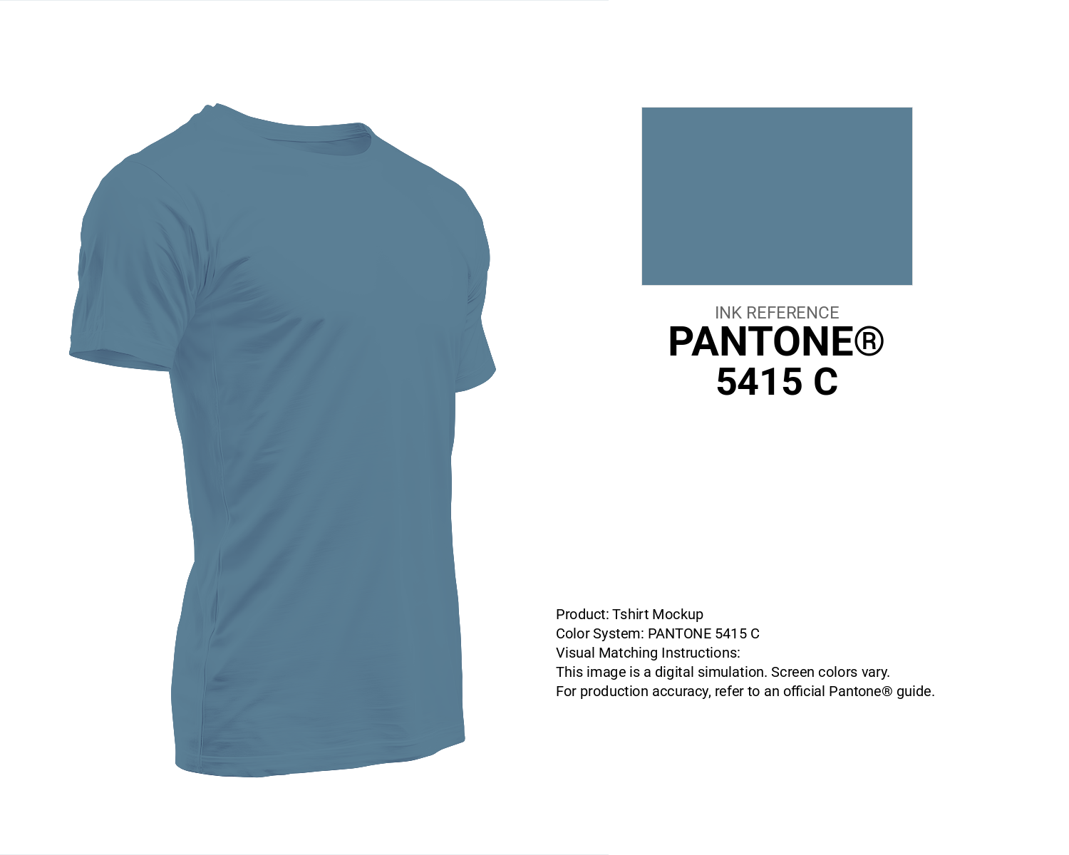
#5b7f95 Pantone 5415 C Color | Hex color Code #5b7f95 T-Shirt Mockup
Download T-Shirt Mockup
#5b7f95 Pantone 5415 C Color | Hex color Code #5b7f95 Printing Artwork Pantone Reference
Download Pantone Printing ReferenceRelated Color Palettes
- Medium Aquamarine and Slate Gray •
- Dim Gray and Lavender •
- Forest Green and Dark Gray •
- Slate Gray and Light Gray •
- Slate Gray and Slate Blue •
- Dark Slate Gray and Plum •
- Pale Goldenrod and Dark Slate Gray •
- Dark Salmon and Dark Slate Gray •
- Lemon Chiffon and Dark Slate Gray •
- Light Slate Gray and Dark Khaki •
- Heathered Gray •
- Light Gray and White Smoke •
- Light Coral and Gray •
- Dark Gray and Yellow Green •
- Sea Green and Light Slate Gray
Color Palette Collection

Pink Colors
8 color palettes with 40 colors.
Chardonnay
1 color palettes with 5 colors.

500+ Popular Color Palette Collection
501 color palettes with 2505 colors.
Chardon
1 color palettes with 5 colors.