#C2E189 Color
Your all-in-one color resource. Download hex background images, Adobe swatches (ASE), PDF color sheets, and SVG files. Explore palettes, harmonies, accessibility, conversions, and professional exports — designed for designers, developers, and color perfectionists.
#C2E189 is a light, cheerful green reminiscent of a vibrant spring meadow bathed in sunlight. The color evokes feelings of freshness, growth, and renewal. It suggests optimism, hope, and a sense of peace and tranquility. It reminds one of lush landscapes, new beginnings, and the vibrant energy of springtime. The subtle yellow undertones add a touch of warmth and cheerfulness, avoiding any harshness. This color creates a calming and uplifting mood, perfect for spaces designed to promote relaxation and well-being. In design, it could be used to create a feeling of natural harmony and serenity, working well in living rooms, bedrooms, or even offices to foster creativity and productivity. Culturally, green is often associated with nature, growth, and prosperity across many cultures. Visually matched named color: Spring Meadow.
PANTONE 365 C
Choose Color
Selected Color
Recent Colors
Color Details
Similar Ink Alternatives for #C2E189 color Alternative print inks for reproducing #C2E189 background image with a similar visual appearance.
Disclaimer: The visually matched ink reference is an independent approximation intended as a guide only. Please be advised that this pantone colors is only intended as a guide, Actual colours will depend on screen calibration variances. The print ink suggestions provided are independent visual approximations and are not affiliated with or endorsed by Pantone LLC. For official color specifications, conversion factors, and comprehensive color system information, please visit Pantone Connect. Official Pantone products can be purchased at pantone.com.
Color Previews for #000000 See how this color looks as a background or as text.
Complete Guide to Your Color Laboratory
Everything you need to know about this professional color toolkit.
Use the Color Picker at the top to select any color. All modules below update instantly.
Workflow: Pick a color → Explore palettes & data → Download what you need (PDF, Image, or Adobe ASE).
Color Details — Your color in all formats: HEX, RGB, RGBA, HSL, HSLA, HSV, CMYK, CIELab, Hunter-Lab, XYZ, Yxy, YUV. One-click copy.
Color Psychology — Emotional impact, cultural meanings, physiological effects, branding applications, and historical significance.
Named Colors — Find official color names (HTML/CSS, Pantone) that match your selection with similarity percentages.
Light & Dark Shades
80-step gradient from black to white. Perfect for button states and component systems.
Tints
Color mixed with white → lighter, pastel variations for backgrounds and disabled states.
Monochromatic — 11 curated tints/shades from one color. Production-ready for design systems.
- Complementary — Opposite on wheel (180°). High contrast.
- Analogous — Neighbors (±30°). Harmonious flow.
- Triadic — Three colors (120° apart). Vibrant, balanced.
- Split-Complementary — Base + two near-complements. Softer contrast.
- Tetradic/Square — Four colors. Complex, maximum variety.
- Neutral — Desaturated versions. Subtle, sophisticated.
15 Professional Variations — Monochromatic, Analogous, Complementary, Warm/Cool/Earth Tones, Pastel, Vibrant, High Contrast, and more.
Color Infusion — 10 palettes showing your color morphing into each major hue. Find bridge colors.
Similar Colors — 60+ colors generated via CIELAB Delta E matching. Unexpected harmonious combinations.
18 Ready-to-Use Gradients — Complementary, Analogous, Triadic, Tint/Shade progressions, and more.
Downloads: PNG (2560×1440), CSS (production-ready code), SVG (scalable vector).
WCAG Contrast Checker — Tests your color against white, black, and custom colors for AA (4.5:1) and AAA (7:1) compliance. Large text thresholds included.
Harmony & Accessibility Guide — Tests against 10 canonical hues. Shows which pairs are both beautiful AND WCAG-compliant for text.
PNG/JPG — High-res images for presentations and mood boards.
PDF — Print-ready reports for clients and teams.
Adobe ASE — Direct import to Photoshop, Illustrator, InDesign, XD.
CSS/SVG — Gradients only. Production-ready code and vectors.
Color Science: Industry-standard conversions (HSL, CIELAB, CMYK, XYZ). WCAG 2.1 luminance formula. Delta E (ΔE76) for perceptual matching.
Direct Links: Share colors via icolorpalette.com/color/ff5733 or icolorpalette.com/color/red
Issues? Refresh the page, wait for rendering, try another browser, or check console (F12) for errors.
Printing Guide for #c2e189 Background Image
Use PANTONE 365 C as a visually matched ink reference when printing this background image.
To print the #c2e189 background image from our site, consider using PANTONE 365 C as a visually matched ink reference.
Download the background image, then provide this reference code to your print vendor to help achieve accurate color reproduction.
The visually matched ink reference for the #c2e189 background image is PANTONE 365 C.
This color is commonly described as Spring Meadow.
#C2E189 is a light, cheerful green reminiscent of a vibrant spring meadow bathed in sunlight. The color evokes feelings of freshness, growth, and renewal. It suggests optimism, hope, and a sense of peace and tranquility. It reminds one of lush landscapes, new beginnings, and the vibrant energy of springtime. The subtle yellow undertones add a touch of warmth and cheerfulness, avoiding any harshness. This color creates a calming and uplifting mood, perfect for spaces designed to promote relaxation and well-being. In design, it could be used to create a feeling of natural harmony and serenity, working well in living rooms, bedrooms, or even offices to foster creativity and productivity. Culturally, green is often associated with nature, growth, and prosperity across many cultures.
We provide PANTONE 365 C as a visually matched ink reference to help you reproduce the #c2e189 background image accurately in professional printing.
This reference code helps print vendors achieve consistent color output across different printing equipment and materials.
After downloading the #c2e189 background image from our site:
- Include the visually matched ink reference PANTONE 365 C in your print order notes
- Inform your print vendor that this is your target color reference
- Request a proof print to verify the Spring Meadow color appearance before full production
The #c2e189 background image with PANTONE 365 C as visually matched ink reference can be used for:
- Posters, banners, and backdrops
- Business cards, brochures, and flyers
- Packaging, labels, and stickers
- Signage and promotional materials
This is an independent visual approximation.
While PANTONE 365 C closely matches the #c2e189 background image color, variations may exist between screen display and printed output.
We recommend requesting a proof print to verify the final appearance.
#C2E189 is a light, cheerful green reminiscent of a vibrant spring meadow bathed in sunlight. The color evokes feelings of freshness, growth, and renewal. It suggests optimism, hope, and a sense of peace and tranquility. It reminds one of lush landscapes, new beginnings, and the vibrant energy of springtime. The subtle yellow undertones add a touch of warmth and cheerfulness, avoiding any harshness. This color creates a calming and uplifting mood, perfect for spaces designed to promote relaxation and well-being. In design, it could be used to create a feeling of natural harmony and serenity, working well in living rooms, bedrooms, or even offices to foster creativity and productivity. Culturally, green is often associated with nature, growth, and prosperity across many cultures.
Understanding these associations helps ensure the #c2e189 background image aligns with your intended message and brand impact.
Important Information
The visually matched ink reference is an independent approximation intended as a guide only.
Actual printed colors may vary depending on screen calibration, substrate material, ink type, and printing equipment used.
For official color specifications and certified color standards, visit Pantone Connect.
Official color guides and swatch books can be purchased from pantone.com.
Pantone 365 C Color: Vibrant Green | #C2E189
Introduction:
Vibrant Green is a shade of green that radiates energy and vitality. It is a bright and lively color, evoking a sense of freshness and growth.
Historical Significance:
Early Usage: Vibrant Green has been used throughout history in various forms of art and design. Notably, it gained prominence during the Renaissance period, when it was utilized by artists such as Leonardo da Vinci and Raphael in their landscape paintings.
Modern Usage: In the 20th century, Vibrant Green became popular in the field of graphic design, particularly in the psychedelic art movement of the 1960s. It was also prominently featured in the environmental movement during the 1970s, symbolizing nature and ecological balance.
Symbolism and Meaning:
Nature and Life: Vibrant Green symbolizes the lushness of nature and the vibrant energy of life. It represents growth, fertility, and renewal. In many cultures, green is associated with luck, abundance, and harmony.
Vibrant Green in Fashion:
Trendsetter: Vibrant Green has been a popular color in the fashion world, especially during the spring and summer seasons. It brings a refreshing and youthful vibe to clothing and accessories, and it is often used to add a pop of color to neutral or monochromatic outfits.
Vibrant Green in Graphic Design:
Energetic and Fresh: In graphic design, Vibrant Green is often used to create eye-catching designs with a sense of energy and freshness. It is commonly seen in environmental and nature-related campaigns, as well as in branding for health and wellness products.
Color Combinations:
Harmonious Pairings: Vibrant Green can be combined with a range of colors to create harmonious and visually appealing palettes. Some popular combinations include Vibrant Green with shades of blue for a cool and calming effect, or with yellow and orange for a vibrant and energetic vibe.
Nature’s Palette:
Lush Landscapes: Vibrant Green is abundant in nature, commonly found in leaves, grass, and vegetation. It can be seen in lush forests, vibrant meadows, and tropical landscapes, creating a sense of tranquility and serenity.
Artistic Representations:
Symbolism in Art: Throughout art history, Vibrant Green has been utilized to symbolize different themes and emotions. It has been used to depict the beauty of the natural world, the energy of life, and the symbolism of growth and renewal.
Movies and Cinematic Landscapes:
Mood and Atmosphere: Vibrant Green is often used in movies to set the tone or create a specific mood. It can be seen in scenes depicting lush landscapes, enchanted forests, or idyllic natural settings, evoking a sense of tranquility, enchantment, or mystery.
Products and Commercial Appeal:
Refreshing and Natural: Vibrant Green is commonly used in branding for products associated with freshness, nature, and health. It is often seen in packaging for organic or sustainable goods, as well as in advertisements for energy drinks and wellness products.
National Symbols and Significance:
Cultural Connections: In some cultures, Vibrant Green holds special significance and is associated with specific national symbols or traditions. For example, in Ireland, green is a symbol of luck and is closely tied to St. Patrick's Day.
The Psychological and Emotional Impact:
Positive and Calming: Vibrant Green has a positive and calming influence on emotions. It is often associated with feelings of freshness, vitality, and harmony. It can also promote a sense of balance and relaxation.
Conclusion:
Vibrant Green is a color that embodies the beauty of nature and the energy of life. Its historical significance, cultural symbolism, and aesthetic appeal make it a timeless choice in various fields, from fashion to graphic design. The color's positive impact on emotions and its association with freshness and harmony further contribute to its enduring popularity.
Pantone 365 C Color | Hex color Code #c2e189 Image & Artwork
Download high-quality assets for your projects.

#c2e189 Color Schemes
Download Color Schemes
#c2e189 Color Shades
Download Color Shades
Pantone 365 C Color | Hex color Code #c2e189 Solid Color Background
Download Solid Color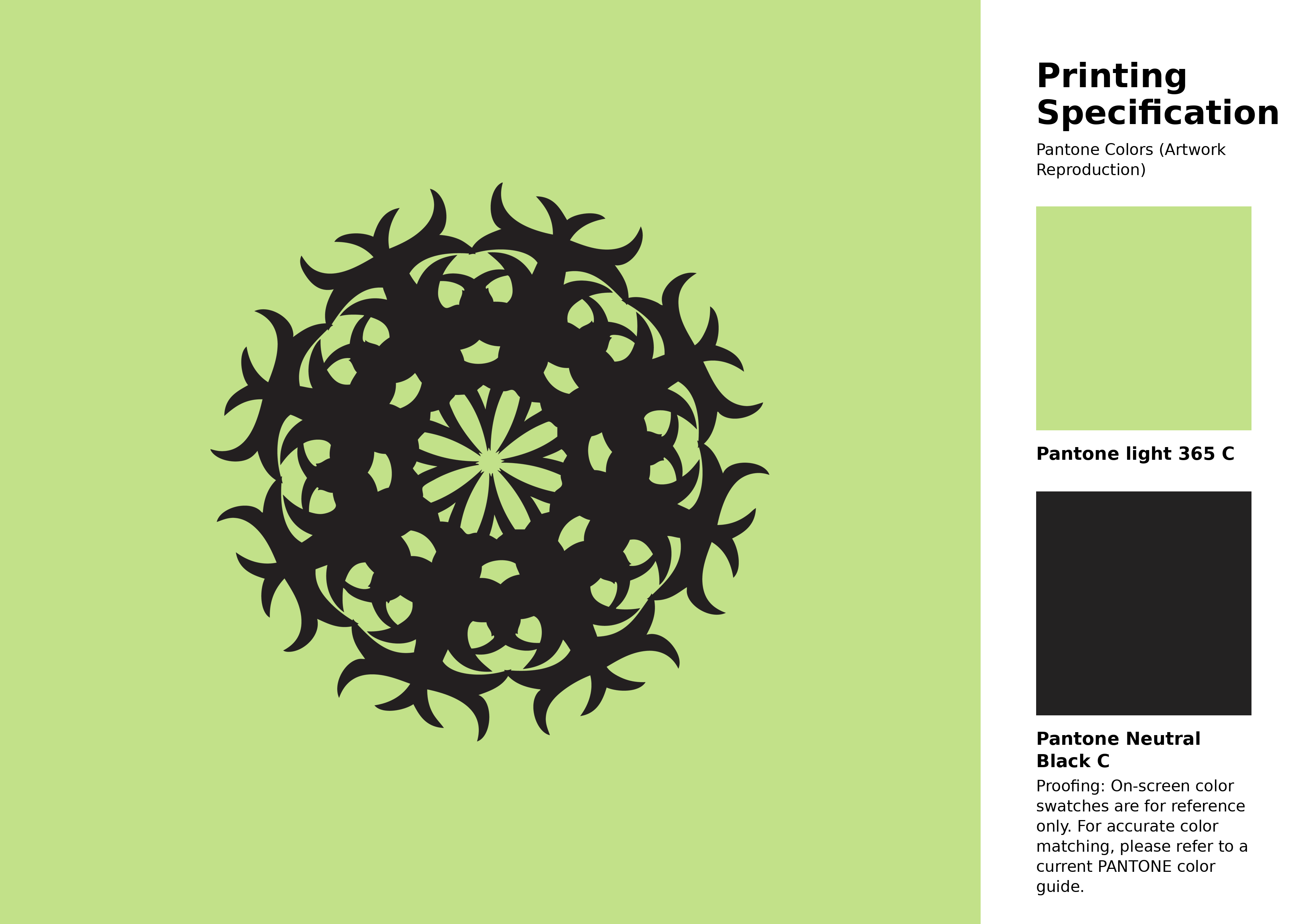
#c2e189 Pantone 365 C Color | Hex color Code #c2e189 Artwork Image (PNG)
Download Artwork (PNG)#c2e189 Pantone 365 C Color | Hex color Code #c2e189 Artwork Vector (PDF)
Download Artwork (PDF)#c2e189 Pantone 365 C Color | Hex color Code #c2e189 Artwork Vector (SVG)
Download Artwork (SVG)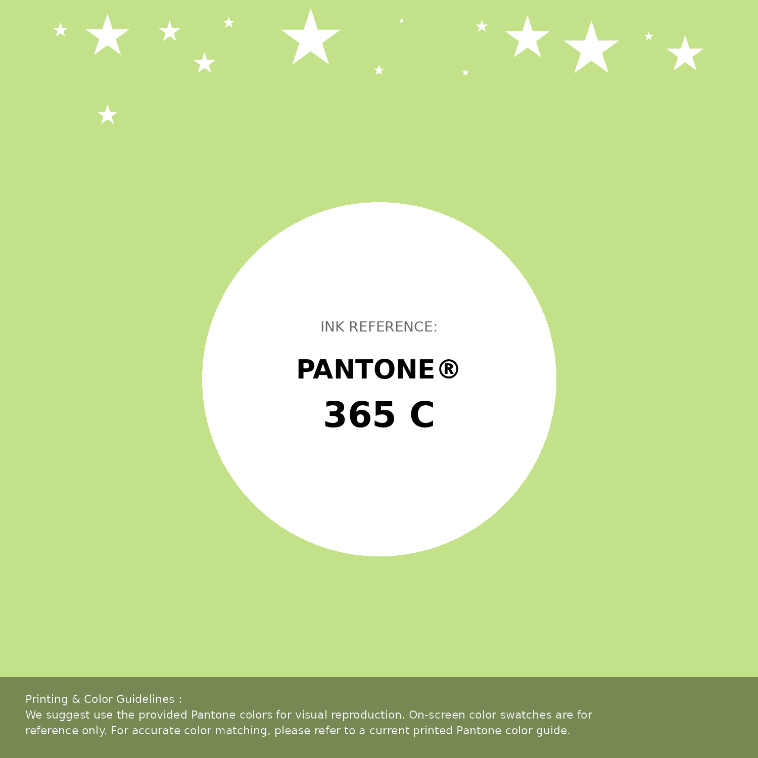
#c2e189 Pantone 365 C Color | Hex color Code #c2e189 Pantone Swatch Artwork
Download Artwork Swatch
#c2e189 Pantone 365 C Color | Hex color Code #c2e189 Gradient Artwork (PNG)
Download Gradient (PNG)#c2e189 Pantone 365 C Color | Hex color Code #c2e189 Gradient Artwork (SVG)
Download Gradient (SVG)
#c2e189 Pantone 365 C Color | Hex color Code #c2e189 T-Shirt Mockup
Download T-Shirt Mockup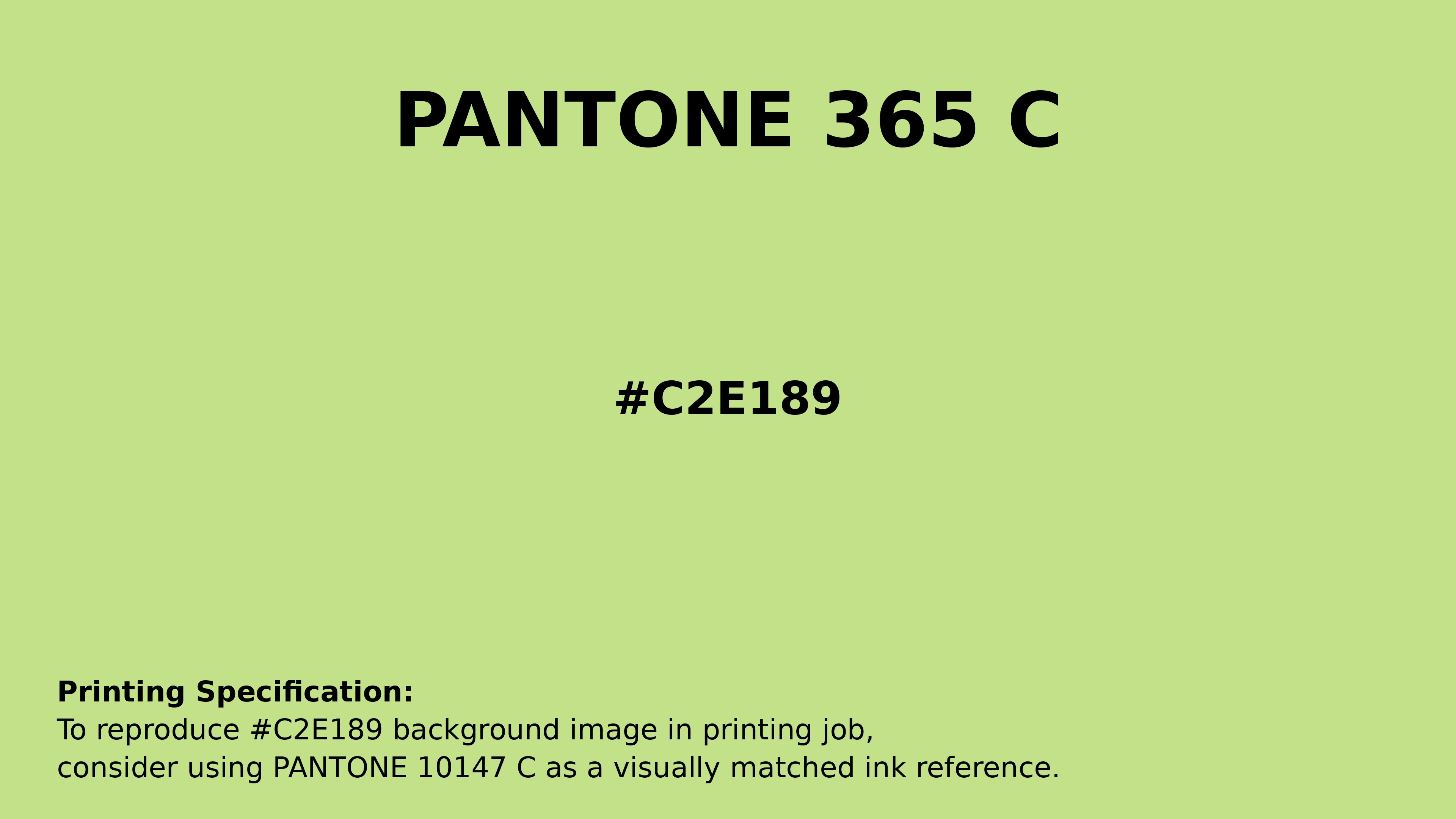
#c2e189 Pantone 365 C Color | Hex color Code #c2e189 Printing Artwork Pantone Reference
Download Pantone Printing ReferenceRelated Color Palettes
- Beige and Dark Olive Green •
- Medium Aquamarine and Beige •
- Beige and Sienna •
- Beige and Chocolate •
- Pale Violet Red and Beige •
- Khaki and Beige •
- White and Beige •
- Peru and Beige •
- Beige and Steel Blue •
- Beige and Dark Sea Green •
- Beige and Thistle •
- Light Sea Green and Beige •
- Beige and Gray •
- Light Gray and Beige •
- Beige and Dark Gray
Color Palette Collection
Yadunna
1 color palettes with 5 colors.

30+ Purple Color Palettes
31 color palettes with 155 colors.

20 Pink Color Schemes
20 color palettes with 100 colors.
Chardonnay
1 color palettes with 5 colors.