#006341 Color
Your all-in-one color resource. Download hex background images, Adobe swatches (ASE), PDF color sheets, and SVG files. Explore palettes, harmonies, accessibility, conversions, and professional exports — designed for designers, developers, and color perfectionists.
This deep, verdant green evokes a sense of calm, grounding, and natural abundance. It reminds of lush forests, springtime meadows, and the rich earth after rain. The color suggests peace, prosperity, and a connection to nature. It creates a soothing and comforting atmosphere, perfect for bedrooms, meditation spaces, or offices needing to foster focus. The color's earthy tones promote feelings of stability and security, while also offering a feeling of growth and new beginnings. In design, it can be used to create a sense of tranquility and balance, or to bring a feeling of freshness and renewal. Visually matched named color: Emerald Haven.
PANTONE 3425 C
Choose Color
Selected Color
Recent Colors
Color Details
Similar Ink Alternatives for #006341 color Alternative print inks for reproducing #006341 background image with a similar visual appearance.
Disclaimer: The visually matched ink reference is an independent approximation intended as a guide only. Please be advised that this pantone colors is only intended as a guide, Actual colours will depend on screen calibration variances. The print ink suggestions provided are independent visual approximations and are not affiliated with or endorsed by Pantone LLC. For official color specifications, conversion factors, and comprehensive color system information, please visit Pantone Connect. Official Pantone products can be purchased at pantone.com.
Color Previews for #000000 See how this color looks as a background or as text.
Complete Guide to Your Color Laboratory
Everything you need to know about this professional color toolkit.
Use the Color Picker at the top to select any color. All modules below update instantly.
Workflow: Pick a color → Explore palettes & data → Download what you need (PDF, Image, or Adobe ASE).
Color Details — Your color in all formats: HEX, RGB, RGBA, HSL, HSLA, HSV, CMYK, CIELab, Hunter-Lab, XYZ, Yxy, YUV. One-click copy.
Color Psychology — Emotional impact, cultural meanings, physiological effects, branding applications, and historical significance.
Named Colors — Find official color names (HTML/CSS, Pantone) that match your selection with similarity percentages.
Light & Dark Shades
80-step gradient from black to white. Perfect for button states and component systems.
Tints
Color mixed with white → lighter, pastel variations for backgrounds and disabled states.
Monochromatic — 11 curated tints/shades from one color. Production-ready for design systems.
- Complementary — Opposite on wheel (180°). High contrast.
- Analogous — Neighbors (±30°). Harmonious flow.
- Triadic — Three colors (120° apart). Vibrant, balanced.
- Split-Complementary — Base + two near-complements. Softer contrast.
- Tetradic/Square — Four colors. Complex, maximum variety.
- Neutral — Desaturated versions. Subtle, sophisticated.
15 Professional Variations — Monochromatic, Analogous, Complementary, Warm/Cool/Earth Tones, Pastel, Vibrant, High Contrast, and more.
Color Infusion — 10 palettes showing your color morphing into each major hue. Find bridge colors.
Similar Colors — 60+ colors generated via CIELAB Delta E matching. Unexpected harmonious combinations.
18 Ready-to-Use Gradients — Complementary, Analogous, Triadic, Tint/Shade progressions, and more.
Downloads: PNG (2560×1440), CSS (production-ready code), SVG (scalable vector).
WCAG Contrast Checker — Tests your color against white, black, and custom colors for AA (4.5:1) and AAA (7:1) compliance. Large text thresholds included.
Harmony & Accessibility Guide — Tests against 10 canonical hues. Shows which pairs are both beautiful AND WCAG-compliant for text.
PNG/JPG — High-res images for presentations and mood boards.
PDF — Print-ready reports for clients and teams.
Adobe ASE — Direct import to Photoshop, Illustrator, InDesign, XD.
CSS/SVG — Gradients only. Production-ready code and vectors.
Color Science: Industry-standard conversions (HSL, CIELAB, CMYK, XYZ). WCAG 2.1 luminance formula. Delta E (ΔE76) for perceptual matching.
Direct Links: Share colors via icolorpalette.com/color/ff5733 or icolorpalette.com/color/red
Issues? Refresh the page, wait for rendering, try another browser, or check console (F12) for errors.
Printing Guide for #006341 Background Image
Use PANTONE 3425 C as a visually matched ink reference when printing this background image.
To print the #006341 background image from our site, consider using PANTONE 3425 C as a visually matched ink reference.
Download the background image, then provide this reference code to your print vendor to help achieve accurate color reproduction.
The visually matched ink reference for the #006341 background image is PANTONE 3425 C.
This color is commonly described as Emerald Haven.
This deep, verdant green evokes a sense of calm, grounding, and natural abundance. It reminds of lush forests, springtime meadows, and the rich earth after rain. The color suggests peace, prosperity, and a connection to nature. It creates a soothing and comforting atmosphere, perfect for bedrooms, meditation spaces, or offices needing to foster focus. The color's earthy tones promote feelings of stability and security, while also offering a feeling of growth and new beginnings. In design, it can be used to create a sense of tranquility and balance, or to bring a feeling of freshness and renewal.
We provide PANTONE 3425 C as a visually matched ink reference to help you reproduce the #006341 background image accurately in professional printing.
This reference code helps print vendors achieve consistent color output across different printing equipment and materials.
After downloading the #006341 background image from our site:
- Include the visually matched ink reference PANTONE 3425 C in your print order notes
- Inform your print vendor that this is your target color reference
- Request a proof print to verify the Emerald Haven color appearance before full production
The #006341 background image with PANTONE 3425 C as visually matched ink reference can be used for:
- Posters, banners, and backdrops
- Business cards, brochures, and flyers
- Packaging, labels, and stickers
- Signage and promotional materials
This is an independent visual approximation.
While PANTONE 3425 C closely matches the #006341 background image color, variations may exist between screen display and printed output.
We recommend requesting a proof print to verify the final appearance.
This deep, verdant green evokes a sense of calm, grounding, and natural abundance. It reminds of lush forests, springtime meadows, and the rich earth after rain. The color suggests peace, prosperity, and a connection to nature. It creates a soothing and comforting atmosphere, perfect for bedrooms, meditation spaces, or offices needing to foster focus. The color's earthy tones promote feelings of stability and security, while also offering a feeling of growth and new beginnings. In design, it can be used to create a sense of tranquility and balance, or to bring a feeling of freshness and renewal.
Understanding these associations helps ensure the #006341 background image aligns with your intended message and brand impact.
Important Information
The visually matched ink reference is an independent approximation intended as a guide only.
Actual printed colors may vary depending on screen calibration, substrate material, ink type, and printing equipment used.
For official color specifications and certified color standards, visit Pantone Connect.
Official color guides and swatch books can be purchased from pantone.com.
Pantone 3425 C Color: Verdant Green | #006341
Introduction:
Verdant Green, also known as Pantone 3425 C, is a rich and vibrant shade of green. It exudes a sense of lushness and vitality, drawing inspiration from the abundant greenery found in nature.
Historical Significance:
Classical Period: Verdant Green was widely used during the Classical Period in ancient Greece and Rome. It adorned the walls of temples and palaces, symbolizing fertility and growth.
Renaissance Art: Artists during the Renaissance period, such as Leonardo da Vinci and Michelangelo, incorporated Verdant Green into their paintings to depict landscapes and convey the beauty of nature.
Symbolism and Meaning:
Nature: Verdant Green is often associated with nature and the environment. It represents freshness, vitality, and harmony with the natural world.
Growth and Renewal: The color symbolizes growth, renewal, and rejuvenation. It is often used to inspire feelings of optimism and new beginnings.
Verdant Green in Fashion:
Runway Trends: Verdant Green has been a popular choice among fashion designers for showcasing vibrant and fresh looks on the runway. It adds a touch of nature-inspired elegance to clothing and accessories.
Eco-Friendly Fashion: As sustainability gains importance in the fashion industry, Verdant Green is often used by brands that promote eco-friendly practices. It represents a commitment to the environment and ethical fashion choices.
Verdant Green in Graphic Design:
Aesthetic Appeal: In graphic design, Verdant Green is known for its visual impact and ability to evoke a sense of natural beauty. It is often used in branding and design to convey freshness, growth, and harmony.
Environmental Awareness: Graphic designers often incorporate Verdant Green into designs promoting environmental causes or organizations, emphasizing the importance of sustainability and eco-consciousness.
Color Combinations:
Harmonious Combinations: Verdant Green pairs well with complementary colors such as crisp whites, earthy browns, and soft blues. It also creates a striking contrast when combined with vibrant yellows or warm oranges.
Nature-inspired Combinations: To create a natural and serene color palette, Verdant Green can be paired with shades of moss green, leafy greens, and floral-inspired hues like lavender or soft pink.
Nature's Palette:
Flora: Verdant Green is prominently found in various plant species, including lush leaves, grass, and moss. It represents the vibrancy and vitality of the natural world.
Landscape: In forests, meadows, and gardens, Verdant Green dominates the scenery, creating a sense of tranquility and connection to nature.
Artistic Representations:
Impressionist Art: Artists like Claude Monet and Pierre-Auguste Renoir used Verdant Green extensively in their impressionist paintings to capture the beauty and essence of natural landscapes.
Abstract Art: In abstract art, Verdant Green is often employed to represent elements of nature or to evoke a sense of organic energy and growth.
Movies and Cinematic Landscapes:
Verdant Green is often used in movies to create lush cinematic landscapes. It is frequently seen in scenes depicting idyllic countryside settings or enchanted forests.
Products and Commercial Appeal:
Cosmetics: Verdant Green is commonly used in cosmetics, particularly in eyeshadows and nail polishes, to create fresh and vibrant looks.
Nature-inspired Brands: Many eco-friendly and nature-inspired brands incorporate Verdant Green into their packaging and branding to convey a strong connection to the environment and promote sustainable products.
National Symbols and Significance:
Ireland: Verdant Green is strongly associated with Ireland, often referred to as the "Emerald Isle." It symbolizes the country's lush landscapes and is recognized as a national color.
The Psychological and Emotional Impact:
Verdant Green evokes feelings of calmness, balance, and rejuvenation. It is believed to promote relaxation, encourage harmony, and reduce stress.
Conclusion:
Verdant Green, with its historical significance, symbolism, and association with nature, holds a timeless appeal. It represents growth, renewal, and harmony, making it a versatile and visually captivating color choice in various industries and art forms.
Pantone 3425 C Color | Hex color Code #006341 Image & Artwork
Download high-quality assets for your projects.

#006341 Color Schemes
Download Color Schemes
#006341 Color Shades
Download Color Shades
Pantone 3425 C Color | Hex color Code #006341 Solid Color Background
Download Solid Color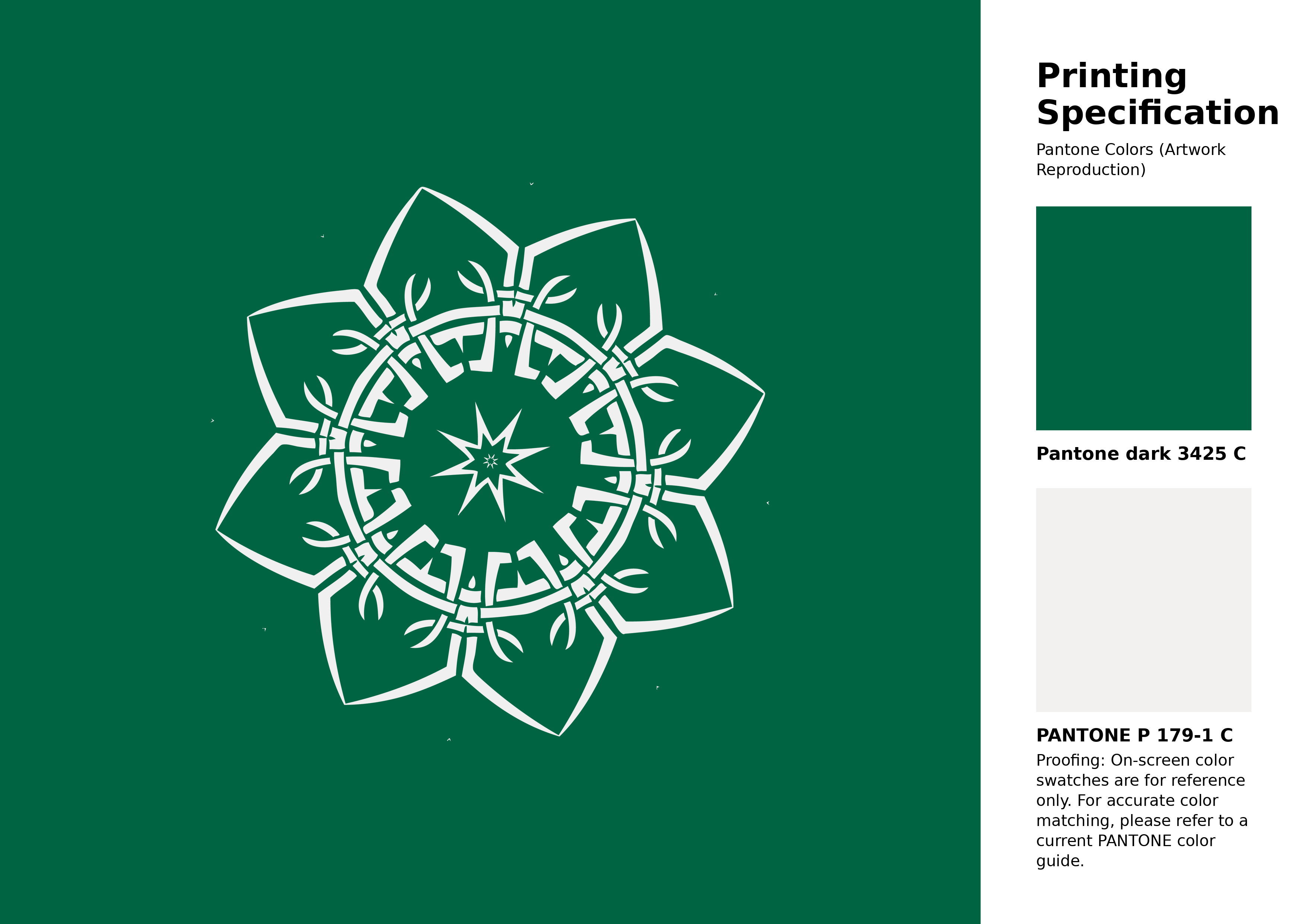
#006341 Pantone 3425 C Color | Hex color Code #006341 Artwork Image (PNG)
Download Artwork (PNG)#006341 Pantone 3425 C Color | Hex color Code #006341 Artwork Vector (PDF)
Download Artwork (PDF)#006341 Pantone 3425 C Color | Hex color Code #006341 Artwork Vector (SVG)
Download Artwork (SVG)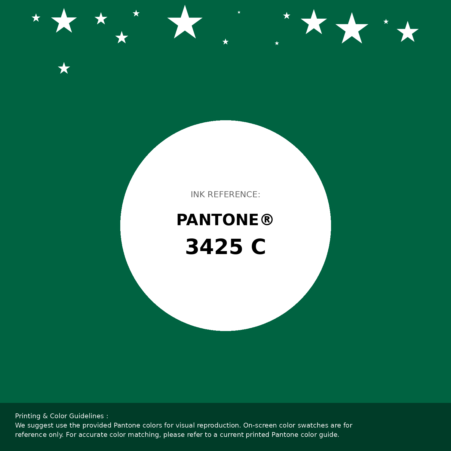
#006341 Pantone 3425 C Color | Hex color Code #006341 Pantone Swatch Artwork
Download Artwork Swatch
#006341 Pantone 3425 C Color | Hex color Code #006341 Gradient Artwork (PNG)
Download Gradient (PNG)#006341 Pantone 3425 C Color | Hex color Code #006341 Gradient Artwork (SVG)
Download Gradient (SVG)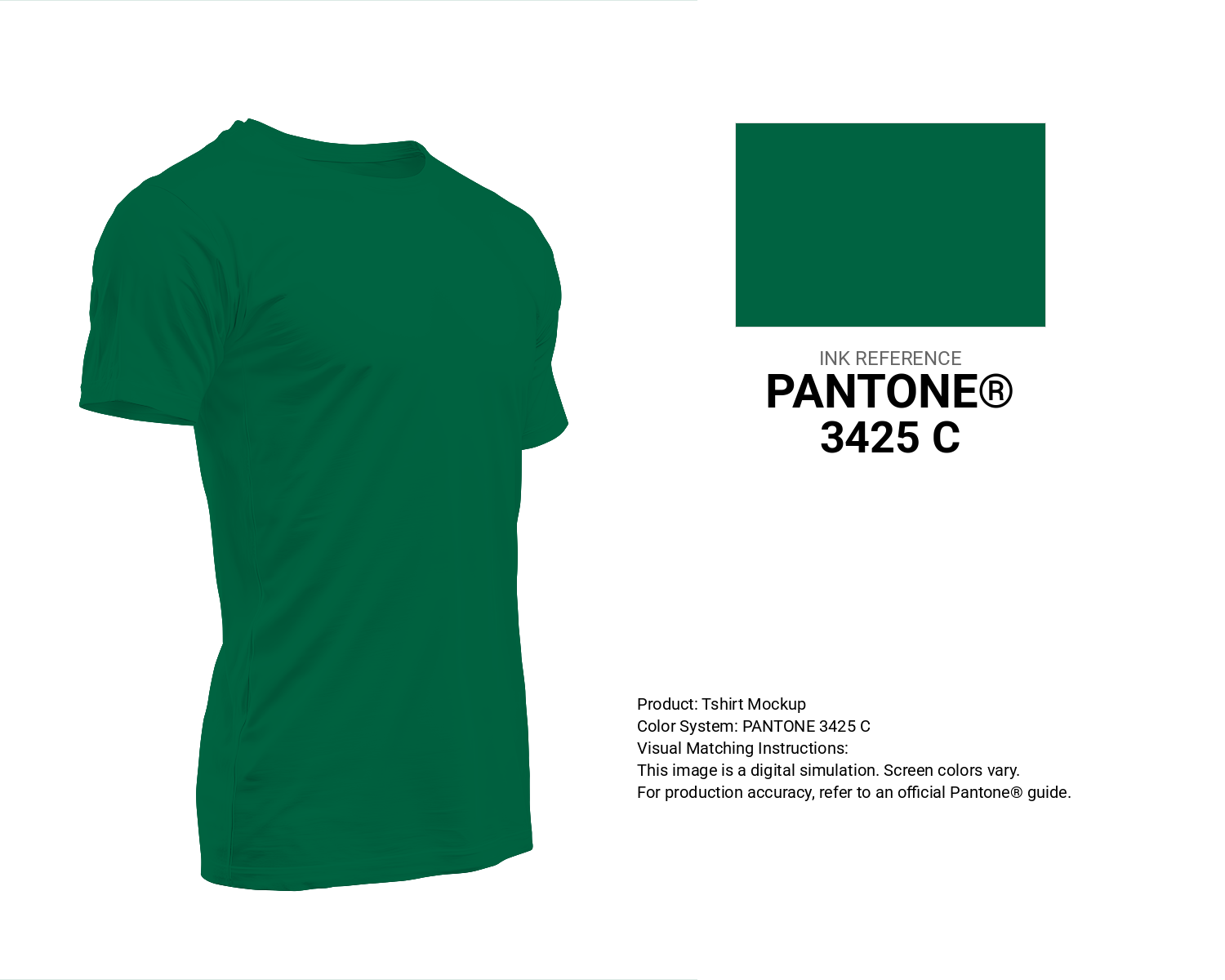
#006341 Pantone 3425 C Color | Hex color Code #006341 T-Shirt Mockup
Download T-Shirt Mockup
#006341 Pantone 3425 C Color | Hex color Code #006341 Printing Artwork Pantone Reference
Download Pantone Printing ReferenceRelated Color Palettes
- Dark Gray and Pale Violet Red •
- Wheat and Dark Gray •
- Dark Gray and Fire Brick •
- Dim Gray and Dark Gray •
- Saddle Brown and Dark Gray •
- Dark Slate Blue and Dark Gray •
- Dark Gray and Maroon •
- Dark Gray and Light Gray •
- Dark Slate Gray and Dark Gray •
- Dark Gray and Lavender •
- Thistle and Dark Gray •
- Light Gray and Dark Gray •
- Yellow Green and Dark Gray •
- Indian Red and Dark Gray •
- Dark Gray and Saddle Brown
Color Palette Collection

20 Turquoise Color Palettes
20 color palettes with 100 colors.

31 Purple Color Combinations
31 color palettes with 155 colors.

49 Green Color Combinations
49 color palettes with 245 colors.

24 Summer Color Palettes
24 color palettes with 120 colors.