#00BFB3 Color
Your all-in-one color resource. Download hex background images, Adobe swatches (ASE), PDF color sheets, and SVG files. Explore palettes, harmonies, accessibility, conversions, and professional exports — designed for designers, developers, and color perfectionists.
#00BFB3, a vibrant teal, evokes a sense of calm and refreshing energy. Its blend of blue and green suggests both the tranquility of deep water and the vibrancy of lush vegetation. It reminds one of a clear, shallow tropical sea, perhaps a calm lagoon reflecting the sky. This color promotes feelings of peace, serenity, and revitalization, offering a sense of escape and rejuvenation. The mood it creates is optimistic and uplifting, yet soothing and calming. In design, it would be suitable for spaces promoting relaxation and well-being, such as spas, wellness centers, or bedrooms. It could also be used to create a feeling of freshness and cleanliness in kitchens or bathrooms. The color has subtle associations with nature's restorative power and the feeling of being near a body of clean, clear water. Visually matched named color: Aqua Serenity.
PANTONE 3262 C
Choose Color
Selected Color
Recent Colors
Color Details
Similar Ink Alternatives for #00BFB3 color Alternative print inks for reproducing #00BFB3 background image with a similar visual appearance.
Disclaimer: The visually matched ink reference is an independent approximation intended as a guide only. Please be advised that this pantone colors is only intended as a guide, Actual colours will depend on screen calibration variances. The print ink suggestions provided are independent visual approximations and are not affiliated with or endorsed by Pantone LLC. For official color specifications, conversion factors, and comprehensive color system information, please visit Pantone Connect. Official Pantone products can be purchased at pantone.com.
Color Previews for #000000 See how this color looks as a background or as text.
Complete Guide to Your Color Laboratory
Everything you need to know about this professional color toolkit.
Use the Color Picker at the top to select any color. All modules below update instantly.
Workflow: Pick a color → Explore palettes & data → Download what you need (PDF, Image, or Adobe ASE).
Color Details — Your color in all formats: HEX, RGB, RGBA, HSL, HSLA, HSV, CMYK, CIELab, Hunter-Lab, XYZ, Yxy, YUV. One-click copy.
Color Psychology — Emotional impact, cultural meanings, physiological effects, branding applications, and historical significance.
Named Colors — Find official color names (HTML/CSS, Pantone) that match your selection with similarity percentages.
Light & Dark Shades
80-step gradient from black to white. Perfect for button states and component systems.
Tints
Color mixed with white → lighter, pastel variations for backgrounds and disabled states.
Monochromatic — 11 curated tints/shades from one color. Production-ready for design systems.
- Complementary — Opposite on wheel (180°). High contrast.
- Analogous — Neighbors (±30°). Harmonious flow.
- Triadic — Three colors (120° apart). Vibrant, balanced.
- Split-Complementary — Base + two near-complements. Softer contrast.
- Tetradic/Square — Four colors. Complex, maximum variety.
- Neutral — Desaturated versions. Subtle, sophisticated.
15 Professional Variations — Monochromatic, Analogous, Complementary, Warm/Cool/Earth Tones, Pastel, Vibrant, High Contrast, and more.
Color Infusion — 10 palettes showing your color morphing into each major hue. Find bridge colors.
Similar Colors — 60+ colors generated via CIELAB Delta E matching. Unexpected harmonious combinations.
18 Ready-to-Use Gradients — Complementary, Analogous, Triadic, Tint/Shade progressions, and more.
Downloads: PNG (2560×1440), CSS (production-ready code), SVG (scalable vector).
WCAG Contrast Checker — Tests your color against white, black, and custom colors for AA (4.5:1) and AAA (7:1) compliance. Large text thresholds included.
Harmony & Accessibility Guide — Tests against 10 canonical hues. Shows which pairs are both beautiful AND WCAG-compliant for text.
PNG/JPG — High-res images for presentations and mood boards.
PDF — Print-ready reports for clients and teams.
Adobe ASE — Direct import to Photoshop, Illustrator, InDesign, XD.
CSS/SVG — Gradients only. Production-ready code and vectors.
Color Science: Industry-standard conversions (HSL, CIELAB, CMYK, XYZ). WCAG 2.1 luminance formula. Delta E (ΔE76) for perceptual matching.
Direct Links: Share colors via icolorpalette.com/color/ff5733 or icolorpalette.com/color/red
Issues? Refresh the page, wait for rendering, try another browser, or check console (F12) for errors.
Printing Guide for #00bfb3 Background Image
Use PANTONE 3262 C as a visually matched ink reference when printing this background image.
To print the #00bfb3 background image from our site, consider using PANTONE 3262 C as a visually matched ink reference.
Download the background image, then provide this reference code to your print vendor to help achieve accurate color reproduction.
The visually matched ink reference for the #00bfb3 background image is PANTONE 3262 C.
This color is commonly described as Aqua Serenity.
#00BFB3, a vibrant teal, evokes a sense of calm and refreshing energy. Its blend of blue and green suggests both the tranquility of deep water and the vibrancy of lush vegetation. It reminds one of a clear, shallow tropical sea, perhaps a calm lagoon reflecting the sky. This color promotes feelings of peace, serenity, and revitalization, offering a sense of escape and rejuvenation. The mood it creates is optimistic and uplifting, yet soothing and calming. In design, it would be suitable for spaces promoting relaxation and well-being, such as spas, wellness centers, or bedrooms. It could also be used to create a feeling of freshness and cleanliness in kitchens or bathrooms. The color has subtle associations with nature's restorative power and the feeling of being near a body of clean, clear water.
We provide PANTONE 3262 C as a visually matched ink reference to help you reproduce the #00bfb3 background image accurately in professional printing.
This reference code helps print vendors achieve consistent color output across different printing equipment and materials.
After downloading the #00bfb3 background image from our site:
- Include the visually matched ink reference PANTONE 3262 C in your print order notes
- Inform your print vendor that this is your target color reference
- Request a proof print to verify the Aqua Serenity color appearance before full production
The #00bfb3 background image with PANTONE 3262 C as visually matched ink reference can be used for:
- Posters, banners, and backdrops
- Business cards, brochures, and flyers
- Packaging, labels, and stickers
- Signage and promotional materials
This is an independent visual approximation.
While PANTONE 3262 C closely matches the #00bfb3 background image color, variations may exist between screen display and printed output.
We recommend requesting a proof print to verify the final appearance.
#00BFB3, a vibrant teal, evokes a sense of calm and refreshing energy. Its blend of blue and green suggests both the tranquility of deep water and the vibrancy of lush vegetation. It reminds one of a clear, shallow tropical sea, perhaps a calm lagoon reflecting the sky. This color promotes feelings of peace, serenity, and revitalization, offering a sense of escape and rejuvenation. The mood it creates is optimistic and uplifting, yet soothing and calming. In design, it would be suitable for spaces promoting relaxation and well-being, such as spas, wellness centers, or bedrooms. It could also be used to create a feeling of freshness and cleanliness in kitchens or bathrooms. The color has subtle associations with nature's restorative power and the feeling of being near a body of clean, clear water.
Understanding these associations helps ensure the #00bfb3 background image aligns with your intended message and brand impact.
Important Information
The visually matched ink reference is an independent approximation intended as a guide only.
Actual printed colors may vary depending on screen calibration, substrate material, ink type, and printing equipment used.
For official color specifications and certified color standards, visit Pantone Connect.
Official color guides and swatch books can be purchased from pantone.com.
Pantone 3262 C Color: Aquamarine | #00BFB3
Introduction:
Aquamarine is a vibrant and refreshing color that embodies the essence of the sea. Its beautiful blue-green shade evokes a sense of tranquility and calmness, making it a popular choice in various design applications.
Historical Significance:
Importance in Ancient Art: Aquamarine was used extensively in ancient Roman and Greek art, particularly in jewelry and decorative objects. It was believed to symbolize eternal youth and happiness.
Modern Significance: Aquamarine gained popularity in the early 20th century and was often associated with the Art Nouveau movement. It became a symbol of elegance and sophistication.
Symbolism and Meaning:
Tranquility and Serenity: Aquamarine symbolizes tranquility and serenity. Its calming properties are believed to promote peace and harmony.
Clear Communication: Aquamarine is associated with clear communication and self-expression. It is believed to enhance one's ability to express thoughts and feelings.
Aquamarine in Fashion:
Trendy and Refreshing: Aquamarine has been a popular color in the fashion industry, particularly during spring and summer seasons. It adds a refreshing and trendy touch to outfits and accessories.
Aquamarine in Graphic Design:
Aesthetic Appeal: Aquamarine is widely used in graphic design due to its aesthetic appeal. It adds a sense of tranquility and sophistication to designs, making it suitable for various branding and visual impact purposes.
Color Combinations:
Complementary Colors: Aquamarine pairs well with colors such as coral, peach, and pink, creating a harmonious and vibrant combination. It also works well with neutrals like white and gray, providing a balanced and elegant look.
Nature’s Palette:
Oceanic Inspiration: Aquamarine draws inspiration from the beautiful color of the ocean. It can be found in various natural elements such as turquoise waters, coral reefs, and gemstones.
Artistic Representations:
Artistic Expression: Aquamarine has been used by artists in paintings, sculptures, and other forms of art. It adds a refreshing and soothing element to artworks, capturing the essence of nature.
Movies and Cinematic Landscapes:
Aqua Themes: Aquamarine is often featured in movies and cinematic landscapes that revolve around water, such as ocean scenes, underwater adventures, and tropical settings.
Products and Commercial Appeal:
Jewelry and Accessories: Aquamarine is commonly used in jewelry, especially in gemstone settings and beaded designs. It is also seen in various fashion accessories such as bags, scarves, and shoes.
National Symbols and Significance:
March Birthstone: Aquamarine is the birthstone for the month of March. It is associated with loyalty, honesty, and good health, making it a significant symbol in many cultures.
The Psychological and Emotional Impact:
Relaxation and Harmony: Aquamarine has a calming and soothing effect on individuals. It promotes relaxation, reduces stress, and enhances emotional balance.
Conclusion:
Aquamarine, with its rich historical significance, symbolic meaning, and aesthetic appeal, continues to be a timeless color choice. Whether in fashion, graphic design, or artistic expressions, it brings a sense of tranquility and elegance, making it a versatile and captivating color.
Pantone 3262 C Color | Hex color Code #00bfb3 Image & Artwork
Download high-quality assets for your projects.

#00bfb3 Color Schemes
Download Color Schemes
#00bfb3 Color Shades
Download Color Shades
Pantone 3262 C Color | Hex color Code #00bfb3 Solid Color Background
Download Solid Color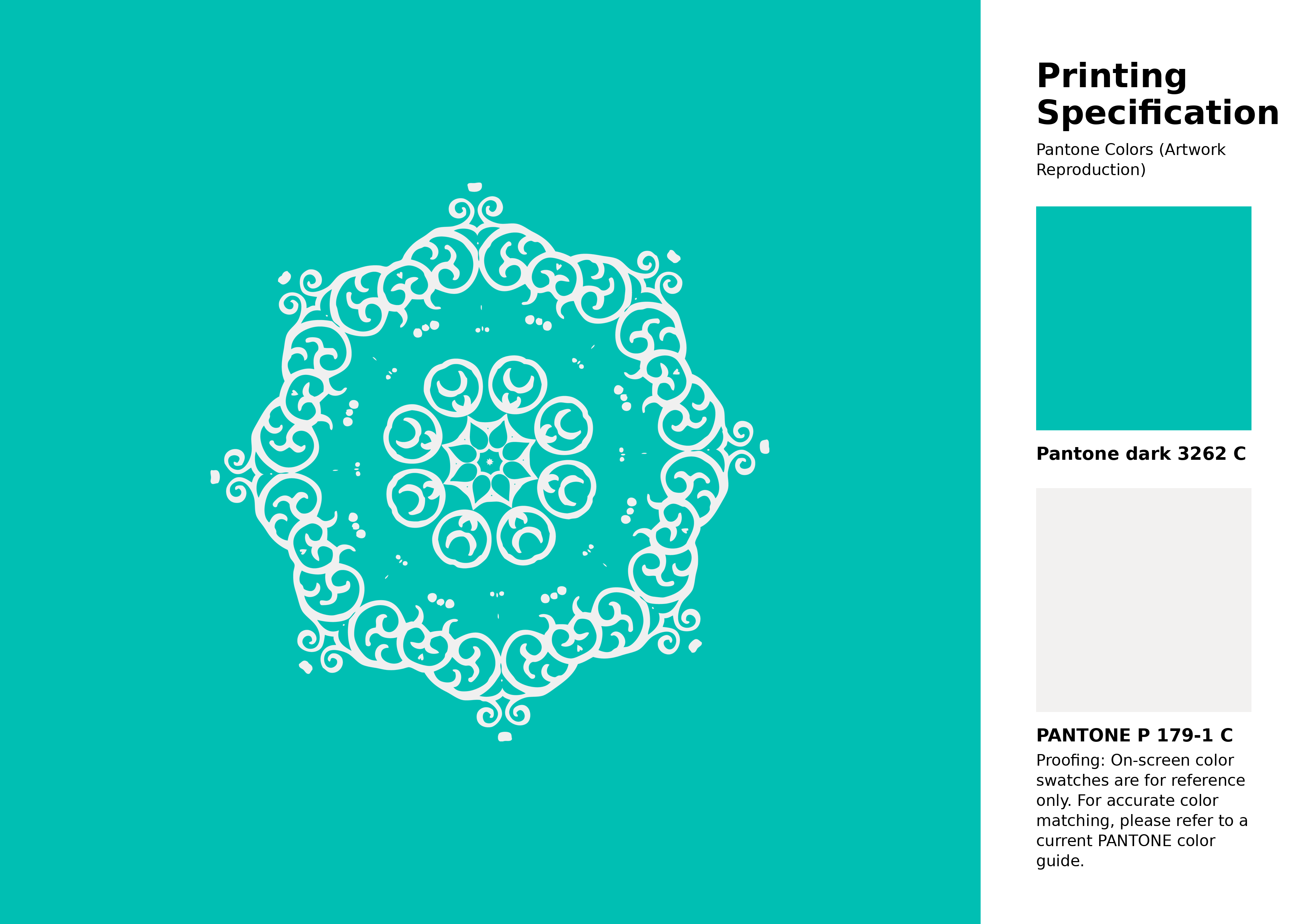
#00bfb3 Pantone 3262 C Color | Hex color Code #00bfb3 Artwork Image (PNG)
Download Artwork (PNG)#00bfb3 Pantone 3262 C Color | Hex color Code #00bfb3 Artwork Vector (PDF)
Download Artwork (PDF)#00bfb3 Pantone 3262 C Color | Hex color Code #00bfb3 Artwork Vector (SVG)
Download Artwork (SVG)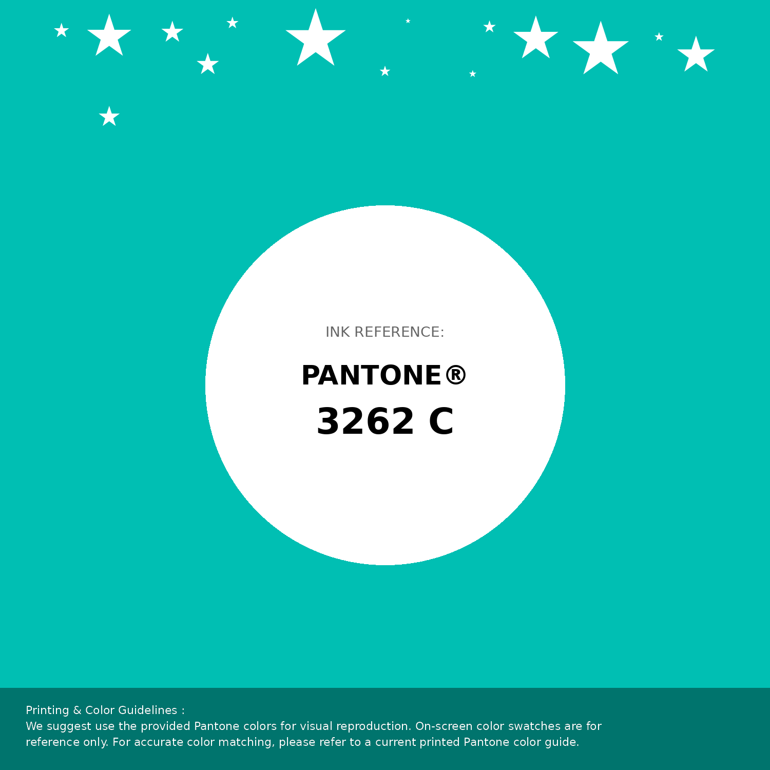
#00bfb3 Pantone 3262 C Color | Hex color Code #00bfb3 Pantone Swatch Artwork
Download Artwork Swatch
#00bfb3 Pantone 3262 C Color | Hex color Code #00bfb3 Gradient Artwork (PNG)
Download Gradient (PNG)#00bfb3 Pantone 3262 C Color | Hex color Code #00bfb3 Gradient Artwork (SVG)
Download Gradient (SVG)
#00bfb3 Pantone 3262 C Color | Hex color Code #00bfb3 T-Shirt Mockup
Download T-Shirt Mockup
#00bfb3 Pantone 3262 C Color | Hex color Code #00bfb3 Printing Artwork Pantone Reference
Download Pantone Printing ReferenceRelated Color Palettes
- Pale Turquoise and Light Sky Blue •
- Pale Turquoise and Royal Blue •
- Dark Slate Blue and Pale Turquoise •
- Medium Turquoise and Medium Turquoise •
- Teal and Medium Turquoise •
- Pale Turquoise and Black •
- Pale Turquoise and Cornflower Blue •
- Turquoise and Midnight Blue •
- Pale Turquoise and Cadet Blue •
- Dark Turquoise and Dark Slate Gray •
- Lavender and Pale Turquoise •
- Midnight Blue and Pale Turquoise •
- Pale Turquoise and Lavender •
- Pale Turquoise and Beige •
- Light Blue and Pale Turquoise
Color Palette Collection
65 Red Color Palettes
65 color palettes with 325 colors.

30+ Purple Color Palettes
31 color palettes with 155 colors.

31 Purple Color Combinations
31 color palettes with 155 colors.
My Red Color Palettes
20 color palettes with 100 colors.