#00205B Color
Your all-in-one color resource. Download hex background images, Adobe swatches (ASE), PDF color sheets, and SVG files. Explore palettes, harmonies, accessibility, conversions, and professional exports — designed for designers, developers, and color perfectionists.
#00205B is a deep, rich blue, verging on navy, with a hint of subtle green undertone. The emotional impact is one of quiet intensity and mystery, evoking the deep ocean's unknown depths. It suggests a sense of seriousness, sophistication, and perhaps even a touch of melancholy. It reminds one of twilight skies, a starless night, or the depths of a vast, unexplored sea. The atmosphere it creates is one of calm contemplation, introspection, and quiet power. In design, it could be used to create a sophisticated and calming environment, perhaps in a study, library, or high-end office space. Its darkness suggests authority and stability, while its subtle depth prevents it from feeling overly austere. The color lacks overt cheerfulness, suggesting more of a serious, thoughtful, and perhaps even slightly formal mood. Visually matched named color: Deep Sea Mystery.
PANTONE 281 C
Choose Color
Selected Color
Recent Colors
Color Details
Similar Ink Alternatives for #00205B color Alternative print inks for reproducing #00205B background image with a similar visual appearance.
Disclaimer: The visually matched ink reference is an independent approximation intended as a guide only. Please be advised that this pantone colors is only intended as a guide, Actual colours will depend on screen calibration variances. The print ink suggestions provided are independent visual approximations and are not affiliated with or endorsed by Pantone LLC. For official color specifications, conversion factors, and comprehensive color system information, please visit Pantone Connect. Official Pantone products can be purchased at pantone.com.
Color Previews for #000000 See how this color looks as a background or as text.
Complete Guide to Your Color Laboratory
Everything you need to know about this professional color toolkit.
Use the Color Picker at the top to select any color. All modules below update instantly.
Workflow: Pick a color → Explore palettes & data → Download what you need (PDF, Image, or Adobe ASE).
Color Details — Your color in all formats: HEX, RGB, RGBA, HSL, HSLA, HSV, CMYK, CIELab, Hunter-Lab, XYZ, Yxy, YUV. One-click copy.
Color Psychology — Emotional impact, cultural meanings, physiological effects, branding applications, and historical significance.
Named Colors — Find official color names (HTML/CSS, Pantone) that match your selection with similarity percentages.
Light & Dark Shades
80-step gradient from black to white. Perfect for button states and component systems.
Tints
Color mixed with white → lighter, pastel variations for backgrounds and disabled states.
Monochromatic — 11 curated tints/shades from one color. Production-ready for design systems.
- Complementary — Opposite on wheel (180°). High contrast.
- Analogous — Neighbors (±30°). Harmonious flow.
- Triadic — Three colors (120° apart). Vibrant, balanced.
- Split-Complementary — Base + two near-complements. Softer contrast.
- Tetradic/Square — Four colors. Complex, maximum variety.
- Neutral — Desaturated versions. Subtle, sophisticated.
15 Professional Variations — Monochromatic, Analogous, Complementary, Warm/Cool/Earth Tones, Pastel, Vibrant, High Contrast, and more.
Color Infusion — 10 palettes showing your color morphing into each major hue. Find bridge colors.
Similar Colors — 60+ colors generated via CIELAB Delta E matching. Unexpected harmonious combinations.
18 Ready-to-Use Gradients — Complementary, Analogous, Triadic, Tint/Shade progressions, and more.
Downloads: PNG (2560×1440), CSS (production-ready code), SVG (scalable vector).
WCAG Contrast Checker — Tests your color against white, black, and custom colors for AA (4.5:1) and AAA (7:1) compliance. Large text thresholds included.
Harmony & Accessibility Guide — Tests against 10 canonical hues. Shows which pairs are both beautiful AND WCAG-compliant for text.
PNG/JPG — High-res images for presentations and mood boards.
PDF — Print-ready reports for clients and teams.
Adobe ASE — Direct import to Photoshop, Illustrator, InDesign, XD.
CSS/SVG — Gradients only. Production-ready code and vectors.
Color Science: Industry-standard conversions (HSL, CIELAB, CMYK, XYZ). WCAG 2.1 luminance formula. Delta E (ΔE76) for perceptual matching.
Direct Links: Share colors via icolorpalette.com/color/ff5733 or icolorpalette.com/color/red
Issues? Refresh the page, wait for rendering, try another browser, or check console (F12) for errors.
Printing Guide for #00205b Background Image
Use PANTONE 281 C as a visually matched ink reference when printing this background image.
To print the #00205b background image from our site, consider using PANTONE 281 C as a visually matched ink reference.
Download the background image, then provide this reference code to your print vendor to help achieve accurate color reproduction.
The visually matched ink reference for the #00205b background image is PANTONE 281 C.
This color is commonly described as Deep Sea Mystery.
#00205B is a deep, rich blue, verging on navy, with a hint of subtle green undertone. The emotional impact is one of quiet intensity and mystery, evoking the deep ocean's unknown depths. It suggests a sense of seriousness, sophistication, and perhaps even a touch of melancholy. It reminds one of twilight skies, a starless night, or the depths of a vast, unexplored sea. The atmosphere it creates is one of calm contemplation, introspection, and quiet power. In design, it could be used to create a sophisticated and calming environment, perhaps in a study, library, or high-end office space. Its darkness suggests authority and stability, while its subtle depth prevents it from feeling overly austere. The color lacks overt cheerfulness, suggesting more of a serious, thoughtful, and perhaps even slightly formal mood.
We provide PANTONE 281 C as a visually matched ink reference to help you reproduce the #00205b background image accurately in professional printing.
This reference code helps print vendors achieve consistent color output across different printing equipment and materials.
After downloading the #00205b background image from our site:
- Include the visually matched ink reference PANTONE 281 C in your print order notes
- Inform your print vendor that this is your target color reference
- Request a proof print to verify the Deep Sea Mystery color appearance before full production
The #00205b background image with PANTONE 281 C as visually matched ink reference can be used for:
- Posters, banners, and backdrops
- Business cards, brochures, and flyers
- Packaging, labels, and stickers
- Signage and promotional materials
This is an independent visual approximation.
While PANTONE 281 C closely matches the #00205b background image color, variations may exist between screen display and printed output.
We recommend requesting a proof print to verify the final appearance.
#00205B is a deep, rich blue, verging on navy, with a hint of subtle green undertone. The emotional impact is one of quiet intensity and mystery, evoking the deep ocean's unknown depths. It suggests a sense of seriousness, sophistication, and perhaps even a touch of melancholy. It reminds one of twilight skies, a starless night, or the depths of a vast, unexplored sea. The atmosphere it creates is one of calm contemplation, introspection, and quiet power. In design, it could be used to create a sophisticated and calming environment, perhaps in a study, library, or high-end office space. Its darkness suggests authority and stability, while its subtle depth prevents it from feeling overly austere. The color lacks overt cheerfulness, suggesting more of a serious, thoughtful, and perhaps even slightly formal mood.
Understanding these associations helps ensure the #00205b background image aligns with your intended message and brand impact.
Important Information
The visually matched ink reference is an independent approximation intended as a guide only.
Actual printed colors may vary depending on screen calibration, substrate material, ink type, and printing equipment used.
For official color specifications and certified color standards, visit Pantone Connect.
Official color guides and swatch books can be purchased from pantone.com.
Pantone 281 C Color: Deep Blue | #00205B
Introduction:
Deep Blue, also known as Pantone 281 C, is a rich and vibrant shade of blue. With its prominent presence, it exudes a strong and authoritative vibe, while captivating the viewer with its visual allure.
Historical Significance:
Key moments in history: Deep Blue has been prominently used or played a significant role in various historical events. One notable example is its association with the United Nations, where it is often used to symbolize trust, stability, and unity.
Symbolism and Meaning:
Symbolism and Meaning: Deep Blue typically symbolizes qualities such as loyalty, confidence, and intelligence. It is often associated with calmness and depth, making it a popular choice for conveying trust and reliability in different cultures and contexts.
Deep Blue in Fashion:
Deep Blue in Fashion: This captivating shade has a significant impact on styles and trends within the fashion world. It is often used to create elegant and sophisticated looks, evoking a sense of confidence and poise in clothing and accessories.
Deep Blue in Graphic Design:
Significance in graphic design: Deep Blue holds great significance in design aesthetics, branding, and visual impact. It is commonly utilized to communicate professionalism, trustworthiness, and reliability, making it a popular choice for logos and corporate identities.
Color Combinations:
Color combinations: Deep Blue can be complemented by various colors to create visually appealing combinations. Some potential color combinations include Deep Blue with silver for a modern and sophisticated look, or Deep Blue with gold for a luxurious and regal feel.
Nature’s Palette:
Natural occurrences: Deep Blue can be found in various natural phenomena such as the vibrant blue color of the ocean, the rich blue petals of certain flowers like the Morning Glory, and the hues of exotic bird feathers.
Artistic Representations:
Artistic representations: Deep Blue has been widely used in various forms of art throughout history. It is often utilized to convey depth, tranquility, and emotions in paintings, sculptures, and installations.
Movies and Cinematic Landscapes:
Movies and cinematic landscapes: Deep Blue is frequently utilized in movies and cinematic scenes to set the tone or mood. Whether it is the vast expanse of the open ocean or the dark depths of outer space, Deep Blue plays a significant role in creating impactful visuals.
Products and Commercial Appeal:
Products and commercial appeal: Many popular products and brands have integrated Deep Blue into their branding to evoke a sense of trust, dependability, and sophistication. From luxury watches to financial institutions, Deep Blue is often used to project a professional image.
National Symbols and Significance:
National symbols and significance: Deep Blue is associated with national and cultural significance in various countries. For example, in the United States, it represents patriotism and is found in the national flag and other symbols of the nation.
The Psychological and Emotional Impact:
Psychological and emotional impact: Deep Blue has a profound influence on emotions and perceptions. It can evoke feelings of calmness, stability, and serenity, while also encouraging trust, focus, and productivity.
Conclusion:
Deep Blue, Pantone 281 C, holds a significant place in history and culture. With its timeless appeal and deep emotional impact, it continues to be a popular and versatile color in various fields, from art to design, fashion to branding.
Pantone 281 C Color | Hex color Code #00205b Image & Artwork
Download high-quality assets for your projects.

#00205b Color Schemes
Download Color Schemes
#00205b Color Shades
Download Color Shades
Pantone 281 C Color | Hex color Code #00205b Solid Color Background
Download Solid Color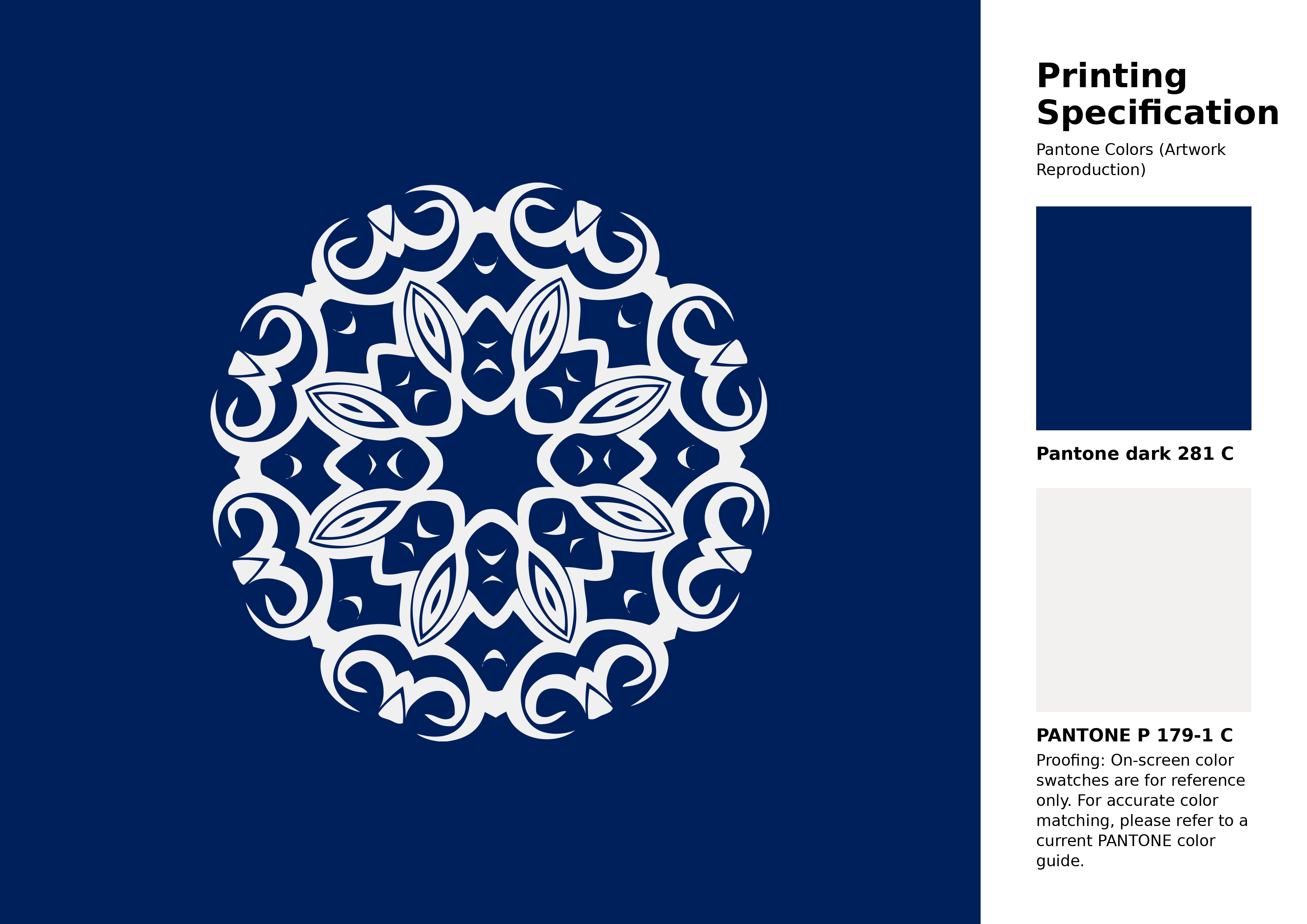
#00205b Pantone 281 C Color | Hex color Code #00205b Artwork Image (PNG)
Download Artwork (PNG)#00205b Pantone 281 C Color | Hex color Code #00205b Artwork Vector (PDF)
Download Artwork (PDF)#00205b Pantone 281 C Color | Hex color Code #00205b Artwork Vector (SVG)
Download Artwork (SVG)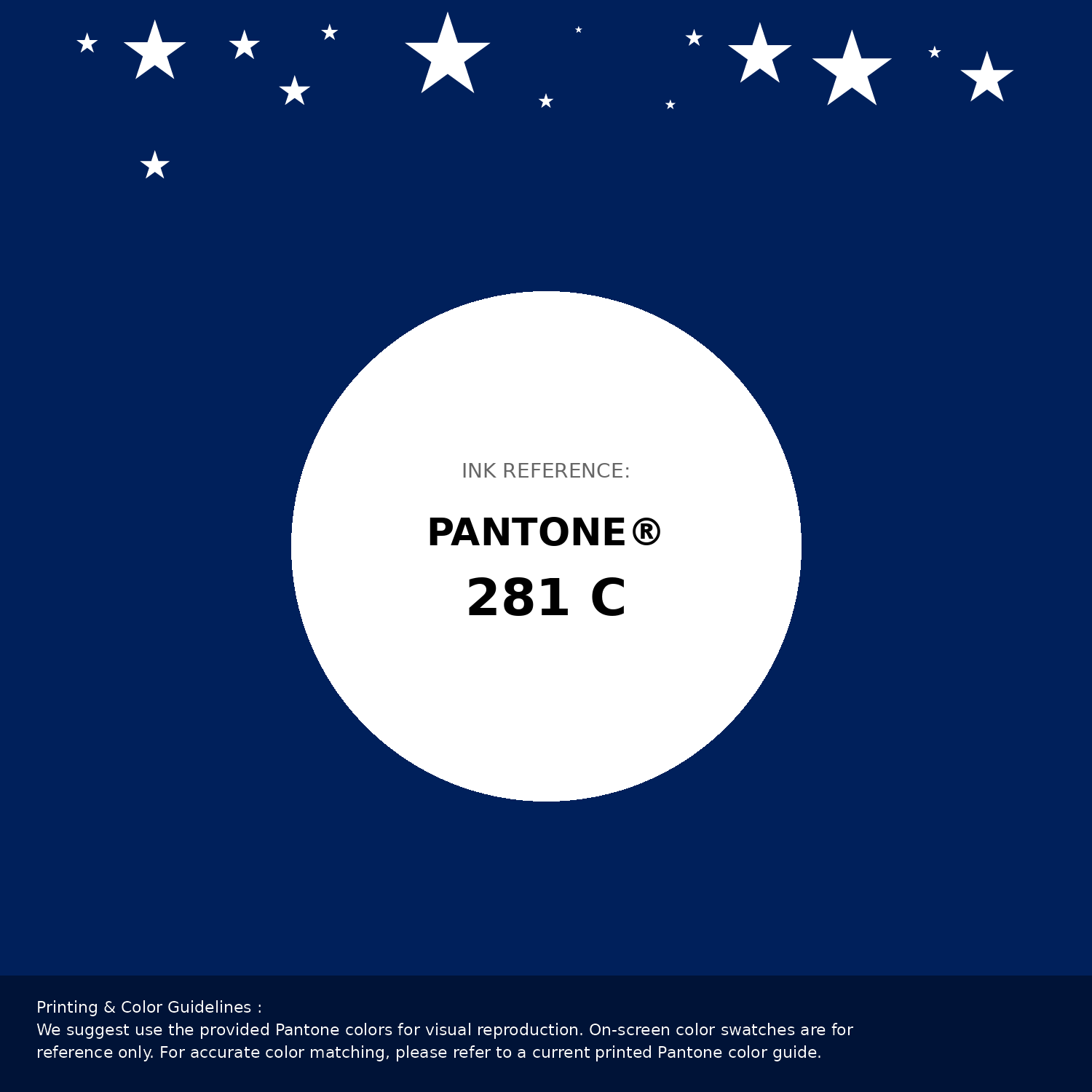
#00205b Pantone 281 C Color | Hex color Code #00205b Pantone Swatch Artwork
Download Artwork Swatch
#00205b Pantone 281 C Color | Hex color Code #00205b Gradient Artwork (PNG)
Download Gradient (PNG)#00205b Pantone 281 C Color | Hex color Code #00205b Gradient Artwork (SVG)
Download Gradient (SVG)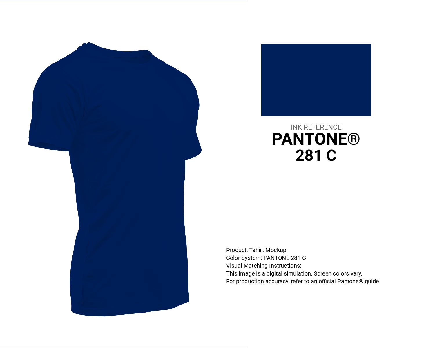
#00205b Pantone 281 C Color | Hex color Code #00205b T-Shirt Mockup
Download T-Shirt Mockup
#00205b Pantone 281 C Color | Hex color Code #00205b Printing Artwork Pantone Reference
Download Pantone Printing ReferenceRelated Color Palettes
- Dark Gray and Light Blue •
- Burly Wood and Dark Gray •
- Dark Gray and Thistle •
- Dark Gray and Steel Blue •
- Dark Gray and Slate Gray •
- Dim Gray and Dark Gray •
- Dark Gray and Light Gray •
- Dark Gray and Sandy Brown •
- Dark Gray and Silver •
- Pale Violet Red and Dark Gray •
- Dark Gray and Dim Gray •
- Brown and Dark Gray •
- Saddle Brown and Dark Gray •
- Dark Gray and Forest Green •
- Dark Gray and Fire Brick
Color Palette Collection
23 Light Blue Color Schemes
23 color palettes with 115 colors.

Purple ideas
10 color palettes with 50 colors.

25 Blue Color Palettes
25 color palettes with 125 colors.

Summer Color Palettes
28 color palettes with 140 colors.