#221C35 Color
Your all-in-one color resource. Download hex background images, Adobe swatches (ASE), PDF color sheets, and SVG files. Explore palettes, harmonies, accessibility, conversions, and professional exports — designed for designers, developers, and color perfectionists.
This deep, rich, bluish-purple hue evokes a sense of mystery and intrigue. It whispers of the night sky, filled with countless stars, and the quiet depth of a moonlit forest. The color evokes feelings of contemplation, introspection, and a touch of melancholy. Its intensity creates a dramatic and sophisticated atmosphere, perfect for a study or a sophisticated bedroom. In design, it can be used to create a powerful statement or to accentuate a space, adding an air of elegance and quiet intensity. The deep tones suggest a sense of strength and resilience, while still maintaining a touch of mystery. Visually matched named color: Midnight Enigma.
PANTONE 276 C
Choose Color
Selected Color
Recent Colors
Color Details
Similar Ink Alternatives for #221C35 color Alternative print inks for reproducing #221C35 background image with a similar visual appearance.
Disclaimer: The visually matched ink reference is an independent approximation intended as a guide only. Please be advised that this pantone colors is only intended as a guide, Actual colours will depend on screen calibration variances. The print ink suggestions provided are independent visual approximations and are not affiliated with or endorsed by Pantone LLC. For official color specifications, conversion factors, and comprehensive color system information, please visit Pantone Connect. Official Pantone products can be purchased at pantone.com.
Color Previews for #000000 See how this color looks as a background or as text.
Complete Guide to Your Color Laboratory
Everything you need to know about this professional color toolkit.
Use the Color Picker at the top to select any color. All modules below update instantly.
Workflow: Pick a color → Explore palettes & data → Download what you need (PDF, Image, or Adobe ASE).
Color Details — Your color in all formats: HEX, RGB, RGBA, HSL, HSLA, HSV, CMYK, CIELab, Hunter-Lab, XYZ, Yxy, YUV. One-click copy.
Color Psychology — Emotional impact, cultural meanings, physiological effects, branding applications, and historical significance.
Named Colors — Find official color names (HTML/CSS, Pantone) that match your selection with similarity percentages.
Light & Dark Shades
80-step gradient from black to white. Perfect for button states and component systems.
Tints
Color mixed with white → lighter, pastel variations for backgrounds and disabled states.
Monochromatic — 11 curated tints/shades from one color. Production-ready for design systems.
- Complementary — Opposite on wheel (180°). High contrast.
- Analogous — Neighbors (±30°). Harmonious flow.
- Triadic — Three colors (120° apart). Vibrant, balanced.
- Split-Complementary — Base + two near-complements. Softer contrast.
- Tetradic/Square — Four colors. Complex, maximum variety.
- Neutral — Desaturated versions. Subtle, sophisticated.
15 Professional Variations — Monochromatic, Analogous, Complementary, Warm/Cool/Earth Tones, Pastel, Vibrant, High Contrast, and more.
Color Infusion — 10 palettes showing your color morphing into each major hue. Find bridge colors.
Similar Colors — 60+ colors generated via CIELAB Delta E matching. Unexpected harmonious combinations.
18 Ready-to-Use Gradients — Complementary, Analogous, Triadic, Tint/Shade progressions, and more.
Downloads: PNG (2560×1440), CSS (production-ready code), SVG (scalable vector).
WCAG Contrast Checker — Tests your color against white, black, and custom colors for AA (4.5:1) and AAA (7:1) compliance. Large text thresholds included.
Harmony & Accessibility Guide — Tests against 10 canonical hues. Shows which pairs are both beautiful AND WCAG-compliant for text.
PNG/JPG — High-res images for presentations and mood boards.
PDF — Print-ready reports for clients and teams.
Adobe ASE — Direct import to Photoshop, Illustrator, InDesign, XD.
CSS/SVG — Gradients only. Production-ready code and vectors.
Color Science: Industry-standard conversions (HSL, CIELAB, CMYK, XYZ). WCAG 2.1 luminance formula. Delta E (ΔE76) for perceptual matching.
Direct Links: Share colors via icolorpalette.com/color/ff5733 or icolorpalette.com/color/red
Issues? Refresh the page, wait for rendering, try another browser, or check console (F12) for errors.
Printing Guide for #221c35 Background Image
Use PANTONE 276 C as a visually matched ink reference when printing this background image.
To print the #221c35 background image from our site, consider using PANTONE 276 C as a visually matched ink reference.
Download the background image, then provide this reference code to your print vendor to help achieve accurate color reproduction.
The visually matched ink reference for the #221c35 background image is PANTONE 276 C.
This color is commonly described as Midnight Enigma.
This deep, rich, bluish-purple hue evokes a sense of mystery and intrigue. It whispers of the night sky, filled with countless stars, and the quiet depth of a moonlit forest. The color evokes feelings of contemplation, introspection, and a touch of melancholy. Its intensity creates a dramatic and sophisticated atmosphere, perfect for a study or a sophisticated bedroom. In design, it can be used to create a powerful statement or to accentuate a space, adding an air of elegance and quiet intensity. The deep tones suggest a sense of strength and resilience, while still maintaining a touch of mystery.
We provide PANTONE 276 C as a visually matched ink reference to help you reproduce the #221c35 background image accurately in professional printing.
This reference code helps print vendors achieve consistent color output across different printing equipment and materials.
After downloading the #221c35 background image from our site:
- Include the visually matched ink reference PANTONE 276 C in your print order notes
- Inform your print vendor that this is your target color reference
- Request a proof print to verify the Midnight Enigma color appearance before full production
The #221c35 background image with PANTONE 276 C as visually matched ink reference can be used for:
- Posters, banners, and backdrops
- Business cards, brochures, and flyers
- Packaging, labels, and stickers
- Signage and promotional materials
This is an independent visual approximation.
While PANTONE 276 C closely matches the #221c35 background image color, variations may exist between screen display and printed output.
We recommend requesting a proof print to verify the final appearance.
This deep, rich, bluish-purple hue evokes a sense of mystery and intrigue. It whispers of the night sky, filled with countless stars, and the quiet depth of a moonlit forest. The color evokes feelings of contemplation, introspection, and a touch of melancholy. Its intensity creates a dramatic and sophisticated atmosphere, perfect for a study or a sophisticated bedroom. In design, it can be used to create a powerful statement or to accentuate a space, adding an air of elegance and quiet intensity. The deep tones suggest a sense of strength and resilience, while still maintaining a touch of mystery.
Understanding these associations helps ensure the #221c35 background image aligns with your intended message and brand impact.
Important Information
The visually matched ink reference is an independent approximation intended as a guide only.
Actual printed colors may vary depending on screen calibration, substrate material, ink type, and printing equipment used.
For official color specifications and certified color standards, visit Pantone Connect.
Official color guides and swatch books can be purchased from pantone.com.
Pantone 276 C Color: Deep Indigo | #221C35
Introduction:
Deep Indigo is a rich and alluring color that embodies elegance and sophistication. Its deep, dark shade of indigo with hints of purple and blue creates a sense of depth and mystery. This color exudes a sense of power and authority, making it a popular choice for creative and luxurious designs.
Historical Significance:
Deep Indigo has a long history and has been prominently used in various cultures throughout time. In ancient Egypt, indigo dye was highly valued and used to color fabrics and decorations. It was also associated with royalty and was often used in regal attire. In Renaissance art, Deep Indigo was used to create rich and dramatic backgrounds in paintings, adding depth and intensity to the artwork.
Symbolism and Meaning:
Deep Indigo is commonly associated with wisdom, intuition, and spirituality. It is often seen as a color representing deep thoughts and reflection. In many cultures, it is believed to have a calming effect on the mind and is associated with meditation and spiritual practices. It also symbolizes power, dignity, and authority, making it a popular choice for formal settings and prestigious institutions.
Deep Indigo in Fashion:
Deep Indigo has a strong presence in the fashion world. It is often used in high-end designer collections to create luxurious and sophisticated looks. Deep Indigo garments or accessories can add a touch of elegance and glamour to any outfit. It is a versatile color that can be paired with other bold colors or used as the main color in a monochromatic ensemble.
Deep Indigo in Graphic Design:
In graphic design, Deep Indigo is widely used for its visual impact and ability to create a sense of depth and contrast. It is often used to add drama and intensity to designs, particularly in branding and advertising. Deep Indigo is also a popular choice for creating a sleek and modern aesthetic, especially in technology-related industries.
Color Combinations:
Deep Indigo pairs well with a variety of colors, creating striking and harmonious combinations. Some popular color combinations include Deep Indigo and gold for a regal and luxurious feel, Deep Indigo and silver for a modern and sleek look, and Deep Indigo and lavender for a soft and elegant palette. Other complementary colors such as deep greens and vibrant oranges can also create interesting and eye-catching combinations with Deep Indigo.
Nature’s Palette:
Deep Indigo can be found in nature in the form of blue/purple flowers such as irises and violets. It is also seen in the color of the night sky during twilight, as well as in the deep waters of the ocean. These natural occurrences of Deep Indigo evoke a sense of calmness, tranquility, and mystery.
Artistic Representations:
Throughout history, Deep Indigo has been used by artists to create moody and dramatic effects in their works. It is often used to depict nighttime scenes or to create a sense of depth and mystery. Famous artworks such as Vincent van Gogh's "Starry Night" and Pablo Picasso's "The Old Guitarist" prominently feature shades of Deep Indigo.
Movies and Cinematic Landscapes:
Deep Indigo is often used in movies to create a mysterious and atmospheric ambiance. It is frequently used in film noir genres to evoke a sense of intrigue and suspense. Movies such as "Sin City" and "The Matrix" utilize Deep Indigo in their cinematography to portray a dark and edgy tone.
Products and Commercial Appeal:
Many luxury brands and high-end products utilize Deep Indigo in their branding to convey a sense of exclusivity and sophistication. It can be commonly seen in packaging, logos, and advertisements for products in industries such as fashion, cosmetics, and jewelry.
National Symbols and Significance:
Deep Indigo does not have specific national or cultural significance tied to it. However, it is often associated with qualities such as power, nobility, and wisdom, which could be interpreted differently in various cultural contexts.
The Psychological and Emotional Impact:
Deep Indigo has a calming and soothing effect on the mind. It is often associated with introspection and deep thinking. This color can create a sense of focus, concentration, and mental clarity. It is also believed to enhance creativity and intuition.
Conclusion:
Deep Indigo, with its rich and captivating hue, holds a significant historical and cultural importance. Its timeless appeal lies in its association with wisdom, power, and elegance. Whether in fashion, graphic design, or artistic representations, Deep Indigo adds depth and sophistication to any creative endeavor.
Pantone 276 C Color | Hex color Code #221c35 Image & Artwork
Download high-quality assets for your projects.

#221c35 Color Schemes
Download Color Schemes
#221c35 Color Shades
Download Color Shades
Pantone 276 C Color | Hex color Code #221c35 Solid Color Background
Download Solid Color
#221c35 Pantone 276 C Color | Hex color Code #221c35 Artwork Image (PNG)
Download Artwork (PNG)#221c35 Pantone 276 C Color | Hex color Code #221c35 Artwork Vector (PDF)
Download Artwork (PDF)#221c35 Pantone 276 C Color | Hex color Code #221c35 Artwork Vector (SVG)
Download Artwork (SVG)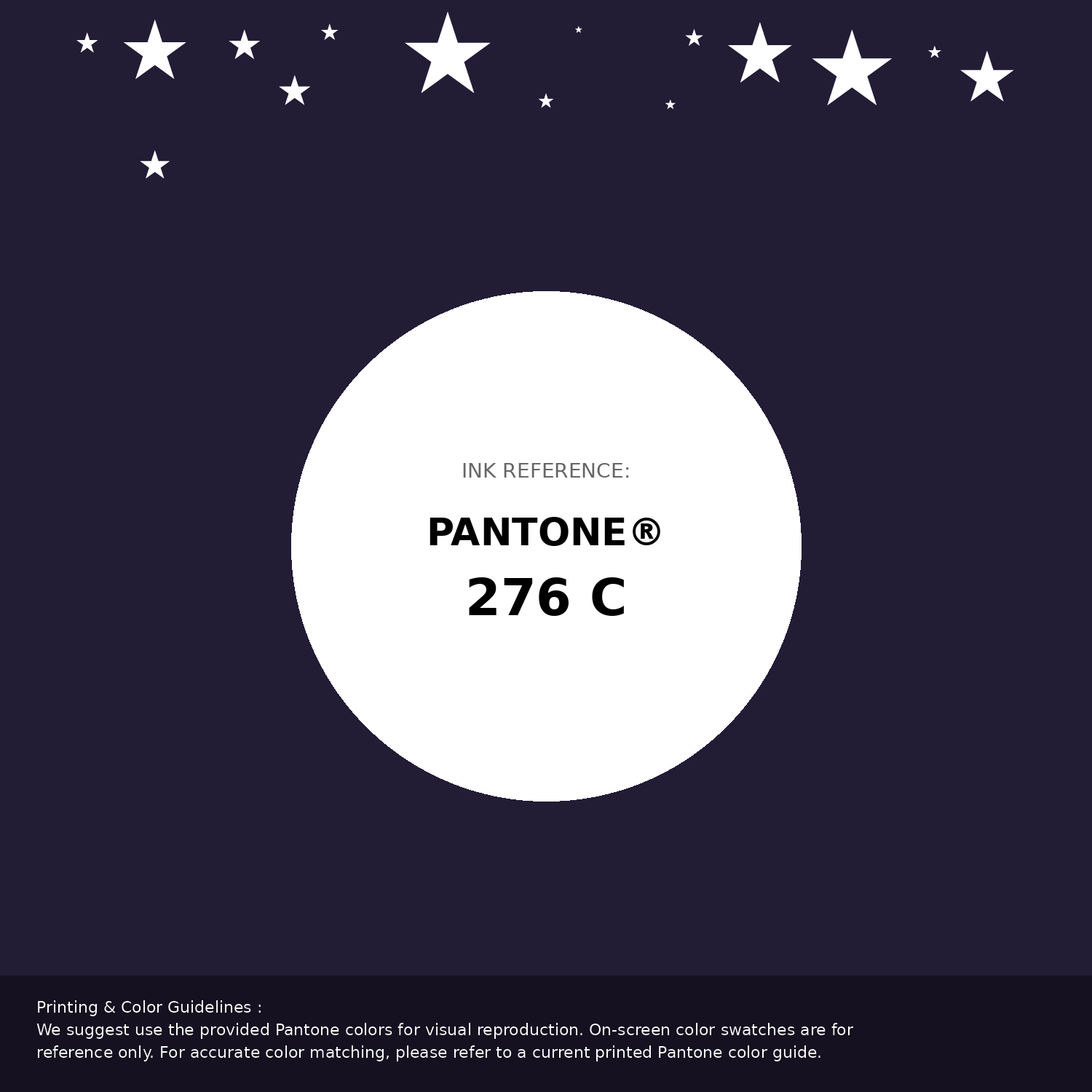
#221c35 Pantone 276 C Color | Hex color Code #221c35 Pantone Swatch Artwork
Download Artwork Swatch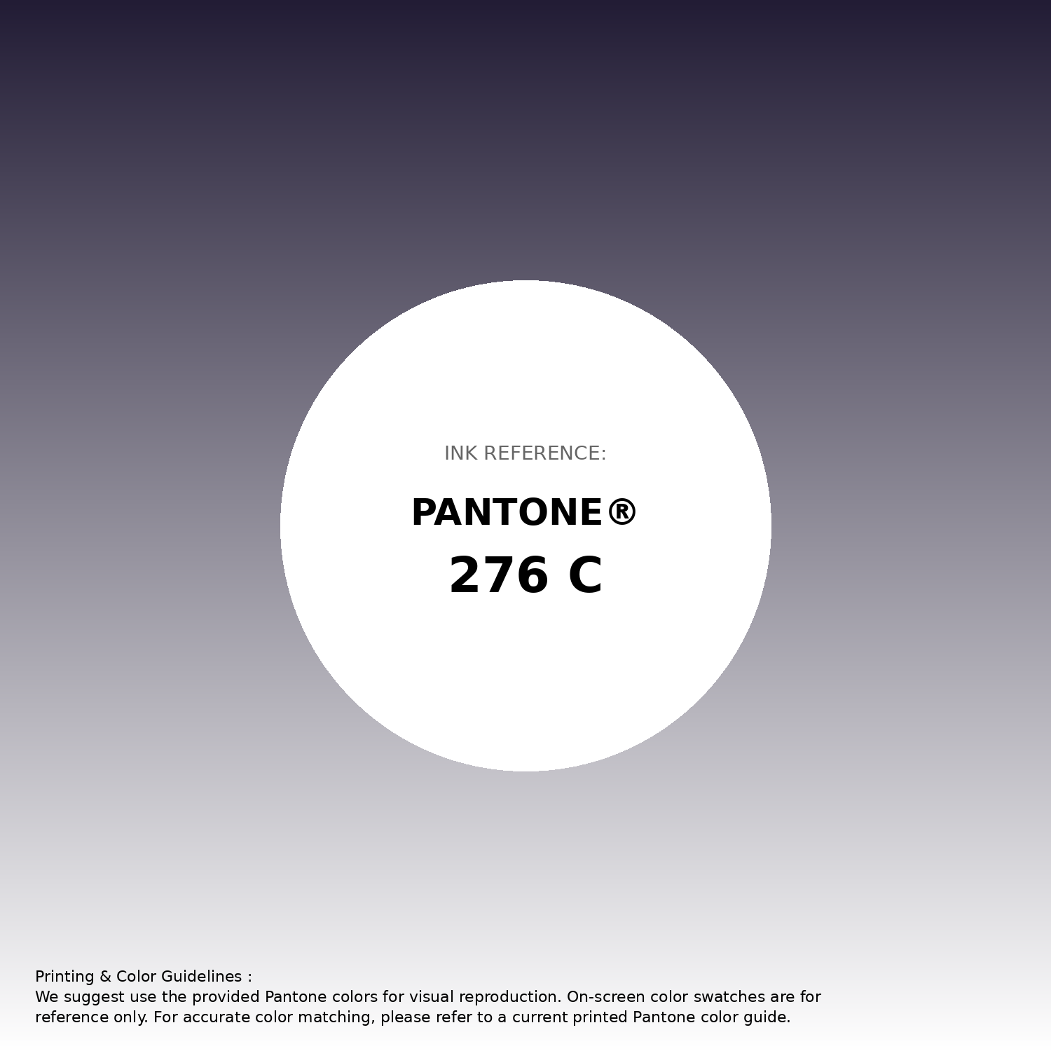
#221c35 Pantone 276 C Color | Hex color Code #221c35 Gradient Artwork (PNG)
Download Gradient (PNG)#221c35 Pantone 276 C Color | Hex color Code #221c35 Gradient Artwork (SVG)
Download Gradient (SVG)
#221c35 Pantone 276 C Color | Hex color Code #221c35 T-Shirt Mockup
Download T-Shirt Mockup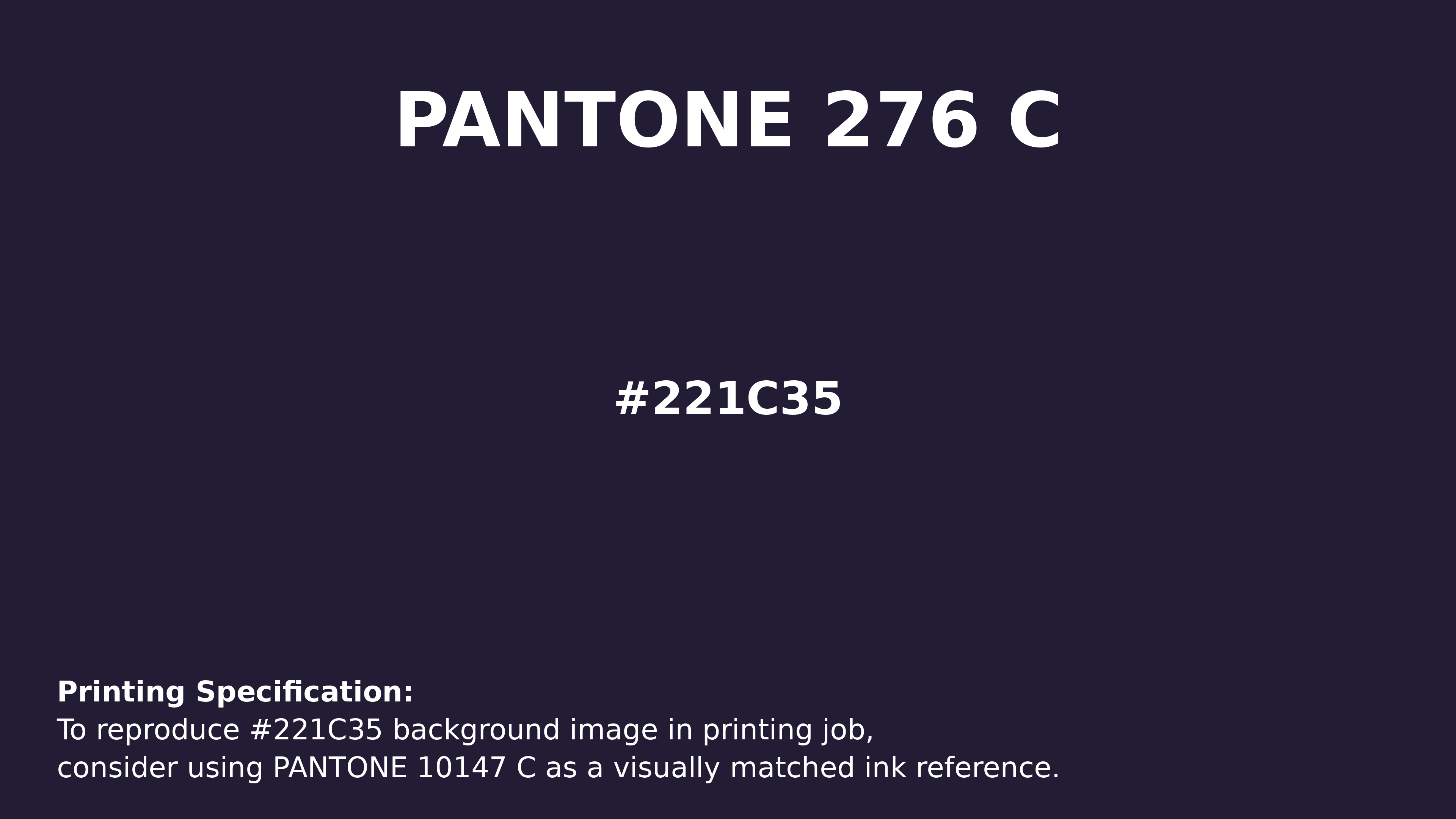
#221c35 Pantone 276 C Color | Hex color Code #221c35 Printing Artwork Pantone Reference
Download Pantone Printing ReferenceRelated Color Palettes
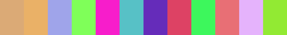
- Burly Wood and Dark Gray •
- Pale Violet Red and Dark Gray •
- Chocolate and Dark Gray •
- Dark Gray and Linen •
- Olive Drab and Dark Gray •
- Dark Gray and White Smoke •
- Rosy Brown and Dark Gray •
- Saddle Brown and Dark Gray •
- Plum and Dark Gray •
- Gainsboro and Dark Gray •
- Dark Gray and Brown •
- Dark Gray and Sandy Brown •
- Dim Gray and Dark Gray •
- Dark Gray and Wheat •
- Dark Khaki and Dark Gray
Color Palette Collection

Light Blue Palettes to Enhance Your Design
13 color palettes with 65 colors.
15 Skin Tone Color Palettes
15 color palettes with 75 colors.
Home vibes
1 color palettes with 5 colors.
My color palette 1
863 color palettes with 4315 colors.