#001A72 Color
Your all-in-one color resource. Download hex background images, Adobe swatches (ASE), PDF color sheets, and SVG files. Explore palettes, harmonies, accessibility, conversions, and professional exports — designed for designers, developers, and color perfectionists.
This deep, saturated blue, #001A72, conjures the stillness of a twilight sky just after sunset. It's a color of profound depth and mystery, hinting at the vastness of the unknown and the secrets held within the night. It evokes feelings of introspection, contemplation, and a sense of quiet power, like the silent strength of a moonlit ocean. This color reminds one of the transition between day and night, the hushed moments before stars emerge, and the hidden depths of the sea. It creates a mood of sophistication and elegance, suggesting authority and a touch of the dramatic. In design, it could be used to convey a sense of luxury, as an accent color against lighter neutrals, or in spaces designed for focus and reflection, such as libraries or studies. It carries a subtle cultural association with knowledge, wisdom, and the enduring power of the night. Visually matched named color: Deep Indigo Twilight.
PANTONE 2747 C
Choose Color
Selected Color
Recent Colors
Color Details
Similar Ink Alternatives for #001A72 color Alternative print inks for reproducing #001A72 background image with a similar visual appearance.
Disclaimer: The visually matched ink reference is an independent approximation intended as a guide only. Please be advised that this pantone colors is only intended as a guide, Actual colours will depend on screen calibration variances. The print ink suggestions provided are independent visual approximations and are not affiliated with or endorsed by Pantone LLC. For official color specifications, conversion factors, and comprehensive color system information, please visit Pantone Connect. Official Pantone products can be purchased at pantone.com.
Color Previews for #000000 See how this color looks as a background or as text.
Complete Guide to Your Color Laboratory
Everything you need to know about this professional color toolkit.
Use the Color Picker at the top to select any color. All modules below update instantly.
Workflow: Pick a color → Explore palettes & data → Download what you need (PDF, Image, or Adobe ASE).
Color Details — Your color in all formats: HEX, RGB, RGBA, HSL, HSLA, HSV, CMYK, CIELab, Hunter-Lab, XYZ, Yxy, YUV. One-click copy.
Color Psychology — Emotional impact, cultural meanings, physiological effects, branding applications, and historical significance.
Named Colors — Find official color names (HTML/CSS, Pantone) that match your selection with similarity percentages.
Light & Dark Shades
80-step gradient from black to white. Perfect for button states and component systems.
Tints
Color mixed with white → lighter, pastel variations for backgrounds and disabled states.
Monochromatic — 11 curated tints/shades from one color. Production-ready for design systems.
- Complementary — Opposite on wheel (180°). High contrast.
- Analogous — Neighbors (±30°). Harmonious flow.
- Triadic — Three colors (120° apart). Vibrant, balanced.
- Split-Complementary — Base + two near-complements. Softer contrast.
- Tetradic/Square — Four colors. Complex, maximum variety.
- Neutral — Desaturated versions. Subtle, sophisticated.
15 Professional Variations — Monochromatic, Analogous, Complementary, Warm/Cool/Earth Tones, Pastel, Vibrant, High Contrast, and more.
Color Infusion — 10 palettes showing your color morphing into each major hue. Find bridge colors.
Similar Colors — 60+ colors generated via CIELAB Delta E matching. Unexpected harmonious combinations.
18 Ready-to-Use Gradients — Complementary, Analogous, Triadic, Tint/Shade progressions, and more.
Downloads: PNG (2560×1440), CSS (production-ready code), SVG (scalable vector).
WCAG Contrast Checker — Tests your color against white, black, and custom colors for AA (4.5:1) and AAA (7:1) compliance. Large text thresholds included.
Harmony & Accessibility Guide — Tests against 10 canonical hues. Shows which pairs are both beautiful AND WCAG-compliant for text.
PNG/JPG — High-res images for presentations and mood boards.
PDF — Print-ready reports for clients and teams.
Adobe ASE — Direct import to Photoshop, Illustrator, InDesign, XD.
CSS/SVG — Gradients only. Production-ready code and vectors.
Color Science: Industry-standard conversions (HSL, CIELAB, CMYK, XYZ). WCAG 2.1 luminance formula. Delta E (ΔE76) for perceptual matching.
Direct Links: Share colors via icolorpalette.com/color/ff5733 or icolorpalette.com/color/red
Issues? Refresh the page, wait for rendering, try another browser, or check console (F12) for errors.
Printing Guide for #001a72 Background Image
Use PANTONE 2747 C as a visually matched ink reference when printing this background image.
To print the #001a72 background image from our site, consider using PANTONE 2747 C as a visually matched ink reference.
Download the background image, then provide this reference code to your print vendor to help achieve accurate color reproduction.
The visually matched ink reference for the #001a72 background image is PANTONE 2747 C.
This color is commonly described as Deep Indigo Twilight.
This deep, saturated blue, #001A72, conjures the stillness of a twilight sky just after sunset. It's a color of profound depth and mystery, hinting at the vastness of the unknown and the secrets held within the night. It evokes feelings of introspection, contemplation, and a sense of quiet power, like the silent strength of a moonlit ocean. This color reminds one of the transition between day and night, the hushed moments before stars emerge, and the hidden depths of the sea. It creates a mood of sophistication and elegance, suggesting authority and a touch of the dramatic. In design, it could be used to convey a sense of luxury, as an accent color against lighter neutrals, or in spaces designed for focus and reflection, such as libraries or studies. It carries a subtle cultural association with knowledge, wisdom, and the enduring power of the night.
We provide PANTONE 2747 C as a visually matched ink reference to help you reproduce the #001a72 background image accurately in professional printing.
This reference code helps print vendors achieve consistent color output across different printing equipment and materials.
After downloading the #001a72 background image from our site:
- Include the visually matched ink reference PANTONE 2747 C in your print order notes
- Inform your print vendor that this is your target color reference
- Request a proof print to verify the Deep Indigo Twilight color appearance before full production
The #001a72 background image with PANTONE 2747 C as visually matched ink reference can be used for:
- Posters, banners, and backdrops
- Business cards, brochures, and flyers
- Packaging, labels, and stickers
- Signage and promotional materials
This is an independent visual approximation.
While PANTONE 2747 C closely matches the #001a72 background image color, variations may exist between screen display and printed output.
We recommend requesting a proof print to verify the final appearance.
This deep, saturated blue, #001A72, conjures the stillness of a twilight sky just after sunset. It's a color of profound depth and mystery, hinting at the vastness of the unknown and the secrets held within the night. It evokes feelings of introspection, contemplation, and a sense of quiet power, like the silent strength of a moonlit ocean. This color reminds one of the transition between day and night, the hushed moments before stars emerge, and the hidden depths of the sea. It creates a mood of sophistication and elegance, suggesting authority and a touch of the dramatic. In design, it could be used to convey a sense of luxury, as an accent color against lighter neutrals, or in spaces designed for focus and reflection, such as libraries or studies. It carries a subtle cultural association with knowledge, wisdom, and the enduring power of the night.
Understanding these associations helps ensure the #001a72 background image aligns with your intended message and brand impact.
Important Information
The visually matched ink reference is an independent approximation intended as a guide only.
Actual printed colors may vary depending on screen calibration, substrate material, ink type, and printing equipment used.
For official color specifications and certified color standards, visit Pantone Connect.
Official color guides and swatch books can be purchased from pantone.com.
PANTONE 2747 C Color: A Regal Purple | #001A72
Introduction:
Regal Purple is a deep and rich color that exudes luxury and sophistication. It is a popular choice in design due to its visual appeal and ability to create a sense of opulence.
Historical Significance:
Key Moments in History: Regal Purple has a long and storied history dating back to ancient times. In ancient Rome, it was a symbol of royalty and power and was often reserved for emperors. Additionally, it was one of the most expensive dyes to produce, making it a status symbol among the elite.
Symbolism and Meaning:
Symbolism and Meaning: Regal Purple typically symbolizes royalty, luxury, and power. It is associated with wealth and extravagance.
Regal Purple in Fashion:
Regal Purple in Fashion: Regal Purple is often used in high-end fashion to convey elegance and sophistication. It is a popular color choice for evening gowns and formal attire.
Regal Purple in Graphic Design:
Significance in Design Aesthetics: Regal Purple is widely used in graphic design to create a sense of luxury and exclusivity. It adds a touch of elegance and sophistication to visual compositions.
Color Combinations:
Potential Color Combinations: Regal Purple pairs well with gold, silver, and white. It also complements shades of pink and blue, creating a harmonious and visually appealing color palette.
Nature’s Palette:
Natural Occurrences: Regal Purple can be seen in the petals of flowers like lavender, orchids, and irises. It also appears in certain sunsets and majestic landscapes, adding a touch of royalty to the natural world.
Artistic Representations:
Use in Art: Regal Purple has been used by artists throughout history to convey royalty, power, and beauty. It can be found in paintings, sculptures, and other forms of artistic expression.
Movies and Cinematic Landscapes:
Movies and Scenes: Regal Purple is often used in movies to create a sense of grandeur and elegance. It can be seen in luxurious settings and costumes, setting the tone for opulence.
Products and Commercial Appeal:
Branding and Products: Many luxury brands incorporate Regal Purple into their branding to convey a sense of exclusivity and sophistication. It is often used in high-end cosmetics, perfumes, and fashion accessories.
National Symbols and Significance:
National Symbols: Regal Purple is not commonly associated with specific national symbols or cultural significance. However, its association with royalty and power makes it a color that transcends borders.
The Psychological and Emotional Impact:
Psychological Impact: Regal Purple elicits feelings of luxury, elegance, and power. It can create a sense of awe and admiration.
Conclusion:
Regal Purple, also known as Pantone 2747 C, is a color that represents royalty, luxury, and power. Its historical significance, symbolism, and visual appeal make it a popular choice in fashion, graphic design, and various forms of art. Whether used in a logo, an evening gown, or a cinematic scene, Regal Purple adds a touch of elegance and sophistication.
Pantone 2747 C Color | Hex color Code #001a72 Image & Artwork
Download high-quality assets for your projects.

#001a72 Color Schemes
Download Color Schemes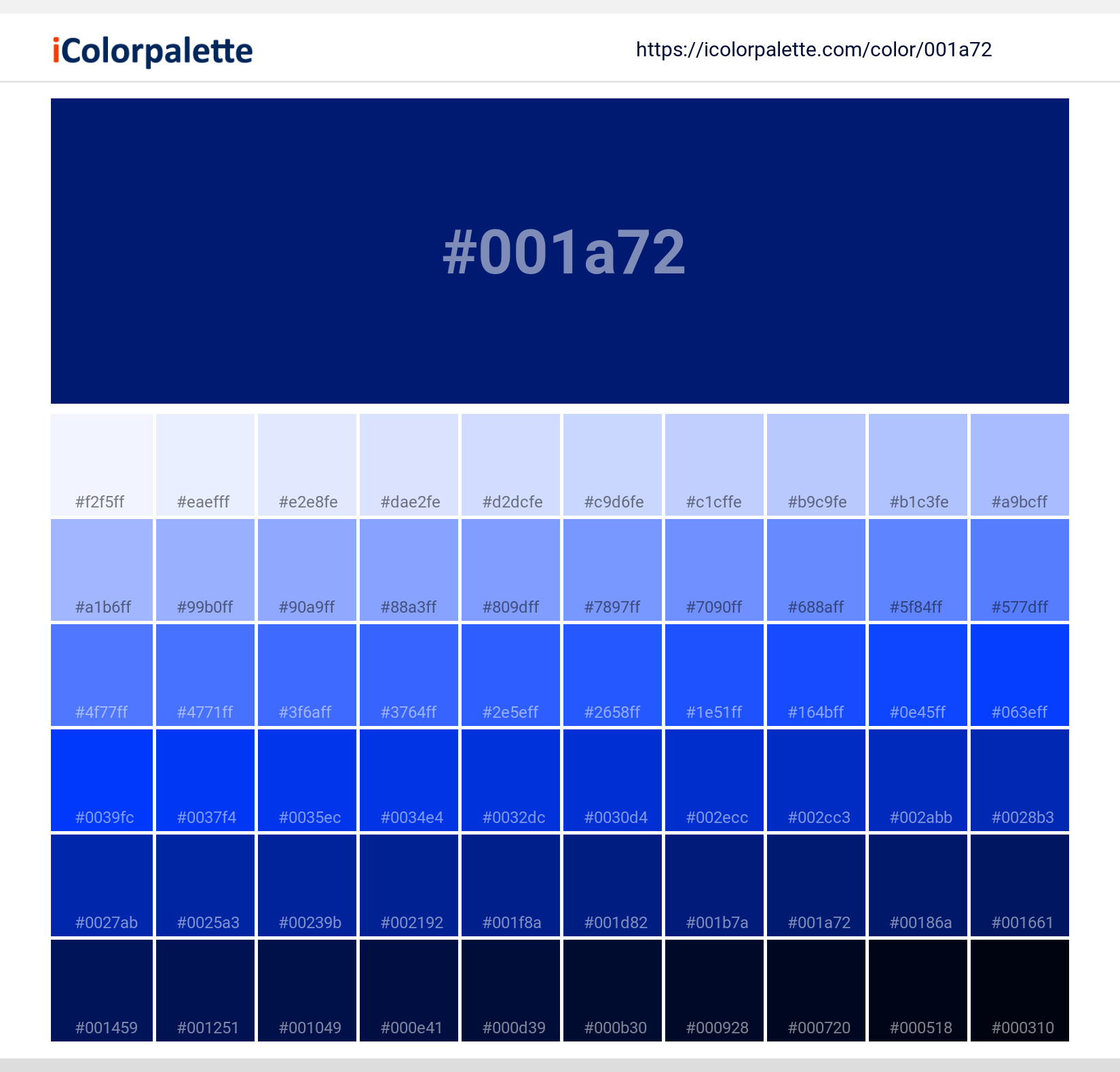
#001a72 Color Shades
Download Color Shades
Pantone 2747 C Color | Hex color Code #001a72 Solid Color Background
Download Solid Color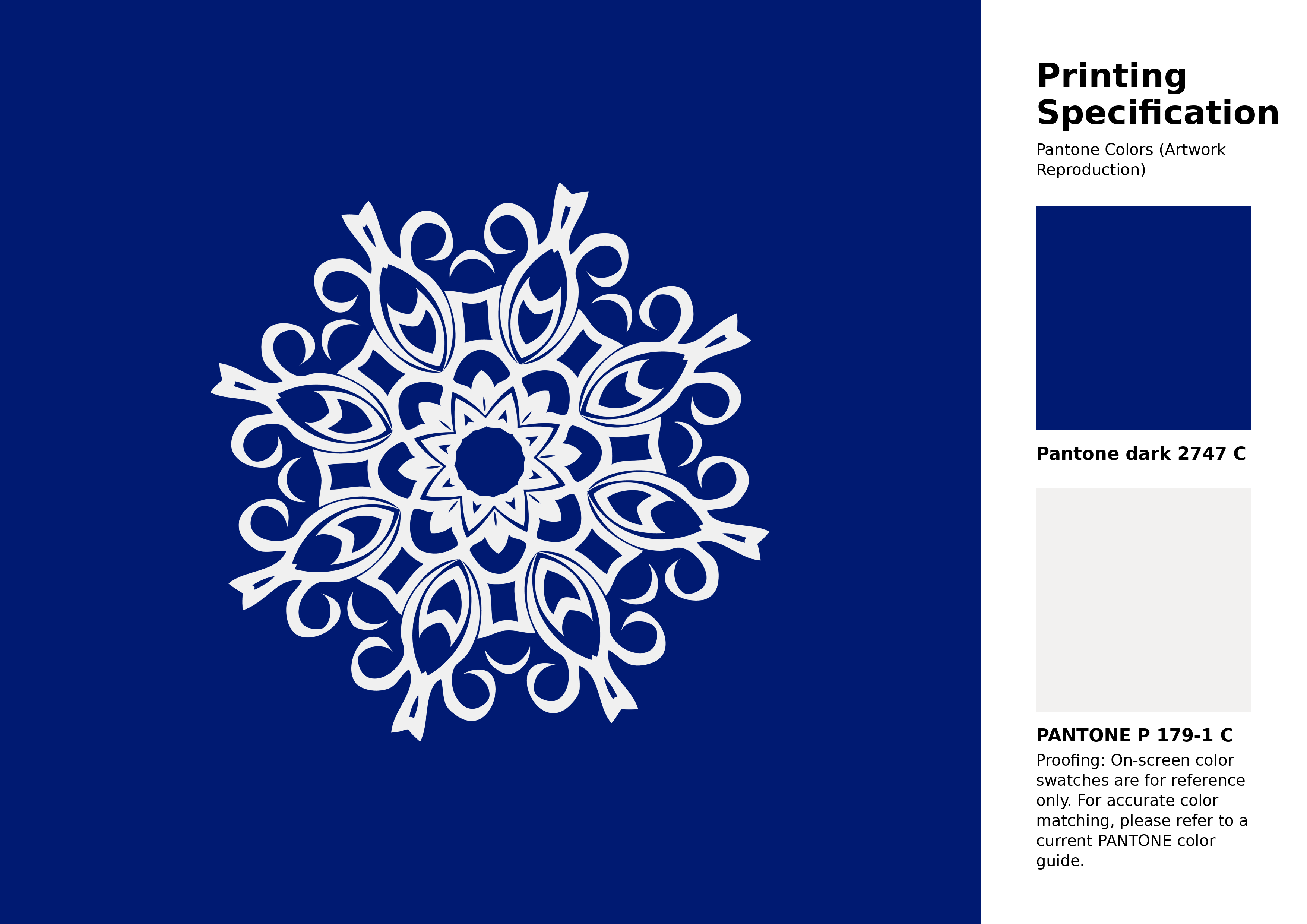
#001a72 Pantone 2747 C Color | Hex color Code #001a72 Artwork Image (PNG)
Download Artwork (PNG)#001a72 Pantone 2747 C Color | Hex color Code #001a72 Artwork Vector (PDF)
Download Artwork (PDF)#001a72 Pantone 2747 C Color | Hex color Code #001a72 Artwork Vector (SVG)
Download Artwork (SVG)
#001a72 Pantone 2747 C Color | Hex color Code #001a72 Pantone Swatch Artwork
Download Artwork Swatch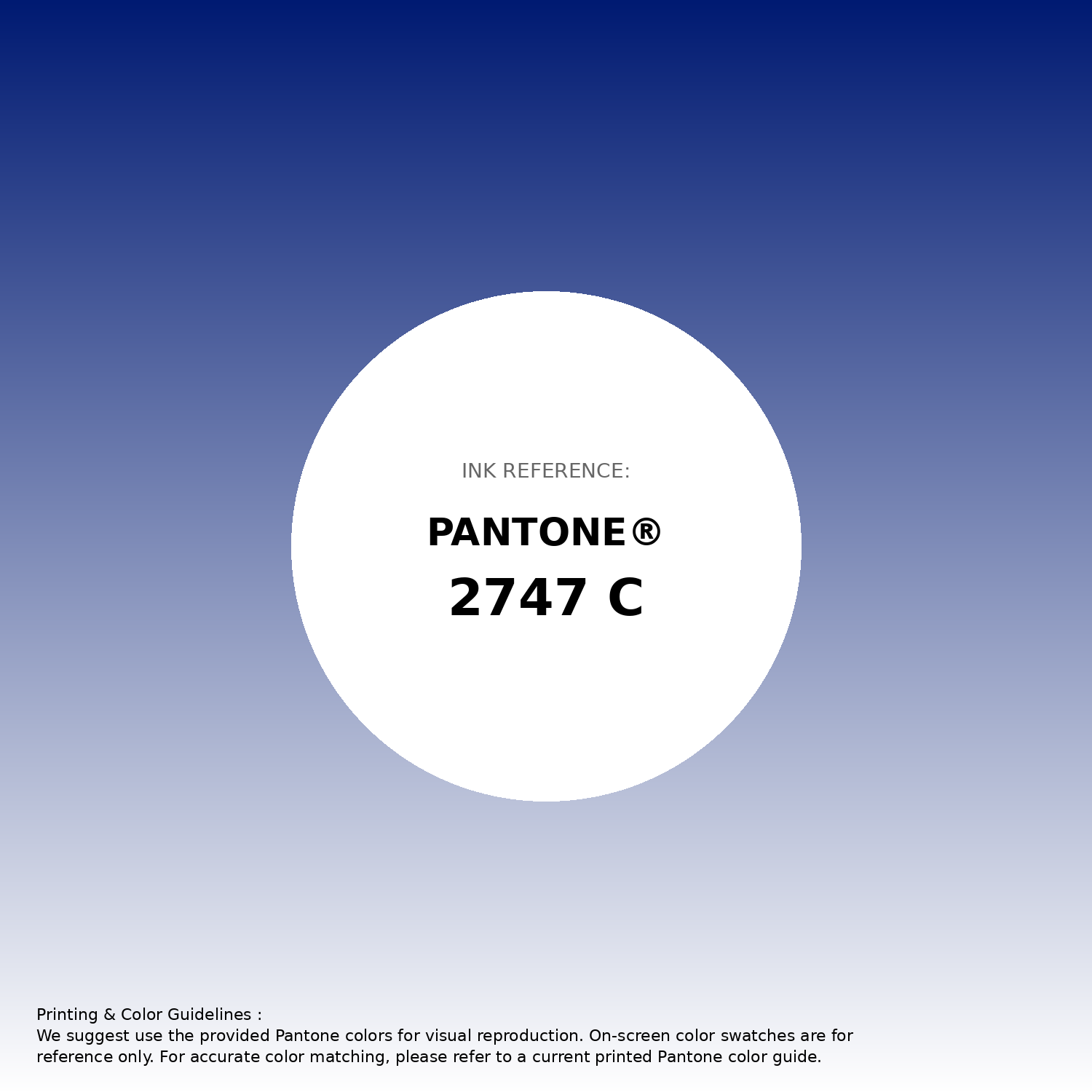
#001a72 Pantone 2747 C Color | Hex color Code #001a72 Gradient Artwork (PNG)
Download Gradient (PNG)#001a72 Pantone 2747 C Color | Hex color Code #001a72 Gradient Artwork (SVG)
Download Gradient (SVG)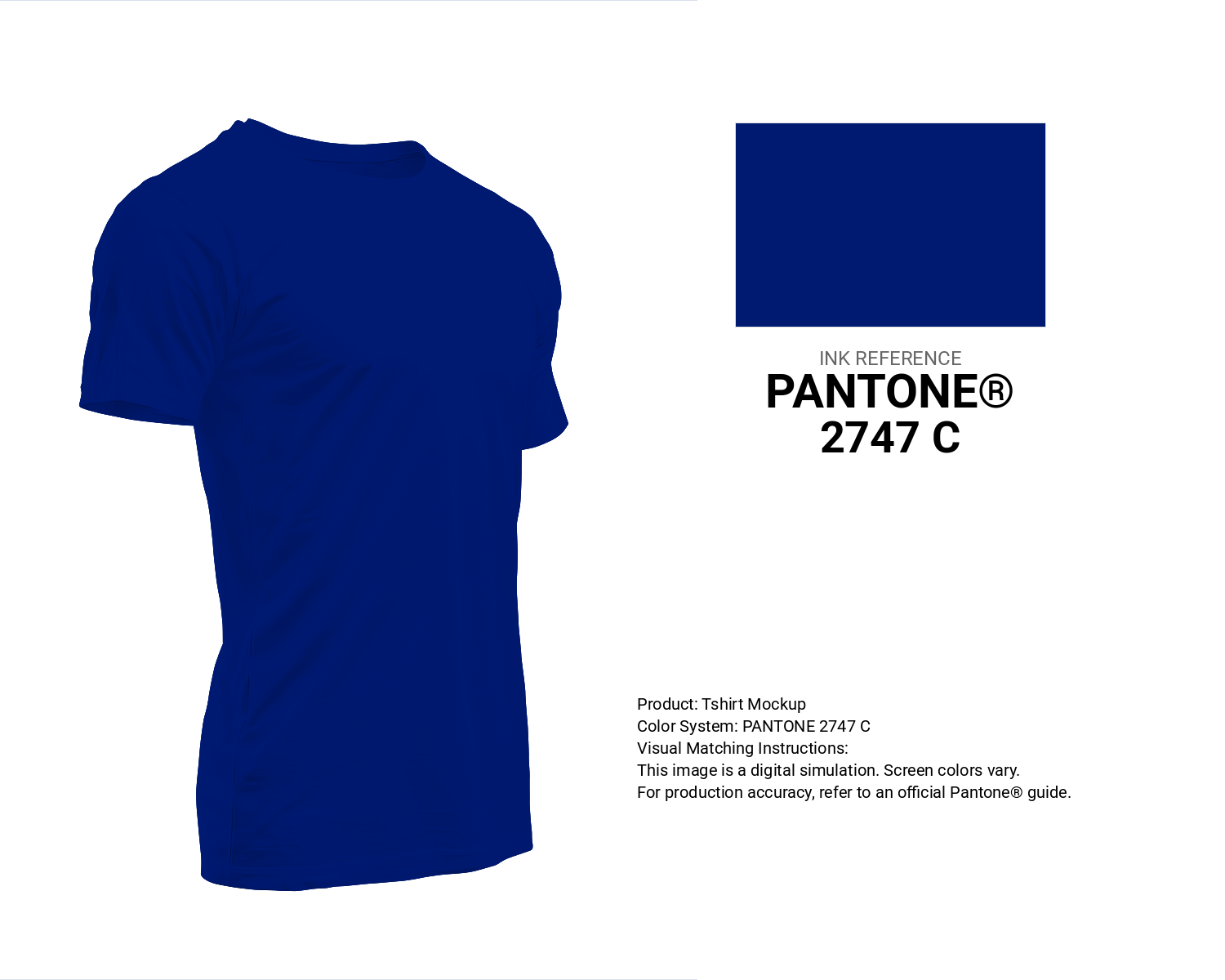
#001a72 Pantone 2747 C Color | Hex color Code #001a72 T-Shirt Mockup
Download T-Shirt Mockup
#001a72 Pantone 2747 C Color | Hex color Code #001a72 Printing Artwork Pantone Reference
Download Pantone Printing ReferenceRelated Color Palettes
- Dark Gray and Lavender •
- Dark Gray and Light Steel Blue •
- Midnight Blue and Dark Gray •
- Black and Dark Gray •
- Dark Gray and Dark Green •
- Silver and Dark Gray •
- Chocolate and Dark Gray •
- Dark Gray and Maroon •
- Thistle and Dark Gray •
- Light Slate Gray and Dark Gray •
- Dark Gray and Chocolate •
- Dark Gray and Dark Gray •
- Dark Gray and Beige •
- Dark Gray and Rosy Brown •
- Beige and Dark Gray
Color Palette Collection

75 Sunset Color Schemes
75 color palettes with 375 colors.

AE
2 color palettes with 10 colors.

49 Green Color Combinations
49 color palettes with 245 colors.

20 Turquoise Color Palettes
20 color palettes with 100 colors.