#2A2A35 Color
Your all-in-one color resource. Download hex background images, Adobe swatches (ASE), PDF color sheets, and SVG files. Explore palettes, harmonies, accessibility, conversions, and professional exports — designed for designers, developers, and color perfectionists.
A very dark gray-blue, reminiscent of the hour before dawn. It evokes feelings of quiet contemplation, mystery, and a sense of impending change. It suggests a sense of sophistication and elegance, often used in design to create a sense of depth and a modern aesthetic. It can represent authority and formality. It's a color that creates a feeling of quiet anticipation. Visually matched named color: Charcoal Dusk.
PANTONE 19-3924 TCX
Choose Color
Selected Color
Recent Colors
Color Details
Similar Ink Alternatives for #2A2A35 color Alternative print inks for reproducing #2A2A35 background image with a similar visual appearance.
Disclaimer: The visually matched ink reference is an independent approximation intended as a guide only. Please be advised that this pantone colors is only intended as a guide, Actual colours will depend on screen calibration variances. The print ink suggestions provided are independent visual approximations and are not affiliated with or endorsed by Pantone LLC. For official color specifications, conversion factors, and comprehensive color system information, please visit Pantone Connect. Official Pantone products can be purchased at pantone.com.
Color Previews for #000000 See how this color looks as a background or as text.
Complete Guide to Your Color Laboratory
Everything you need to know about this professional color toolkit.
Use the Color Picker at the top to select any color. All modules below update instantly.
Workflow: Pick a color → Explore palettes & data → Download what you need (PDF, Image, or Adobe ASE).
Color Details — Your color in all formats: HEX, RGB, RGBA, HSL, HSLA, HSV, CMYK, CIELab, Hunter-Lab, XYZ, Yxy, YUV. One-click copy.
Color Psychology — Emotional impact, cultural meanings, physiological effects, branding applications, and historical significance.
Named Colors — Find official color names (HTML/CSS, Pantone) that match your selection with similarity percentages.
Light & Dark Shades
80-step gradient from black to white. Perfect for button states and component systems.
Tints
Color mixed with white → lighter, pastel variations for backgrounds and disabled states.
Monochromatic — 11 curated tints/shades from one color. Production-ready for design systems.
- Complementary — Opposite on wheel (180°). High contrast.
- Analogous — Neighbors (±30°). Harmonious flow.
- Triadic — Three colors (120° apart). Vibrant, balanced.
- Split-Complementary — Base + two near-complements. Softer contrast.
- Tetradic/Square — Four colors. Complex, maximum variety.
- Neutral — Desaturated versions. Subtle, sophisticated.
15 Professional Variations — Monochromatic, Analogous, Complementary, Warm/Cool/Earth Tones, Pastel, Vibrant, High Contrast, and more.
Color Infusion — 10 palettes showing your color morphing into each major hue. Find bridge colors.
Similar Colors — 60+ colors generated via CIELAB Delta E matching. Unexpected harmonious combinations.
18 Ready-to-Use Gradients — Complementary, Analogous, Triadic, Tint/Shade progressions, and more.
Downloads: PNG (2560×1440), CSS (production-ready code), SVG (scalable vector).
WCAG Contrast Checker — Tests your color against white, black, and custom colors for AA (4.5:1) and AAA (7:1) compliance. Large text thresholds included.
Harmony & Accessibility Guide — Tests against 10 canonical hues. Shows which pairs are both beautiful AND WCAG-compliant for text.
PNG/JPG — High-res images for presentations and mood boards.
PDF — Print-ready reports for clients and teams.
Adobe ASE — Direct import to Photoshop, Illustrator, InDesign, XD.
CSS/SVG — Gradients only. Production-ready code and vectors.
Color Science: Industry-standard conversions (HSL, CIELAB, CMYK, XYZ). WCAG 2.1 luminance formula. Delta E (ΔE76) for perceptual matching.
Direct Links: Share colors via icolorpalette.com/color/ff5733 or icolorpalette.com/color/red
Issues? Refresh the page, wait for rendering, try another browser, or check console (F12) for errors.
Printing Guide for #2a2a35 Background Image
Use PANTONE 19-3924 TCX as a visually matched ink reference when printing this background image.
To print the #2a2a35 background image from our site, consider using PANTONE 19-3924 TCX as a visually matched ink reference.
Download the background image, then provide this reference code to your print vendor to help achieve accurate color reproduction.
The visually matched ink reference for the #2a2a35 background image is PANTONE 19-3924 TCX.
This color is commonly described as Charcoal Dusk.
A very dark gray-blue, reminiscent of the hour before dawn. It evokes feelings of quiet contemplation, mystery, and a sense of impending change. It suggests a sense of sophistication and elegance, often used in design to create a sense of depth and a modern aesthetic. It can represent authority and formality. It's a color that creates a feeling of quiet anticipation.
We provide PANTONE 19-3924 TCX as a visually matched ink reference to help you reproduce the #2a2a35 background image accurately in professional printing.
This reference code helps print vendors achieve consistent color output across different printing equipment and materials.
After downloading the #2a2a35 background image from our site:
- Include the visually matched ink reference PANTONE 19-3924 TCX in your print order notes
- Inform your print vendor that this is your target color reference
- Request a proof print to verify the Charcoal Dusk color appearance before full production
The #2a2a35 background image with PANTONE 19-3924 TCX as visually matched ink reference can be used for:
- Posters, banners, and backdrops
- Business cards, brochures, and flyers
- Packaging, labels, and stickers
- Signage and promotional materials
This is an independent visual approximation.
While PANTONE 19-3924 TCX closely matches the #2a2a35 background image color, variations may exist between screen display and printed output.
We recommend requesting a proof print to verify the final appearance.
A very dark gray-blue, reminiscent of the hour before dawn. It evokes feelings of quiet contemplation, mystery, and a sense of impending change. It suggests a sense of sophistication and elegance, often used in design to create a sense of depth and a modern aesthetic. It can represent authority and formality. It's a color that creates a feeling of quiet anticipation.
Understanding these associations helps ensure the #2a2a35 background image aligns with your intended message and brand impact.
Important Information
The visually matched ink reference is an independent approximation intended as a guide only.
Actual printed colors may vary depending on screen calibration, substrate material, ink type, and printing equipment used.
For official color specifications and certified color standards, visit Pantone Connect.
Official color guides and swatch books can be purchased from pantone.com.
Night Sky Color: Elegance and Mystery | #2A2A35
Introduction:
Night Sky Color, with its deep and rich hue, embodies a sense of elegance and mystery. This color captures the essence of a dark, starry night sky and evokes a sense of wonder and intrigue.
Historical Significance:
Artistic RepresentationsThroughout art history, Night Sky Color has been used to depict night scenes and create a sense of depth and atmosphere. Artists like Vincent van Gogh and James Abbott McNeill Whistler have incorporated this color into their works, emphasizing its ability to set the mood and tone of a painting.
Symbolism and Meaning:
Conveying MysteryNight Sky Color is often associated with mystery, secrecy, and the unknown. It represents the depth of the universe and the vastness of space, symbolizing the limitless possibilities and potential that exist beyond our comprehension.
Night Sky Color in Fashion:
Stylish and ElegantNight Sky Color has a strong presence in the fashion world, often used to add sophistication and elegance to clothing and accessories. It is frequently seen in eveningwear, giving a sense of glamour and allure.
Night Sky Color in Graphic Design:
Branding and ImpactIn graphic design, Night Sky Color is commonly used to create a sense of mystery and intrigue. It can be seen in branding for luxury products or in designs that require a moody and atmospheric aesthetic.
Color Combinations:
Harmonious MatchesNight Sky Color pairs well with a variety of other hues. Some popular color combinations include Night Sky Color and silver for a celestial look, or Night Sky Color and deep purple for a regal and luxurious feel.
Nature’s Palette:
Nocturnal BeautyNight Sky Color can be found in nature, particularly in the nighttime landscape. From the deep blue hues of the ocean at night to the rich colors of a midnight flower garden, this color is often present in scenes of nocturnal beauty.
Artistic Representations:
Depicting the NightNight Sky Color has been featured in various forms of art to depict nighttime scenes. From paintings to photography, artists have utilized this color to capture the serenity and enchantment of the night.
Movies and Cinematic Landscapes:
Setting the MoodNight Sky Color is often used in movies to set a specific tone or mood. Whether it is creating a sense of mystery in a thriller or conveying a romantic atmosphere in a nighttime love scene, this color plays a crucial role in cinematic landscapes.
Products and Commercial Appeal:
Luxury and SophisticationNight Sky Color is often associated with premium and high-end products, lending a touch of luxury and sophistication. From luxury cars to high-end fashion brands, this color is favored for its elegant and timeless appeal.
National Symbols and Significance:
Ties to the CosmosIn various cultures, Night Sky Color is associated with cosmic elements and celestial bodies. It represents the vastness of the universe and is often tied to concepts of spirituality and the divine.
The Psychological and Emotional Impact:
Mystery and IntrigueNight Sky Color can evoke emotions of mystery, intrigue, and introspection. It can create a sense of calm and tranquility, allowing for moments of reflection and contemplation.
Conclusion:
Night Sky Color, with its rich and deep hue, holds a timeless appeal in various contexts. Its historical significance in art, its symbolic representation of mystery, and its usage in fashion, graphic design, and cinema all contribute to its allure. Whether seen in nature or depicted in artworks, this color exudes elegance and captivates with its enigmatic charm.
Pantone 19-3924 Tcx Night Sky Color | Hex color Code #2a2a35 Image & Artwork
Download high-quality assets for your projects.

#2a2a35 Color Schemes
Download Color Schemes
#2a2a35 Color Shades
Download Color Shades
Pantone 19-3924 Tcx Night Sky Color | Hex color Code #2a2a35 Solid Color Background
Download Solid Color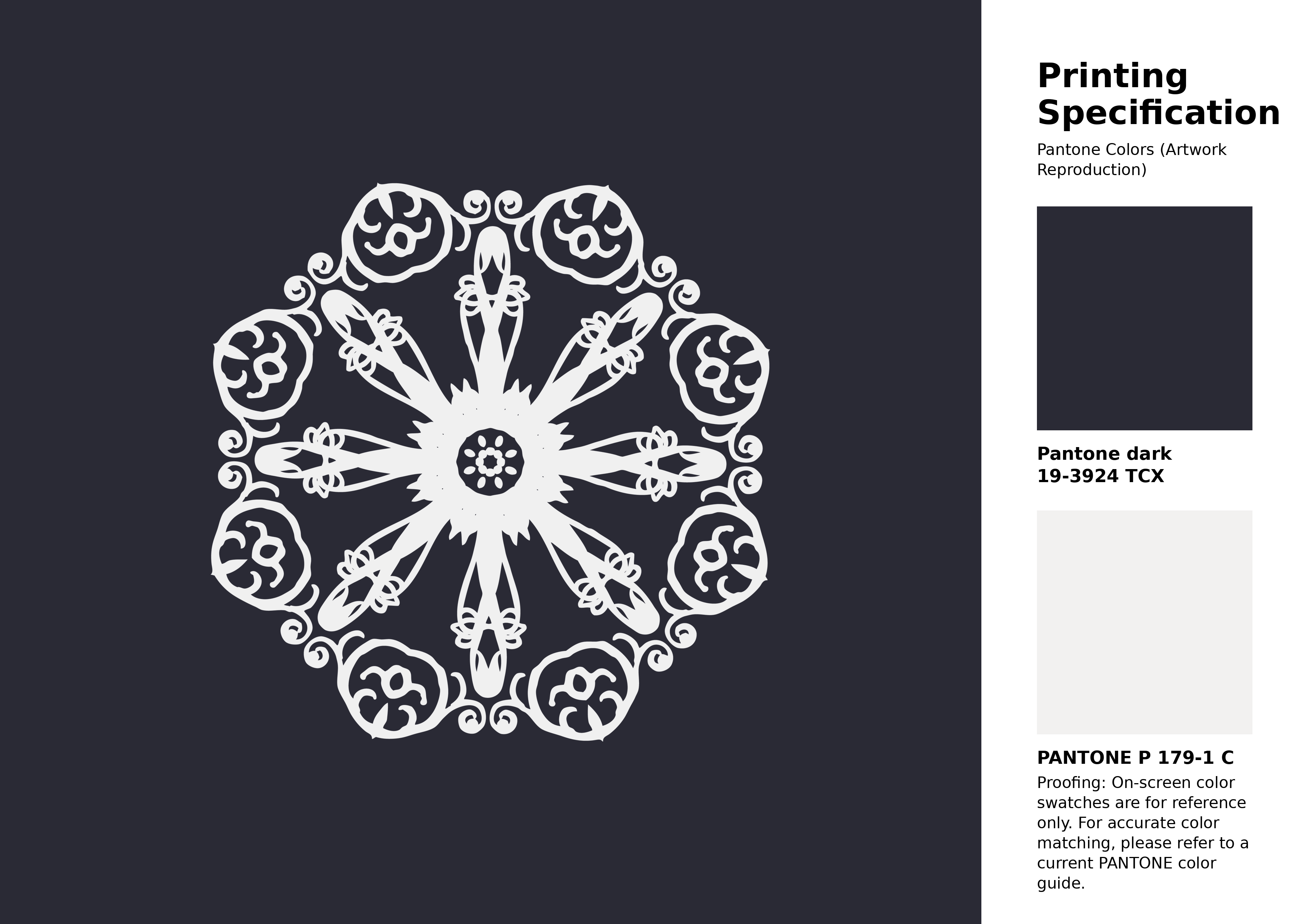
#2a2a35 Pantone 19-3924 Tcx Night Sky Color | Hex color Code #2a2a35 Artwork Image (PNG)
Download Artwork (PNG)#2a2a35 Pantone 19-3924 Tcx Night Sky Color | Hex color Code #2a2a35 Artwork Vector (PDF)
Download Artwork (PDF)#2a2a35 Pantone 19-3924 Tcx Night Sky Color | Hex color Code #2a2a35 Artwork Vector (SVG)
Download Artwork (SVG)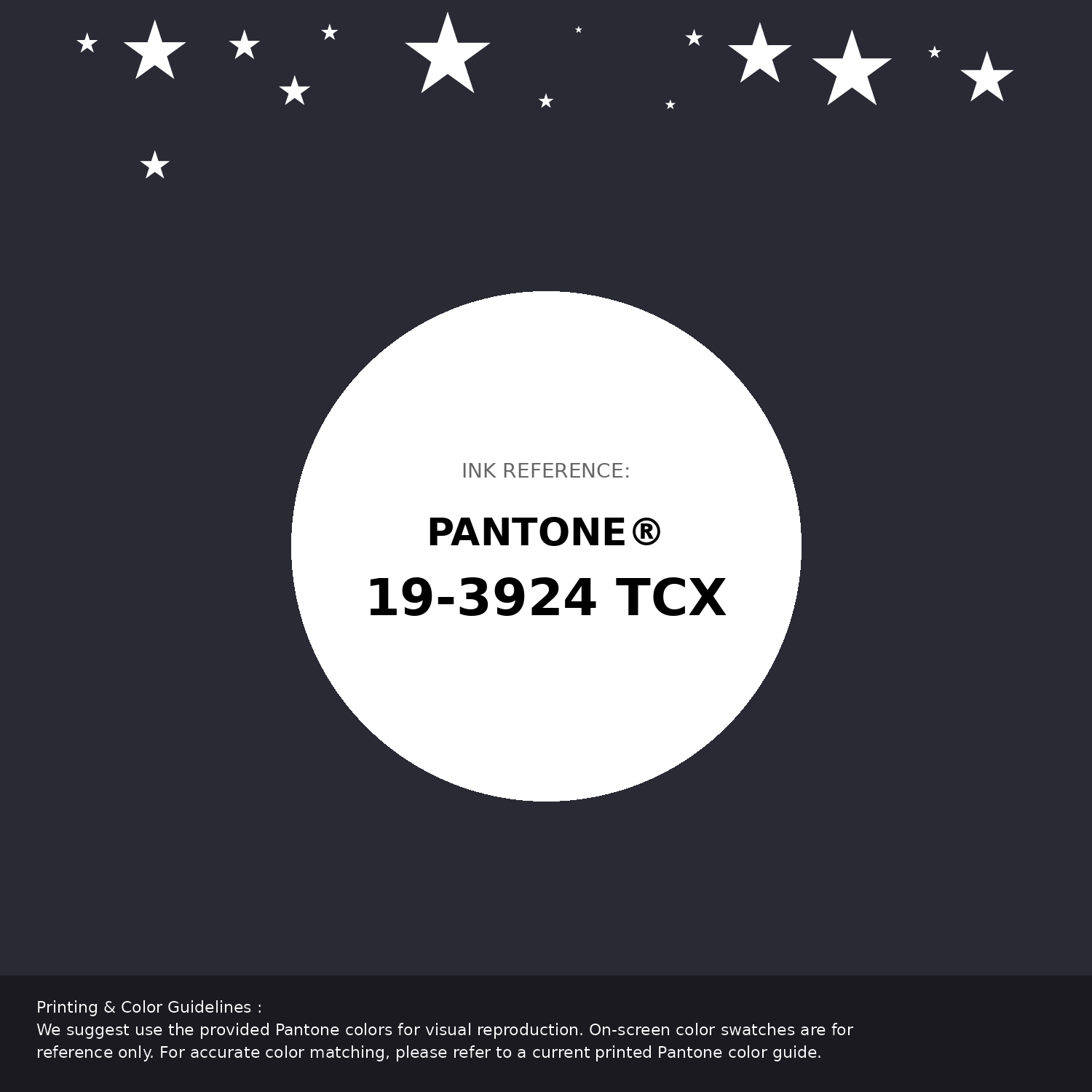
#2a2a35 Pantone 19-3924 Tcx Night Sky Color | Hex color Code #2a2a35 Pantone Swatch Artwork
Download Artwork Swatch
#2a2a35 Pantone 19-3924 Tcx Night Sky Color | Hex color Code #2a2a35 Gradient Artwork (PNG)
Download Gradient (PNG)#2a2a35 Pantone 19-3924 Tcx Night Sky Color | Hex color Code #2a2a35 Gradient Artwork (SVG)
Download Gradient (SVG)
#2a2a35 Pantone 19-3924 Tcx Night Sky Color | Hex color Code #2a2a35 T-Shirt Mockup
Download T-Shirt Mockup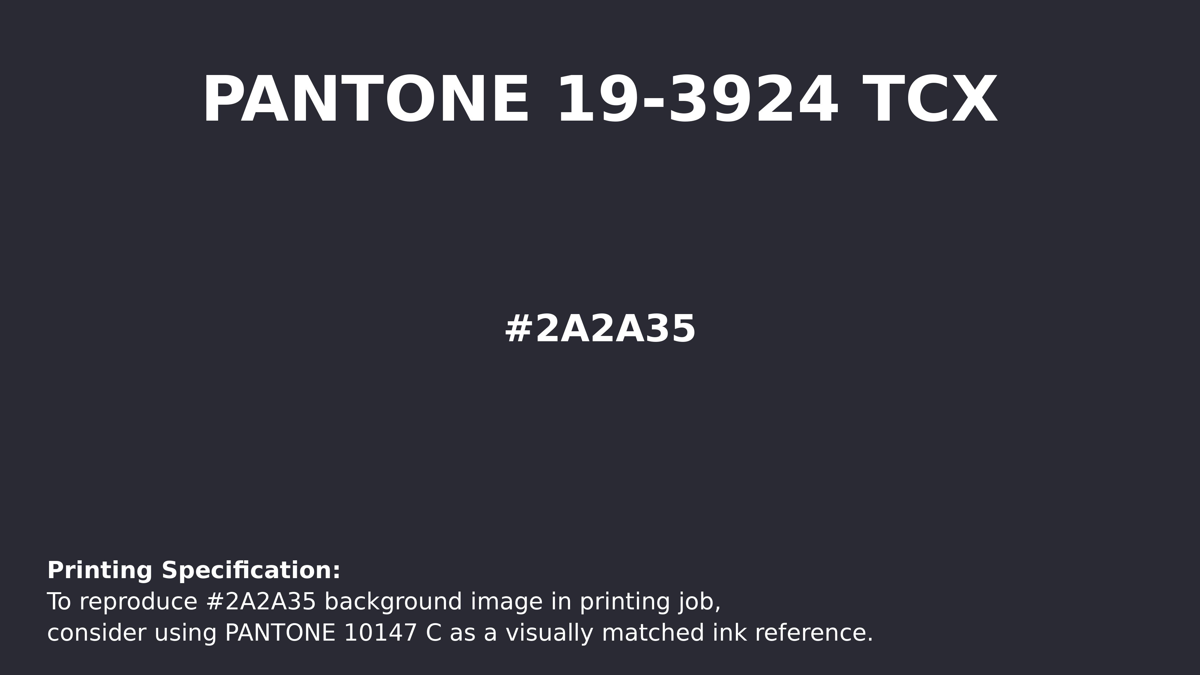
#2a2a35 Pantone 19-3924 Tcx Night Sky Color | Hex color Code #2a2a35 Printing Artwork Pantone Reference
Download Pantone Printing Reference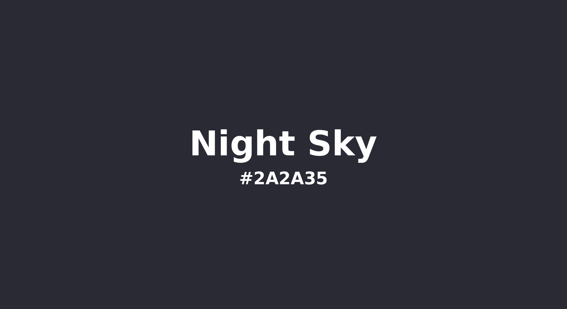
Night Sky - #2a2a35 Color Name
Download Color NameRelated Color Palettes
- Peru and Dark Gray •
- Linen and Dark Gray •
- Olive Drab and Dark Gray •
- Dark Gray and Peru •
- Dark Gray and Yellow Green •
- Dark Gray and Slate Gray •
- Saddle Brown and Dark Gray •
- Dark Sea Green and Dark Gray •
- Dark Gray and Light Slate Gray •
- Tan and Dark Gray •
- Dim Gray and Dark Gray •
- Dark Gray and Tan •
- Dark Gray and Light Gray •
- Gainsboro and Dark Gray •
- Dark Gray and Pale Violet Red
Color Palette Collection

42 Green Color Schemes
42 color palettes with 210 colors.

24 Summer Color Palettes
24 color palettes with 120 colors.
Forest Theme colors
15 color palettes with 75 colors.
21 Pastel Yellow Color Schemes
21 color palettes with 105 colors.