#7C2529 Color
Your all-in-one color resource. Download hex background images, Adobe swatches (ASE), PDF color sheets, and SVG files. Explore palettes, harmonies, accessibility, conversions, and professional exports — designed for designers, developers, and color perfectionists.
This deep, reddish-brown evokes a sense of warmth tinged with melancholy. It conjures images of a fiery sunset fading into the night, or the rich hues of autumn leaves as they begin to turn. The color evokes feelings of contemplation, nostalgia, and a quiet intensity. It creates a warm yet slightly subdued atmosphere, suitable for rooms where introspection and reflection are desired. The color might be used in a living room or study to create a sophisticated and inviting ambiance, perhaps with hints of gold or deep greens for contrast. In some cultures, deep reds and browns can symbolize strength and stability. Visually matched named color: Crimson Dusk.
PANTONE 1815 C
Choose Color
Selected Color
Recent Colors
Color Details
Similar Ink Alternatives for #7C2529 color Alternative print inks for reproducing #7C2529 background image with a similar visual appearance.
Disclaimer: The visually matched ink reference is an independent approximation intended as a guide only. Please be advised that this pantone colors is only intended as a guide, Actual colours will depend on screen calibration variances. The print ink suggestions provided are independent visual approximations and are not affiliated with or endorsed by Pantone LLC. For official color specifications, conversion factors, and comprehensive color system information, please visit Pantone Connect. Official Pantone products can be purchased at pantone.com.
Color Previews for #000000 See how this color looks as a background or as text.
Complete Guide to Your Color Laboratory
Everything you need to know about this professional color toolkit.
Use the Color Picker at the top to select any color. All modules below update instantly.
Workflow: Pick a color → Explore palettes & data → Download what you need (PDF, Image, or Adobe ASE).
Color Details — Your color in all formats: HEX, RGB, RGBA, HSL, HSLA, HSV, CMYK, CIELab, Hunter-Lab, XYZ, Yxy, YUV. One-click copy.
Color Psychology — Emotional impact, cultural meanings, physiological effects, branding applications, and historical significance.
Named Colors — Find official color names (HTML/CSS, Pantone) that match your selection with similarity percentages.
Light & Dark Shades
80-step gradient from black to white. Perfect for button states and component systems.
Tints
Color mixed with white → lighter, pastel variations for backgrounds and disabled states.
Monochromatic — 11 curated tints/shades from one color. Production-ready for design systems.
- Complementary — Opposite on wheel (180°). High contrast.
- Analogous — Neighbors (±30°). Harmonious flow.
- Triadic — Three colors (120° apart). Vibrant, balanced.
- Split-Complementary — Base + two near-complements. Softer contrast.
- Tetradic/Square — Four colors. Complex, maximum variety.
- Neutral — Desaturated versions. Subtle, sophisticated.
15 Professional Variations — Monochromatic, Analogous, Complementary, Warm/Cool/Earth Tones, Pastel, Vibrant, High Contrast, and more.
Color Infusion — 10 palettes showing your color morphing into each major hue. Find bridge colors.
Similar Colors — 60+ colors generated via CIELAB Delta E matching. Unexpected harmonious combinations.
18 Ready-to-Use Gradients — Complementary, Analogous, Triadic, Tint/Shade progressions, and more.
Downloads: PNG (2560×1440), CSS (production-ready code), SVG (scalable vector).
WCAG Contrast Checker — Tests your color against white, black, and custom colors for AA (4.5:1) and AAA (7:1) compliance. Large text thresholds included.
Harmony & Accessibility Guide — Tests against 10 canonical hues. Shows which pairs are both beautiful AND WCAG-compliant for text.
PNG/JPG — High-res images for presentations and mood boards.
PDF — Print-ready reports for clients and teams.
Adobe ASE — Direct import to Photoshop, Illustrator, InDesign, XD.
CSS/SVG — Gradients only. Production-ready code and vectors.
Color Science: Industry-standard conversions (HSL, CIELAB, CMYK, XYZ). WCAG 2.1 luminance formula. Delta E (ΔE76) for perceptual matching.
Direct Links: Share colors via icolorpalette.com/color/ff5733 or icolorpalette.com/color/red
Issues? Refresh the page, wait for rendering, try another browser, or check console (F12) for errors.
Printing Guide for #7c2529 Background Image
Use PANTONE 1815 C as a visually matched ink reference when printing this background image.
To print the #7c2529 background image from our site, consider using PANTONE 1815 C as a visually matched ink reference.
Download the background image, then provide this reference code to your print vendor to help achieve accurate color reproduction.
The visually matched ink reference for the #7c2529 background image is PANTONE 1815 C.
This color is commonly described as Crimson Dusk.
This deep, reddish-brown evokes a sense of warmth tinged with melancholy. It conjures images of a fiery sunset fading into the night, or the rich hues of autumn leaves as they begin to turn. The color evokes feelings of contemplation, nostalgia, and a quiet intensity. It creates a warm yet slightly subdued atmosphere, suitable for rooms where introspection and reflection are desired. The color might be used in a living room or study to create a sophisticated and inviting ambiance, perhaps with hints of gold or deep greens for contrast. In some cultures, deep reds and browns can symbolize strength and stability.
We provide PANTONE 1815 C as a visually matched ink reference to help you reproduce the #7c2529 background image accurately in professional printing.
This reference code helps print vendors achieve consistent color output across different printing equipment and materials.
After downloading the #7c2529 background image from our site:
- Include the visually matched ink reference PANTONE 1815 C in your print order notes
- Inform your print vendor that this is your target color reference
- Request a proof print to verify the Crimson Dusk color appearance before full production
The #7c2529 background image with PANTONE 1815 C as visually matched ink reference can be used for:
- Posters, banners, and backdrops
- Business cards, brochures, and flyers
- Packaging, labels, and stickers
- Signage and promotional materials
This is an independent visual approximation.
While PANTONE 1815 C closely matches the #7c2529 background image color, variations may exist between screen display and printed output.
We recommend requesting a proof print to verify the final appearance.
This deep, reddish-brown evokes a sense of warmth tinged with melancholy. It conjures images of a fiery sunset fading into the night, or the rich hues of autumn leaves as they begin to turn. The color evokes feelings of contemplation, nostalgia, and a quiet intensity. It creates a warm yet slightly subdued atmosphere, suitable for rooms where introspection and reflection are desired. The color might be used in a living room or study to create a sophisticated and inviting ambiance, perhaps with hints of gold or deep greens for contrast. In some cultures, deep reds and browns can symbolize strength and stability.
Understanding these associations helps ensure the #7c2529 background image aligns with your intended message and brand impact.
Important Information
The visually matched ink reference is an independent approximation intended as a guide only.
Actual printed colors may vary depending on screen calibration, substrate material, ink type, and printing equipment used.
For official color specifications and certified color standards, visit Pantone Connect.
Official color guides and swatch books can be purchased from pantone.com.
Pantone 1815 C Color: Fiery Red | #7C2529
Introduction:
Fiery Red is a vibrant and intense color that exudes energy and passion. With its deep crimson tone, it commands attention and creates a strong visual impact.
Historical Significance:
Key moments in history: Fiery Red has been prominently used throughout history to symbolize power, love, and revolution. It was notably seen during the French Revolution and has since been associated with movements fighting for change and liberation.
Symbolism and Meaning:
Symbolism: Fiery Red typically symbolizes passion, desire, and strength across various cultures. It is often associated with love, anger, and vitality. In some cultures, it represents good luck and prosperity.
Fiery Red in Fashion:
Fashion impact: Fiery Red is a bold and attention-grabbing color in the fashion world. It is often used to convey confidence and make a statement. It is commonly seen in eveningwear, accessories, and haute couture designs.
Fiery Red in Graphic Design:
Significance in design: Fiery Red is widely used in graphic design to evoke strong emotions and create a sense of urgency or importance. It is often utilized in branding and advertising to capture attention and convey power.
Color Combinations:
Potential color combinations: Fiery Red pairs well with contrasting colors such as crisp white, jet black, and vibrant yellows. It also complements earthy tones like deep greens and rich browns.
Nature’s Palette:
Natural occurrences: Fiery Red can be found in vibrant flowers like roses and poppies. It also appears in the fiery hues of sunsets and autumn leaves. The color reflects the beauty and intensity of nature.
Artistic Representations:
Artistic usage: Fiery Red has been used in various forms of art to convey passion, intensity, and emotional depth. It is commonly seen in paintings, sculptures, and abstract art.
Movies and Cinematic Landscapes:
Movies and scenes: Fiery Red sets the tone and mood in movies that explore themes of passion, danger, and intense emotions. It often appears in dramatic and visually striking scenes, creating a sense of urgency and excitement.
Products and Commercial Appeal:
Associated products and branding: Many popular brands use Fiery Red in their logos and packaging to convey power, confidence, and energy. It is often seen in sports branding, energy drinks, and luxury products.
National Symbols and Significance:
National significance: Fiery Red holds cultural and national significance in various countries. In some cultures, it represents love and patriotism, while in others, it symbolizes revolution and resilience.
The Psychological and Emotional Impact:
Psychological impact: Fiery Red can evoke strong emotions such as passion, excitement, and aggression. It is known to increase heart rate and stimulate energy. It is often associated with feelings of love, anger, and power.
Conclusion:
Fiery Red is a color that has a rich historical significance and carries significant symbolism in various cultures. It plays a prominent role in fashion, graphic design, and art. With its intense and vibrant nature, it evokes powerful emotions and captures attention. Whether in nature, movies, or commercial branding, Fiery Red leaves a lasting impact.
Pantone 1815 C Color | Hex color Code #7c2529 Image & Artwork
Download high-quality assets for your projects.

#7c2529 Color Schemes
Download Color Schemes
#7c2529 Color Shades
Download Color Shades
Pantone 1815 C Color | Hex color Code #7c2529 Solid Color Background
Download Solid Color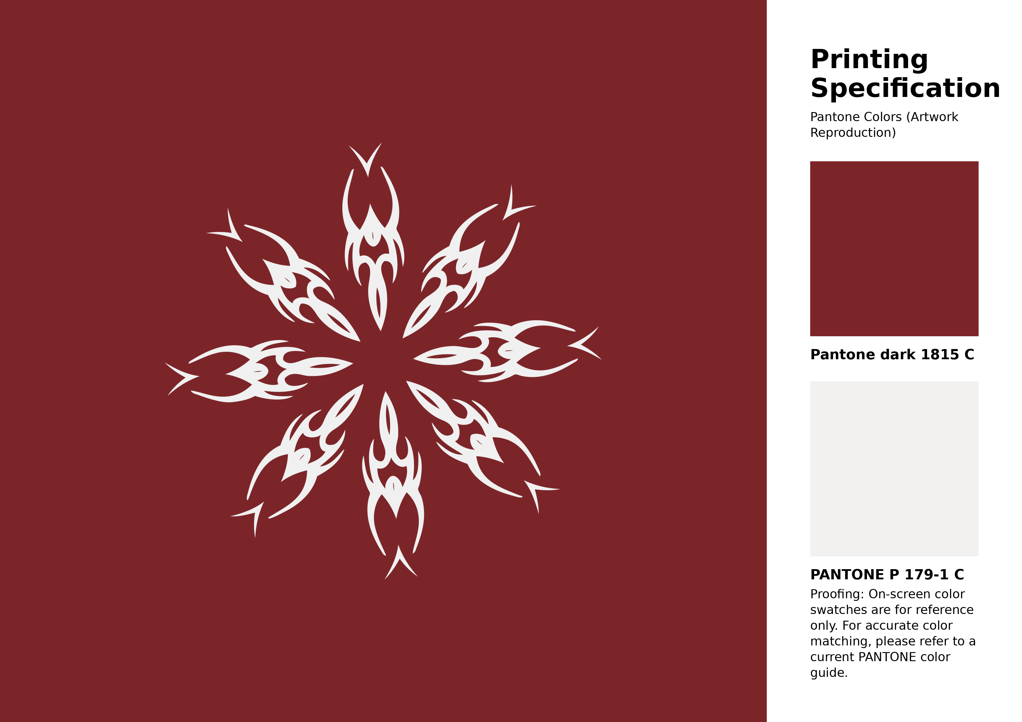
#7c2529 Pantone 1815 C Color | Hex color Code #7c2529 Artwork Image (PNG)
Download Artwork (PNG)#7c2529 Pantone 1815 C Color | Hex color Code #7c2529 Artwork Vector (PDF)
Download Artwork (PDF)#7c2529 Pantone 1815 C Color | Hex color Code #7c2529 Artwork Vector (SVG)
Download Artwork (SVG)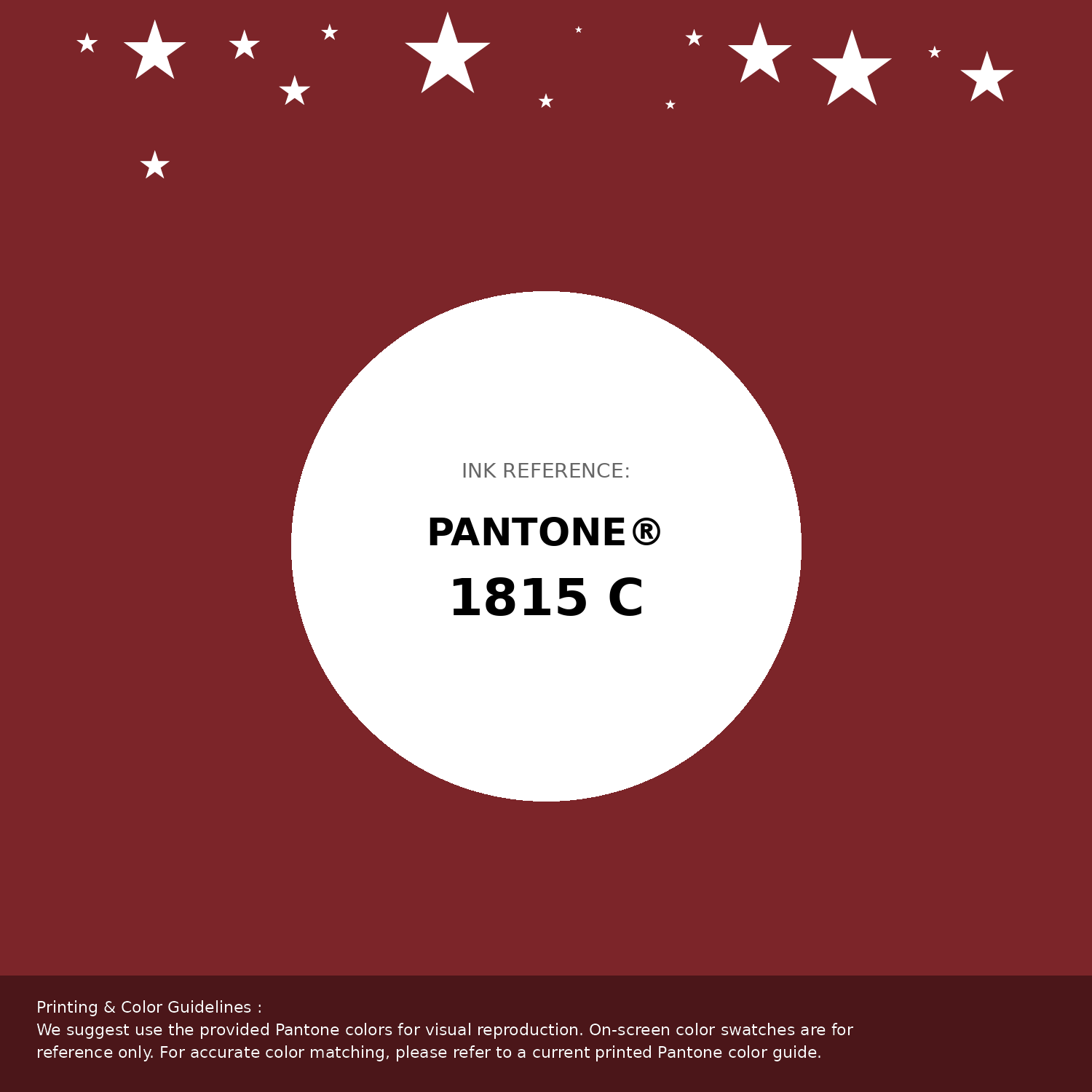
#7c2529 Pantone 1815 C Color | Hex color Code #7c2529 Pantone Swatch Artwork
Download Artwork Swatch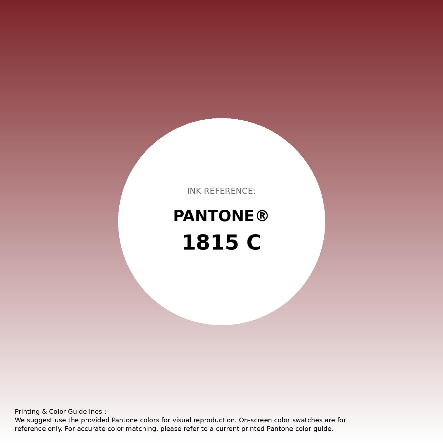
#7c2529 Pantone 1815 C Color | Hex color Code #7c2529 Gradient Artwork (PNG)
Download Gradient (PNG)#7c2529 Pantone 1815 C Color | Hex color Code #7c2529 Gradient Artwork (SVG)
Download Gradient (SVG)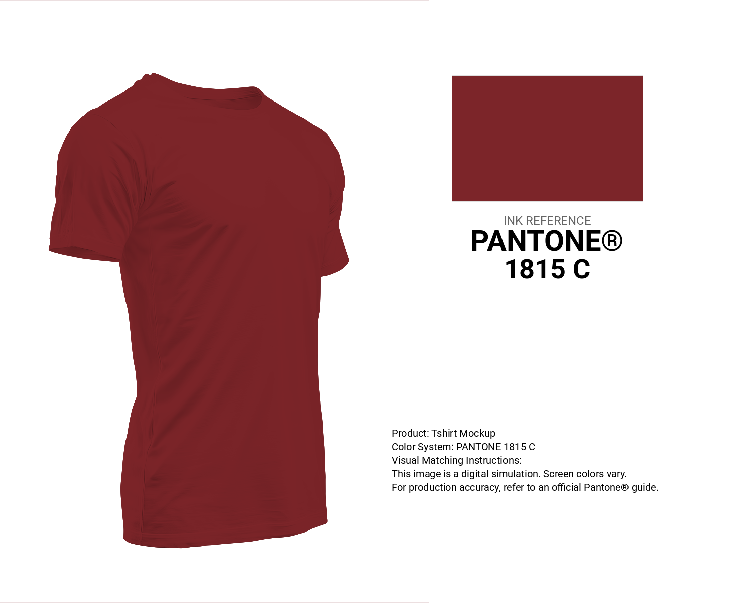
#7c2529 Pantone 1815 C Color | Hex color Code #7c2529 T-Shirt Mockup
Download T-Shirt Mockup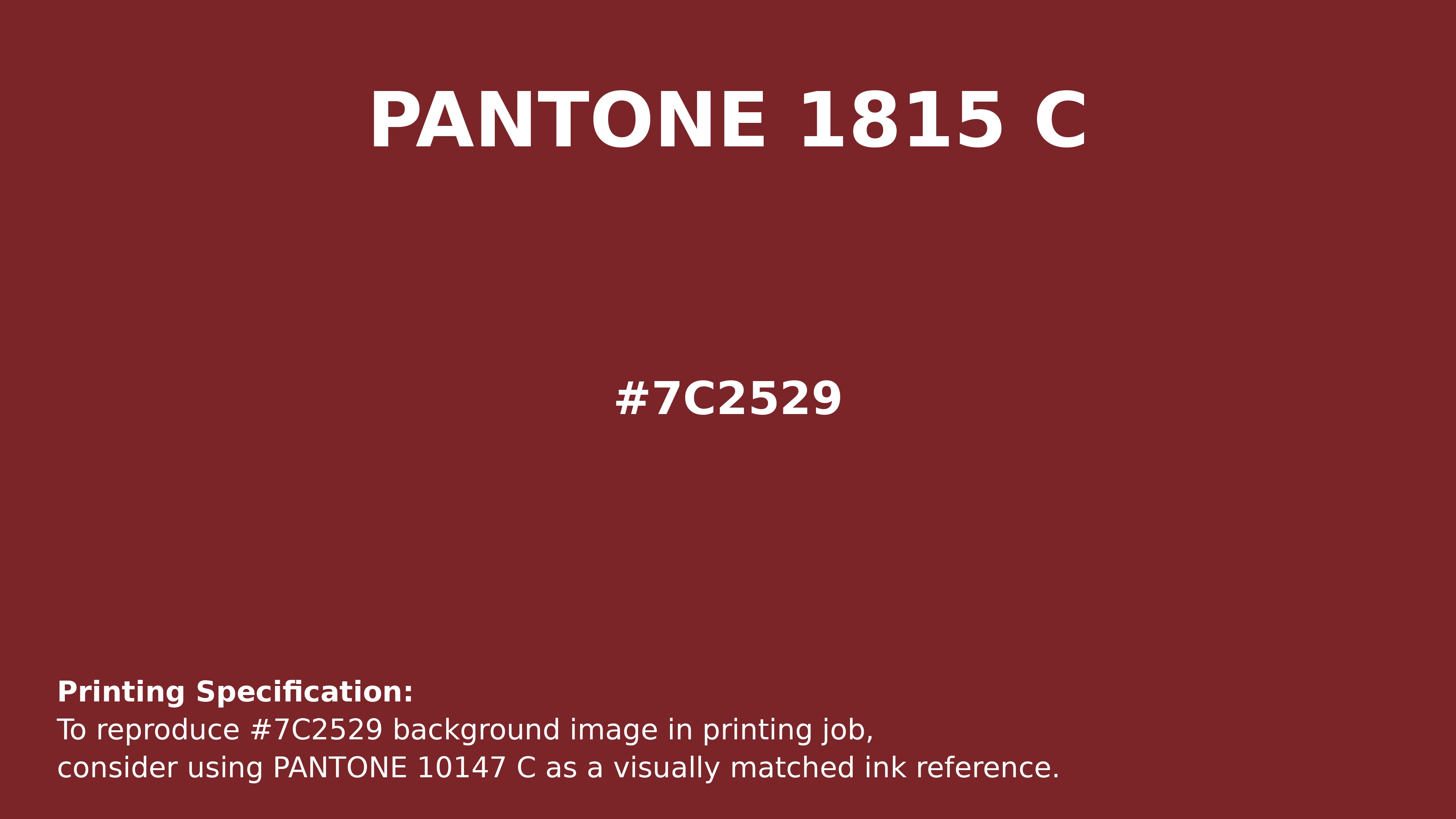
#7c2529 Pantone 1815 C Color | Hex color Code #7c2529 Printing Artwork Pantone Reference
Download Pantone Printing ReferenceRelated Color Palettes
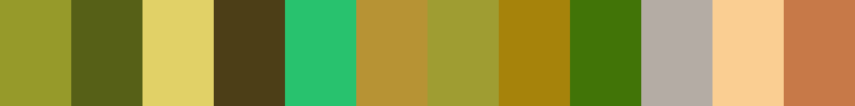
- Gainsboro and Rosy Brown •
- Dark Khaki and Brown •
- Lisbon Brown •
- Rosy Brown and Navajo White •
- Orchid and Rosy Brown •
- Rosy Brown and White Smoke •
- Steel Blue and Brown •
- Dark Olive Green and Saddle Brown •
- Brown and Dark Salmon •
- Brown and Pale Goldenrod •
- Crimson and Sandy brown •
- Sea Green and Sandy Brown •
- Saddle Brown and Gray •
- Brown and Dark Red •
- Sandy Brown and Burly Wood
Color Palette Collection
33 Nature Inspired Color Schemes
33 color palettes with 165 colors.

35 Light Blue Color Palette
35 color palettes with 175 colors.
125 Yellow Color Palettes
125 color palettes with 625 colors.

36 Orange shades Color Palette Collection
36 color palettes with 180 colors.