#778FA8 Color
Your all-in-one color resource. Download hex background images, Adobe swatches (ASE), PDF color sheets, and SVG files. Explore palettes, harmonies, accessibility, conversions, and professional exports — designed for designers, developers, and color perfectionists.
Evoking the serene atmosphere of a cloudy day, this color speaks of calm and balance. It suggests a sense of peace, stability, and reliability. It's reminiscent of a clear day, offering a sense of lightness and optimism. It can be used in design to project trustworthiness and professionalism, often found in corporate settings or healthcare branding. Visually matched named color: Sky's Gentle Embrace.
PANTONE 17-4021 TPX
Choose Color
Selected Color
Recent Colors
Color Details
Similar Ink Alternatives for #778FA8 color Alternative print inks for reproducing #778FA8 background image with a similar visual appearance.
Disclaimer: The visually matched ink reference is an independent approximation intended as a guide only. Please be advised that this pantone colors is only intended as a guide, Actual colours will depend on screen calibration variances. The print ink suggestions provided are independent visual approximations and are not affiliated with or endorsed by Pantone LLC. For official color specifications, conversion factors, and comprehensive color system information, please visit Pantone Connect. Official Pantone products can be purchased at pantone.com.
Color Previews for #000000 See how this color looks as a background or as text.
Complete Guide to Your Color Laboratory
Everything you need to know about this professional color toolkit.
Use the Color Picker at the top to select any color. All modules below update instantly.
Workflow: Pick a color → Explore palettes & data → Download what you need (PDF, Image, or Adobe ASE).
Color Details — Your color in all formats: HEX, RGB, RGBA, HSL, HSLA, HSV, CMYK, CIELab, Hunter-Lab, XYZ, Yxy, YUV. One-click copy.
Color Psychology — Emotional impact, cultural meanings, physiological effects, branding applications, and historical significance.
Named Colors — Find official color names (HTML/CSS, Pantone) that match your selection with similarity percentages.
Light & Dark Shades
80-step gradient from black to white. Perfect for button states and component systems.
Tints
Color mixed with white → lighter, pastel variations for backgrounds and disabled states.
Monochromatic — 11 curated tints/shades from one color. Production-ready for design systems.
- Complementary — Opposite on wheel (180°). High contrast.
- Analogous — Neighbors (±30°). Harmonious flow.
- Triadic — Three colors (120° apart). Vibrant, balanced.
- Split-Complementary — Base + two near-complements. Softer contrast.
- Tetradic/Square — Four colors. Complex, maximum variety.
- Neutral — Desaturated versions. Subtle, sophisticated.
15 Professional Variations — Monochromatic, Analogous, Complementary, Warm/Cool/Earth Tones, Pastel, Vibrant, High Contrast, and more.
Color Infusion — 10 palettes showing your color morphing into each major hue. Find bridge colors.
Similar Colors — 60+ colors generated via CIELAB Delta E matching. Unexpected harmonious combinations.
18 Ready-to-Use Gradients — Complementary, Analogous, Triadic, Tint/Shade progressions, and more.
Downloads: PNG (2560×1440), CSS (production-ready code), SVG (scalable vector).
WCAG Contrast Checker — Tests your color against white, black, and custom colors for AA (4.5:1) and AAA (7:1) compliance. Large text thresholds included.
Harmony & Accessibility Guide — Tests against 10 canonical hues. Shows which pairs are both beautiful AND WCAG-compliant for text.
PNG/JPG — High-res images for presentations and mood boards.
PDF — Print-ready reports for clients and teams.
Adobe ASE — Direct import to Photoshop, Illustrator, InDesign, XD.
CSS/SVG — Gradients only. Production-ready code and vectors.
Color Science: Industry-standard conversions (HSL, CIELAB, CMYK, XYZ). WCAG 2.1 luminance formula. Delta E (ΔE76) for perceptual matching.
Direct Links: Share colors via icolorpalette.com/color/ff5733 or icolorpalette.com/color/red
Issues? Refresh the page, wait for rendering, try another browser, or check console (F12) for errors.
Printing Guide for #778fa8 Background Image
Use PANTONE 17-4021 TPX as a visually matched ink reference when printing this background image.
To print the #778fa8 background image from our site, consider using PANTONE 17-4021 TPX as a visually matched ink reference.
Download the background image, then provide this reference code to your print vendor to help achieve accurate color reproduction.
The visually matched ink reference for the #778fa8 background image is PANTONE 17-4021 TPX.
This color is commonly described as Sky's Gentle Embrace.
Evoking the serene atmosphere of a cloudy day, this color speaks of calm and balance. It suggests a sense of peace, stability, and reliability. It's reminiscent of a clear day, offering a sense of lightness and optimism. It can be used in design to project trustworthiness and professionalism, often found in corporate settings or healthcare branding.
We provide PANTONE 17-4021 TPX as a visually matched ink reference to help you reproduce the #778fa8 background image accurately in professional printing.
This reference code helps print vendors achieve consistent color output across different printing equipment and materials.
After downloading the #778fa8 background image from our site:
- Include the visually matched ink reference PANTONE 17-4021 TPX in your print order notes
- Inform your print vendor that this is your target color reference
- Request a proof print to verify the Sky's Gentle Embrace color appearance before full production
The #778fa8 background image with PANTONE 17-4021 TPX as visually matched ink reference can be used for:
- Posters, banners, and backdrops
- Business cards, brochures, and flyers
- Packaging, labels, and stickers
- Signage and promotional materials
This is an independent visual approximation.
While PANTONE 17-4021 TPX closely matches the #778fa8 background image color, variations may exist between screen display and printed output.
We recommend requesting a proof print to verify the final appearance.
Evoking the serene atmosphere of a cloudy day, this color speaks of calm and balance. It suggests a sense of peace, stability, and reliability. It's reminiscent of a clear day, offering a sense of lightness and optimism. It can be used in design to project trustworthiness and professionalism, often found in corporate settings or healthcare branding.
Understanding these associations helps ensure the #778fa8 background image aligns with your intended message and brand impact.
Important Information
The visually matched ink reference is an independent approximation intended as a guide only.
Actual printed colors may vary depending on screen calibration, substrate material, ink type, and printing equipment used.
For official color specifications and certified color standards, visit Pantone Connect.
Official color guides and swatch books can be purchased from pantone.com.
Pantone 17-4021 TPX Faded Denim Color: A Muted Shade of Blue | #778FA8
Introduction:
Faded Denim Color is a muted shade of blue that is reminiscent of well-worn denim jeans. It exudes a sense of comfort, relaxation, and effortless style. The color has a cool undertone and a slightly desaturated appearance, giving it a vintage and nostalgic feel.
Historical Significance:
Indigo Revolution: Faded Denim Color gained prominence in the late 19th century with the rise of indigo dye and the popularity of denim fabric. It became synonymous with American workwear and later became a symbol of rebellion and counterculture in the mid-20th century. Denim jeans, made with Faded Denim Color, took the fashion industry by storm and became a staple in casual wear worldwide.
Symbolism and Meaning:
Casual and Relaxed: Faded Denim Color typically symbolizes a laid-back and effortless attitude. It represents comfort, familiarity, and a sense of freedom. In some contexts, it can also signify ruggedness and durability.
Faded Denim Color in Fashion:
Trendy and Timeless: Faded Denim Color continues to be a popular choice in the fashion world. It is versatile and can be incorporated into various styles, from casual to more refined looks. It pairs well with neutrals, whites, and other shades of blue, making it a versatile and easy-to-wear color.
Faded Denim Color in Graphic Design:
Reliable and Trustworthy: In design aesthetics, Faded Denim Color is often associated with dependability, trustworthiness, and stability. It can be used to convey a sense of professionalism and reliability in branding and visual communication.
Color Combinations:
Complementary Colors: Faded Denim Color pairs well with a range of colors, including light shades of gray, soft pinks, and warm earth tones. It can also be combined with brighter colors like coral or yellow for a more energetic and playful look.
Nature’s Palette:
Unifying Element: Faded Denim Color can be found in natural landscapes and elements such as serene waters, cloudy skies, and certain varieties of flowers. It creates a soothing and harmonious effect, acting as a unifying element in nature's palette.
Artistic Representations:
Expressive and Versatile: Faded Denim Color has been utilized by artists in various forms of art, including paintings, sculptures, and even photography. It adds depth, texture, and a touch of nostalgia to artistic representations.
Movies and Cinematic Landscapes:
Iconic Wardrobe:Faded Denim Color is often featured in movies to evoke a sense of authenticity and timelessness. From classic Westerns to contemporary dramas, this color is frequently associated with iconic wardrobe choices that make a lasting impression on the audience.
Products and Commercial Appeal:
Casual and Approachable: Many popular brands incorporate Faded Denim Color in their products or branding to establish a sense of approachability and relatability. It is commonly seen in clothing, home decor, and lifestyle products.
National Symbols and Significance:
Democracy and Independence: In some cultures, Faded Denim Color is associated with democratic values, independence, and freedom. It embodies the spirit of individuality and self-expression.
The Psychological and Emotional Impact:
Tranquility and Relaxation: Faded Denim Color has a calming effect and can evoke feelings of tranquility, serenity, and relaxation. It is often used in spaces intended for rest and reflection, such as bedrooms and wellness centers.
Conclusion:
In summary, Faded Denim Color holds historical significance as a symbol of rebellion and workwear. It represents a casual and relaxed attitude, while also having a versatile and timeless appeal in fashion and design. This color can be found in nature and has been utilized in various forms of art. It sets the tone in movies and creates a sense of approachability in commercial products. Faded Denim Color also carries symbolic meanings associated with democracy, tranquility, and independence.
Pantone 17-4021 Tpx Faded Denim Color | Hex color Code #778fa8 Image & Artwork
Download high-quality assets for your projects.

#778fa8 Color Schemes
Download Color Schemes
#778fa8 Color Shades
Download Color Shades
Pantone 17-4021 Tpx Faded Denim Color | Hex color Code #778fa8 Solid Color Background
Download Solid Color
#778fa8 Pantone 17-4021 Tpx Faded Denim Color | Hex color Code #778fa8 Artwork Image (PNG)
Download Artwork (PNG)#778fa8 Pantone 17-4021 Tpx Faded Denim Color | Hex color Code #778fa8 Artwork Vector (PDF)
Download Artwork (PDF)#778fa8 Pantone 17-4021 Tpx Faded Denim Color | Hex color Code #778fa8 Artwork Vector (SVG)
Download Artwork (SVG)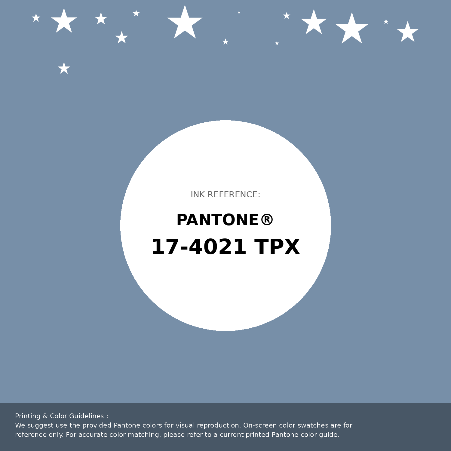
#778fa8 Pantone 17-4021 Tpx Faded Denim Color | Hex color Code #778fa8 Pantone Swatch Artwork
Download Artwork Swatch
#778fa8 Pantone 17-4021 Tpx Faded Denim Color | Hex color Code #778fa8 Gradient Artwork (PNG)
Download Gradient (PNG)#778fa8 Pantone 17-4021 Tpx Faded Denim Color | Hex color Code #778fa8 Gradient Artwork (SVG)
Download Gradient (SVG)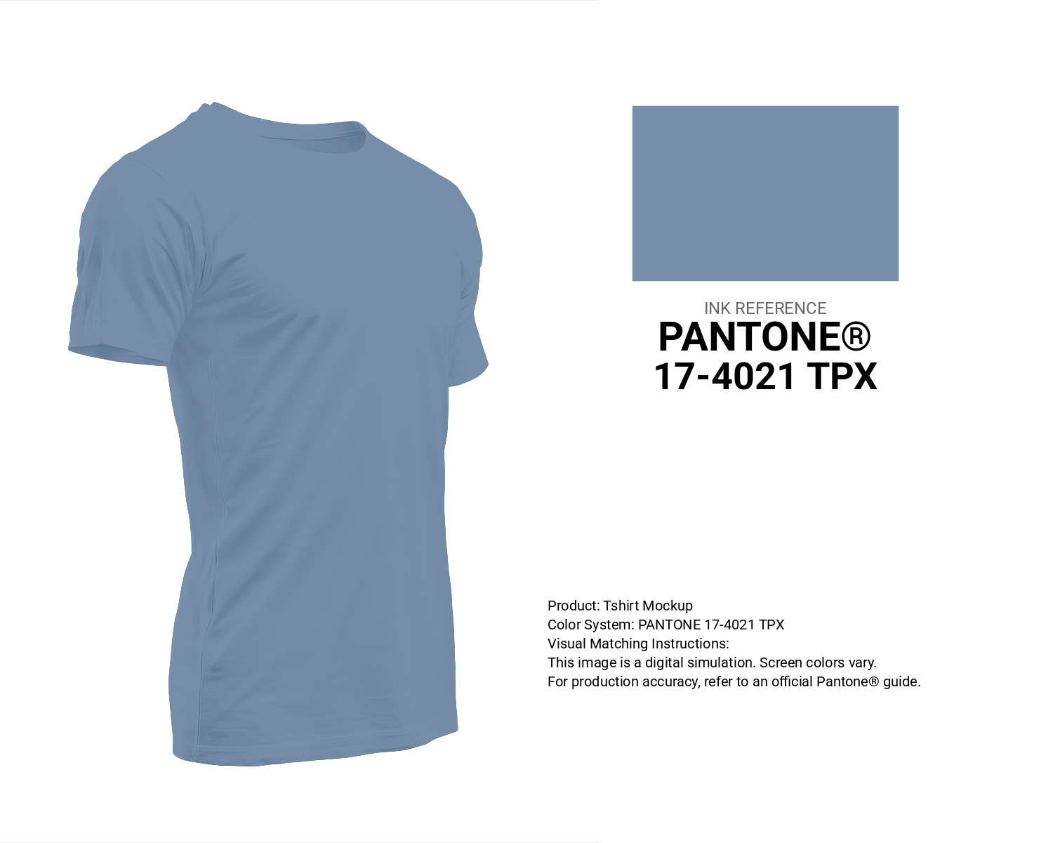
#778fa8 Pantone 17-4021 Tpx Faded Denim Color | Hex color Code #778fa8 T-Shirt Mockup
Download T-Shirt Mockup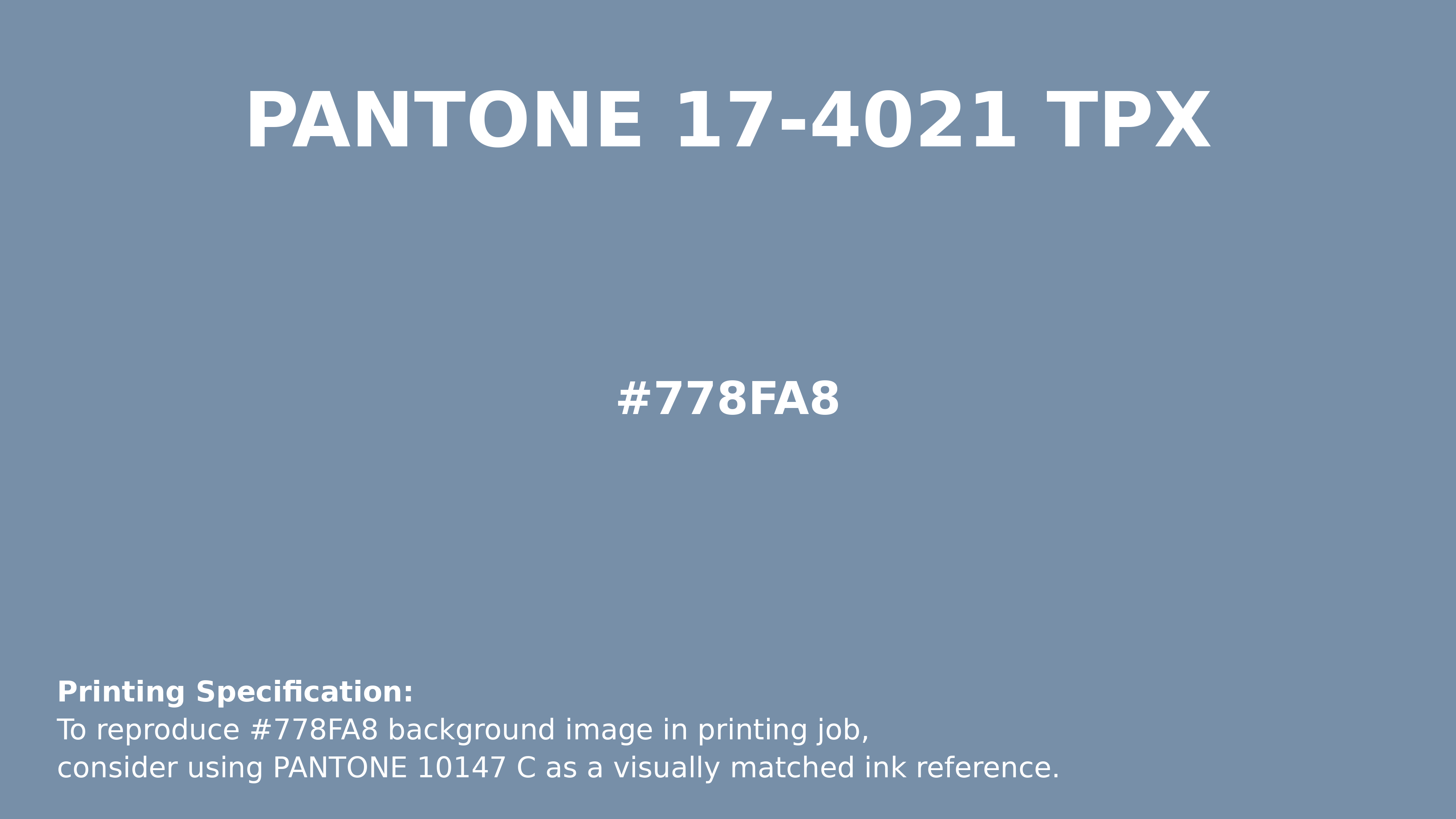
#778fa8 Pantone 17-4021 Tpx Faded Denim Color | Hex color Code #778fa8 Printing Artwork Pantone Reference
Download Pantone Printing ReferenceRelated Color Palettes
- Slate Gray and Dim Gray •
- Olive Drab and Light Slate Gray •
- Dim Gray and Gray •
- Dark Slate Gray and Dark Turquoise •
- Light Slate Gray and Dark Khaki •
- Dark Gray and Crimson •
- Chocolate and Dim Gray •
- Medium Aquamarine and Slate Gray •
- Dark Slate Gray and Sienna •
- Light Gray and Thistle •
- Dark Slate Gray and Dark Slate Blue •
- Light Slate Gray and Yellow Green •
- Fire Brick and Gray •
- Gold and Dark Slate Gray •
- Slate Gray and Dark Slate Gray
Color Palette Collection
26 Brown Color Combinations
26 color palettes with 130 colors.
Forest Theme colors
15 color palettes with 75 colors.

Purple ideas
10 color palettes with 50 colors.

49 Beautiful curated Color Schemes For Your Next Design Project
49 color palettes with 245 colors.