#B4D3B2 Color
Your all-in-one color resource. Download hex background images, Adobe swatches (ASE), PDF color sheets, and SVG files. Explore palettes, harmonies, accessibility, conversions, and professional exports — designed for designers, developers, and color perfectionists.
This gentle, muted green evokes a sense of calm and tranquility, like a hazy morning in a spring meadow. It's reminiscent of new growth, soft leaves unfurling, and the quiet promise of the season. The color fosters feelings of serenity, peace, and hope, creating a soothing and refreshing atmosphere. It suggests harmony with nature and a return to simpler times. In design, it's ideal for creating a calming and inviting space, particularly in bedrooms, nurseries, or wellness centers. This color can also be used to create a subtle and organic feel in branding and packaging, suggesting natural ingredients and a gentle touch. Visually matched named color: Spring Meadow Mist.
PANTONE 13-0116 TCX
Choose Color
Selected Color
Recent Colors
Color Details
Similar Ink Alternatives for #B4D3B2 color Alternative print inks for reproducing #B4D3B2 background image with a similar visual appearance.
Disclaimer: The visually matched ink reference is an independent approximation intended as a guide only. Please be advised that this pantone colors is only intended as a guide, Actual colours will depend on screen calibration variances. The print ink suggestions provided are independent visual approximations and are not affiliated with or endorsed by Pantone LLC. For official color specifications, conversion factors, and comprehensive color system information, please visit Pantone Connect. Official Pantone products can be purchased at pantone.com.
Color Previews for #000000 See how this color looks as a background or as text.
Complete Guide to Your Color Laboratory
Everything you need to know about this professional color toolkit.
Use the Color Picker at the top to select any color. All modules below update instantly.
Workflow: Pick a color → Explore palettes & data → Download what you need (PDF, Image, or Adobe ASE).
Color Details — Your color in all formats: HEX, RGB, RGBA, HSL, HSLA, HSV, CMYK, CIELab, Hunter-Lab, XYZ, Yxy, YUV. One-click copy.
Color Psychology — Emotional impact, cultural meanings, physiological effects, branding applications, and historical significance.
Named Colors — Find official color names (HTML/CSS, Pantone) that match your selection with similarity percentages.
Light & Dark Shades
80-step gradient from black to white. Perfect for button states and component systems.
Tints
Color mixed with white → lighter, pastel variations for backgrounds and disabled states.
Monochromatic — 11 curated tints/shades from one color. Production-ready for design systems.
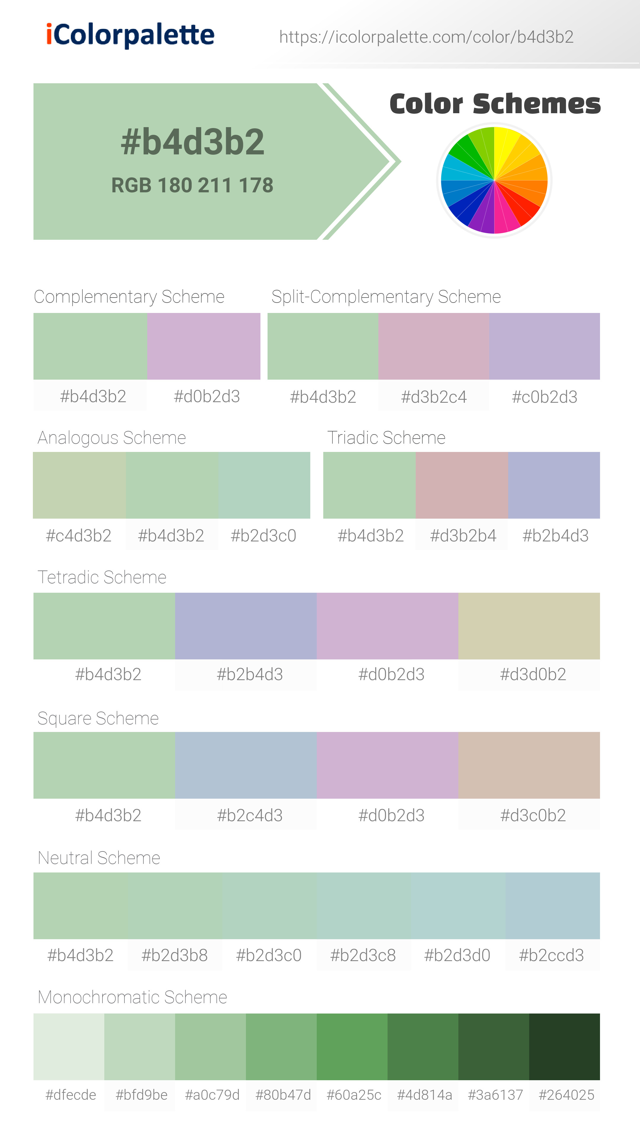
- Complementary — Opposite on wheel (180°). High contrast.
- Analogous — Neighbors (±30°). Harmonious flow.
- Triadic — Three colors (120° apart). Vibrant, balanced.
- Split-Complementary — Base + two near-complements. Softer contrast.
- Tetradic/Square — Four colors. Complex, maximum variety.
- Neutral — Desaturated versions. Subtle, sophisticated.
15 Professional Variations — Monochromatic, Analogous, Complementary, Warm/Cool/Earth Tones, Pastel, Vibrant, High Contrast, and more.
Color Infusion — 10 palettes showing your color morphing into each major hue. Find bridge colors.
Similar Colors — 60+ colors generated via CIELAB Delta E matching. Unexpected harmonious combinations.
18 Ready-to-Use Gradients — Complementary, Analogous, Triadic, Tint/Shade progressions, and more.
Downloads: PNG (2560×1440), CSS (production-ready code), SVG (scalable vector).
WCAG Contrast Checker — Tests your color against white, black, and custom colors for AA (4.5:1) and AAA (7:1) compliance. Large text thresholds included.
Harmony & Accessibility Guide — Tests against 10 canonical hues. Shows which pairs are both beautiful AND WCAG-compliant for text.
PNG/JPG — High-res images for presentations and mood boards.
PDF — Print-ready reports for clients and teams.
Adobe ASE — Direct import to Photoshop, Illustrator, InDesign, XD.
CSS/SVG — Gradients only. Production-ready code and vectors.
Color Science: Industry-standard conversions (HSL, CIELAB, CMYK, XYZ). WCAG 2.1 luminance formula. Delta E (ΔE76) for perceptual matching.
Direct Links: Share colors via icolorpalette.com/color/ff5733 or icolorpalette.com/color/red
Issues? Refresh the page, wait for rendering, try another browser, or check console (F12) for errors.
Printing Guide for #b4d3b2 Background Image
Use PANTONE 13-0116 TCX as a visually matched ink reference when printing this background image.
To print the #b4d3b2 background image from our site, consider using PANTONE 13-0116 TCX as a visually matched ink reference.
Download the background image, then provide this reference code to your print vendor to help achieve accurate color reproduction.
The visually matched ink reference for the #b4d3b2 background image is PANTONE 13-0116 TCX.
This color is commonly described as Spring Meadow Mist.
This gentle, muted green evokes a sense of calm and tranquility, like a hazy morning in a spring meadow. It's reminiscent of new growth, soft leaves unfurling, and the quiet promise of the season. The color fosters feelings of serenity, peace, and hope, creating a soothing and refreshing atmosphere. It suggests harmony with nature and a return to simpler times. In design, it's ideal for creating a calming and inviting space, particularly in bedrooms, nurseries, or wellness centers. This color can also be used to create a subtle and organic feel in branding and packaging, suggesting natural ingredients and a gentle touch.
We provide PANTONE 13-0116 TCX as a visually matched ink reference to help you reproduce the #b4d3b2 background image accurately in professional printing.
This reference code helps print vendors achieve consistent color output across different printing equipment and materials.
After downloading the #b4d3b2 background image from our site:
- Include the visually matched ink reference PANTONE 13-0116 TCX in your print order notes
- Inform your print vendor that this is your target color reference
- Request a proof print to verify the Spring Meadow Mist color appearance before full production
The #b4d3b2 background image with PANTONE 13-0116 TCX as visually matched ink reference can be used for:
- Posters, banners, and backdrops
- Business cards, brochures, and flyers
- Packaging, labels, and stickers
- Signage and promotional materials
This is an independent visual approximation.
While PANTONE 13-0116 TCX closely matches the #b4d3b2 background image color, variations may exist between screen display and printed output.
We recommend requesting a proof print to verify the final appearance.
This gentle, muted green evokes a sense of calm and tranquility, like a hazy morning in a spring meadow. It's reminiscent of new growth, soft leaves unfurling, and the quiet promise of the season. The color fosters feelings of serenity, peace, and hope, creating a soothing and refreshing atmosphere. It suggests harmony with nature and a return to simpler times. In design, it's ideal for creating a calming and inviting space, particularly in bedrooms, nurseries, or wellness centers. This color can also be used to create a subtle and organic feel in branding and packaging, suggesting natural ingredients and a gentle touch.
Understanding these associations helps ensure the #b4d3b2 background image aligns with your intended message and brand impact.
Important Information
The visually matched ink reference is an independent approximation intended as a guide only.
Actual printed colors may vary depending on screen calibration, substrate material, ink type, and printing equipment used.
For official color specifications and certified color standards, visit Pantone Connect.
Official color guides and swatch books can be purchased from pantone.com.
Pastel Green Color: a Tranquil and Refreshing Shade | #B4D3B2
Introduction:
Pastel Green Color is a soothing and gentle shade that resembles the softness of spring leaves and fresh grass. Its lightness and cool undertones create a tranquil and refreshing visual appeal.
Historical Significance:
Early Use in Art: Pastel Green Color has been used in various forms of art throughout history, particularly in landscapes and nature-inspired works.
Green Movement: In the 1960s, Pastel Green Color gained prominence as a symbol of the environmental movement and sustainability.
Popularity in Home Decor: In the 1980s and 1990s, Pastel Green Color became a popular choice for home decor, reflecting a desire for a calming and natural atmosphere.
Symbolism and Meaning:
Renewal and Growth: Pastel Green Color typically symbolizes renewal, growth, and harmony. It represents a sense of balance and connection with nature in various cultures.
Pastel Green Color in Fashion:
Natural and Sustainable Fashion: Pastel Green Color is often used in eco-friendly and sustainable fashion collections. It evokes a sense of freshness, tranquility, and connection to nature.
Pastel Green Color in Graphic Design:
Harmonious and Calming Aesthetics: Pastel Green Color is widely used in graphic design to create a sense of harmony, balance, and relaxation. It is often associated with wellness, nature, and environmental themes.
Color Combinations:
Pastel Green with Pink: The combination of Pastel Green and Pink creates a delicate and feminine color palette.
Pastel Green with Lavender: Pairing Pastel Green with Lavender results in a calming and serene combination.
Nature’s Palette:
Natural Occurrences: Pastel Green Color can be observed in various natural occurrences, such as the leaves of certain plants, moss, and some types of algae.
Artistic Representations:
Landscape Art: Many landscape artists incorporate Pastel Green Color into their works to depict serene and tranquil natural scenes.
Movies and Cinematic Landscapes:
Enchanted Forest: Pastel Green Color is often used in movies and cinematic landscapes to depict magical and fantastical environments, particularly in fairy tale settings.
Products and Commercial Appeal:
Natural and Organic Products: Pastel Green Color is often associated with natural and organic products, conveying a sense of purity and eco-friendliness.
National Symbols and Significance:
Irish Culture: Pastel Green Color is symbolically associated with Irish culture and is often seen in representations of St. Patrick's Day and Irish symbolism.
The Psychological and Emotional Impact:
Relaxation and Calm: Pastel Green Color has a psychologically calming effect, promoting relaxation, serenity, and a sense of well-being.
Conclusion:
The Pastel Green Color evokes a sense of tranquility, growth, and connection with nature. Its historical significance in art, fashion, and design, along with its calming and refreshing symbolism, make it a timeless and versatile color choice.
Pantone 13-0116 Tcx Pastel Green Color | Hex color Code #b4d3b2 Image & Artwork
Download high-quality assets for your projects.
#b4d3b2 Color Schemes
Download Color Schemes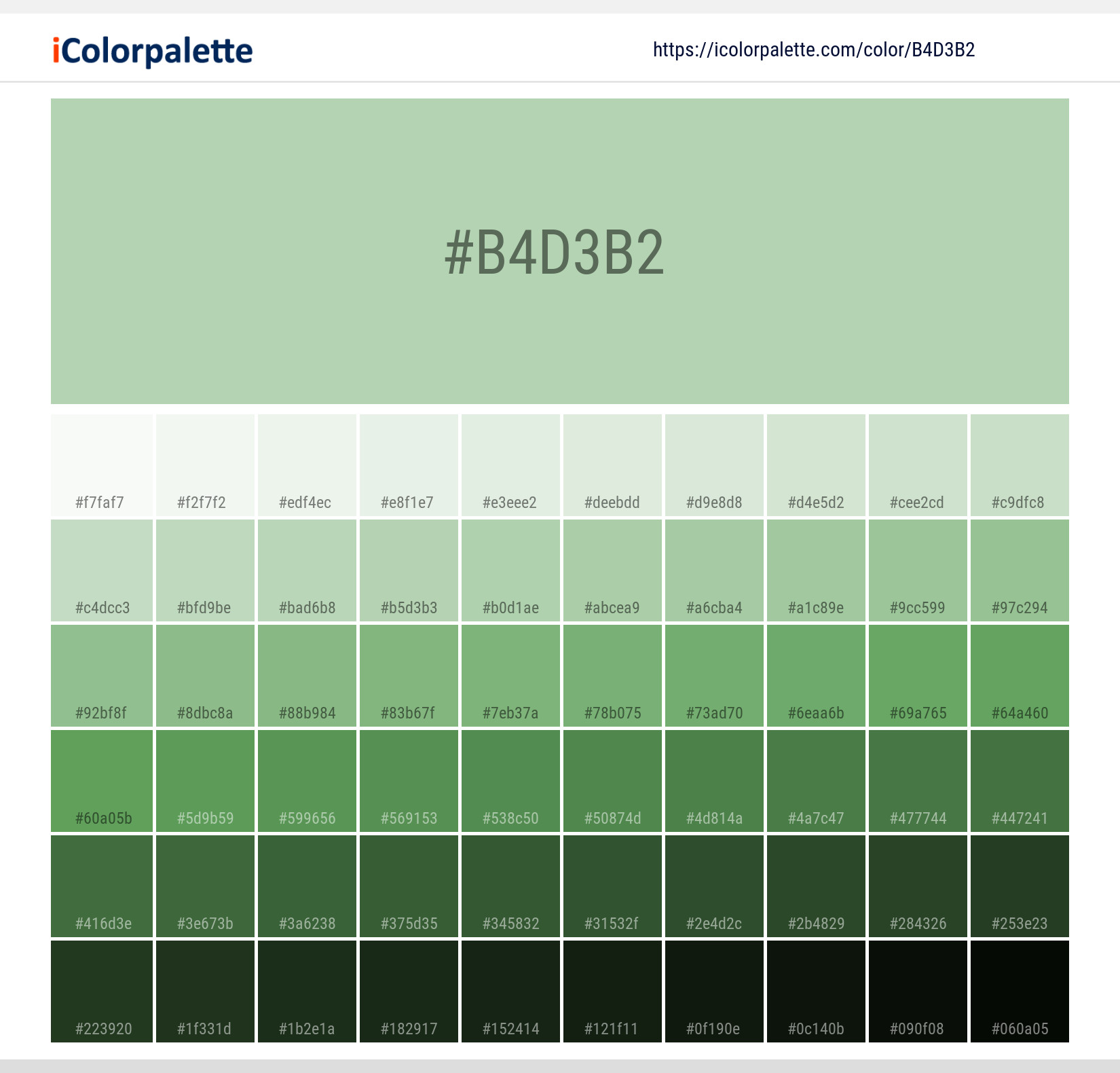
#b4d3b2 Color Shades
Download Color Shades
Pantone 13-0116 Tcx Pastel Green Color | Hex color Code #b4d3b2 Solid Color Background
Download Solid Color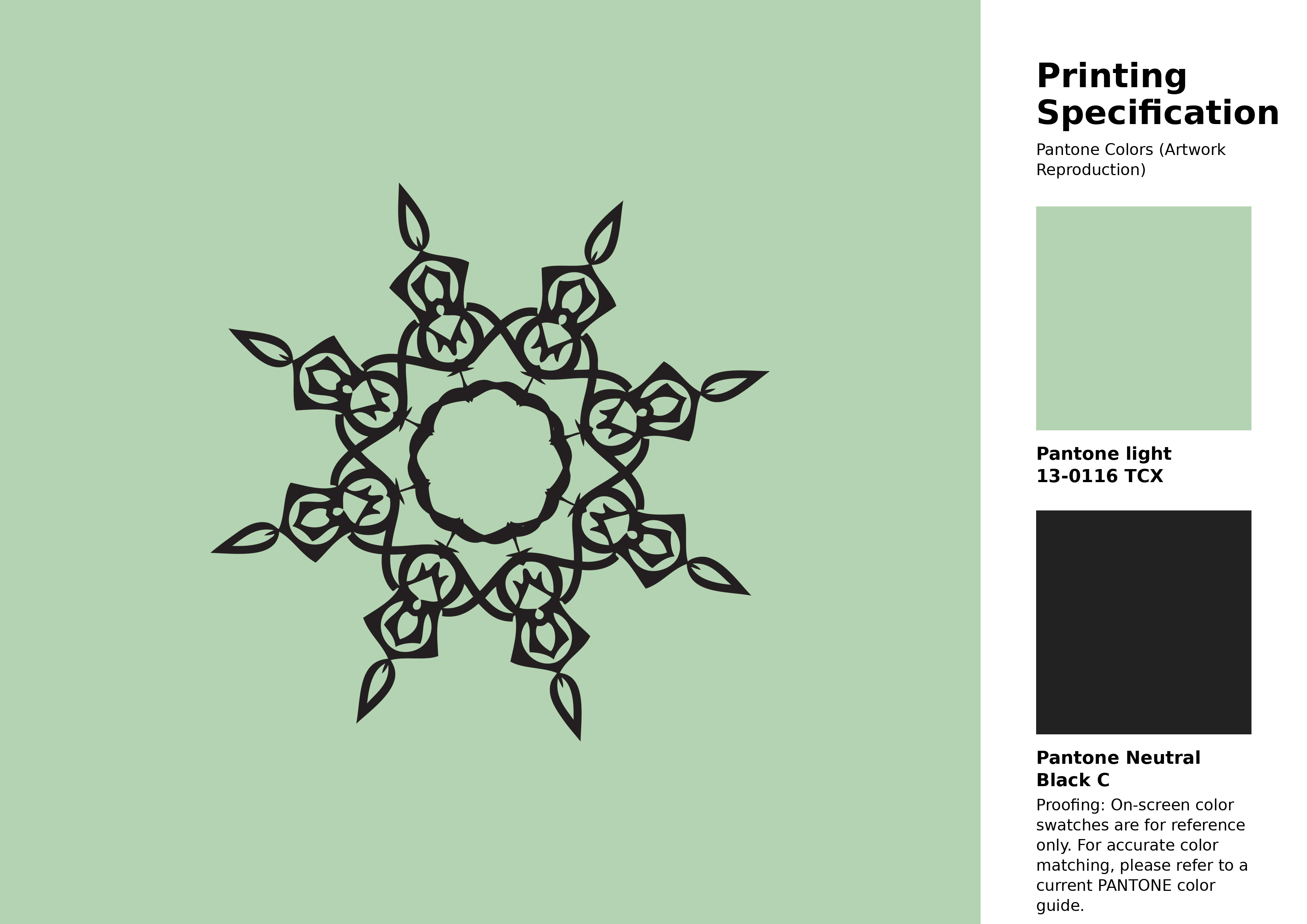
#b4d3b2 Pantone 13-0116 Tcx Pastel Green Color | Hex color Code #b4d3b2 Artwork Image (PNG)
Download Artwork (PNG)#b4d3b2 Pantone 13-0116 Tcx Pastel Green Color | Hex color Code #b4d3b2 Artwork Vector (PDF)
Download Artwork (PDF)#b4d3b2 Pantone 13-0116 Tcx Pastel Green Color | Hex color Code #b4d3b2 Artwork Vector (SVG)
Download Artwork (SVG)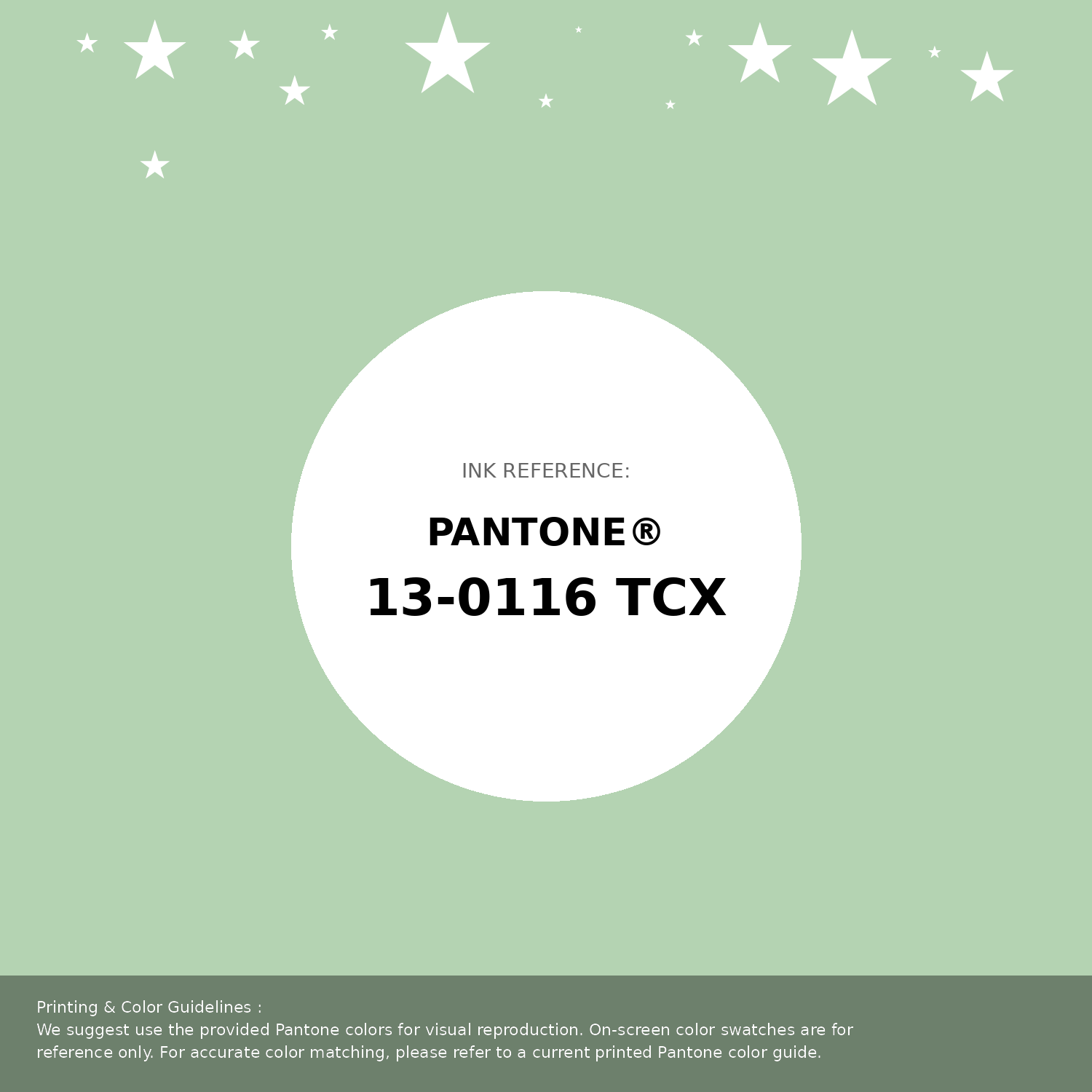
#b4d3b2 Pantone 13-0116 Tcx Pastel Green Color | Hex color Code #b4d3b2 Pantone Swatch Artwork
Download Artwork Swatch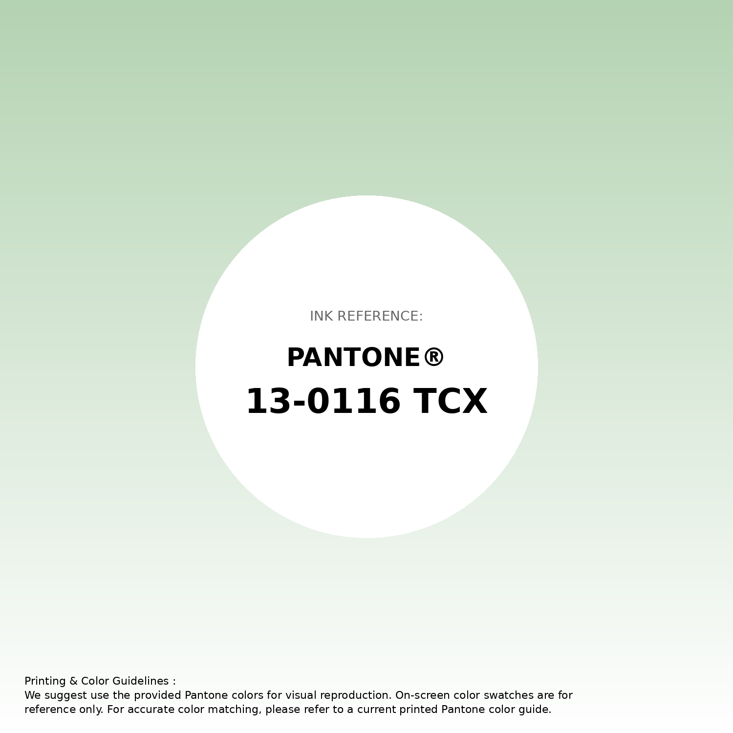
#b4d3b2 Pantone 13-0116 Tcx Pastel Green Color | Hex color Code #b4d3b2 Gradient Artwork (PNG)
Download Gradient (PNG)#b4d3b2 Pantone 13-0116 Tcx Pastel Green Color | Hex color Code #b4d3b2 Gradient Artwork (SVG)
Download Gradient (SVG)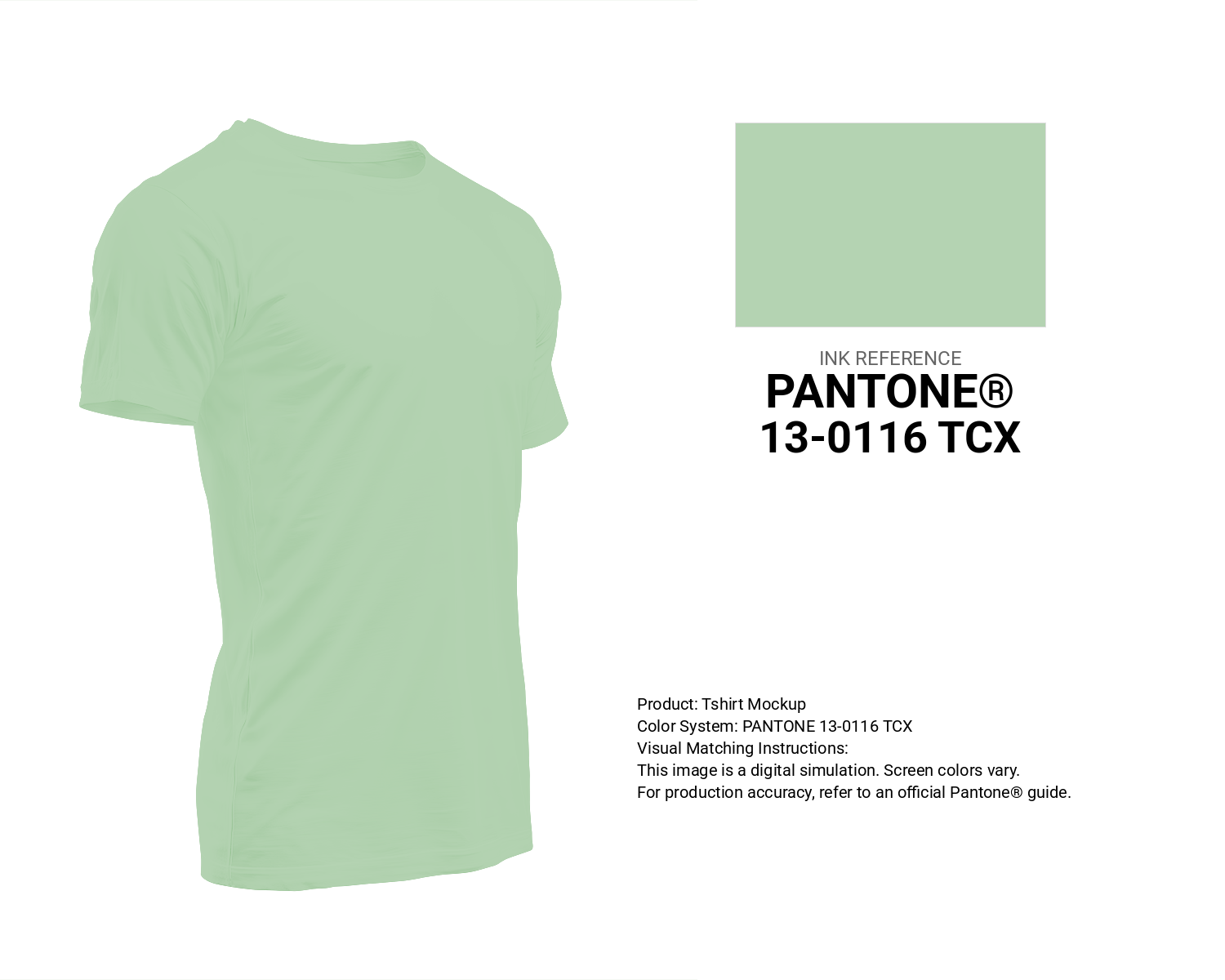
#b4d3b2 Pantone 13-0116 Tcx Pastel Green Color | Hex color Code #b4d3b2 T-Shirt Mockup
Download T-Shirt Mockup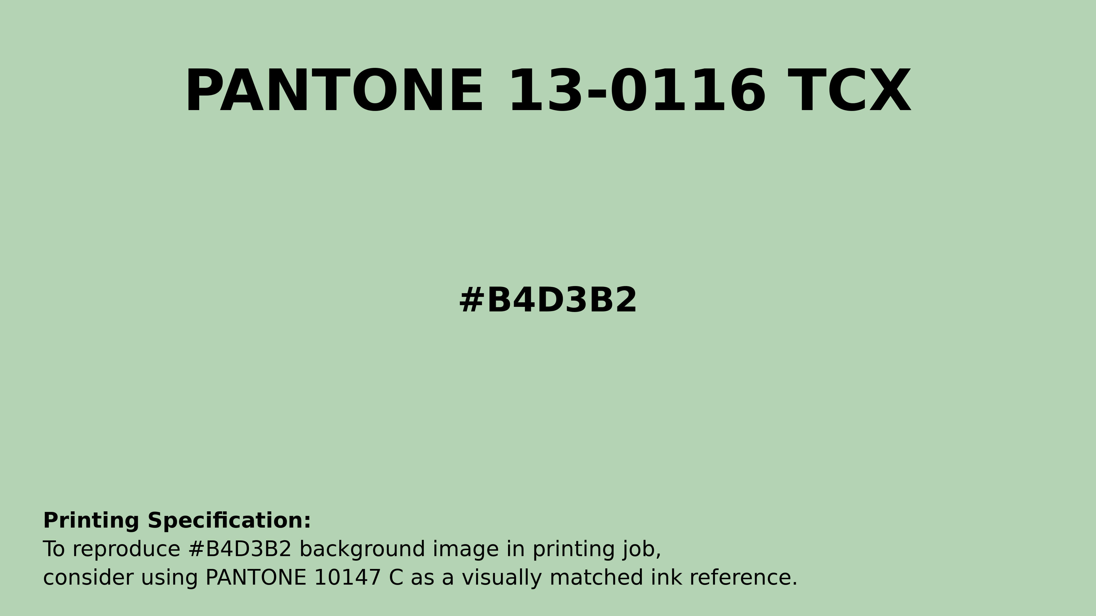
#b4d3b2 Pantone 13-0116 Tcx Pastel Green Color | Hex color Code #b4d3b2 Printing Artwork Pantone Reference
Download Pantone Printing ReferenceRelated Color Palettes
- Beige and Fire Brick •
- Beige and Thistle •
- Thistle and Beige •
- Beige and Light Blue •
- Indian Red and Beige •
- Powder Blue and Beige •
- Beige and Light Gray •
- Beige and OrangeRed •
- Steel Blue and Beige •
- Dark Khaki and Beige •
- Midnight Blue and Beige •
- Cadet Blue and Beige •
- Dark Sea Green and Beige •
- Beige and Dark Slate Blue •
- Beige and Plum
Color Palette Collection

Home vibes
1 color palettes with 5 colors.

42 Green Color Schemes
42 color palettes with 210 colors.

38 Beautiful Color Palettes
38 color palettes with 190 colors.

366 Bright Color Palettes
366 color palettes with 1830 colors.