#DAAA00 Color
Your all-in-one color resource. Download hex background images, Adobe swatches (ASE), PDF color sheets, and SVG files. Explore palettes, harmonies, accessibility, conversions, and professional exports — designed for designers, developers, and color perfectionists.
This rich, warm ochre evokes feelings of abundance, prosperity, and the golden hour of sunset. It conjures images of ripe, golden cornfields, autumn leaves, and the warmth of a crackling fire. The color creates a cheerful and inviting atmosphere, perfect for kitchens, dining rooms, or spaces designed to promote a sense of home and comfort. In design, it can be used to highlight natural elements and bring a touch of rustic charm. The color might also symbolize harvest celebrations or the bounty of the earth. Visually matched named color: Golden Harvest.
PANTONE 110 C
Choose Color
Selected Color
Recent Colors
Color Details
Similar Ink Alternatives for #DAAA00 color Alternative print inks for reproducing #DAAA00 background image with a similar visual appearance.
Disclaimer: The visually matched ink reference is an independent approximation intended as a guide only. Please be advised that this pantone colors is only intended as a guide, Actual colours will depend on screen calibration variances. The print ink suggestions provided are independent visual approximations and are not affiliated with or endorsed by Pantone LLC. For official color specifications, conversion factors, and comprehensive color system information, please visit Pantone Connect. Official Pantone products can be purchased at pantone.com.
Color Previews for #000000 See how this color looks as a background or as text.
Complete Guide to Your Color Laboratory
Everything you need to know about this professional color toolkit.
Use the Color Picker at the top to select any color. All modules below update instantly.
Workflow: Pick a color → Explore palettes & data → Download what you need (PDF, Image, or Adobe ASE).
Color Details — Your color in all formats: HEX, RGB, RGBA, HSL, HSLA, HSV, CMYK, CIELab, Hunter-Lab, XYZ, Yxy, YUV. One-click copy.
Color Psychology — Emotional impact, cultural meanings, physiological effects, branding applications, and historical significance.
Named Colors — Find official color names (HTML/CSS, Pantone) that match your selection with similarity percentages.
Light & Dark Shades
80-step gradient from black to white. Perfect for button states and component systems.
Tints
Color mixed with white → lighter, pastel variations for backgrounds and disabled states.
Monochromatic — 11 curated tints/shades from one color. Production-ready for design systems.
- Complementary — Opposite on wheel (180°). High contrast.
- Analogous — Neighbors (±30°). Harmonious flow.
- Triadic — Three colors (120° apart). Vibrant, balanced.
- Split-Complementary — Base + two near-complements. Softer contrast.
- Tetradic/Square — Four colors. Complex, maximum variety.
- Neutral — Desaturated versions. Subtle, sophisticated.
15 Professional Variations — Monochromatic, Analogous, Complementary, Warm/Cool/Earth Tones, Pastel, Vibrant, High Contrast, and more.
Color Infusion — 10 palettes showing your color morphing into each major hue. Find bridge colors.
Similar Colors — 60+ colors generated via CIELAB Delta E matching. Unexpected harmonious combinations.
18 Ready-to-Use Gradients — Complementary, Analogous, Triadic, Tint/Shade progressions, and more.
Downloads: PNG (2560×1440), CSS (production-ready code), SVG (scalable vector).
WCAG Contrast Checker — Tests your color against white, black, and custom colors for AA (4.5:1) and AAA (7:1) compliance. Large text thresholds included.
Harmony & Accessibility Guide — Tests against 10 canonical hues. Shows which pairs are both beautiful AND WCAG-compliant for text.
PNG/JPG — High-res images for presentations and mood boards.
PDF — Print-ready reports for clients and teams.
Adobe ASE — Direct import to Photoshop, Illustrator, InDesign, XD.
CSS/SVG — Gradients only. Production-ready code and vectors.
Color Science: Industry-standard conversions (HSL, CIELAB, CMYK, XYZ). WCAG 2.1 luminance formula. Delta E (ΔE76) for perceptual matching.
Direct Links: Share colors via icolorpalette.com/color/ff5733 or icolorpalette.com/color/red
Issues? Refresh the page, wait for rendering, try another browser, or check console (F12) for errors.
Printing Guide for #daaa00 Background Image
Use PANTONE 110 C as a visually matched ink reference when printing this background image.
To print the #daaa00 background image from our site, consider using PANTONE 110 C as a visually matched ink reference.
Download the background image, then provide this reference code to your print vendor to help achieve accurate color reproduction.
The visually matched ink reference for the #daaa00 background image is PANTONE 110 C.
This color is commonly described as Golden Harvest.
This rich, warm ochre evokes feelings of abundance, prosperity, and the golden hour of sunset. It conjures images of ripe, golden cornfields, autumn leaves, and the warmth of a crackling fire. The color creates a cheerful and inviting atmosphere, perfect for kitchens, dining rooms, or spaces designed to promote a sense of home and comfort. In design, it can be used to highlight natural elements and bring a touch of rustic charm. The color might also symbolize harvest celebrations or the bounty of the earth.
We provide PANTONE 110 C as a visually matched ink reference to help you reproduce the #daaa00 background image accurately in professional printing.
This reference code helps print vendors achieve consistent color output across different printing equipment and materials.
After downloading the #daaa00 background image from our site:
- Include the visually matched ink reference PANTONE 110 C in your print order notes
- Inform your print vendor that this is your target color reference
- Request a proof print to verify the Golden Harvest color appearance before full production
The #daaa00 background image with PANTONE 110 C as visually matched ink reference can be used for:
- Posters, banners, and backdrops
- Business cards, brochures, and flyers
- Packaging, labels, and stickers
- Signage and promotional materials
This is an independent visual approximation.
While PANTONE 110 C closely matches the #daaa00 background image color, variations may exist between screen display and printed output.
We recommend requesting a proof print to verify the final appearance.
This rich, warm ochre evokes feelings of abundance, prosperity, and the golden hour of sunset. It conjures images of ripe, golden cornfields, autumn leaves, and the warmth of a crackling fire. The color creates a cheerful and inviting atmosphere, perfect for kitchens, dining rooms, or spaces designed to promote a sense of home and comfort. In design, it can be used to highlight natural elements and bring a touch of rustic charm. The color might also symbolize harvest celebrations or the bounty of the earth.
Understanding these associations helps ensure the #daaa00 background image aligns with your intended message and brand impact.
Important Information
The visually matched ink reference is an independent approximation intended as a guide only.
Actual printed colors may vary depending on screen calibration, substrate material, ink type, and printing equipment used.
For official color specifications and certified color standards, visit Pantone Connect.
Official color guides and swatch books can be purchased from pantone.com.
Pantone 110 C Color: Subtle Citrine | #DAAA00
Introduction:
Subtle Citrine (#DAAA00) is a vibrant shade that combines the warmth of yellow and the subtlety of orange. It exudes energy, positivity, and optimism, making it a popular choice in various design genres.
Historical Significance:
Early Uses: Subtle Citrine has been used throughout history in various cultures. Ancient Egyptians used it to represent the sun, while Ancient Persians considered it a symbol of prosperity. In more recent history, it gained popularity in the Art Nouveau and Art Deco movements for its bold and vibrant nature. Notable examples include its use in stained glass windows and architectural details.
Contemporary Significance: Subtle Citrine has remained a popular color in the present day. It is often used in branding and advertising to evoke feelings of energy, happiness, and youthfulness. It is also commonly seen in fashion, particularly during the spring and summer seasons.
Symbolism and Meaning:
In Western Culture: Subtle Citrine is often associated with positivity, joy, and creativity. It is believed to stimulate mental activity and promote optimism. In Eastern cultures, it symbolizes wealth, good fortune, and prosperity.
In Fashion: Subtle Citrine is a popular color in the fashion industry, especially for spring and summer collections. It adds a vibrant and refreshing touch to outfits, and it can be styled in various ways, from bold and eye-catching to subtle and elegant.
Color Combinations:
Harmonious Combinations: Subtle Citrine pairs well with complementary colors like deep blue or purple, creating a striking and balanced contrast. It also works well with neutrals such as beige or gray, allowing it to stand out while maintaining a sense of sophistication.
Contrasting Combinations: For a more daring and energetic look, Subtle Citrine can be combined with intense colors like hot pink or electric blue. This combination creates a vibrant and eye-catching effect that is perfect for making a bold fashion statement.
Nature’s Palette:
Flowers: Subtle Citrine can be found in nature in flowers such as marigolds, sunflowers, and daffodils. It brings a touch of warmth and brightness to floral arrangements and symbolizes the beauty of nature in full bloom.
Landscape: In landscapes, Subtle Citrine can be observed in the warm glow of the setting sun, adding a touch of radiance and beauty to the natural environment.
Artistic Representations:
Traditional Art: Subtle Citrine has been widely used by artists throughout history to depict energy, vitality, and luminosity. It can be seen in paintings, sculptures, and other art forms that aim to capture the essence of life and its vibrancy.
Contemporary Art: In contemporary art, Subtle Citrine continues to be a popular choice for artists exploring themes of positivity, happiness, and the human experience. It is often used in abstract and pop art styles, creating visually striking and engaging pieces.
Products and Commercial Appeal:
Brands: Many brands of energy drinks, juices, and sports-related products use Subtle Citrine in their branding to convey a sense of energy, vitality, and freshness. It is also commonly used in advertisements for summer and outdoor-related products.
National Symbols and Significance:
National Symbols: Subtle Citrine is not commonly associated with specific national symbols. However, in some cultures, it may be used as a color representation of the sun or prosperity.
The Psychological and Emotional Impact:
Energetic and Optimistic: Subtle Citrine is known to evoke feelings of energy, optimism, and happiness. It can uplift the mood and promote a positive mindset. It is often used in spaces where creativity and productivity are desired, such as offices or creative environments.
Conclusion:
Subtle Citrine (#DAAA00) is a color that represents energy, positivity, and creativity. Its historical significance, symbolism, and presence in various artistic and commercial fields make it a versatile and timeless choice. Whether used in fashion, design, or art, Subtle Citrine adds a vibrant and uplifting touch to any context.
Pantone 110 C Color | Hex color Code #daaa00 Image & Artwork
Download high-quality assets for your projects.

#daaa00 Color Schemes
Download Color Schemes
#daaa00 Color Shades
Download Color Shades
Pantone 110 C Color | Hex color Code #daaa00 Solid Color Background
Download Solid Color
#daaa00 Pantone 110 C Color | Hex color Code #daaa00 Artwork Image (PNG)
Download Artwork (PNG)#daaa00 Pantone 110 C Color | Hex color Code #daaa00 Artwork Vector (PDF)
Download Artwork (PDF)#daaa00 Pantone 110 C Color | Hex color Code #daaa00 Artwork Vector (SVG)
Download Artwork (SVG)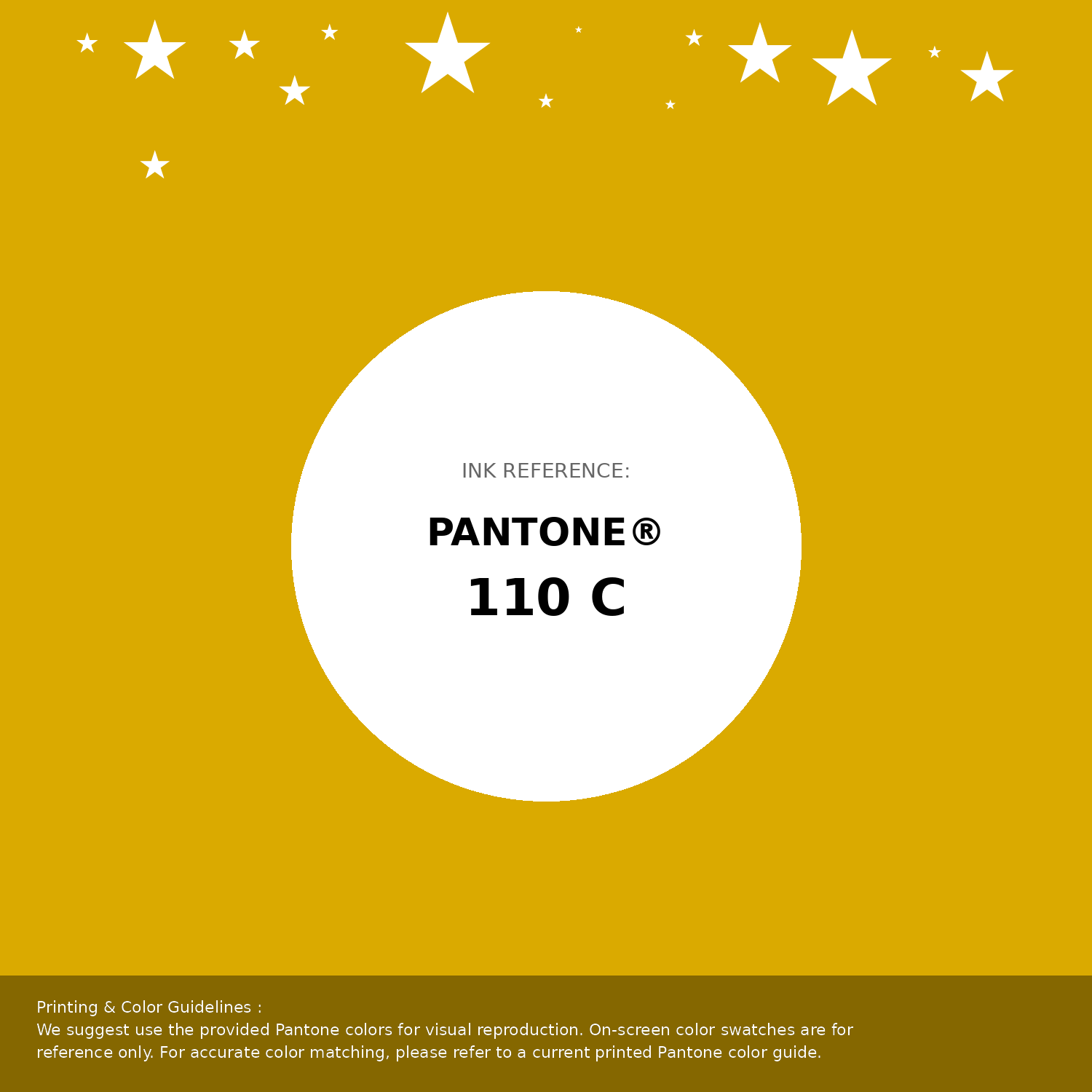
#daaa00 Pantone 110 C Color | Hex color Code #daaa00 Pantone Swatch Artwork
Download Artwork Swatch
#daaa00 Pantone 110 C Color | Hex color Code #daaa00 Gradient Artwork (PNG)
Download Gradient (PNG)#daaa00 Pantone 110 C Color | Hex color Code #daaa00 Gradient Artwork (SVG)
Download Gradient (SVG)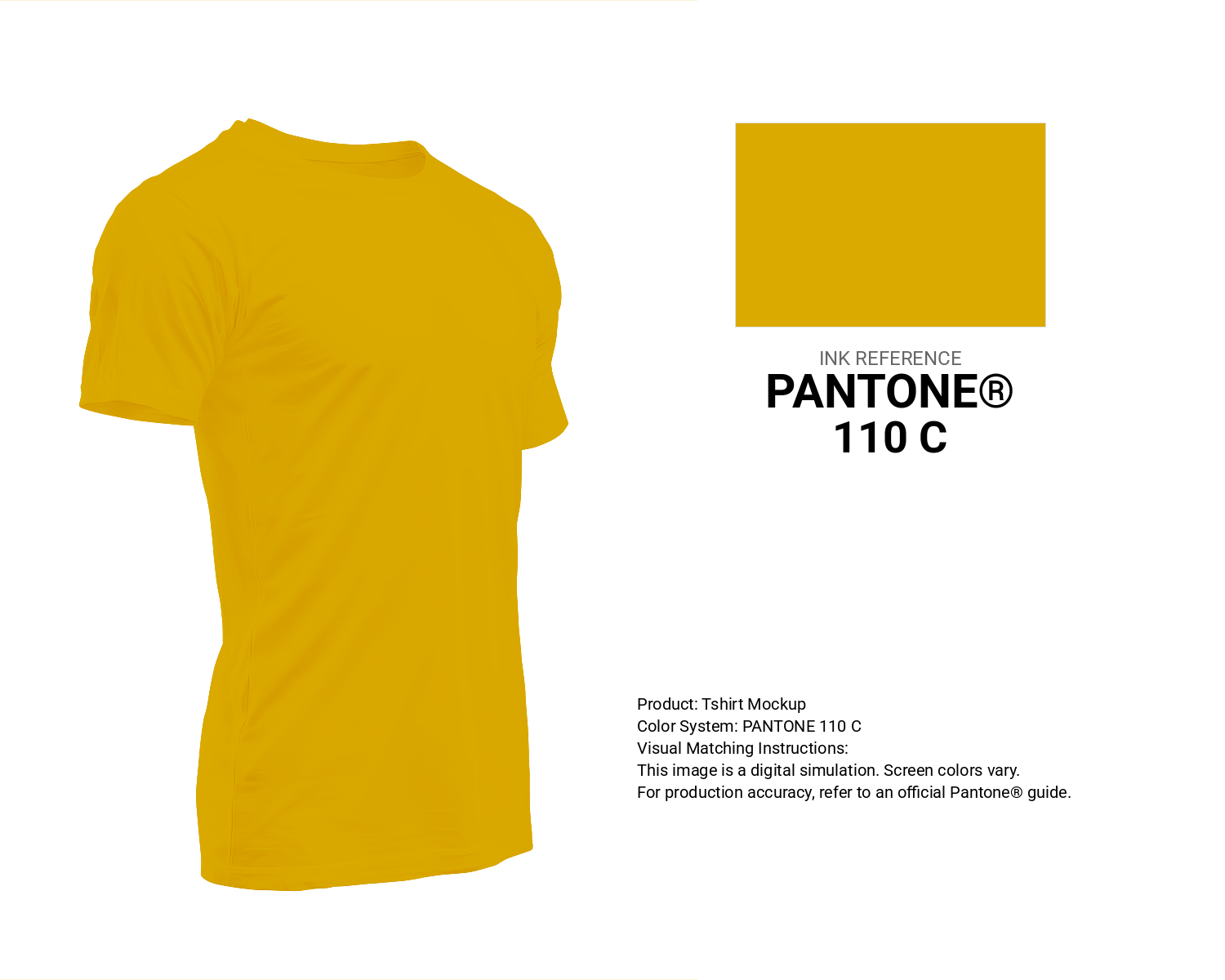
#daaa00 Pantone 110 C Color | Hex color Code #daaa00 T-Shirt Mockup
Download T-Shirt Mockup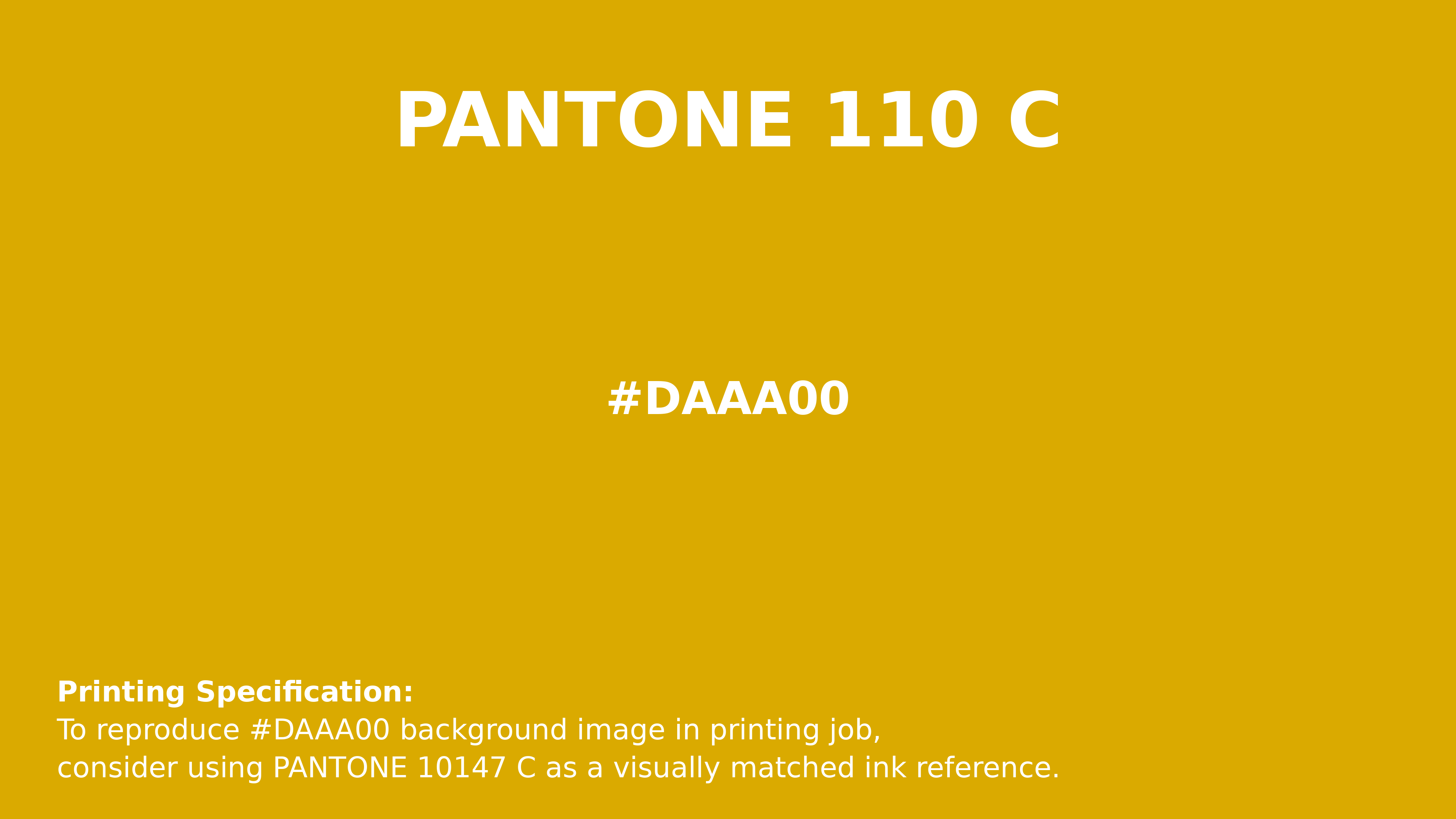
#daaa00 Pantone 110 C Color | Hex color Code #daaa00 Printing Artwork Pantone Reference
Download Pantone Printing ReferenceRelated Color Palettes
- Dim Gray and OrangeRed •
- Burning Orange •
- Saddle Brown and Orange •
- Web Orange •
- Brown and Dark Orange •
- Khaki and Orange •
- Dark Slate Gray and OrangeRed •
- OrangeRed and Red •
- Dark Khaki and OrangeRed •
- Dark Orange and Goldenrod •
- Red and OrangeRed •
- OrangeRed and Tomato •
- OrangeRed and Dim Gray •
- Orange and Olive •
- Tan and Dark Orange
Color Palette Collection
Chardonnay
1 color palettes with 5 colors.

100 Rose Flower Nature Color Palettes
100 color palettes with 500 colors.

33 Blue Color Schemes
33 color palettes with 165 colors.

31 Royal Blue Color Palette
31 color palettes with 155 colors.