Kraft Paper Color | #d5b59c
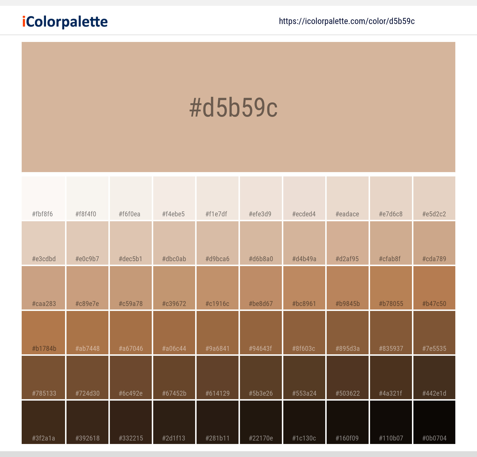
Kraft Paper Color | #d5b59c Color Shades Lighter / Darker shades of the color
Similar / Matching Pantone color(s) for Kraft Paper Color | #d5b59c Color | Hex code #d5b59c
Solid Color Coated
Solid Color UnCoated
Fashion, Home + Interiors
CMYK Color Guide Coated
CMYK Color Guide Uncoated
Color Bridge Uncoated
Color Bridge Coated
Fashion, Home + Interiors
Fashion, Home + Interiors
Pastels & Neons UnCoated
Pastels & Neons Coated
Premium Metallics Coated
Metallics Coated
Important: Colors are presented as a result of mathematical calculations. Conversions may be inaccurate/approximate. Please be advised that this pantone colors is only intended as a guide, Actual colours will depend on screen calibration variances. For best results use a Pantone Colour book
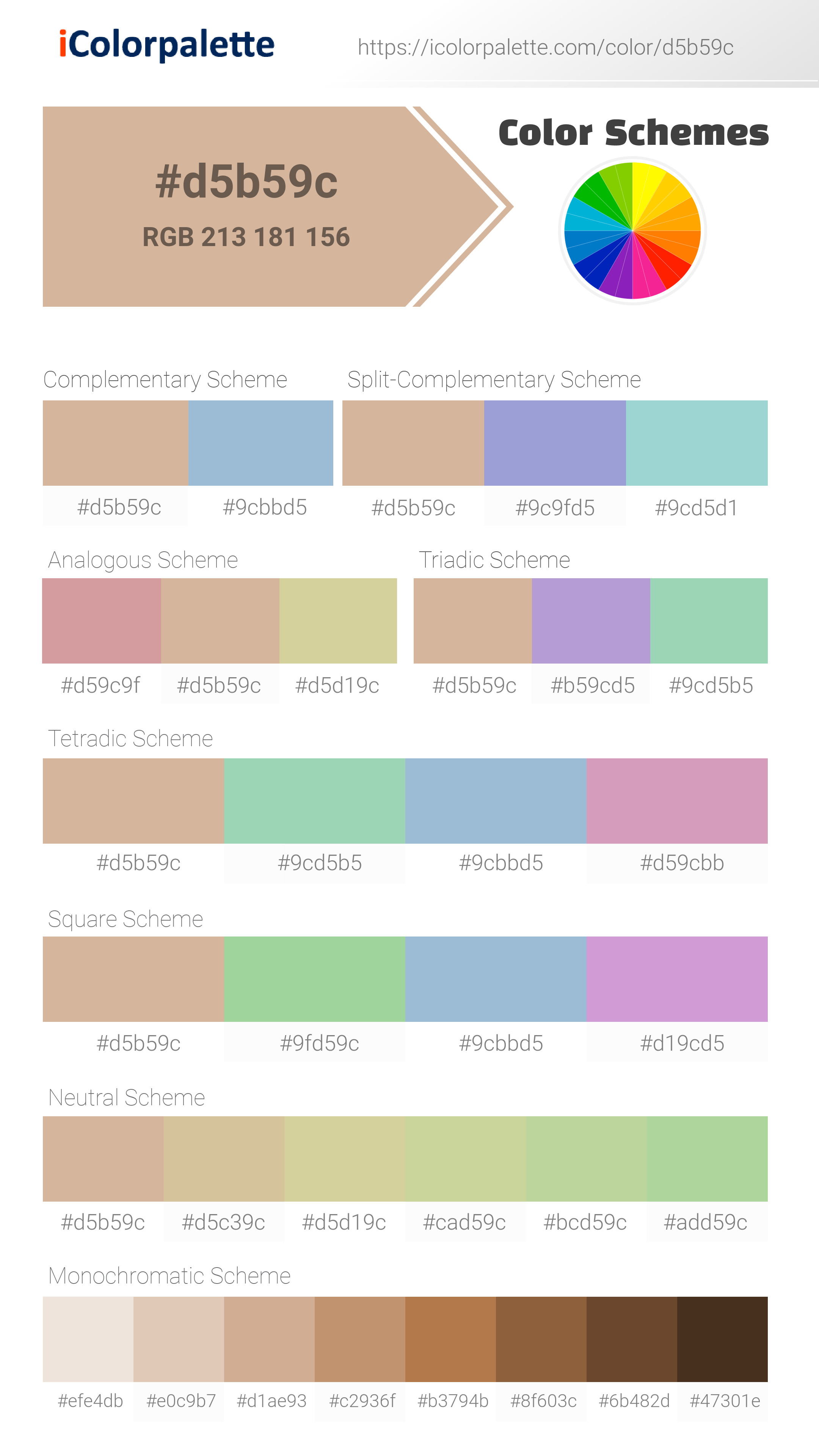
Color Schemes from #d5d19c
Kraft Paper Color | #d5b59c Monochromatic Color
Tones of Kraft Paper Color | #d5b59c
Kraft Paper Color: The Earthy, Neutral Tone | #d5b59c
Introduction:
Kraft Paper Color, also known as #d5b59c, is a warm and earthy neutral tone. It is reminiscent of the natural color of kraft paper, which is commonly used in packaging and crafts. This color exudes a sense of warmth, simplicity, and versatility.
Historical Significance:
Usage in Art and Craft: Kraft Paper Color has a rich history in the world of art and craft. It has been used in various forms of creative expression, such as paper sculpture, collage, and printmaking. The natural and organic feel of this color has made it a popular choice for artists seeking a rustic and earthy aesthetic. Kraft Paper Color has also been used extensively in packaging and labeling industries, giving products an eco-friendly and minimalist look.
Historical Usage in Packaging: The use of kraft paper, and by extension Kraft Paper Color, dates back to the late 19th century. It was invented as a packaging material and gained popularity for its strength and durability. Kraft paper was commonly used in industries such as food and transportation due to its ability to protect goods during shipping.
Industrial Revolution: During the Industrial Revolution, Kraft Paper Color became synonymous with modesty and practicality. It was widely used for packaging everyday goods, showcasing its reliability and affordability.
Symbolism and Meaning:
Eco-Friendliness: Kraft Paper Color is often associated with environmental consciousness and sustainability. Its natural and earthy tone reflects a connection to nature and an appreciation for organic materials. It is commonly used by brands that emphasize ethical practices and eco-friendly products. In this context, Kraft Paper Color symbolizes a commitment to reducing waste and embracing a more sustainable lifestyle.
Simplicity and Minimalism: Kraft Paper Color is also associated with simplicity and minimalism. Its muted and understated tone evokes a sense of elegance and sophistication. This color is often used in minimalist designs and branding to convey a sense of refinement and clarity.
Rustic and Natural Aesthetics: Kraft Paper Color is frequently used to create a rustic and natural aesthetic. It is commonly seen in home decor, wedding themes, and DIY projects that aim to capture a warm, earthy atmosphere. This color evokes images of cozy cabins, natural textures, and a handmade touch.
Kraft Paper Color in Fashion:
Earth-inspired Fashion: Kraft Paper Color has made its mark in the fashion industry, particularly in designs inspired by nature and earth tones. It offers a neutral base that complements a variety of colors and textures. From earthy-toned outfits to accessories resembling natural fibers, this color adds a touch of organic beauty to fashion ensembles.
Minimalist Styles: Kraft Paper Color is a staple in minimalist fashion, where clean lines, neutral tones, and simplicity are prominent. It is often seen in clothing, bags, and shoes that prioritize functionality and timeless designs. This color allows for versatile styling and can be effortlessly paired with other neutrals or bold accents.
Kraft Paper Color in Graphic Design:
Natural Branding: Kraft Paper Color is highly valued in graphic design for its ability to create a natural and organic aesthetic. It is often used in branding for products that focus on sustainability, eco-friendliness, and natural ingredients. This color helps establish trust and authenticity while conveying a sense of simplicity and earthiness.
Minimalistic Design: In graphic design, Kraft Paper Color is frequently employed in minimalist designs. It adds a touch of warmth and texture to complement clean lines and simple layouts. This color is often paired with other neutral tones or subtle pops of color to achieve a balanced and visually appealing composition.
Color Combinations:
Complementary Colors:
- Kraft Paper Color (#d5b59c) pairs well with deep forest green (#00563f) for an earthy and natural combination.
- For a sophisticated and understated look, combine Kraft Paper Color with charcoal gray (#333333) or taupe (#b3a094).
- For a warm and inviting palette, pair Kraft Paper Color with burnt orange (#d46d12) or mustard yellow (#d4b300).
Nature’s Palette:
Earthy Landscapes: Kraft Paper Color can be found in various elements of nature, especially in landscapes with earthy tones. It often resembles the color of dry leaves, tree trunks, and sandy terrains. This color is also reminiscent of the warm hues seen during sunrise or sunset.
Flora and Fauna: Certain flowers, like dried sunflowers and ornamental grasses, feature hues similar to Kraft Paper Color. Some animals, such as owls and foxes, also possess fur or feathers that share this earthy tone.
Artistic Representations:
Paper Art: The rich brown shade of Kraft Paper Color has inspired artists to create intricate paper sculptures and patterns. It serves as a canvas for artists to express their creativity and showcase the beauty of this earthy tone.
Mixed Media: Artists often incorporate Kraft Paper Color into mixed media artworks to add depth and texture. It combines well with other materials like wood, fabric, and metal, creating visually appealing contrasts.
Movies and Cinematic Landscapes:
Scenic Nature Settings: Kraft Paper Color sets the tone for movies and scenes depicting natural and serene environments. It depicts landscapes that exude a sense of tranquility, warmth, and timelessness. Think of movies set in forests, countryside areas, or rural landscapes, where this color adds a touch of rustic beauty.
Products and Commercial Appeal:
Packaging and Labeling: Kraft Paper Color is widely used in packaging and labeling due to its natural and eco-friendly appeal. It is commonly seen in food packaging, organic products, and artisanal goods. This color creates a connection with consumers seeking environmentally conscious products.
Branding: Many brands choose Kraft Paper Color to evoke a sense of authenticity, simplicity, and sustainability. It is often used by companies in the natural and organic market segments, as well as those promoting handmade or rustic products.
National Symbols and Significance:
Cultural References: In some cultures, Kraft Paper Color symbolizes tradition, craftsmanship, and a connection with the land. It is often associated with rituals, festivals, and traditional clothing, representing a strong cultural identity.
The Psychological and Emotional Impact:
Warmth and Comfort: Kraft Paper Color evokes a sense of warmth and comfort. Its earthy tone creates a soothing atmosphere and can elicit feelings of relaxation, security, and coziness.
Down-to-Earth and Reliable: This color is often associated with reliability, simplicity, and authenticity. It conveys a sense of trustworthiness and stability, appealing to individuals seeking honesty and transparency.
Simplicity and Minimalism: Kraft Paper Color, with its understated and neutral tone, is closely linked to simplicity and minimalism. It encourages a clutter-free and balanced environment, mentally and visually.
Conclusion:
Kraft Paper Color, also known as #d5b59c, carries a rich history and multifaceted symbolism. Its connection to nature, simplicity, and versatility makes it a timeless and popular choice. Whether in fashion, graphic design, or everyday products, Kraft Paper Color brings an earthy charm and a touch of authenticity that resonates with many people.
#d5b59c Color Information
#d5b59c color RGB value is (255,0,0). A hexadecimal color is specified with: #RRGGBB, where the RR (red), GG (green) and BB (blue) hexadecimal integers specify the components of the color. All values must be between 00 and FF.#d5b59c Color Name(s)
#d5b59c color name is Kraft Paper Color | #d5b59c.RGB Colors
An RGB color value is specified with: rgb(red, green, blue). Each parameter (red, green, and blue) defines the intensity of the color and can be an integer between 0 and 255 or a percentage value (from 0% to 100%).Red value of its RGB is 213, Green value is 181 and blue value is 156.
RGBA Colors
alpha The rgba() function define colors using the Red-green-blue-alpha (RGBA) model. RGBA color values are an extension of RGB color values with an alpha channel - which specifies the opacity of the color.Red value of its RGBA is 213, Green value is 181, blue value is 156 and alpha value is 1.
HSL Colors
The hsl() function define colors using the Hue-saturation-lightness model (HSL). HSL stands for hue, saturation, and lightness - and represents a cylindrical-coordinate representation of colors.Hue value of its Hsl is 26.315789473684, Saturation value is 0.40425531914894, Lightness value is 0.72352941176471.
HSLA Colors
The hsla() function define colors using the Hue-saturation-lightness-alpha model (HSLA). HSLA color values are an extension of HSL color values with an alpha channel - which specifies the opacity of the color.Hue value of its Hsl is 26.315789473684, Saturation value is 0.40425531914894, Lightness value is 0.72352941176471 and alpha value is 1.
Preview #d5b59c
Color Preview with white background
Lorem Ipsum is simply dummy text of the printing and typesetting industry. Lorem Ipsum has been the industry's standard dummy text ever since the 1500s, when an unknown printer took a galley of type and scrambled it to make a type specimen book. It has survived not only five centuries, but also the leap into electronic typesetting, remaining essentially unchanged. It was popularised in the 1960s with the release of Letraset sheets containing Lorem Ipsum passages, and more recently with desktop publishing software like Aldus PageMaker including versions of Lorem Ipsum
.background {color:#d5b59c;}Color Preview with background color
Lorem Ipsum is simply dummy text of the printing and typesetting industry. Lorem Ipsum has been the industry's standard dummy text ever since the 1500s, when an unknown printer took a galley of type and scrambled it to make a type specimen book. It has survived not only five centuries, but also the leap into electronic typesetting, remaining essentially unchanged. It was popularised in the 1960s with the release of Letraset sheets containing Lorem Ipsum passages, and more recently with desktop publishing software like Aldus PageMaker including versions of Lorem Ipsum
.background {background-color:#d5b59c;}Color Palette Collection


Kraft Paper Color | #d5b59c Image Downloads

Related Color Palettes
- My Pink •
- Mountbatten Pink •
- Solid Pink •
- Careys Pink •
- Fuchsia Pink •
- Spicy Pink •
- Cannon Pink •
- New York Pink •
- Oriental Pink •
- Oyster Pink •
- Pink Flare •
- Persian Pink •
- Tonys Pink •
- Sea Pink •
- Mandys Pink •

31 Royal Blue Color Palette
31 color palettes with 155 colors.

30 Pastel Pink Color Palette
30 color palettes with 150 colors.

33 Blue Color Schemes
33 color palettes with 165 colors.

50 Green Color Palettes
50 color palettes with 250 colors.

32 Sky Color Schemes
32 color palettes with 160 colors.

The Color of Calm: 18 Blue Palettes to Enhance Your Design
18 color palettes with 90 colors.

Purple ideas
10 color palettes with 50 colors.
75 Sunset Color Schemes
75 color palettes with 375 colors.
15 Skin Tone Color Palettes
15 color palettes with 75 colors.

26 Pastel Color Schemes
26 color palettes with 130 colors.

366 Bright Color Palettes
366 color palettes with 1830 colors.
34 Yellow Color Schemes
34 color palettes with 170 colors.

66 Brown Color Palettes
66 color palettes with 330 colors.
20 Beige Color Combinations
20 color palettes with 100 colors.

Pink Colors
8 color palettes with 40 colors.
80 Pastel Light color Palettes
80 color palettes with 400 colors.