#FF8A3D Color
Your all-in-one color resource. Download hex background images, Adobe swatches (ASE), PDF color sheets, and SVG files. Explore palettes, harmonies, accessibility, conversions, and professional exports — designed for designers, developers, and color perfectionists.
This vibrant hue of #FF8A3D radiates warmth and energy, conjuring images of a sunrise breaking over a desert landscape. It evokes feelings of optimism, enthusiasm, and a sense of adventure, similar to the anticipation of a new day. The color feels inviting and stimulating, reminiscent of ripe oranges, autumn leaves, and the warmth of a crackling fire. It creates a cheerful and dynamic atmosphere, suggesting creativity and activity. In design, it works well as an accent color to draw attention, or as a dominant color in spaces designed for social interaction or creative endeavors. Culturally, it can symbolize vitality, happiness, and the pursuit of goals, often associated with energy and dynamism. Visually matched named color: Golden Sunrise Glow.
PANTONE 2025 C
Choose Color
Selected Color
Recent Colors
Color Details
Similar Ink Alternatives for #FF8A3D color Alternative print inks for reproducing #FF8A3D background image with a similar visual appearance.
Disclaimer: The visually matched ink reference is an independent approximation intended as a guide only. Please be advised that this pantone colors is only intended as a guide, Actual colours will depend on screen calibration variances. The print ink suggestions provided are independent visual approximations and are not affiliated with or endorsed by Pantone LLC. For official color specifications, conversion factors, and comprehensive color system information, please visit Pantone Connect. Official Pantone products can be purchased at pantone.com.
Color Previews for #000000 See how this color looks as a background or as text.
Complete Guide to Your Color Laboratory
Everything you need to know about this professional color toolkit.
Use the Color Picker at the top to select any color. All modules below update instantly.
Workflow: Pick a color → Explore palettes & data → Download what you need (PDF, Image, or Adobe ASE).
Color Details — Your color in all formats: HEX, RGB, RGBA, HSL, HSLA, HSV, CMYK, CIELab, Hunter-Lab, XYZ, Yxy, YUV. One-click copy.
Color Psychology — Emotional impact, cultural meanings, physiological effects, branding applications, and historical significance.
Named Colors — Find official color names (HTML/CSS, Pantone) that match your selection with similarity percentages.
Light & Dark Shades
80-step gradient from black to white. Perfect for button states and component systems.
Tints
Color mixed with white → lighter, pastel variations for backgrounds and disabled states.
Monochromatic — 11 curated tints/shades from one color. Production-ready for design systems.
- Complementary — Opposite on wheel (180°). High contrast.
- Analogous — Neighbors (±30°). Harmonious flow.
- Triadic — Three colors (120° apart). Vibrant, balanced.
- Split-Complementary — Base + two near-complements. Softer contrast.
- Tetradic/Square — Four colors. Complex, maximum variety.
- Neutral — Desaturated versions. Subtle, sophisticated.
15 Professional Variations — Monochromatic, Analogous, Complementary, Warm/Cool/Earth Tones, Pastel, Vibrant, High Contrast, and more.
Color Infusion — 10 palettes showing your color morphing into each major hue. Find bridge colors.
Similar Colors — 60+ colors generated via CIELAB Delta E matching. Unexpected harmonious combinations.
18 Ready-to-Use Gradients — Complementary, Analogous, Triadic, Tint/Shade progressions, and more.
Downloads: PNG (2560×1440), CSS (production-ready code), SVG (scalable vector).
WCAG Contrast Checker — Tests your color against white, black, and custom colors for AA (4.5:1) and AAA (7:1) compliance. Large text thresholds included.
Harmony & Accessibility Guide — Tests against 10 canonical hues. Shows which pairs are both beautiful AND WCAG-compliant for text.
PNG/JPG — High-res images for presentations and mood boards.
PDF — Print-ready reports for clients and teams.
Adobe ASE — Direct import to Photoshop, Illustrator, InDesign, XD.
CSS/SVG — Gradients only. Production-ready code and vectors.
Color Science: Industry-standard conversions (HSL, CIELAB, CMYK, XYZ). WCAG 2.1 luminance formula. Delta E (ΔE76) for perceptual matching.
Direct Links: Share colors via icolorpalette.com/color/ff5733 or icolorpalette.com/color/red
Issues? Refresh the page, wait for rendering, try another browser, or check console (F12) for errors.
Printing Guide for #ff8a3d Background Image
Use PANTONE 2025 C as a visually matched ink reference when printing this background image.
To print the #ff8a3d background image from our site, consider using PANTONE 2025 C as a visually matched ink reference.
Download the background image, then provide this reference code to your print vendor to help achieve accurate color reproduction.
The visually matched ink reference for the #ff8a3d background image is PANTONE 2025 C.
This color is commonly described as Golden Sunrise Glow.
This vibrant hue of #FF8A3D radiates warmth and energy, conjuring images of a sunrise breaking over a desert landscape. It evokes feelings of optimism, enthusiasm, and a sense of adventure, similar to the anticipation of a new day. The color feels inviting and stimulating, reminiscent of ripe oranges, autumn leaves, and the warmth of a crackling fire. It creates a cheerful and dynamic atmosphere, suggesting creativity and activity. In design, it works well as an accent color to draw attention, or as a dominant color in spaces designed for social interaction or creative endeavors. Culturally, it can symbolize vitality, happiness, and the pursuit of goals, often associated with energy and dynamism.
We provide PANTONE 2025 C as a visually matched ink reference to help you reproduce the #ff8a3d background image accurately in professional printing.
This reference code helps print vendors achieve consistent color output across different printing equipment and materials.
After downloading the #ff8a3d background image from our site:
- Include the visually matched ink reference PANTONE 2025 C in your print order notes
- Inform your print vendor that this is your target color reference
- Request a proof print to verify the Golden Sunrise Glow color appearance before full production
The #ff8a3d background image with PANTONE 2025 C as visually matched ink reference can be used for:
- Posters, banners, and backdrops
- Business cards, brochures, and flyers
- Packaging, labels, and stickers
- Signage and promotional materials
This is an independent visual approximation.
While PANTONE 2025 C closely matches the #ff8a3d background image color, variations may exist between screen display and printed output.
We recommend requesting a proof print to verify the final appearance.
This vibrant hue of #FF8A3D radiates warmth and energy, conjuring images of a sunrise breaking over a desert landscape. It evokes feelings of optimism, enthusiasm, and a sense of adventure, similar to the anticipation of a new day. The color feels inviting and stimulating, reminiscent of ripe oranges, autumn leaves, and the warmth of a crackling fire. It creates a cheerful and dynamic atmosphere, suggesting creativity and activity. In design, it works well as an accent color to draw attention, or as a dominant color in spaces designed for social interaction or creative endeavors. Culturally, it can symbolize vitality, happiness, and the pursuit of goals, often associated with energy and dynamism.
Understanding these associations helps ensure the #ff8a3d background image aligns with your intended message and brand impact.
Important Information
The visually matched ink reference is an independent approximation intended as a guide only.
Actual printed colors may vary depending on screen calibration, substrate material, ink type, and printing equipment used.
For official color specifications and certified color standards, visit Pantone Connect.
Official color guides and swatch books can be purchased from pantone.com.
Pantone 2025 C Color: Vibrant Citrus | #FF8A3D
Introduction:
Vibrant Citrus is a striking shade that exudes energy and warmth. Its vibrant orange hue captures attention and adds a pop of brightness to any palette.
Historical Significance:
Artistic Movements: Vibrant Citrus found prominence in the abstract and pop art movements of the 20th century, where it was used to create bold and eye-catching compositions.
Symbolism and Meaning:
Vibrant Citrus in Fashion:
Vibrant Citrus in Graphic Design:
Color Combinations:
Nature’s Palette:
Artistic Representations:
Movies and Cinematic Landscapes:
Products and Commercial Appeal:
National Symbols and Significance:
The Psychological and Emotional Impact:
Conclusion:
Vibrant Citrus, with its rich orange hue, holds historical significance, cultural symbolism, and a wide range of emotional and psychological effects. Its energetic and bold nature makes it a versatile color that finds its place in fashion, graphic design, and various forms of artistic expression. Whether it's used to catch attention, stimulate conversation, or evoke powerful emotions, Vibrant Citrus remains a timeless and influential shade in the world of color.
Pantone 2025 C Color | Hex color Code #ff8a3d Image & Artwork
Download high-quality assets for your projects.

#ff8a3d Color Schemes
Download Color Schemes
#ff8a3d Color Shades
Download Color Shades
Pantone 2025 C Color | Hex color Code #ff8a3d Solid Color Background
Download Solid Color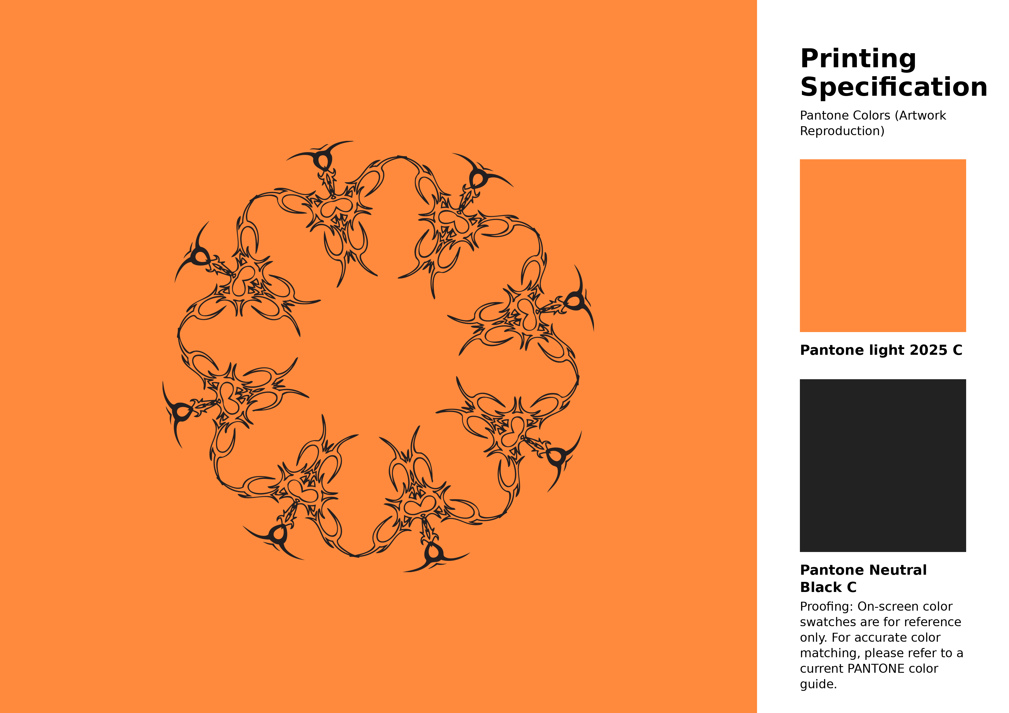
#ff8a3d Pantone 2025 C Color | Hex color Code #ff8a3d Artwork Image (PNG)
Download Artwork (PNG)#ff8a3d Pantone 2025 C Color | Hex color Code #ff8a3d Artwork Vector (PDF)
Download Artwork (PDF)#ff8a3d Pantone 2025 C Color | Hex color Code #ff8a3d Artwork Vector (SVG)
Download Artwork (SVG)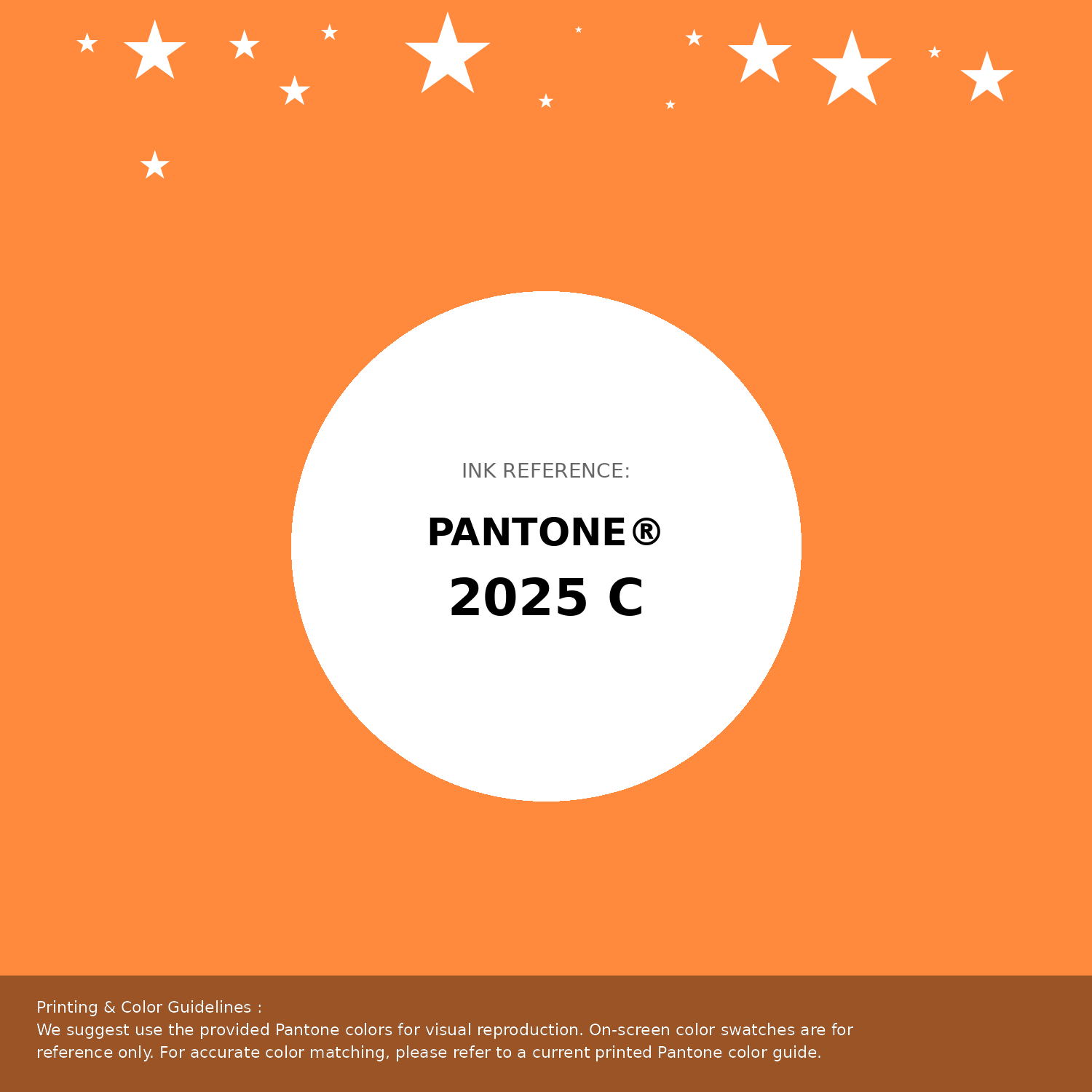
#ff8a3d Pantone 2025 C Color | Hex color Code #ff8a3d Pantone Swatch Artwork
Download Artwork Swatch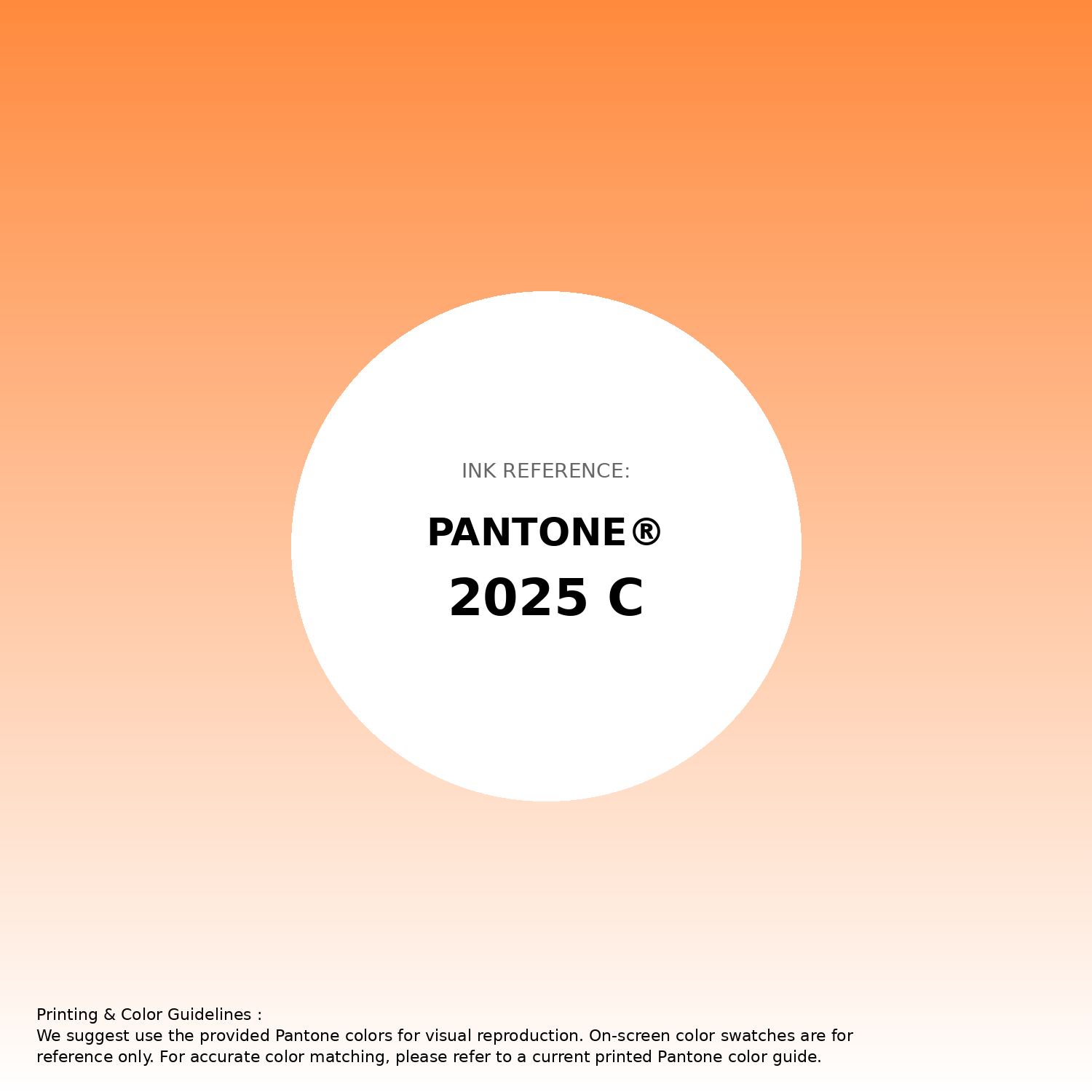
#ff8a3d Pantone 2025 C Color | Hex color Code #ff8a3d Gradient Artwork (PNG)
Download Gradient (PNG)#ff8a3d Pantone 2025 C Color | Hex color Code #ff8a3d Gradient Artwork (SVG)
Download Gradient (SVG)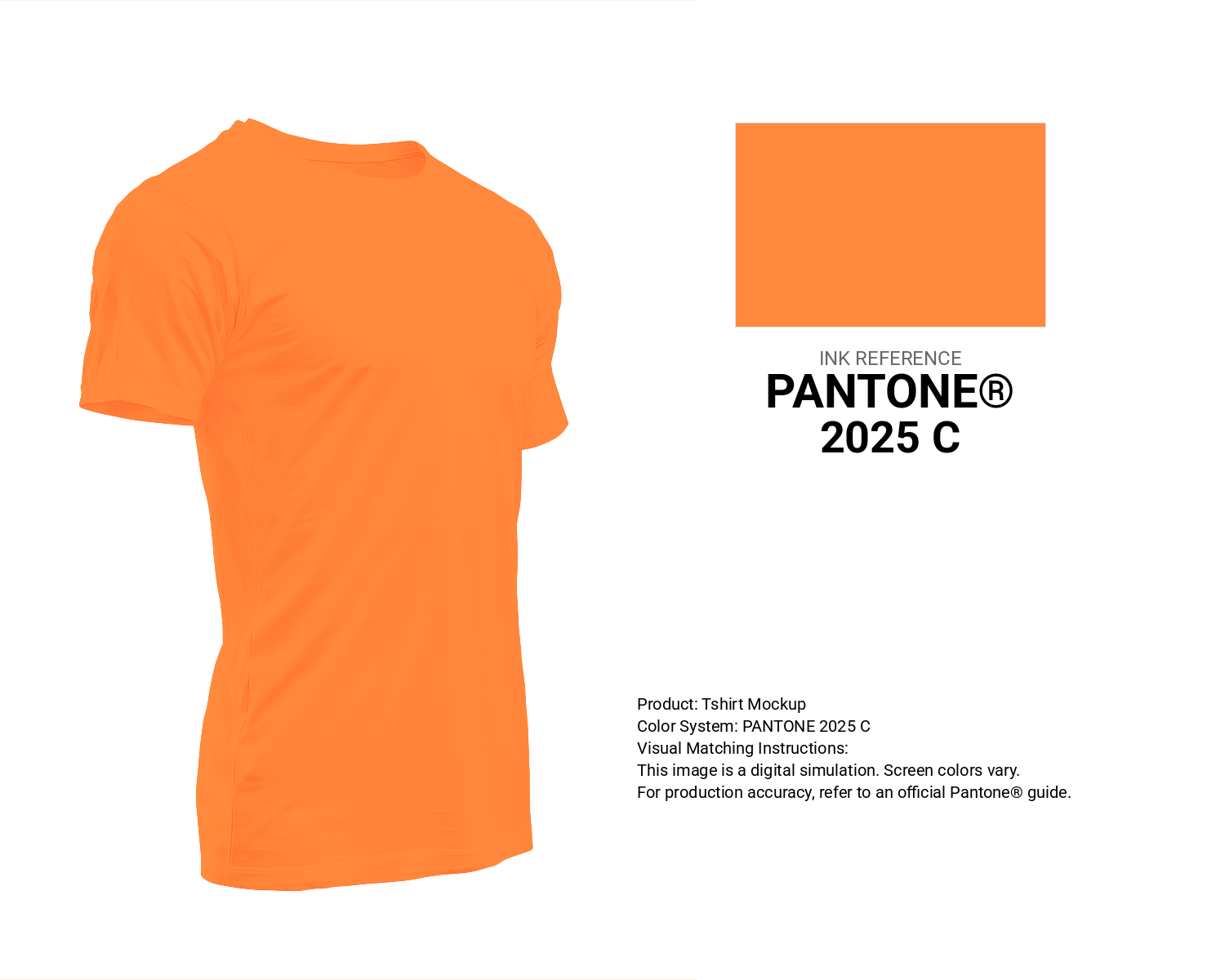
#ff8a3d Pantone 2025 C Color | Hex color Code #ff8a3d T-Shirt Mockup
Download T-Shirt Mockup
#ff8a3d Pantone 2025 C Color | Hex color Code #ff8a3d Printing Artwork Pantone Reference
Download Pantone Printing ReferenceRelated Color Palettes
- Dark Orange and Orange •
- Orange and Sienna •
- Fire Brick and OrangeRed •
- Chocolate and OrangeRed •
- Peach Orange •
- OrangeRed and Dim Gray •
- Black and Orange •
- OrangeRed and Sienna •
- Orange and OrangeRed •
- Dark Slate Blue and Orange •
- Saddle Brown and OrangeRed •
- Dark Khaki and OrangeRed •
- Dark Orange and Dark Slate Gray •
- Sandy Brown and Orange •
- Dark Slate Blue and OrangeRed
Color Palette Collection

Purple ideas
10 color palettes with 50 colors.

38 Beautiful Color Palettes
38 color palettes with 190 colors.

20 Turquoise Color Palettes
20 color palettes with 100 colors.

24 Summer Color Palettes
24 color palettes with 120 colors.