#FF7F41 Color
Your all-in-one color resource. Download hex background images, Adobe swatches (ASE), PDF color sheets, and SVG files. Explore palettes, harmonies, accessibility, conversions, and professional exports — designed for designers, developers, and color perfectionists.
This vibrant orange-red evokes the fiery glow of a setting sun, a feeling of warmth and energy. It sparks feelings of passion, excitement, and enthusiasm, reminiscent of a crackling bonfire or autumn leaves ablaze. The color creates a bold and engaging atmosphere, ideal for spaces demanding attention or celebrating a joyful occasion. In design, it can be used to highlight key elements or add a touch of drama, perhaps in a dining room or a creative workspace. It carries a sense of warmth and celebration, though it can also suggest danger or warning depending on the context. Visually matched named color: Sunset Ember.
PANTONE 164 C
Choose Color
Selected Color
Recent Colors
Color Details
Similar Ink Alternatives for #FF7F41 color Alternative print inks for reproducing #FF7F41 background image with a similar visual appearance.
Disclaimer: The visually matched ink reference is an independent approximation intended as a guide only. Please be advised that this pantone colors is only intended as a guide, Actual colours will depend on screen calibration variances. The print ink suggestions provided are independent visual approximations and are not affiliated with or endorsed by Pantone LLC. For official color specifications, conversion factors, and comprehensive color system information, please visit Pantone Connect. Official Pantone products can be purchased at pantone.com.
Color Previews for #000000 See how this color looks as a background or as text.
Complete Guide to Your Color Laboratory
Everything you need to know about this professional color toolkit.
Use the Color Picker at the top to select any color. All modules below update instantly.
Workflow: Pick a color → Explore palettes & data → Download what you need (PDF, Image, or Adobe ASE).
Color Details — Your color in all formats: HEX, RGB, RGBA, HSL, HSLA, HSV, CMYK, CIELab, Hunter-Lab, XYZ, Yxy, YUV. One-click copy.
Color Psychology — Emotional impact, cultural meanings, physiological effects, branding applications, and historical significance.
Named Colors — Find official color names (HTML/CSS, Pantone) that match your selection with similarity percentages.
Light & Dark Shades
80-step gradient from black to white. Perfect for button states and component systems.
Tints
Color mixed with white → lighter, pastel variations for backgrounds and disabled states.
Monochromatic — 11 curated tints/shades from one color. Production-ready for design systems.
- Complementary — Opposite on wheel (180°). High contrast.
- Analogous — Neighbors (±30°). Harmonious flow.
- Triadic — Three colors (120° apart). Vibrant, balanced.
- Split-Complementary — Base + two near-complements. Softer contrast.
- Tetradic/Square — Four colors. Complex, maximum variety.
- Neutral — Desaturated versions. Subtle, sophisticated.
15 Professional Variations — Monochromatic, Analogous, Complementary, Warm/Cool/Earth Tones, Pastel, Vibrant, High Contrast, and more.
Color Infusion — 10 palettes showing your color morphing into each major hue. Find bridge colors.
Similar Colors — 60+ colors generated via CIELAB Delta E matching. Unexpected harmonious combinations.
18 Ready-to-Use Gradients — Complementary, Analogous, Triadic, Tint/Shade progressions, and more.
Downloads: PNG (2560×1440), CSS (production-ready code), SVG (scalable vector).
WCAG Contrast Checker — Tests your color against white, black, and custom colors for AA (4.5:1) and AAA (7:1) compliance. Large text thresholds included.
Harmony & Accessibility Guide — Tests against 10 canonical hues. Shows which pairs are both beautiful AND WCAG-compliant for text.
PNG/JPG — High-res images for presentations and mood boards.
PDF — Print-ready reports for clients and teams.
Adobe ASE — Direct import to Photoshop, Illustrator, InDesign, XD.
CSS/SVG — Gradients only. Production-ready code and vectors.
Color Science: Industry-standard conversions (HSL, CIELAB, CMYK, XYZ). WCAG 2.1 luminance formula. Delta E (ΔE76) for perceptual matching.
Direct Links: Share colors via icolorpalette.com/color/ff5733 or icolorpalette.com/color/red
Issues? Refresh the page, wait for rendering, try another browser, or check console (F12) for errors.
Printing Guide for #ff7f41 Background Image
Use PANTONE 164 C as a visually matched ink reference when printing this background image.
To print the #ff7f41 background image from our site, consider using PANTONE 164 C as a visually matched ink reference.
Download the background image, then provide this reference code to your print vendor to help achieve accurate color reproduction.
The visually matched ink reference for the #ff7f41 background image is PANTONE 164 C.
This color is commonly described as Sunset Ember.
This vibrant orange-red evokes the fiery glow of a setting sun, a feeling of warmth and energy. It sparks feelings of passion, excitement, and enthusiasm, reminiscent of a crackling bonfire or autumn leaves ablaze. The color creates a bold and engaging atmosphere, ideal for spaces demanding attention or celebrating a joyful occasion. In design, it can be used to highlight key elements or add a touch of drama, perhaps in a dining room or a creative workspace. It carries a sense of warmth and celebration, though it can also suggest danger or warning depending on the context.
We provide PANTONE 164 C as a visually matched ink reference to help you reproduce the #ff7f41 background image accurately in professional printing.
This reference code helps print vendors achieve consistent color output across different printing equipment and materials.
After downloading the #ff7f41 background image from our site:
- Include the visually matched ink reference PANTONE 164 C in your print order notes
- Inform your print vendor that this is your target color reference
- Request a proof print to verify the Sunset Ember color appearance before full production
The #ff7f41 background image with PANTONE 164 C as visually matched ink reference can be used for:
- Posters, banners, and backdrops
- Business cards, brochures, and flyers
- Packaging, labels, and stickers
- Signage and promotional materials
This is an independent visual approximation.
While PANTONE 164 C closely matches the #ff7f41 background image color, variations may exist between screen display and printed output.
We recommend requesting a proof print to verify the final appearance.
This vibrant orange-red evokes the fiery glow of a setting sun, a feeling of warmth and energy. It sparks feelings of passion, excitement, and enthusiasm, reminiscent of a crackling bonfire or autumn leaves ablaze. The color creates a bold and engaging atmosphere, ideal for spaces demanding attention or celebrating a joyful occasion. In design, it can be used to highlight key elements or add a touch of drama, perhaps in a dining room or a creative workspace. It carries a sense of warmth and celebration, though it can also suggest danger or warning depending on the context.
Understanding these associations helps ensure the #ff7f41 background image aligns with your intended message and brand impact.
Important Information
The visually matched ink reference is an independent approximation intended as a guide only.
Actual printed colors may vary depending on screen calibration, substrate material, ink type, and printing equipment used.
For official color specifications and certified color standards, visit Pantone Connect.
Official color guides and swatch books can be purchased from pantone.com.
Pantone 164 C Color: Vibrant Orange | #FF7F41
Introduction:
Vibrant Orange, also known as Pantone 164 C, is a bold and energetic color. It exudes warmth and vitality, making it visually appealing and attention-grabbing.
Historical Significance:
Key moments in history: Vibrant Orange has been prominently used in various historical contexts. For example, it has been associated with the counterculture movements of the 1960s and has symbolized rebellion and freedom.
Symbolism and Meaning:
Symbolism and Meaning: Vibrant Orange typically symbolizes energy, enthusiasm, and positivity. In many cultures, it represents joy, creativity, and celebration.
Vibrant Orange in Fashion:
Vibrant Orange in Fashion: The color has a significant impact on styles and trends in the fashion world. It is often used to make bold statements and add vibrancy to outfits.
Vibrant Orange in Graphic Design:
Vibrant Orange in Graphic Design: The color is widely used in design aesthetics and branding. It has a strong visual impact, conveying energy and grabbing attention.
Color Combinations:
Color Combinations: Vibrant Orange can be paired with complementary colors such as blue and green to create a vibrant and dynamic color palette. Other combinations include orange and yellow or orange and brown.
Nature’s Palette:
Nature’s Palette: Vibrant Orange can be found in elements of nature such as sunsets, flowers like marigolds, and autumn foliage. It adds warmth and brightness to natural landscapes.
Artistic Representations:
Artistic Representations: Vibrant Orange has been widely used in various forms of art throughout history. Artists have used it to create vibrant and expressive works.
Movies and Cinematic Landscapes:
Movies and Cinematic Landscapes: Vibrant Orange sets the tone or mood in movies or scenes portraying energy, intensity, and passion. It often symbolizes excitement and adventure.
Products and Commercial Appeal:
Products and Commercial Appeal: Many popular products and brands use Vibrant Orange in their branding to convey energy, enthusiasm, and a bold personality.
National Symbols and Significance:
National Symbols and Significance: Vibrant Orange may be associated with national significance in countries where it represents important values such as courage, strength, or cultural traditions.
The Psychological and Emotional Impact:
The Psychological and Emotional Impact: Vibrant Orange can evoke feelings of enthusiasm, excitement, and warmth. It stimulates energy and optimism.
Conclusion:
Vibrant Orange, or Pantone 164 C Color, carries historical significance and holds a symbolic meaning of energy, positivity, and joy. It has a strong presence in various fields such as fashion, graphic design, and art. Its versatility and emotional impact make it a popular choice for commercial appeal and cultural representation.
Pantone 164 C Color | Hex color Code #ff7f41 Image & Artwork
Download high-quality assets for your projects.

#ff7f41 Color Schemes
Download Color Schemes
#ff7f41 Color Shades
Download Color Shades
Pantone 164 C Color | Hex color Code #ff7f41 Solid Color Background
Download Solid Color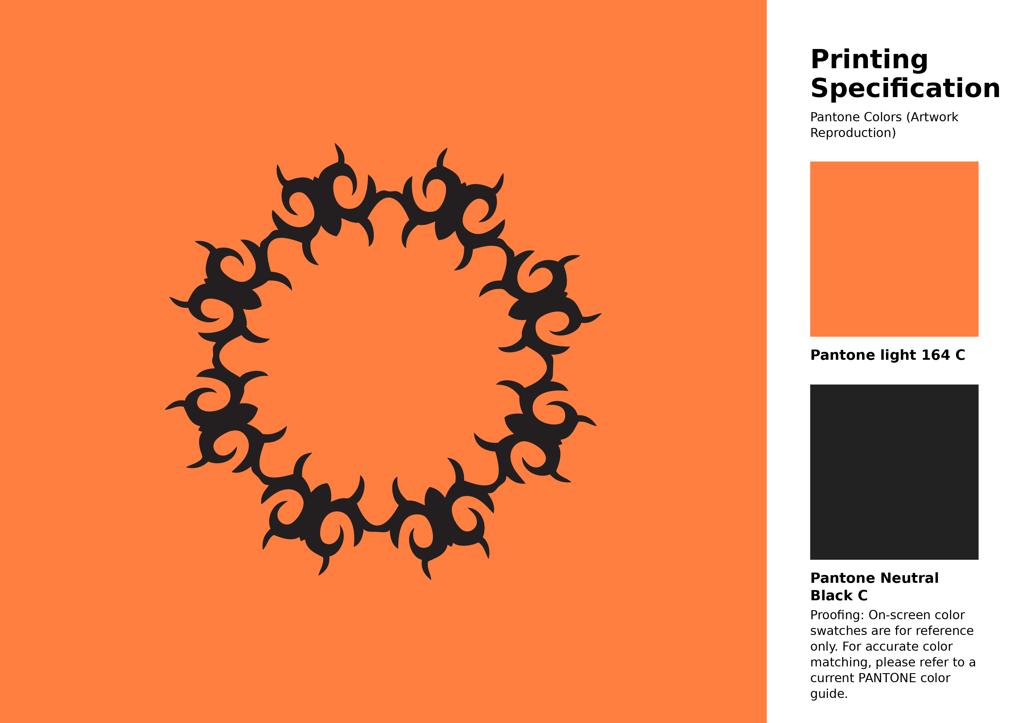
#ff7f41 Pantone 164 C Color | Hex color Code #ff7f41 Artwork Image (PNG)
Download Artwork (PNG)#ff7f41 Pantone 164 C Color | Hex color Code #ff7f41 Artwork Vector (PDF)
Download Artwork (PDF)#ff7f41 Pantone 164 C Color | Hex color Code #ff7f41 Artwork Vector (SVG)
Download Artwork (SVG)
#ff7f41 Pantone 164 C Color | Hex color Code #ff7f41 Pantone Swatch Artwork
Download Artwork Swatch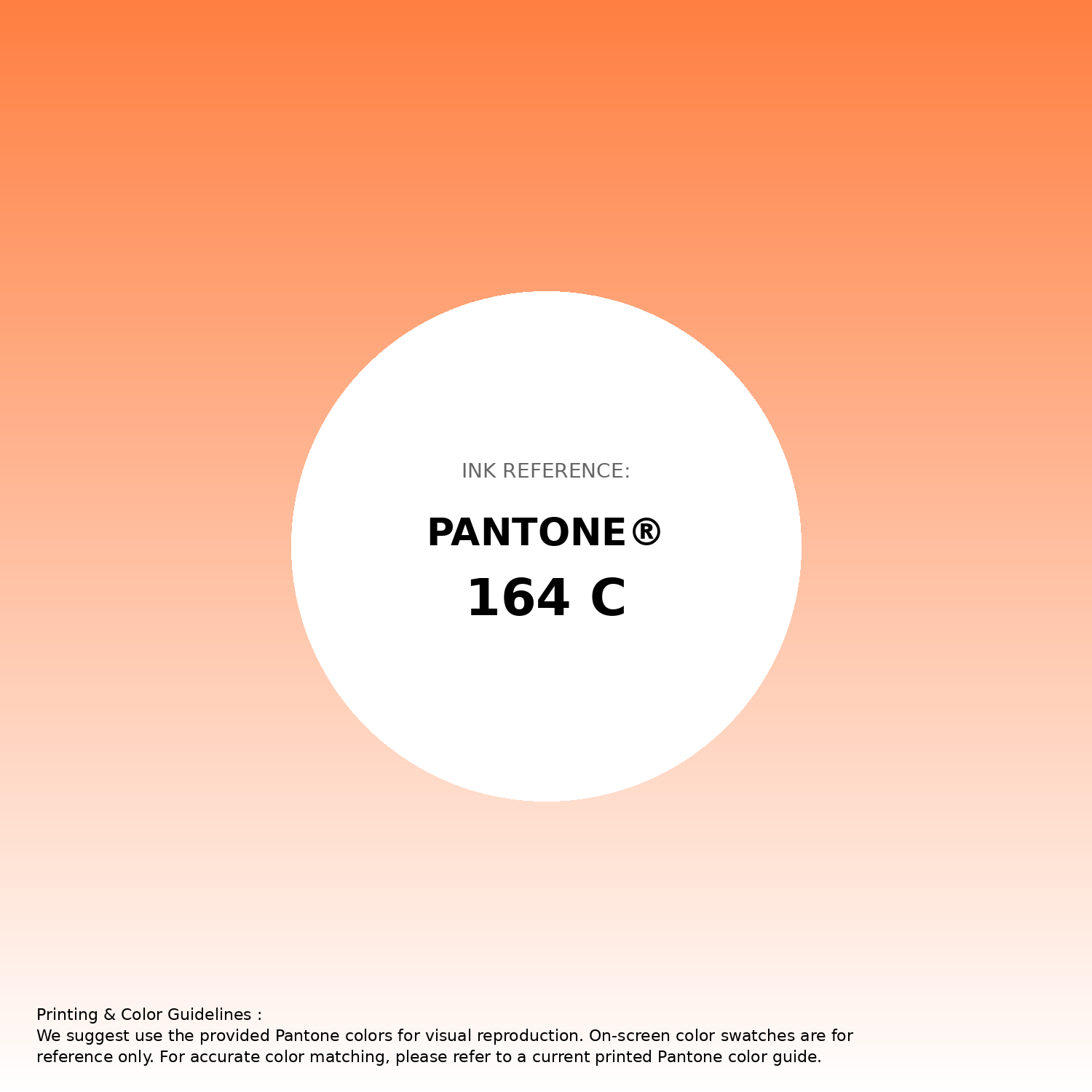
#ff7f41 Pantone 164 C Color | Hex color Code #ff7f41 Gradient Artwork (PNG)
Download Gradient (PNG)#ff7f41 Pantone 164 C Color | Hex color Code #ff7f41 Gradient Artwork (SVG)
Download Gradient (SVG)
#ff7f41 Pantone 164 C Color | Hex color Code #ff7f41 T-Shirt Mockup
Download T-Shirt Mockup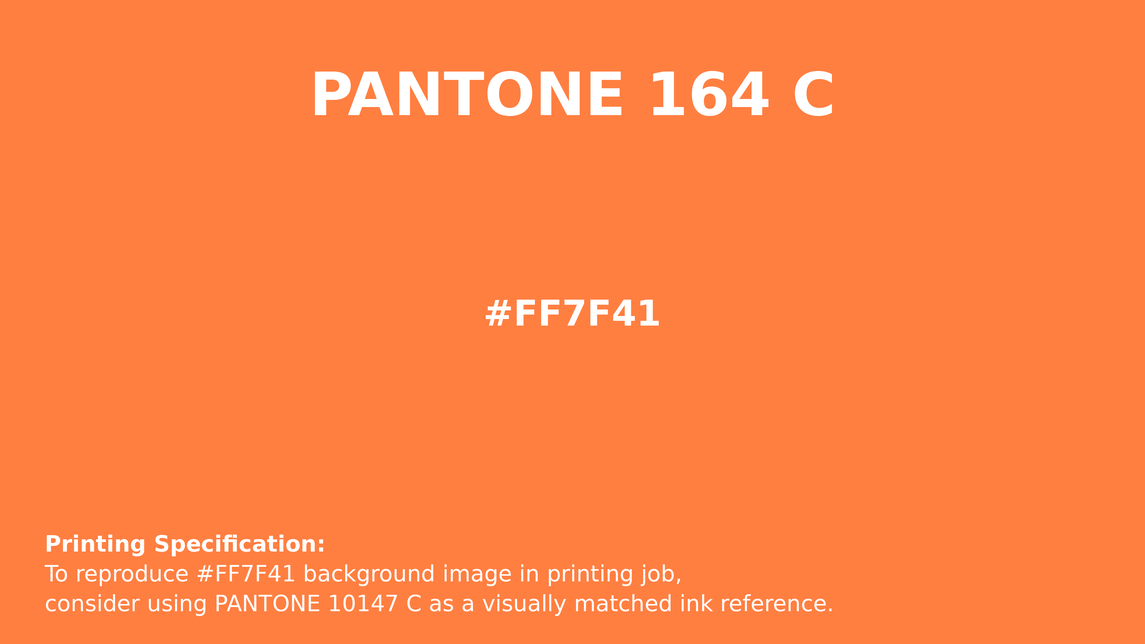
#ff7f41 Pantone 164 C Color | Hex color Code #ff7f41 Printing Artwork Pantone Reference
Download Pantone Printing ReferenceRelated Color Palettes
- Dark Slate Gray and Dark Orange •
- Light Sea Green and Orange •
- Tan and OrangeRed •
- Orange and Black •
- Crimson and Dark Orange •
- Orange Roughy •
- OrangeRed and Rosy Brown •
- Black and Orange •
- Orange and Light Steel Blue •
- Navy and Dark Orange •
- Dark Orange and Tan •
- Orange and Olive •
- Crimson and OrangeRed •
- Dark Olive Green and Orange •
- Dark Orange and Red
Color Palette Collection

38 Beautiful Color Palettes
38 color palettes with 190 colors.

70 Winter Color Palette
70 color palettes with 350 colors.

30 Pastel Pink Color Palette
30 color palettes with 150 colors.
26 Brown Color Combinations
26 color palettes with 130 colors.