#FCD0B8 Color
Your all-in-one color resource. Download hex background images, Adobe swatches (ASE), PDF color sheets, and SVG files. Explore palettes, harmonies, accessibility, conversions, and professional exports — designed for designers, developers, and color perfectionists.
This light, creamy apricot (#FCD0B8) radiates feelings of warmth, joy, and gentle beauty. It's reminiscent of delicate apricot blossoms in spring, evoking a sense of freshness, renewal, and a touch of romance. Psychologically, it's associated with sweetness, innocence, and a sense of optimism. It creates a mood of gentle happiness and can be used in design to promote a feeling of warmth and approachability. Design applications include creating a calming and inviting atmosphere. Visually matched named color: Apricot Blossom Dream.
PANTONE 12-0915 TPG
Choose Color
Selected Color
Recent Colors
Color Details
Similar Ink Alternatives for #FCD0B8 color Alternative print inks for reproducing #FCD0B8 background image with a similar visual appearance.
Disclaimer: The visually matched ink reference is an independent approximation intended as a guide only. Please be advised that this pantone colors is only intended as a guide, Actual colours will depend on screen calibration variances. The print ink suggestions provided are independent visual approximations and are not affiliated with or endorsed by Pantone LLC. For official color specifications, conversion factors, and comprehensive color system information, please visit Pantone Connect. Official Pantone products can be purchased at pantone.com.
Color Previews for #000000 See how this color looks as a background or as text.
Complete Guide to Your Color Laboratory
Everything you need to know about this professional color toolkit.
Use the Color Picker at the top to select any color. All modules below update instantly.
Workflow: Pick a color → Explore palettes & data → Download what you need (PDF, Image, or Adobe ASE).
Color Details — Your color in all formats: HEX, RGB, RGBA, HSL, HSLA, HSV, CMYK, CIELab, Hunter-Lab, XYZ, Yxy, YUV. One-click copy.
Color Psychology — Emotional impact, cultural meanings, physiological effects, branding applications, and historical significance.
Named Colors — Find official color names (HTML/CSS, Pantone) that match your selection with similarity percentages.
Light & Dark Shades
80-step gradient from black to white. Perfect for button states and component systems.
Tints
Color mixed with white → lighter, pastel variations for backgrounds and disabled states.
Monochromatic — 11 curated tints/shades from one color. Production-ready for design systems.
- Complementary — Opposite on wheel (180°). High contrast.
- Analogous — Neighbors (±30°). Harmonious flow.
- Triadic — Three colors (120° apart). Vibrant, balanced.
- Split-Complementary — Base + two near-complements. Softer contrast.
- Tetradic/Square — Four colors. Complex, maximum variety.
- Neutral — Desaturated versions. Subtle, sophisticated.
15 Professional Variations — Monochromatic, Analogous, Complementary, Warm/Cool/Earth Tones, Pastel, Vibrant, High Contrast, and more.
Color Infusion — 10 palettes showing your color morphing into each major hue. Find bridge colors.
Similar Colors — 60+ colors generated via CIELAB Delta E matching. Unexpected harmonious combinations.
18 Ready-to-Use Gradients — Complementary, Analogous, Triadic, Tint/Shade progressions, and more.
Downloads: PNG (2560×1440), CSS (production-ready code), SVG (scalable vector).
WCAG Contrast Checker — Tests your color against white, black, and custom colors for AA (4.5:1) and AAA (7:1) compliance. Large text thresholds included.
Harmony & Accessibility Guide — Tests against 10 canonical hues. Shows which pairs are both beautiful AND WCAG-compliant for text.
PNG/JPG — High-res images for presentations and mood boards.
PDF — Print-ready reports for clients and teams.
Adobe ASE — Direct import to Photoshop, Illustrator, InDesign, XD.
CSS/SVG — Gradients only. Production-ready code and vectors.
Color Science: Industry-standard conversions (HSL, CIELAB, CMYK, XYZ). WCAG 2.1 luminance formula. Delta E (ΔE76) for perceptual matching.
Direct Links: Share colors via icolorpalette.com/color/ff5733 or icolorpalette.com/color/red
Issues? Refresh the page, wait for rendering, try another browser, or check console (F12) for errors.
Printing Guide for #fcd0b8 Background Image
Use PANTONE 12-0915 TPG as a visually matched ink reference when printing this background image.
To print the #fcd0b8 background image from our site, consider using PANTONE 12-0915 TPG as a visually matched ink reference.
Download the background image, then provide this reference code to your print vendor to help achieve accurate color reproduction.
The visually matched ink reference for the #fcd0b8 background image is PANTONE 12-0915 TPG.
This color is commonly described as Apricot Blossom Dream.
This light, creamy apricot (#FCD0B8) radiates feelings of warmth, joy, and gentle beauty. It's reminiscent of delicate apricot blossoms in spring, evoking a sense of freshness, renewal, and a touch of romance. Psychologically, it's associated with sweetness, innocence, and a sense of optimism. It creates a mood of gentle happiness and can be used in design to promote a feeling of warmth and approachability. Design applications include creating a calming and inviting atmosphere.
We provide PANTONE 12-0915 TPG as a visually matched ink reference to help you reproduce the #fcd0b8 background image accurately in professional printing.
This reference code helps print vendors achieve consistent color output across different printing equipment and materials.
After downloading the #fcd0b8 background image from our site:
- Include the visually matched ink reference PANTONE 12-0915 TPG in your print order notes
- Inform your print vendor that this is your target color reference
- Request a proof print to verify the Apricot Blossom Dream color appearance before full production
The #fcd0b8 background image with PANTONE 12-0915 TPG as visually matched ink reference can be used for:
- Posters, banners, and backdrops
- Business cards, brochures, and flyers
- Packaging, labels, and stickers
- Signage and promotional materials
This is an independent visual approximation.
While PANTONE 12-0915 TPG closely matches the #fcd0b8 background image color, variations may exist between screen display and printed output.
We recommend requesting a proof print to verify the final appearance.
This light, creamy apricot (#FCD0B8) radiates feelings of warmth, joy, and gentle beauty. It's reminiscent of delicate apricot blossoms in spring, evoking a sense of freshness, renewal, and a touch of romance. Psychologically, it's associated with sweetness, innocence, and a sense of optimism. It creates a mood of gentle happiness and can be used in design to promote a feeling of warmth and approachability. Design applications include creating a calming and inviting atmosphere.
Understanding these associations helps ensure the #fcd0b8 background image aligns with your intended message and brand impact.
Important Information
The visually matched ink reference is an independent approximation intended as a guide only.
Actual printed colors may vary depending on screen calibration, substrate material, ink type, and printing equipment used.
For official color specifications and certified color standards, visit Pantone Connect.
Official color guides and swatch books can be purchased from pantone.com.
Pale Peach Color: Subtle Elegance | #FCD0B8
Introduction:
Pale Peach Color, with its gentle and delicate tones, exudes a sense of softness and tranquility. Its light and airy nature make it an ideal choice for creating a soothing and calming atmosphere. The subtle warmth of this color adds a touch of elegance to any space or design.
Historical Significance:
The Victorian Era: During the Victorian era, Pale Peach Color became increasingly popular for interior design and fashion. It was often used in delicate wallpapers, fabrics, and accessories, reflecting the romantic and ornate style of the period.
The Roaring Twenties: In the 1920s, Pale Peach Color gained popularity in Art Deco designs. The soft hue was used to create a sense of femininity and sophistication in fashion and interior decor.
Contemporary Usage: Today, Pale Peach Color continues to be a favored choice for wedding themes, as it symbolizes love, purity, and tenderness. Its timeless appeal makes it a versatile color used in various design disciplines.
Symbolism and Meaning:
Softness and Serenity: Pale Peach Color typically symbolizes gentleness and serenity. It evokes feelings of calmness, tranquility, and inner peace. In color psychology, it is associated with innocence, kindness, and emotional healing.
Romantic Love: This color is often associated with romance, love, and tenderness. It conveys a sense of affection and warmth, making it a popular choice for wedding decorations and romantic-themed designs.
Femininity: Pale Peach Color is also strongly linked to femininity. Its delicate and soft tones are often used to represent beauty, grace, and femininity, making it a popular choice in fashion, cosmetics, and interior design targeted towards women.
Pale Peach Color in Fashion:
Elegant and Refined: In fashion, Pale Peach Color is often associated with sophistication and elegance. It can be seen in evening gowns, bridal wear, and feminine accessories. This color adds a touch of subtle luxury to any ensemble.
Spring and Summer Styles: Pale Peach Color is commonly used in spring and summer fashion collections. Its light and airy quality perfectly aligns with the season, creating a fresh and romantic look.
Complementary Colors: Pale Peach Color pairs well with other soft pastels such as light pink, lavender, and mint green. It can also be combined with neutral tones like beige, ivory, and gray.
Pale Peach Color in Graphic Design:
Subtle and Calming: In graphic design, Pale Peach Color is used to create a sense of tranquility and harmony. It is often employed in designs related to wellness, beauty, and lifestyle. Its gentle tone helps to establish a visually pleasing and relaxed atmosphere.
Feminine Branding: Pale Peach Color is commonly used in branding aimed at women. It represents femininity, beauty, and elegance, making it suitable for beauty, fashion, and lifestyle brands.
Contrast and Balance: When paired with darker shades, Pale Peach Color creates a striking contrast that adds visual interest and depth to designs. It can also be combined with other pastel shades to create a harmonious and gentle color palette.
Color Combinations:
Light Pink and Pale Peach Color: The combination of light pink and pale peach creates a sweet and delicate palette, often used in feminine designs and wedding themes.
Mint Green and Pale Peach Color: The pairing of mint green and pale peach creates a fresh and invigorating color scheme, reminiscent of springtime and nature.
Ivory and Pale Peach Color: Ivory and pale peach create an elegant and refined combination, perfect for timeless and sophisticated designs.
Nature’s Palette:
Flowers: Pale Peach Color can be found in various flowers, including roses, peonies, and tulips. These delicate blossoms represent beauty, love, and growth.
Sunsets: During sunset, the sky often displays a range of soft peach tones. The serene and calming ambiance created by these colors evokes a sense of tranquility.
Artistic Representations:
Impressionist Paintings: Pale Peach Color is commonly seen in Impressionist paintings, often used to depict soft and ethereal lighting. Artists like Claude Monet and Pierre-Auguste Renoir utilized this color to create dreamy and atmospheric landscapes.
Still Life: In still life paintings, Pale Peach Color is often used to represent objects such as porcelain, fruits, or flowers. Its soft tones add a touch of delicacy and refinement to these compositions.
Movies and Cinematic Landscapes:
The Great Gatsby (2013): The film adaptation of F. Scott Fitzgerald's novel prominently features Pale Peach Color in its lavish Art Deco-inspired sets, costumes, and cinematography. This color choice adds a touch of vintage glamour to the overall visual aesthetic.
La La Land (2016): This romantic musical movie showcases several scenes with Pale Peach Color, which conveys a dreamy and nostalgic atmosphere. The color enhances the romantic and sentimental aspects of the film's storyline.
Products and Commercial Appeal:
Wedding Industry: Pale Peach Color is frequently used in wedding-related products and services, including invitations, decor, and bridal fashion. Its soft and romantic tones align perfectly with the themes of love and commitment.
Interior Design: Pale Peach Color is a popular choice for interior decor, especially in spaces where a serene and calming ambiance is desired. It can be used for walls, furniture, and accessories to create a soft and elegant atmosphere.
National Symbols and Significance:
Japan: In Japanese culture, Pale Peach Color is associated with the sakura (cherry blossom). The cherry blossom holds great cultural significance as a symbol of beauty, renewal, and the transient nature of life.
India: In India, Pale Peach Color holds religious and cultural significance. It is often used to represent purity, spirituality, and enlightenment.
The Psychological and Emotional Impact:
Calming and Soothing: Pale Peach Color has a calming effect on the mind and body. Its gentle tone can help reduce stress, anxiety, and promote relaxation and tranquility.
Positive Energy: This color radiates positive and uplifting energy. It can inspire feelings of optimism, joy, and happiness.
Comforting and Nurturing: Pale Peach Color provides a sense of comfort and warmth. It can evoke feelings of security and nurture the emotional well-being of individuals.
Conclusion:
Pale Peach Color, with its subtle and elegant nature, has been significant throughout history in fashion, art, and design. It symbolizes softness, serenity, and femininity. The color's timeless appeal and its various applications make it a versatile choice for creating a calming and soothing atmosphere. Whether used in fashion, graphic design
Pantone 12-0915 Tpg Pale Peach Color | Hex color Code #fcd0b8 Image & Artwork
Download high-quality assets for your projects.

#fcd0b8 Color Schemes
Download Color Schemes
#fcd0b8 Color Shades
Download Color Shades
Pantone 12-0915 Tpg Pale Peach Color | Hex color Code #fcd0b8 Solid Color Background
Download Solid Color
#fcd0b8 Pantone 12-0915 Tpg Pale Peach Color | Hex color Code #fcd0b8 Artwork Image (PNG)
Download Artwork (PNG)#fcd0b8 Pantone 12-0915 Tpg Pale Peach Color | Hex color Code #fcd0b8 Artwork Vector (PDF)
Download Artwork (PDF)#fcd0b8 Pantone 12-0915 Tpg Pale Peach Color | Hex color Code #fcd0b8 Artwork Vector (SVG)
Download Artwork (SVG)
#fcd0b8 Pantone 12-0915 Tpg Pale Peach Color | Hex color Code #fcd0b8 Pantone Swatch Artwork
Download Artwork Swatch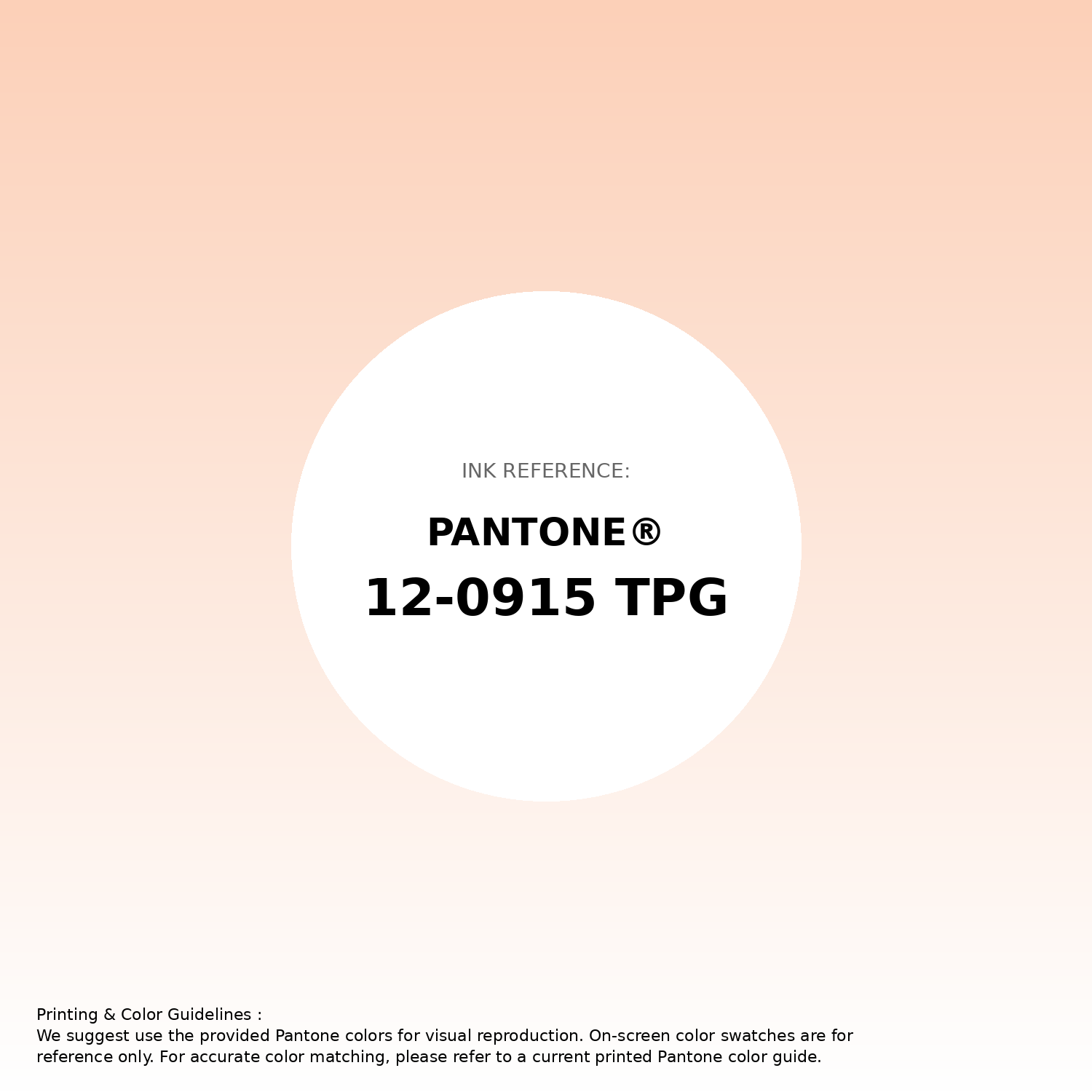
#fcd0b8 Pantone 12-0915 Tpg Pale Peach Color | Hex color Code #fcd0b8 Gradient Artwork (PNG)
Download Gradient (PNG)#fcd0b8 Pantone 12-0915 Tpg Pale Peach Color | Hex color Code #fcd0b8 Gradient Artwork (SVG)
Download Gradient (SVG)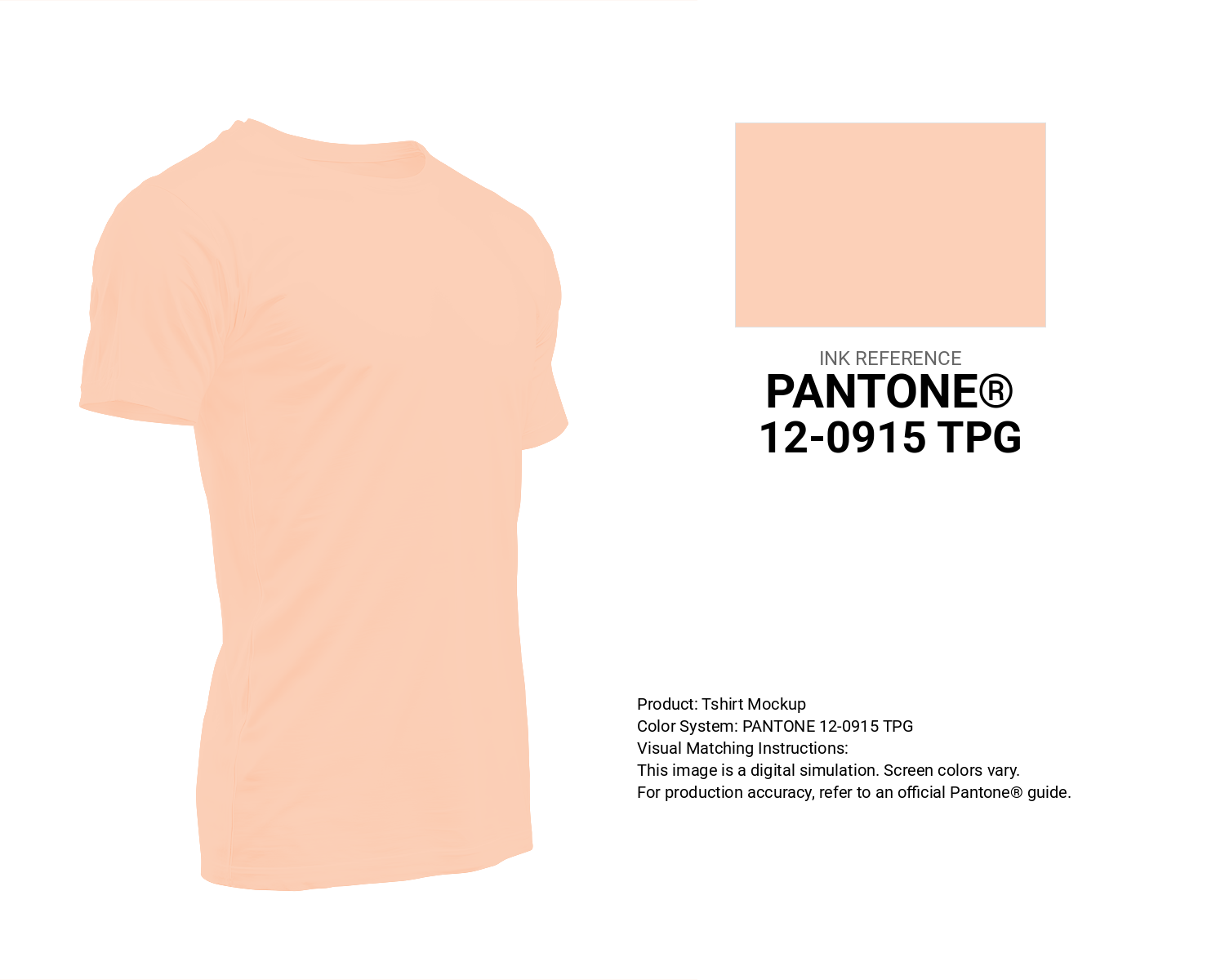
#fcd0b8 Pantone 12-0915 Tpg Pale Peach Color | Hex color Code #fcd0b8 T-Shirt Mockup
Download T-Shirt Mockup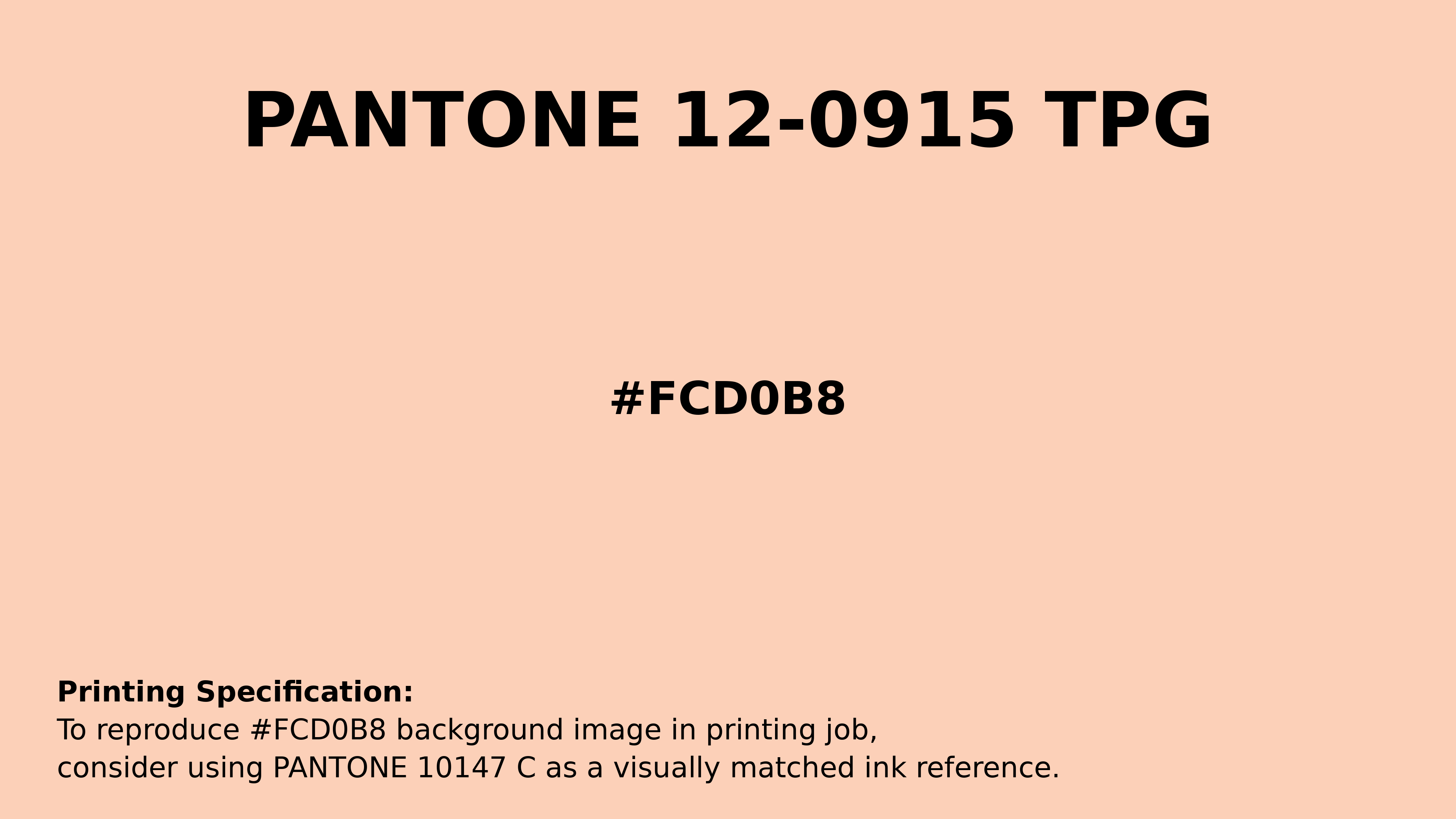
#fcd0b8 Pantone 12-0915 Tpg Pale Peach Color | Hex color Code #fcd0b8 Printing Artwork Pantone Reference
Download Pantone Printing ReferenceRelated Color Palettes
- Medium Violet Red and Deep Pink •
- Hot Pink and Medium Violet Red •
- Pink •
- Deep Pink and Crimson •
- Medium Violet Red and Hot Pink •
- Dim Gray and Deep Pink •
- Persian Pink •
- Solid Pink •
- Light Pink and Dark Sea Green •
- Light Pink and Salmon •
- Dark Sea Green and Hot Pink •
- Tickle Me Pink •
- Tonys Pink •
- Light Pink and Dim Gray •
- Hot Pink and Light Pink
Color Palette Collection

366 Bright Color Palettes
366 color palettes with 1830 colors.

38 Purple Color Schemes
38 color palettes with 190 colors.
34 Yellow Color Schemes
34 color palettes with 170 colors.
ADC Website Accents
1 color palettes with 5 colors.