#FCC89B Color
Your all-in-one color resource. Download hex background images, Adobe swatches (ASE), PDF color sheets, and SVG files. Explore palettes, harmonies, accessibility, conversions, and professional exports — designed for designers, developers, and color perfectionists.
This warm, honey-toned peach evokes the feeling of a sun-drenched sunset, a moment of peaceful reflection and warmth. It brings feelings of joy, comfort, and contentment, reminiscent of golden hour skies and autumn leaves. The color creates a cozy and inviting atmosphere, perfect for living rooms, dining areas, or bedrooms. It might be used in design to suggest prosperity and abundance, or to create a sense of nostalgia and nostalgia. The soft, muted tones are ideal for creating a calming and welcoming space. Visually matched named color: Golden Sunset.
PANTONE 712 C
Choose Color
Selected Color
Recent Colors
Color Details
Similar Ink Alternatives for #FCC89B color Alternative print inks for reproducing #FCC89B background image with a similar visual appearance.
Disclaimer: The visually matched ink reference is an independent approximation intended as a guide only. Please be advised that this pantone colors is only intended as a guide, Actual colours will depend on screen calibration variances. The print ink suggestions provided are independent visual approximations and are not affiliated with or endorsed by Pantone LLC. For official color specifications, conversion factors, and comprehensive color system information, please visit Pantone Connect. Official Pantone products can be purchased at pantone.com.
Color Previews for #000000 See how this color looks as a background or as text.
Complete Guide to Your Color Laboratory
Everything you need to know about this professional color toolkit.
Use the Color Picker at the top to select any color. All modules below update instantly.
Workflow: Pick a color → Explore palettes & data → Download what you need (PDF, Image, or Adobe ASE).
Color Details — Your color in all formats: HEX, RGB, RGBA, HSL, HSLA, HSV, CMYK, CIELab, Hunter-Lab, XYZ, Yxy, YUV. One-click copy.
Color Psychology — Emotional impact, cultural meanings, physiological effects, branding applications, and historical significance.
Named Colors — Find official color names (HTML/CSS, Pantone) that match your selection with similarity percentages.
Light & Dark Shades
80-step gradient from black to white. Perfect for button states and component systems.
Tints
Color mixed with white → lighter, pastel variations for backgrounds and disabled states.
Monochromatic — 11 curated tints/shades from one color. Production-ready for design systems.
- Complementary — Opposite on wheel (180°). High contrast.
- Analogous — Neighbors (±30°). Harmonious flow.
- Triadic — Three colors (120° apart). Vibrant, balanced.
- Split-Complementary — Base + two near-complements. Softer contrast.
- Tetradic/Square — Four colors. Complex, maximum variety.
- Neutral — Desaturated versions. Subtle, sophisticated.
15 Professional Variations — Monochromatic, Analogous, Complementary, Warm/Cool/Earth Tones, Pastel, Vibrant, High Contrast, and more.
Color Infusion — 10 palettes showing your color morphing into each major hue. Find bridge colors.
Similar Colors — 60+ colors generated via CIELAB Delta E matching. Unexpected harmonious combinations.
18 Ready-to-Use Gradients — Complementary, Analogous, Triadic, Tint/Shade progressions, and more.
Downloads: PNG (2560×1440), CSS (production-ready code), SVG (scalable vector).
WCAG Contrast Checker — Tests your color against white, black, and custom colors for AA (4.5:1) and AAA (7:1) compliance. Large text thresholds included.
Harmony & Accessibility Guide — Tests against 10 canonical hues. Shows which pairs are both beautiful AND WCAG-compliant for text.
PNG/JPG — High-res images for presentations and mood boards.
PDF — Print-ready reports for clients and teams.
Adobe ASE — Direct import to Photoshop, Illustrator, InDesign, XD.
CSS/SVG — Gradients only. Production-ready code and vectors.
Color Science: Industry-standard conversions (HSL, CIELAB, CMYK, XYZ). WCAG 2.1 luminance formula. Delta E (ΔE76) for perceptual matching.
Direct Links: Share colors via icolorpalette.com/color/ff5733 or icolorpalette.com/color/red
Issues? Refresh the page, wait for rendering, try another browser, or check console (F12) for errors.
Printing Guide for #fcc89b Background Image
Use PANTONE 712 C as a visually matched ink reference when printing this background image.
To print the #fcc89b background image from our site, consider using PANTONE 712 C as a visually matched ink reference.
Download the background image, then provide this reference code to your print vendor to help achieve accurate color reproduction.
The visually matched ink reference for the #fcc89b background image is PANTONE 712 C.
This color is commonly described as Golden Sunset.
This warm, honey-toned peach evokes the feeling of a sun-drenched sunset, a moment of peaceful reflection and warmth. It brings feelings of joy, comfort, and contentment, reminiscent of golden hour skies and autumn leaves. The color creates a cozy and inviting atmosphere, perfect for living rooms, dining areas, or bedrooms. It might be used in design to suggest prosperity and abundance, or to create a sense of nostalgia and nostalgia. The soft, muted tones are ideal for creating a calming and welcoming space.
We provide PANTONE 712 C as a visually matched ink reference to help you reproduce the #fcc89b background image accurately in professional printing.
This reference code helps print vendors achieve consistent color output across different printing equipment and materials.
After downloading the #fcc89b background image from our site:
- Include the visually matched ink reference PANTONE 712 C in your print order notes
- Inform your print vendor that this is your target color reference
- Request a proof print to verify the Golden Sunset color appearance before full production
The #fcc89b background image with PANTONE 712 C as visually matched ink reference can be used for:
- Posters, banners, and backdrops
- Business cards, brochures, and flyers
- Packaging, labels, and stickers
- Signage and promotional materials
This is an independent visual approximation.
While PANTONE 712 C closely matches the #fcc89b background image color, variations may exist between screen display and printed output.
We recommend requesting a proof print to verify the final appearance.
This warm, honey-toned peach evokes the feeling of a sun-drenched sunset, a moment of peaceful reflection and warmth. It brings feelings of joy, comfort, and contentment, reminiscent of golden hour skies and autumn leaves. The color creates a cozy and inviting atmosphere, perfect for living rooms, dining areas, or bedrooms. It might be used in design to suggest prosperity and abundance, or to create a sense of nostalgia and nostalgia. The soft, muted tones are ideal for creating a calming and welcoming space.
Understanding these associations helps ensure the #fcc89b background image aligns with your intended message and brand impact.
Important Information
The visually matched ink reference is an independent approximation intended as a guide only.
Actual printed colors may vary depending on screen calibration, substrate material, ink type, and printing equipment used.
For official color specifications and certified color standards, visit Pantone Connect.
Official color guides and swatch books can be purchased from pantone.com.
Pantone 712 C Color: Sunny Delight | #FCC89B
Introduction:
The color Pantone 712 C, also known as Sunny Delight, is a warm, bright shade of orange. It exudes enthusiasm, energy, and positivity, making it an ideal choice for creating a vibrant and dynamic visual impact.
Historical Significance:
Popularity in the 1970s: Pantone 712 C gained popularity during the 1970s. It was often used in fashion, interior design, and graphic arts to represent the vibrant and free-spirited culture of that era.
Revival in the 2010s: In recent years, Pantone 712 C has made a comeback, influenced by the resurgence of retro and nostalgic aesthetics. It is frequently used in modern designs to evoke a sense of nostalgia and playfulness.
Symbolism and Meaning:
Energetic and Optimistic: Pantone 712 C is often associated with energy, warmth, and optimism. It symbolizes joy, enthusiasm, and a zest for life. In some cultures, it is also associated with luck and success.
Cultural Significance: In certain cultures, Pantone 712 C represents celebration and festivity. It is often used in traditional ceremonies and is believed to bring good fortune and happiness.
Pantone 712 C in Fashion:
A Bold and Playful Choice: In fashion, Pantone 712 C is embraced by those who want to make a bold and lively statement. It is often used in clothing and accessories to add a touch of vibrancy and excitement to an outfit.
Pantone 712 C in Graphic Design:
Branding and Visual Impact: Pantone 712 C is widely used in graphic design to create eye-catching visuals. Its warm and energetic nature helps attract attention and convey a sense of enthusiasm, making it suitable for advertising, packaging, and logo design.
Color Combinations:
Color Combinations:
- Pantone 712 C pairs well with complementary shades such as navy blue and deep purples for a striking contrast.
- For a more harmonious combination, it can be paired with other warm tones like coral or peach.
- To create a fresh and modern look, Pantone 712 C can be paired with cool neutral tones like gray or white.
Nature’s Palette:
Flowers: Pantone 712 C is reminiscent of the warm hues found in flowers such as marigolds, sunflowers, and hibiscus.
Artistic Representations:
Pop Art: Pantone 712 C has been frequently used in pop art to evoke a sense of energy and vibrancy. Artists like Andy Warhol often incorporated this color into their works.
Movies and Cinematic Landscapes:
Movie Title: In the movie "Sunshine State," Pantone 712 C was used extensively in the film's visual design to reflect the vibrant and energetic atmosphere of the story.
Products and Commercial Appeal:
Popular Brands: Many beverage brands use Pantone 712 C in their packaging to create a fresh and energetic appeal. It is also commonly used in sports-related products and advertisements to convey a sense of vitality and excitement.
National Symbols and Significance:
National Holiday: In some countries, Pantone 712 C is associated with national holidays or celebrations. It represents the joy and enthusiasm of the people during these events.
The Psychological and Emotional Impact:
Elevated Mood: Pantone 712 C has a positive impact on emotions, evoking feelings of happiness, excitement, and energy. It is often used to create an uplifting and motivating environment.
Conclusion:
Pantone 712 C, or Sunny Delight, is a color that exudes warmth, vibrancy, and enthusiasm. It has a rich historical significance and continues to be a popular choice in various fields, including fashion, graphic design, and branding. Its energetic and optimistic nature makes it a versatile color that can create an impact in any visual setting.
Pantone 712 C Color | Hex color Code #fcc89b Image & Artwork
Download high-quality assets for your projects.

#fcc89b Color Schemes
Download Color Schemes
#fcc89b Color Shades
Download Color Shades
Pantone 712 C Color | Hex color Code #fcc89b Solid Color Background
Download Solid Color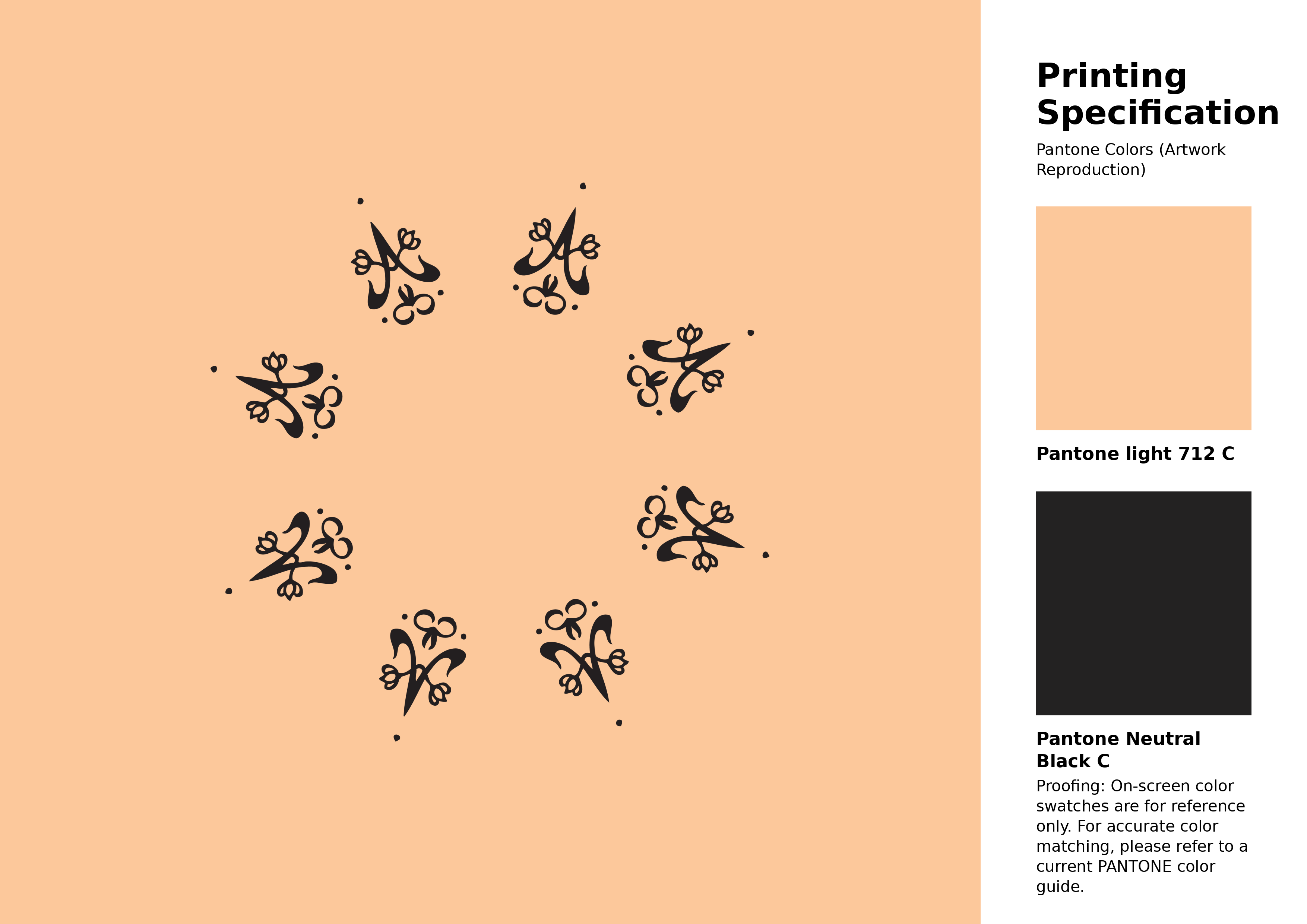
#fcc89b Pantone 712 C Color | Hex color Code #fcc89b Artwork Image (PNG)
Download Artwork (PNG)#fcc89b Pantone 712 C Color | Hex color Code #fcc89b Artwork Vector (PDF)
Download Artwork (PDF)#fcc89b Pantone 712 C Color | Hex color Code #fcc89b Artwork Vector (SVG)
Download Artwork (SVG)
#fcc89b Pantone 712 C Color | Hex color Code #fcc89b Pantone Swatch Artwork
Download Artwork Swatch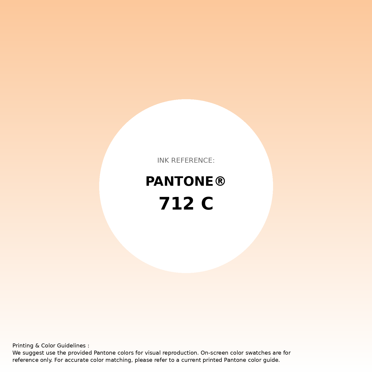
#fcc89b Pantone 712 C Color | Hex color Code #fcc89b Gradient Artwork (PNG)
Download Gradient (PNG)#fcc89b Pantone 712 C Color | Hex color Code #fcc89b Gradient Artwork (SVG)
Download Gradient (SVG)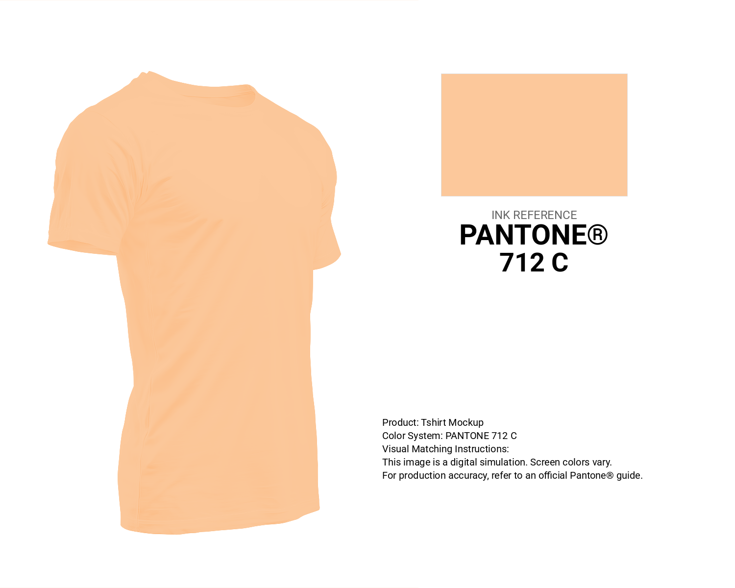
#fcc89b Pantone 712 C Color | Hex color Code #fcc89b T-Shirt Mockup
Download T-Shirt Mockup
#fcc89b Pantone 712 C Color | Hex color Code #fcc89b Printing Artwork Pantone Reference
Download Pantone Printing ReferenceRelated Color Palettes
- Deep Pink and Dark Sea Green •
- Deep Pink and Crimson •
- Deep Pink and Dim Gray •
- pink peacock •
- Hippie Pink •
- Oriental Pink •
- Lavender Pink •
- Medium Violet Red and Deep Pink •
- Dark Sea Green and Deep Pink •
- Light Pink and Dark Sea Green •
- Light Coral and Light Pink •
- Dark Orange and Deep Pink •
- Rosy Brown and Deep Pink •
- Black and Deep Pink •
- Hot Pink and Deep Pink
Color Palette Collection

Home vibes
1 color palettes with 5 colors.

29 Pink Color Palettes for your next design project
29 color palettes with 145 colors.
15 Skin Tone Color Palettes
15 color palettes with 75 colors.

Light Blue Palettes to Enhance Your Design
13 color palettes with 65 colors.