#F5DADF Color
Your all-in-one color resource. Download hex background images, Adobe swatches (ASE), PDF color sheets, and SVG files. Explore palettes, harmonies, accessibility, conversions, and professional exports — designed for designers, developers, and color perfectionists.
This soft, rosy-pink hue with a touch of lavender evokes a sense of gentle romance and fading daylight. It conjures images of a beautiful sunset over a field of wildflowers, a delicate rose bloom, or the quiet moments before sleep. The color palette creates a calming and nostalgic mood, perfect for bedrooms or spaces designed to promote relaxation and a sense of serenity. Its subtle tones could be used in a variety of design settings, from delicate floral patterns to simple, understated decor. There are no strong cultural or symbolic meanings attached to this specific shade. Visually matched named color: Rose Petal Dusk.
PANTONE 705 C
Choose Color
Selected Color
Recent Colors
Color Details
Similar Ink Alternatives for #F5DADF color Alternative print inks for reproducing #F5DADF background image with a similar visual appearance.
Disclaimer: The visually matched ink reference is an independent approximation intended as a guide only. Please be advised that this pantone colors is only intended as a guide, Actual colours will depend on screen calibration variances. The print ink suggestions provided are independent visual approximations and are not affiliated with or endorsed by Pantone LLC. For official color specifications, conversion factors, and comprehensive color system information, please visit Pantone Connect. Official Pantone products can be purchased at pantone.com.
Color Previews for #000000 See how this color looks as a background or as text.
Complete Guide to Your Color Laboratory
Everything you need to know about this professional color toolkit.
Use the Color Picker at the top to select any color. All modules below update instantly.
Workflow: Pick a color → Explore palettes & data → Download what you need (PDF, Image, or Adobe ASE).
Color Details — Your color in all formats: HEX, RGB, RGBA, HSL, HSLA, HSV, CMYK, CIELab, Hunter-Lab, XYZ, Yxy, YUV. One-click copy.
Color Psychology — Emotional impact, cultural meanings, physiological effects, branding applications, and historical significance.
Named Colors — Find official color names (HTML/CSS, Pantone) that match your selection with similarity percentages.
Light & Dark Shades
80-step gradient from black to white. Perfect for button states and component systems.
Tints
Color mixed with white → lighter, pastel variations for backgrounds and disabled states.
Monochromatic — 11 curated tints/shades from one color. Production-ready for design systems.
- Complementary — Opposite on wheel (180°). High contrast.
- Analogous — Neighbors (±30°). Harmonious flow.
- Triadic — Three colors (120° apart). Vibrant, balanced.
- Split-Complementary — Base + two near-complements. Softer contrast.
- Tetradic/Square — Four colors. Complex, maximum variety.
- Neutral — Desaturated versions. Subtle, sophisticated.
15 Professional Variations — Monochromatic, Analogous, Complementary, Warm/Cool/Earth Tones, Pastel, Vibrant, High Contrast, and more.
Color Infusion — 10 palettes showing your color morphing into each major hue. Find bridge colors.
Similar Colors — 60+ colors generated via CIELAB Delta E matching. Unexpected harmonious combinations.
18 Ready-to-Use Gradients — Complementary, Analogous, Triadic, Tint/Shade progressions, and more.
Downloads: PNG (2560×1440), CSS (production-ready code), SVG (scalable vector).
WCAG Contrast Checker — Tests your color against white, black, and custom colors for AA (4.5:1) and AAA (7:1) compliance. Large text thresholds included.
Harmony & Accessibility Guide — Tests against 10 canonical hues. Shows which pairs are both beautiful AND WCAG-compliant for text.
PNG/JPG — High-res images for presentations and mood boards.
PDF — Print-ready reports for clients and teams.
Adobe ASE — Direct import to Photoshop, Illustrator, InDesign, XD.
CSS/SVG — Gradients only. Production-ready code and vectors.
Color Science: Industry-standard conversions (HSL, CIELAB, CMYK, XYZ). WCAG 2.1 luminance formula. Delta E (ΔE76) for perceptual matching.
Direct Links: Share colors via icolorpalette.com/color/ff5733 or icolorpalette.com/color/red
Issues? Refresh the page, wait for rendering, try another browser, or check console (F12) for errors.
Printing Guide for #f5dadf Background Image
Use PANTONE 705 C as a visually matched ink reference when printing this background image.
To print the #f5dadf background image from our site, consider using PANTONE 705 C as a visually matched ink reference.
Download the background image, then provide this reference code to your print vendor to help achieve accurate color reproduction.
The visually matched ink reference for the #f5dadf background image is PANTONE 705 C.
This color is commonly described as Rose Petal Dusk.
This soft, rosy-pink hue with a touch of lavender evokes a sense of gentle romance and fading daylight. It conjures images of a beautiful sunset over a field of wildflowers, a delicate rose bloom, or the quiet moments before sleep. The color palette creates a calming and nostalgic mood, perfect for bedrooms or spaces designed to promote relaxation and a sense of serenity. Its subtle tones could be used in a variety of design settings, from delicate floral patterns to simple, understated decor. There are no strong cultural or symbolic meanings attached to this specific shade.
We provide PANTONE 705 C as a visually matched ink reference to help you reproduce the #f5dadf background image accurately in professional printing.
This reference code helps print vendors achieve consistent color output across different printing equipment and materials.
After downloading the #f5dadf background image from our site:
- Include the visually matched ink reference PANTONE 705 C in your print order notes
- Inform your print vendor that this is your target color reference
- Request a proof print to verify the Rose Petal Dusk color appearance before full production
The #f5dadf background image with PANTONE 705 C as visually matched ink reference can be used for:
- Posters, banners, and backdrops
- Business cards, brochures, and flyers
- Packaging, labels, and stickers
- Signage and promotional materials
This is an independent visual approximation.
While PANTONE 705 C closely matches the #f5dadf background image color, variations may exist between screen display and printed output.
We recommend requesting a proof print to verify the final appearance.
This soft, rosy-pink hue with a touch of lavender evokes a sense of gentle romance and fading daylight. It conjures images of a beautiful sunset over a field of wildflowers, a delicate rose bloom, or the quiet moments before sleep. The color palette creates a calming and nostalgic mood, perfect for bedrooms or spaces designed to promote relaxation and a sense of serenity. Its subtle tones could be used in a variety of design settings, from delicate floral patterns to simple, understated decor. There are no strong cultural or symbolic meanings attached to this specific shade.
Understanding these associations helps ensure the #f5dadf background image aligns with your intended message and brand impact.
Important Information
The visually matched ink reference is an independent approximation intended as a guide only.
Actual printed colors may vary depending on screen calibration, substrate material, ink type, and printing equipment used.
For official color specifications and certified color standards, visit Pantone Connect.
Official color guides and swatch books can be purchased from pantone.com.
Pantone 705 C Color: Delicate Pink | #F5DADF
Introduction:
Delicate Pink (Pantone 705 C) is a soft, gentle color that exudes a sense of femininity and elegance. Its subtle and delicate nature adds a touch of sophistication to any design or visual composition.
Historical Significance:
Key moments in history: Delicate Pink has been prominently used in various historical periods, especially in the Victorian era. It was a popular color choice for fashion, interiors, and art during this time, symbolizing femininity and delicacy.
Symbolism and Meaning:
Symbolism and Meaning: Delicate Pink typically symbolizes love, tenderness, and compassion. It represents a nurturing and caring attitude in various cultures or contexts.
Delicate Pink in Fashion:
Delicate Pink in Fashion: Delicate Pink has a significant impact on styles and trends in the fashion world. It is often used in elegant and feminine designs, adding a touch of grace and sophistication to outfits.
Delicate Pink in Graphic Design:
Delicate Pink in Graphic Design: Delicate Pink holds significance in design aesthetics, branding, and visual impact. It is often used to convey elegance, femininity, and a calming presence in various design projects.
Color Combinations:
Color Combinations: Delicate Pink can be beautifully paired with colors like mint green, lavender, peach, and gold. These combinations create a harmonious and visually pleasing palette.
Nature’s Palette:
Nature’s Palette: Delicate Pink can be found in nature, such as in flowers like cherry blossoms and roses. It also appears in sunsets and certain landscapes, adding a serene and romantic touch to the surroundings.
Artistic Representations:
Artistic Representations: Delicate Pink has been used in various forms of art over time, particularly in paintings, illustrations, and photography. Its soft and soothing quality adds a dreamy and whimsical feel to art compositions.
Movies and Cinematic Landscapes:
Movies and Cinematic Landscapes: Delicate Pink is often used in movies and scenes to set a romantic, soft, and sentimental tone. It creates a visually appealing ambiance that enhances the emotional impact of the film.
Products and Commercial Appeal:
Products and Commercial Appeal: Delicate Pink is popularly associated with products and brands that signify grace, femininity, and elegance. It is commonly used in cosmetics, fashion accessories, and luxury goods.
National Symbols and Significance:
National Symbols and Significance: While Delicate Pink may not hold specific national or cultural significance, its universal association with love and femininity makes it appealing in various contexts.
The Psychological and Emotional Impact:
The Psychological and Emotional Impact: Delicate Pink influences emotions and perceptions psychologically with its calming and soothing qualities. It can create a sense of tranquility, comfort, and affection.
Conclusion:
Delicate Pink (Pantone 705 C) is a color that holds historical significance, symbolizes love and femininity, impacts fashion and design, and has a calming and emotional influence. Its timeless appeal makes it a versatile and essential color in various creative contexts.
Pantone 705 C Color | Hex color Code #f5dadf Image & Artwork
Download high-quality assets for your projects.

#f5dadf Color Schemes
Download Color Schemes
#f5dadf Color Shades
Download Color Shades
Pantone 705 C Color | Hex color Code #f5dadf Solid Color Background
Download Solid Color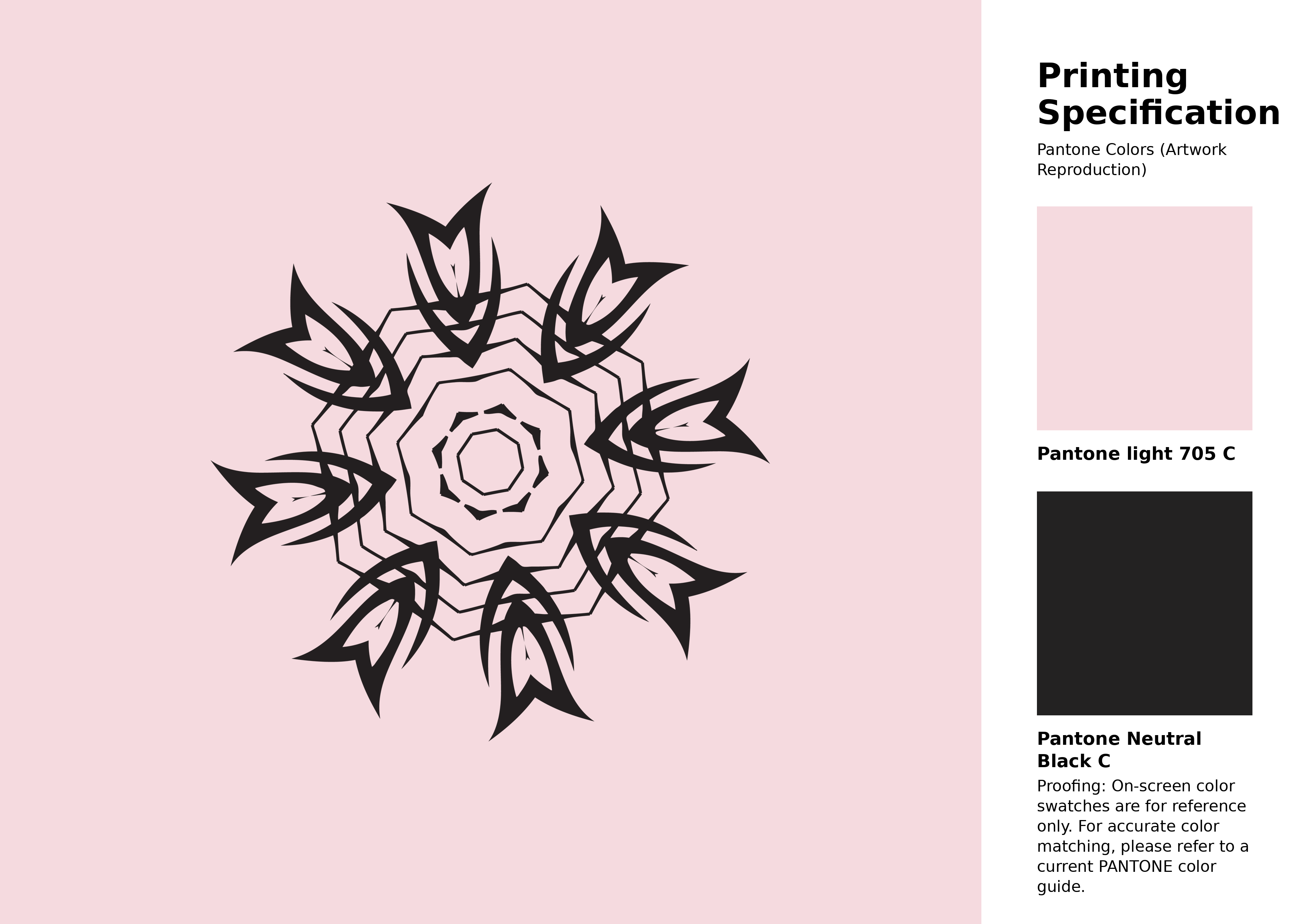
#f5dadf Pantone 705 C Color | Hex color Code #f5dadf Artwork Image (PNG)
Download Artwork (PNG)#f5dadf Pantone 705 C Color | Hex color Code #f5dadf Artwork Vector (PDF)
Download Artwork (PDF)#f5dadf Pantone 705 C Color | Hex color Code #f5dadf Artwork Vector (SVG)
Download Artwork (SVG)
#f5dadf Pantone 705 C Color | Hex color Code #f5dadf Pantone Swatch Artwork
Download Artwork Swatch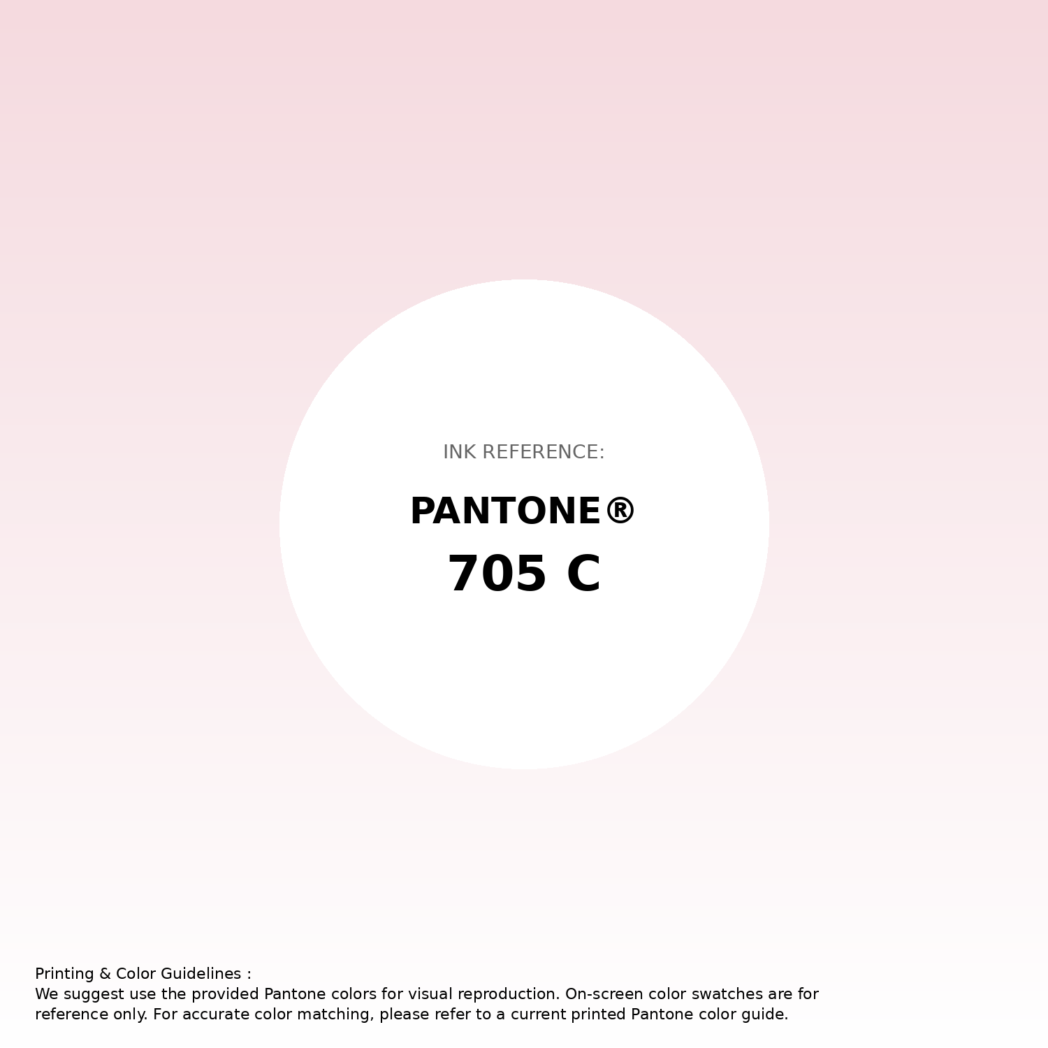
#f5dadf Pantone 705 C Color | Hex color Code #f5dadf Gradient Artwork (PNG)
Download Gradient (PNG)#f5dadf Pantone 705 C Color | Hex color Code #f5dadf Gradient Artwork (SVG)
Download Gradient (SVG)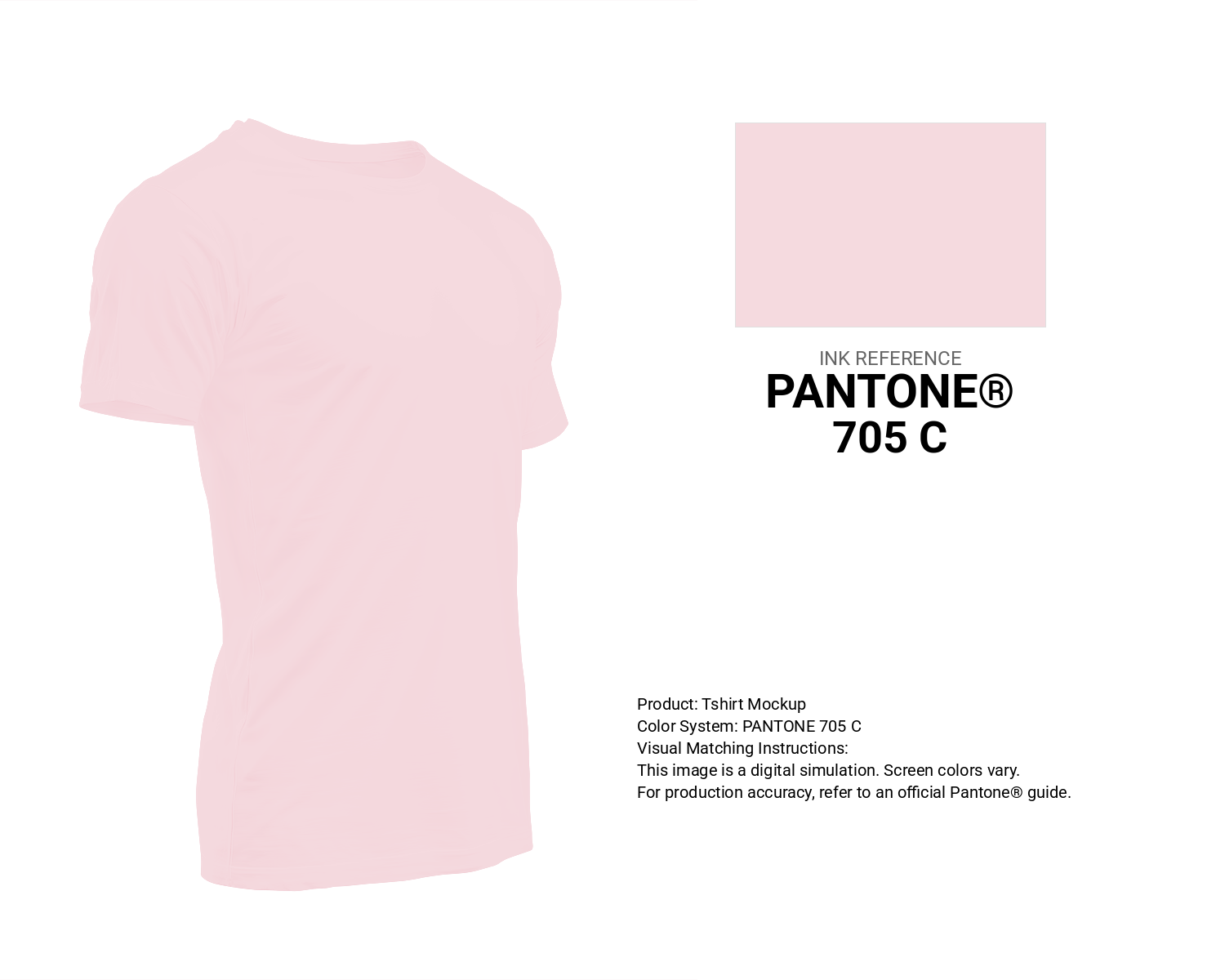
#f5dadf Pantone 705 C Color | Hex color Code #f5dadf T-Shirt Mockup
Download T-Shirt Mockup
#f5dadf Pantone 705 C Color | Hex color Code #f5dadf Printing Artwork Pantone Reference
Download Pantone Printing ReferenceRelated Color Palettes
- Light Pink and Hot Pink •
- Pastel Pink •
- Pale Violet Red and Light Pink •
- Dark Sea Green and Hot Pink •
- pink peacock •
- Tomato and Deep Pink •
- Beige and Deep Pink •
- Deep Pink and Tomato •
- Tonys Pink •
- Saddle Brown and Hot Pink •
- Brown and Light Pink •
- Deep Pink and Medium Violet Red •
- Rosy Brown and Light Pink •
- Pink Swan •
- Hot Pink and Crimson
Color Palette Collection
50 Autumn / Fall Color Palettes
50 color palettes with 250 colors.

AE
2 color palettes with 10 colors.

744 Color Palettes
744 color palettes with 3720 colors.
Chardon
1 color palettes with 5 colors.