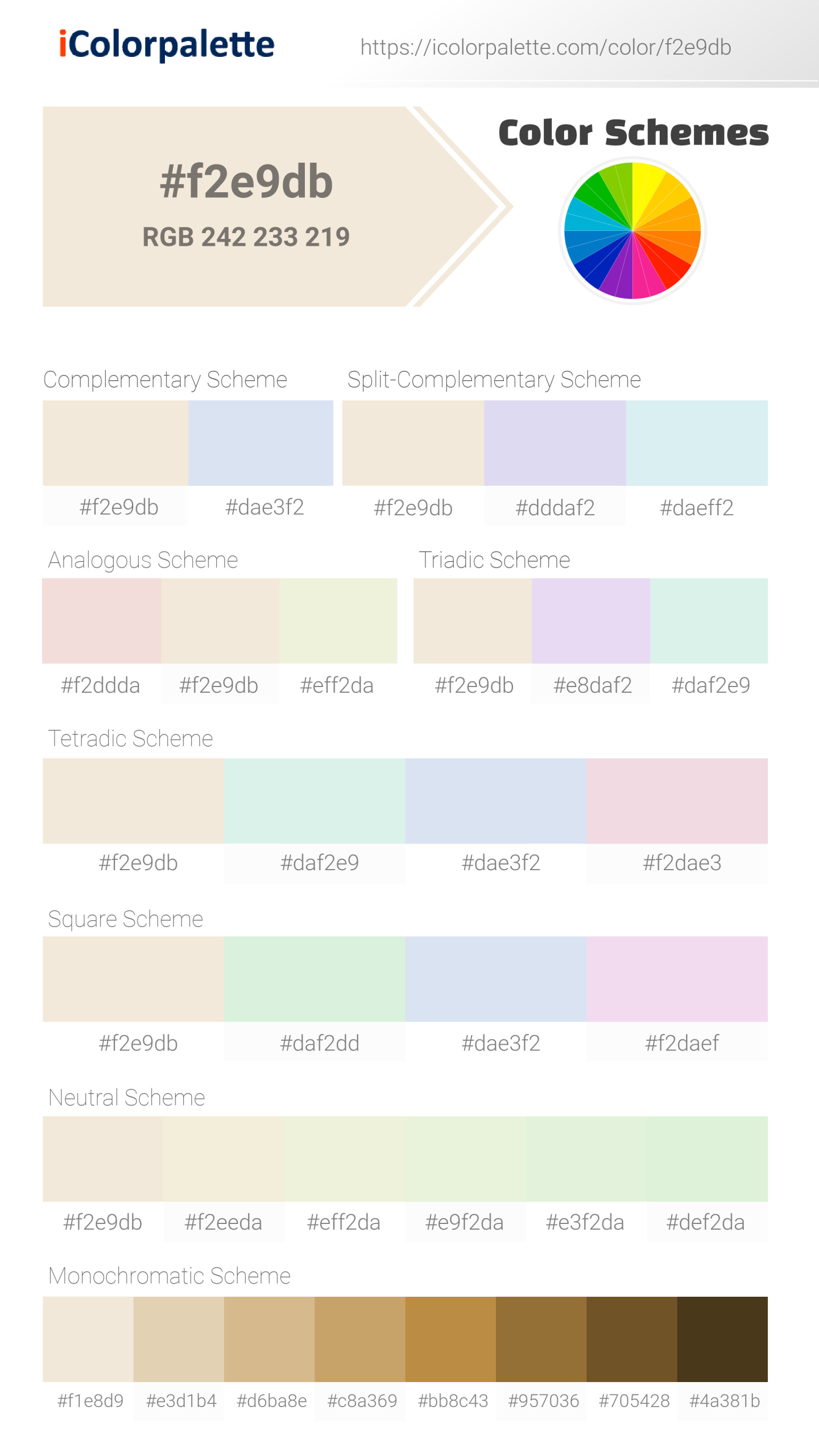
#F2E9DB Color
Your all-in-one color resource. Download hex background images, Adobe swatches (ASE), PDF color sheets, and SVG files. Explore palettes, harmonies, accessibility, conversions, and professional exports — designed for designers, developers, and color perfectionists.
This warm, off-white evokes a sense of purity, simplicity, and a gentle warmth. It evokes feelings of comfort, peace, and a sense of understated elegance. Psychologically, it suggests innocence and neutrality. It reminds me of a blank canvas, fresh linen, or a cozy, well-lit room. The mood is calming and inviting, perfect for creating a sense of space and a feeling of comfort in design, and often associated with simplicity and cleanliness. Visually matched named color: Vanilla Cream.
PANTONE 9224 C
Choose Color
Selected Color
Recent Colors
Color Details
Similar Ink Alternatives for #F2E9DB color Alternative print inks for reproducing #F2E9DB background image with a similar visual appearance.
Disclaimer: The visually matched ink reference is an independent approximation intended as a guide only. Please be advised that this pantone colors is only intended as a guide, Actual colours will depend on screen calibration variances. The print ink suggestions provided are independent visual approximations and are not affiliated with or endorsed by Pantone LLC. For official color specifications, conversion factors, and comprehensive color system information, please visit Pantone Connect. Official Pantone products can be purchased at pantone.com.
Color Previews for #000000 See how this color looks as a background or as text.
Complete Guide to Your Color Laboratory
Everything you need to know about this professional color toolkit.
Use the Color Picker at the top to select any color. All modules below update instantly.
Workflow: Pick a color → Explore palettes & data → Download what you need (PDF, Image, or Adobe ASE).
Color Details — Your color in all formats: HEX, RGB, RGBA, HSL, HSLA, HSV, CMYK, CIELab, Hunter-Lab, XYZ, Yxy, YUV. One-click copy.
Color Psychology — Emotional impact, cultural meanings, physiological effects, branding applications, and historical significance.
Named Colors — Find official color names (HTML/CSS, Pantone) that match your selection with similarity percentages.
Light & Dark Shades
80-step gradient from black to white. Perfect for button states and component systems.
Tints
Color mixed with white → lighter, pastel variations for backgrounds and disabled states.
Monochromatic — 11 curated tints/shades from one color. Production-ready for design systems.
- Complementary — Opposite on wheel (180°). High contrast.
- Analogous — Neighbors (±30°). Harmonious flow.
- Triadic — Three colors (120° apart). Vibrant, balanced.
- Split-Complementary — Base + two near-complements. Softer contrast.
- Tetradic/Square — Four colors. Complex, maximum variety.
- Neutral — Desaturated versions. Subtle, sophisticated.
15 Professional Variations — Monochromatic, Analogous, Complementary, Warm/Cool/Earth Tones, Pastel, Vibrant, High Contrast, and more.
Color Infusion — 10 palettes showing your color morphing into each major hue. Find bridge colors.
Similar Colors — 60+ colors generated via CIELAB Delta E matching. Unexpected harmonious combinations.
18 Ready-to-Use Gradients — Complementary, Analogous, Triadic, Tint/Shade progressions, and more.
Downloads: PNG (2560×1440), CSS (production-ready code), SVG (scalable vector).
WCAG Contrast Checker — Tests your color against white, black, and custom colors for AA (4.5:1) and AAA (7:1) compliance. Large text thresholds included.
Harmony & Accessibility Guide — Tests against 10 canonical hues. Shows which pairs are both beautiful AND WCAG-compliant for text.
PNG/JPG — High-res images for presentations and mood boards.
PDF — Print-ready reports for clients and teams.
Adobe ASE — Direct import to Photoshop, Illustrator, InDesign, XD.
CSS/SVG — Gradients only. Production-ready code and vectors.
Color Science: Industry-standard conversions (HSL, CIELAB, CMYK, XYZ). WCAG 2.1 luminance formula. Delta E (ΔE76) for perceptual matching.
Direct Links: Share colors via icolorpalette.com/color/ff5733 or icolorpalette.com/color/red
Issues? Refresh the page, wait for rendering, try another browser, or check console (F12) for errors.
Printing Guide for #f2e9db Background Image
Use PANTONE 9224 C as a visually matched ink reference when printing this background image.
To print the #f2e9db background image from our site, consider using PANTONE 9224 C as a visually matched ink reference.
Download the background image, then provide this reference code to your print vendor to help achieve accurate color reproduction.
The visually matched ink reference for the #f2e9db background image is PANTONE 9224 C.
This color is commonly described as Vanilla Cream.
This warm, off-white evokes a sense of purity, simplicity, and a gentle warmth. It evokes feelings of comfort, peace, and a sense of understated elegance. Psychologically, it suggests innocence and neutrality. It reminds me of a blank canvas, fresh linen, or a cozy, well-lit room. The mood is calming and inviting, perfect for creating a sense of space and a feeling of comfort in design, and often associated with simplicity and cleanliness.
We provide PANTONE 9224 C as a visually matched ink reference to help you reproduce the #f2e9db background image accurately in professional printing.
This reference code helps print vendors achieve consistent color output across different printing equipment and materials.
After downloading the #f2e9db background image from our site:
- Include the visually matched ink reference PANTONE 9224 C in your print order notes
- Inform your print vendor that this is your target color reference
- Request a proof print to verify the Vanilla Cream color appearance before full production
The #f2e9db background image with PANTONE 9224 C as visually matched ink reference can be used for:
- Posters, banners, and backdrops
- Business cards, brochures, and flyers
- Packaging, labels, and stickers
- Signage and promotional materials
This is an independent visual approximation.
While PANTONE 9224 C closely matches the #f2e9db background image color, variations may exist between screen display and printed output.
We recommend requesting a proof print to verify the final appearance.
This warm, off-white evokes a sense of purity, simplicity, and a gentle warmth. It evokes feelings of comfort, peace, and a sense of understated elegance. Psychologically, it suggests innocence and neutrality. It reminds me of a blank canvas, fresh linen, or a cozy, well-lit room. The mood is calming and inviting, perfect for creating a sense of space and a feeling of comfort in design, and often associated with simplicity and cleanliness.
Understanding these associations helps ensure the #f2e9db background image aligns with your intended message and brand impact.
Important Information
The visually matched ink reference is an independent approximation intended as a guide only.
Actual printed colors may vary depending on screen calibration, substrate material, ink type, and printing equipment used.
For official color specifications and certified color standards, visit Pantone Connect.
Official color guides and swatch books can be purchased from pantone.com.
Pantone 9224 C Color: Subtle Ivory | #F2E9DB
Introduction:
Subtle Ivory is a warm and delicate color. It exudes a soft and gentle vibe with its pale, creamy tone. This color adds a touch of elegance and sophistication to any visual composition.
Historical Significance:
Earliest Uses: Subtle Ivory can be traced back to ancient civilizations where it was used as a symbol of purity and luxury. It was often utilized in royal palaces and ornate artifacts to signify wealth and opulence.
Victorian Era: During the late 19th century, Subtle Ivory became popular in fashion and interior design. Its understated yet refined appearance made it a staple in Victorian mansions and high-end clothing.
Modern Times: Today, Subtle Ivory continues to be favored for its timeless and versatile qualities. It is frequently employed in weddings, formal events, and upscale branding to evoke a sense of sophistication and elegance.
Symbolism and Meaning:
Harmony and Calmness: Subtle Ivory represents tranquility and serenity. Its soft and soothing hue creates a harmonious atmosphere, making it ideal for spaces meant for relaxation and introspection.
Purity and Innocence: As an off-white color, Subtle Ivory symbolizes purity and innocence. It is often associated with weddings, where it signifies the bride's untainted beauty and the beginnings of a new chapter in life.
Elegance and Refinement: Subtle Ivory conveys elegance and refinement. Its understated charm enhances the visual appeal of designs in various contexts, from fashion to graphic design.
Subtle Ivory in Fashion:
Subtle Ivory has a strong presence in the fashion world. It is often used in luxury designs, such as evening gowns, bridal wear, and high-end accessories. Its neutral and sophisticated nature allows it to complement a variety of styles and color combinations.
Subtle Ivory in Graphic Design:
In graphic design, Subtle Ivory is valued for its ability to create a clean and elegant aesthetic. It is commonly used as a background color, allowing other elements to stand out. Its softness and neutrality make it a versatile choice for a wide range of design projects.
Color Combinations:
Subtle Ivory pairs beautifully with various colors, enhancing their impact and creating a harmonious composition. Some popular color combinations include:
- Subtle Ivory and Dusty Rose
- Subtle Ivory and Sage Green
- Subtle Ivory and Navy Blue
- Subtle Ivory and Gold
These combinations exude sophistication and elegance, catering to different design needs and aesthetics.
Nature's Palette:
Subtle Ivory can be found in various natural elements, adding a touch of softness and serenity to the world around us. Some examples include seashells, cream-colored flowers, and sand dunes at sunrise or sunset.
Artistic Representations:
Throughout history, artists have utilized Subtle Ivory in their works to evoke a sense of elegance and sophistication. It can be seen in classic sculptures, intricate tapestries, and delicate porcelain creations. The subdued nature of Subtle Ivory adds a timeless quality to these artistic representations.
Movies and Cinematic Landscapes:
Subtle Ivory often sets the tone for romantic and dreamlike scenes in movies. It creates an ethereal and nostalgic ambiance, enhancing the emotional impact of the storytelling. Films like "The Great Gatsby" and "Pride and Prejudice" use Subtle Ivory to transport viewers to a bygone era of elegance and romance.
Products and Commercial Appeal:
Many luxury brands and products incorporate Subtle Ivory into their branding and packaging. It evokes a sense of sophistication and exclusivity, appealing to discerning consumers seeking elegance and refinement. Examples include high-end cosmetics, designer furniture, and premium chocolates.
National Symbols and Significance:
Subtle Ivory does not have direct national or cultural significance tied to it. However, its timeless appeal and association with luxury often make it a preferred choice for representing prestige and refinement in various cultural contexts.
The Psychological and Emotional Impact:
Subtle Ivory has a calming and soothing effect on emotions. It instills a sense of peace and tranquility, reducing stress and anxiety. Its association with purity and elegance also evokes positive emotions such as joy and serenity.
Conclusion:
Subtle Ivory, with its timeless elegance and refined presence, holds a significant place in design and aesthetic choices. From its historical significance to its use in fashion, graphic design, and beyond, Subtle Ivory continues to captivate with its delicate beauty. Its calming effect and association with purity make it a versatile color that resonates emotionally and visually.
Pantone 9224 C Color | Hex color Code #f2e9db Image & Artwork
Download high-quality assets for your projects.
#f2e9db Color Schemes
Download Color Schemes
#f2e9db Color Shades
Download Color Shades
Pantone 9224 C Color | Hex color Code #f2e9db Solid Color Background
Download Solid Color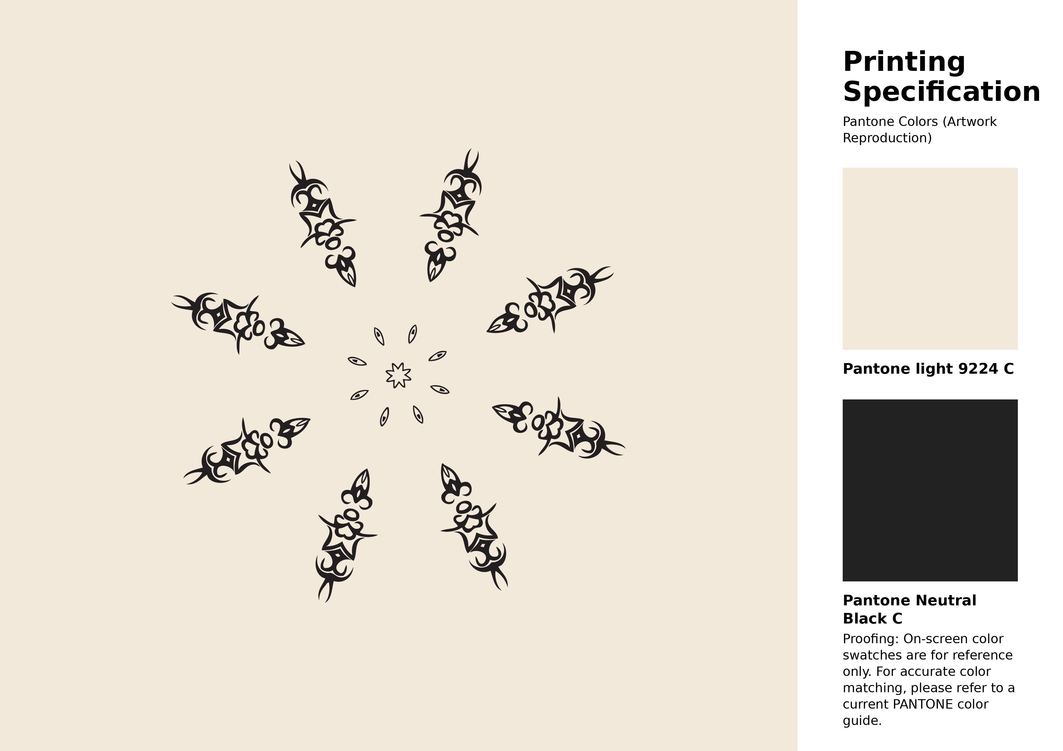
#f2e9db Pantone 9224 C Color | Hex color Code #f2e9db Artwork Image (PNG)
Download Artwork (PNG)#f2e9db Pantone 9224 C Color | Hex color Code #f2e9db Artwork Vector (PDF)
Download Artwork (PDF)#f2e9db Pantone 9224 C Color | Hex color Code #f2e9db Artwork Vector (SVG)
Download Artwork (SVG)
#f2e9db Pantone 9224 C Color | Hex color Code #f2e9db Pantone Swatch Artwork
Download Artwork Swatch
#f2e9db Pantone 9224 C Color | Hex color Code #f2e9db Gradient Artwork (PNG)
Download Gradient (PNG)#f2e9db Pantone 9224 C Color | Hex color Code #f2e9db Gradient Artwork (SVG)
Download Gradient (SVG)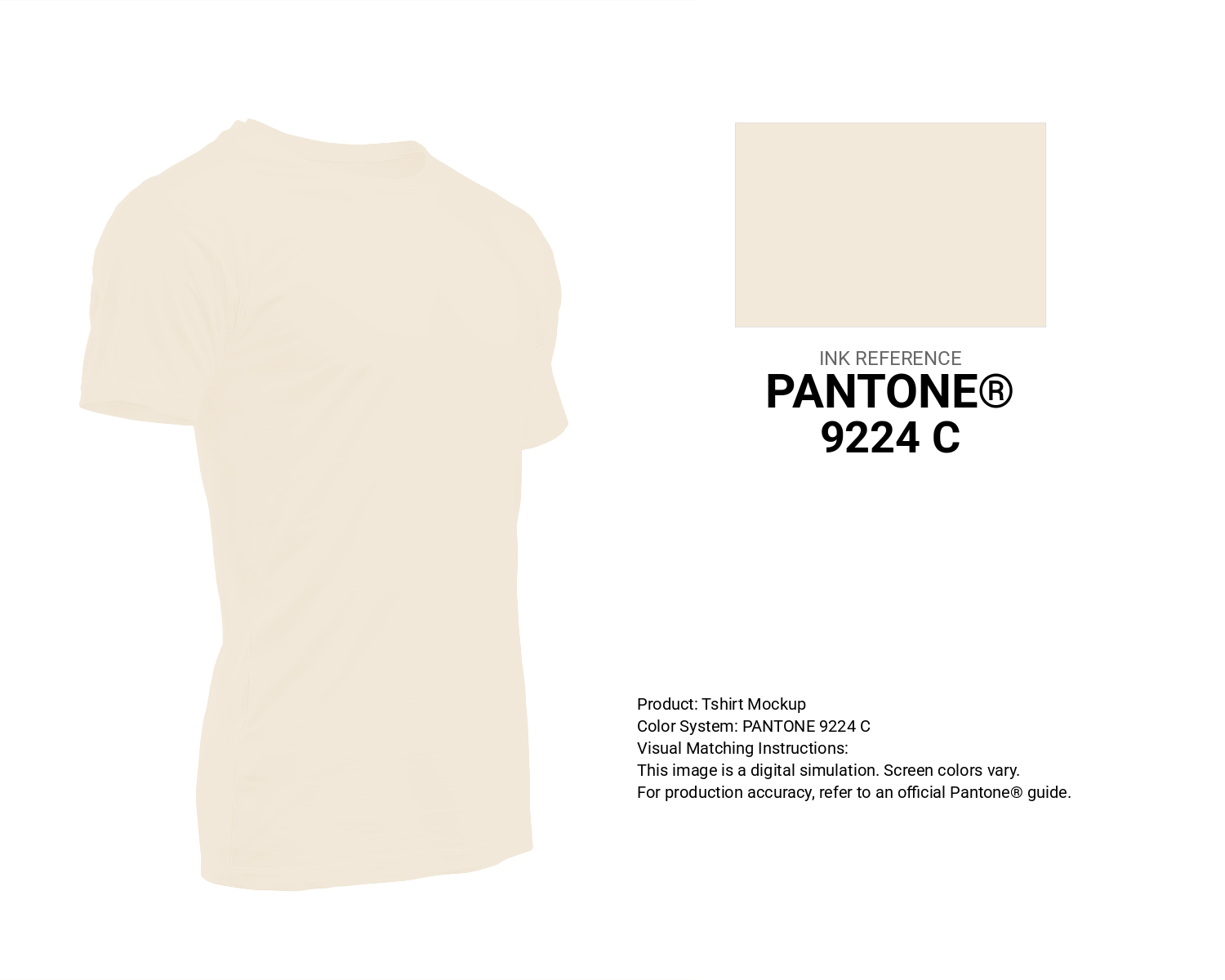
#f2e9db Pantone 9224 C Color | Hex color Code #f2e9db T-Shirt Mockup
Download T-Shirt Mockup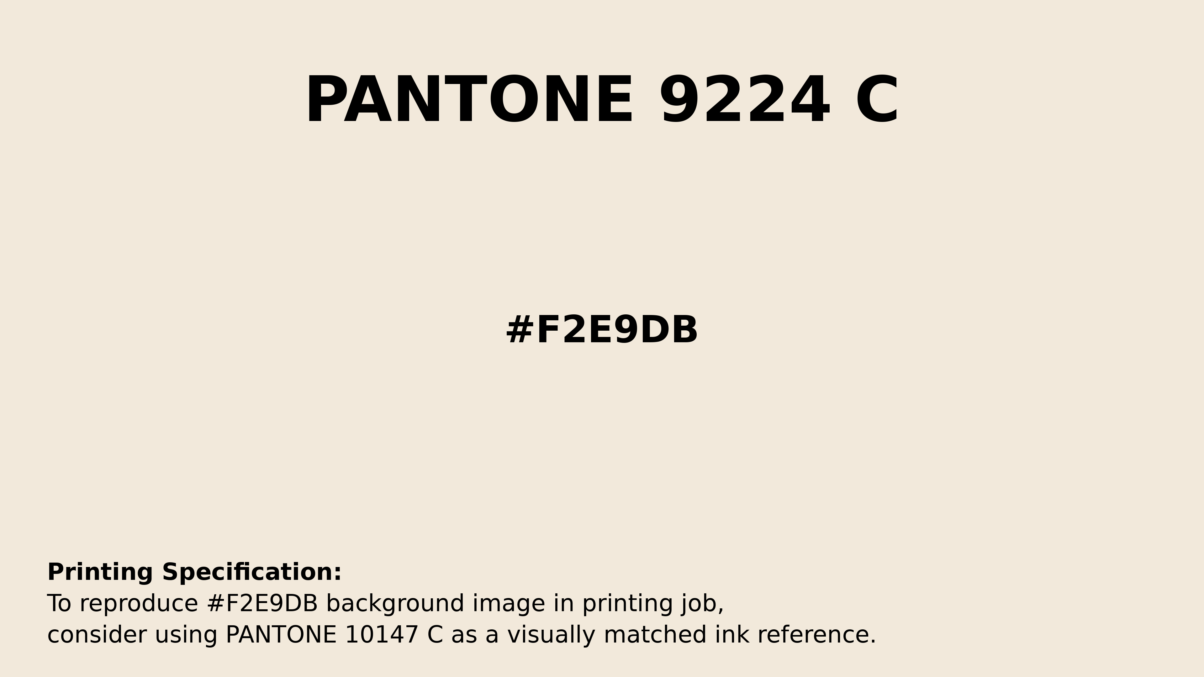
#f2e9db Pantone 9224 C Color | Hex color Code #f2e9db Printing Artwork Pantone Reference
Download Pantone Printing ReferenceRelated Color Palettes
- Beige and Powder Blue •
- Powder Blue and Beige •
- Beige and Midnight Blue •
- Dark Khaki and Beige •
- Plum and Beige •
- Beige and White Smoke •
- Beige and Dark Red •
- SkyBlue and Beige •
- Beige and Dark Salmon •
- Light Slate Gray and Beige •
- Beige and Maroon •
- Beige and Peru •
- Khaki and Beige •
- Beige and Dark Gray •
- Dark Gray and Beige
Color Palette Collection

36 Orange shades Color Palette Collection
36 color palettes with 180 colors.
Chardon
1 color palettes with 5 colors.

50 Green Color Palettes
50 color palettes with 250 colors.
20 Beige Color Combinations
20 color palettes with 100 colors.