#F0EADA Color
Your all-in-one color resource. Download hex background images, Adobe swatches (ASE), PDF color sheets, and SVG files. Explore palettes, harmonies, accessibility, conversions, and professional exports — designed for designers, developers, and color perfectionists.
#F0EADA is a muted, warm pink-beige, reminiscent of a sunrise filtered through a soft, dusty haze. Its gentle hue evokes feelings of nostalgia, serenity, and a quiet warmth. The color calls to mind faded rose petals, sun-bleached sand, or the soft light of early morning. The overall mood is calm and contemplative, suggesting a sense of gentle optimism and quiet hope. This color would be appropriate in spaces designed for relaxation or introspection, perhaps a bedroom or a meditation room. Its understated elegance makes it suitable for interior design where a soft, sophisticated touch is desired. The color lacks strong cultural symbolism, but its muted nature lends itself to a timeless and universally appealing aesthetic, avoiding bold statements while still creating a welcoming atmosphere. Visually matched named color: Dusty Rose Dawn.
PANTONE 11-0104 TCX
Choose Color
Selected Color
Recent Colors
Color Details
Similar Ink Alternatives for #F0EADA color Alternative print inks for reproducing #F0EADA background image with a similar visual appearance.
Disclaimer: The visually matched ink reference is an independent approximation intended as a guide only. Please be advised that this pantone colors is only intended as a guide, Actual colours will depend on screen calibration variances. The print ink suggestions provided are independent visual approximations and are not affiliated with or endorsed by Pantone LLC. For official color specifications, conversion factors, and comprehensive color system information, please visit Pantone Connect. Official Pantone products can be purchased at pantone.com.
Color Previews for #000000 See how this color looks as a background or as text.
Complete Guide to Your Color Laboratory
Everything you need to know about this professional color toolkit.
Use the Color Picker at the top to select any color. All modules below update instantly.
Workflow: Pick a color → Explore palettes & data → Download what you need (PDF, Image, or Adobe ASE).
Color Details — Your color in all formats: HEX, RGB, RGBA, HSL, HSLA, HSV, CMYK, CIELab, Hunter-Lab, XYZ, Yxy, YUV. One-click copy.
Color Psychology — Emotional impact, cultural meanings, physiological effects, branding applications, and historical significance.
Named Colors — Find official color names (HTML/CSS, Pantone) that match your selection with similarity percentages.
Light & Dark Shades
80-step gradient from black to white. Perfect for button states and component systems.
Tints
Color mixed with white → lighter, pastel variations for backgrounds and disabled states.
Monochromatic — 11 curated tints/shades from one color. Production-ready for design systems.
- Complementary — Opposite on wheel (180°). High contrast.
- Analogous — Neighbors (±30°). Harmonious flow.
- Triadic — Three colors (120° apart). Vibrant, balanced.
- Split-Complementary — Base + two near-complements. Softer contrast.
- Tetradic/Square — Four colors. Complex, maximum variety.
- Neutral — Desaturated versions. Subtle, sophisticated.
15 Professional Variations — Monochromatic, Analogous, Complementary, Warm/Cool/Earth Tones, Pastel, Vibrant, High Contrast, and more.
Color Infusion — 10 palettes showing your color morphing into each major hue. Find bridge colors.
Similar Colors — 60+ colors generated via CIELAB Delta E matching. Unexpected harmonious combinations.
18 Ready-to-Use Gradients — Complementary, Analogous, Triadic, Tint/Shade progressions, and more.
Downloads: PNG (2560×1440), CSS (production-ready code), SVG (scalable vector).
WCAG Contrast Checker — Tests your color against white, black, and custom colors for AA (4.5:1) and AAA (7:1) compliance. Large text thresholds included.
Harmony & Accessibility Guide — Tests against 10 canonical hues. Shows which pairs are both beautiful AND WCAG-compliant for text.
PNG/JPG — High-res images for presentations and mood boards.
PDF — Print-ready reports for clients and teams.
Adobe ASE — Direct import to Photoshop, Illustrator, InDesign, XD.
CSS/SVG — Gradients only. Production-ready code and vectors.
Color Science: Industry-standard conversions (HSL, CIELAB, CMYK, XYZ). WCAG 2.1 luminance formula. Delta E (ΔE76) for perceptual matching.
Direct Links: Share colors via icolorpalette.com/color/ff5733 or icolorpalette.com/color/red
Issues? Refresh the page, wait for rendering, try another browser, or check console (F12) for errors.
Printing Guide for #f0eada Background Image
Use PANTONE 11-0104 TCX as a visually matched ink reference when printing this background image.
To print the #f0eada background image from our site, consider using PANTONE 11-0104 TCX as a visually matched ink reference.
Download the background image, then provide this reference code to your print vendor to help achieve accurate color reproduction.
The visually matched ink reference for the #f0eada background image is PANTONE 11-0104 TCX.
This color is commonly described as Dusty Rose Dawn.
#F0EADA is a muted, warm pink-beige, reminiscent of a sunrise filtered through a soft, dusty haze. Its gentle hue evokes feelings of nostalgia, serenity, and a quiet warmth. The color calls to mind faded rose petals, sun-bleached sand, or the soft light of early morning. The overall mood is calm and contemplative, suggesting a sense of gentle optimism and quiet hope. This color would be appropriate in spaces designed for relaxation or introspection, perhaps a bedroom or a meditation room. Its understated elegance makes it suitable for interior design where a soft, sophisticated touch is desired. The color lacks strong cultural symbolism, but its muted nature lends itself to a timeless and universally appealing aesthetic, avoiding bold statements while still creating a welcoming atmosphere.
We provide PANTONE 11-0104 TCX as a visually matched ink reference to help you reproduce the #f0eada background image accurately in professional printing.
This reference code helps print vendors achieve consistent color output across different printing equipment and materials.
After downloading the #f0eada background image from our site:
- Include the visually matched ink reference PANTONE 11-0104 TCX in your print order notes
- Inform your print vendor that this is your target color reference
- Request a proof print to verify the Dusty Rose Dawn color appearance before full production
The #f0eada background image with PANTONE 11-0104 TCX as visually matched ink reference can be used for:
- Posters, banners, and backdrops
- Business cards, brochures, and flyers
- Packaging, labels, and stickers
- Signage and promotional materials
This is an independent visual approximation.
While PANTONE 11-0104 TCX closely matches the #f0eada background image color, variations may exist between screen display and printed output.
We recommend requesting a proof print to verify the final appearance.
#F0EADA is a muted, warm pink-beige, reminiscent of a sunrise filtered through a soft, dusty haze. Its gentle hue evokes feelings of nostalgia, serenity, and a quiet warmth. The color calls to mind faded rose petals, sun-bleached sand, or the soft light of early morning. The overall mood is calm and contemplative, suggesting a sense of gentle optimism and quiet hope. This color would be appropriate in spaces designed for relaxation or introspection, perhaps a bedroom or a meditation room. Its understated elegance makes it suitable for interior design where a soft, sophisticated touch is desired. The color lacks strong cultural symbolism, but its muted nature lends itself to a timeless and universally appealing aesthetic, avoiding bold statements while still creating a welcoming atmosphere.
Understanding these associations helps ensure the #f0eada background image aligns with your intended message and brand impact.
Important Information
The visually matched ink reference is an independent approximation intended as a guide only.
Actual printed colors may vary depending on screen calibration, substrate material, ink type, and printing equipment used.
For official color specifications and certified color standards, visit Pantone Connect.
Official color guides and swatch books can be purchased from pantone.com.
Pantone 11-0104 TCX Vanilla Ice Color: The Subtle Elegance | #F0EADA
Introduction:
Vanilla Ice Color, represented by Pantone 11-0104 TCX, is a delicate and sophisticated hue that exudes elegance and refinement. With its soft and creamy appearance, this color has a gentle and alluring appeal.
Historical Significance:
Early Appearances: Vanilla Ice Color has been used since ancient times in various forms of art and design. It was often seen in classical sculptures and was also utilized in Renaissance paintings, adding a touch of luxury and sophistication to these artistic expressions.
Modern Popularity: In recent decades, Vanilla Ice Color has gained popularity in interior design, particularly in minimalistic and contemporary styles. Its timeless appeal and versatility make it a popular choice for creating serene and calming spaces.
Symbolism and Meaning:
Calmness and Tranquility: Vanilla Ice Color is often associated with feelings of peace, calmness, and tranquility. It has a soothing effect on the mind and can create an atmosphere of relaxation.
Elegance and Sophistication: The soft and muted tones of Vanilla Ice Color evoke a sense of luxury and sophistication. It adds an element of refinement to any design or aesthetic.
Vanilla Ice Color in Fashion:
Minimalist Chic: In the world of fashion, Vanilla Ice Color is often used to create minimalist and chic looks. It can be seen in elegant dresses, blouses, and accessories, adding a touch of sophistication to any outfit.
Neutral Palette: Vanilla Ice Color serves as a versatile neutral that can be easily paired with other colors. It is often used as a base color in fashion, allowing other hues to stand out and shine.
Vanilla Ice Color in Graphic Design:
Elegant Branding: Vanilla Ice Color is often utilized in graphic design to convey a sense of elegance and sophistication. It is commonly seen in luxury brand logos, providing a refined and timeless aesthetic.
Minimalistic Layouts: In graphic design, Vanilla Ice Color is frequently used in minimalist layouts to create a serene and clean visual impact. It allows the focus to be on the content and enhances readability.
Color Combinations:
Combining with Soft Pastels: Vanilla Ice Color pairs well with other soft pastel hues, such as blush pink, mint green, and light grey. This combination creates a gentle and soothing palette.
Contrasting with Bold Accents: Vanilla Ice Color can also be paired with bold and vibrant accents, such as deep navy blue or bright coral. This creates a striking contrast and adds visual interest to the design.
Nature’s Palette:
In Blooming Flowers: Vanilla Ice Color can be found in delicate and fragrant flowers, such as lilies and peonies. These flowers showcase the elegance and beauty of this soft hue in nature.
Calming Landscapes: In tranquil landscapes, Vanilla Ice Color can be seen in peaceful seascapes and serene sunsets. It adds a touch of tranquility and calmness to these natural scenes.
Artistic Representations:
Subtle Still Life Paintings: Vanilla Ice Color has been used in still life paintings to capture the beauty of simple objects. It adds a gentle and serene atmosphere to these artistic representations.
Minimalist Sculptures: In modern art, Vanilla Ice Color can be seen in minimalist sculptures, creating a sense of elegance and purity in these three-dimensional forms.
Movies and Cinematic Landscapes:
Scenic Romance: Vanilla Ice Color sets the tone for romantic and dreamy cinematic landscapes. It can be seen in movies with ethereal and captivating scenes, creating an enchanting atmosphere.
Products and Commercial Appeal:
Luxury Brands: Vanilla Ice Color is associated with luxury and high-end products. It is often used by luxury brands in their packaging and advertisements to convey a sense of elegance and sophistication.
National Symbols and Significance:
None Currently: Vanilla Ice Color does not have any specific national or cultural significance tied to it at present.
The Psychological and Emotional Impact:
Tranquility and Relaxation: Vanilla Ice Color has a calming effect on the mind and promotes feelings of tranquility and relaxation. It can help reduce stress and create a soothing environment.
Conclusion:
Vanilla Ice Color, Pantone 11-0104 TCX, holds a special place in design and aesthetics. Its historical significance, symbolism, and timeless appeal make it a versatile and sophisticated option. Whether used in fashion, graphic design, or artistic representations, Vanilla Ice Color adds an element of elegance and refinement.
Pantone 11-0104 Tcx Vanilla Ice Color | Hex color Code #f0eada Image & Artwork
Download high-quality assets for your projects.

#f0eada Color Schemes
Download Color Schemes
#f0eada Color Shades
Download Color Shades
Pantone 11-0104 Tcx Vanilla Ice Color | Hex color Code #f0eada Solid Color Background
Download Solid Color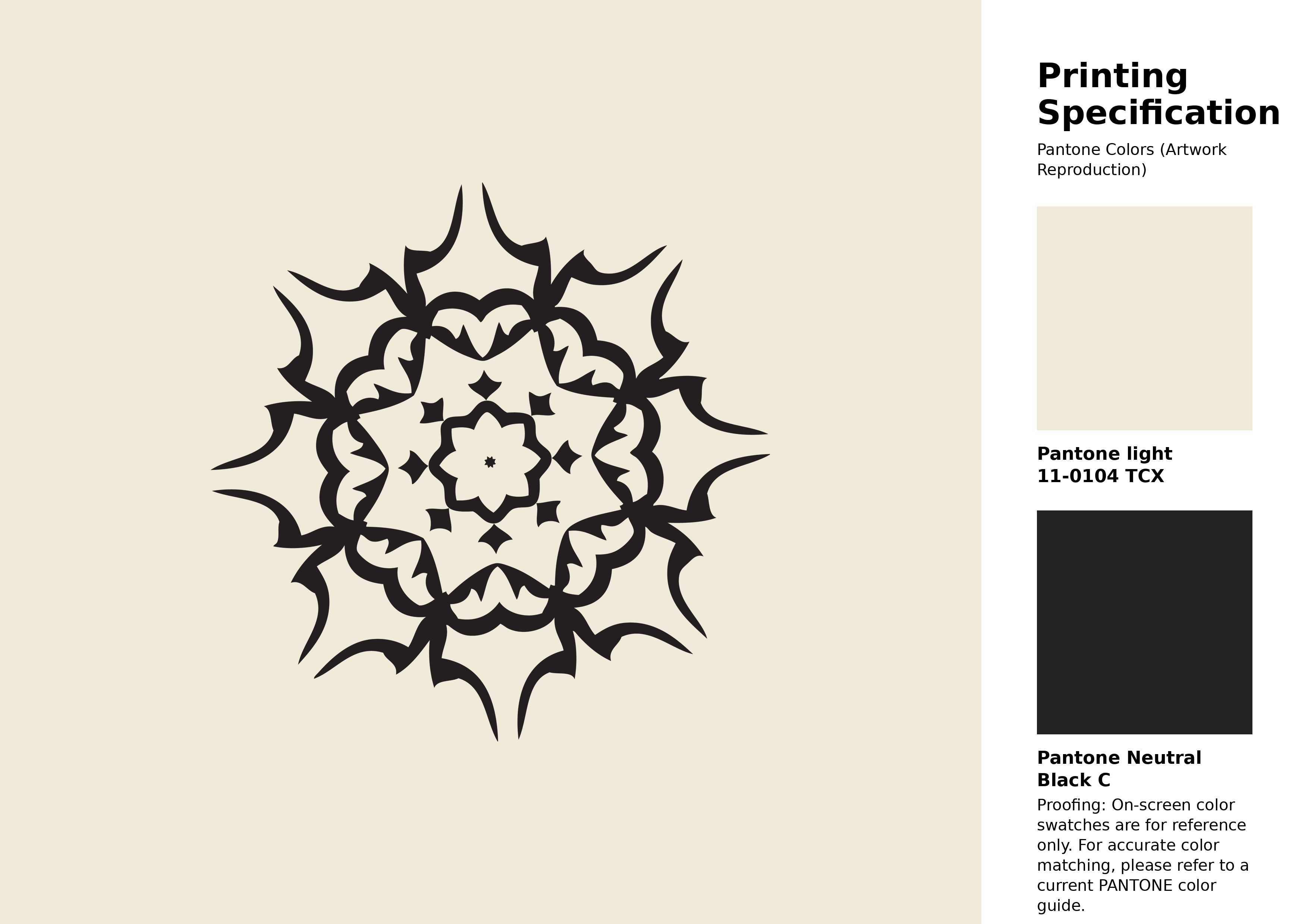
#f0eada Pantone 11-0104 Tcx Vanilla Ice Color | Hex color Code #f0eada Artwork Image (PNG)
Download Artwork (PNG)#f0eada Pantone 11-0104 Tcx Vanilla Ice Color | Hex color Code #f0eada Artwork Vector (PDF)
Download Artwork (PDF)#f0eada Pantone 11-0104 Tcx Vanilla Ice Color | Hex color Code #f0eada Artwork Vector (SVG)
Download Artwork (SVG)
#f0eada Pantone 11-0104 Tcx Vanilla Ice Color | Hex color Code #f0eada Pantone Swatch Artwork
Download Artwork Swatch
#f0eada Pantone 11-0104 Tcx Vanilla Ice Color | Hex color Code #f0eada Gradient Artwork (PNG)
Download Gradient (PNG)#f0eada Pantone 11-0104 Tcx Vanilla Ice Color | Hex color Code #f0eada Gradient Artwork (SVG)
Download Gradient (SVG)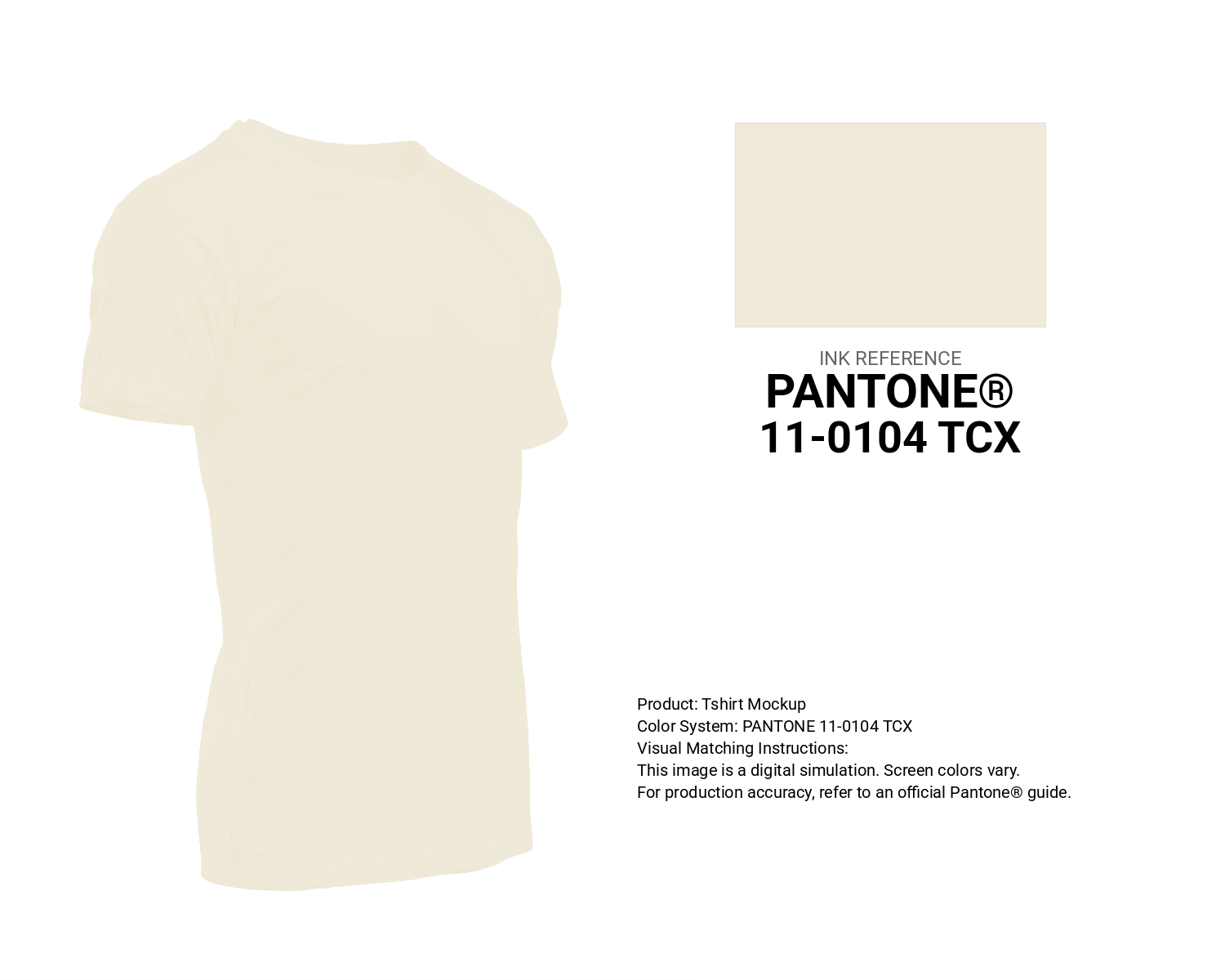
#f0eada Pantone 11-0104 Tcx Vanilla Ice Color | Hex color Code #f0eada T-Shirt Mockup
Download T-Shirt Mockup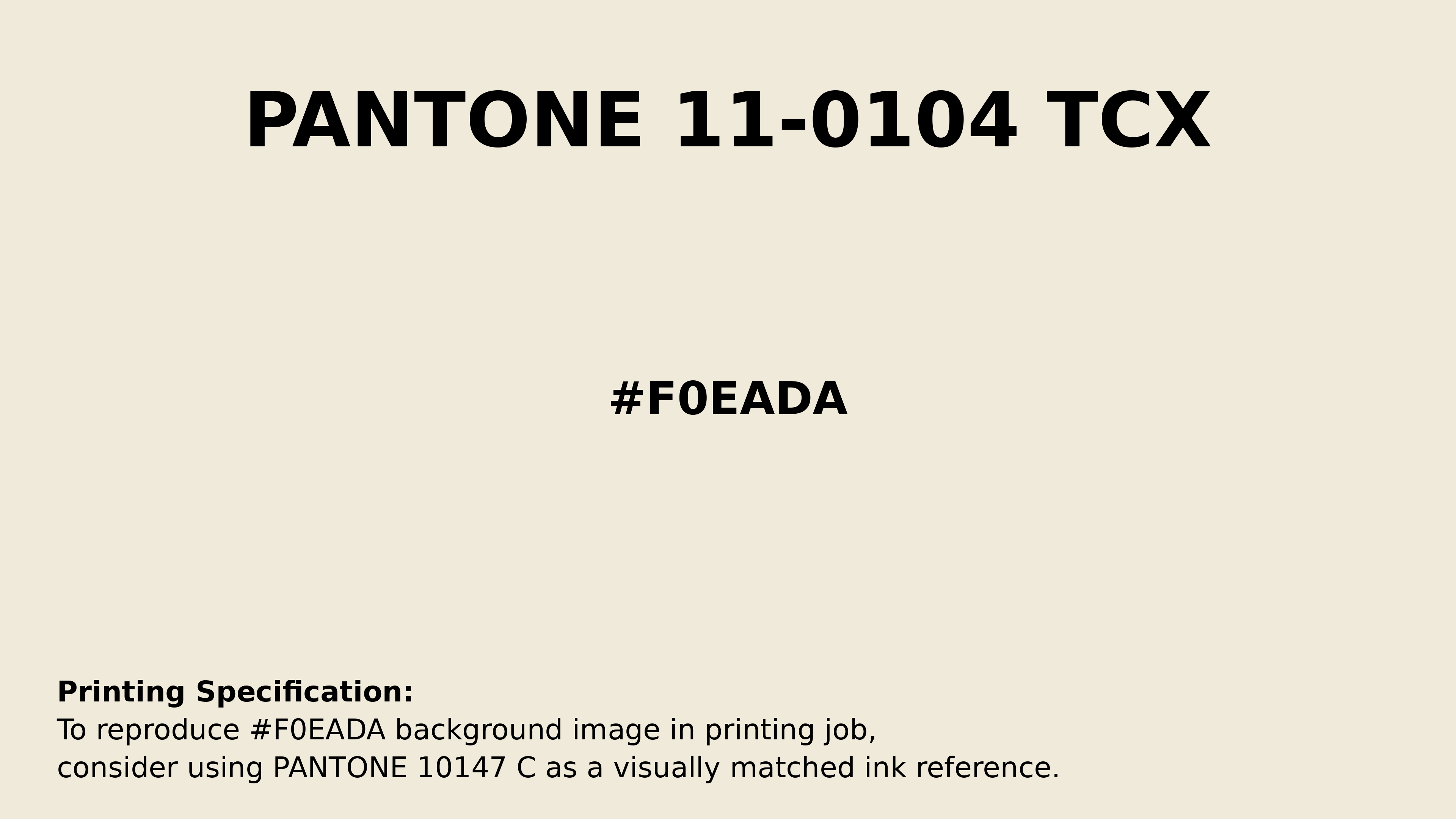
#f0eada Pantone 11-0104 Tcx Vanilla Ice Color | Hex color Code #f0eada Printing Artwork Pantone Reference
Download Pantone Printing Reference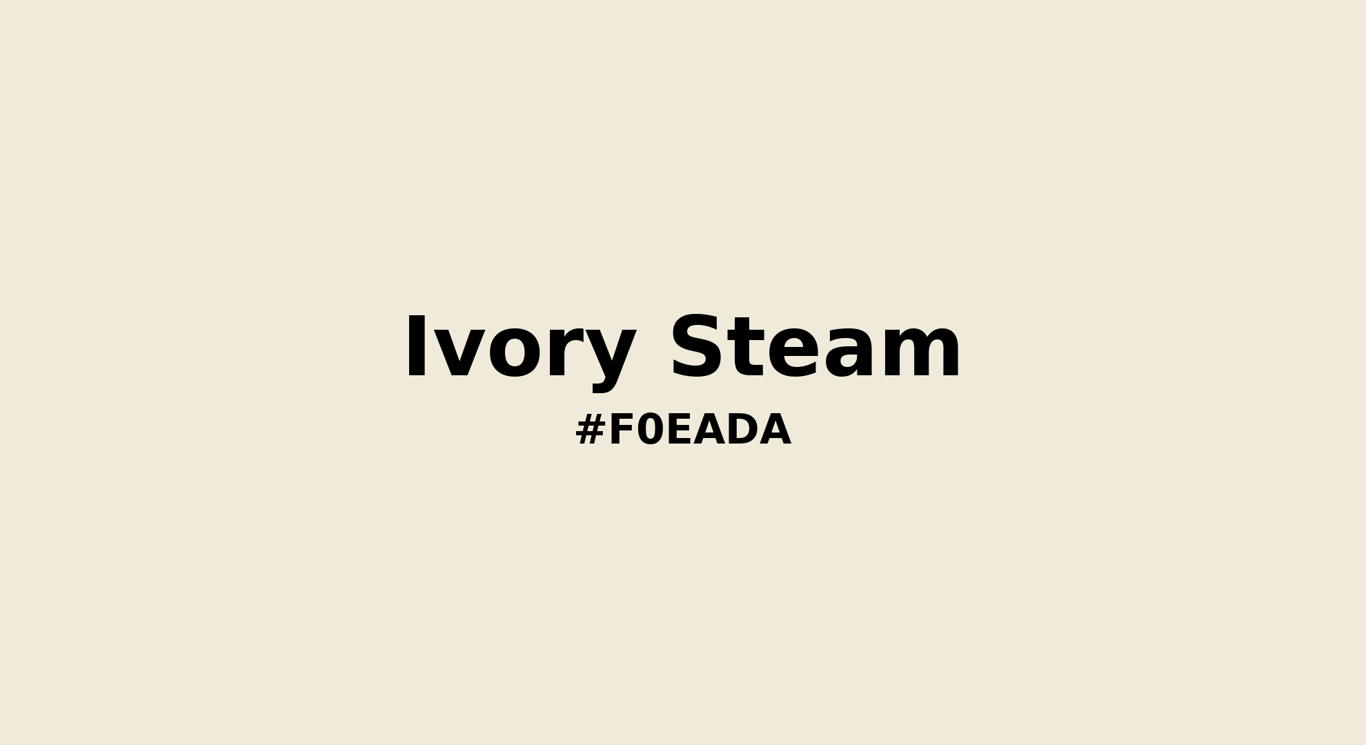
Ivory Steam - #f0eada Color Name
Download Color NameRelated Color Palettes
- Wheat and Beige •
- Peru and Beige •
- Burly Wood and Beige •
- Beige and White Smoke •
- Beige and Tan •
- Light GoldenrodYellow and Beige •
- Dark Salmon and Beige •
- Pale Turquoise and Beige •
- Beige and Light Salmon •
- Gainsboro and Beige •
- Beige and Dim Gray •
- Dark Green and Beige •
- Navajo White and Beige •
- Beige and Rosy Brown •
- Beige and Sienna
Color Palette Collection

Light color Palettes
9 color palettes with 45 colors.

20 Pink Color Schemes
20 color palettes with 100 colors.

26 Pastel Color Schemes
26 color palettes with 130 colors.
Chardonnay
1 color palettes with 5 colors.