#EFEAD7 Color
Your all-in-one color resource. Download hex background images, Adobe swatches (ASE), PDF color sheets, and SVG files. Explore palettes, harmonies, accessibility, conversions, and professional exports — designed for designers, developers, and color perfectionists.
This creamy yellow-toned off-white radiates the gentle warmth of sunlight filtering through a window. It inspires feelings of comfort, optimism, and gentle joy. It recalls sun-drenched fields and the feeling of a cozy afternoon. In design, it lends a welcoming and inviting feel, perfect for spaces designed for relaxation or social interaction. Culturally, it can represent hospitality and the promise of a bright future. Visually matched named color: 2. Warm Sunlight Gaze.
PANTONE 11-0105 TPX
Choose Color
Selected Color
Recent Colors
Color Details
Similar Ink Alternatives for #EFEAD7 color Alternative print inks for reproducing #EFEAD7 background image with a similar visual appearance.
Disclaimer: The visually matched ink reference is an independent approximation intended as a guide only. Please be advised that this pantone colors is only intended as a guide, Actual colours will depend on screen calibration variances. The print ink suggestions provided are independent visual approximations and are not affiliated with or endorsed by Pantone LLC. For official color specifications, conversion factors, and comprehensive color system information, please visit Pantone Connect. Official Pantone products can be purchased at pantone.com.
Color Previews for #000000 See how this color looks as a background or as text.
Complete Guide to Your Color Laboratory
Everything you need to know about this professional color toolkit.
Use the Color Picker at the top to select any color. All modules below update instantly.
Workflow: Pick a color → Explore palettes & data → Download what you need (PDF, Image, or Adobe ASE).
Color Details — Your color in all formats: HEX, RGB, RGBA, HSL, HSLA, HSV, CMYK, CIELab, Hunter-Lab, XYZ, Yxy, YUV. One-click copy.
Color Psychology — Emotional impact, cultural meanings, physiological effects, branding applications, and historical significance.
Named Colors — Find official color names (HTML/CSS, Pantone) that match your selection with similarity percentages.
Light & Dark Shades
80-step gradient from black to white. Perfect for button states and component systems.
Tints
Color mixed with white → lighter, pastel variations for backgrounds and disabled states.
Monochromatic — 11 curated tints/shades from one color. Production-ready for design systems.
- Complementary — Opposite on wheel (180°). High contrast.
- Analogous — Neighbors (±30°). Harmonious flow.
- Triadic — Three colors (120° apart). Vibrant, balanced.
- Split-Complementary — Base + two near-complements. Softer contrast.
- Tetradic/Square — Four colors. Complex, maximum variety.
- Neutral — Desaturated versions. Subtle, sophisticated.
15 Professional Variations — Monochromatic, Analogous, Complementary, Warm/Cool/Earth Tones, Pastel, Vibrant, High Contrast, and more.
Color Infusion — 10 palettes showing your color morphing into each major hue. Find bridge colors.
Similar Colors — 60+ colors generated via CIELAB Delta E matching. Unexpected harmonious combinations.
18 Ready-to-Use Gradients — Complementary, Analogous, Triadic, Tint/Shade progressions, and more.
Downloads: PNG (2560×1440), CSS (production-ready code), SVG (scalable vector).
WCAG Contrast Checker — Tests your color against white, black, and custom colors for AA (4.5:1) and AAA (7:1) compliance. Large text thresholds included.
Harmony & Accessibility Guide — Tests against 10 canonical hues. Shows which pairs are both beautiful AND WCAG-compliant for text.
PNG/JPG — High-res images for presentations and mood boards.
PDF — Print-ready reports for clients and teams.
Adobe ASE — Direct import to Photoshop, Illustrator, InDesign, XD.
CSS/SVG — Gradients only. Production-ready code and vectors.
Color Science: Industry-standard conversions (HSL, CIELAB, CMYK, XYZ). WCAG 2.1 luminance formula. Delta E (ΔE76) for perceptual matching.
Direct Links: Share colors via icolorpalette.com/color/ff5733 or icolorpalette.com/color/red
Issues? Refresh the page, wait for rendering, try another browser, or check console (F12) for errors.
Printing Guide for #efead7 Background Image
Use PANTONE 11-0105 TPX as a visually matched ink reference when printing this background image.
To print the #efead7 background image from our site, consider using PANTONE 11-0105 TPX as a visually matched ink reference.
Download the background image, then provide this reference code to your print vendor to help achieve accurate color reproduction.
The visually matched ink reference for the #efead7 background image is PANTONE 11-0105 TPX.
This color is commonly described as 2. Warm Sunlight Gaze.
This creamy yellow-toned off-white radiates the gentle warmth of sunlight filtering through a window. It inspires feelings of comfort, optimism, and gentle joy. It recalls sun-drenched fields and the feeling of a cozy afternoon. In design, it lends a welcoming and inviting feel, perfect for spaces designed for relaxation or social interaction. Culturally, it can represent hospitality and the promise of a bright future.
We provide PANTONE 11-0105 TPX as a visually matched ink reference to help you reproduce the #efead7 background image accurately in professional printing.
This reference code helps print vendors achieve consistent color output across different printing equipment and materials.
After downloading the #efead7 background image from our site:
- Include the visually matched ink reference PANTONE 11-0105 TPX in your print order notes
- Inform your print vendor that this is your target color reference
- Request a proof print to verify the 2. Warm Sunlight Gaze color appearance before full production
The #efead7 background image with PANTONE 11-0105 TPX as visually matched ink reference can be used for:
- Posters, banners, and backdrops
- Business cards, brochures, and flyers
- Packaging, labels, and stickers
- Signage and promotional materials
This is an independent visual approximation.
While PANTONE 11-0105 TPX closely matches the #efead7 background image color, variations may exist between screen display and printed output.
We recommend requesting a proof print to verify the final appearance.
This creamy yellow-toned off-white radiates the gentle warmth of sunlight filtering through a window. It inspires feelings of comfort, optimism, and gentle joy. It recalls sun-drenched fields and the feeling of a cozy afternoon. In design, it lends a welcoming and inviting feel, perfect for spaces designed for relaxation or social interaction. Culturally, it can represent hospitality and the promise of a bright future.
Understanding these associations helps ensure the #efead7 background image aligns with your intended message and brand impact.
Important Information
The visually matched ink reference is an independent approximation intended as a guide only.
Actual printed colors may vary depending on screen calibration, substrate material, ink type, and printing equipment used.
For official color specifications and certified color standards, visit Pantone Connect.
Official color guides and swatch books can be purchased from pantone.com.
Pantone 11-0105 Tpx Antique White Color: A Classic and Timeless Shade of White | #EFEAD7
Introduction:
Antique White is a deep and rich shade of white that exudes elegance and sophistication. Its warm undertones add depth and character to any space, making it a versatile color for various design applications.
Historical Significance:
Early Use in Interior Design: Antique White gained popularity during the Victorian era when it was often used in the decoration of homes and palaces, symbolizing luxury and refinement. It has since remained a timeless choice for creating a classic and elegant atmosphere.
Symbolism and Meaning:
Timelessness and Purity: Antique White is commonly associated with purity, innocence, and simplicity. It represents a sense of timeless beauty that transcends passing trends and fads. In various cultures, it is also linked to spirituality and enlightenment.
Antique White in Fashion:
Elegant and Sophisticated: In the world of fashion, Antique White is often used to create classic and sophisticated looks. It is a popular choice for wedding dresses, formal attire, and couture designs, adding a touch of timeless elegance to any ensemble.
Antique White in Graphic Design:
Versatile and Neutral: Antique White is widely used in graphic design due to its versatility and neutral nature. It serves as a backdrop for other colors, allowing them to stand out while providing a sense of balance and harmony to the overall design.
Color Combinations:
Classic Pairings: Antique White pairs well with a wide range of colors, including soft pastels like blush pink and light blue, as well as deeper shades such as navy blue and forest green. It also complements metallic accents like gold and silver, creating a luxurious and sophisticated color palette.
Nature’s Palette:
Natural Elements: Antique White can be found in nature, particularly in the delicate petals of flowers like roses and peonies. It is also reminiscent of sandy beaches and seashells, creating a tranquil and soothing aesthetic.
Artistic Representations:
A Classic in Art: Throughout art history, Antique White has been used to create highlights, shadows, and subtle gradients in various forms of art. It adds depth and dimension to paintings, sculptures, and other artistic creations.
Movies and Cinematic Landscapes:
Setting the Mood: Antique White often sets the tone in films and cinematic landscapes. It can evoke a sense of nostalgia, elegance, or create a dream-like atmosphere, depending on the director's vision and storytelling.
Products and Commercial Appeal:
Luxury and Sophistication: Many luxury brands and high-end products incorporate Antique White into their branding to evoke a sense of elegance, sophistication, and timeless appeal. It conveys a sense of exclusivity and quality.
National Symbols and Significance:
Cultural Significance: Antique White holds cultural significance in various countries. In some cultures, it represents purity, while in others, it symbolizes wisdom and enlightenment. It is also associated with religious symbolism and ceremonies.
The Psychological and Emotional Impact:
Sense of Calm and Serenity: Antique White has a calming and soothing effect on the mind. It promotes relaxation, clarity, and a sense of balance. As a neutral color, it also allows individuals to focus and enhances mental clarity.
Conclusion:
Antique White is a timeless and versatile color that has a rich historical significance. It is associated with elegance, purity, and sophistication. Whether used in interior design, fashion, graphic design, or art, Antique White adds a touch of timeless beauty and creates a sense of balance and harmony. Its versatility and neutral nature make it a popular choice in various design applications.
Pantone 11-0105 Tpx Antique White Color | Hex color Code #efead7 Image & Artwork
Download high-quality assets for your projects.

#efead7 Color Schemes
Download Color Schemes
#efead7 Color Shades
Download Color Shades
Pantone 11-0105 Tpx Antique White Color | Hex color Code #efead7 Solid Color Background
Download Solid Color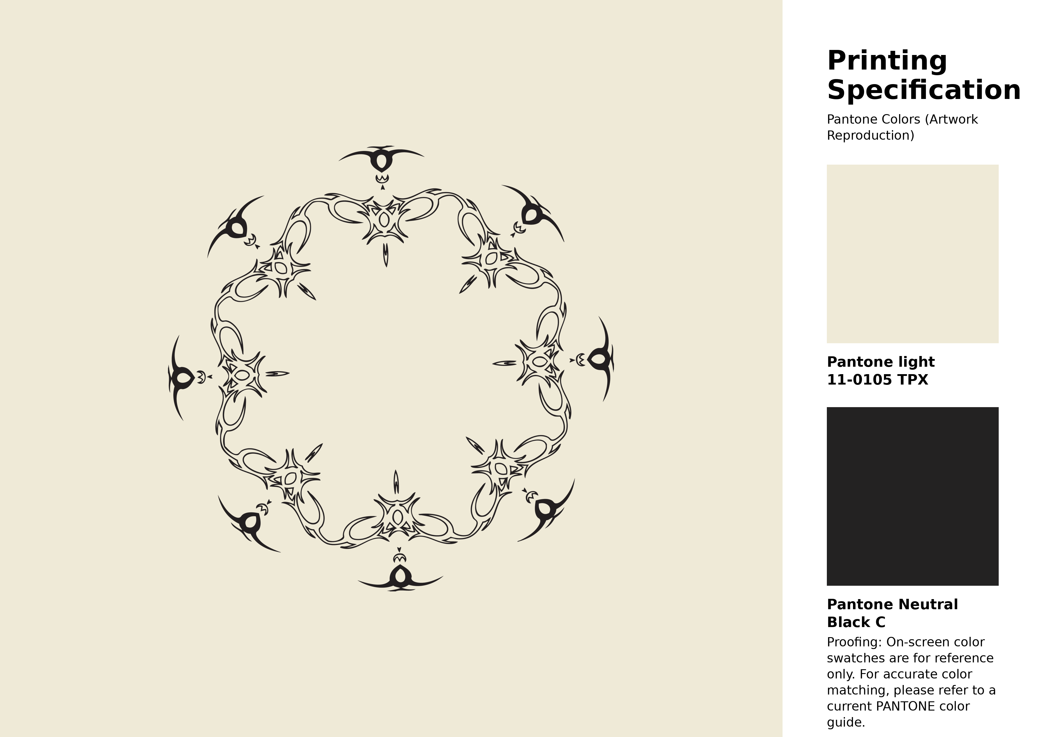
#efead7 Pantone 11-0105 Tpx Antique White Color | Hex color Code #efead7 Artwork Image (PNG)
Download Artwork (PNG)#efead7 Pantone 11-0105 Tpx Antique White Color | Hex color Code #efead7 Artwork Vector (PDF)
Download Artwork (PDF)#efead7 Pantone 11-0105 Tpx Antique White Color | Hex color Code #efead7 Artwork Vector (SVG)
Download Artwork (SVG)
#efead7 Pantone 11-0105 Tpx Antique White Color | Hex color Code #efead7 Pantone Swatch Artwork
Download Artwork Swatch
#efead7 Pantone 11-0105 Tpx Antique White Color | Hex color Code #efead7 Gradient Artwork (PNG)
Download Gradient (PNG)#efead7 Pantone 11-0105 Tpx Antique White Color | Hex color Code #efead7 Gradient Artwork (SVG)
Download Gradient (SVG)
#efead7 Pantone 11-0105 Tpx Antique White Color | Hex color Code #efead7 T-Shirt Mockup
Download T-Shirt Mockup
#efead7 Pantone 11-0105 Tpx Antique White Color | Hex color Code #efead7 Printing Artwork Pantone Reference
Download Pantone Printing ReferenceRelated Color Palettes
- Beige and Olive Drab •
- Beige and Brown •
- Wheat and Beige •
- Beige and Thistle •
- Slate Gray and Beige •
- White Smoke and Beige •
- Beige and Rosy Brown •
- Beige and Dark Slate Blue •
- Powder Blue and Beige •
- Thistle and Beige •
- Beige and Dark Sea Green •
- Steel Blue and Beige •
- Beige and Light Blue •
- Beige and Orange •
- Yellow Green and Beige
Color Palette Collection

49 Beautiful curated Color Schemes For Your Next Design Project
49 color palettes with 245 colors.

38 Purple Color Schemes
38 color palettes with 190 colors.

20 Turquoise Color Palettes
20 color palettes with 100 colors.

My color palette 1
863 color palettes with 4315 colors.