#EFD19F Color
Your all-in-one color resource. Download hex background images, Adobe swatches (ASE), PDF color sheets, and SVG files. Explore palettes, harmonies, accessibility, conversions, and professional exports — designed for designers, developers, and color perfectionists.
This warm, inviting hue evokes the feeling of sun-drenched fields and the gentle touch of late afternoon light. It speaks of comfort, nostalgia, and a sense of groundedness, reminiscent of sun-baked earth, ripe wheat, and the soft glow of antique parchment. The color fosters feelings of optimism, warmth, and contentment, creating a relaxed and welcoming atmosphere. In design, it lends itself well to spaces that encourage connection and tranquility, such as living rooms, kitchens, and bedrooms, adding a touch of vintage charm or a sense of understated elegance. Its association with the harvest and the changing seasons hints at themes of abundance, prosperity, and the passage of time, suggesting both practicality and a gentle, enduring beauty. Visually matched named color: Golden Sunlight.
PANTONE 155 C
Choose Color
Selected Color
Recent Colors
Color Details
Similar Ink Alternatives for #EFD19F color Alternative print inks for reproducing #EFD19F background image with a similar visual appearance.
Disclaimer: The visually matched ink reference is an independent approximation intended as a guide only. Please be advised that this pantone colors is only intended as a guide, Actual colours will depend on screen calibration variances. The print ink suggestions provided are independent visual approximations and are not affiliated with or endorsed by Pantone LLC. For official color specifications, conversion factors, and comprehensive color system information, please visit Pantone Connect. Official Pantone products can be purchased at pantone.com.
Color Previews for #000000 See how this color looks as a background or as text.
Complete Guide to Your Color Laboratory
Everything you need to know about this professional color toolkit.
Use the Color Picker at the top to select any color. All modules below update instantly.
Workflow: Pick a color → Explore palettes & data → Download what you need (PDF, Image, or Adobe ASE).
Color Details — Your color in all formats: HEX, RGB, RGBA, HSL, HSLA, HSV, CMYK, CIELab, Hunter-Lab, XYZ, Yxy, YUV. One-click copy.
Color Psychology — Emotional impact, cultural meanings, physiological effects, branding applications, and historical significance.
Named Colors — Find official color names (HTML/CSS, Pantone) that match your selection with similarity percentages.
Light & Dark Shades
80-step gradient from black to white. Perfect for button states and component systems.
Tints
Color mixed with white → lighter, pastel variations for backgrounds and disabled states.
Monochromatic — 11 curated tints/shades from one color. Production-ready for design systems.
- Complementary — Opposite on wheel (180°). High contrast.
- Analogous — Neighbors (±30°). Harmonious flow.
- Triadic — Three colors (120° apart). Vibrant, balanced.
- Split-Complementary — Base + two near-complements. Softer contrast.
- Tetradic/Square — Four colors. Complex, maximum variety.
- Neutral — Desaturated versions. Subtle, sophisticated.
15 Professional Variations — Monochromatic, Analogous, Complementary, Warm/Cool/Earth Tones, Pastel, Vibrant, High Contrast, and more.
Color Infusion — 10 palettes showing your color morphing into each major hue. Find bridge colors.
Similar Colors — 60+ colors generated via CIELAB Delta E matching. Unexpected harmonious combinations.
18 Ready-to-Use Gradients — Complementary, Analogous, Triadic, Tint/Shade progressions, and more.
Downloads: PNG (2560×1440), CSS (production-ready code), SVG (scalable vector).
WCAG Contrast Checker — Tests your color against white, black, and custom colors for AA (4.5:1) and AAA (7:1) compliance. Large text thresholds included.
Harmony & Accessibility Guide — Tests against 10 canonical hues. Shows which pairs are both beautiful AND WCAG-compliant for text.
PNG/JPG — High-res images for presentations and mood boards.
PDF — Print-ready reports for clients and teams.
Adobe ASE — Direct import to Photoshop, Illustrator, InDesign, XD.
CSS/SVG — Gradients only. Production-ready code and vectors.
Color Science: Industry-standard conversions (HSL, CIELAB, CMYK, XYZ). WCAG 2.1 luminance formula. Delta E (ΔE76) for perceptual matching.
Direct Links: Share colors via icolorpalette.com/color/ff5733 or icolorpalette.com/color/red
Issues? Refresh the page, wait for rendering, try another browser, or check console (F12) for errors.
Printing Guide for #efd19f Background Image
Use PANTONE 155 C as a visually matched ink reference when printing this background image.
To print the #efd19f background image from our site, consider using PANTONE 155 C as a visually matched ink reference.
Download the background image, then provide this reference code to your print vendor to help achieve accurate color reproduction.
The visually matched ink reference for the #efd19f background image is PANTONE 155 C.
This color is commonly described as Golden Sunlight.
This warm, inviting hue evokes the feeling of sun-drenched fields and the gentle touch of late afternoon light. It speaks of comfort, nostalgia, and a sense of groundedness, reminiscent of sun-baked earth, ripe wheat, and the soft glow of antique parchment. The color fosters feelings of optimism, warmth, and contentment, creating a relaxed and welcoming atmosphere. In design, it lends itself well to spaces that encourage connection and tranquility, such as living rooms, kitchens, and bedrooms, adding a touch of vintage charm or a sense of understated elegance. Its association with the harvest and the changing seasons hints at themes of abundance, prosperity, and the passage of time, suggesting both practicality and a gentle, enduring beauty.
We provide PANTONE 155 C as a visually matched ink reference to help you reproduce the #efd19f background image accurately in professional printing.
This reference code helps print vendors achieve consistent color output across different printing equipment and materials.
After downloading the #efd19f background image from our site:
- Include the visually matched ink reference PANTONE 155 C in your print order notes
- Inform your print vendor that this is your target color reference
- Request a proof print to verify the Golden Sunlight color appearance before full production
The #efd19f background image with PANTONE 155 C as visually matched ink reference can be used for:
- Posters, banners, and backdrops
- Business cards, brochures, and flyers
- Packaging, labels, and stickers
- Signage and promotional materials
This is an independent visual approximation.
While PANTONE 155 C closely matches the #efd19f background image color, variations may exist between screen display and printed output.
We recommend requesting a proof print to verify the final appearance.
This warm, inviting hue evokes the feeling of sun-drenched fields and the gentle touch of late afternoon light. It speaks of comfort, nostalgia, and a sense of groundedness, reminiscent of sun-baked earth, ripe wheat, and the soft glow of antique parchment. The color fosters feelings of optimism, warmth, and contentment, creating a relaxed and welcoming atmosphere. In design, it lends itself well to spaces that encourage connection and tranquility, such as living rooms, kitchens, and bedrooms, adding a touch of vintage charm or a sense of understated elegance. Its association with the harvest and the changing seasons hints at themes of abundance, prosperity, and the passage of time, suggesting both practicality and a gentle, enduring beauty.
Understanding these associations helps ensure the #efd19f background image aligns with your intended message and brand impact.
Important Information
The visually matched ink reference is an independent approximation intended as a guide only.
Actual printed colors may vary depending on screen calibration, substrate material, ink type, and printing equipment used.
For official color specifications and certified color standards, visit Pantone Connect.
Official color guides and swatch books can be purchased from pantone.com.
Pantone 155 C Color: Warm Bliss | #EFD19F
Introduction:
Pantone 155 C is a warm and vibrant color that exudes a sense of bliss and joy. Its hue is reminiscent of a golden sunrise, radiating warmth and positivity. The color captures attention and evokes a sense of energy and enthusiasm.
Historical Significance:
Key moments in history: Throughout history, Pantone 155 C has been prominently used in various cultural celebrations and religious ceremonies. It has also been associated with artistic movements that aimed to capture the vibrant spirit of life.
Symbolism and Meaning:
Symbolism and Meaning: Pantone 155 C is often seen as a color of joy, happiness, and prosperity. It symbolizes warmth, optimism, and a zest for life. In different cultures, it may also represent abundance, creativity, and spiritual enlightenment.
Pantone 155 C in Fashion:
Pantone 155 C in Fashion: The vibrant and energetic nature of Pantone 155 C makes it a popular choice in fashion. It is often used to create eye-catching designs that exude confidence and positivity. It is frequently seen in clothing, accessories, and footwear.
Pantone 155 C in Graphic Design:
Pantone 155 C in Graphic Design: Pantone 155 C is a versatile color in graphic design. Its warm and vibrant tones make it ideal for creating impactful designs and branding. It can convey energy, enthusiasm, and creativity. It is often used to evoke positive emotions and catch the viewer's attention.
Color Combinations:
Color Combinations: Pantone 155 C can be paired with various colors to create visually appealing combinations. Some recommended color combinations include Pantone 155 C with shades of blue for a cool and refreshing look, Pantone 155 C with deep oranges for a bold and vibrant combination, and Pantone 155 C with earthy browns for a warm and cozy feel.
Nature’s Palette:
Nature’s Palette: Pantone 155 C can be found in nature's palette in the form of vibrant flowers like marigolds and sunflowers. It also reflects the warm hues of autumn leaves and the golden glow of a sunset. Its presence in nature brings a feeling of warmth and joy.
Artistic Representations:
Artistic Representations: Pantone 155 C has been popularly used in various forms of art to capture the vibrancy and energy it embodies. It has been seen in paintings, sculptures, and installations, often representing themes of happiness, celebration, and vitality.
Movies and Cinematic Landscapes:
Movies and Cinematic Landscapes: Pantone 155 C is often used in movies to create a vibrant and energetic atmosphere. It can be seen in scenes depicting joyful moments, celebrations, and lightheartedness. The color sets the tone and adds a sense of warmth and positivity to the cinematic experience.
Products and Commercial Appeal:
Products and Commercial Appeal: Many popular products and brands embrace Pantone 155 C in their branding to convey a sense of energy and optimism. It is commonly seen in cosmetics, home decor, and lifestyle products that aim to evoke positivity and happiness.
National Symbols and Significance:
National Symbols and Significance: Pantone 155 C holds no specific national or cultural significance. However, its universal associations with joy, warmth, and positivity make it a color that resonates with people across cultures and backgrounds.
The Psychological and Emotional Impact:
The Psychological and Emotional Impact: Pantone 155 C has a profound impact on emotions and perceptions. It has been known to evoke feelings of happiness, optimism, and enthusiasm. The color can uplift moods, create a sense of energy, and foster a positive outlook.
Conclusion:
Pantone 155 C, known as Warm Bliss, is a color that exudes joy, warmth, and happiness. It has a rich historical significance and is widely used in various domains such as fashion, graphic design, and art. Its vibrant and energetic nature makes it a popular choice for creating visually appealing designs and evoking positive emotions. With its universal associations and psychological impact, Pantone 155 C continues to charm and inspire people across cultures and backgrounds.
Pantone 155 C Color | Hex color Code #efd19f Image & Artwork
Download high-quality assets for your projects.

#efd19f Color Schemes
Download Color Schemes
#efd19f Color Shades
Download Color Shades
Pantone 155 C Color | Hex color Code #efd19f Solid Color Background
Download Solid Color
#efd19f Pantone 155 C Color | Hex color Code #efd19f Artwork Image (PNG)
Download Artwork (PNG)#efd19f Pantone 155 C Color | Hex color Code #efd19f Artwork Vector (PDF)
Download Artwork (PDF)#efd19f Pantone 155 C Color | Hex color Code #efd19f Artwork Vector (SVG)
Download Artwork (SVG)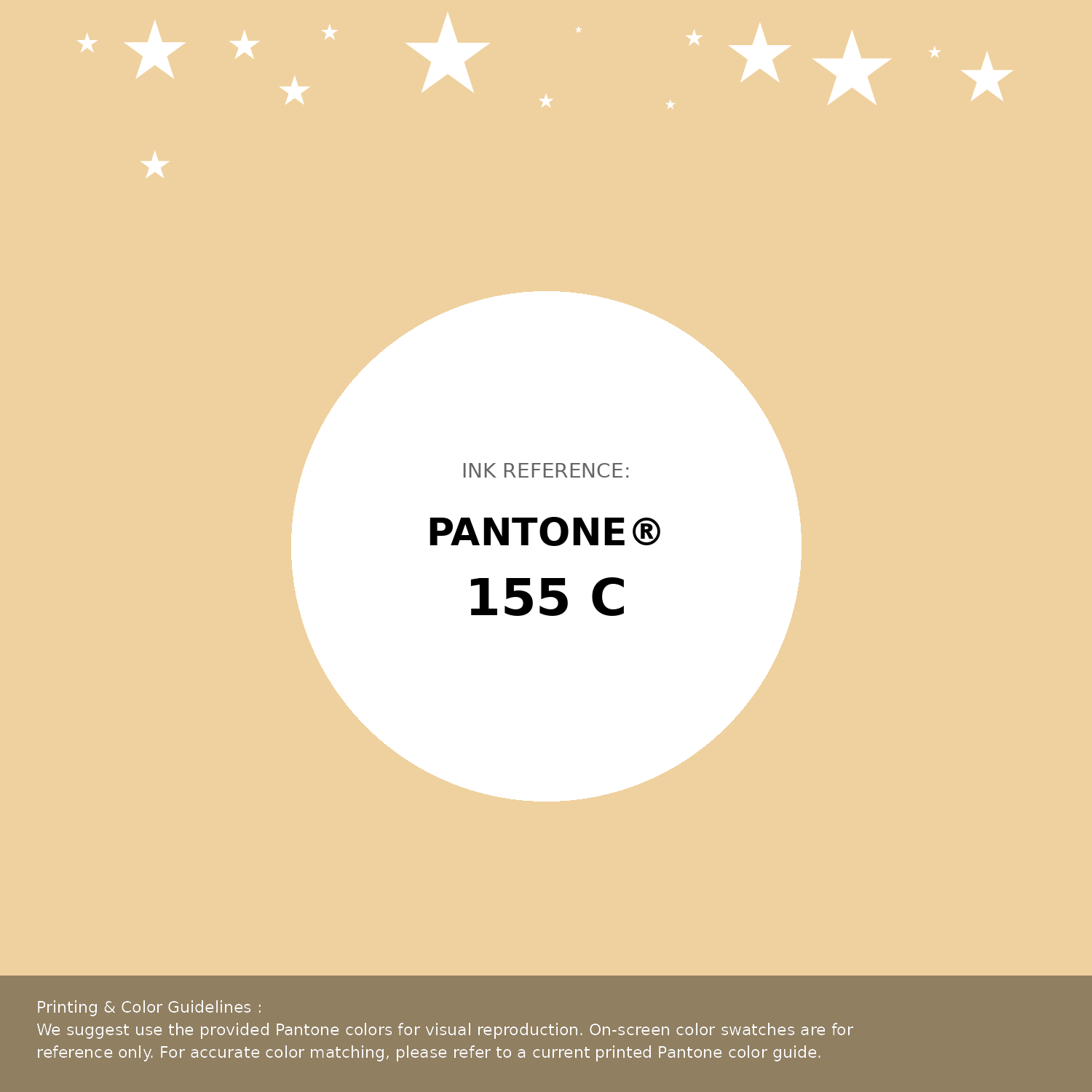
#efd19f Pantone 155 C Color | Hex color Code #efd19f Pantone Swatch Artwork
Download Artwork Swatch
#efd19f Pantone 155 C Color | Hex color Code #efd19f Gradient Artwork (PNG)
Download Gradient (PNG)#efd19f Pantone 155 C Color | Hex color Code #efd19f Gradient Artwork (SVG)
Download Gradient (SVG)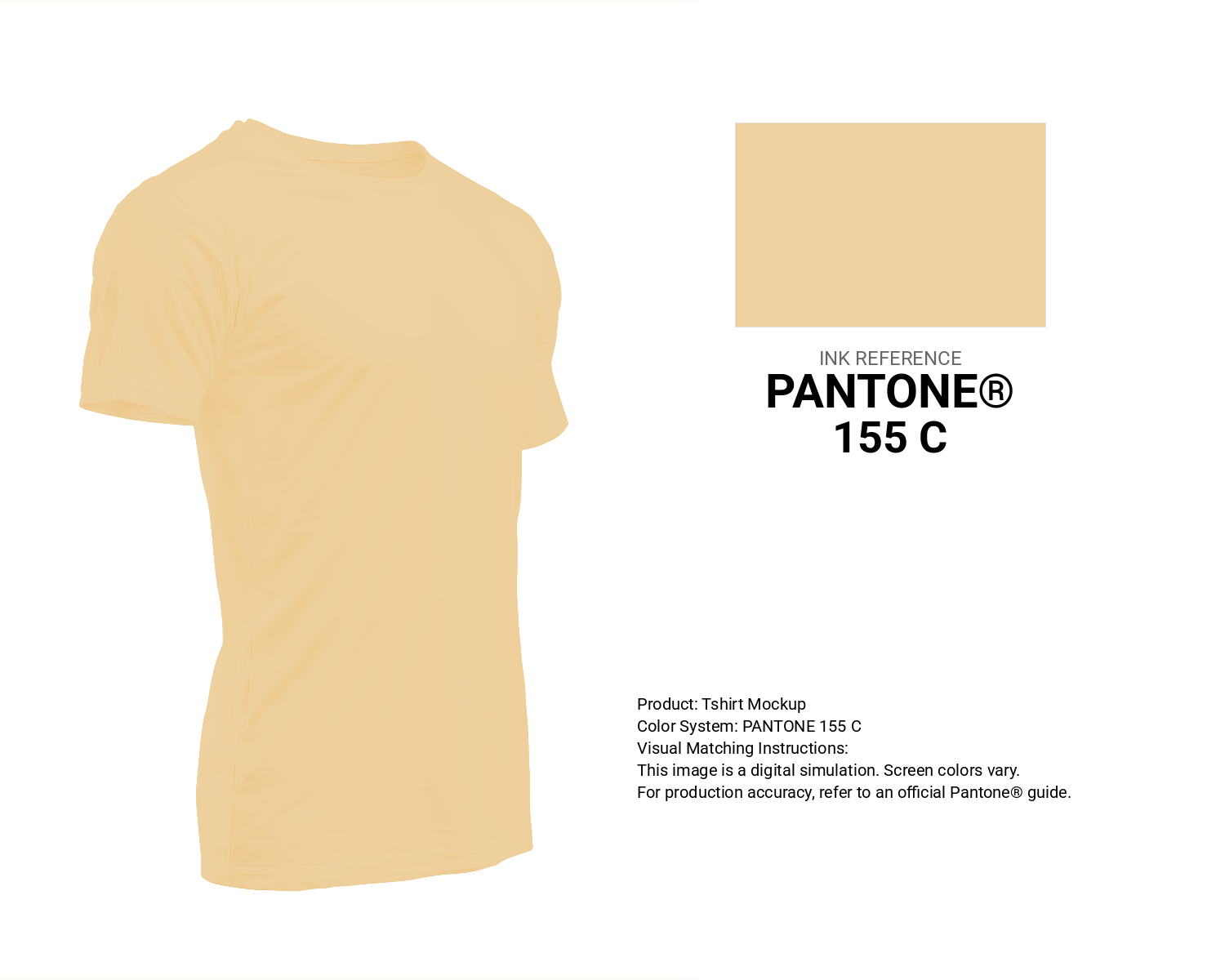
#efd19f Pantone 155 C Color | Hex color Code #efd19f T-Shirt Mockup
Download T-Shirt Mockup
#efd19f Pantone 155 C Color | Hex color Code #efd19f Printing Artwork Pantone Reference
Download Pantone Printing ReferenceRelated Color Palettes
- Cavern Pink •
- New York Pink •
- Tickle Me Pink •
- Light Pink and Tan •
- Oriental Pink •
- Hit Pink •
- Hot Pink and Pale Violet Red •
- Light Pink and Dark Olive Green •
- Beige and Light Pink •
- Light Pink and Beige •
- Spicy Pink •
- Deep Pink and Dark Slate Gray •
- Rosy Brown and Light Pink •
- Hot Pink and Light Pink •
- Deep Pink and Dark Sea Green
Color Palette Collection

17 Christmas Color Palettes Ideas
17 color palettes with 85 colors.

25 Shades of Orange color Palette Collection
25 color palettes with 125 colors.

Light color Palettes
9 color palettes with 45 colors.

46 Indigo Color Palettes
46 color palettes with 230 colors.