#EF426F Color
Your all-in-one color resource. Download hex background images, Adobe swatches (ASE), PDF color sheets, and SVG files. Explore palettes, harmonies, accessibility, conversions, and professional exports — designed for designers, developers, and color perfectionists.
#EF426F is a vibrant, warm pink-red hue that evokes a strong sense of energy and passion. The color's intensity suggests excitement and perhaps even a touch of aggression, reminiscent of a fiery sunset or blooming poppies in a summer field. It's a bold color that commands attention, creating a mood that is both dramatic and alluring. Psychologically, it might be associated with feelings of love, desire, and confidence, but also potentially with anger or frustration if overused. In design, it could be used to create a striking focal point, perhaps in accents or smaller details rather than large swathes, to avoid overwhelming the space. The color's warmth could be balanced with cooler tones to prevent it from feeling too intense. Culturally, red hues are often associated with passion, love and even danger or warning in many societies. Visually matched named color: Crimson Sunset.
PANTONE 191 C
Choose Color
Selected Color
Recent Colors
Color Details
Similar Ink Alternatives for #EF426F color Alternative print inks for reproducing #EF426F background image with a similar visual appearance.
Disclaimer: The visually matched ink reference is an independent approximation intended as a guide only. Please be advised that this pantone colors is only intended as a guide, Actual colours will depend on screen calibration variances. The print ink suggestions provided are independent visual approximations and are not affiliated with or endorsed by Pantone LLC. For official color specifications, conversion factors, and comprehensive color system information, please visit Pantone Connect. Official Pantone products can be purchased at pantone.com.
Color Previews for #000000 See how this color looks as a background or as text.
Complete Guide to Your Color Laboratory
Everything you need to know about this professional color toolkit.
Use the Color Picker at the top to select any color. All modules below update instantly.
Workflow: Pick a color → Explore palettes & data → Download what you need (PDF, Image, or Adobe ASE).
Color Details — Your color in all formats: HEX, RGB, RGBA, HSL, HSLA, HSV, CMYK, CIELab, Hunter-Lab, XYZ, Yxy, YUV. One-click copy.
Color Psychology — Emotional impact, cultural meanings, physiological effects, branding applications, and historical significance.
Named Colors — Find official color names (HTML/CSS, Pantone) that match your selection with similarity percentages.
Light & Dark Shades
80-step gradient from black to white. Perfect for button states and component systems.
Tints
Color mixed with white → lighter, pastel variations for backgrounds and disabled states.
Monochromatic — 11 curated tints/shades from one color. Production-ready for design systems.
- Complementary — Opposite on wheel (180°). High contrast.
- Analogous — Neighbors (±30°). Harmonious flow.
- Triadic — Three colors (120° apart). Vibrant, balanced.
- Split-Complementary — Base + two near-complements. Softer contrast.
- Tetradic/Square — Four colors. Complex, maximum variety.
- Neutral — Desaturated versions. Subtle, sophisticated.
15 Professional Variations — Monochromatic, Analogous, Complementary, Warm/Cool/Earth Tones, Pastel, Vibrant, High Contrast, and more.
Color Infusion — 10 palettes showing your color morphing into each major hue. Find bridge colors.
Similar Colors — 60+ colors generated via CIELAB Delta E matching. Unexpected harmonious combinations.
18 Ready-to-Use Gradients — Complementary, Analogous, Triadic, Tint/Shade progressions, and more.
Downloads: PNG (2560×1440), CSS (production-ready code), SVG (scalable vector).
WCAG Contrast Checker — Tests your color against white, black, and custom colors for AA (4.5:1) and AAA (7:1) compliance. Large text thresholds included.
Harmony & Accessibility Guide — Tests against 10 canonical hues. Shows which pairs are both beautiful AND WCAG-compliant for text.
PNG/JPG — High-res images for presentations and mood boards.
PDF — Print-ready reports for clients and teams.
Adobe ASE — Direct import to Photoshop, Illustrator, InDesign, XD.
CSS/SVG — Gradients only. Production-ready code and vectors.
Color Science: Industry-standard conversions (HSL, CIELAB, CMYK, XYZ). WCAG 2.1 luminance formula. Delta E (ΔE76) for perceptual matching.
Direct Links: Share colors via icolorpalette.com/color/ff5733 or icolorpalette.com/color/red
Issues? Refresh the page, wait for rendering, try another browser, or check console (F12) for errors.
Printing Guide for #ef426f Background Image
Use PANTONE 191 C as a visually matched ink reference when printing this background image.
To print the #ef426f background image from our site, consider using PANTONE 191 C as a visually matched ink reference.
Download the background image, then provide this reference code to your print vendor to help achieve accurate color reproduction.
The visually matched ink reference for the #ef426f background image is PANTONE 191 C.
This color is commonly described as Crimson Sunset.
#EF426F is a vibrant, warm pink-red hue that evokes a strong sense of energy and passion. The color's intensity suggests excitement and perhaps even a touch of aggression, reminiscent of a fiery sunset or blooming poppies in a summer field. It's a bold color that commands attention, creating a mood that is both dramatic and alluring. Psychologically, it might be associated with feelings of love, desire, and confidence, but also potentially with anger or frustration if overused. In design, it could be used to create a striking focal point, perhaps in accents or smaller details rather than large swathes, to avoid overwhelming the space. The color's warmth could be balanced with cooler tones to prevent it from feeling too intense. Culturally, red hues are often associated with passion, love and even danger or warning in many societies.
We provide PANTONE 191 C as a visually matched ink reference to help you reproduce the #ef426f background image accurately in professional printing.
This reference code helps print vendors achieve consistent color output across different printing equipment and materials.
After downloading the #ef426f background image from our site:
- Include the visually matched ink reference PANTONE 191 C in your print order notes
- Inform your print vendor that this is your target color reference
- Request a proof print to verify the Crimson Sunset color appearance before full production
The #ef426f background image with PANTONE 191 C as visually matched ink reference can be used for:
- Posters, banners, and backdrops
- Business cards, brochures, and flyers
- Packaging, labels, and stickers
- Signage and promotional materials
This is an independent visual approximation.
While PANTONE 191 C closely matches the #ef426f background image color, variations may exist between screen display and printed output.
We recommend requesting a proof print to verify the final appearance.
#EF426F is a vibrant, warm pink-red hue that evokes a strong sense of energy and passion. The color's intensity suggests excitement and perhaps even a touch of aggression, reminiscent of a fiery sunset or blooming poppies in a summer field. It's a bold color that commands attention, creating a mood that is both dramatic and alluring. Psychologically, it might be associated with feelings of love, desire, and confidence, but also potentially with anger or frustration if overused. In design, it could be used to create a striking focal point, perhaps in accents or smaller details rather than large swathes, to avoid overwhelming the space. The color's warmth could be balanced with cooler tones to prevent it from feeling too intense. Culturally, red hues are often associated with passion, love and even danger or warning in many societies.
Understanding these associations helps ensure the #ef426f background image aligns with your intended message and brand impact.
Important Information
The visually matched ink reference is an independent approximation intended as a guide only.
Actual printed colors may vary depending on screen calibration, substrate material, ink type, and printing equipment used.
For official color specifications and certified color standards, visit Pantone Connect.
Official color guides and swatch books can be purchased from pantone.com.
Pantone 191 C Color: Vibrant Pink | #EF426F
Introduction:
Vibrant Pink is a bold and eye-catching color that exudes energy and passion. Its vivid hue and intense saturation make it a captivating choice for various creative projects.
Historical Significance:
Significance in Fashion: Vibrant Pink rose to prominence in the 1960s during the vibrant fashion trends of that era. It became associated with femininity and rebellion, challenging traditional gender norms.
Symbolism and Meaning:
Symbolic Meaning: Vibrant Pink is often associated with love, passion, and romance. It can also represent youthful energy, creativity, and playfulness.
Vibrant Pink in Fashion:
Influence on Fashion Styles: Vibrant Pink is often used in fashion to create vibrant and attention-grabbing looks. It adds a bold and confident touch to outfits and is popular in both casual and formal wear.
Vibrant Pink in Graphic Design:
Design Significance: In graphic design, Vibrant Pink is used to create visually striking and impactful designs. Its boldness and vibrancy make it a popular choice for logos, branding, and promotional materials.
Color Combinations:
Potential Color Combinations: Vibrant Pink pairs well with other bold and contrasting colors such as electric blue, sunny yellow, and deep purple. It can also be balanced with neutrals like white or gray for a more subtle effect.
Nature's Palette:
Natural Occurrences: Vibrant Pink is commonly found in the petals of flowers such as roses, peonies, and carnations. It also appears in certain sunsets and tropical landscapes.
Artistic Representations:
Artistic Usage: Vibrant Pink has been used by various artists throughout history to evoke passion, femininity, and emotional intensity in their artworks. It has been employed in paintings, sculptures, and mixed media pieces.
Movies and Cinematic Landscapes:
Cinematic Impact: Vibrant Pink is often used in movies to create a visually striking atmosphere or to symbolize love, desire, or femininity. It can add a touch of passion and intensity to a scene.
Products and Commercial Appeal:
Commercial Usage: Vibrant Pink is commonly used by various brands in their product packaging, advertising, and branding. It is often associated with youthfulness, energy, and creativity.
National Symbols and Significance:
Significance in National Symbols: Vibrant Pink holds different meanings in various cultures. In some countries, it may symbolize love and femininity, while in others, it represents joy and celebration.
The Psychological and Emotional Impact:
Psychological Influence: Vibrant Pink has a positive and uplifting effect on emotions. It can evoke feelings of happiness, excitement, and passion, creating a sense of vitality and energy.
Conclusion:
Vibrant Pink, also known as Pantone 191 C Color, is a powerful and attention-grabbing color that has a rich historical significance. Its symbolic meanings, impact on fashion and design, and emotional influence make it a captivating choice for various creative endeavors.
Pantone 191 C Color | Hex color Code #ef426f Image & Artwork
Download high-quality assets for your projects.

#ef426f Color Schemes
Download Color Schemes
#ef426f Color Shades
Download Color Shades
Pantone 191 C Color | Hex color Code #ef426f Solid Color Background
Download Solid Color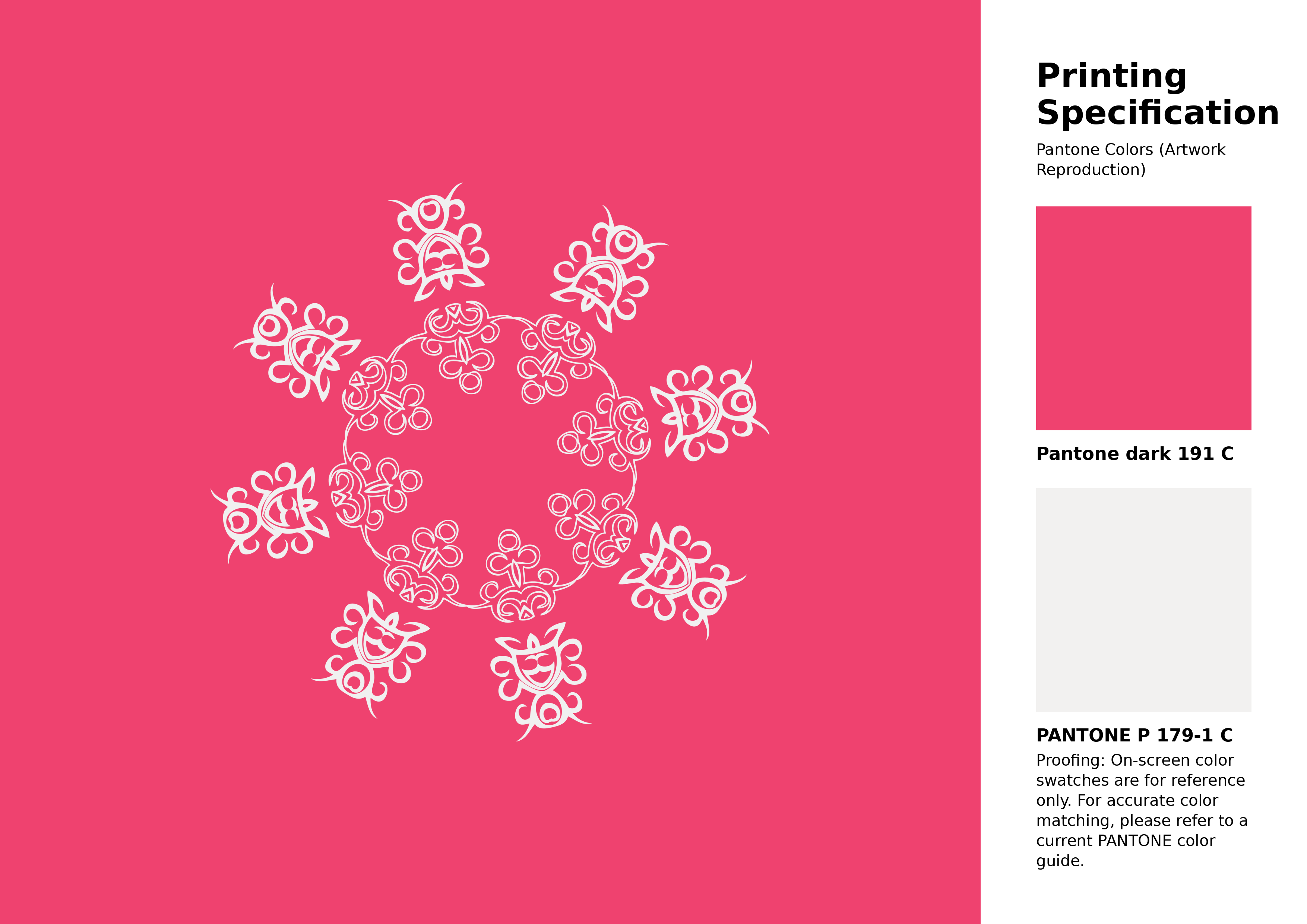
#ef426f Pantone 191 C Color | Hex color Code #ef426f Artwork Image (PNG)
Download Artwork (PNG)#ef426f Pantone 191 C Color | Hex color Code #ef426f Artwork Vector (PDF)
Download Artwork (PDF)#ef426f Pantone 191 C Color | Hex color Code #ef426f Artwork Vector (SVG)
Download Artwork (SVG)
#ef426f Pantone 191 C Color | Hex color Code #ef426f Pantone Swatch Artwork
Download Artwork Swatch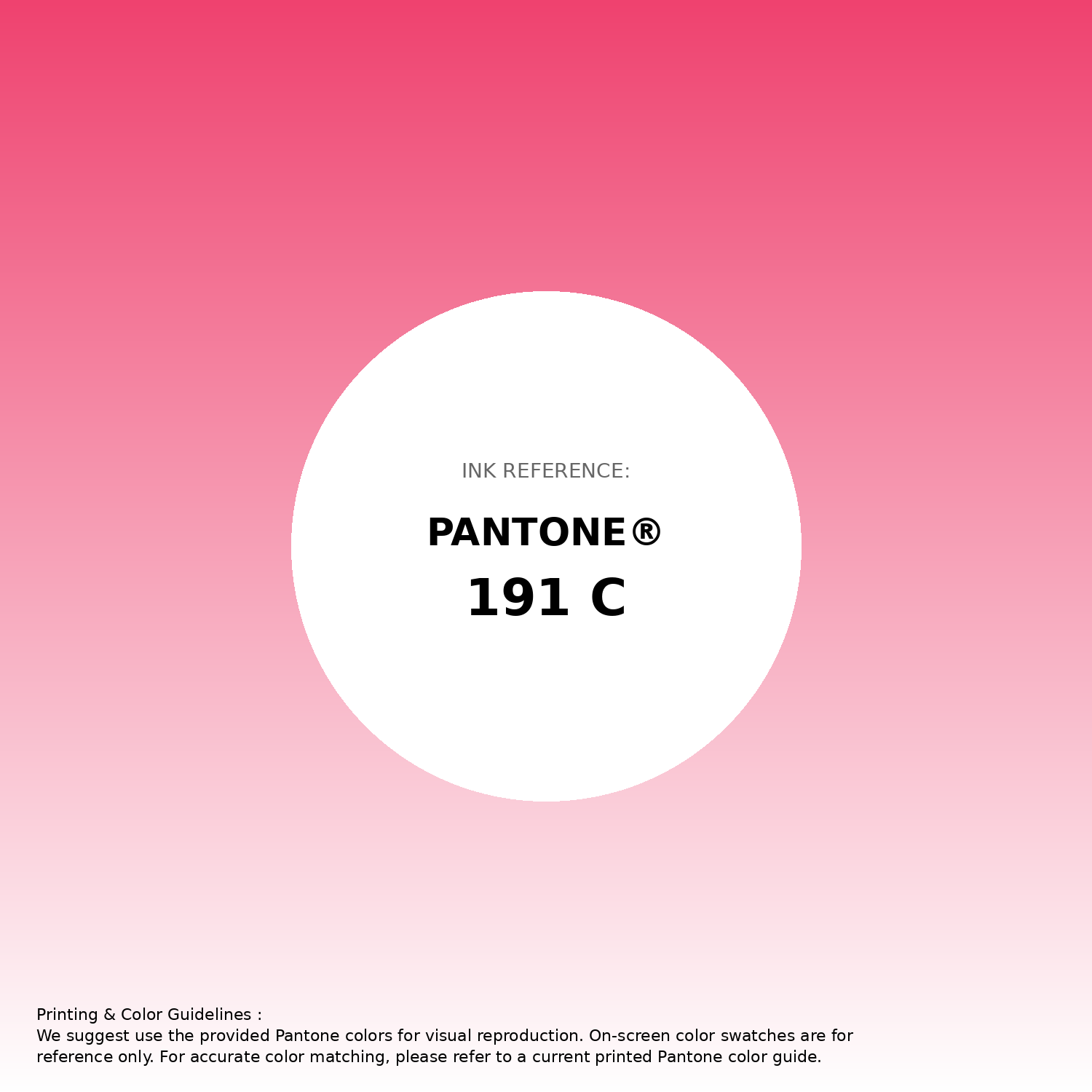
#ef426f Pantone 191 C Color | Hex color Code #ef426f Gradient Artwork (PNG)
Download Gradient (PNG)#ef426f Pantone 191 C Color | Hex color Code #ef426f Gradient Artwork (SVG)
Download Gradient (SVG)
#ef426f Pantone 191 C Color | Hex color Code #ef426f T-Shirt Mockup
Download T-Shirt Mockup
#ef426f Pantone 191 C Color | Hex color Code #ef426f Printing Artwork Pantone Reference
Download Pantone Printing ReferenceRelated Color Palettes
- Red Color Palettes • Green Color Palettes • Purple Color Palettes • Pink Color Palettes • Orange Color Palettes • Blue Color Palettes • Yellow Color Palettes • Brown Color Palettes • Gray Color Palettes • Beige Color Palettes • Turquoise Color Palettes
Color Palette Collection
Chardon
1 color palettes with 5 colors.
21 Pastel Yellow Color Schemes
21 color palettes with 105 colors.

42 Green Color Schemes
42 color palettes with 210 colors.

55 Nature Color Palettes
55 color palettes with 275 colors.