#EEEEE6 Color
Your all-in-one color resource. Download hex background images, Adobe swatches (ASE), PDF color sheets, and SVG files. Explore palettes, harmonies, accessibility, conversions, and professional exports — designed for designers, developers, and color perfectionists.
This creamy, off-white shade embodies a sense of serenity, warmth, and gentle illumination. It evokes feelings of comfort, peace, and a subtle, inviting radiance. Its reminiscent of the soft glow of moonlight, the warmth of a cozy blanket, or the richness of vanilla cream. The mood is soothing and calming, creating a sense of welcoming comfort. It is a versatile neutral, suitable for creating a sense of spaciousness and elegance in design. Visually matched named color: Creamy Moon Glow.
PANTONE 11-4300 TPX
Choose Color
Selected Color
Recent Colors
Color Details
Similar Ink Alternatives for #EEEEE6 color Alternative print inks for reproducing #EEEEE6 background image with a similar visual appearance.
Disclaimer: The visually matched ink reference is an independent approximation intended as a guide only. Please be advised that this pantone colors is only intended as a guide, Actual colours will depend on screen calibration variances. The print ink suggestions provided are independent visual approximations and are not affiliated with or endorsed by Pantone LLC. For official color specifications, conversion factors, and comprehensive color system information, please visit Pantone Connect. Official Pantone products can be purchased at pantone.com.
Color Previews for #000000 See how this color looks as a background or as text.
Complete Guide to Your Color Laboratory
Everything you need to know about this professional color toolkit.
Use the Color Picker at the top to select any color. All modules below update instantly.
Workflow: Pick a color → Explore palettes & data → Download what you need (PDF, Image, or Adobe ASE).
Color Details — Your color in all formats: HEX, RGB, RGBA, HSL, HSLA, HSV, CMYK, CIELab, Hunter-Lab, XYZ, Yxy, YUV. One-click copy.
Color Psychology — Emotional impact, cultural meanings, physiological effects, branding applications, and historical significance.
Named Colors — Find official color names (HTML/CSS, Pantone) that match your selection with similarity percentages.
Light & Dark Shades
80-step gradient from black to white. Perfect for button states and component systems.
Tints
Color mixed with white → lighter, pastel variations for backgrounds and disabled states.
Monochromatic — 11 curated tints/shades from one color. Production-ready for design systems.
- Complementary — Opposite on wheel (180°). High contrast.
- Analogous — Neighbors (±30°). Harmonious flow.
- Triadic — Three colors (120° apart). Vibrant, balanced.
- Split-Complementary — Base + two near-complements. Softer contrast.
- Tetradic/Square — Four colors. Complex, maximum variety.
- Neutral — Desaturated versions. Subtle, sophisticated.
15 Professional Variations — Monochromatic, Analogous, Complementary, Warm/Cool/Earth Tones, Pastel, Vibrant, High Contrast, and more.
Color Infusion — 10 palettes showing your color morphing into each major hue. Find bridge colors.
Similar Colors — 60+ colors generated via CIELAB Delta E matching. Unexpected harmonious combinations.
18 Ready-to-Use Gradients — Complementary, Analogous, Triadic, Tint/Shade progressions, and more.
Downloads: PNG (2560×1440), CSS (production-ready code), SVG (scalable vector).
WCAG Contrast Checker — Tests your color against white, black, and custom colors for AA (4.5:1) and AAA (7:1) compliance. Large text thresholds included.
Harmony & Accessibility Guide — Tests against 10 canonical hues. Shows which pairs are both beautiful AND WCAG-compliant for text.
PNG/JPG — High-res images for presentations and mood boards.
PDF — Print-ready reports for clients and teams.
Adobe ASE — Direct import to Photoshop, Illustrator, InDesign, XD.
CSS/SVG — Gradients only. Production-ready code and vectors.
Color Science: Industry-standard conversions (HSL, CIELAB, CMYK, XYZ). WCAG 2.1 luminance formula. Delta E (ΔE76) for perceptual matching.
Direct Links: Share colors via icolorpalette.com/color/ff5733 or icolorpalette.com/color/red
Issues? Refresh the page, wait for rendering, try another browser, or check console (F12) for errors.
Printing Guide for #eeeee6 Background Image
Use PANTONE 11-4300 TPX as a visually matched ink reference when printing this background image.
To print the #eeeee6 background image from our site, consider using PANTONE 11-4300 TPX as a visually matched ink reference.
Download the background image, then provide this reference code to your print vendor to help achieve accurate color reproduction.
The visually matched ink reference for the #eeeee6 background image is PANTONE 11-4300 TPX.
This color is commonly described as Creamy Moon Glow.
This creamy, off-white shade embodies a sense of serenity, warmth, and gentle illumination. It evokes feelings of comfort, peace, and a subtle, inviting radiance. Its reminiscent of the soft glow of moonlight, the warmth of a cozy blanket, or the richness of vanilla cream. The mood is soothing and calming, creating a sense of welcoming comfort. It is a versatile neutral, suitable for creating a sense of spaciousness and elegance in design.
We provide PANTONE 11-4300 TPX as a visually matched ink reference to help you reproduce the #eeeee6 background image accurately in professional printing.
This reference code helps print vendors achieve consistent color output across different printing equipment and materials.
After downloading the #eeeee6 background image from our site:
- Include the visually matched ink reference PANTONE 11-4300 TPX in your print order notes
- Inform your print vendor that this is your target color reference
- Request a proof print to verify the Creamy Moon Glow color appearance before full production
The #eeeee6 background image with PANTONE 11-4300 TPX as visually matched ink reference can be used for:
- Posters, banners, and backdrops
- Business cards, brochures, and flyers
- Packaging, labels, and stickers
- Signage and promotional materials
This is an independent visual approximation.
While PANTONE 11-4300 TPX closely matches the #eeeee6 background image color, variations may exist between screen display and printed output.
We recommend requesting a proof print to verify the final appearance.
This creamy, off-white shade embodies a sense of serenity, warmth, and gentle illumination. It evokes feelings of comfort, peace, and a subtle, inviting radiance. Its reminiscent of the soft glow of moonlight, the warmth of a cozy blanket, or the richness of vanilla cream. The mood is soothing and calming, creating a sense of welcoming comfort. It is a versatile neutral, suitable for creating a sense of spaciousness and elegance in design.
Understanding these associations helps ensure the #eeeee6 background image aligns with your intended message and brand impact.
Important Information
The visually matched ink reference is an independent approximation intended as a guide only.
Actual printed colors may vary depending on screen calibration, substrate material, ink type, and printing equipment used.
For official color specifications and certified color standards, visit Pantone Connect.
Official color guides and swatch books can be purchased from pantone.com.
Pantone 11-4300 TPX Marshmallow Color: A Serene and Subtle Hue | #EEEEE6
Introduction:
Pantone 11-4300 TPX Marshmallow Color is a soft and delicate shade of off-white. It exudes a sense of tranquility and purity, reminiscent of fluffy marshmallows. The color's understated elegance makes it a versatile option for various design applications.
Historical Significance:
Key Moments in History: Marshmallow Color gained popularity in the mid-20th century during the post-war era. It was frequently used in interior design and fashion to create serene and sophisticated spaces.
Symbolism and Meaning:
Symbolism and Meaning: Marshmallow Color typically symbolizes purity, innocence, and simplicity. In various cultures, it is associated with calmness and tranquility.
Marshmallow Color in Fashion:
Impact on Fashion: Marshmallow Color often appears in elegant and minimalistic fashion designs. It is utilized in both formal and casual attire, adding a touch of sophistication and refinement to any ensemble.
Marshmallow Color in Graphic Design:
Significance in Graphic Design: Marshmallow Color is favored in design aesthetics for its calming and clean appearance. It is often used to convey a sense of balance, simplicity, and modernity.
Color Combinations:
Potential Color Combinations:
- Marshmallow Color and Pale Pink
- Marshmallow Color and Light Gray
- Marshmallow Color and Mint Green
-Marshmallow Color and Beige
- Marshmallow Color and Soft Blue
- Marshmallow Color and Lavender
Nature’s Palette:
Natural Occurrences: Marshmallow Color can be found in delicate flowers like cotton candy hydrangeas and cherry blossoms. It also resembles the soft hues of clouds during sunrise and sunset.
Artistic Representations:
Usage in Art: Marshmallow Color has been utilized by artists to create ethereal and dreamy paintings, particularly in the realm of abstract and minimalistic art.
Movies and Cinematic Landscapes:
Movies and Scenes: Marshmallow Color often sets the tone for serene and tranquil cinematic moments. It can be seen in scenes depicting peaceful landscapes or intimate and tender moments.
Products and Commercial Appeal:
Popular Products and Brands: Many luxury cosmetic and skincare brands incorporate Marshmallow Color in their packaging and branding, emphasizing its association with purity and efficacy.
National Symbols and Significance:
National Symbols: Marshmallow Color is not specifically tied to any national or cultural significance.
The Psychological and Emotional Impact:
Psychological Influence: Marshmallow Color evokes feelings of calmness, serenity, and purity. It can create a sense of tranquility and relaxation, making it suitable for spaces intended to promote well-being.
Conclusion:
In conclusion, Pantone 11-4300 TPX Marshmallow Color is a serene and subtle hue that carries historical relevance and timeless appeal. With its tranquil symbolism and versatile applications in various fields, Marshmallow Color continues to remain a popular choice for creating sophisticated and calming aesthetics.
Pantone 11-4300 Tpx Marshmallow Color | Hex color Code #eeeee6 Image & Artwork
Download high-quality assets for your projects.

#eeeee6 Color Schemes
Download Color Schemes
#eeeee6 Color Shades
Download Color Shades
Pantone 11-4300 Tpx Marshmallow Color | Hex color Code #eeeee6 Solid Color Background
Download Solid Color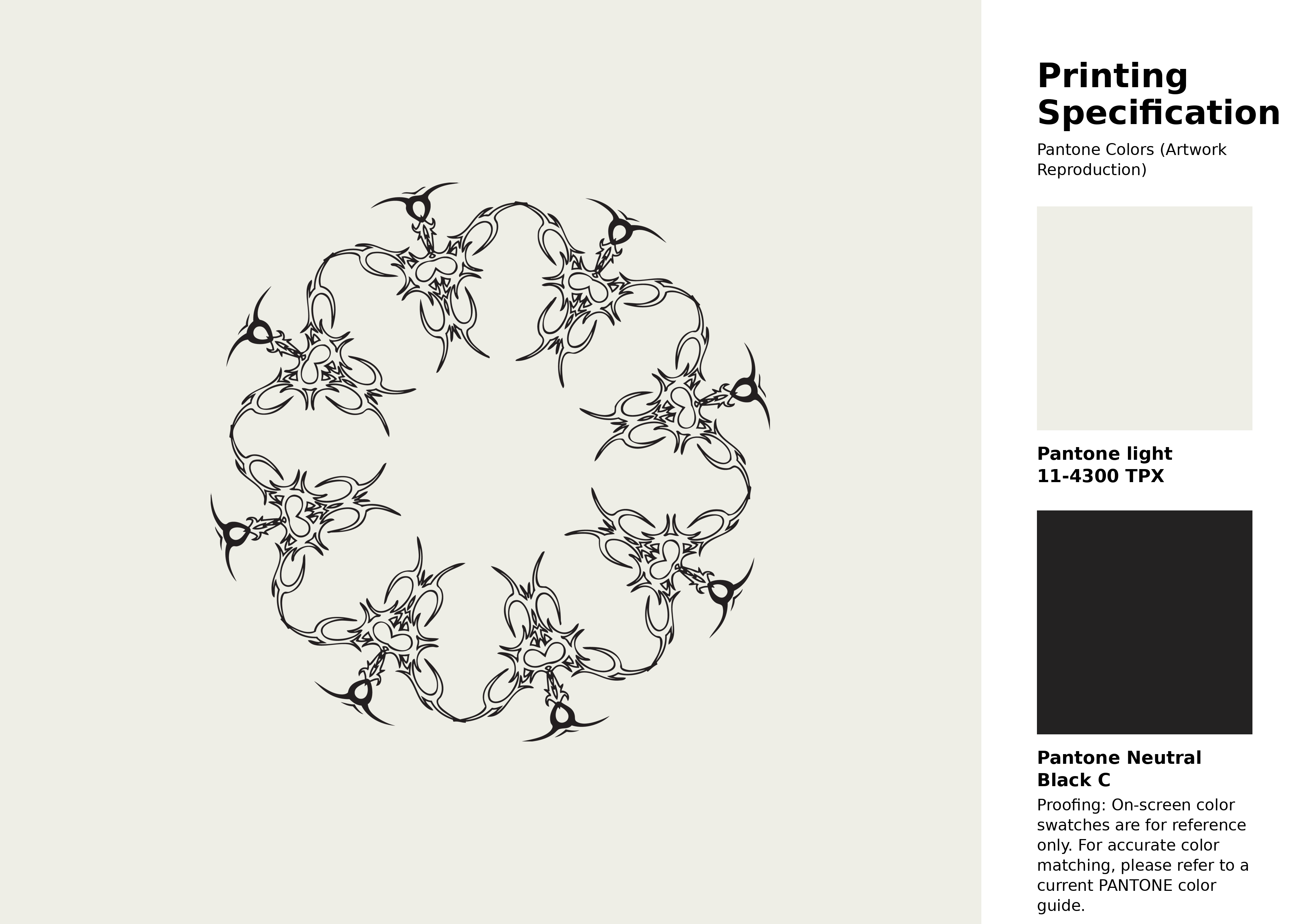
#eeeee6 Pantone 11-4300 Tpx Marshmallow Color | Hex color Code #eeeee6 Artwork Image (PNG)
Download Artwork (PNG)#eeeee6 Pantone 11-4300 Tpx Marshmallow Color | Hex color Code #eeeee6 Artwork Vector (PDF)
Download Artwork (PDF)#eeeee6 Pantone 11-4300 Tpx Marshmallow Color | Hex color Code #eeeee6 Artwork Vector (SVG)
Download Artwork (SVG)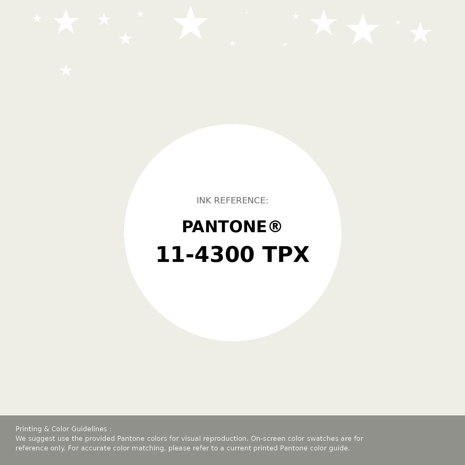
#eeeee6 Pantone 11-4300 Tpx Marshmallow Color | Hex color Code #eeeee6 Pantone Swatch Artwork
Download Artwork Swatch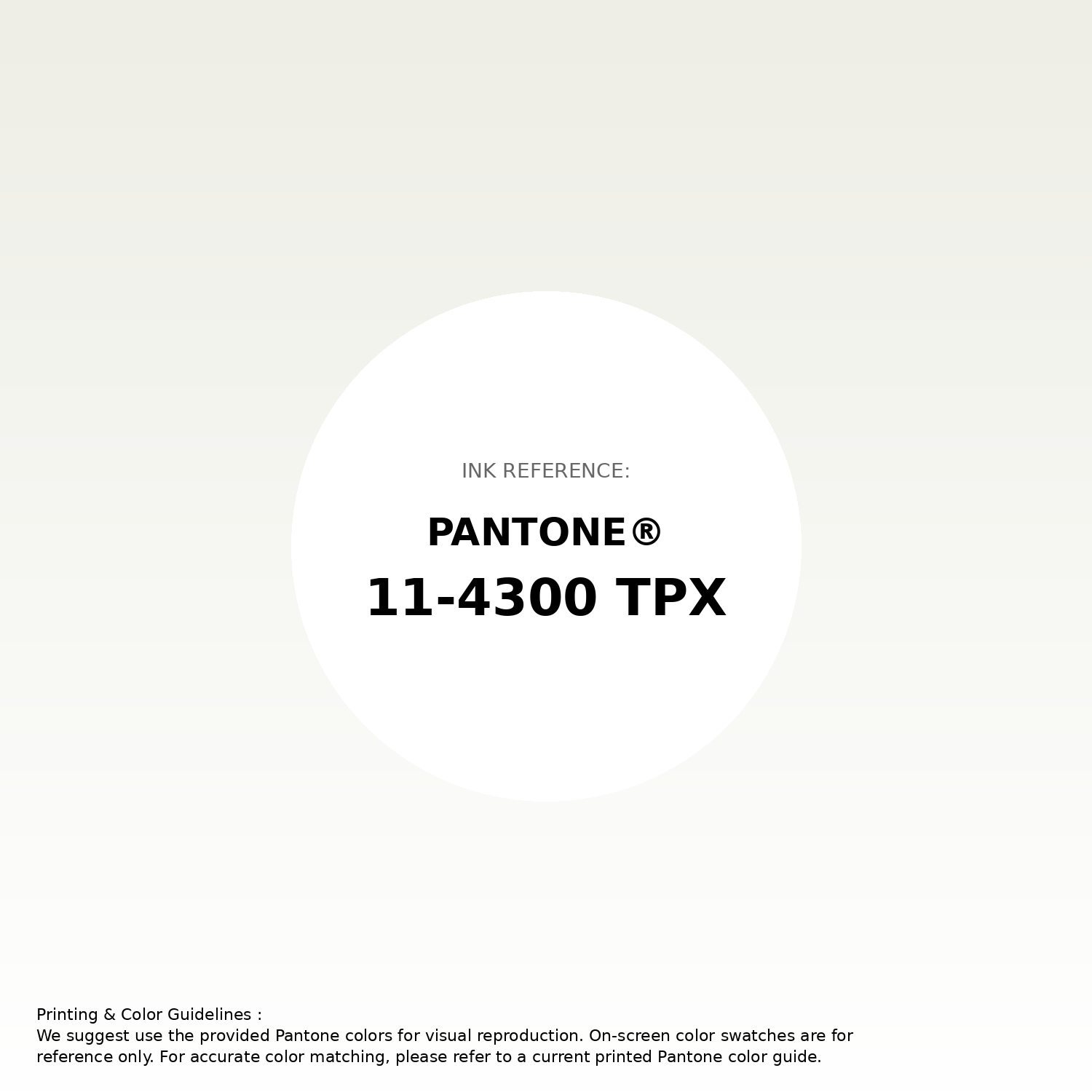
#eeeee6 Pantone 11-4300 Tpx Marshmallow Color | Hex color Code #eeeee6 Gradient Artwork (PNG)
Download Gradient (PNG)#eeeee6 Pantone 11-4300 Tpx Marshmallow Color | Hex color Code #eeeee6 Gradient Artwork (SVG)
Download Gradient (SVG)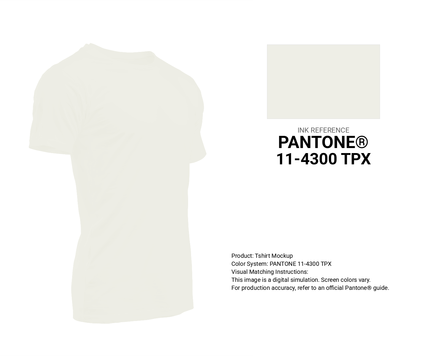
#eeeee6 Pantone 11-4300 Tpx Marshmallow Color | Hex color Code #eeeee6 T-Shirt Mockup
Download T-Shirt Mockup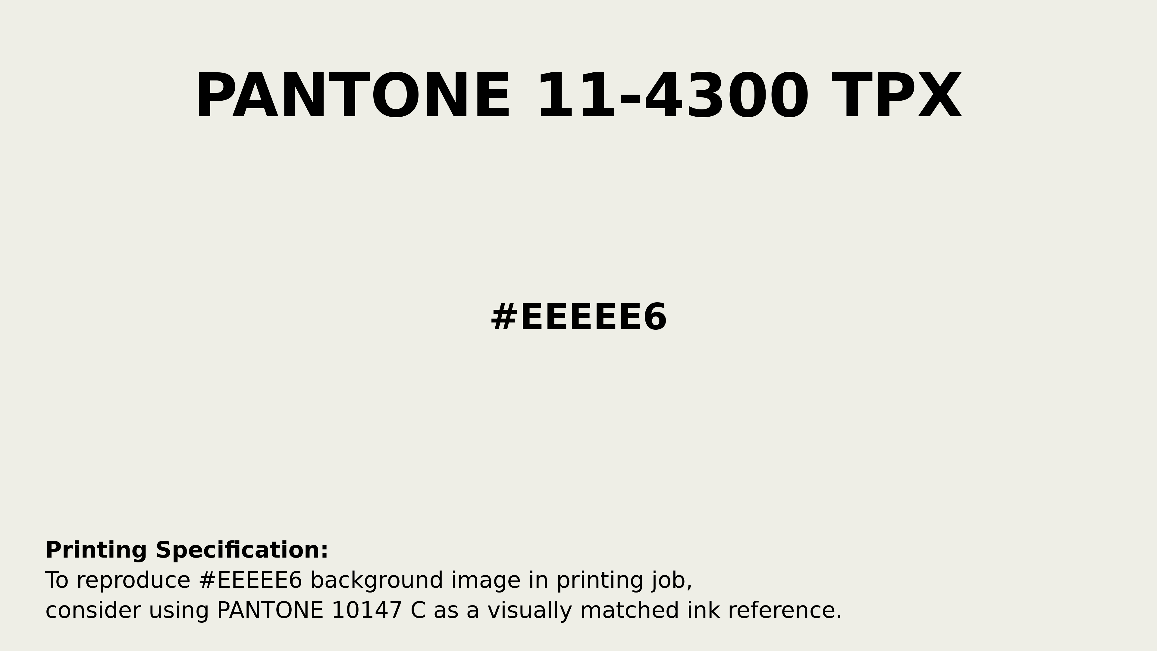
#eeeee6 Pantone 11-4300 Tpx Marshmallow Color | Hex color Code #eeeee6 Printing Artwork Pantone Reference
Download Pantone Printing ReferenceRelated Color Palettes
- Sandy Brown and Beige •
- Gray and Beige •
- Beige and Khaki •
- Cadet Blue and Beige •
- Beige and Lavender •
- Beige and Orange •
- Beige and Plum •
- Beige and OrangeRed •
- Pale Violet Red and Beige •
- Navy and Beige •
- Beige and Slate Gray •
- Beige and Light GoldenrodYellow •
- Beige and Peru •
- Dark Sea Green and Beige •
- Beige and Dark Goldenrod
Color Palette Collection
ERGO
1 color palettes with 5 colors.

Light Blue Palettes to Enhance Your Design
13 color palettes with 65 colors.

49 Beautiful curated Color Schemes For Your Next Design Project
49 color palettes with 245 colors.

52 Orange Color Palettes
52 color palettes with 260 colors.