#EDE6DB Color
Your all-in-one color resource. Download hex background images, Adobe swatches (ASE), PDF color sheets, and SVG files. Explore palettes, harmonies, accessibility, conversions, and professional exports — designed for designers, developers, and color perfectionists.
#EDE6DB evokes a feeling of gentle, muted warmth, like the soft light of dawn or the pale glow of moonlight on aged stone. The color's muted tones suggest a sense of calm and nostalgia, hinting at memories rather than vibrant experiences. It reminds one of dusty rose petals, faded linen, or the worn patina of antique silver. The overall mood is quiet and contemplative, peaceful yet slightly melancholic. In design, it would lend itself well to creating a sophisticated, understated elegance, perhaps in a minimalist setting or as an accent color against richer tones. It projects a sense of timelessness and understated luxury, possibly referencing historical periods or classic styles. There's a subtle sense of fragility and delicate beauty, suggesting a quiet dignity. Visually matched named color: Silvered Dust.
PANTONE 11-0701 TCX
Choose Color
Selected Color
Recent Colors
Color Details
Similar Ink Alternatives for #EDE6DB color Alternative print inks for reproducing #EDE6DB background image with a similar visual appearance.
Disclaimer: The visually matched ink reference is an independent approximation intended as a guide only. Please be advised that this pantone colors is only intended as a guide, Actual colours will depend on screen calibration variances. The print ink suggestions provided are independent visual approximations and are not affiliated with or endorsed by Pantone LLC. For official color specifications, conversion factors, and comprehensive color system information, please visit Pantone Connect. Official Pantone products can be purchased at pantone.com.
Color Previews for #000000 See how this color looks as a background or as text.
Complete Guide to Your Color Laboratory
Everything you need to know about this professional color toolkit.
Use the Color Picker at the top to select any color. All modules below update instantly.
Workflow: Pick a color → Explore palettes & data → Download what you need (PDF, Image, or Adobe ASE).
Color Details — Your color in all formats: HEX, RGB, RGBA, HSL, HSLA, HSV, CMYK, CIELab, Hunter-Lab, XYZ, Yxy, YUV. One-click copy.
Color Psychology — Emotional impact, cultural meanings, physiological effects, branding applications, and historical significance.
Named Colors — Find official color names (HTML/CSS, Pantone) that match your selection with similarity percentages.
Light & Dark Shades
80-step gradient from black to white. Perfect for button states and component systems.
Tints
Color mixed with white → lighter, pastel variations for backgrounds and disabled states.
Monochromatic — 11 curated tints/shades from one color. Production-ready for design systems.
- Complementary — Opposite on wheel (180°). High contrast.
- Analogous — Neighbors (±30°). Harmonious flow.
- Triadic — Three colors (120° apart). Vibrant, balanced.
- Split-Complementary — Base + two near-complements. Softer contrast.
- Tetradic/Square — Four colors. Complex, maximum variety.
- Neutral — Desaturated versions. Subtle, sophisticated.
15 Professional Variations — Monochromatic, Analogous, Complementary, Warm/Cool/Earth Tones, Pastel, Vibrant, High Contrast, and more.
Color Infusion — 10 palettes showing your color morphing into each major hue. Find bridge colors.
Similar Colors — 60+ colors generated via CIELAB Delta E matching. Unexpected harmonious combinations.
18 Ready-to-Use Gradients — Complementary, Analogous, Triadic, Tint/Shade progressions, and more.
Downloads: PNG (2560×1440), CSS (production-ready code), SVG (scalable vector).
WCAG Contrast Checker — Tests your color against white, black, and custom colors for AA (4.5:1) and AAA (7:1) compliance. Large text thresholds included.
Harmony & Accessibility Guide — Tests against 10 canonical hues. Shows which pairs are both beautiful AND WCAG-compliant for text.
PNG/JPG — High-res images for presentations and mood boards.
PDF — Print-ready reports for clients and teams.
Adobe ASE — Direct import to Photoshop, Illustrator, InDesign, XD.
CSS/SVG — Gradients only. Production-ready code and vectors.
Color Science: Industry-standard conversions (HSL, CIELAB, CMYK, XYZ). WCAG 2.1 luminance formula. Delta E (ΔE76) for perceptual matching.
Direct Links: Share colors via icolorpalette.com/color/ff5733 or icolorpalette.com/color/red
Issues? Refresh the page, wait for rendering, try another browser, or check console (F12) for errors.
Printing Guide for #ede6db Background Image
Use PANTONE 11-0701 TCX as a visually matched ink reference when printing this background image.
To print the #ede6db background image from our site, consider using PANTONE 11-0701 TCX as a visually matched ink reference.
Download the background image, then provide this reference code to your print vendor to help achieve accurate color reproduction.
The visually matched ink reference for the #ede6db background image is PANTONE 11-0701 TCX.
This color is commonly described as Silvered Dust.
#EDE6DB evokes a feeling of gentle, muted warmth, like the soft light of dawn or the pale glow of moonlight on aged stone. The color's muted tones suggest a sense of calm and nostalgia, hinting at memories rather than vibrant experiences. It reminds one of dusty rose petals, faded linen, or the worn patina of antique silver. The overall mood is quiet and contemplative, peaceful yet slightly melancholic. In design, it would lend itself well to creating a sophisticated, understated elegance, perhaps in a minimalist setting or as an accent color against richer tones. It projects a sense of timelessness and understated luxury, possibly referencing historical periods or classic styles. There's a subtle sense of fragility and delicate beauty, suggesting a quiet dignity.
We provide PANTONE 11-0701 TCX as a visually matched ink reference to help you reproduce the #ede6db background image accurately in professional printing.
This reference code helps print vendors achieve consistent color output across different printing equipment and materials.
After downloading the #ede6db background image from our site:
- Include the visually matched ink reference PANTONE 11-0701 TCX in your print order notes
- Inform your print vendor that this is your target color reference
- Request a proof print to verify the Silvered Dust color appearance before full production
The #ede6db background image with PANTONE 11-0701 TCX as visually matched ink reference can be used for:
- Posters, banners, and backdrops
- Business cards, brochures, and flyers
- Packaging, labels, and stickers
- Signage and promotional materials
This is an independent visual approximation.
While PANTONE 11-0701 TCX closely matches the #ede6db background image color, variations may exist between screen display and printed output.
We recommend requesting a proof print to verify the final appearance.
#EDE6DB evokes a feeling of gentle, muted warmth, like the soft light of dawn or the pale glow of moonlight on aged stone. The color's muted tones suggest a sense of calm and nostalgia, hinting at memories rather than vibrant experiences. It reminds one of dusty rose petals, faded linen, or the worn patina of antique silver. The overall mood is quiet and contemplative, peaceful yet slightly melancholic. In design, it would lend itself well to creating a sophisticated, understated elegance, perhaps in a minimalist setting or as an accent color against richer tones. It projects a sense of timelessness and understated luxury, possibly referencing historical periods or classic styles. There's a subtle sense of fragility and delicate beauty, suggesting a quiet dignity.
Understanding these associations helps ensure the #ede6db background image aligns with your intended message and brand impact.
Important Information
The visually matched ink reference is an independent approximation intended as a guide only.
Actual printed colors may vary depending on screen calibration, substrate material, ink type, and printing equipment used.
For official color specifications and certified color standards, visit Pantone Connect.
Official color guides and swatch books can be purchased from pantone.com.
Whisper White Color: Assign Creative related COLOR TITLE HERE | #EDE6DB
Introduction:
Whisper White is a soft and delicate color that exudes elegance and purity. Its essence lies in its calm and serene visual appeal.
Historical Significance:
Significant art movements: Whisper White was prominently used during the Renaissance period, particularly in religious paintings where it symbolized purity and divinity.
Royal fashion: Whisper White played a significant role in European royal fashion throughout history, representing opulence and sophistication.
Symbolism and Meaning:
Innocence: Whisper White typically symbolizes innocence and purity in various cultures and contexts. It is often associated with new beginnings and untainted emotions.
Whisper White in Fashion:
Whisper White is a timeless color in the fashion world. It is often seen in bridal gowns, representing purity and elegance. It also appears in minimalistic and sophisticated designs, adding a touch of sophistication to any outfit.
Whisper White in Graphic Design:
Whisper White is widely used in graphic design for its ability to create a clean and minimalistic aesthetic. It is commonly used as a background color to enhance the visibility of other elements and create a sense of balance and harmony.
Color Combinations:
Black and Whisper White: This classic combination creates a timeless and elegant look.
Whisper White and Soft Pink: This combination exudes a delicate and feminine feel.
Nature’s Palette:
White flowers: Whisper White can be seen in various white flowers like lilies, roses, and daisies, representing purity and beauty.
Artistic Representations:
Whisper White has been used by artists in various forms of art to convey lightness, purity, and tranquility. It has been used in paintings, sculptures, and installations to create a sense of calm and serenity.
Movies and Cinematic Landscapes:
In the film "The Great Gatsby," Whisper White plays a significant role in depicting the opulent and glamorous world of the 1920s. It sets the tone for the luxurious lifestyle of the characters.
Products and Commercial Appeal:
Brands like Apple and Ikea have used Whisper White in their branding to convey simplicity, elegance, and modernity. It is often associated with high-end and minimalist products.
National Symbols and Significance:
Whisper White is not specifically tied to any national or cultural significance, but it is universally recognized as a color representing purity and innocence.
The Psychological and Emotional Impact:
Whisper White has a calming and soothing effect on the mind. It can evoke feelings of tranquility, purity, and cleanliness. It also creates a sense of spaciousness and openness.
Conclusion:
Whisper White is a color that embodies purity, elegance, and timeless appeal. Its historical significance, symbolism, and aesthetic qualities make it a versatile and popular choice in various fields of design and creativity.
Pantone 11-0701 Tcx Whisper White Color | Hex color Code #ede6db Image & Artwork
Download high-quality assets for your projects.

#ede6db Color Schemes
Download Color Schemes
#ede6db Color Shades
Download Color Shades
Pantone 11-0701 Tcx Whisper White Color | Hex color Code #ede6db Solid Color Background
Download Solid Color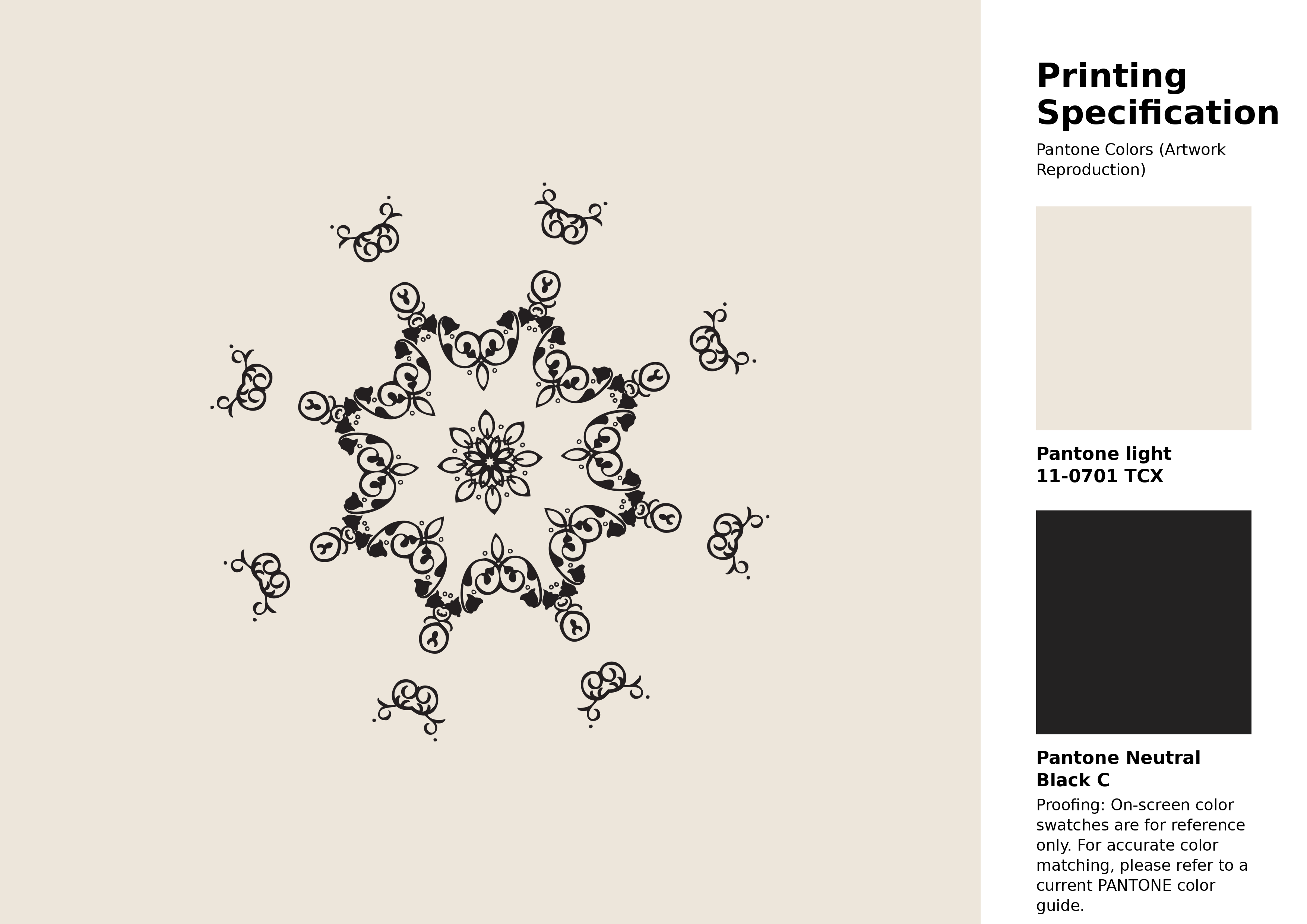
#ede6db Pantone 11-0701 Tcx Whisper White Color | Hex color Code #ede6db Artwork Image (PNG)
Download Artwork (PNG)#ede6db Pantone 11-0701 Tcx Whisper White Color | Hex color Code #ede6db Artwork Vector (PDF)
Download Artwork (PDF)#ede6db Pantone 11-0701 Tcx Whisper White Color | Hex color Code #ede6db Artwork Vector (SVG)
Download Artwork (SVG)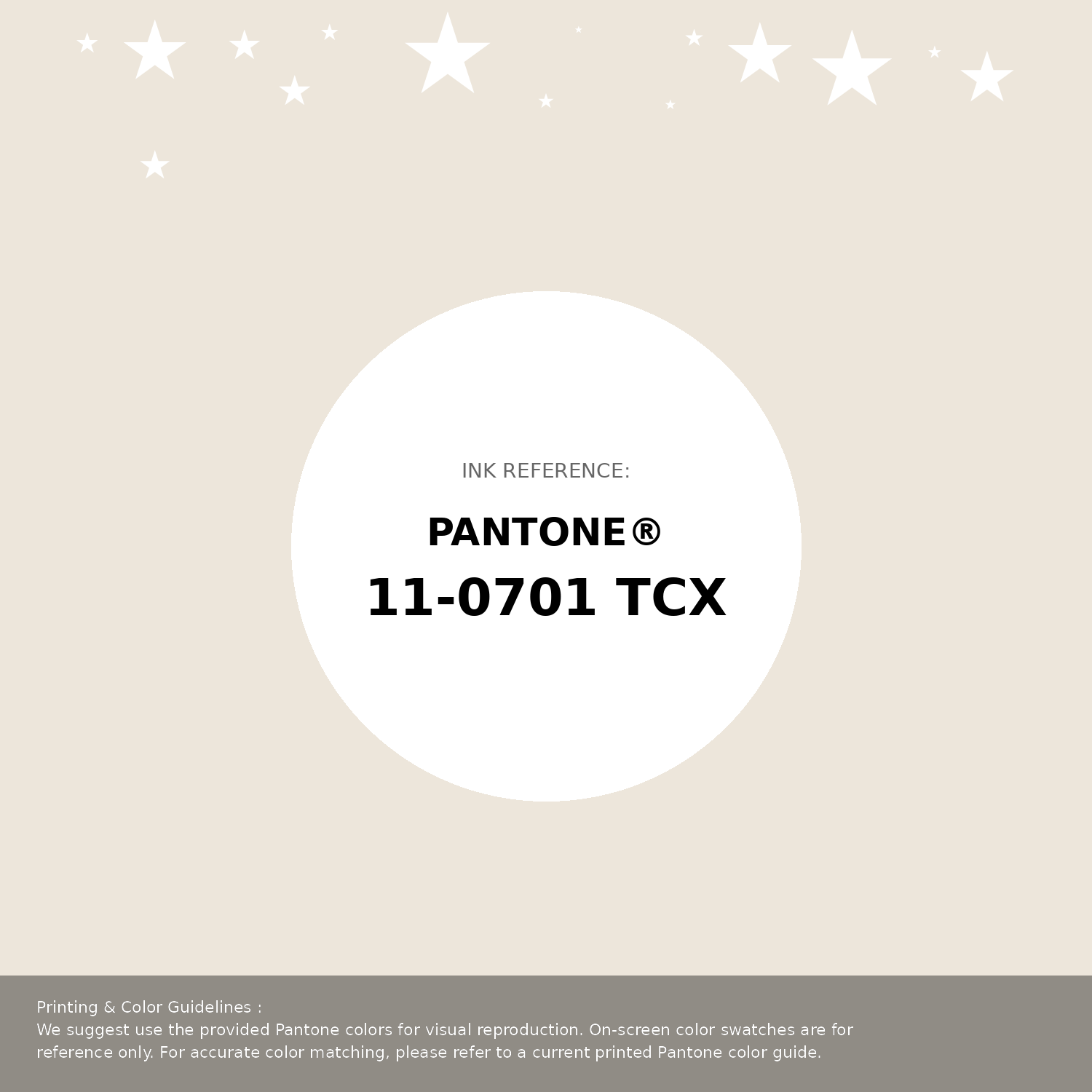
#ede6db Pantone 11-0701 Tcx Whisper White Color | Hex color Code #ede6db Pantone Swatch Artwork
Download Artwork Swatch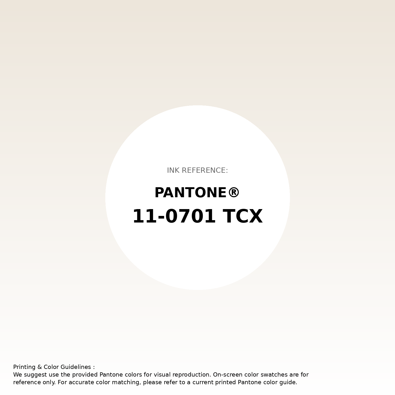
#ede6db Pantone 11-0701 Tcx Whisper White Color | Hex color Code #ede6db Gradient Artwork (PNG)
Download Gradient (PNG)#ede6db Pantone 11-0701 Tcx Whisper White Color | Hex color Code #ede6db Gradient Artwork (SVG)
Download Gradient (SVG)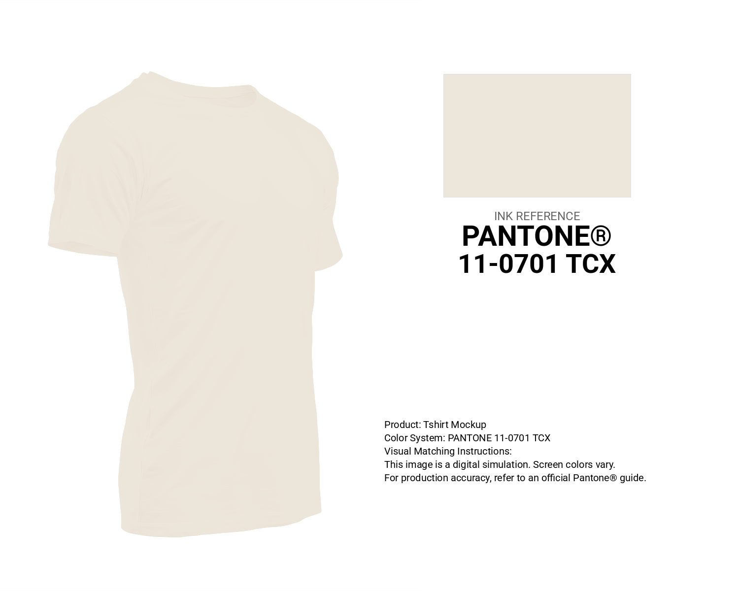
#ede6db Pantone 11-0701 Tcx Whisper White Color | Hex color Code #ede6db T-Shirt Mockup
Download T-Shirt Mockup
#ede6db Pantone 11-0701 Tcx Whisper White Color | Hex color Code #ede6db Printing Artwork Pantone Reference
Download Pantone Printing Reference
Whisper White - #ede6db Color Name
Download Color NameRelated Color Palettes
- Beige and Navy •
- Beige and Dark Slate Gray •
- Dark Slate Blue and Beige •
- Dark Khaki and Beige •
- Antique White and Beige •
- Beige and Sea Green •
- Beige and Dark Olive Green •
- Peru and Beige •
- Midnight Blue and Beige •
- Beige and Medium Aquamarine •
- Beige and Gray •
- Silver and Beige •
- Beige and Thistle •
- Beige and Dark Green •
- Beige and Gainsboro
Color Palette Collection

30+ Purple Color Palettes
31 color palettes with 155 colors.

66 Brown Color Palettes
66 color palettes with 330 colors.
125 Yellow Color Palettes
125 color palettes with 625 colors.

100 Rose Flower Nature Color Palettes
100 color palettes with 500 colors.