#E7CEB5 Color
Your all-in-one color resource. Download hex background images, Adobe swatches (ASE), PDF color sheets, and SVG files. Explore palettes, harmonies, accessibility, conversions, and professional exports — designed for designers, developers, and color perfectionists.
This warm, muted peach evokes the feeling of a gentle sunset. It brings a sense of comfort, warmth, and nostalgia, reminiscent of golden hour skies and the end of a long day. The color palette suggests a relaxed and inviting atmosphere, perfect for living rooms or bedrooms. It embodies a sense of serenity and peace, perhaps even a touch of nostalgia for simpler times. In design, it can be used to create a cozy and inviting space, or to evoke a sense of calm and tranquility. The muted tones suggest a subtle elegance, avoiding any harshness or boldness. Visually matched named color: Peachy Sunset.
PANTONE 2309 C
Choose Color
Selected Color
Recent Colors
Color Details
Similar Ink Alternatives for #E7CEB5 color Alternative print inks for reproducing #E7CEB5 background image with a similar visual appearance.
Disclaimer: The visually matched ink reference is an independent approximation intended as a guide only. Please be advised that this pantone colors is only intended as a guide, Actual colours will depend on screen calibration variances. The print ink suggestions provided are independent visual approximations and are not affiliated with or endorsed by Pantone LLC. For official color specifications, conversion factors, and comprehensive color system information, please visit Pantone Connect. Official Pantone products can be purchased at pantone.com.
Color Previews for #000000 See how this color looks as a background or as text.
Complete Guide to Your Color Laboratory
Everything you need to know about this professional color toolkit.
Use the Color Picker at the top to select any color. All modules below update instantly.
Workflow: Pick a color → Explore palettes & data → Download what you need (PDF, Image, or Adobe ASE).
Color Details — Your color in all formats: HEX, RGB, RGBA, HSL, HSLA, HSV, CMYK, CIELab, Hunter-Lab, XYZ, Yxy, YUV. One-click copy.
Color Psychology — Emotional impact, cultural meanings, physiological effects, branding applications, and historical significance.
Named Colors — Find official color names (HTML/CSS, Pantone) that match your selection with similarity percentages.
Light & Dark Shades
80-step gradient from black to white. Perfect for button states and component systems.
Tints
Color mixed with white → lighter, pastel variations for backgrounds and disabled states.
Monochromatic — 11 curated tints/shades from one color. Production-ready for design systems.
- Complementary — Opposite on wheel (180°). High contrast.
- Analogous — Neighbors (±30°). Harmonious flow.
- Triadic — Three colors (120° apart). Vibrant, balanced.
- Split-Complementary — Base + two near-complements. Softer contrast.
- Tetradic/Square — Four colors. Complex, maximum variety.
- Neutral — Desaturated versions. Subtle, sophisticated.
15 Professional Variations — Monochromatic, Analogous, Complementary, Warm/Cool/Earth Tones, Pastel, Vibrant, High Contrast, and more.
Color Infusion — 10 palettes showing your color morphing into each major hue. Find bridge colors.
Similar Colors — 60+ colors generated via CIELAB Delta E matching. Unexpected harmonious combinations.
18 Ready-to-Use Gradients — Complementary, Analogous, Triadic, Tint/Shade progressions, and more.
Downloads: PNG (2560×1440), CSS (production-ready code), SVG (scalable vector).
WCAG Contrast Checker — Tests your color against white, black, and custom colors for AA (4.5:1) and AAA (7:1) compliance. Large text thresholds included.
Harmony & Accessibility Guide — Tests against 10 canonical hues. Shows which pairs are both beautiful AND WCAG-compliant for text.
PNG/JPG — High-res images for presentations and mood boards.
PDF — Print-ready reports for clients and teams.
Adobe ASE — Direct import to Photoshop, Illustrator, InDesign, XD.
CSS/SVG — Gradients only. Production-ready code and vectors.
Color Science: Industry-standard conversions (HSL, CIELAB, CMYK, XYZ). WCAG 2.1 luminance formula. Delta E (ΔE76) for perceptual matching.
Direct Links: Share colors via icolorpalette.com/color/ff5733 or icolorpalette.com/color/red
Issues? Refresh the page, wait for rendering, try another browser, or check console (F12) for errors.
Printing Guide for #e7ceb5 Background Image
Use PANTONE 2309 C as a visually matched ink reference when printing this background image.
To print the #e7ceb5 background image from our site, consider using PANTONE 2309 C as a visually matched ink reference.
Download the background image, then provide this reference code to your print vendor to help achieve accurate color reproduction.
The visually matched ink reference for the #e7ceb5 background image is PANTONE 2309 C.
This color is commonly described as Peachy Sunset.
This warm, muted peach evokes the feeling of a gentle sunset. It brings a sense of comfort, warmth, and nostalgia, reminiscent of golden hour skies and the end of a long day. The color palette suggests a relaxed and inviting atmosphere, perfect for living rooms or bedrooms. It embodies a sense of serenity and peace, perhaps even a touch of nostalgia for simpler times. In design, it can be used to create a cozy and inviting space, or to evoke a sense of calm and tranquility. The muted tones suggest a subtle elegance, avoiding any harshness or boldness.
We provide PANTONE 2309 C as a visually matched ink reference to help you reproduce the #e7ceb5 background image accurately in professional printing.
This reference code helps print vendors achieve consistent color output across different printing equipment and materials.
After downloading the #e7ceb5 background image from our site:
- Include the visually matched ink reference PANTONE 2309 C in your print order notes
- Inform your print vendor that this is your target color reference
- Request a proof print to verify the Peachy Sunset color appearance before full production
The #e7ceb5 background image with PANTONE 2309 C as visually matched ink reference can be used for:
- Posters, banners, and backdrops
- Business cards, brochures, and flyers
- Packaging, labels, and stickers
- Signage and promotional materials
This is an independent visual approximation.
While PANTONE 2309 C closely matches the #e7ceb5 background image color, variations may exist between screen display and printed output.
We recommend requesting a proof print to verify the final appearance.
This warm, muted peach evokes the feeling of a gentle sunset. It brings a sense of comfort, warmth, and nostalgia, reminiscent of golden hour skies and the end of a long day. The color palette suggests a relaxed and inviting atmosphere, perfect for living rooms or bedrooms. It embodies a sense of serenity and peace, perhaps even a touch of nostalgia for simpler times. In design, it can be used to create a cozy and inviting space, or to evoke a sense of calm and tranquility. The muted tones suggest a subtle elegance, avoiding any harshness or boldness.
Understanding these associations helps ensure the #e7ceb5 background image aligns with your intended message and brand impact.
Important Information
The visually matched ink reference is an independent approximation intended as a guide only.
Actual printed colors may vary depending on screen calibration, substrate material, ink type, and printing equipment used.
For official color specifications and certified color standards, visit Pantone Connect.
Official color guides and swatch books can be purchased from pantone.com.
Pantone 2309 C Color: Warm Apricot | #E7CEB5
Introduction:
Warm Apricot, also known as Pantone 2309 C, is a soft and comforting color that resembles the hues of ripe apricots. It exudes warmth and subtlety, making it a versatile choice for various design and aesthetic purposes.
Historical Significance:
Key moments in history: Warm Apricot has made appearances in historical paintings and artwork, evoking a sense of elegance and beauty. It gained popularity during the Renaissance period, where it was often used as a symbol of femininity and delicacy.
Symbolism and Meaning:
Symbolism in various cultures: In many cultures, Warm Apricot is associated with warmth, love, and hospitality. It represents the sweetness of life and the joy that comes from simple pleasures. In Chinese culture, it is often seen as a lucky color that brings good fortune.
Warm Apricot in Fashion:
Impact on fashion: Warm Apricot is a popular choice in the fashion industry, especially during spring and summer seasons. It is often used in dresses, blouses, and accessories to create a soft and feminine look. It pairs well with other pastel shades and neutral colors.
Warm Apricot in Graphic Design:
Significance in design aesthetics: Warm Apricot is frequently used in graphic design to create a soothing and inviting atmosphere. It can be seen in branding, advertisements, and packaging, as it appeals to consumers' emotions and creates a sense of warmth and comfort.
Color Combinations:
Potential color combinations: Warm Apricot pairs well with various colors, such as soft greens, light blues, and creamy whites. The combination of Warm Apricot and sage green creates a calming and organic feel, while pairing it with dusty rose adds a touch of romance and femininity.
Nature’s Palette:
Natural occurrences: Warm Apricot can be found in nature, particularly in flowers like apricot roses and lilies. It also resembles the warm hues of sunset and the gentle tones of sand beaches. Its presence in nature evokes a sense of tranquility and natural beauty.
Artistic Representations:
Usage in art: Warm Apricot has been utilized by numerous artists throughout history in their paintings, sculptures, and other forms of artwork. Its soft and comforting qualities make it a popular choice in depicting serene landscapes, portraits, and still-life compositions.
Movies and Cinematic Landscapes:
Set the tone in movies: Warm Apricot is often used in movies to create a warm and nostalgic ambiance. It can be seen in scenes depicting romantic moments, dream sequences, or flashbacks, enhancing the emotional impact and setting the mood for the audience.
Products and Commercial Appeal:
Associated products and brands: Warm Apricot is commonly used in the branding and packaging of various products. It is often seen in cosmetics, home decor, and clothing brands that aim to convey a sense of elegance, comfort, and approachability.
National Symbols and Significance:
Cultural significance: Warm Apricot does not have any specific national or cultural significance tied to it.
The Psychological and Emotional Impact:
Psychological influence: Warm Apricot is known to evoke feelings of comfort, relaxation, and happiness. It can create a warm and welcoming atmosphere, making people feel at ease and nurtured. The color has a positive impact on emotions and promotes a sense of emotional well-being.
Conclusion:
Warm Apricot, also known as Pantone 2309 C, is a color that embodies warmth, comfort, and elegance. Its historical significance, versatility in design, and emotional impact make it a timeless choice for various artistic and creative endeavors. Whether used in fashion, graphic design, or cinematic landscapes, Warm Apricot has the ability to create a soothing and inviting atmosphere, appealing to people's emotions and creating a sense of warmth and comfort.
Pantone 2309 C Color | Hex color Code #e7ceb5 Image & Artwork
Download high-quality assets for your projects.

#e7ceb5 Color Schemes
Download Color Schemes
#e7ceb5 Color Shades
Download Color Shades
Pantone 2309 C Color | Hex color Code #e7ceb5 Solid Color Background
Download Solid Color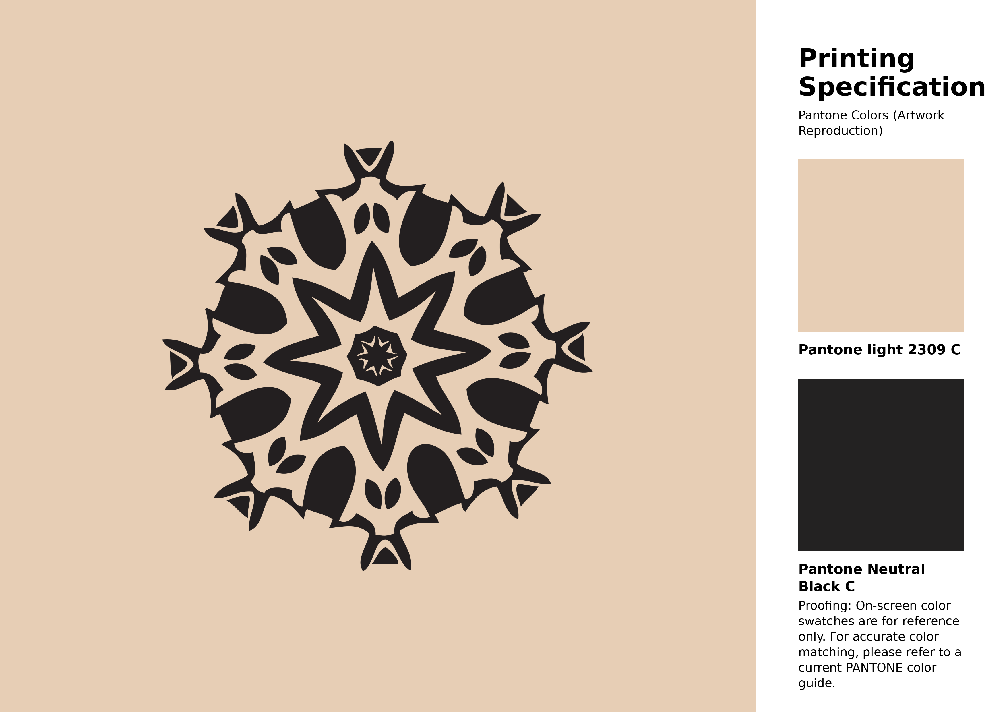
#e7ceb5 Pantone 2309 C Color | Hex color Code #e7ceb5 Artwork Image (PNG)
Download Artwork (PNG)#e7ceb5 Pantone 2309 C Color | Hex color Code #e7ceb5 Artwork Vector (PDF)
Download Artwork (PDF)#e7ceb5 Pantone 2309 C Color | Hex color Code #e7ceb5 Artwork Vector (SVG)
Download Artwork (SVG)
#e7ceb5 Pantone 2309 C Color | Hex color Code #e7ceb5 Pantone Swatch Artwork
Download Artwork Swatch
#e7ceb5 Pantone 2309 C Color | Hex color Code #e7ceb5 Gradient Artwork (PNG)
Download Gradient (PNG)#e7ceb5 Pantone 2309 C Color | Hex color Code #e7ceb5 Gradient Artwork (SVG)
Download Gradient (SVG)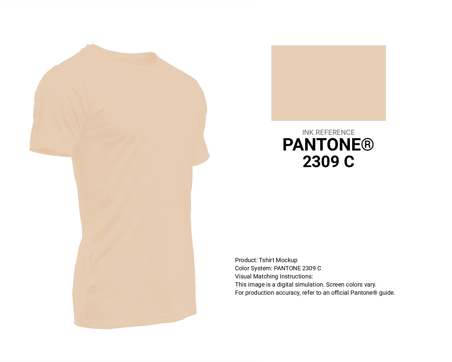
#e7ceb5 Pantone 2309 C Color | Hex color Code #e7ceb5 T-Shirt Mockup
Download T-Shirt Mockup
#e7ceb5 Pantone 2309 C Color | Hex color Code #e7ceb5 Printing Artwork Pantone Reference
Download Pantone Printing Reference
Malibu Dune - #e7ceb5 Color Name
Download Color NameRelated Color Palettes
- Shocking Pink •
- Deep Pink and Dark Slate Blue •
- Tickle Me Pink •
- Tan and Deep Pink •
- Hot Pink and Pale Violet Red •
- Wheat and Light Pink •
- Deep Pink and Dark Olive Green •
- Light Pink and Indian Red •
- Persian Pink •
- Hot Pink and Deep Pink •
- Light Coral and Light Pink •
- Deep Pink and Hot Pink •
- Light Pink and Antique White •
- Indian Red and Light Pink •
- Light Pink and Wheat
Color Palette Collection

89 Blue Color Palettes
89 color palettes with 445 colors.

AE
2 color palettes with 10 colors.
ERGO
1 color palettes with 5 colors.
28 Pink Color Combinations
28 color palettes with 140 colors.