#E40046 Color
Your all-in-one color resource. Download hex background images, Adobe swatches (ASE), PDF color sheets, and SVG files. Explore palettes, harmonies, accessibility, conversions, and professional exports — designed for designers, developers, and color perfectionists.
This vibrant, almost shocking, red-orange hue evokes a sense of passionate intensity and urgency. It's reminiscent of a fiery sunset, volcanic eruptions, and the passionate hues of autumn leaves. The color creates a bold and dramatic mood, perfect for spaces demanding attention. It might be used in a dramatic living room, a powerful marketing campaign, or a piece of art meant to stir emotion. In some cultures, red is associated with energy, excitement, and even danger, depending on the specific shade and context. Visually matched named color: Crimson Fury.
PANTONE 192 C
Choose Color
Selected Color
Recent Colors
Color Details
Similar Ink Alternatives for #E40046 color Alternative print inks for reproducing #E40046 background image with a similar visual appearance.
Disclaimer: The visually matched ink reference is an independent approximation intended as a guide only. Please be advised that this pantone colors is only intended as a guide, Actual colours will depend on screen calibration variances. The print ink suggestions provided are independent visual approximations and are not affiliated with or endorsed by Pantone LLC. For official color specifications, conversion factors, and comprehensive color system information, please visit Pantone Connect. Official Pantone products can be purchased at pantone.com.
Color Previews for #000000 See how this color looks as a background or as text.
Complete Guide to Your Color Laboratory
Everything you need to know about this professional color toolkit.
Use the Color Picker at the top to select any color. All modules below update instantly.
Workflow: Pick a color → Explore palettes & data → Download what you need (PDF, Image, or Adobe ASE).
Color Details — Your color in all formats: HEX, RGB, RGBA, HSL, HSLA, HSV, CMYK, CIELab, Hunter-Lab, XYZ, Yxy, YUV. One-click copy.
Color Psychology — Emotional impact, cultural meanings, physiological effects, branding applications, and historical significance.
Named Colors — Find official color names (HTML/CSS, Pantone) that match your selection with similarity percentages.
Light & Dark Shades
80-step gradient from black to white. Perfect for button states and component systems.
Tints
Color mixed with white → lighter, pastel variations for backgrounds and disabled states.
Monochromatic — 11 curated tints/shades from one color. Production-ready for design systems.
- Complementary — Opposite on wheel (180°). High contrast.
- Analogous — Neighbors (±30°). Harmonious flow.
- Triadic — Three colors (120° apart). Vibrant, balanced.
- Split-Complementary — Base + two near-complements. Softer contrast.
- Tetradic/Square — Four colors. Complex, maximum variety.
- Neutral — Desaturated versions. Subtle, sophisticated.
15 Professional Variations — Monochromatic, Analogous, Complementary, Warm/Cool/Earth Tones, Pastel, Vibrant, High Contrast, and more.
Color Infusion — 10 palettes showing your color morphing into each major hue. Find bridge colors.
Similar Colors — 60+ colors generated via CIELAB Delta E matching. Unexpected harmonious combinations.
18 Ready-to-Use Gradients — Complementary, Analogous, Triadic, Tint/Shade progressions, and more.
Downloads: PNG (2560×1440), CSS (production-ready code), SVG (scalable vector).
WCAG Contrast Checker — Tests your color against white, black, and custom colors for AA (4.5:1) and AAA (7:1) compliance. Large text thresholds included.
Harmony & Accessibility Guide — Tests against 10 canonical hues. Shows which pairs are both beautiful AND WCAG-compliant for text.
PNG/JPG — High-res images for presentations and mood boards.
PDF — Print-ready reports for clients and teams.
Adobe ASE — Direct import to Photoshop, Illustrator, InDesign, XD.
CSS/SVG — Gradients only. Production-ready code and vectors.
Color Science: Industry-standard conversions (HSL, CIELAB, CMYK, XYZ). WCAG 2.1 luminance formula. Delta E (ΔE76) for perceptual matching.
Direct Links: Share colors via icolorpalette.com/color/ff5733 or icolorpalette.com/color/red
Issues? Refresh the page, wait for rendering, try another browser, or check console (F12) for errors.
Printing Guide for #e40046 Background Image
Use PANTONE 192 C as a visually matched ink reference when printing this background image.
To print the #e40046 background image from our site, consider using PANTONE 192 C as a visually matched ink reference.
Download the background image, then provide this reference code to your print vendor to help achieve accurate color reproduction.
The visually matched ink reference for the #e40046 background image is PANTONE 192 C.
This color is commonly described as Crimson Fury.
This vibrant, almost shocking, red-orange hue evokes a sense of passionate intensity and urgency. It's reminiscent of a fiery sunset, volcanic eruptions, and the passionate hues of autumn leaves. The color creates a bold and dramatic mood, perfect for spaces demanding attention. It might be used in a dramatic living room, a powerful marketing campaign, or a piece of art meant to stir emotion. In some cultures, red is associated with energy, excitement, and even danger, depending on the specific shade and context.
We provide PANTONE 192 C as a visually matched ink reference to help you reproduce the #e40046 background image accurately in professional printing.
This reference code helps print vendors achieve consistent color output across different printing equipment and materials.
After downloading the #e40046 background image from our site:
- Include the visually matched ink reference PANTONE 192 C in your print order notes
- Inform your print vendor that this is your target color reference
- Request a proof print to verify the Crimson Fury color appearance before full production
The #e40046 background image with PANTONE 192 C as visually matched ink reference can be used for:
- Posters, banners, and backdrops
- Business cards, brochures, and flyers
- Packaging, labels, and stickers
- Signage and promotional materials
This is an independent visual approximation.
While PANTONE 192 C closely matches the #e40046 background image color, variations may exist between screen display and printed output.
We recommend requesting a proof print to verify the final appearance.
This vibrant, almost shocking, red-orange hue evokes a sense of passionate intensity and urgency. It's reminiscent of a fiery sunset, volcanic eruptions, and the passionate hues of autumn leaves. The color creates a bold and dramatic mood, perfect for spaces demanding attention. It might be used in a dramatic living room, a powerful marketing campaign, or a piece of art meant to stir emotion. In some cultures, red is associated with energy, excitement, and even danger, depending on the specific shade and context.
Understanding these associations helps ensure the #e40046 background image aligns with your intended message and brand impact.
Important Information
The visually matched ink reference is an independent approximation intended as a guide only.
Actual printed colors may vary depending on screen calibration, substrate material, ink type, and printing equipment used.
For official color specifications and certified color standards, visit Pantone Connect.
Official color guides and swatch books can be purchased from pantone.com.
Pantone 192 C Color: Vibrant Red | #E40046
Introduction:
Vibrant Red is an intense and eye-catching color known for its boldness and energy. It is a warm shade of red that immediately grabs attention and creates a sense of excitement and passion.
Historical Significance:
Key moments in history: Vibrant Red has been prominently used throughout history in various significant events. One notable example is its association with love and passion in ancient Roman culture, where it was often used in art and clothing to symbolize desire and romance. It has also been used in traditional Chinese celebrations and festivals, representing happiness and good fortune.
Symbolism and Meaning:
Symbolism: Vibrant Red typically symbolizes power, strength, and confidence. It is often associated with love, passion, and desire. In some cultures, it represents good luck and prosperity. This bold color can also evoke strong emotions and grab attention, making it a popular choice for brands and advertisements seeking to create an impact.
Vibrant Red in Fashion:
Influence on fashion: Vibrant Red has a significant impact on styles and trends in the fashion world. It is often used to make a statement and add a bold pop of color to outfits. Red dresses, jackets, and accessories are popular choices for those who want to stand out and exude confidence. It is also a classic color for formal occasions, symbolizing elegance and sophistication.
Vibrant Red in Graphic Design:
Visual impact in design: Vibrant Red is often used in graphic design to create visual impact and grab attention. It is a popular choice for branding and advertising materials as it can convey a sense of energy and excitement. Its boldness makes it effective for highlighting important elements or creating contrast with other colors.
Color Combinations:
Potential color combinations: Vibrant Red pairs well with various colors to create different moods and aesthetics. Some popular combinations include: - Vibrant Red and White: This combination creates a classic and timeless look, often associated with elegance and sophistication. - Vibrant Red and Black: This combination exudes power and drama, often seen in edgy and bold designs. - Vibrant Red and Gold: This combination represents luxury and opulence, commonly used in high-end branding and products.
Nature’s Palette:
Natural occurrences: Vibrant Red can be found in various natural occurrences, such as vibrant red flowers like roses and poppies. It is also present in some stunning sunsets and autumn leaves, adding warmth and vibrancy to natural landscapes.
Artistic Representations:
Usage in art: Vibrant Red has been used in various forms of art to convey powerful emotions and evoke strong reactions. It has been utilized by renowned artists throughout history to depict passion, anger, and intensity. It is often used as a focal point or to create a sense of contrast in artworks.
Movies and Cinematic Landscapes:
Setting the tone: Vibrant Red is often used in movies or specific scenes to set a particular tone or evoke specific emotions. It can represent danger, passion, or intensity, depending on the context. This color is frequently used to symbolize love and desire in romantic films.
Products and Commercial Appeal:
Associated products: Vibrant Red is commonly associated with popular products and brands that aim to convey energy, excitement, and confidence. It is often used in sports-related products, food and beverage branding, and cosmetics. Red packaging or logos can catch attention and create a memorable impression.
National Symbols and Significance:
Cultural significance: Vibrant Red holds cultural significance in various countries. In some cultures, it symbolizes luck, prosperity, and happiness. It can also represent patriotism or national identity in specific countries where red is incorporated into their flags or national symbols.
The Psychological and Emotional Impact:
Influencing emotions: Vibrant Red has a significant psychological and emotional impact. It can evoke strong emotions such as passion, love, and excitement. It is also associated with energy and activity. However, red can also be perceived as aggressive or intense, depending on the context and individual experiences.
Conclusion:
Vibrant Red, also known as Pantone 192 C, is a color that has a timeless appeal. Its historical significance, symbolic representation, and bold visual impact make it a versatile and influential color choice. Whether used in fashion, graphic design, or various artistic expressions, Vibrant Red commands attention and conveys powerful emotions.
Pantone 192 C Color | Hex color Code #e40046 Image & Artwork
Download high-quality assets for your projects.

#e40046 Color Schemes
Download Color Schemes
#e40046 Color Shades
Download Color Shades
Pantone 192 C Color | Hex color Code #e40046 Solid Color Background
Download Solid Color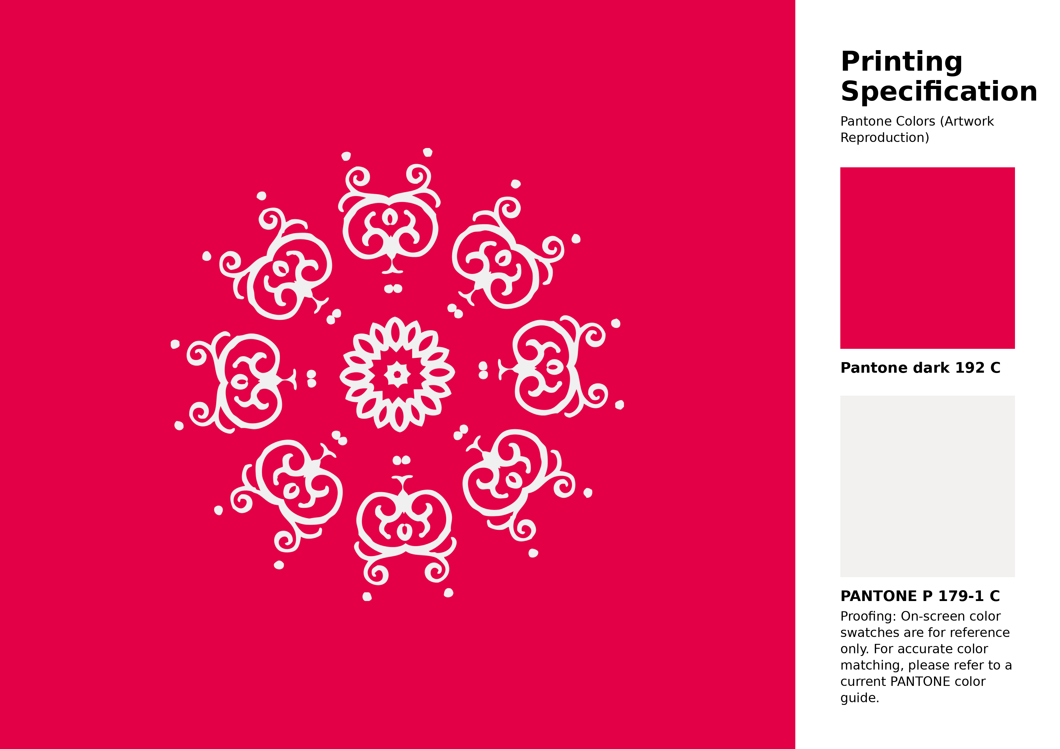
#e40046 Pantone 192 C Color | Hex color Code #e40046 Artwork Image (PNG)
Download Artwork (PNG)#e40046 Pantone 192 C Color | Hex color Code #e40046 Artwork Vector (PDF)
Download Artwork (PDF)#e40046 Pantone 192 C Color | Hex color Code #e40046 Artwork Vector (SVG)
Download Artwork (SVG)
#e40046 Pantone 192 C Color | Hex color Code #e40046 Pantone Swatch Artwork
Download Artwork Swatch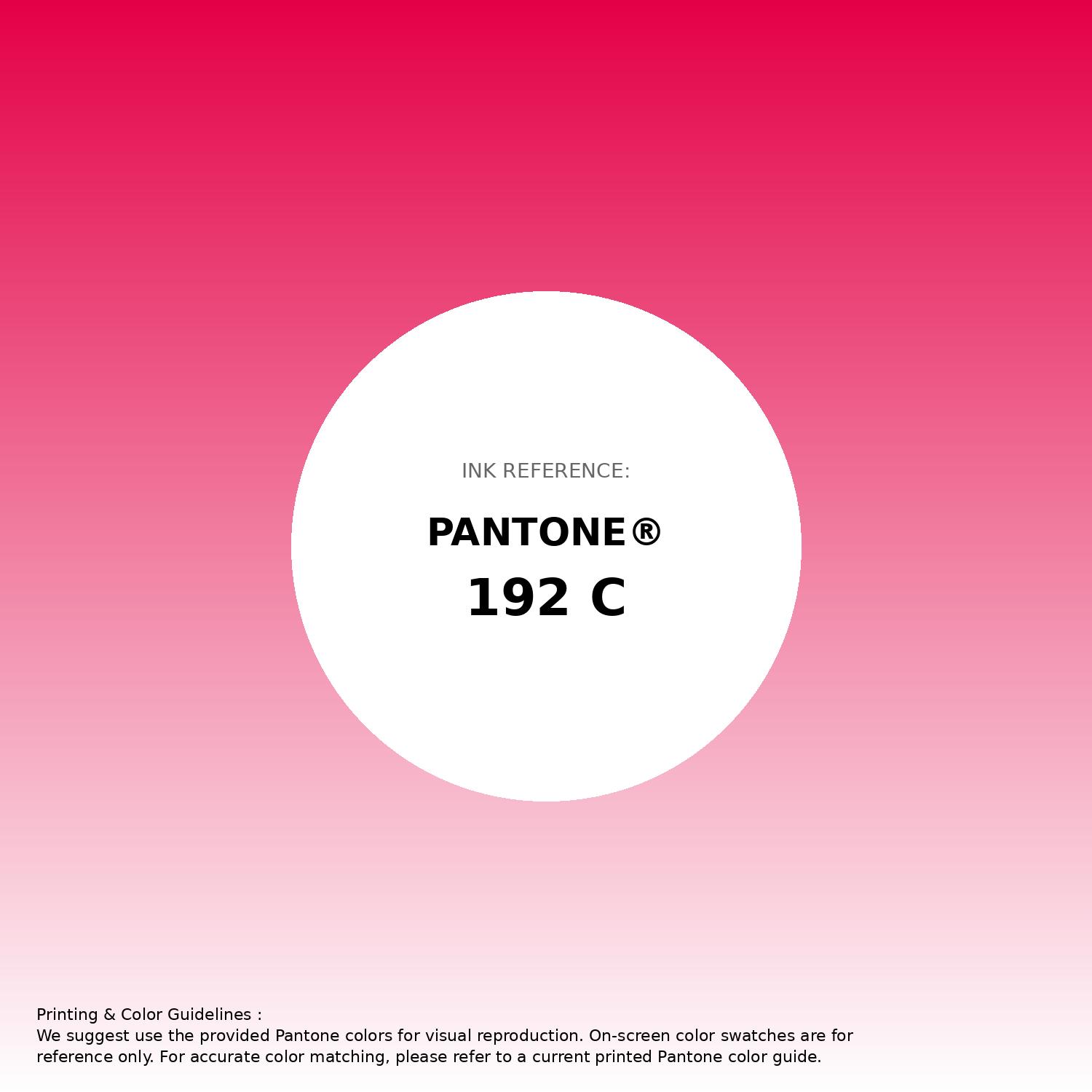
#e40046 Pantone 192 C Color | Hex color Code #e40046 Gradient Artwork (PNG)
Download Gradient (PNG)#e40046 Pantone 192 C Color | Hex color Code #e40046 Gradient Artwork (SVG)
Download Gradient (SVG)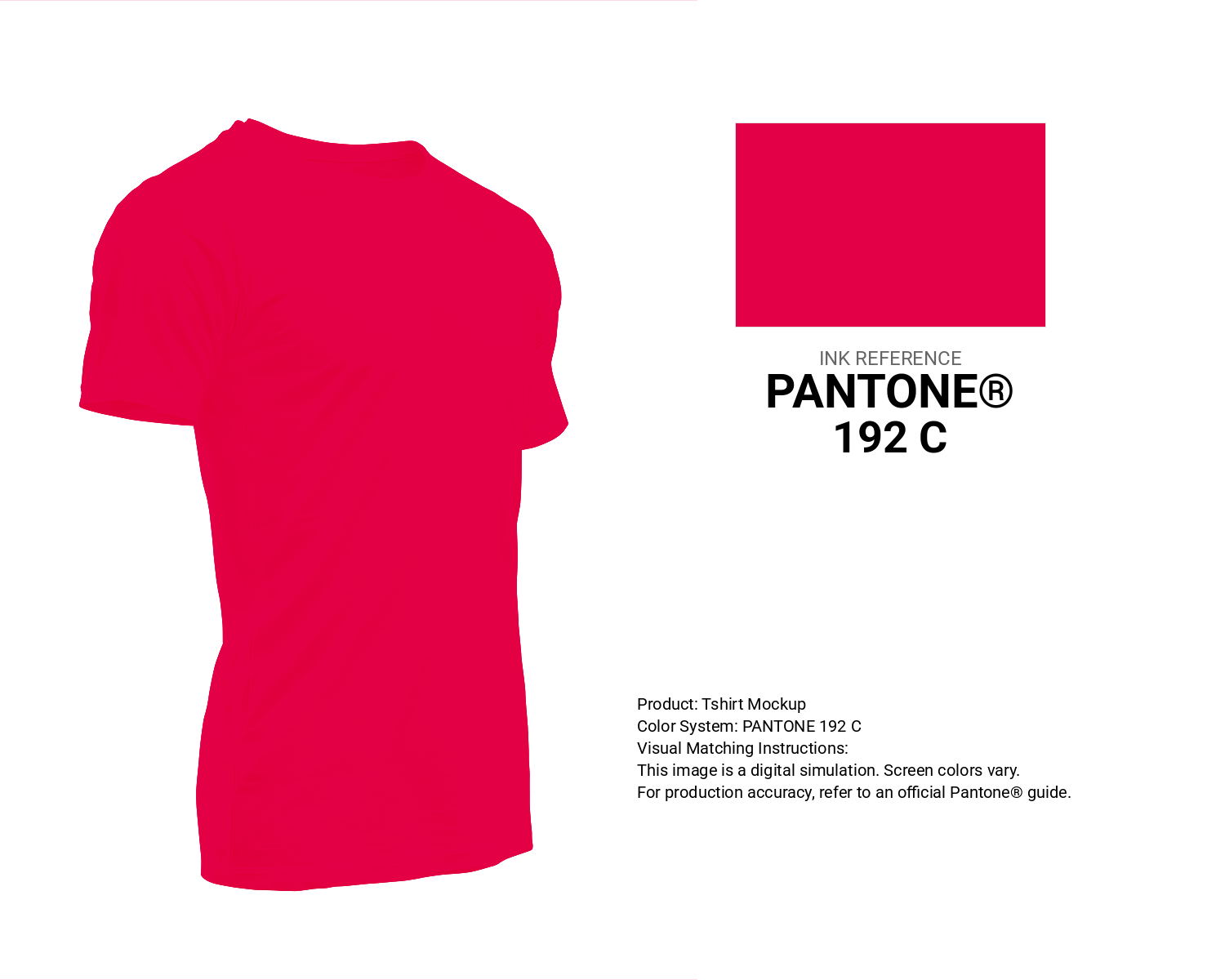
#e40046 Pantone 192 C Color | Hex color Code #e40046 T-Shirt Mockup
Download T-Shirt Mockup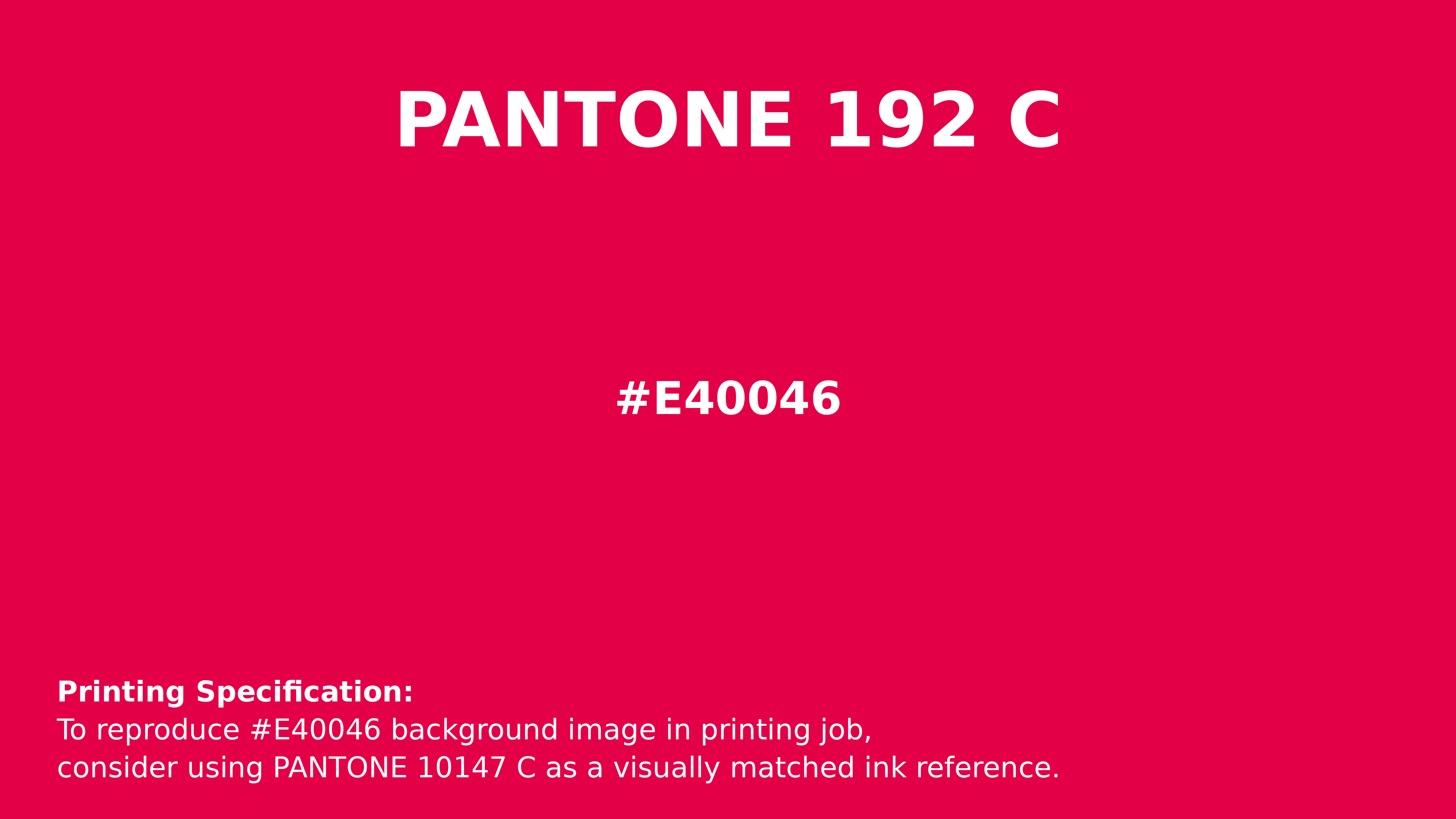
#e40046 Pantone 192 C Color | Hex color Code #e40046 Printing Artwork Pantone Reference
Download Pantone Printing Reference
Lotti Red - #e40046 Color Name
Download Color NameRelated Color Palettes
- Pale Violet Red and Dark Slate Blue •
- Indian Red and Saddle Brown •
- Dark Khaki and Indian Red •
- Pale Violet Red and Light Steel Blue •
- Hint of Red •
- OrangeRed and Sandy Brown •
- Indian Red and Gainsboro •
- Pale Violet Red and Crimson •
- Wheat and Indian Red •
- Linen and Pale Violet Red •
- Dark Orange and Dark Red •
- Rustic Red •
- Gainsboro and Indian Red •
- Pale Violet Red and Olive Drab •
- Indian Red and Maroon
Color Palette Collection

81 Pink color palettes
81 color palettes with 405 colors.

30 Pastel Pink Color Palette
30 color palettes with 150 colors.
125 Yellow Color Palettes
125 color palettes with 625 colors.

100+ Color palettes for background designs
113 color palettes with 565 colors.