#E4002B Color
Your all-in-one color resource. Download hex background images, Adobe swatches (ASE), PDF color sheets, and SVG files. Explore palettes, harmonies, accessibility, conversions, and professional exports — designed for designers, developers, and color perfectionists.
This vibrant, fiery red-orange evokes a sense of passion, energy, and excitement. It's reminiscent of a fiery sunset, a blazing bonfire, or the intense energy of a tropical rainforest. The color creates a dynamic and stimulating atmosphere, perfect for spaces designed to inspire creativity or action. In design, it can be used to draw attention, evoke a sense of urgency, or create a dramatic focal point. Its intensity might suggest a passionate love or even a sense of danger. Visually matched named color: Crimson Blaze.
PANTONE 185 C
Choose Color
Selected Color
Recent Colors
Color Details
Similar Ink Alternatives for #E4002B color Alternative print inks for reproducing #E4002B background image with a similar visual appearance.
Disclaimer: The visually matched ink reference is an independent approximation intended as a guide only. Please be advised that this pantone colors is only intended as a guide, Actual colours will depend on screen calibration variances. The print ink suggestions provided are independent visual approximations and are not affiliated with or endorsed by Pantone LLC. For official color specifications, conversion factors, and comprehensive color system information, please visit Pantone Connect. Official Pantone products can be purchased at pantone.com.
Color Previews for #000000 See how this color looks as a background or as text.
Complete Guide to Your Color Laboratory
Everything you need to know about this professional color toolkit.
Use the Color Picker at the top to select any color. All modules below update instantly.
Workflow: Pick a color → Explore palettes & data → Download what you need (PDF, Image, or Adobe ASE).
Color Details — Your color in all formats: HEX, RGB, RGBA, HSL, HSLA, HSV, CMYK, CIELab, Hunter-Lab, XYZ, Yxy, YUV. One-click copy.
Color Psychology — Emotional impact, cultural meanings, physiological effects, branding applications, and historical significance.
Named Colors — Find official color names (HTML/CSS, Pantone) that match your selection with similarity percentages.
Light & Dark Shades
80-step gradient from black to white. Perfect for button states and component systems.
Tints
Color mixed with white → lighter, pastel variations for backgrounds and disabled states.
Monochromatic — 11 curated tints/shades from one color. Production-ready for design systems.
- Complementary — Opposite on wheel (180°). High contrast.
- Analogous — Neighbors (±30°). Harmonious flow.
- Triadic — Three colors (120° apart). Vibrant, balanced.
- Split-Complementary — Base + two near-complements. Softer contrast.
- Tetradic/Square — Four colors. Complex, maximum variety.
- Neutral — Desaturated versions. Subtle, sophisticated.
15 Professional Variations — Monochromatic, Analogous, Complementary, Warm/Cool/Earth Tones, Pastel, Vibrant, High Contrast, and more.
Color Infusion — 10 palettes showing your color morphing into each major hue. Find bridge colors.
Similar Colors — 60+ colors generated via CIELAB Delta E matching. Unexpected harmonious combinations.
18 Ready-to-Use Gradients — Complementary, Analogous, Triadic, Tint/Shade progressions, and more.
Downloads: PNG (2560×1440), CSS (production-ready code), SVG (scalable vector).
WCAG Contrast Checker — Tests your color against white, black, and custom colors for AA (4.5:1) and AAA (7:1) compliance. Large text thresholds included.
Harmony & Accessibility Guide — Tests against 10 canonical hues. Shows which pairs are both beautiful AND WCAG-compliant for text.
PNG/JPG — High-res images for presentations and mood boards.
PDF — Print-ready reports for clients and teams.
Adobe ASE — Direct import to Photoshop, Illustrator, InDesign, XD.
CSS/SVG — Gradients only. Production-ready code and vectors.
Color Science: Industry-standard conversions (HSL, CIELAB, CMYK, XYZ). WCAG 2.1 luminance formula. Delta E (ΔE76) for perceptual matching.
Direct Links: Share colors via icolorpalette.com/color/ff5733 or icolorpalette.com/color/red
Issues? Refresh the page, wait for rendering, try another browser, or check console (F12) for errors.
Printing Guide for #e4002b Background Image
Use PANTONE 185 C as a visually matched ink reference when printing this background image.
To print the #e4002b background image from our site, consider using PANTONE 185 C as a visually matched ink reference.
Download the background image, then provide this reference code to your print vendor to help achieve accurate color reproduction.
The visually matched ink reference for the #e4002b background image is PANTONE 185 C.
This color is commonly described as Crimson Blaze.
This vibrant, fiery red-orange evokes a sense of passion, energy, and excitement. It's reminiscent of a fiery sunset, a blazing bonfire, or the intense energy of a tropical rainforest. The color creates a dynamic and stimulating atmosphere, perfect for spaces designed to inspire creativity or action. In design, it can be used to draw attention, evoke a sense of urgency, or create a dramatic focal point. Its intensity might suggest a passionate love or even a sense of danger.
We provide PANTONE 185 C as a visually matched ink reference to help you reproduce the #e4002b background image accurately in professional printing.
This reference code helps print vendors achieve consistent color output across different printing equipment and materials.
After downloading the #e4002b background image from our site:
- Include the visually matched ink reference PANTONE 185 C in your print order notes
- Inform your print vendor that this is your target color reference
- Request a proof print to verify the Crimson Blaze color appearance before full production
The #e4002b background image with PANTONE 185 C as visually matched ink reference can be used for:
- Posters, banners, and backdrops
- Business cards, brochures, and flyers
- Packaging, labels, and stickers
- Signage and promotional materials
This is an independent visual approximation.
While PANTONE 185 C closely matches the #e4002b background image color, variations may exist between screen display and printed output.
We recommend requesting a proof print to verify the final appearance.
This vibrant, fiery red-orange evokes a sense of passion, energy, and excitement. It's reminiscent of a fiery sunset, a blazing bonfire, or the intense energy of a tropical rainforest. The color creates a dynamic and stimulating atmosphere, perfect for spaces designed to inspire creativity or action. In design, it can be used to draw attention, evoke a sense of urgency, or create a dramatic focal point. Its intensity might suggest a passionate love or even a sense of danger.
Understanding these associations helps ensure the #e4002b background image aligns with your intended message and brand impact.
Important Information
The visually matched ink reference is an independent approximation intended as a guide only.
Actual printed colors may vary depending on screen calibration, substrate material, ink type, and printing equipment used.
For official color specifications and certified color standards, visit Pantone Connect.
Official color guides and swatch books can be purchased from pantone.com.
Pantone 185 C Color: Creative Red | #E4002B
Introduction:
Creative Red, also known as Pantone 185 C color, is a vibrant and intense shade of red. It exudes energy, passion, and excitement while commanding attention. Its striking visual appeal makes it a powerful choice for various purposes.
Historical Significance:
Key moments in history: Creative Red has played a significant role in various historical events and cultural movements. For example, it was prominently used in political campaigns, such as the red banners of socialist and communist movements. It has also been associated with revolutionary movements and protests against oppression.
Symbolism and Meaning:
Symbolism: Creative Red is often symbolized as a representation of love, passion, and power. It can also convey danger, intensity, and urgency. In different cultures, it may have different connotations and interpretations, but it generally evokes strong emotions and makes a bold statement.
Creative Red in Fashion:
Fashion impact: Creative Red has a significant impact on the world of fashion. It is often used to create bold and eye-catching designs. Red dresses, suits, and accessories are popular choices for making a statement or expressing confidence. It is also a classic color for romantic occasions and celebrations.
Creative Red in Graphic Design:
Significance in design aesthetics: Creative Red holds great significance in graphic design. Its vibrancy and visibility make it a popular choice for creating attention-grabbing logos, advertisements, and branding materials. It can convey energy, excitement, and a sense of urgency in visual communication.
Color Combinations:
Potential color combinations: Creative Red pairs well with various colors, creating different visual effects and moods. Some popular combinations include red and white for a classic and clean look, red and black for a bold and sophisticated feel, and red and gold for a luxurious and elegant atmosphere.
Nature's Palette:
Natural occurrences: Creative Red can be found in nature, particularly in vibrant flowers such as roses, poppies, and tulips. It is also present in fiery sunsets, autumn leaves, and some bird feathers. The color adds a sense of liveliness and beauty to the natural world.
Artistic Representations:
Artistic usage: Creative Red has been widely used in various forms of artistic expression throughout history. It has been featured in paintings, fashion design, photography, and sculptures. Artists often utilize its boldness and intensity to evoke strong emotions and create visually stunning works.
Movies and Cinematic Landscapes:
Impact in movies: Creative Red has been used in movies to set the tone and mood of scenes. It can create a sense of danger, passion, or excitement. For example, red lighting or color grading may be used in intense action sequences or romantic scenes to enhance the emotional impact and immerse the audience in the story.
Products and Commercial Appeal:
Popular products and brands: Many products and brands have embraced Creative Red in their branding to convey energy, excitement, and passion. Red is commonly used in the food and beverage industry, as it can stimulate appetite and create a sense of urgency. It is also commonly seen in entertainment, sports, and technology.
National Symbols and Significance:
National symbolism: In some cultures, Creative Red holds national or cultural significance. For instance, it is associated with luck, happiness, and celebration in Chinese culture. In other countries, it may symbolize bravery, revolution, or patriotism. Its meaning can vary depending on the specific context and cultural background.
The Psychological and Emotional Impact:
Psychological impact: Creative Red has a powerful psychological impact on individuals. It stimulates energy, excitement, and passion. It can also evoke a sense of danger or urgency. Red is known to increase heart rate, grab attention, and create a feeling of intensity. It can inspire strong emotions and perspectives.
Conclusion:
Creative Red, also known as Pantone 185 C color, holds a rich historical significance and brings forth a timeless appeal. Its vibrancy and visual impact make it an excellent choice for various purposes, from fashion and graphic design to cultural symbolism and emotional expression. Its energetic and passionate nature captivates attention and leaves a lasting impression.
Pantone 185 C Color | Hex color Code #e4002b Image & Artwork
Download high-quality assets for your projects.

#e4002b Color Schemes
Download Color Schemes
#e4002b Color Shades
Download Color Shades
Pantone 185 C Color | Hex color Code #e4002b Solid Color Background
Download Solid Color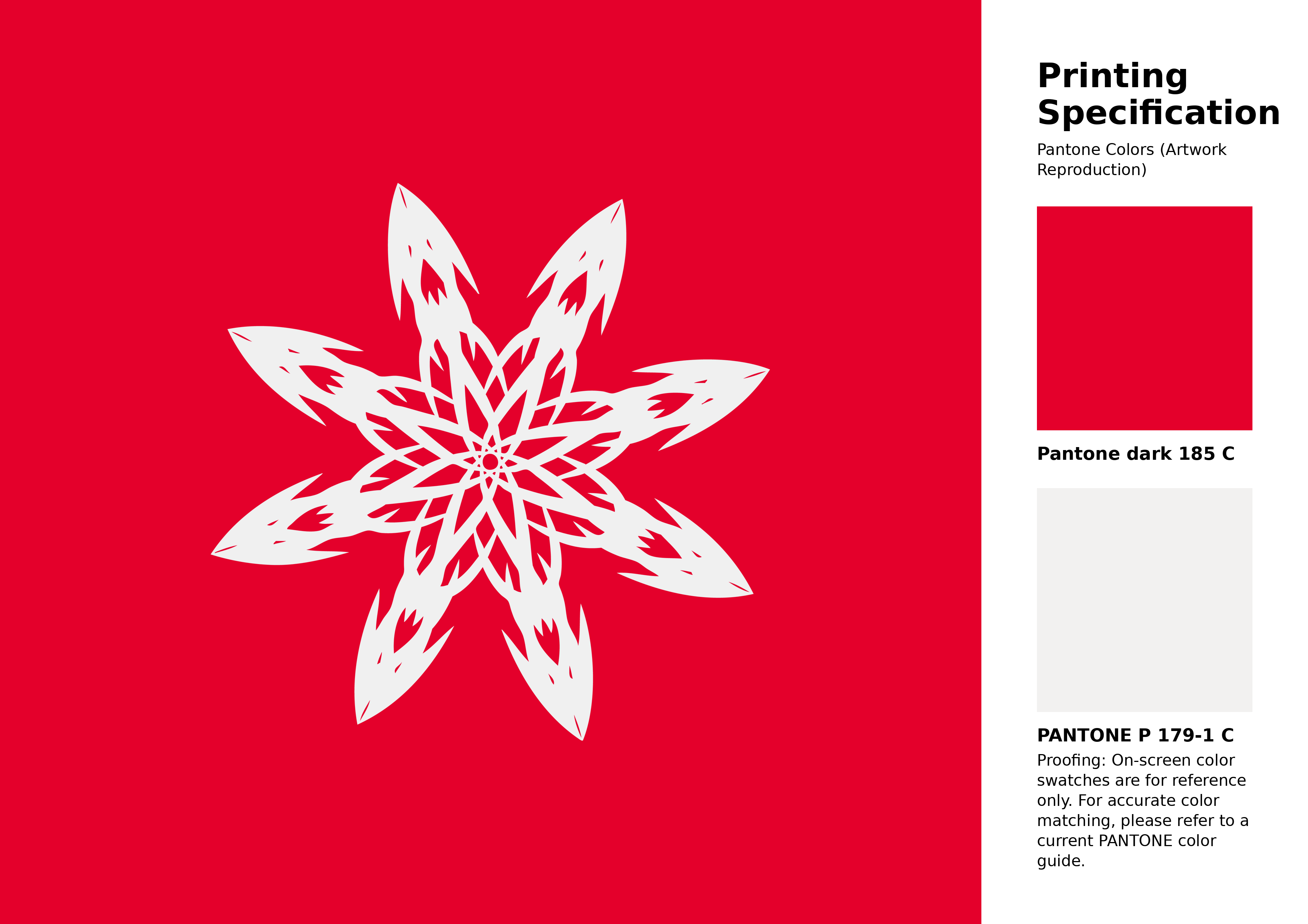
#e4002b Pantone 185 C Color | Hex color Code #e4002b Artwork Image (PNG)
Download Artwork (PNG)#e4002b Pantone 185 C Color | Hex color Code #e4002b Artwork Vector (PDF)
Download Artwork (PDF)#e4002b Pantone 185 C Color | Hex color Code #e4002b Artwork Vector (SVG)
Download Artwork (SVG)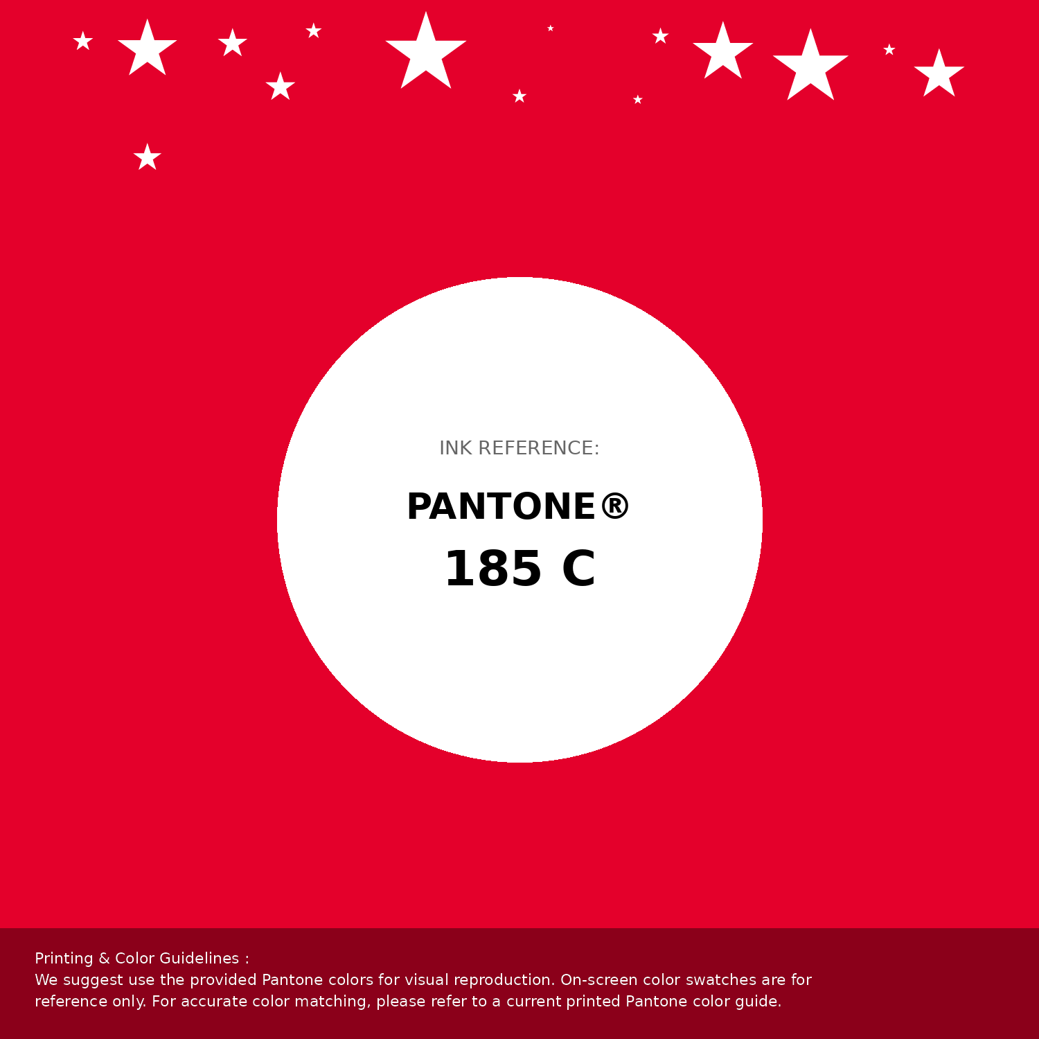
#e4002b Pantone 185 C Color | Hex color Code #e4002b Pantone Swatch Artwork
Download Artwork Swatch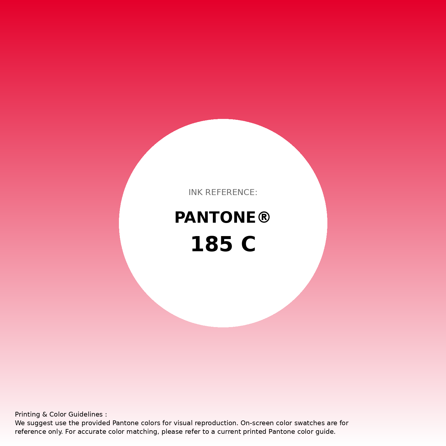
#e4002b Pantone 185 C Color | Hex color Code #e4002b Gradient Artwork (PNG)
Download Gradient (PNG)#e4002b Pantone 185 C Color | Hex color Code #e4002b Gradient Artwork (SVG)
Download Gradient (SVG)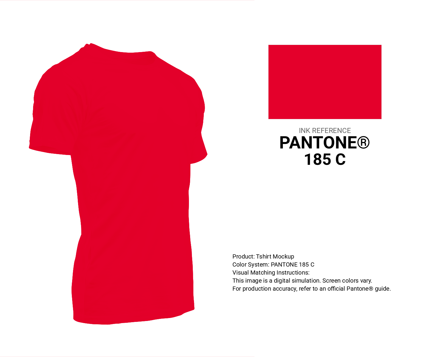
#e4002b Pantone 185 C Color | Hex color Code #e4002b T-Shirt Mockup
Download T-Shirt Mockup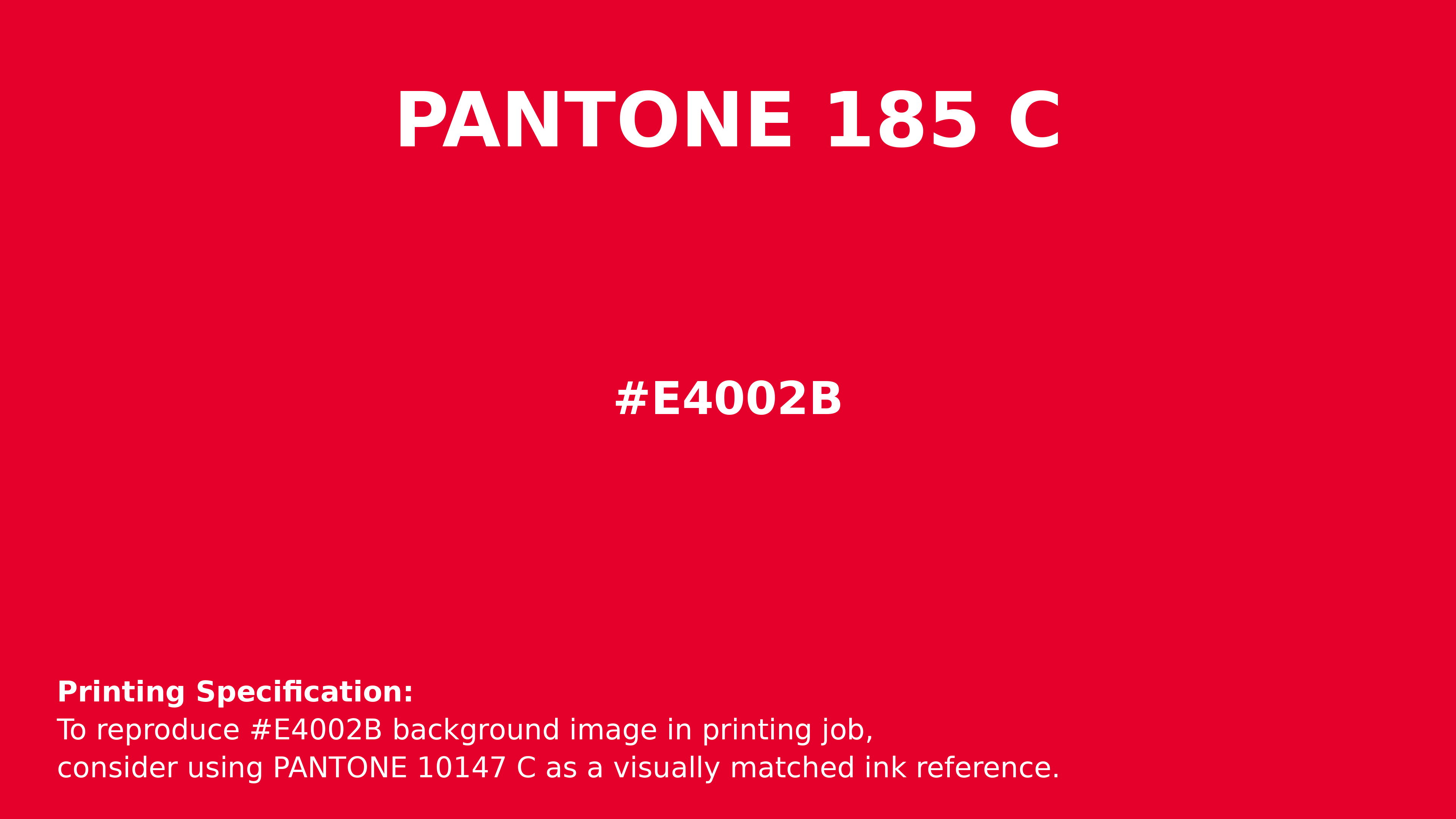
#e4002b Pantone 185 C Color | Hex color Code #e4002b Printing Artwork Pantone Reference
Download Pantone Printing ReferenceRelated Color Palettes
- Dim Gray and OrangeRed •
- Saddle Brown and OrangeRed •
- Dark Gray and Pale Violet Red •
- Midnight Blue and Dark Red •
- Crimson and Dark Red •
- Pale Violet Red and Dark Slate Blue •
- Medium Violet Red and Sienna •
- Red and Maroon •
- OrangeRed and Tomato •
- Light Steel Blue and Dark Red •
- Plum and Medium Violet Red •
- Rosy Brown and Indian Red •
- Yellow Green and Medium Violet Red •
- Fire Brick and OrangeRed •
- OrangeRed and Dim Gray
Color Palette Collection

49 Green Color Combinations
49 color palettes with 245 colors.

16 Brown Color Palettes
16 color palettes with 80 colors.
17 Christmas Color Palettes Ideas
17 color palettes with 85 colors.

50 Color Palettes inspired by Sky
50 color palettes with 250 colors.