#DFD1A7 Color
Your all-in-one color resource. Download hex background images, Adobe swatches (ASE), PDF color sheets, and SVG files. Explore palettes, harmonies, accessibility, conversions, and professional exports — designed for designers, developers, and color perfectionists.
This soft, warm beige-yellow evokes feelings of abundance, comfort, and a sense of groundedness. It brings to mind sun-drenched fields of ripe grain, the cozy warmth of a fall afternoon, and the satisfying completion of a harvest. The color creates a welcoming and comforting atmosphere, perfect for spaces designed for relaxation, or to showcase natural elements. It suggests a sense of security and familiarity, and in design, is often associated with autumnal themes and rustic aesthetics. Visually matched named color: Golden Harvest.
PANTONE 7500 C
Choose Color
Selected Color
Recent Colors
Color Details
Similar Ink Alternatives for #DFD1A7 color Alternative print inks for reproducing #DFD1A7 background image with a similar visual appearance.
Disclaimer: The visually matched ink reference is an independent approximation intended as a guide only. Please be advised that this pantone colors is only intended as a guide, Actual colours will depend on screen calibration variances. The print ink suggestions provided are independent visual approximations and are not affiliated with or endorsed by Pantone LLC. For official color specifications, conversion factors, and comprehensive color system information, please visit Pantone Connect. Official Pantone products can be purchased at pantone.com.
Color Previews for #000000 See how this color looks as a background or as text.
Complete Guide to Your Color Laboratory
Everything you need to know about this professional color toolkit.
Use the Color Picker at the top to select any color. All modules below update instantly.
Workflow: Pick a color → Explore palettes & data → Download what you need (PDF, Image, or Adobe ASE).
Color Details — Your color in all formats: HEX, RGB, RGBA, HSL, HSLA, HSV, CMYK, CIELab, Hunter-Lab, XYZ, Yxy, YUV. One-click copy.
Color Psychology — Emotional impact, cultural meanings, physiological effects, branding applications, and historical significance.
Named Colors — Find official color names (HTML/CSS, Pantone) that match your selection with similarity percentages.
Light & Dark Shades
80-step gradient from black to white. Perfect for button states and component systems.
Tints
Color mixed with white → lighter, pastel variations for backgrounds and disabled states.
Monochromatic — 11 curated tints/shades from one color. Production-ready for design systems.
- Complementary — Opposite on wheel (180°). High contrast.
- Analogous — Neighbors (±30°). Harmonious flow.
- Triadic — Three colors (120° apart). Vibrant, balanced.
- Split-Complementary — Base + two near-complements. Softer contrast.
- Tetradic/Square — Four colors. Complex, maximum variety.
- Neutral — Desaturated versions. Subtle, sophisticated.
15 Professional Variations — Monochromatic, Analogous, Complementary, Warm/Cool/Earth Tones, Pastel, Vibrant, High Contrast, and more.
Color Infusion — 10 palettes showing your color morphing into each major hue. Find bridge colors.
Similar Colors — 60+ colors generated via CIELAB Delta E matching. Unexpected harmonious combinations.
18 Ready-to-Use Gradients — Complementary, Analogous, Triadic, Tint/Shade progressions, and more.
Downloads: PNG (2560×1440), CSS (production-ready code), SVG (scalable vector).
WCAG Contrast Checker — Tests your color against white, black, and custom colors for AA (4.5:1) and AAA (7:1) compliance. Large text thresholds included.
Harmony & Accessibility Guide — Tests against 10 canonical hues. Shows which pairs are both beautiful AND WCAG-compliant for text.
PNG/JPG — High-res images for presentations and mood boards.
PDF — Print-ready reports for clients and teams.
Adobe ASE — Direct import to Photoshop, Illustrator, InDesign, XD.
CSS/SVG — Gradients only. Production-ready code and vectors.
Color Science: Industry-standard conversions (HSL, CIELAB, CMYK, XYZ). WCAG 2.1 luminance formula. Delta E (ΔE76) for perceptual matching.
Direct Links: Share colors via icolorpalette.com/color/ff5733 or icolorpalette.com/color/red
Issues? Refresh the page, wait for rendering, try another browser, or check console (F12) for errors.
Printing Guide for #dfd1a7 Background Image
Use PANTONE 7500 C as a visually matched ink reference when printing this background image.
To print the #dfd1a7 background image from our site, consider using PANTONE 7500 C as a visually matched ink reference.
Download the background image, then provide this reference code to your print vendor to help achieve accurate color reproduction.
The visually matched ink reference for the #dfd1a7 background image is PANTONE 7500 C.
This color is commonly described as Golden Harvest.
This soft, warm beige-yellow evokes feelings of abundance, comfort, and a sense of groundedness. It brings to mind sun-drenched fields of ripe grain, the cozy warmth of a fall afternoon, and the satisfying completion of a harvest. The color creates a welcoming and comforting atmosphere, perfect for spaces designed for relaxation, or to showcase natural elements. It suggests a sense of security and familiarity, and in design, is often associated with autumnal themes and rustic aesthetics.
We provide PANTONE 7500 C as a visually matched ink reference to help you reproduce the #dfd1a7 background image accurately in professional printing.
This reference code helps print vendors achieve consistent color output across different printing equipment and materials.
After downloading the #dfd1a7 background image from our site:
- Include the visually matched ink reference PANTONE 7500 C in your print order notes
- Inform your print vendor that this is your target color reference
- Request a proof print to verify the Golden Harvest color appearance before full production
The #dfd1a7 background image with PANTONE 7500 C as visually matched ink reference can be used for:
- Posters, banners, and backdrops
- Business cards, brochures, and flyers
- Packaging, labels, and stickers
- Signage and promotional materials
This is an independent visual approximation.
While PANTONE 7500 C closely matches the #dfd1a7 background image color, variations may exist between screen display and printed output.
We recommend requesting a proof print to verify the final appearance.
This soft, warm beige-yellow evokes feelings of abundance, comfort, and a sense of groundedness. It brings to mind sun-drenched fields of ripe grain, the cozy warmth of a fall afternoon, and the satisfying completion of a harvest. The color creates a welcoming and comforting atmosphere, perfect for spaces designed for relaxation, or to showcase natural elements. It suggests a sense of security and familiarity, and in design, is often associated with autumnal themes and rustic aesthetics.
Understanding these associations helps ensure the #dfd1a7 background image aligns with your intended message and brand impact.
Important Information
The visually matched ink reference is an independent approximation intended as a guide only.
Actual printed colors may vary depending on screen calibration, substrate material, ink type, and printing equipment used.
For official color specifications and certified color standards, visit Pantone Connect.
Official color guides and swatch books can be purchased from pantone.com.
Pantone 7500 C Color: Warm Tan | #DFD1A7
Introduction:
Warm Tan is a color that exudes comfort and coziness. With its earthy undertones and soothing presence, it brings a sense of warmth and relaxation to any space. The color's gentle hue creates a welcoming ambiance and adds a touch of sophistication to interior designs and creative projects.
Historical Significance:
Significant Moments in History: Warm Tan has been utilized throughout history in various forms of art and design, representing timeless elegance and natural beauty. From Renaissance paintings to Art Deco architecture, this color has made its mark as a symbol of refinement and class.
Symbolism and Meaning:
Symbolism and Meaning: Warm Tan is often associated with earthiness, stability, and groundedness. It represents a connection to nature and the idea of rootedness. In some cultures, it symbolizes abundance and prosperity.
Warm Tan in Fashion:
Warm Tan in Fashion: This color has been a staple in the fashion industry, often found in clothing and accessories that aim for a timeless and sophisticated look. It complements various skin tones and can be incorporated into both casual and formal attire.
Warm Tan in Graphic Design:
Warm Tan in Graphic Design: In graphic design, Warm Tan adds warmth and depth to layouts and visual compositions. It is often used to evoke a sense of nostalgia or to create a vintage aesthetic. The color's versatility allows it to be seamlessly integrated into branding and marketing materials.
Color Combinations:
Color Combinations: Warm Tan pairs well with other earthy tones such as olive green, burnt orange, and deep brown. It can also be matched with soft pastel shades like blush pink or pale yellow for a delicate and feminine palette.
Nature’s Palette:
Nature’s Palette: Warm Tan can be found in various natural elements, such as the sandy beaches, the bark of trees, and the feathers of some birds. It is often seen in landscapes during sunset or autumn, adding warmth and richness to the surroundings.
Artistic Representations:
Artistic Representations: Warm Tan has been a favored color among artists throughout history. It has been used to convey a sense of peace, tranquility, and earthly beauty in paintings, sculptures, and other art forms.
Movies and Cinematic Landscapes:
Movies and Cinematic Landscapes: Warm Tan is often used in movies to create warm and inviting atmospheres. It sets the tone for cozy and intimate scenes or adds a touch of nostalgia to period films.
Products and Commercial Appeal:
Products and Commercial Appeal: Warm Tan is often seen in products and brands that want to convey a sense of comfort, reliability, and sophistication. It is commonly used in interior design, beauty products, and high-end fashion items.
National Symbols and Significance:
National Symbols and Significance: While Warm Tan may not be directly tied to any specific national symbols, its association with earthiness and stability can evoke a sense of national pride and connection to the land.
The Psychological and Emotional Impact:
The Psychological and Emotional Impact: Warm Tan has a calming and soothing effect on the mind and emotions. It promotes feelings of comfort, security, and relaxation. It can also create a sense of groundedness and stability.
Conclusion:
Warm Tan, with its rich history, versatile symbolism, and timeless appeal, is a color that brings warmth and sophistication to any design or space. Its connection to nature and earthiness adds a sense of stability and comfort, making it a popular choice in various industries and creative fields.
Pantone 7500 C Color | Hex color Code #dfd1a7 Image & Artwork
Download high-quality assets for your projects.

#dfd1a7 Color Schemes
Download Color Schemes
#dfd1a7 Color Shades
Download Color Shades
Pantone 7500 C Color | Hex color Code #dfd1a7 Solid Color Background
Download Solid Color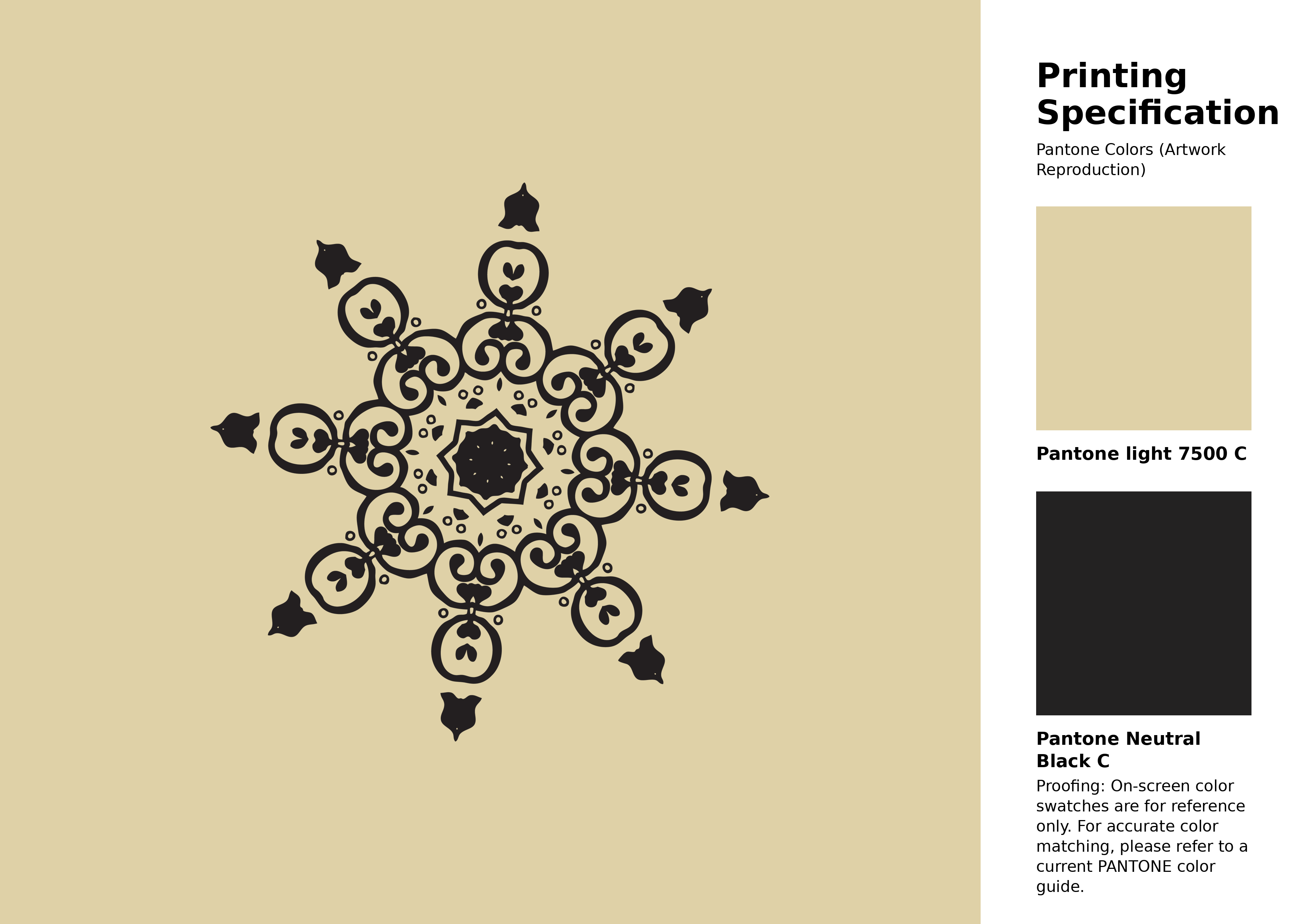
#dfd1a7 Pantone 7500 C Color | Hex color Code #dfd1a7 Artwork Image (PNG)
Download Artwork (PNG)#dfd1a7 Pantone 7500 C Color | Hex color Code #dfd1a7 Artwork Vector (PDF)
Download Artwork (PDF)#dfd1a7 Pantone 7500 C Color | Hex color Code #dfd1a7 Artwork Vector (SVG)
Download Artwork (SVG)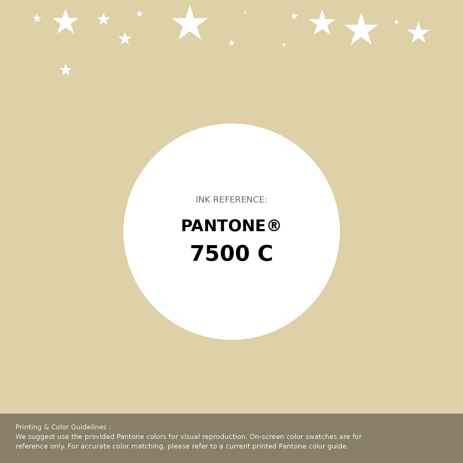
#dfd1a7 Pantone 7500 C Color | Hex color Code #dfd1a7 Pantone Swatch Artwork
Download Artwork Swatch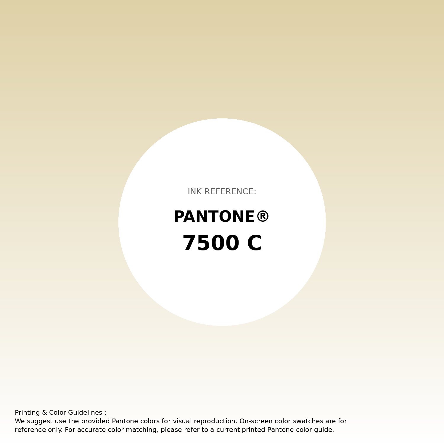
#dfd1a7 Pantone 7500 C Color | Hex color Code #dfd1a7 Gradient Artwork (PNG)
Download Gradient (PNG)#dfd1a7 Pantone 7500 C Color | Hex color Code #dfd1a7 Gradient Artwork (SVG)
Download Gradient (SVG)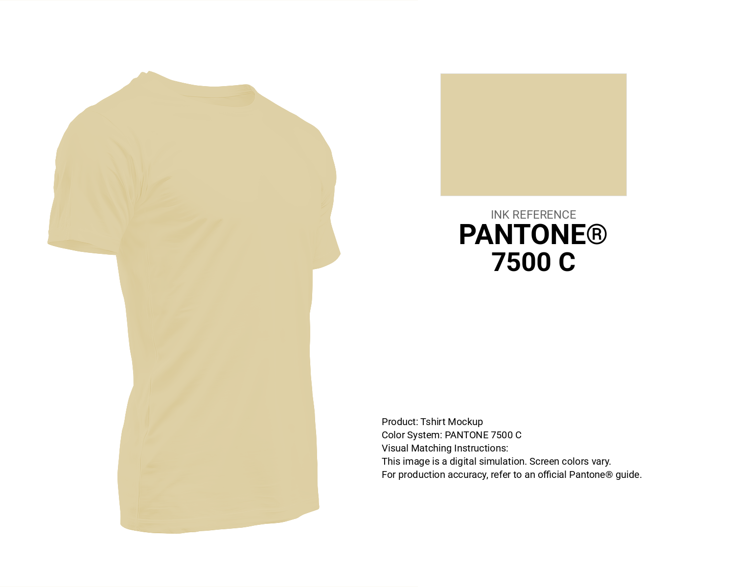
#dfd1a7 Pantone 7500 C Color | Hex color Code #dfd1a7 T-Shirt Mockup
Download T-Shirt Mockup
#dfd1a7 Pantone 7500 C Color | Hex color Code #dfd1a7 Printing Artwork Pantone Reference
Download Pantone Printing ReferenceRelated Color Palettes
- Dawn Pink •
- Sea Pink •
- Light Coral and Light Pink •
- Deep Pink and Rosy Brown •
- Lavender Pink •
- Oyster Pink •
- Rosy Brown and Hot Pink •
- Deep Pink and Gold •
- Brink Pink •
- pink peacock •
- Dark Olive Green and Deep Pink •
- Brown and Deep Pink •
- Dark Slate Gray and Hot Pink •
- Light Pink and Rosy Brown •
- Rosy Brown and Light Pink
Color Palette Collection

100+ Color palettes for background designs
113 color palettes with 565 colors.

30+ Purple Color Palettes
31 color palettes with 155 colors.
Chardonnay
1 color palettes with 5 colors.

Pink Colors
8 color palettes with 40 colors.