#DF1995 Color
Your all-in-one color resource. Download hex background images, Adobe swatches (ASE), PDF color sheets, and SVG files. Explore palettes, harmonies, accessibility, conversions, and professional exports — designed for designers, developers, and color perfectionists.
This vibrant, yet slightly muted, magenta, #DF1995, evokes a sense of passionate intensity and a touch of melancholy. It's a color reminiscent of twilight blooms, the deep hues of velvet petals illuminated by a fading sun, or the rich stain of a ripe berry. It speaks of hidden depths, of secrets whispered in the shadows, and of the powerful pull of desire. The color creates an atmosphere of drama and allure, a sense of both boldness and vulnerability. It could be used in design to create a feeling of opulence, mystery, or artistic expression, perhaps in a boudoir, a gallery, or a high-fashion setting. Symbolically, it can represent love, beauty, and the complexities of the human heart, with a slight edge of rebellion or nonconformity. Visually matched named color: Crimson Bloom.
PANTONE 225 C
Choose Color
Selected Color
Recent Colors
Color Details
Similar Ink Alternatives for #DF1995 color Alternative print inks for reproducing #DF1995 background image with a similar visual appearance.
Disclaimer: The visually matched ink reference is an independent approximation intended as a guide only. Please be advised that this pantone colors is only intended as a guide, Actual colours will depend on screen calibration variances. The print ink suggestions provided are independent visual approximations and are not affiliated with or endorsed by Pantone LLC. For official color specifications, conversion factors, and comprehensive color system information, please visit Pantone Connect. Official Pantone products can be purchased at pantone.com.
Color Previews for #000000 See how this color looks as a background or as text.
Complete Guide to Your Color Laboratory
Everything you need to know about this professional color toolkit.
Use the Color Picker at the top to select any color. All modules below update instantly.
Workflow: Pick a color → Explore palettes & data → Download what you need (PDF, Image, or Adobe ASE).
Color Details — Your color in all formats: HEX, RGB, RGBA, HSL, HSLA, HSV, CMYK, CIELab, Hunter-Lab, XYZ, Yxy, YUV. One-click copy.
Color Psychology — Emotional impact, cultural meanings, physiological effects, branding applications, and historical significance.
Named Colors — Find official color names (HTML/CSS, Pantone) that match your selection with similarity percentages.
Light & Dark Shades
80-step gradient from black to white. Perfect for button states and component systems.
Tints
Color mixed with white → lighter, pastel variations for backgrounds and disabled states.
Monochromatic — 11 curated tints/shades from one color. Production-ready for design systems.
- Complementary — Opposite on wheel (180°). High contrast.
- Analogous — Neighbors (±30°). Harmonious flow.
- Triadic — Three colors (120° apart). Vibrant, balanced.
- Split-Complementary — Base + two near-complements. Softer contrast.
- Tetradic/Square — Four colors. Complex, maximum variety.
- Neutral — Desaturated versions. Subtle, sophisticated.
15 Professional Variations — Monochromatic, Analogous, Complementary, Warm/Cool/Earth Tones, Pastel, Vibrant, High Contrast, and more.
Color Infusion — 10 palettes showing your color morphing into each major hue. Find bridge colors.
Similar Colors — 60+ colors generated via CIELAB Delta E matching. Unexpected harmonious combinations.
18 Ready-to-Use Gradients — Complementary, Analogous, Triadic, Tint/Shade progressions, and more.
Downloads: PNG (2560×1440), CSS (production-ready code), SVG (scalable vector).
WCAG Contrast Checker — Tests your color against white, black, and custom colors for AA (4.5:1) and AAA (7:1) compliance. Large text thresholds included.
Harmony & Accessibility Guide — Tests against 10 canonical hues. Shows which pairs are both beautiful AND WCAG-compliant for text.
PNG/JPG — High-res images for presentations and mood boards.
PDF — Print-ready reports for clients and teams.
Adobe ASE — Direct import to Photoshop, Illustrator, InDesign, XD.
CSS/SVG — Gradients only. Production-ready code and vectors.
Color Science: Industry-standard conversions (HSL, CIELAB, CMYK, XYZ). WCAG 2.1 luminance formula. Delta E (ΔE76) for perceptual matching.
Direct Links: Share colors via icolorpalette.com/color/ff5733 or icolorpalette.com/color/red
Issues? Refresh the page, wait for rendering, try another browser, or check console (F12) for errors.
Printing Guide for #df1995 Background Image
Use PANTONE 225 C as a visually matched ink reference when printing this background image.
To print the #df1995 background image from our site, consider using PANTONE 225 C as a visually matched ink reference.
Download the background image, then provide this reference code to your print vendor to help achieve accurate color reproduction.
The visually matched ink reference for the #df1995 background image is PANTONE 225 C.
This color is commonly described as Crimson Bloom.
This vibrant, yet slightly muted, magenta, #DF1995, evokes a sense of passionate intensity and a touch of melancholy. It's a color reminiscent of twilight blooms, the deep hues of velvet petals illuminated by a fading sun, or the rich stain of a ripe berry. It speaks of hidden depths, of secrets whispered in the shadows, and of the powerful pull of desire. The color creates an atmosphere of drama and allure, a sense of both boldness and vulnerability. It could be used in design to create a feeling of opulence, mystery, or artistic expression, perhaps in a boudoir, a gallery, or a high-fashion setting. Symbolically, it can represent love, beauty, and the complexities of the human heart, with a slight edge of rebellion or nonconformity.
We provide PANTONE 225 C as a visually matched ink reference to help you reproduce the #df1995 background image accurately in professional printing.
This reference code helps print vendors achieve consistent color output across different printing equipment and materials.
After downloading the #df1995 background image from our site:
- Include the visually matched ink reference PANTONE 225 C in your print order notes
- Inform your print vendor that this is your target color reference
- Request a proof print to verify the Crimson Bloom color appearance before full production
The #df1995 background image with PANTONE 225 C as visually matched ink reference can be used for:
- Posters, banners, and backdrops
- Business cards, brochures, and flyers
- Packaging, labels, and stickers
- Signage and promotional materials
This is an independent visual approximation.
While PANTONE 225 C closely matches the #df1995 background image color, variations may exist between screen display and printed output.
We recommend requesting a proof print to verify the final appearance.
This vibrant, yet slightly muted, magenta, #DF1995, evokes a sense of passionate intensity and a touch of melancholy. It's a color reminiscent of twilight blooms, the deep hues of velvet petals illuminated by a fading sun, or the rich stain of a ripe berry. It speaks of hidden depths, of secrets whispered in the shadows, and of the powerful pull of desire. The color creates an atmosphere of drama and allure, a sense of both boldness and vulnerability. It could be used in design to create a feeling of opulence, mystery, or artistic expression, perhaps in a boudoir, a gallery, or a high-fashion setting. Symbolically, it can represent love, beauty, and the complexities of the human heart, with a slight edge of rebellion or nonconformity.
Understanding these associations helps ensure the #df1995 background image aligns with your intended message and brand impact.
Important Information
The visually matched ink reference is an independent approximation intended as a guide only.
Actual printed colors may vary depending on screen calibration, substrate material, ink type, and printing equipment used.
For official color specifications and certified color standards, visit Pantone Connect.
Official color guides and swatch books can be purchased from pantone.com.
Pantone 225 C Color: Vibrant Violet | #DF1995
Introduction:
Vibrant Violet is a captivating color that combines the energy of red and the stability of blue. With its intense hue, it creates a strong visual impact and evokes feelings of excitement and passion.
Historical Significance:
Early Use: Vibrant Violet first gained prominence during the Renaissance period, where it was used in religious paintings to symbolize spirituality and divine power.
Modern Influence: In the 1960s, Vibrant Violet became associated with counterculture and psychedelic movements, representing freedom, creativity, and non-conformity.
Symbolism and Meaning:
Spirituality: Vibrant Violet is often associated with spirituality and mysticism, representing introspection, enlightenment, and higher consciousness.
Royalty: Throughout history, Vibrant Violet has been associated with royalty and power, symbolizing nobility, luxury, and extravagance.
Vibrant Violet in Fashion:
Vibrant Violet has a significant impact on fashion trends, often seen on runways during seasons that embrace bold and vibrant colors. It adds a touch of drama and sophistication to outfits, making a powerful fashion statement.
Vibrant Violet in Graphic Design:
In graphic design, Vibrant Violet is often used to create eye-catching visuals, evoke emotion, and add a sense of depth and richness to designs. It is particularly popular in branding for beauty and luxury products.
Color Combinations:
Vibrant Violet pairs well with complementary colors such as yellow and green, creating a vibrant and energetic color scheme. It also works well with neutrals like gray and white, adding a pop of color to a more subdued palette.
Nature’s Palette:
Vibrant Violet is rarely found in nature, but some flowers like violets and lavender showcase shades similar to this vibrant hue. Their beauty and delicate allure are often associated with femininity and elegance.
Artistic Representations:
Vibrant Violet has been used in various art forms, including paintings, sculptures, and digital art. It can represent mystery, spirituality, and creativity, adding a sense of drama and intensity to artistic compositions.
Movies and Cinematic Landscapes:
Vibrant Violet is often used in movies and cinematic landscapes to create a dreamlike or surreal atmosphere. It is frequently seen in fantasy or science fiction films to convey otherworldly settings or characters.
Products and Commercial Appeal:
Vibrant Violet is popularly used in the branding of luxury goods and beauty products due to its association with royalty, elegance, and sophistication. It catches attention and adds a touch of glamour to product packaging and advertisements.
National Symbols and Significance:
Vibrant Violet holds no specific national or cultural significance.
The Psychological and Emotional Impact:
Vibrant Violet can evoke a range of emotions, from passion and excitement to introspection and spirituality. It is often associated with creativity and imagination, making it a popular choice for artists and dreamers.
Conclusion:
Vibrant Violet is a color that has a rich historical background, representing spirituality, creativity, and royalty. Its captivating hue adds a touch of drama and elegance in various fields, from fashion and graphic design to art and cinematography. With its strong visual impact and emotional resonance, Vibrant Violet continues to be a timeless and influential color.
Pantone 225 C Color | Hex color Code #df1995 Image & Artwork
Download high-quality assets for your projects.

#df1995 Color Schemes
Download Color Schemes
#df1995 Color Shades
Download Color Shades
Pantone 225 C Color | Hex color Code #df1995 Solid Color Background
Download Solid Color
#df1995 Pantone 225 C Color | Hex color Code #df1995 Artwork Image (PNG)
Download Artwork (PNG)#df1995 Pantone 225 C Color | Hex color Code #df1995 Artwork Vector (PDF)
Download Artwork (PDF)#df1995 Pantone 225 C Color | Hex color Code #df1995 Artwork Vector (SVG)
Download Artwork (SVG)
#df1995 Pantone 225 C Color | Hex color Code #df1995 Pantone Swatch Artwork
Download Artwork Swatch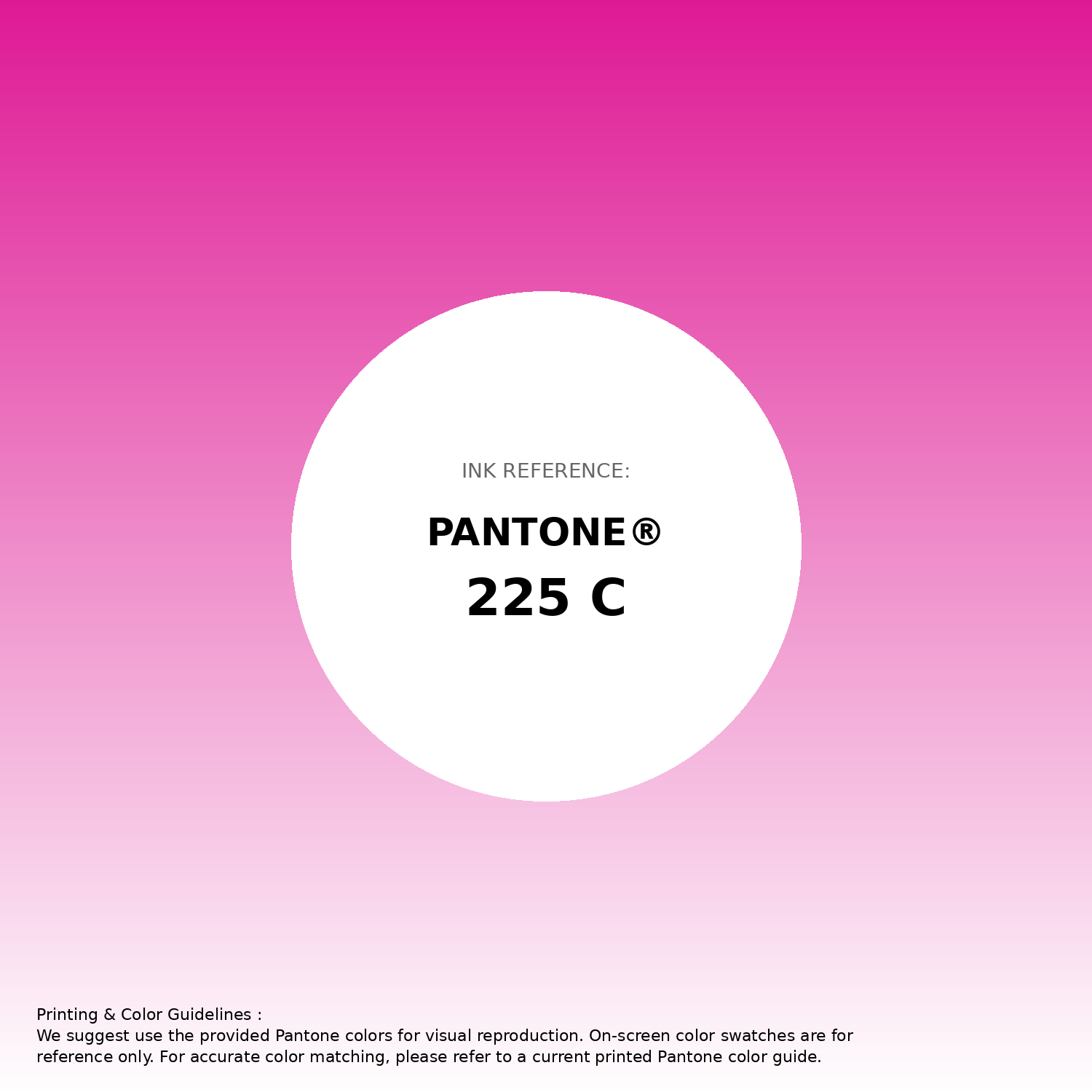
#df1995 Pantone 225 C Color | Hex color Code #df1995 Gradient Artwork (PNG)
Download Gradient (PNG)#df1995 Pantone 225 C Color | Hex color Code #df1995 Gradient Artwork (SVG)
Download Gradient (SVG)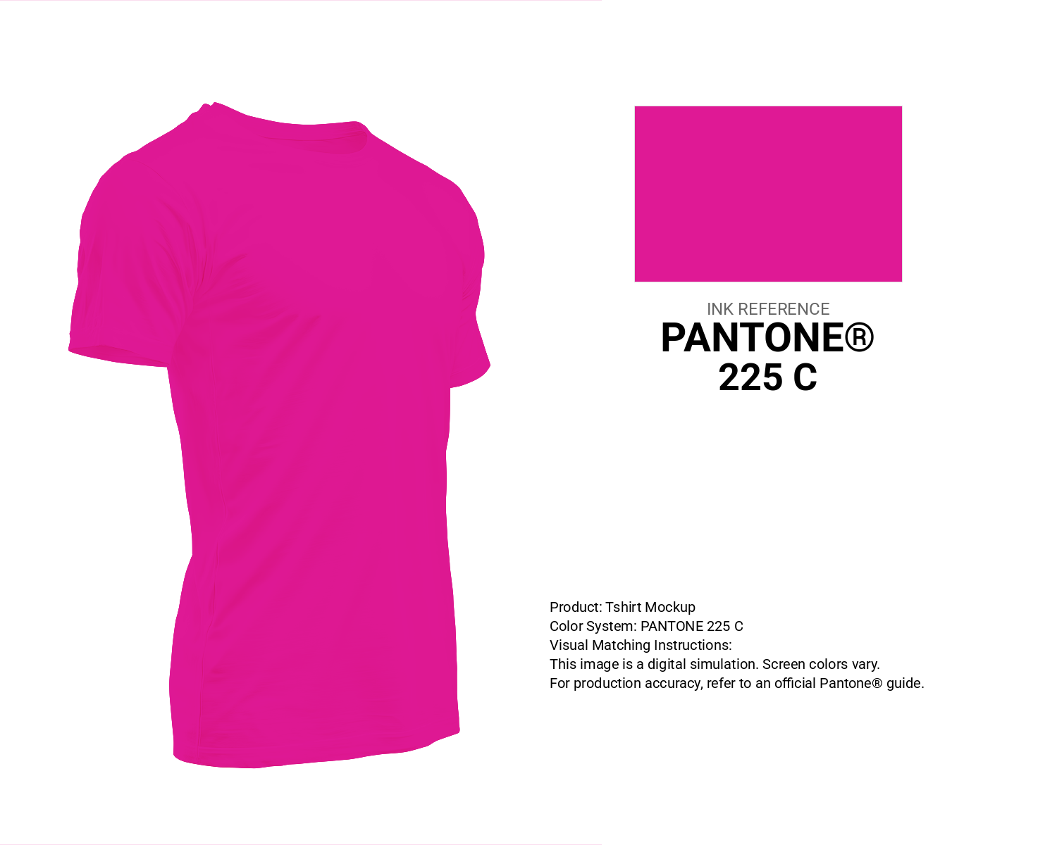
#df1995 Pantone 225 C Color | Hex color Code #df1995 T-Shirt Mockup
Download T-Shirt Mockup
#df1995 Pantone 225 C Color | Hex color Code #df1995 Printing Artwork Pantone Reference
Download Pantone Printing ReferenceRelated Color Palettes
- Red Color Palettes • Green Color Palettes • Purple Color Palettes • Pink Color Palettes • Orange Color Palettes • Blue Color Palettes • Yellow Color Palettes • Brown Color Palettes • Gray Color Palettes • Beige Color Palettes • Turquoise Color Palettes
Color Palette Collection
23 Light Blue Color Schemes
23 color palettes with 115 colors.

24 Summer Color Palettes
24 color palettes with 120 colors.

The Color of Calm: 18 Blue Palettes to Enhance Your Design
18 color palettes with 90 colors.

100 Rose Flower Nature Color Palettes
100 color palettes with 500 colors.