#DDE5ED Color
Your all-in-one color resource. Download hex background images, Adobe swatches (ASE), PDF color sheets, and SVG files. Explore palettes, harmonies, accessibility, conversions, and professional exports — designed for designers, developers, and color perfectionists.
#DDE5ED is a pale, soft blue-gray, reminiscent of a misty dawn or a lightly overcast sky. The color evokes feelings of serenity, calmness, and a gentle melancholy. It suggests a quiet contemplation, a sense of peacefulness before the day fully begins. The subtle blue undertones hint at hope and tranquility, while the gray adds a touch of sophistication and restraint. It reminds one of early mornings, soft clouds, and perhaps a quiet beach scene. The mood is peaceful, introspective, and calming, making it suitable for spaces requiring focus and relaxation, such as offices or bedrooms. In design, it could create a sophisticated yet calming backdrop, particularly effective when paired with warmer, more vibrant accents. It lacks strong cultural or symbolic associations, making it versatile and adaptable to diverse contexts. Visually matched named color: Misty Dawn.
PANTONE 656 C
Choose Color
Selected Color
Recent Colors
Color Details
Similar Ink Alternatives for #DDE5ED color Alternative print inks for reproducing #DDE5ED background image with a similar visual appearance.
Disclaimer: The visually matched ink reference is an independent approximation intended as a guide only. Please be advised that this pantone colors is only intended as a guide, Actual colours will depend on screen calibration variances. The print ink suggestions provided are independent visual approximations and are not affiliated with or endorsed by Pantone LLC. For official color specifications, conversion factors, and comprehensive color system information, please visit Pantone Connect. Official Pantone products can be purchased at pantone.com.
Color Previews for #000000 See how this color looks as a background or as text.
Complete Guide to Your Color Laboratory
Everything you need to know about this professional color toolkit.
Use the Color Picker at the top to select any color. All modules below update instantly.
Workflow: Pick a color → Explore palettes & data → Download what you need (PDF, Image, or Adobe ASE).
Color Details — Your color in all formats: HEX, RGB, RGBA, HSL, HSLA, HSV, CMYK, CIELab, Hunter-Lab, XYZ, Yxy, YUV. One-click copy.
Color Psychology — Emotional impact, cultural meanings, physiological effects, branding applications, and historical significance.
Named Colors — Find official color names (HTML/CSS, Pantone) that match your selection with similarity percentages.
Light & Dark Shades
80-step gradient from black to white. Perfect for button states and component systems.
Tints
Color mixed with white → lighter, pastel variations for backgrounds and disabled states.
Monochromatic — 11 curated tints/shades from one color. Production-ready for design systems.
- Complementary — Opposite on wheel (180°). High contrast.
- Analogous — Neighbors (±30°). Harmonious flow.
- Triadic — Three colors (120° apart). Vibrant, balanced.
- Split-Complementary — Base + two near-complements. Softer contrast.
- Tetradic/Square — Four colors. Complex, maximum variety.
- Neutral — Desaturated versions. Subtle, sophisticated.
15 Professional Variations — Monochromatic, Analogous, Complementary, Warm/Cool/Earth Tones, Pastel, Vibrant, High Contrast, and more.
Color Infusion — 10 palettes showing your color morphing into each major hue. Find bridge colors.
Similar Colors — 60+ colors generated via CIELAB Delta E matching. Unexpected harmonious combinations.
18 Ready-to-Use Gradients — Complementary, Analogous, Triadic, Tint/Shade progressions, and more.
Downloads: PNG (2560×1440), CSS (production-ready code), SVG (scalable vector).
WCAG Contrast Checker — Tests your color against white, black, and custom colors for AA (4.5:1) and AAA (7:1) compliance. Large text thresholds included.
Harmony & Accessibility Guide — Tests against 10 canonical hues. Shows which pairs are both beautiful AND WCAG-compliant for text.
PNG/JPG — High-res images for presentations and mood boards.
PDF — Print-ready reports for clients and teams.
Adobe ASE — Direct import to Photoshop, Illustrator, InDesign, XD.
CSS/SVG — Gradients only. Production-ready code and vectors.
Color Science: Industry-standard conversions (HSL, CIELAB, CMYK, XYZ). WCAG 2.1 luminance formula. Delta E (ΔE76) for perceptual matching.
Direct Links: Share colors via icolorpalette.com/color/ff5733 or icolorpalette.com/color/red
Issues? Refresh the page, wait for rendering, try another browser, or check console (F12) for errors.
Printing Guide for #dde5ed Background Image
Use PANTONE 656 C as a visually matched ink reference when printing this background image.
To print the #dde5ed background image from our site, consider using PANTONE 656 C as a visually matched ink reference.
Download the background image, then provide this reference code to your print vendor to help achieve accurate color reproduction.
The visually matched ink reference for the #dde5ed background image is PANTONE 656 C.
This color is commonly described as Misty Dawn.
#DDE5ED is a pale, soft blue-gray, reminiscent of a misty dawn or a lightly overcast sky. The color evokes feelings of serenity, calmness, and a gentle melancholy. It suggests a quiet contemplation, a sense of peacefulness before the day fully begins. The subtle blue undertones hint at hope and tranquility, while the gray adds a touch of sophistication and restraint. It reminds one of early mornings, soft clouds, and perhaps a quiet beach scene. The mood is peaceful, introspective, and calming, making it suitable for spaces requiring focus and relaxation, such as offices or bedrooms. In design, it could create a sophisticated yet calming backdrop, particularly effective when paired with warmer, more vibrant accents. It lacks strong cultural or symbolic associations, making it versatile and adaptable to diverse contexts.
We provide PANTONE 656 C as a visually matched ink reference to help you reproduce the #dde5ed background image accurately in professional printing.
This reference code helps print vendors achieve consistent color output across different printing equipment and materials.
After downloading the #dde5ed background image from our site:
- Include the visually matched ink reference PANTONE 656 C in your print order notes
- Inform your print vendor that this is your target color reference
- Request a proof print to verify the Misty Dawn color appearance before full production
The #dde5ed background image with PANTONE 656 C as visually matched ink reference can be used for:
- Posters, banners, and backdrops
- Business cards, brochures, and flyers
- Packaging, labels, and stickers
- Signage and promotional materials
This is an independent visual approximation.
While PANTONE 656 C closely matches the #dde5ed background image color, variations may exist between screen display and printed output.
We recommend requesting a proof print to verify the final appearance.
#DDE5ED is a pale, soft blue-gray, reminiscent of a misty dawn or a lightly overcast sky. The color evokes feelings of serenity, calmness, and a gentle melancholy. It suggests a quiet contemplation, a sense of peacefulness before the day fully begins. The subtle blue undertones hint at hope and tranquility, while the gray adds a touch of sophistication and restraint. It reminds one of early mornings, soft clouds, and perhaps a quiet beach scene. The mood is peaceful, introspective, and calming, making it suitable for spaces requiring focus and relaxation, such as offices or bedrooms. In design, it could create a sophisticated yet calming backdrop, particularly effective when paired with warmer, more vibrant accents. It lacks strong cultural or symbolic associations, making it versatile and adaptable to diverse contexts.
Understanding these associations helps ensure the #dde5ed background image aligns with your intended message and brand impact.
Important Information
The visually matched ink reference is an independent approximation intended as a guide only.
Actual printed colors may vary depending on screen calibration, substrate material, ink type, and printing equipment used.
For official color specifications and certified color standards, visit Pantone Connect.
Official color guides and swatch books can be purchased from pantone.com.
Pantone 656 C Color: Serene Blue | #DDE5ED
Introduction:
Serene Blue, represented by Pantone 656 C Color with the HEX value #DDE5ED, is a calming and tranquil color that exudes a sense of peace and serenity. Its soft, light blue hue creates a soothing visual experience.
Historical Significance:
Key moments in history: Throughout history, Serene Blue has been used to represent purity, spirituality, and emotional healing. It has been prominently featured in religious art and has been associated with divinity.
Symbolism and Meaning:
Symbolism and Meaning: Serene Blue is often symbolized as a color of tranquility and calmness. It represents peace, stability, and open communication. In various cultures, it is associated with serenity and meditation.
Serene Blue in Fashion:
Fashion impact: Serene Blue is a popular color in the fashion world. It is often used in clothing and accessories to create a sense of elegance and sophistication. It is commonly seen in formal wear and is known to complement a variety of skin tones.
Serene Blue in Graphic Design:
Design aesthetics: Serene Blue holds great significance in graphic design. It is commonly used in branding and advertising to convey trustworthiness, reliability, and professionalism. Its calming nature makes it suitable for creating visually appealing designs.
Color Combinations:
Potential color combinations: Serene Blue pairs well with other soft and pastel shades. Some suggested color combinations include Serene Blue and light pink, Serene Blue and lavender, and Serene Blue and pale yellow.
Nature’s Palette:
Natural occurrences: Serene Blue can be found in various natural elements such as clear skies, calm oceans, and delicate flowers like forget-me-nots. It is also a common color in landscapes and can evoke feelings of serenity and peacefulness.
Artistic Representations:
Artistic usage: Serene Blue has been widely used in art throughout history. It has been depicted in paintings, sculptures, and other art forms to represent tranquility, spirituality, and emotional depth.
Movies and Cinematic Landscapes:
Movies and scenes: Serene Blue is often used in movies to establish a calm and peaceful atmosphere. It is particularly prominent in scenic landscapes and underwater scenes, where it helps create a sense of tranquility and serenity.
Products and Commercial Appeal:
Popular products and brands: Serene Blue is commonly used in branding and marketing strategies. Many products and brands utilize this color to evoke a sense of trust, reliability, and calmness in their target audience.
National Symbols and Significance:
National symbols: Serene Blue holds national significance in various countries as it represents peace, unity, and stability. It is often featured in national flags and emblems as a symbol of these values.
The Psychological and Emotional Impact:
Psychological impact: Serene Blue has a positive psychological impact. It is known to promote feelings of calmness, relaxation, and tranquility. It can also help reduce stress and anxiety, creating a soothing environment.
Conclusion:
In conclusion, Serene Blue (Pantone 656 C Color | #DDE5ED) is a color that exudes calmness, serenity, and tranquility. Its historical significance, symbolism, and impact in various fields such as fashion, graphic design, and art make it a timeless and versatile color choice.
Pantone 656 C Color | Hex color Code #dde5ed Image & Artwork
Download high-quality assets for your projects.

#dde5ed Color Schemes
Download Color Schemes
#dde5ed Color Shades
Download Color Shades
Pantone 656 C Color | Hex color Code #dde5ed Solid Color Background
Download Solid Color
#dde5ed Pantone 656 C Color | Hex color Code #dde5ed Artwork Image (PNG)
Download Artwork (PNG)#dde5ed Pantone 656 C Color | Hex color Code #dde5ed Artwork Vector (PDF)
Download Artwork (PDF)#dde5ed Pantone 656 C Color | Hex color Code #dde5ed Artwork Vector (SVG)
Download Artwork (SVG)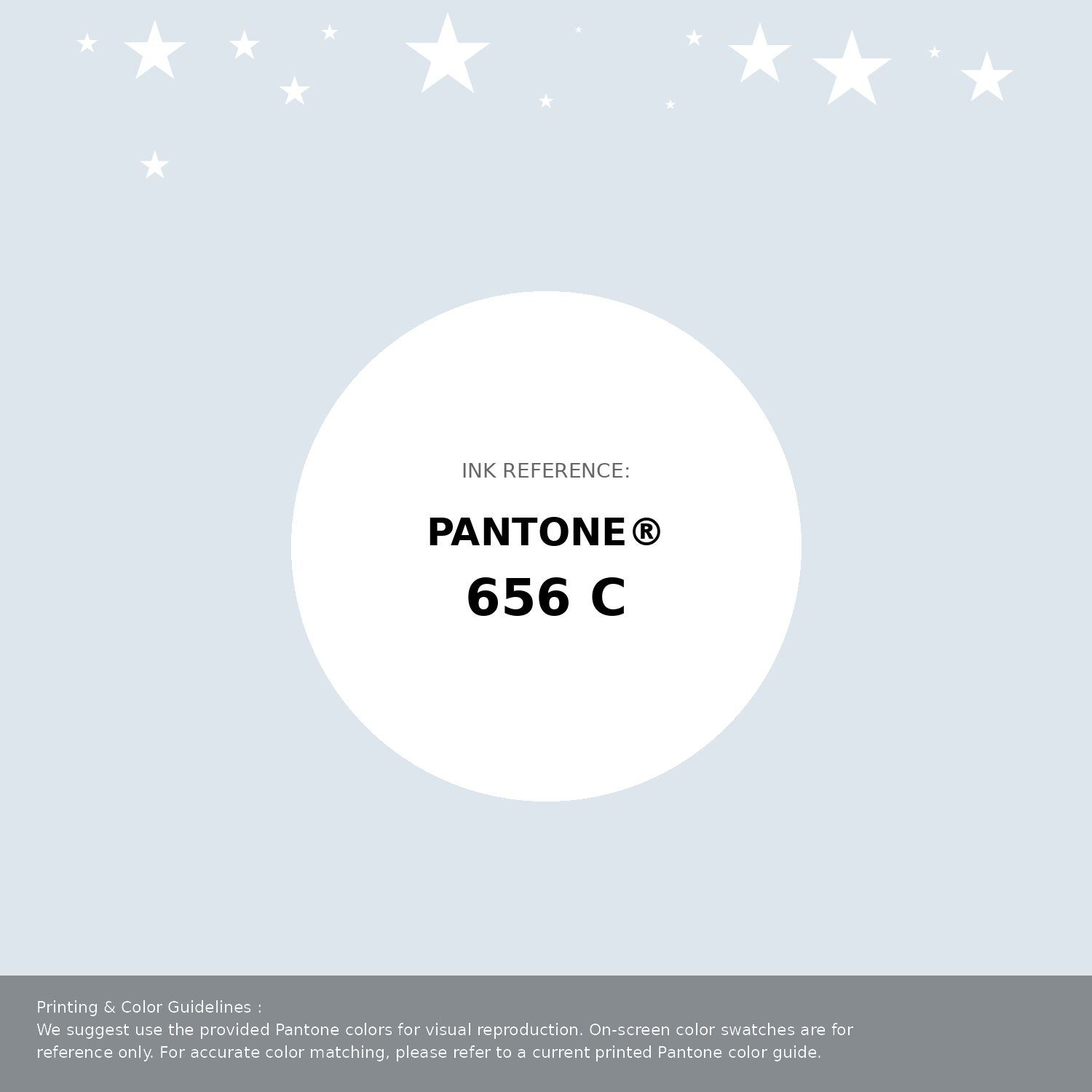
#dde5ed Pantone 656 C Color | Hex color Code #dde5ed Pantone Swatch Artwork
Download Artwork Swatch
#dde5ed Pantone 656 C Color | Hex color Code #dde5ed Gradient Artwork (PNG)
Download Gradient (PNG)#dde5ed Pantone 656 C Color | Hex color Code #dde5ed Gradient Artwork (SVG)
Download Gradient (SVG)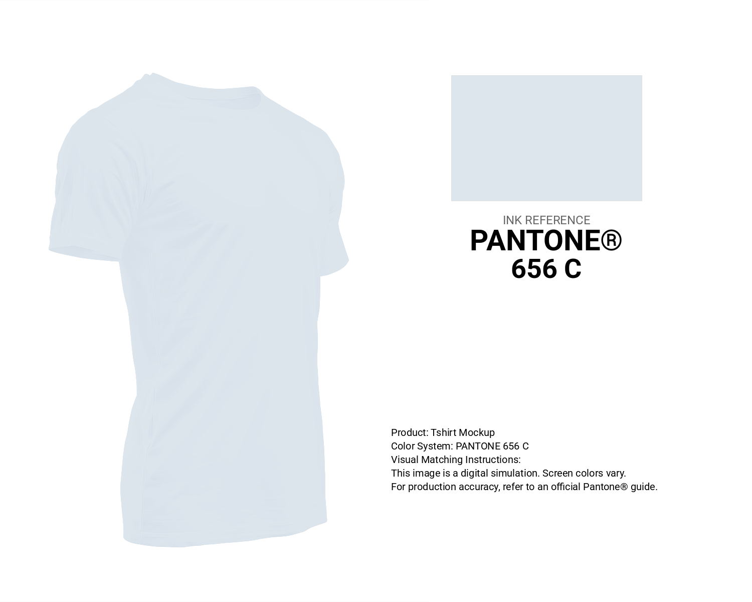
#dde5ed Pantone 656 C Color | Hex color Code #dde5ed T-Shirt Mockup
Download T-Shirt Mockup
#dde5ed Pantone 656 C Color | Hex color Code #dde5ed Printing Artwork Pantone Reference
Download Pantone Printing ReferenceRelated Color Palettes
- Beige and Sandy Brown •
- Sea Green and Beige •
- Fire Brick and Beige •
- Beige and Sienna •
- Dark Goldenrod and Beige •
- Beige and Gold •
- Light Salmon and Beige •
- Beige and Saddle Brown •
- Beige and Dim Gray •
- Beige and Indian Red •
- Beige and Rosy Brown •
- Beige and Light Salmon •
- Beige and SkyBlue •
- Light Pink and Beige •
- Black and Beige
Color Palette Collection
125 Yellow Color Palettes
125 color palettes with 625 colors.
Forest Theme colors
15 color palettes with 75 colors.

49 Beautiful curated Color Schemes For Your Next Design Project
49 color palettes with 245 colors.
34 Yellow Color Schemes
34 color palettes with 170 colors.