#DDBCB0 Color
Your all-in-one color resource. Download hex background images, Adobe swatches (ASE), PDF color sheets, and SVG files. Explore palettes, harmonies, accessibility, conversions, and professional exports — designed for designers, developers, and color perfectionists.
A warm, comforting embrace, #DDBCB0 whispers of gentle beginnings and fading light. It evokes the soft blush of a sunrise, the tender petals of a rose, and the mellow hues of autumn leaves. This color resonates with feelings of nostalgia, serenity, and quiet contentment. It brings to mind cozy textures, like worn leather or soft linen, and experiences such as sipping tea by a fireplace. The atmosphere it creates is one of understated elegance and warmth, fostering a sense of peace and security. It could be used in interior design to create welcoming, inviting spaces, especially in bedrooms or living rooms, lending a touch of vintage charm and a feeling of being grounded. It carries a subtle femininity and speaks of refinement. Visually matched named color: Dusty Rose Dawn.
PANTONE 7611 C
Choose Color
Selected Color
Recent Colors
Color Details
Similar Ink Alternatives for #DDBCB0 color Alternative print inks for reproducing #DDBCB0 background image with a similar visual appearance.
Disclaimer: The visually matched ink reference is an independent approximation intended as a guide only. Please be advised that this pantone colors is only intended as a guide, Actual colours will depend on screen calibration variances. The print ink suggestions provided are independent visual approximations and are not affiliated with or endorsed by Pantone LLC. For official color specifications, conversion factors, and comprehensive color system information, please visit Pantone Connect. Official Pantone products can be purchased at pantone.com.
Color Previews for #000000 See how this color looks as a background or as text.
Complete Guide to Your Color Laboratory
Everything you need to know about this professional color toolkit.
Use the Color Picker at the top to select any color. All modules below update instantly.
Workflow: Pick a color → Explore palettes & data → Download what you need (PDF, Image, or Adobe ASE).
Color Details — Your color in all formats: HEX, RGB, RGBA, HSL, HSLA, HSV, CMYK, CIELab, Hunter-Lab, XYZ, Yxy, YUV. One-click copy.
Color Psychology — Emotional impact, cultural meanings, physiological effects, branding applications, and historical significance.
Named Colors — Find official color names (HTML/CSS, Pantone) that match your selection with similarity percentages.
Light & Dark Shades
80-step gradient from black to white. Perfect for button states and component systems.
Tints
Color mixed with white → lighter, pastel variations for backgrounds and disabled states.
Monochromatic — 11 curated tints/shades from one color. Production-ready for design systems.
- Complementary — Opposite on wheel (180°). High contrast.
- Analogous — Neighbors (±30°). Harmonious flow.
- Triadic — Three colors (120° apart). Vibrant, balanced.
- Split-Complementary — Base + two near-complements. Softer contrast.
- Tetradic/Square — Four colors. Complex, maximum variety.
- Neutral — Desaturated versions. Subtle, sophisticated.
15 Professional Variations — Monochromatic, Analogous, Complementary, Warm/Cool/Earth Tones, Pastel, Vibrant, High Contrast, and more.
Color Infusion — 10 palettes showing your color morphing into each major hue. Find bridge colors.
Similar Colors — 60+ colors generated via CIELAB Delta E matching. Unexpected harmonious combinations.
18 Ready-to-Use Gradients — Complementary, Analogous, Triadic, Tint/Shade progressions, and more.
Downloads: PNG (2560×1440), CSS (production-ready code), SVG (scalable vector).
WCAG Contrast Checker — Tests your color against white, black, and custom colors for AA (4.5:1) and AAA (7:1) compliance. Large text thresholds included.
Harmony & Accessibility Guide — Tests against 10 canonical hues. Shows which pairs are both beautiful AND WCAG-compliant for text.
PNG/JPG — High-res images for presentations and mood boards.
PDF — Print-ready reports for clients and teams.
Adobe ASE — Direct import to Photoshop, Illustrator, InDesign, XD.
CSS/SVG — Gradients only. Production-ready code and vectors.
Color Science: Industry-standard conversions (HSL, CIELAB, CMYK, XYZ). WCAG 2.1 luminance formula. Delta E (ΔE76) for perceptual matching.
Direct Links: Share colors via icolorpalette.com/color/ff5733 or icolorpalette.com/color/red
Issues? Refresh the page, wait for rendering, try another browser, or check console (F12) for errors.
Printing Guide for #ddbcb0 Background Image
Use PANTONE 7611 C as a visually matched ink reference when printing this background image.
To print the #ddbcb0 background image from our site, consider using PANTONE 7611 C as a visually matched ink reference.
Download the background image, then provide this reference code to your print vendor to help achieve accurate color reproduction.
The visually matched ink reference for the #ddbcb0 background image is PANTONE 7611 C.
This color is commonly described as Dusty Rose Dawn.
A warm, comforting embrace, #DDBCB0 whispers of gentle beginnings and fading light. It evokes the soft blush of a sunrise, the tender petals of a rose, and the mellow hues of autumn leaves. This color resonates with feelings of nostalgia, serenity, and quiet contentment. It brings to mind cozy textures, like worn leather or soft linen, and experiences such as sipping tea by a fireplace. The atmosphere it creates is one of understated elegance and warmth, fostering a sense of peace and security. It could be used in interior design to create welcoming, inviting spaces, especially in bedrooms or living rooms, lending a touch of vintage charm and a feeling of being grounded. It carries a subtle femininity and speaks of refinement.
We provide PANTONE 7611 C as a visually matched ink reference to help you reproduce the #ddbcb0 background image accurately in professional printing.
This reference code helps print vendors achieve consistent color output across different printing equipment and materials.
After downloading the #ddbcb0 background image from our site:
- Include the visually matched ink reference PANTONE 7611 C in your print order notes
- Inform your print vendor that this is your target color reference
- Request a proof print to verify the Dusty Rose Dawn color appearance before full production
The #ddbcb0 background image with PANTONE 7611 C as visually matched ink reference can be used for:
- Posters, banners, and backdrops
- Business cards, brochures, and flyers
- Packaging, labels, and stickers
- Signage and promotional materials
This is an independent visual approximation.
While PANTONE 7611 C closely matches the #ddbcb0 background image color, variations may exist between screen display and printed output.
We recommend requesting a proof print to verify the final appearance.
A warm, comforting embrace, #DDBCB0 whispers of gentle beginnings and fading light. It evokes the soft blush of a sunrise, the tender petals of a rose, and the mellow hues of autumn leaves. This color resonates with feelings of nostalgia, serenity, and quiet contentment. It brings to mind cozy textures, like worn leather or soft linen, and experiences such as sipping tea by a fireplace. The atmosphere it creates is one of understated elegance and warmth, fostering a sense of peace and security. It could be used in interior design to create welcoming, inviting spaces, especially in bedrooms or living rooms, lending a touch of vintage charm and a feeling of being grounded. It carries a subtle femininity and speaks of refinement.
Understanding these associations helps ensure the #ddbcb0 background image aligns with your intended message and brand impact.
Important Information
The visually matched ink reference is an independent approximation intended as a guide only.
Actual printed colors may vary depending on screen calibration, substrate material, ink type, and printing equipment used.
For official color specifications and certified color standards, visit Pantone Connect.
Official color guides and swatch books can be purchased from pantone.com.
Pantone 7611 C Color: Creative Dusty Rose | #DDBCB0
Introduction:
Dusty Rose, also known as Pantone 7611 C, is a soft and muted shade of pink that exudes elegance and sophistication. This color brings a sense of tranquility and serenity, creating a calm and soothing atmosphere.
Historical Significance:
Key Moments in History: Dusty Rose first gained popularity in the Victorian era, symbolizing femininity and delicacy. The color was commonly used in fashion and interior design during this time. In recent years, Dusty Rose has made a comeback, becoming a staple color in weddings and fashion trends.
Symbolism and Meaning:
Symbolism: Dusty Rose is often associated with romance, love, and femininity. It represents tenderness, grace, and inner beauty. In some cultures, it is also seen as a color of youth and innocence. The soft and muted nature of this color adds to its sense of elegance and sophistication.
Dusty Rose in Fashion:
Fashion Impact: Dusty Rose has become a popular color in the fashion industry. It is often used in clothing and accessories to create a soft and romantic look. It is a versatile color that works well in both casual and formal attire, adding a touch of femininity and sophistication.
Dusty Rose in Graphic Design:
Design Significance: In graphic design, Dusty Rose is often used to create a sense of elegance and sophistication. It is commonly seen in brand logos, packaging, and marketing materials. This color evokes a feeling of nostalgia and adds a touch of femininity to the overall design.
Color Combinations:
Potential Color Combinations: Dusty Rose pairs well with other muted and neutral tones, such as ivory, gray, and taupe. It can also be combined with bolder colors like navy blue or emerald green for a contrasting look. Additionally, Dusty Rose works well with metallic accents like gold or silver.
Nature’s Palette:
Natural Occurrences: Dusty Rose can be found in nature, particularly in flowers like roses and peonies. It represents the delicate and soft beauty of these blooms. The color also resembles the hues seen during sunset, adding a sense of warmth and tranquility.
Artistic Representations:
Artistic Usage: Dusty Rose has been used in various forms of art over time. It can be seen in paintings, illustrations, and textiles, adding a sense of softness and femininity to the artwork. The color is often used to convey emotions and create a serene atmosphere.
Movies and Cinematic Landscapes:
Movie Influence: Dusty Rose is often used in movies to set a romantic or nostalgic tone. It is commonly seen in period dramas and romantic comedies, adding a touch of elegance and beauty to the cinematic landscapes.
Products and Commercial Appeal:
Commercial Usage: Many popular brands and products use Dusty Rose in their branding or product designs. It is often associated with beauty, femininity, and elegance. From fashion to home decor, Dusty Rose adds a touch of sophistication and timeless appeal.
National Symbols and Significance:
National Symbols: While Dusty Rose may not be directly tied to any specific national symbol, its association with femininity and elegance makes it a color often used in celebrations and events. In some cultures, it represents love, romance, and beauty.
The Psychological and Emotional Impact:
Psychological Impact: Dusty Rose has a calming and soothing effect on emotions. It can evoke feelings of gentleness, tenderness, and tranquility. This color is often used in spaces meant for relaxation, such as bedrooms or spas, to create a peaceful environment.
Conclusion:
Dusty Rose, or Pantone 7611 C, is a color that embodies elegance, femininity, and timeless beauty. Its historical significance, symbolism, and impact in various fields such as fashion, graphic design, and art make it a versatile and beloved choice. Whether used in branding, interior design, or artistic representations, Dusty Rose adds a touch of sophistication and serenity to any setting.
Pantone 7611 C Color | Hex color Code #ddbcb0 Image & Artwork
Download high-quality assets for your projects.

#ddbcb0 Color Schemes
Download Color Schemes
#ddbcb0 Color Shades
Download Color Shades
Pantone 7611 C Color | Hex color Code #ddbcb0 Solid Color Background
Download Solid Color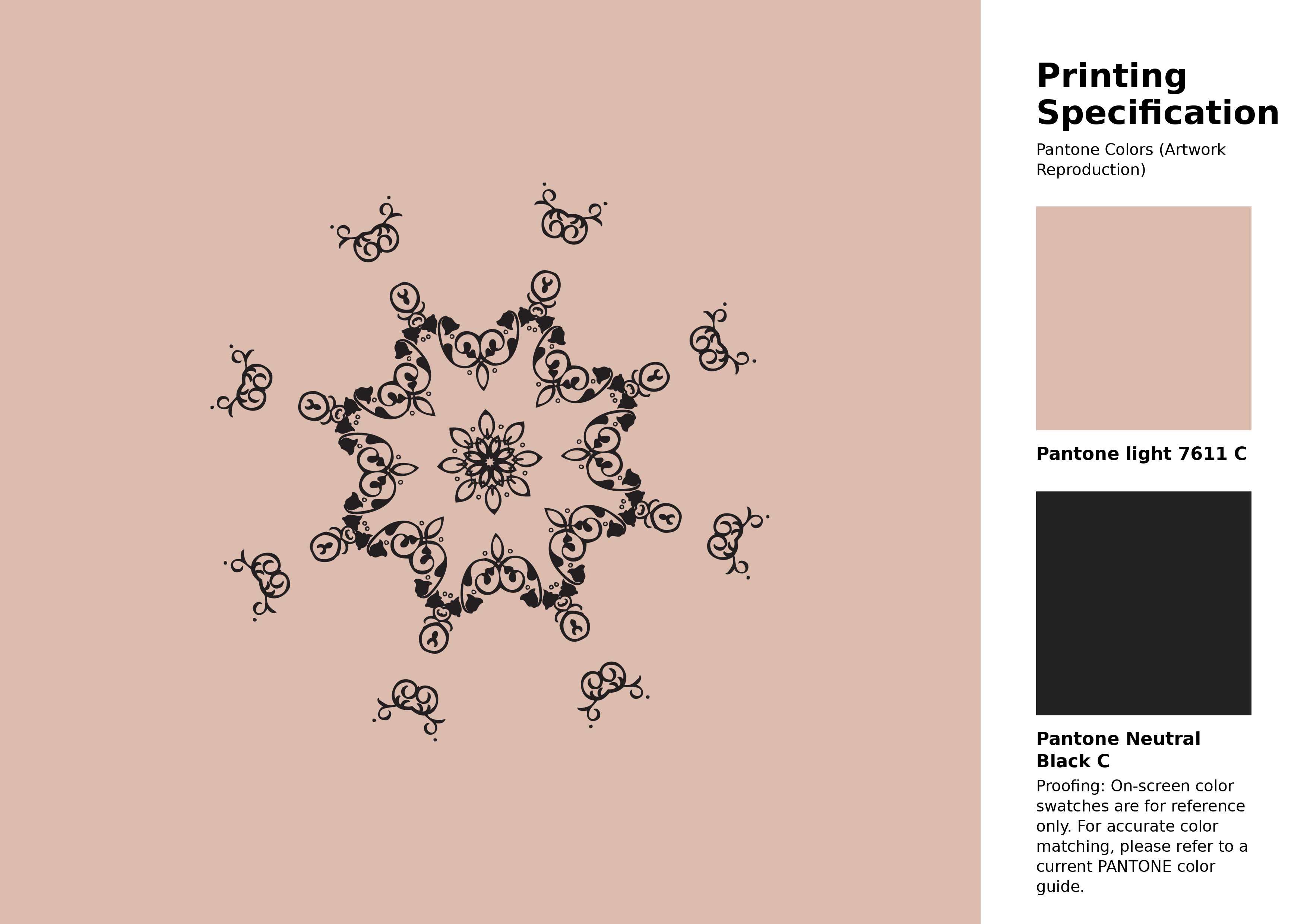
#ddbcb0 Pantone 7611 C Color | Hex color Code #ddbcb0 Artwork Image (PNG)
Download Artwork (PNG)#ddbcb0 Pantone 7611 C Color | Hex color Code #ddbcb0 Artwork Vector (PDF)
Download Artwork (PDF)#ddbcb0 Pantone 7611 C Color | Hex color Code #ddbcb0 Artwork Vector (SVG)
Download Artwork (SVG)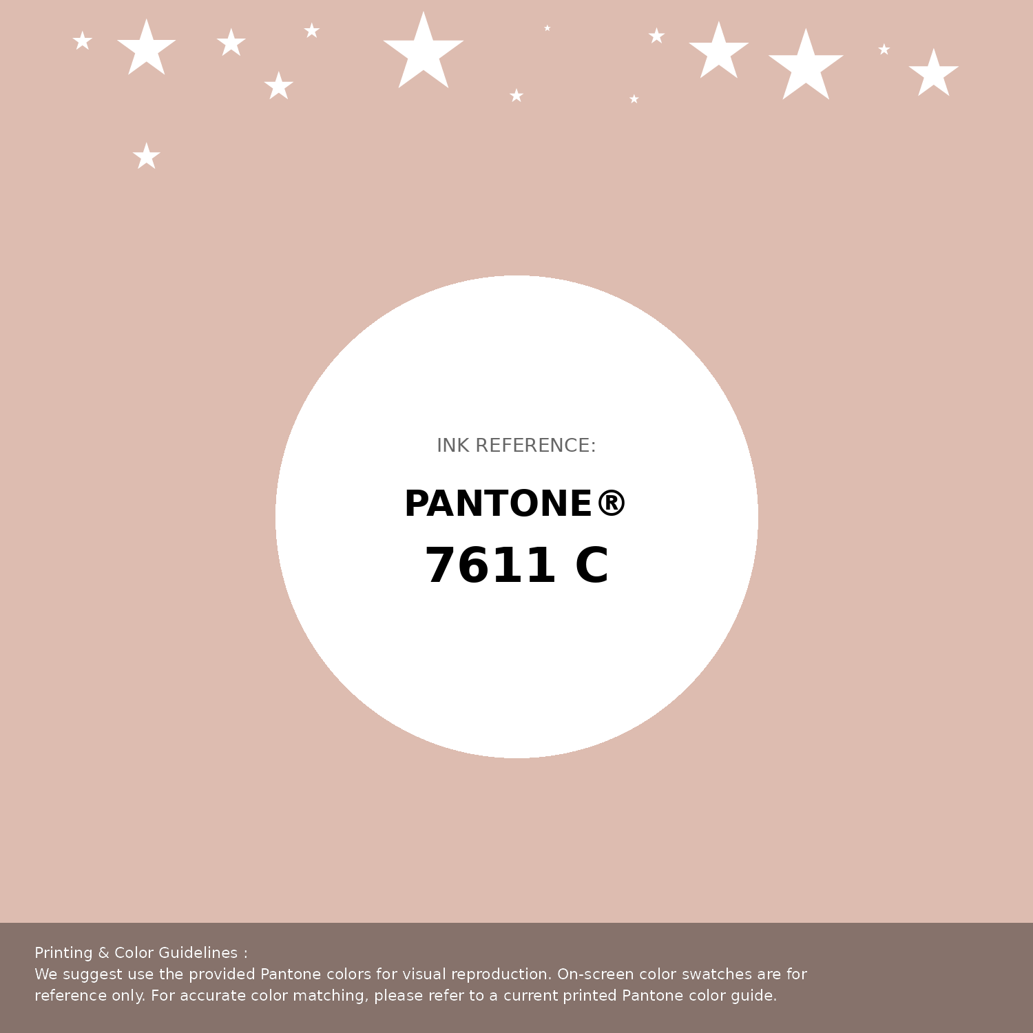
#ddbcb0 Pantone 7611 C Color | Hex color Code #ddbcb0 Pantone Swatch Artwork
Download Artwork Swatch
#ddbcb0 Pantone 7611 C Color | Hex color Code #ddbcb0 Gradient Artwork (PNG)
Download Gradient (PNG)#ddbcb0 Pantone 7611 C Color | Hex color Code #ddbcb0 Gradient Artwork (SVG)
Download Gradient (SVG)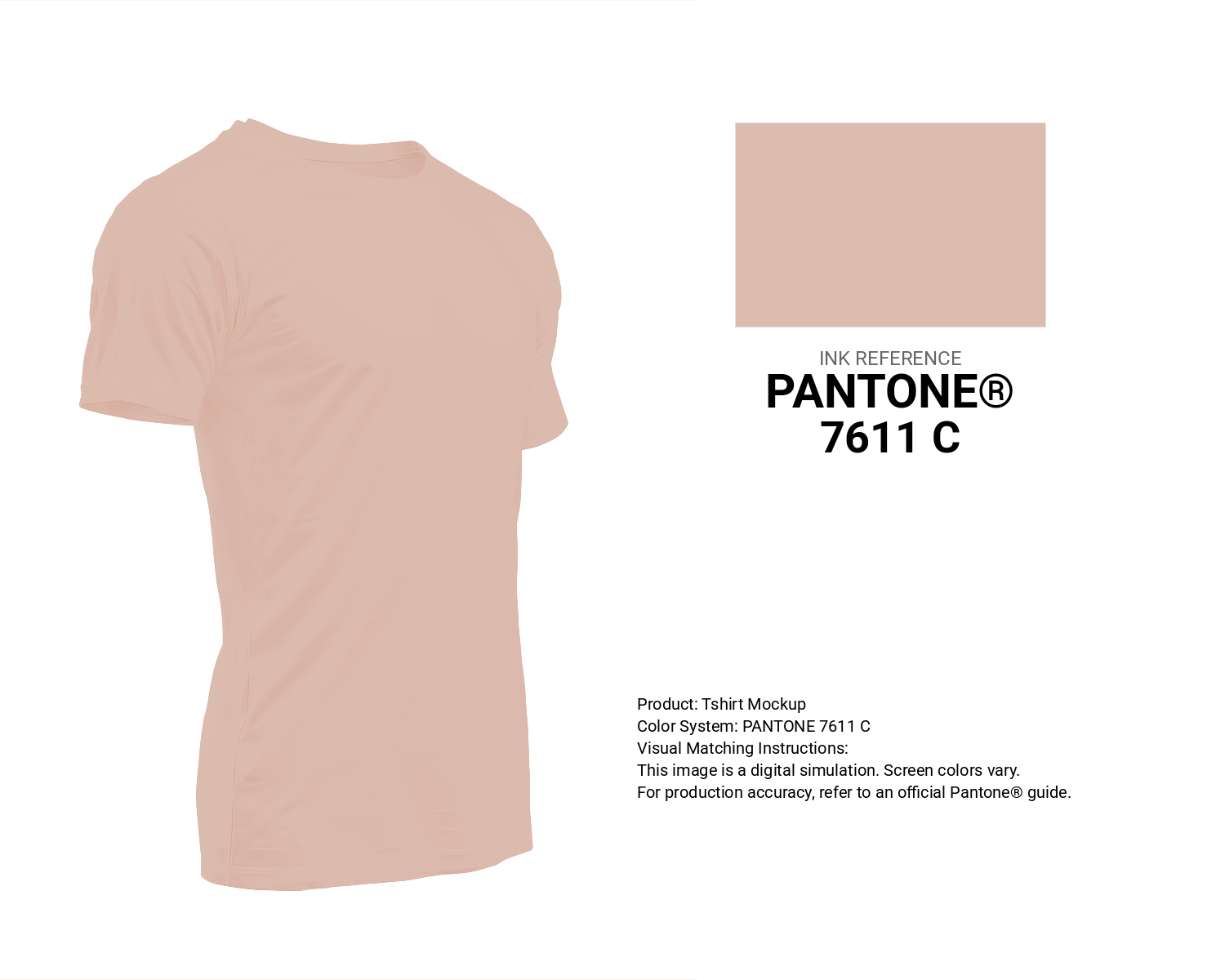
#ddbcb0 Pantone 7611 C Color | Hex color Code #ddbcb0 T-Shirt Mockup
Download T-Shirt Mockup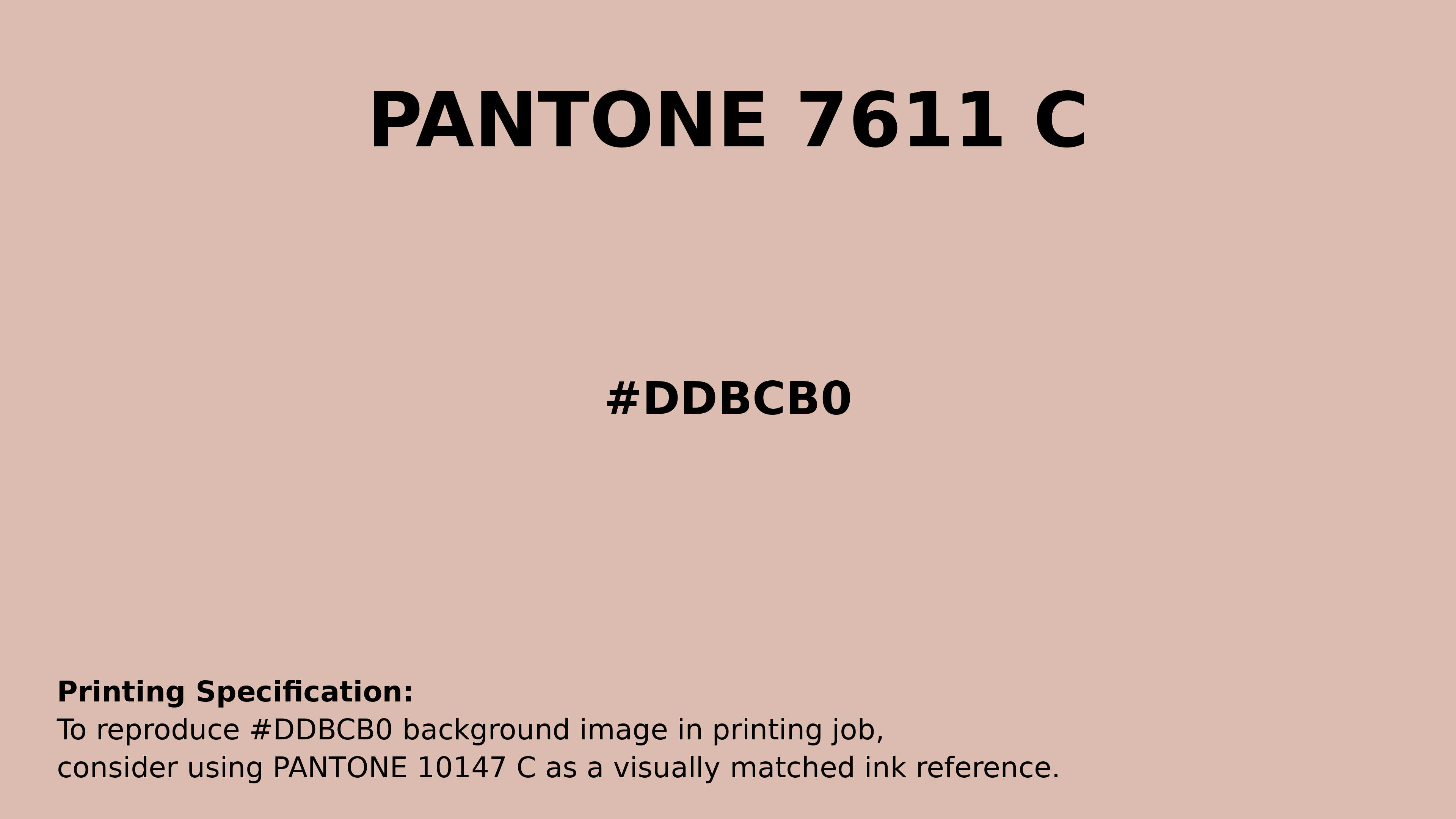
#ddbcb0 Pantone 7611 C Color | Hex color Code #ddbcb0 Printing Artwork Pantone Reference
Download Pantone Printing ReferenceRelated Color Palettes
- Mountbatten Pink •
- Medium Violet Red and Hot Pink •
- Dark Olive Green and Light Pink •
- Wheat and Light Pink •
- Dark Olive Green and Hot Pink •
- Careys Pink •
- Light Pink and Hot Pink •
- Light Pink and Dark Sea Green •
- Cannon Pink •
- Light Pink and Tan •
- Hot Pink and Light Pink •
- Hippie Pink •
- Tickle Me Pink •
- Pink Swan •
- My Pink
Color Palette Collection
125 Yellow Color Palettes
125 color palettes with 625 colors.

30 Pink Color Combinations
30 color palettes with 150 colors.

135 Black / Dark Color Palettes
135 color palettes with 675 colors.

38 Beautiful Color Palettes
38 color palettes with 190 colors.