#DCBFA6 Color
Your all-in-one color resource. Download hex background images, Adobe swatches (ASE), PDF color sheets, and SVG files. Explore palettes, harmonies, accessibility, conversions, and professional exports — designed for designers, developers, and color perfectionists.
This warm, light beige-peach hue evokes feelings of comfort, warmth, and gentle happiness. It brings to mind sun-drenched apricot orchards, the soft glow of a golden sunset, and the cozy embrace of a warm blanket. The color creates a soothing and inviting atmosphere, perfect for spaces designed for relaxation and connection. Its gentle tones are ideal for bedrooms, living rooms, and spaces where a sense of calm and tranquility is desired. In design, it suggests a feeling of abundance and nourishment, much like the harvest season. Visually matched named color: Golden Peach.
PANTONE 4675 C
Choose Color
Selected Color
Recent Colors
Color Details
Similar Ink Alternatives for #DCBFA6 color Alternative print inks for reproducing #DCBFA6 background image with a similar visual appearance.
Disclaimer: The visually matched ink reference is an independent approximation intended as a guide only. Please be advised that this pantone colors is only intended as a guide, Actual colours will depend on screen calibration variances. The print ink suggestions provided are independent visual approximations and are not affiliated with or endorsed by Pantone LLC. For official color specifications, conversion factors, and comprehensive color system information, please visit Pantone Connect. Official Pantone products can be purchased at pantone.com.
Color Previews for #000000 See how this color looks as a background or as text.
Complete Guide to Your Color Laboratory
Everything you need to know about this professional color toolkit.
Use the Color Picker at the top to select any color. All modules below update instantly.
Workflow: Pick a color → Explore palettes & data → Download what you need (PDF, Image, or Adobe ASE).
Color Details — Your color in all formats: HEX, RGB, RGBA, HSL, HSLA, HSV, CMYK, CIELab, Hunter-Lab, XYZ, Yxy, YUV. One-click copy.
Color Psychology — Emotional impact, cultural meanings, physiological effects, branding applications, and historical significance.
Named Colors — Find official color names (HTML/CSS, Pantone) that match your selection with similarity percentages.
Light & Dark Shades
80-step gradient from black to white. Perfect for button states and component systems.
Tints
Color mixed with white → lighter, pastel variations for backgrounds and disabled states.
Monochromatic — 11 curated tints/shades from one color. Production-ready for design systems.
- Complementary — Opposite on wheel (180°). High contrast.
- Analogous — Neighbors (±30°). Harmonious flow.
- Triadic — Three colors (120° apart). Vibrant, balanced.
- Split-Complementary — Base + two near-complements. Softer contrast.
- Tetradic/Square — Four colors. Complex, maximum variety.
- Neutral — Desaturated versions. Subtle, sophisticated.
15 Professional Variations — Monochromatic, Analogous, Complementary, Warm/Cool/Earth Tones, Pastel, Vibrant, High Contrast, and more.
Color Infusion — 10 palettes showing your color morphing into each major hue. Find bridge colors.
Similar Colors — 60+ colors generated via CIELAB Delta E matching. Unexpected harmonious combinations.
18 Ready-to-Use Gradients — Complementary, Analogous, Triadic, Tint/Shade progressions, and more.
Downloads: PNG (2560×1440), CSS (production-ready code), SVG (scalable vector).
WCAG Contrast Checker — Tests your color against white, black, and custom colors for AA (4.5:1) and AAA (7:1) compliance. Large text thresholds included.
Harmony & Accessibility Guide — Tests against 10 canonical hues. Shows which pairs are both beautiful AND WCAG-compliant for text.
PNG/JPG — High-res images for presentations and mood boards.
PDF — Print-ready reports for clients and teams.
Adobe ASE — Direct import to Photoshop, Illustrator, InDesign, XD.
CSS/SVG — Gradients only. Production-ready code and vectors.
Color Science: Industry-standard conversions (HSL, CIELAB, CMYK, XYZ). WCAG 2.1 luminance formula. Delta E (ΔE76) for perceptual matching.
Direct Links: Share colors via icolorpalette.com/color/ff5733 or icolorpalette.com/color/red
Issues? Refresh the page, wait for rendering, try another browser, or check console (F12) for errors.
Printing Guide for #dcbfa6 Background Image
Use PANTONE 4675 C as a visually matched ink reference when printing this background image.
To print the #dcbfa6 background image from our site, consider using PANTONE 4675 C as a visually matched ink reference.
Download the background image, then provide this reference code to your print vendor to help achieve accurate color reproduction.
The visually matched ink reference for the #dcbfa6 background image is PANTONE 4675 C.
This color is commonly described as Golden Peach.
This warm, light beige-peach hue evokes feelings of comfort, warmth, and gentle happiness. It brings to mind sun-drenched apricot orchards, the soft glow of a golden sunset, and the cozy embrace of a warm blanket. The color creates a soothing and inviting atmosphere, perfect for spaces designed for relaxation and connection. Its gentle tones are ideal for bedrooms, living rooms, and spaces where a sense of calm and tranquility is desired. In design, it suggests a feeling of abundance and nourishment, much like the harvest season.
We provide PANTONE 4675 C as a visually matched ink reference to help you reproduce the #dcbfa6 background image accurately in professional printing.
This reference code helps print vendors achieve consistent color output across different printing equipment and materials.
After downloading the #dcbfa6 background image from our site:
- Include the visually matched ink reference PANTONE 4675 C in your print order notes
- Inform your print vendor that this is your target color reference
- Request a proof print to verify the Golden Peach color appearance before full production
The #dcbfa6 background image with PANTONE 4675 C as visually matched ink reference can be used for:
- Posters, banners, and backdrops
- Business cards, brochures, and flyers
- Packaging, labels, and stickers
- Signage and promotional materials
This is an independent visual approximation.
While PANTONE 4675 C closely matches the #dcbfa6 background image color, variations may exist between screen display and printed output.
We recommend requesting a proof print to verify the final appearance.
This warm, light beige-peach hue evokes feelings of comfort, warmth, and gentle happiness. It brings to mind sun-drenched apricot orchards, the soft glow of a golden sunset, and the cozy embrace of a warm blanket. The color creates a soothing and inviting atmosphere, perfect for spaces designed for relaxation and connection. Its gentle tones are ideal for bedrooms, living rooms, and spaces where a sense of calm and tranquility is desired. In design, it suggests a feeling of abundance and nourishment, much like the harvest season.
Understanding these associations helps ensure the #dcbfa6 background image aligns with your intended message and brand impact.
Important Information
The visually matched ink reference is an independent approximation intended as a guide only.
Actual printed colors may vary depending on screen calibration, substrate material, ink type, and printing equipment used.
For official color specifications and certified color standards, visit Pantone Connect.
Official color guides and swatch books can be purchased from pantone.com.
Adobe Beige Color: Sophisticated Beige | #dcbfa6
Introduction:
Adobe Beige Color, also known as Sophisticated Beige, is a warm and elegant color. It is a soft beige shade with a hint of warmth. This color exudes sophistication and creates a cozy and inviting atmosphere.
Historical Significance:
Usage in Architecture: Adobe Beige Color has a significant historical significance in architecture. It is commonly found in traditional adobe buildings, especially in desert regions. The color reflects the natural materials used in construction and blends harmoniously with the surroundings.
Symbolism and Meaning:
Earthly Tones and Grounding: Adobe Beige Color symbolizes earthiness and grounding. It represents stability, simplicity, and a connection to nature. This color evokes a sense of calmness and balance.
Adobe Beige Color in Fashion:
Neutral Elegance: Adobe Beige Color is a popular choice in the fashion industry. It is often used as a neutral base color in clothing and accessories. It adds a touch of sophistication and elegance to any outfit.
Adobe Beige Color in Graphic Design:
Versatile and Subtle: In graphic design, Adobe Beige Color is widely used for its versatility and subtlety. It works well as a background color, allowing other elements to stand out. This color is often chosen for its understated and timeless appeal.
Color Combinations:
Warm Neutrals: Adobe Beige Color pairs well with other warm neutrals, such as taupe, ivory, and sand. This combination creates a harmonious and soothing color palette. Additionally, it can be combined with bolder colors, like burgundy or navy, to create a striking contrast.
Nature's Palette:
Natural Serenity: Adobe Beige Color can be found in various natural occurrences. It is often seen in sandy beaches, desert landscapes, and certain species of seashells. This color reflects the serenity and simplicity of nature.
Artistic Representations:
Minimalistic Art: Adobe Beige Color has been widely used in minimalistic art movements. It represents simplicity, purity, and a focus on essential elements. Artists use this color to create calming and serene compositions.
Movies and Cinematic Landscapes:
Desert Aesthetics: Adobe Beige Color is often featured in movies set in desert landscapes. It helps create an authentic and immersive experience, capturing the vastness and beauty of these environments.
Products and Commercial Appeal:
Cosmetic Industry: Adobe Beige Color is frequently used in the cosmetic industry. It is a popular choice for foundation shades and nude makeup looks. The color complements a wide range of skin tones and enhances natural beauty.
National Symbols and Significance:
Cultural Heritage: In some cultures, Adobe Beige Color holds significant cultural and historical importance. It may represent traditional architecture, ancestral connections, or cultural values. The color is embedded in the national identity of certain countries.
The Psychological and Emotional Impact:
Calmness and Relaxation: Adobe Beige Color has a calming effect on the mind and promotes relaxation. It reduces stress and anxiety, creating a soothing and peaceful environment. This color also enhances focus and concentration.
Conclusion:
Adobe Beige Color, also known as Sophisticated Beige, is a warm and elegant color with historical significance in architecture. It symbolizes earthiness, simplicity, and grounding. This versatile color is widely used in fashion, graphic design, and various art forms. It pairs well with warm neutrals and can be found in natural landscapes. Adobe Beige Color evokes calmness, serenity, and relaxation. It holds cultural and commercial appeal while maintaining a timeless charm.
Pantone 4675 C Color | Hex color Code #dcbfa6 Image & Artwork
Download high-quality assets for your projects.

#dcbfa6 Color Schemes
Download Color Schemes
#dcbfa6 Color Shades
Download Color Shades
Pantone 4675 C Color | Hex color Code #dcbfa6 Solid Color Background
Download Solid Color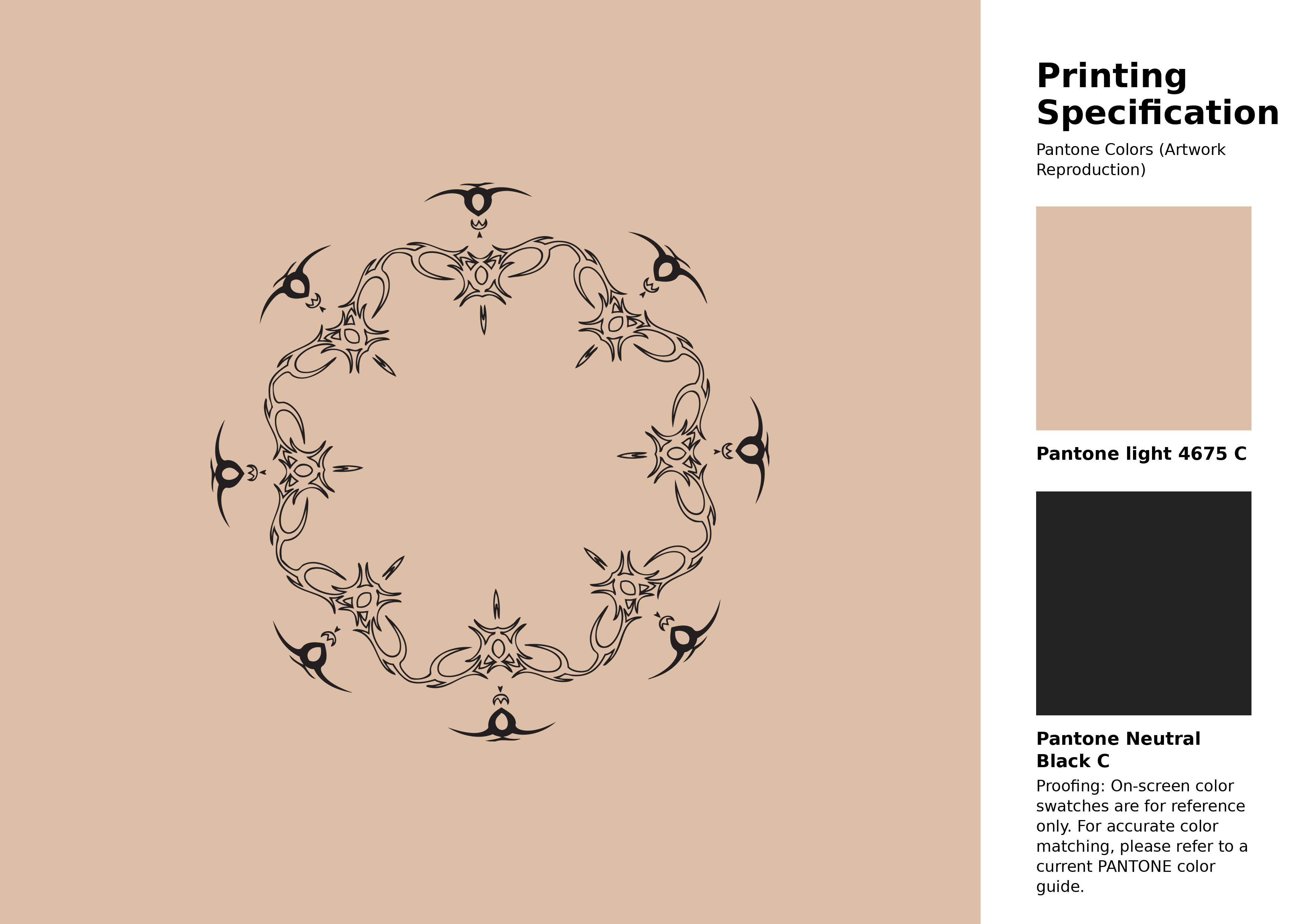
#dcbfa6 Pantone 4675 C Color | Hex color Code #dcbfa6 Artwork Image (PNG)
Download Artwork (PNG)#dcbfa6 Pantone 4675 C Color | Hex color Code #dcbfa6 Artwork Vector (PDF)
Download Artwork (PDF)#dcbfa6 Pantone 4675 C Color | Hex color Code #dcbfa6 Artwork Vector (SVG)
Download Artwork (SVG)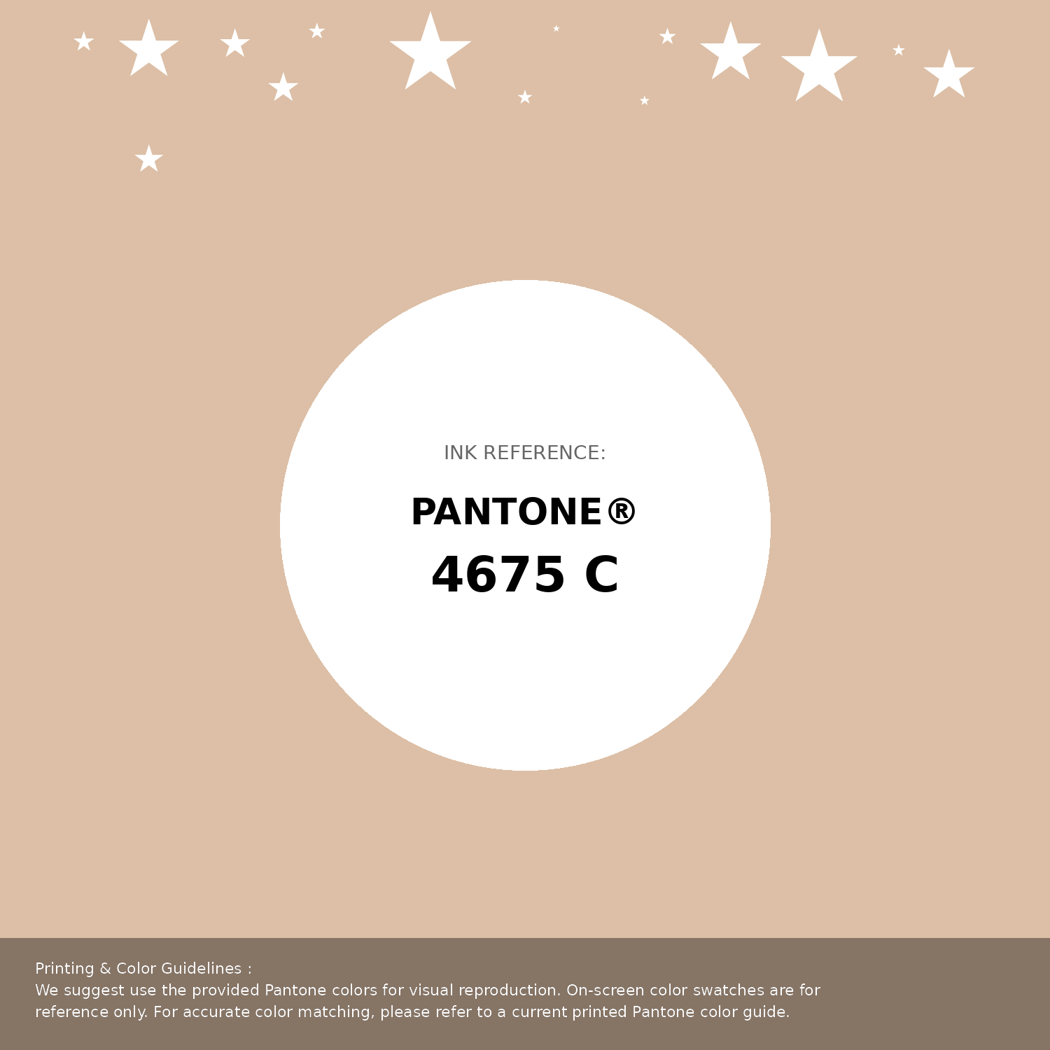
#dcbfa6 Pantone 4675 C Color | Hex color Code #dcbfa6 Pantone Swatch Artwork
Download Artwork Swatch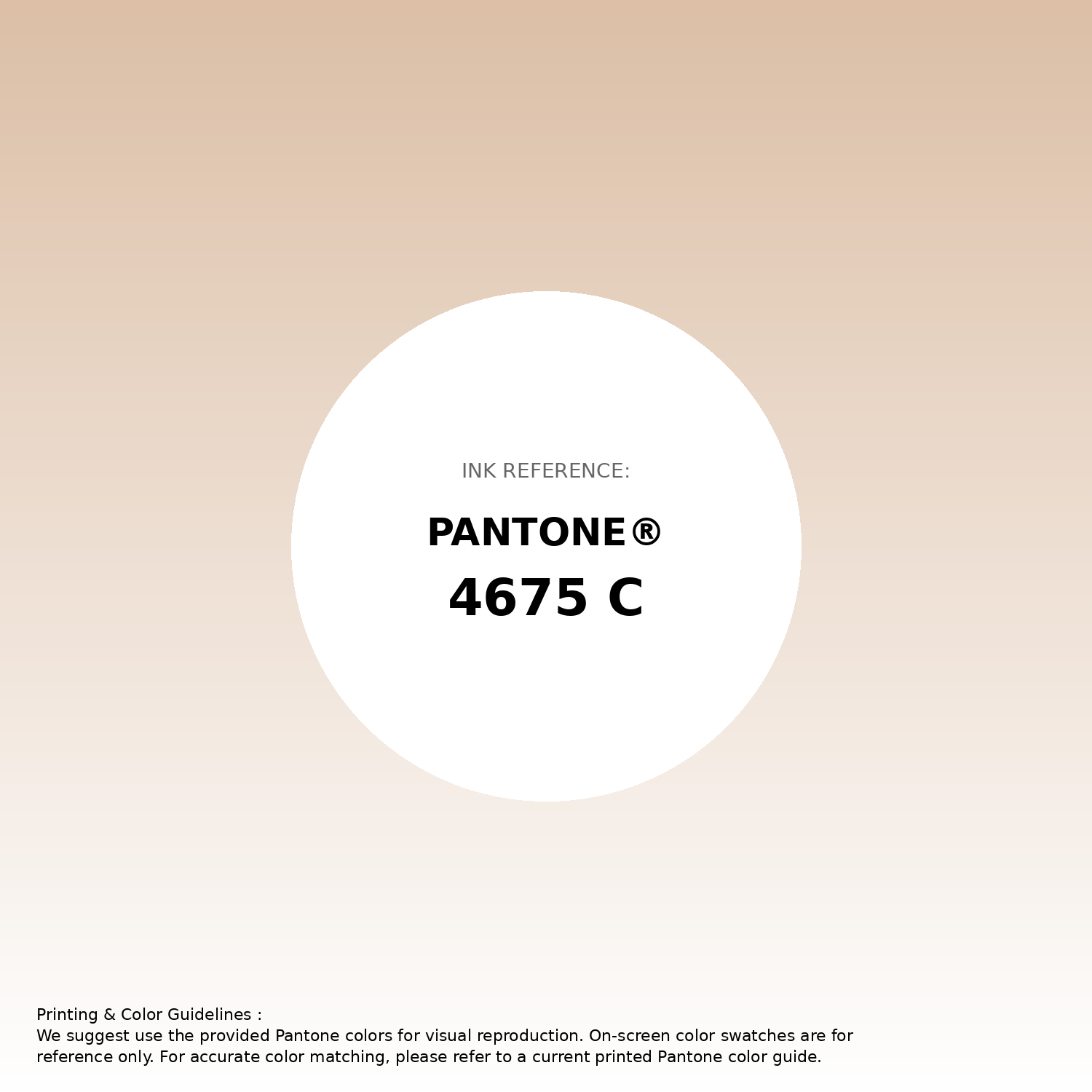
#dcbfa6 Pantone 4675 C Color | Hex color Code #dcbfa6 Gradient Artwork (PNG)
Download Gradient (PNG)#dcbfa6 Pantone 4675 C Color | Hex color Code #dcbfa6 Gradient Artwork (SVG)
Download Gradient (SVG)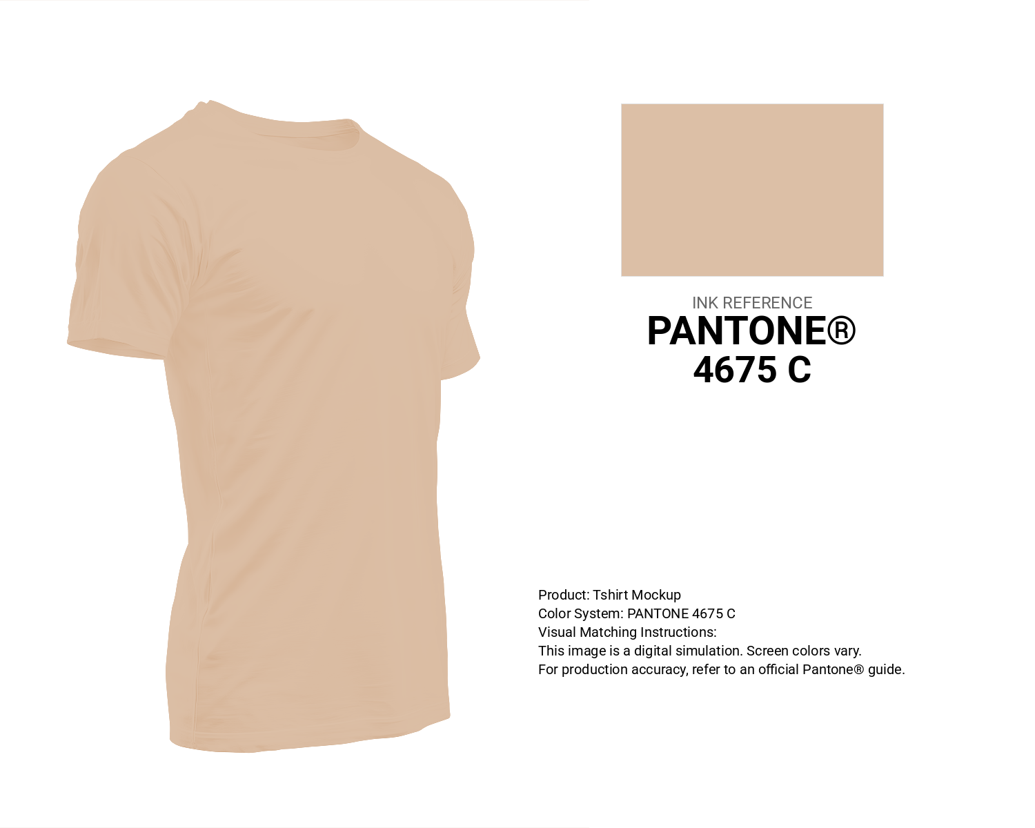
#dcbfa6 Pantone 4675 C Color | Hex color Code #dcbfa6 T-Shirt Mockup
Download T-Shirt Mockup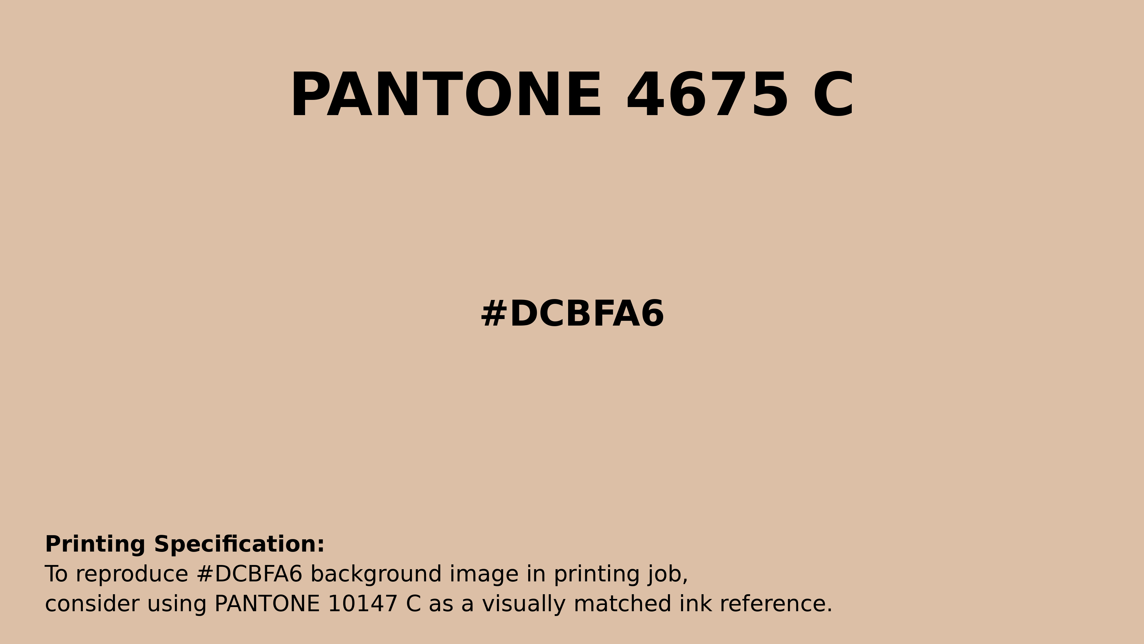
#dcbfa6 Pantone 4675 C Color | Hex color Code #dcbfa6 Printing Artwork Pantone Reference
Download Pantone Printing Reference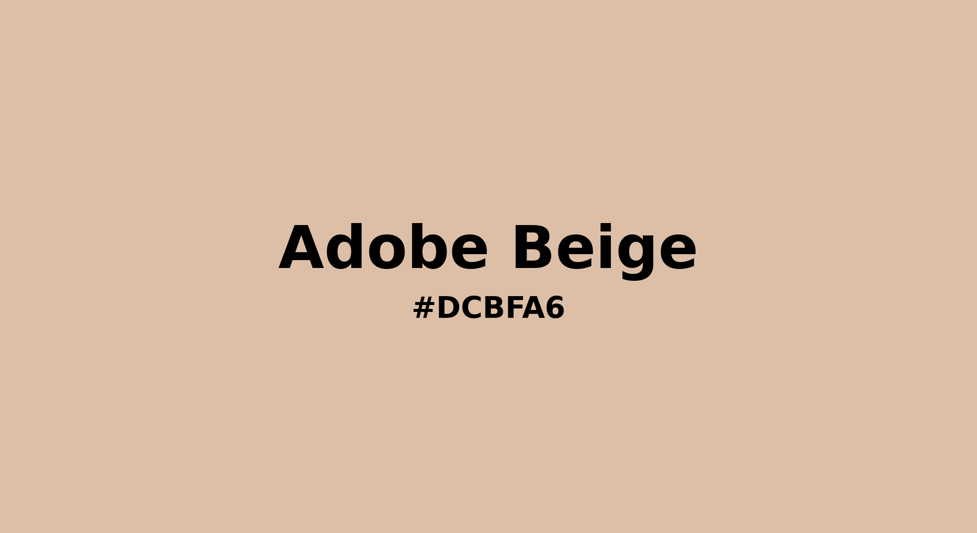
Adobe Beige - #dcbfa6 Color Name
Download Color NameRelated Color Palettes
- Hot Pink •
- Pale Violet Red and Light Pink •
- Deep Pink •
- Light Pink and Dim Gray •
- Careys Pink •
- Your Pink •
- Sweet Pink •
- Deep Pink and Tomato •
- Sea Pink •
- Deep Pink and Dark Slate Blue •
- Carnation Pink •
- Light Pink and Hot Pink •
- Deep Pink and Gold •
- Carousel Pink •
- Light Pink
Color Palette Collection
ADC Website Accents
1 color palettes with 5 colors.
Light color Palettes
9 color palettes with 45 colors.

Child Theme Colors
5 color palettes with 25 colors.
Yadunna
1 color palettes with 5 colors.