#DC582A Color
Your all-in-one color resource. Download hex background images, Adobe swatches (ASE), PDF color sheets, and SVG files. Explore palettes, harmonies, accessibility, conversions, and professional exports — designed for designers, developers, and color perfectionists.
This vibrant orange-red evokes a sense of warmth, energy, and passion. It's reminiscent of a fiery sunset, the glow of a summer bonfire, or the rich hues of autumn leaves. The color suggests excitement, enthusiasm, and a sense of urgency. It creates a dynamic and engaging atmosphere, perfect for spaces where creativity and activity thrive. In design, it could be used to highlight key elements or add a bold, attention-grabbing touch. It might also be associated with feelings of courage and determination. Visually matched named color: Sunset Ember.
PANTONE 7579 C
Choose Color
Selected Color
Recent Colors
Color Details
Similar Ink Alternatives for #DC582A color Alternative print inks for reproducing #DC582A background image with a similar visual appearance.
Disclaimer: The visually matched ink reference is an independent approximation intended as a guide only. Please be advised that this pantone colors is only intended as a guide, Actual colours will depend on screen calibration variances. The print ink suggestions provided are independent visual approximations and are not affiliated with or endorsed by Pantone LLC. For official color specifications, conversion factors, and comprehensive color system information, please visit Pantone Connect. Official Pantone products can be purchased at pantone.com.
Color Previews for #000000 See how this color looks as a background or as text.
Complete Guide to Your Color Laboratory
Everything you need to know about this professional color toolkit.
Use the Color Picker at the top to select any color. All modules below update instantly.
Workflow: Pick a color → Explore palettes & data → Download what you need (PDF, Image, or Adobe ASE).
Color Details — Your color in all formats: HEX, RGB, RGBA, HSL, HSLA, HSV, CMYK, CIELab, Hunter-Lab, XYZ, Yxy, YUV. One-click copy.
Color Psychology — Emotional impact, cultural meanings, physiological effects, branding applications, and historical significance.
Named Colors — Find official color names (HTML/CSS, Pantone) that match your selection with similarity percentages.
Light & Dark Shades
80-step gradient from black to white. Perfect for button states and component systems.
Tints
Color mixed with white → lighter, pastel variations for backgrounds and disabled states.
Monochromatic — 11 curated tints/shades from one color. Production-ready for design systems.
- Complementary — Opposite on wheel (180°). High contrast.
- Analogous — Neighbors (±30°). Harmonious flow.
- Triadic — Three colors (120° apart). Vibrant, balanced.
- Split-Complementary — Base + two near-complements. Softer contrast.
- Tetradic/Square — Four colors. Complex, maximum variety.
- Neutral — Desaturated versions. Subtle, sophisticated.
15 Professional Variations — Monochromatic, Analogous, Complementary, Warm/Cool/Earth Tones, Pastel, Vibrant, High Contrast, and more.
Color Infusion — 10 palettes showing your color morphing into each major hue. Find bridge colors.
Similar Colors — 60+ colors generated via CIELAB Delta E matching. Unexpected harmonious combinations.
18 Ready-to-Use Gradients — Complementary, Analogous, Triadic, Tint/Shade progressions, and more.
Downloads: PNG (2560×1440), CSS (production-ready code), SVG (scalable vector).
WCAG Contrast Checker — Tests your color against white, black, and custom colors for AA (4.5:1) and AAA (7:1) compliance. Large text thresholds included.
Harmony & Accessibility Guide — Tests against 10 canonical hues. Shows which pairs are both beautiful AND WCAG-compliant for text.
PNG/JPG — High-res images for presentations and mood boards.
PDF — Print-ready reports for clients and teams.
Adobe ASE — Direct import to Photoshop, Illustrator, InDesign, XD.
CSS/SVG — Gradients only. Production-ready code and vectors.
Color Science: Industry-standard conversions (HSL, CIELAB, CMYK, XYZ). WCAG 2.1 luminance formula. Delta E (ΔE76) for perceptual matching.
Direct Links: Share colors via icolorpalette.com/color/ff5733 or icolorpalette.com/color/red
Issues? Refresh the page, wait for rendering, try another browser, or check console (F12) for errors.
Printing Guide for #dc582a Background Image
Use PANTONE 7579 C as a visually matched ink reference when printing this background image.
To print the #dc582a background image from our site, consider using PANTONE 7579 C as a visually matched ink reference.
Download the background image, then provide this reference code to your print vendor to help achieve accurate color reproduction.
The visually matched ink reference for the #dc582a background image is PANTONE 7579 C.
This color is commonly described as Sunset Ember.
This vibrant orange-red evokes a sense of warmth, energy, and passion. It's reminiscent of a fiery sunset, the glow of a summer bonfire, or the rich hues of autumn leaves. The color suggests excitement, enthusiasm, and a sense of urgency. It creates a dynamic and engaging atmosphere, perfect for spaces where creativity and activity thrive. In design, it could be used to highlight key elements or add a bold, attention-grabbing touch. It might also be associated with feelings of courage and determination.
We provide PANTONE 7579 C as a visually matched ink reference to help you reproduce the #dc582a background image accurately in professional printing.
This reference code helps print vendors achieve consistent color output across different printing equipment and materials.
After downloading the #dc582a background image from our site:
- Include the visually matched ink reference PANTONE 7579 C in your print order notes
- Inform your print vendor that this is your target color reference
- Request a proof print to verify the Sunset Ember color appearance before full production
The #dc582a background image with PANTONE 7579 C as visually matched ink reference can be used for:
- Posters, banners, and backdrops
- Business cards, brochures, and flyers
- Packaging, labels, and stickers
- Signage and promotional materials
This is an independent visual approximation.
While PANTONE 7579 C closely matches the #dc582a background image color, variations may exist between screen display and printed output.
We recommend requesting a proof print to verify the final appearance.
This vibrant orange-red evokes a sense of warmth, energy, and passion. It's reminiscent of a fiery sunset, the glow of a summer bonfire, or the rich hues of autumn leaves. The color suggests excitement, enthusiasm, and a sense of urgency. It creates a dynamic and engaging atmosphere, perfect for spaces where creativity and activity thrive. In design, it could be used to highlight key elements or add a bold, attention-grabbing touch. It might also be associated with feelings of courage and determination.
Understanding these associations helps ensure the #dc582a background image aligns with your intended message and brand impact.
Important Information
The visually matched ink reference is an independent approximation intended as a guide only.
Actual printed colors may vary depending on screen calibration, substrate material, ink type, and printing equipment used.
For official color specifications and certified color standards, visit Pantone Connect.
Official color guides and swatch books can be purchased from pantone.com.
Pantone 7579 C Color: Vibrant Vermilion | #DC582A
Introduction:
Vibrant Vermilion (#DC582A) is an intense shade of red-orange that exudes energy and passion. Its vibrant and eye-catching nature makes it ideal for attracting attention and creating a bold visual impact.
Historical Significance:
Key Moments in History: Vibrant Vermilion has a rich historical significance and has been prominently used in various cultures throughout history. From ancient Chinese temples to Renaissance artwork, this color has played a significant role in religious and artistic expressions.
Medieval Heraldry: Vibrant Vermilion was a popular color in medieval heraldry, symbolizing bravery and courage. Knights and nobles often donned garments and shields adorned with this color to represent their strength and valor.
20th Century Art Movements: In the 20th century, Vibrant Vermilion gained popularity among artists associated with abstract expressionism and pop art. Artists such as Mark Rothko and Andy Warhol incorporated this color into their works to create bold and dynamic compositions.
Symbolism and Meaning:
Passion and Energy: Vibrant Vermilion symbolizes passion, energy, and intense emotions. It is often associated with vitality, determination, and a zest for life. In some cultures, it is believed to be an auspicious color that brings good luck and prosperity.
Cultural Variations: While Vibrant Vermilion generally represents positive attributes, its symbolism may vary across different cultures. In some Eastern cultures, it is associated with celebrations and joy, while in others, it may symbolize warning or danger.
Vibrant Vermilion in Fashion:
Impact on Styles and Trends: Vibrant Vermilion has been a popular color in fashion, particularly in high-energy and statement-making garments. It adds a bold and captivating element to designs, whether used in full ensembles or as accents. It is often seen on runways during the spring and summer seasons, adding a vibrant and lively touch to collections.
Vibrant Vermilion in Graphic Design:
Design Aesthetics and Branding: Vibrant Vermilion is a powerful color choice in graphic design. Its intense hue commands attention and adds a sense of excitement and urgency to designs. It is often used to create eye-catching logos, advertisements, and promotional materials for brands that want to make a strong visual impact.
Color Combinations:
Potential Color Combinations: Vibrant Vermilion pairs well with complementary colors such as navy blue and emerald green, creating a striking contrast. It can also be combined with warm neutrals like beige or tan for a more subdued yet elegant look. Additionally, it can be paired with other vibrant shades, such as sunny yellow or electric blue, to create a visually stimulating and energetic color palette.
Nature’s Palette:
Natural Occurrences: Vibrant Vermilion can be found in nature in various forms. It appears in the fiery hues of autumn leaves, the vibrant petals of flowers like poppies and tulips, and in the striking feathers of tropical birds such as Scarlet Macaws. Its presence in nature often conveys energy, excitement, and intensity.
Artistic Representations:
Historical Artworks: Vibrant Vermilion has been a popular color choice in art throughout history. It has been used by renowned artists such as Vincent van Gogh and Henri Matisse to convey passion and intensity in their masterpieces. Its bold and vibrant nature adds depth and emotional impact to works of art.
Movies and Cinematic Landscapes:
Setting the Tone: Vibrant Vermilion is often used in movies and cinematic landscapes to evoke specific moods or atmospheres. It can be seen in scenes depicting passion, danger, or excitement. The color's intensity adds a visually striking element to films and helps convey the emotions and themes being portrayed.
Products and Commercial Appeal:
Popular Products and Brands: Vibrant Vermilion is often associated with products and brands that aim to make a bold statement. From sports brands to energy drinks, this color is frequently used to convey energy, passion, and excitement. It is often found in packaging, logos, and advertisements of products targeting youthful and dynamic audiences.
National Symbols and Significance:
Cultural and National Significance: Vibrant Vermilion holds significant cultural meanings in various countries. In Chinese culture, it is associated with celebration, luck, and happiness. In Hinduism, it is a sacred color symbolizing purity and spirituality. It is also a prominent color in the Mexican holiday of Day of the Dead, representing vitality and remembrance.
The Psychological and Emotional Impact:
Emotional Influence: Vibrant Vermilion can evoke strong emotions and stimulate the senses. It is often associated with feelings of excitement, passion, and intensity. However, its impact may vary from person to person, as individual associations and experiences can influence the emotional response to the color.
Conclusion:
Vibrant Vermilion (#DC582A) encompasses a deep historical and cultural significance, symbolizing passion, energy, and intensity. Its presence can be found in various fields, including fashion, graphic design, art, and cinema. Whether used in vibrant combinations or as a standalone color, Vibrant Vermilion captivates attention and leaves a lasting impact.
Pantone 7579 C Color | Hex color Code #dc582a Image & Artwork
Download high-quality assets for your projects.

#dc582a Color Schemes
Download Color Schemes
#dc582a Color Shades
Download Color Shades
Pantone 7579 C Color | Hex color Code #dc582a Solid Color Background
Download Solid Color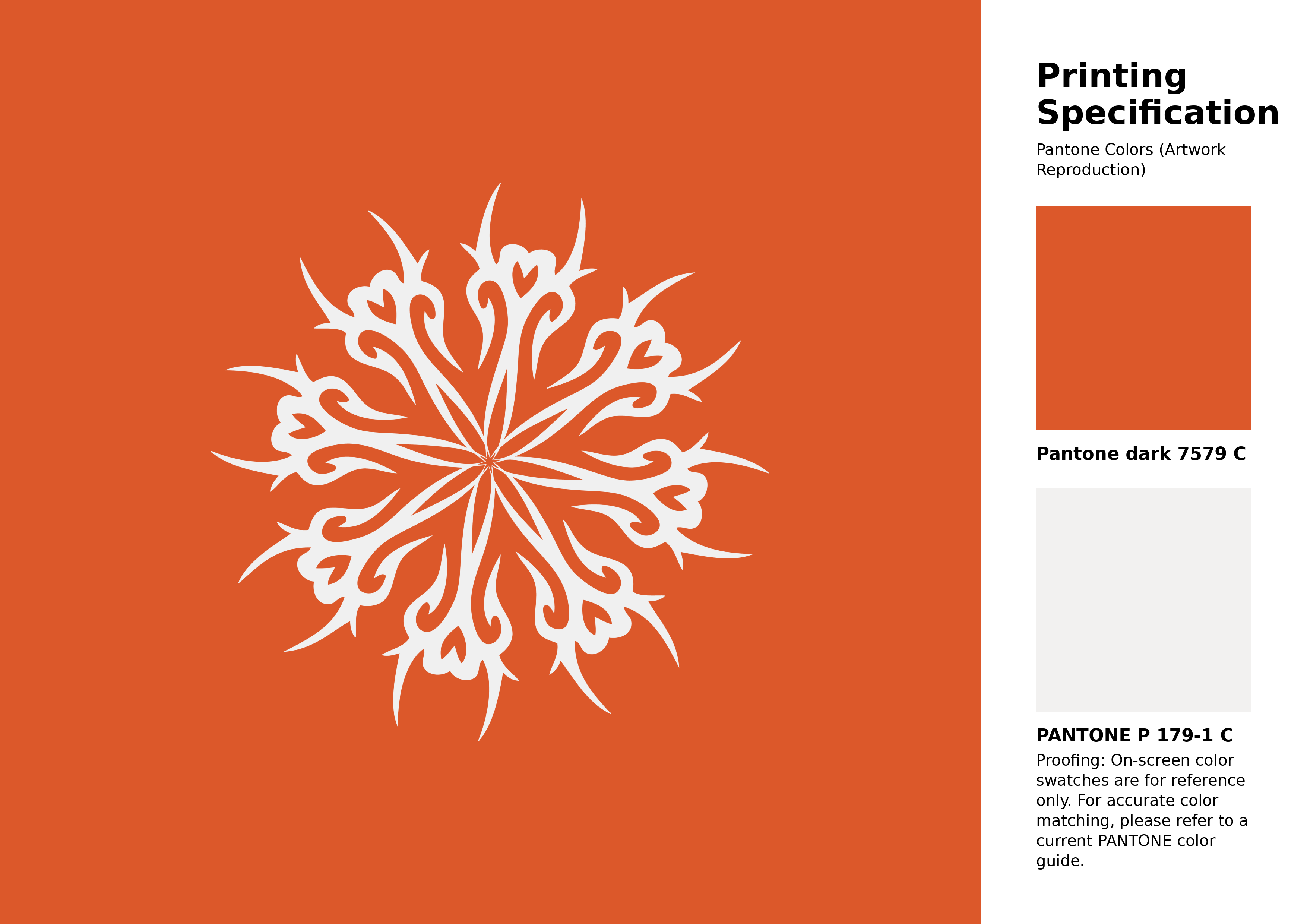
#dc582a Pantone 7579 C Color | Hex color Code #dc582a Artwork Image (PNG)
Download Artwork (PNG)#dc582a Pantone 7579 C Color | Hex color Code #dc582a Artwork Vector (PDF)
Download Artwork (PDF)#dc582a Pantone 7579 C Color | Hex color Code #dc582a Artwork Vector (SVG)
Download Artwork (SVG)
#dc582a Pantone 7579 C Color | Hex color Code #dc582a Pantone Swatch Artwork
Download Artwork Swatch
#dc582a Pantone 7579 C Color | Hex color Code #dc582a Gradient Artwork (PNG)
Download Gradient (PNG)#dc582a Pantone 7579 C Color | Hex color Code #dc582a Gradient Artwork (SVG)
Download Gradient (SVG)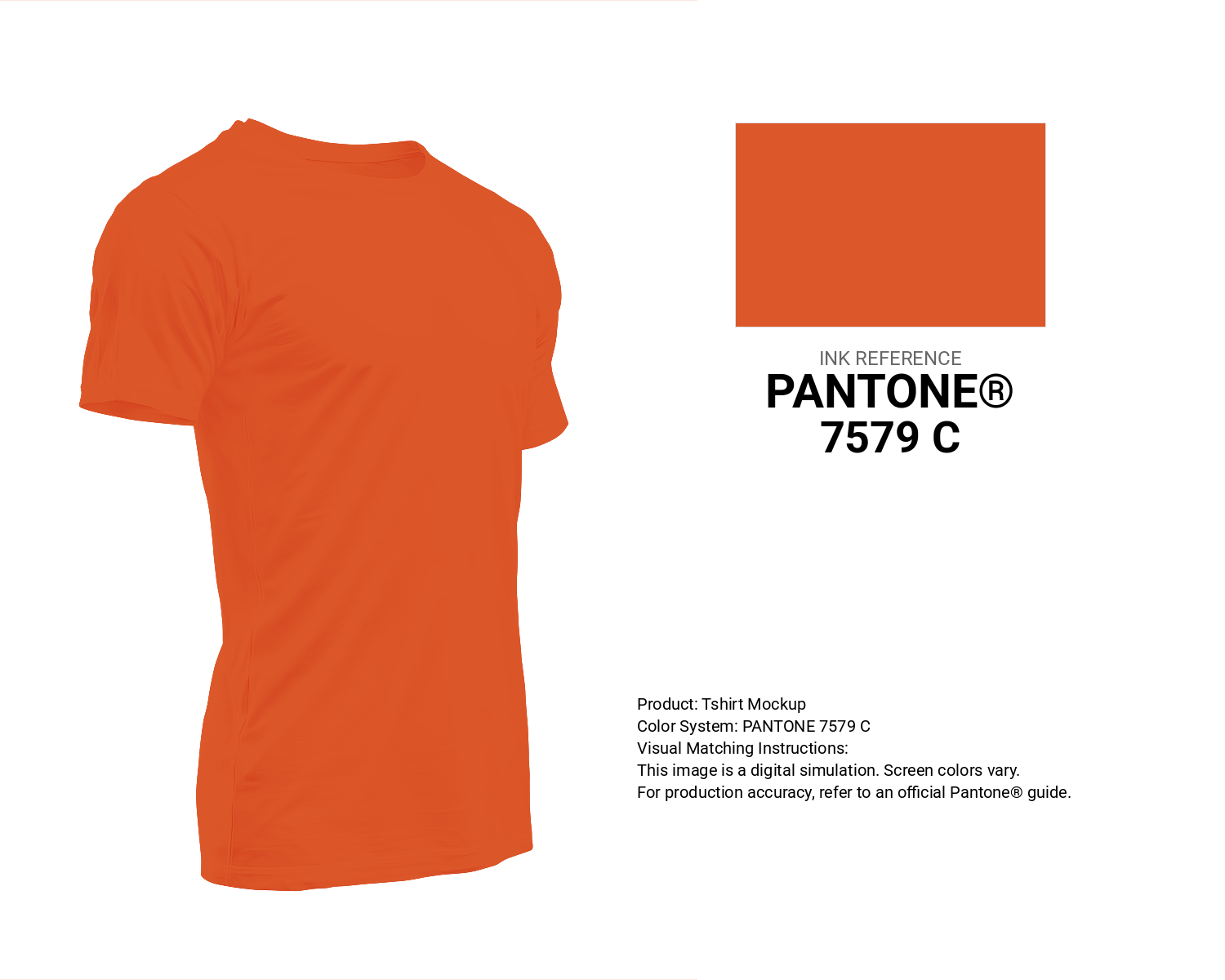
#dc582a Pantone 7579 C Color | Hex color Code #dc582a T-Shirt Mockup
Download T-Shirt Mockup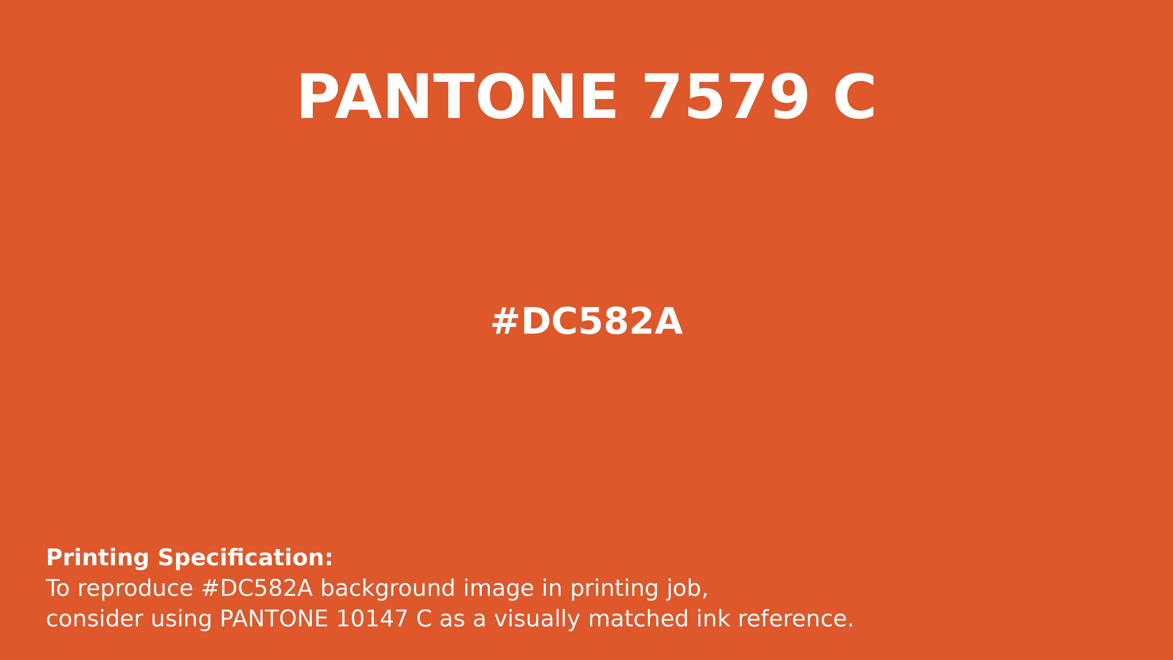
#dc582a Pantone 7579 C Color | Hex color Code #dc582a Printing Artwork Pantone Reference
Download Pantone Printing ReferenceRelated Color Palettes
- Olive and Orange •
- Dim Gray and Dark Orange •
- OrangeRed and Midnight Blue •
- Dark Green and OrangeRed •
- OrangeRed and Saddle Brown •
- Web Orange •
- Dark Red and OrangeRed •
- Tomato and Orange •
- Khaki and Orange •
- OrangeRed •
- OrangeRed and Dark Sea Green •
- Maroon and Dark Orange •
- OrangeRed and Dark Khaki •
- Dark Orange and Dark Orange •
- Beige and Orange
Color Palette Collection

32 Sky Color Schemes
32 color palettes with 160 colors.

81 Pink color palettes
81 color palettes with 405 colors.
Summer Beach Vibes
1 color palettes with 5 colors.

50 Red color palettes
50 color palettes with 250 colors.