#DBD9CE Color
Your all-in-one color resource. Download hex background images, Adobe swatches (ASE), PDF color sheets, and SVG files. Explore palettes, harmonies, accessibility, conversions, and professional exports — designed for designers, developers, and color perfectionists.
This muted, off-white embodies a sense of quiet sophistication and timelessness. It evokes feelings of peacefulness, neutrality, and a subtle elegance, like aged paper or a cloudy sky. It reminds one of libraries, historical documents, and the comfort of familiar spaces. This color sets a calm, understated mood, making it suitable for minimalist designs, backgrounds, and branding that aims for a refined, classic aesthetic. Its culturally associated with purity, peace, and wisdom. Visually matched named color: Clouded Parchment.
PANTONE 12-0404 TPX
Choose Color
Selected Color
Recent Colors
Color Details
Similar Ink Alternatives for #DBD9CE color Alternative print inks for reproducing #DBD9CE background image with a similar visual appearance.
Disclaimer: The visually matched ink reference is an independent approximation intended as a guide only. Please be advised that this pantone colors is only intended as a guide, Actual colours will depend on screen calibration variances. The print ink suggestions provided are independent visual approximations and are not affiliated with or endorsed by Pantone LLC. For official color specifications, conversion factors, and comprehensive color system information, please visit Pantone Connect. Official Pantone products can be purchased at pantone.com.
Color Previews for #000000 See how this color looks as a background or as text.
Complete Guide to Your Color Laboratory
Everything you need to know about this professional color toolkit.
Use the Color Picker at the top to select any color. All modules below update instantly.
Workflow: Pick a color → Explore palettes & data → Download what you need (PDF, Image, or Adobe ASE).
Color Details — Your color in all formats: HEX, RGB, RGBA, HSL, HSLA, HSV, CMYK, CIELab, Hunter-Lab, XYZ, Yxy, YUV. One-click copy.
Color Psychology — Emotional impact, cultural meanings, physiological effects, branding applications, and historical significance.
Named Colors — Find official color names (HTML/CSS, Pantone) that match your selection with similarity percentages.
Light & Dark Shades
80-step gradient from black to white. Perfect for button states and component systems.
Tints
Color mixed with white → lighter, pastel variations for backgrounds and disabled states.
Monochromatic — 11 curated tints/shades from one color. Production-ready for design systems.
- Complementary — Opposite on wheel (180°). High contrast.
- Analogous — Neighbors (±30°). Harmonious flow.
- Triadic — Three colors (120° apart). Vibrant, balanced.
- Split-Complementary — Base + two near-complements. Softer contrast.
- Tetradic/Square — Four colors. Complex, maximum variety.
- Neutral — Desaturated versions. Subtle, sophisticated.
15 Professional Variations — Monochromatic, Analogous, Complementary, Warm/Cool/Earth Tones, Pastel, Vibrant, High Contrast, and more.
Color Infusion — 10 palettes showing your color morphing into each major hue. Find bridge colors.
Similar Colors — 60+ colors generated via CIELAB Delta E matching. Unexpected harmonious combinations.
18 Ready-to-Use Gradients — Complementary, Analogous, Triadic, Tint/Shade progressions, and more.
Downloads: PNG (2560×1440), CSS (production-ready code), SVG (scalable vector).
WCAG Contrast Checker — Tests your color against white, black, and custom colors for AA (4.5:1) and AAA (7:1) compliance. Large text thresholds included.
Harmony & Accessibility Guide — Tests against 10 canonical hues. Shows which pairs are both beautiful AND WCAG-compliant for text.
PNG/JPG — High-res images for presentations and mood boards.
PDF — Print-ready reports for clients and teams.
Adobe ASE — Direct import to Photoshop, Illustrator, InDesign, XD.
CSS/SVG — Gradients only. Production-ready code and vectors.
Color Science: Industry-standard conversions (HSL, CIELAB, CMYK, XYZ). WCAG 2.1 luminance formula. Delta E (ΔE76) for perceptual matching.
Direct Links: Share colors via icolorpalette.com/color/ff5733 or icolorpalette.com/color/red
Issues? Refresh the page, wait for rendering, try another browser, or check console (F12) for errors.
Printing Guide for #dbd9ce Background Image
Use PANTONE 12-0404 TPX as a visually matched ink reference when printing this background image.
To print the #dbd9ce background image from our site, consider using PANTONE 12-0404 TPX as a visually matched ink reference.
Download the background image, then provide this reference code to your print vendor to help achieve accurate color reproduction.
The visually matched ink reference for the #dbd9ce background image is PANTONE 12-0404 TPX.
This color is commonly described as Clouded Parchment.
This muted, off-white embodies a sense of quiet sophistication and timelessness. It evokes feelings of peacefulness, neutrality, and a subtle elegance, like aged paper or a cloudy sky. It reminds one of libraries, historical documents, and the comfort of familiar spaces. This color sets a calm, understated mood, making it suitable for minimalist designs, backgrounds, and branding that aims for a refined, classic aesthetic. Its culturally associated with purity, peace, and wisdom.
We provide PANTONE 12-0404 TPX as a visually matched ink reference to help you reproduce the #dbd9ce background image accurately in professional printing.
This reference code helps print vendors achieve consistent color output across different printing equipment and materials.
After downloading the #dbd9ce background image from our site:
- Include the visually matched ink reference PANTONE 12-0404 TPX in your print order notes
- Inform your print vendor that this is your target color reference
- Request a proof print to verify the Clouded Parchment color appearance before full production
The #dbd9ce background image with PANTONE 12-0404 TPX as visually matched ink reference can be used for:
- Posters, banners, and backdrops
- Business cards, brochures, and flyers
- Packaging, labels, and stickers
- Signage and promotional materials
This is an independent visual approximation.
While PANTONE 12-0404 TPX closely matches the #dbd9ce background image color, variations may exist between screen display and printed output.
We recommend requesting a proof print to verify the final appearance.
This muted, off-white embodies a sense of quiet sophistication and timelessness. It evokes feelings of peacefulness, neutrality, and a subtle elegance, like aged paper or a cloudy sky. It reminds one of libraries, historical documents, and the comfort of familiar spaces. This color sets a calm, understated mood, making it suitable for minimalist designs, backgrounds, and branding that aims for a refined, classic aesthetic. Its culturally associated with purity, peace, and wisdom.
Understanding these associations helps ensure the #dbd9ce background image aligns with your intended message and brand impact.
Important Information
The visually matched ink reference is an independent approximation intended as a guide only.
Actual printed colors may vary depending on screen calibration, substrate material, ink type, and printing equipment used.
For official color specifications and certified color standards, visit Pantone Connect.
Official color guides and swatch books can be purchased from pantone.com.
Pantone 12-0404 Tpx Light Gray Color: A Soothing Neutral Shade | #DBD9CE
Introduction:
Light Gray is a color that exudes calmness, tranquility, and neutrality. It is a versatile shade that can be used in various contexts, representing sophistication and timelessness in its visual appeal.
Historical Significance:
Early Usage: Light Gray has been used throughout history in architecture and interior design to create elegant and understated spaces. It became popular in the Renaissance period for its ability to evoke a sense of balance and harmony.
Industrial Revolution: During the Industrial Revolution, Light Gray became associated with machinery and urbanization, symbolizing progress and modernity.
Contemporary Influence: In recent decades, Light Gray has gained popularity in minimalist and Scandinavian design movements for its clean and understated aesthetic.
Symbolism and Meaning:
Neutrality: Light Gray is often associated with neutrality, representing impartiality and balance. It can be used to bring a sense of calmness and harmony to any visual composition.
Simplicity: Light Gray symbolizes simplicity and minimalism. It enhances the visual impact of other colors and elements, allowing them to stand out.
Light Gray in Fashion:
Elegant Simplicity: Light Gray is a staple color in fashion, particularly in formal attire. It embodies elegance, sophistication, and simplicity, making it a versatile choice for various occasions and seasons.
Neutral Base: Light Gray serves as a neutral base color in fashion, allowing vibrant or contrasting colors to take center stage.
Light Gray in Graphic Design:
Versatile Use: Light Gray is widely used in graphic design due to its versatility. It provides a clean and sophisticated backdrop for other design elements and allows them to communicate effectively.
Branding: Many brands use Light Gray in their logos and visual identities to convey professionalism, elegance, and a timeless appeal.
Color Combinations:
Monochromatic Harmony: Light Gray can be paired with various shades of gray to create a monochromatic color scheme that is soothing to the eye.
Contrasting Accents: Light Gray can be combined with vibrant colors like red, yellow, or teal to create striking visual contrasts.
Nature’s Palette:
Natural Stone: Light Gray is reminiscent of natural stones like granite or marble, which can be found in various landscapes.
Cloudy Skies: Light Gray represents the soft hues of cloudy skies, creating a calming and serene atmosphere.
Artistic Representations:
Minimalism: Light Gray has been used in minimalistic art forms to convey simplicity and emphasize the subject matter.
Abstract Interpretations: Artists often incorporate Light Gray in abstract compositions to evoke a sense of depth and subtlety.
Movies and Cinematic Landscapes:
Nostalgic Atmosphere: Light Gray is often used in movies to create a nostalgic ambiance, particularly in period pieces or scenes set in the past.
Urban Environments: Light Gray is frequently seen in cinematic landscapes depicting urban environments, symbolizing the modern and industrialized world.
Products and Commercial Appeal:
Technology: Many technology products and brands incorporate Light Gray in their designs to convey a sleek and modern aesthetic.
Luxury Brands: Light Gray is often associated with luxury and sophistication, making it a popular choice for high-end products and brands.
National Symbols and Significance:
Flag Colors: Light Gray is not commonly associated with any specific national symbols or significance.
Cultural Ties: In certain cultures, Light Gray may be associated with specific meanings or symbolism, such as modesty or simplicity.
The Psychological and Emotional Impact:
Calming Effect: Light Gray has a calming effect on the mind and is often used in therapeutic environments to promote relaxation.
Impartiality: Light Gray evokes a sense of impartiality and neutrality, making it suitable for situations where objectivity is desired.
Conclusion:
In conclusion, Light Gray, also known as Pantone 12-0404 Tpx, is a versatile color that represents calmness, elegance, and simplicity. Its historical significance, timeless appeal, and neutral nature make it a favorite choice in various industries, including fashion, graphic design, and commercial products. Light Gray's ability to evoke emotions, create visual harmony, and its associations with natural and artistic elements further enhance its relevance and popularity.
Pantone 12-0404 Tpx Light Gray Color | Hex color Code #dbd9ce Image & Artwork
Download high-quality assets for your projects.

#dbd9ce Color Schemes
Download Color Schemes
#dbd9ce Color Shades
Download Color Shades
Pantone 12-0404 Tpx Light Gray Color | Hex color Code #dbd9ce Solid Color Background
Download Solid Color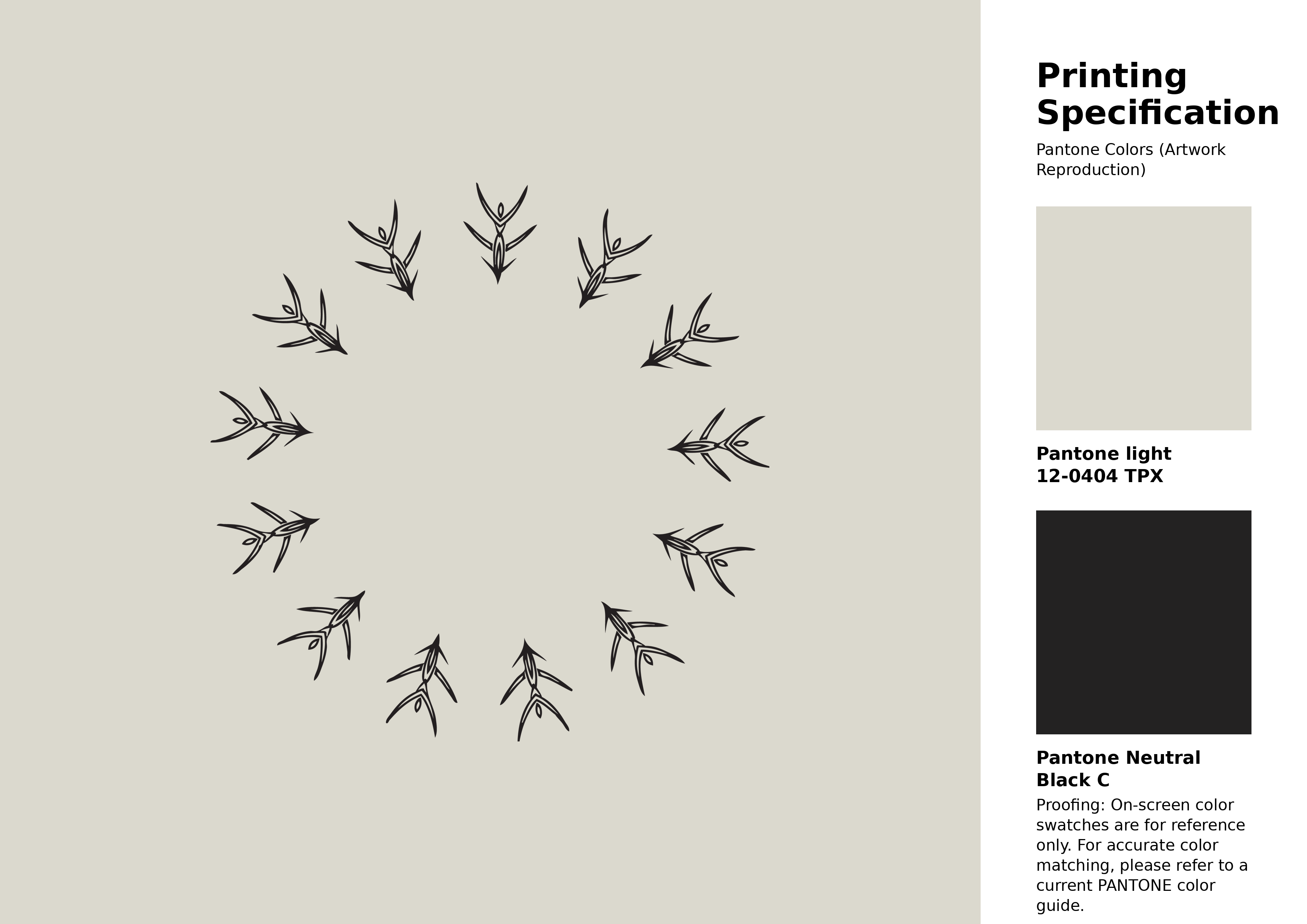
#dbd9ce Pantone 12-0404 Tpx Light Gray Color | Hex color Code #dbd9ce Artwork Image (PNG)
Download Artwork (PNG)#dbd9ce Pantone 12-0404 Tpx Light Gray Color | Hex color Code #dbd9ce Artwork Vector (PDF)
Download Artwork (PDF)#dbd9ce Pantone 12-0404 Tpx Light Gray Color | Hex color Code #dbd9ce Artwork Vector (SVG)
Download Artwork (SVG)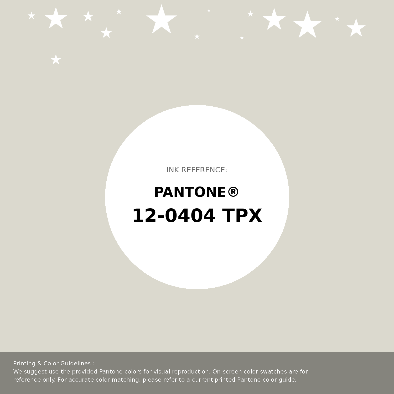
#dbd9ce Pantone 12-0404 Tpx Light Gray Color | Hex color Code #dbd9ce Pantone Swatch Artwork
Download Artwork Swatch
#dbd9ce Pantone 12-0404 Tpx Light Gray Color | Hex color Code #dbd9ce Gradient Artwork (PNG)
Download Gradient (PNG)#dbd9ce Pantone 12-0404 Tpx Light Gray Color | Hex color Code #dbd9ce Gradient Artwork (SVG)
Download Gradient (SVG)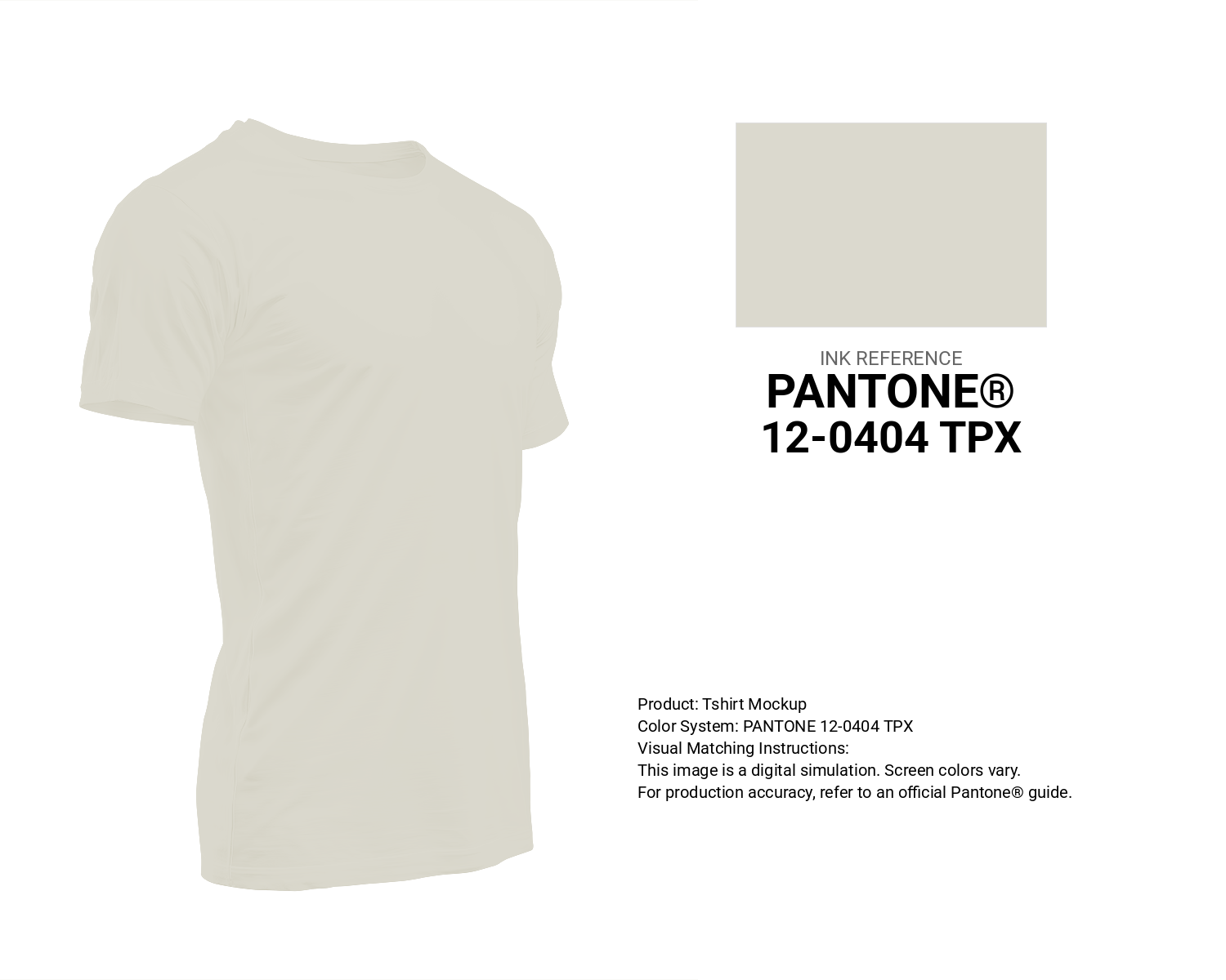
#dbd9ce Pantone 12-0404 Tpx Light Gray Color | Hex color Code #dbd9ce T-Shirt Mockup
Download T-Shirt Mockup
#dbd9ce Pantone 12-0404 Tpx Light Gray Color | Hex color Code #dbd9ce Printing Artwork Pantone Reference
Download Pantone Printing ReferenceRelated Color Palettes
- Beige and Salmon •
- Midnight Blue and Beige •
- Beige and Light Steel Blue •
- SkyBlue and Beige •
- Beige and Cadet Blue •
- Beige and Pale Violet Red •
- Beige and Dark Goldenrod •
- Light Slate Gray and Beige •
- Silver and Beige •
- Beige and Linen •
- Beige and White Smoke •
- Beige and Chocolate •
- Dark Slate Gray and Beige •
- Beige and Steel Blue •
- Beige and Dark Green
Color Palette Collection
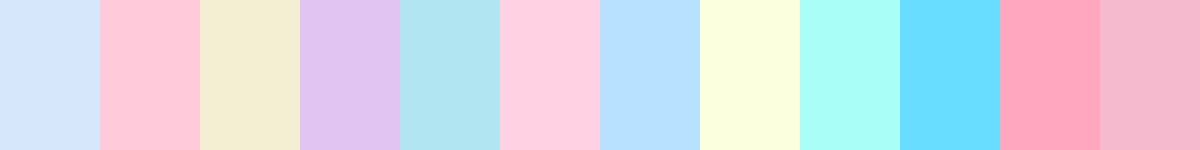
80 Pastel Light color Palettes
80 color palettes with 400 colors.

Light Blue Palettes to Enhance Your Design
13 color palettes with 65 colors.
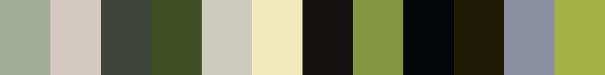
Forest Theme colors
15 color palettes with 75 colors.
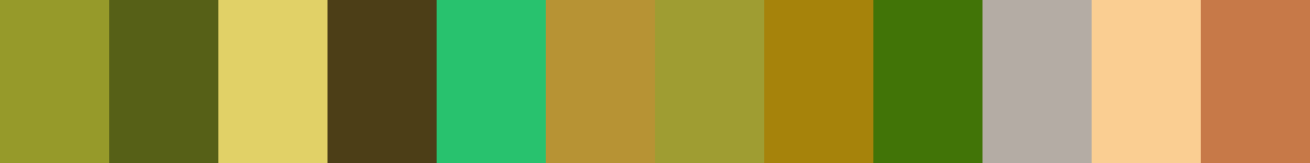
33 Nature Inspired Color Schemes
33 color palettes with 165 colors.