#DBC8B6 Color
Your all-in-one color resource. Download hex background images, Adobe swatches (ASE), PDF color sheets, and SVG files. Explore palettes, harmonies, accessibility, conversions, and professional exports — designed for designers, developers, and color perfectionists.
This muted, peachy-beige hue evokes a sense of gentle warmth and tranquility. It's reminiscent of a sun-drenched summer afternoon, or the soft glow of a setting sun. The color palette hints at a comforting atmosphere, suggesting feelings of nostalgia, security, and contentment. It creates a relaxed and inviting mood, perfect for living rooms, bedrooms, or spaces meant to promote calm reflection. In design, it could be used to create a cozy and inviting ambiance, reminiscent of a rustic or cottagecore aesthetic. Notably, this color palette avoids the harshness of brighter tones, appealing to those who prefer a subdued and serene aesthetic. Visually matched named color: Warm Sunset.
PANTONE 482 C
Choose Color
Selected Color
Recent Colors
Color Details
Similar Ink Alternatives for #DBC8B6 color Alternative print inks for reproducing #DBC8B6 background image with a similar visual appearance.
Disclaimer: The visually matched ink reference is an independent approximation intended as a guide only. Please be advised that this pantone colors is only intended as a guide, Actual colours will depend on screen calibration variances. The print ink suggestions provided are independent visual approximations and are not affiliated with or endorsed by Pantone LLC. For official color specifications, conversion factors, and comprehensive color system information, please visit Pantone Connect. Official Pantone products can be purchased at pantone.com.
Color Previews for #000000 See how this color looks as a background or as text.
Complete Guide to Your Color Laboratory
Everything you need to know about this professional color toolkit.
Use the Color Picker at the top to select any color. All modules below update instantly.
Workflow: Pick a color → Explore palettes & data → Download what you need (PDF, Image, or Adobe ASE).
Color Details — Your color in all formats: HEX, RGB, RGBA, HSL, HSLA, HSV, CMYK, CIELab, Hunter-Lab, XYZ, Yxy, YUV. One-click copy.
Color Psychology — Emotional impact, cultural meanings, physiological effects, branding applications, and historical significance.
Named Colors — Find official color names (HTML/CSS, Pantone) that match your selection with similarity percentages.
Light & Dark Shades
80-step gradient from black to white. Perfect for button states and component systems.
Tints
Color mixed with white → lighter, pastel variations for backgrounds and disabled states.
Monochromatic — 11 curated tints/shades from one color. Production-ready for design systems.
- Complementary — Opposite on wheel (180°). High contrast.
- Analogous — Neighbors (±30°). Harmonious flow.
- Triadic — Three colors (120° apart). Vibrant, balanced.
- Split-Complementary — Base + two near-complements. Softer contrast.
- Tetradic/Square — Four colors. Complex, maximum variety.
- Neutral — Desaturated versions. Subtle, sophisticated.
15 Professional Variations — Monochromatic, Analogous, Complementary, Warm/Cool/Earth Tones, Pastel, Vibrant, High Contrast, and more.
Color Infusion — 10 palettes showing your color morphing into each major hue. Find bridge colors.
Similar Colors — 60+ colors generated via CIELAB Delta E matching. Unexpected harmonious combinations.
18 Ready-to-Use Gradients — Complementary, Analogous, Triadic, Tint/Shade progressions, and more.
Downloads: PNG (2560×1440), CSS (production-ready code), SVG (scalable vector).
WCAG Contrast Checker — Tests your color against white, black, and custom colors for AA (4.5:1) and AAA (7:1) compliance. Large text thresholds included.
Harmony & Accessibility Guide — Tests against 10 canonical hues. Shows which pairs are both beautiful AND WCAG-compliant for text.
PNG/JPG — High-res images for presentations and mood boards.
PDF — Print-ready reports for clients and teams.
Adobe ASE — Direct import to Photoshop, Illustrator, InDesign, XD.
CSS/SVG — Gradients only. Production-ready code and vectors.
Color Science: Industry-standard conversions (HSL, CIELAB, CMYK, XYZ). WCAG 2.1 luminance formula. Delta E (ΔE76) for perceptual matching.
Direct Links: Share colors via icolorpalette.com/color/ff5733 or icolorpalette.com/color/red
Issues? Refresh the page, wait for rendering, try another browser, or check console (F12) for errors.
Printing Guide for #dbc8b6 Background Image
Use PANTONE 482 C as a visually matched ink reference when printing this background image.
To print the #dbc8b6 background image from our site, consider using PANTONE 482 C as a visually matched ink reference.
Download the background image, then provide this reference code to your print vendor to help achieve accurate color reproduction.
The visually matched ink reference for the #dbc8b6 background image is PANTONE 482 C.
This color is commonly described as Warm Sunset.
This muted, peachy-beige hue evokes a sense of gentle warmth and tranquility. It's reminiscent of a sun-drenched summer afternoon, or the soft glow of a setting sun. The color palette hints at a comforting atmosphere, suggesting feelings of nostalgia, security, and contentment. It creates a relaxed and inviting mood, perfect for living rooms, bedrooms, or spaces meant to promote calm reflection. In design, it could be used to create a cozy and inviting ambiance, reminiscent of a rustic or cottagecore aesthetic. Notably, this color palette avoids the harshness of brighter tones, appealing to those who prefer a subdued and serene aesthetic.
We provide PANTONE 482 C as a visually matched ink reference to help you reproduce the #dbc8b6 background image accurately in professional printing.
This reference code helps print vendors achieve consistent color output across different printing equipment and materials.
After downloading the #dbc8b6 background image from our site:
- Include the visually matched ink reference PANTONE 482 C in your print order notes
- Inform your print vendor that this is your target color reference
- Request a proof print to verify the Warm Sunset color appearance before full production
The #dbc8b6 background image with PANTONE 482 C as visually matched ink reference can be used for:
- Posters, banners, and backdrops
- Business cards, brochures, and flyers
- Packaging, labels, and stickers
- Signage and promotional materials
This is an independent visual approximation.
While PANTONE 482 C closely matches the #dbc8b6 background image color, variations may exist between screen display and printed output.
We recommend requesting a proof print to verify the final appearance.
This muted, peachy-beige hue evokes a sense of gentle warmth and tranquility. It's reminiscent of a sun-drenched summer afternoon, or the soft glow of a setting sun. The color palette hints at a comforting atmosphere, suggesting feelings of nostalgia, security, and contentment. It creates a relaxed and inviting mood, perfect for living rooms, bedrooms, or spaces meant to promote calm reflection. In design, it could be used to create a cozy and inviting ambiance, reminiscent of a rustic or cottagecore aesthetic. Notably, this color palette avoids the harshness of brighter tones, appealing to those who prefer a subdued and serene aesthetic.
Understanding these associations helps ensure the #dbc8b6 background image aligns with your intended message and brand impact.
Important Information
The visually matched ink reference is an independent approximation intended as a guide only.
Actual printed colors may vary depending on screen calibration, substrate material, ink type, and printing equipment used.
For official color specifications and certified color standards, visit Pantone Connect.
Official color guides and swatch books can be purchased from pantone.com.
Pantone 482 C Color: Subtle Sand | #DBC8B6
Introduction:
Subtle Sand is a warm and earthy color that exudes a sense of calmness and stability. Its muted tone evokes a feeling of tranquility and sophistication, making it a versatile choice in various design applications.
Historical Significance:
During the mid-20th century, Subtle Sand gained popularity in fashion and interior design. Its neutral and effortlessly elegant nature made it a staple in many modernist movements and minimalist aesthetics. It became a popular choice for creating timeless and sophisticated looks.
Symbolism and Meaning:
Subtle Sand typically symbolizes warmth, comfort, and grounding. It represents stability and reliability, making it a popular choice in branding and design to convey a sense of trust and dependability.
Subtle Sand in Fashion:
Subtle Sand has been embraced by the fashion industry as a versatile neutral. It is often used in both casual and formal attire, adding a touch of elegance and sophistication to any outfit. It pairs well with a wide range of colors and complements both warm and cool tones.
Subtle Sand in Graphic Design:
In graphic design, Subtle Sand is valued for its ability to create balance and harmony. Its neutral and warm undertones make it a popular choice for creating elegant and timeless designs. It can be used as a background color or in combination with bolder hues to create contrast and visual impact.
Color Combinations:
Subtle Sand pairs well with a range of colors, including warm neutrals like beige and cream, earthy tones like olive and terracotta, and soft pastels like blush and sage. It also complements metallic accents like gold and copper.
Nature’s Palette:
Subtle Sand can be found in the hues of sandy beaches, desert landscapes, and warm stones. It mimics the natural tones of the earth and evokes a sense of connection to nature.
Artistic Representations:
In the realm of art, Subtle Sand has been used to create subtle and understated compositions. It is often used to depict serene landscapes, calm seascapes, and minimalist abstract art.
Movies and Cinematic Landscapes:
In movies and cinematography, Subtle Sand is often used to create a relaxed and nostalgic atmosphere. It can be seen in scenes representing warm and comforting environments, and it helps set the tone and mood of the film.
Products and Commercial Appeal:
Many brands utilize the warmth and sophistication of Subtle Sand in their product design and branding. It conveys a sense of reliability, elegance, and timelessness, making it appealing to a wide range of consumers.
National Symbols and Significance:
Subtle Sand does not hold any specific national or cultural significance. However, its timeless and versatile nature allows it to be widely embraced across cultures and design practices.
The Psychological and Emotional Impact:
Subtle Sand has a calming and grounding effect on the mind. It can evoke feelings of relaxation, comfort, and stability. It is often used in interior design to create tranquil and peaceful spaces.
Conclusion:
Subtle Sand, with its warm and earthy tones, has stood the test of time and continues to add depth and elegance to various design applications. Its historical significance, symbolism, and versatility make it a go-to choice for designers and creatives looking for a sophisticated and timeless color.
Pantone 482 C Color | Hex color Code #dbc8b6 Image & Artwork
Download high-quality assets for your projects.

#dbc8b6 Color Schemes
Download Color Schemes
#dbc8b6 Color Shades
Download Color Shades
Pantone 482 C Color | Hex color Code #dbc8b6 Solid Color Background
Download Solid Color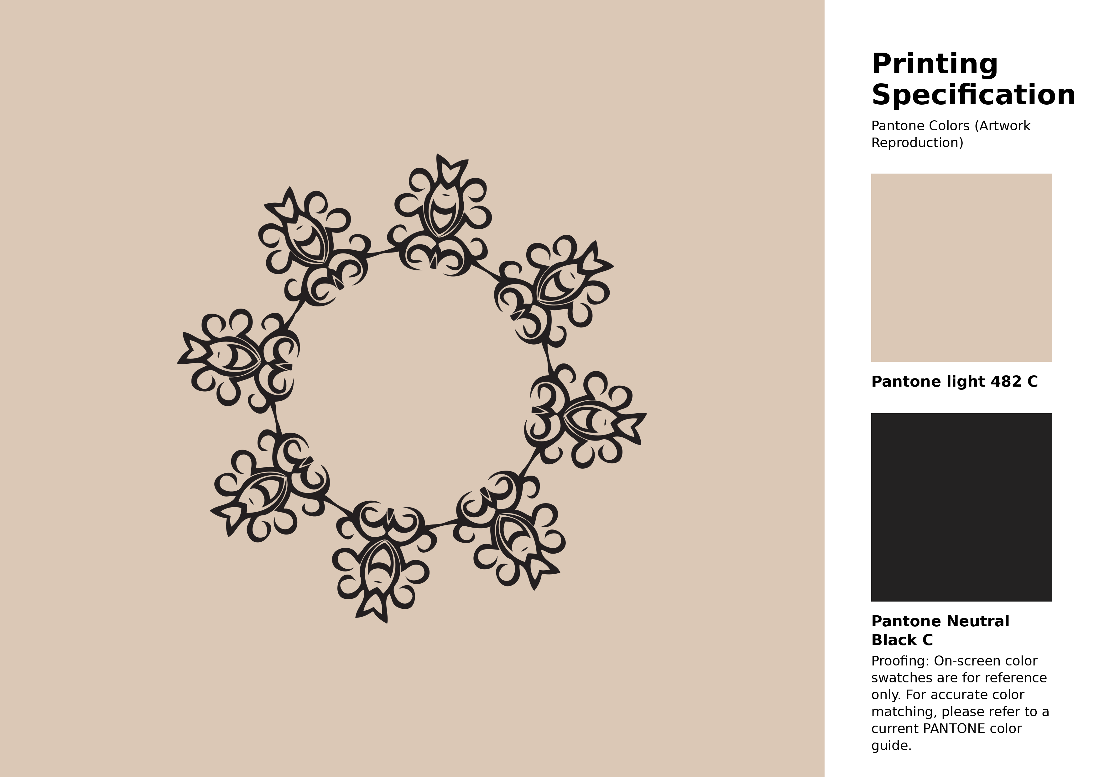
#dbc8b6 Pantone 482 C Color | Hex color Code #dbc8b6 Artwork Image (PNG)
Download Artwork (PNG)#dbc8b6 Pantone 482 C Color | Hex color Code #dbc8b6 Artwork Vector (PDF)
Download Artwork (PDF)#dbc8b6 Pantone 482 C Color | Hex color Code #dbc8b6 Artwork Vector (SVG)
Download Artwork (SVG)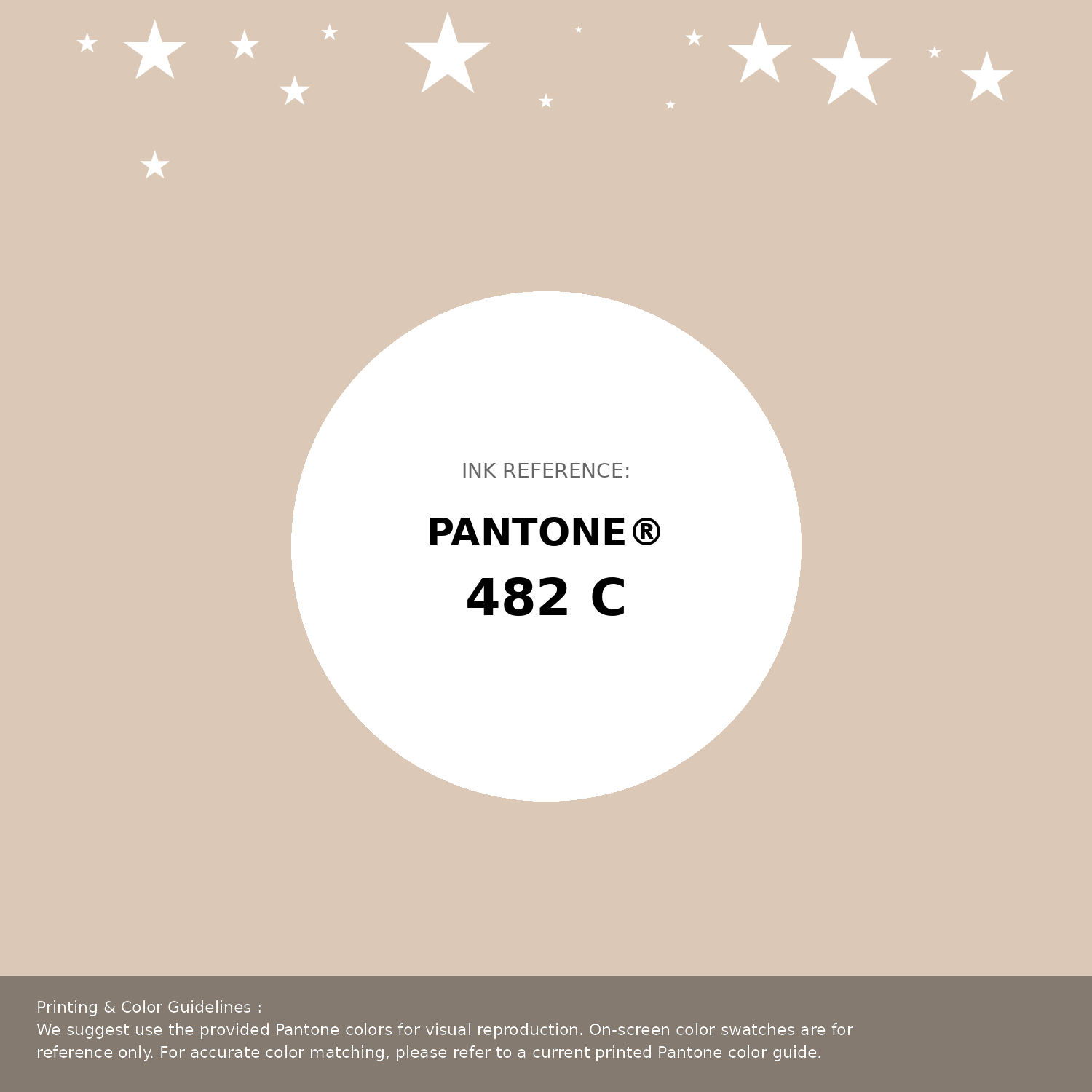
#dbc8b6 Pantone 482 C Color | Hex color Code #dbc8b6 Pantone Swatch Artwork
Download Artwork Swatch
#dbc8b6 Pantone 482 C Color | Hex color Code #dbc8b6 Gradient Artwork (PNG)
Download Gradient (PNG)#dbc8b6 Pantone 482 C Color | Hex color Code #dbc8b6 Gradient Artwork (SVG)
Download Gradient (SVG)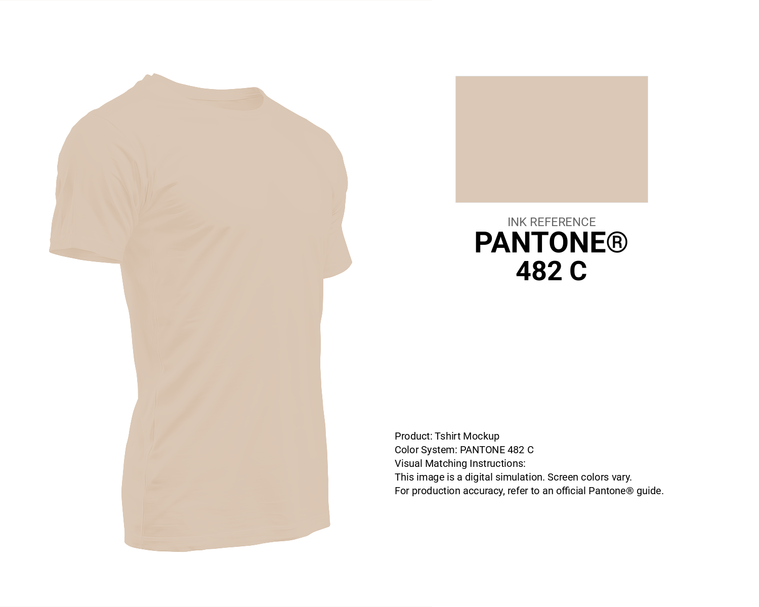
#dbc8b6 Pantone 482 C Color | Hex color Code #dbc8b6 T-Shirt Mockup
Download T-Shirt Mockup
#dbc8b6 Pantone 482 C Color | Hex color Code #dbc8b6 Printing Artwork Pantone Reference
Download Pantone Printing Reference
Cocoa Cream - #dbc8b6 Color Name
Download Color NameRelated Color Palettes
- Deep Pink and Rosy Brown •
- Hit Pink •
- Oriental Pink •
- Hot Pink and Dark Olive Green •
- Deep Pink and Dark Sea Green •
- Lavender Pink •
- Medium Violet Red and Hot Pink •
- Hot Pink and Dark Slate Gray •
- Fuchsia Pink •
- Tan and Light Pink •
- Dark Sea Green and Deep Pink •
- Hot Pink •
- Rosy Brown and Light Pink •
- Light Pink and Dark Sea Green •
- Hot Pink and Deep Pink
Color Palette Collection

Child Theme Colors
5 color palettes with 25 colors.

32 Sky Color Schemes
32 color palettes with 160 colors.

46 Indigo Color Palettes
46 color palettes with 230 colors.

25 Sunset Color Schemes
25 color palettes with 125 colors.