#D5BA98 Color
Your all-in-one color resource. Download hex background images, Adobe swatches (ASE), PDF color sheets, and SVG files. Explore palettes, harmonies, accessibility, conversions, and professional exports — designed for designers, developers, and color perfectionists.
#D5BA98 evokes a warm, nostalgic feeling, reminiscent of late autumn afternoons. The muted beige-toned browns and hints of rose suggest dried leaves, earthy tones, and the gentle fading of summer's vibrancy. It inspires feelings of comfort, coziness, and gentle melancholy, a sense of quiet reflection and acceptance. The color suggests the warmth of a sun-drenched stone wall or the soft light filtering through a canopy of autumn leaves. It creates a calm and inviting atmosphere, perfect for spaces designed for relaxation and contemplation. In design, it works well in creating a rustic, natural aesthetic; it could be used in home dcor to create a warm, inviting living space, perhaps paired with textures like wood and wool. The color lacks strong cultural or symbolic meanings beyond its natural associations with the autumn season and the earth. Visually matched named color: Autumnal Embrace.
PANTONE 14-1118 TCX
Choose Color
Selected Color
Recent Colors
Color Details
Similar Ink Alternatives for #D5BA98 color Alternative print inks for reproducing #D5BA98 background image with a similar visual appearance.
Disclaimer: The visually matched ink reference is an independent approximation intended as a guide only. Please be advised that this pantone colors is only intended as a guide, Actual colours will depend on screen calibration variances. The print ink suggestions provided are independent visual approximations and are not affiliated with or endorsed by Pantone LLC. For official color specifications, conversion factors, and comprehensive color system information, please visit Pantone Connect. Official Pantone products can be purchased at pantone.com.
Color Previews for #000000 See how this color looks as a background or as text.
Complete Guide to Your Color Laboratory
Everything you need to know about this professional color toolkit.
Use the Color Picker at the top to select any color. All modules below update instantly.
Workflow: Pick a color → Explore palettes & data → Download what you need (PDF, Image, or Adobe ASE).
Color Details — Your color in all formats: HEX, RGB, RGBA, HSL, HSLA, HSV, CMYK, CIELab, Hunter-Lab, XYZ, Yxy, YUV. One-click copy.
Color Psychology — Emotional impact, cultural meanings, physiological effects, branding applications, and historical significance.
Named Colors — Find official color names (HTML/CSS, Pantone) that match your selection with similarity percentages.
Light & Dark Shades
80-step gradient from black to white. Perfect for button states and component systems.
Tints
Color mixed with white → lighter, pastel variations for backgrounds and disabled states.
Monochromatic — 11 curated tints/shades from one color. Production-ready for design systems.
- Complementary — Opposite on wheel (180°). High contrast.
- Analogous — Neighbors (±30°). Harmonious flow.
- Triadic — Three colors (120° apart). Vibrant, balanced.
- Split-Complementary — Base + two near-complements. Softer contrast.
- Tetradic/Square — Four colors. Complex, maximum variety.
- Neutral — Desaturated versions. Subtle, sophisticated.
15 Professional Variations — Monochromatic, Analogous, Complementary, Warm/Cool/Earth Tones, Pastel, Vibrant, High Contrast, and more.
Color Infusion — 10 palettes showing your color morphing into each major hue. Find bridge colors.
Similar Colors — 60+ colors generated via CIELAB Delta E matching. Unexpected harmonious combinations.
18 Ready-to-Use Gradients — Complementary, Analogous, Triadic, Tint/Shade progressions, and more.
Downloads: PNG (2560×1440), CSS (production-ready code), SVG (scalable vector).
WCAG Contrast Checker — Tests your color against white, black, and custom colors for AA (4.5:1) and AAA (7:1) compliance. Large text thresholds included.
Harmony & Accessibility Guide — Tests against 10 canonical hues. Shows which pairs are both beautiful AND WCAG-compliant for text.
PNG/JPG — High-res images for presentations and mood boards.
PDF — Print-ready reports for clients and teams.
Adobe ASE — Direct import to Photoshop, Illustrator, InDesign, XD.
CSS/SVG — Gradients only. Production-ready code and vectors.
Color Science: Industry-standard conversions (HSL, CIELAB, CMYK, XYZ). WCAG 2.1 luminance formula. Delta E (ΔE76) for perceptual matching.
Direct Links: Share colors via icolorpalette.com/color/ff5733 or icolorpalette.com/color/red
Issues? Refresh the page, wait for rendering, try another browser, or check console (F12) for errors.
Printing Guide for #d5ba98 Background Image
Use PANTONE 14-1118 TCX as a visually matched ink reference when printing this background image.
To print the #d5ba98 background image from our site, consider using PANTONE 14-1118 TCX as a visually matched ink reference.
Download the background image, then provide this reference code to your print vendor to help achieve accurate color reproduction.
The visually matched ink reference for the #d5ba98 background image is PANTONE 14-1118 TCX.
This color is commonly described as Autumnal Embrace.
#D5BA98 evokes a warm, nostalgic feeling, reminiscent of late autumn afternoons. The muted beige-toned browns and hints of rose suggest dried leaves, earthy tones, and the gentle fading of summer's vibrancy. It inspires feelings of comfort, coziness, and gentle melancholy, a sense of quiet reflection and acceptance. The color suggests the warmth of a sun-drenched stone wall or the soft light filtering through a canopy of autumn leaves. It creates a calm and inviting atmosphere, perfect for spaces designed for relaxation and contemplation. In design, it works well in creating a rustic, natural aesthetic; it could be used in home dcor to create a warm, inviting living space, perhaps paired with textures like wood and wool. The color lacks strong cultural or symbolic meanings beyond its natural associations with the autumn season and the earth.
We provide PANTONE 14-1118 TCX as a visually matched ink reference to help you reproduce the #d5ba98 background image accurately in professional printing.
This reference code helps print vendors achieve consistent color output across different printing equipment and materials.
After downloading the #d5ba98 background image from our site:
- Include the visually matched ink reference PANTONE 14-1118 TCX in your print order notes
- Inform your print vendor that this is your target color reference
- Request a proof print to verify the Autumnal Embrace color appearance before full production
The #d5ba98 background image with PANTONE 14-1118 TCX as visually matched ink reference can be used for:
- Posters, banners, and backdrops
- Business cards, brochures, and flyers
- Packaging, labels, and stickers
- Signage and promotional materials
This is an independent visual approximation.
While PANTONE 14-1118 TCX closely matches the #d5ba98 background image color, variations may exist between screen display and printed output.
We recommend requesting a proof print to verify the final appearance.
#D5BA98 evokes a warm, nostalgic feeling, reminiscent of late autumn afternoons. The muted beige-toned browns and hints of rose suggest dried leaves, earthy tones, and the gentle fading of summer's vibrancy. It inspires feelings of comfort, coziness, and gentle melancholy, a sense of quiet reflection and acceptance. The color suggests the warmth of a sun-drenched stone wall or the soft light filtering through a canopy of autumn leaves. It creates a calm and inviting atmosphere, perfect for spaces designed for relaxation and contemplation. In design, it works well in creating a rustic, natural aesthetic; it could be used in home dcor to create a warm, inviting living space, perhaps paired with textures like wood and wool. The color lacks strong cultural or symbolic meanings beyond its natural associations with the autumn season and the earth.
Understanding these associations helps ensure the #d5ba98 background image aligns with your intended message and brand impact.
Important Information
The visually matched ink reference is an independent approximation intended as a guide only.
Actual printed colors may vary depending on screen calibration, substrate material, ink type, and printing equipment used.
For official color specifications and certified color standards, visit Pantone Connect.
Official color guides and swatch books can be purchased from pantone.com.
Pantone 14-1118 Tcx Beige Color: Warm and Earthy Beige | #D5BA98
Introduction:
Beige is a warm and earthy color that exudes a sense of calm and sophistication. Its neutral tone makes it versatile and easy to incorporate into various design aesthetics. With its soft and subtle look, beige adds a touch of elegance and tranquility to any visual composition.
Historical Significance:
Beige has been prominently used throughout history, especially in interior design during the Victorian era. It was often seen in luxurious homes and palaces, creating an atmosphere of opulence and refinement. In fashion, beige gained popularity in the 1920s as a symbol of sophistication and elegance, especially in women's clothing.
Symbolism and Meaning:
Beige is typically associated with neutrality, calmness, and simplicity. In various cultures, beige represents a sense of balance and harmony. It is often used to depict reliability, stability, and timelessness. In color psychology, beige can evoke a sense of security and comfort.
Beige in Fashion:
Beige has a significant impact on fashion styles and trends. It is commonly used as a neutral base color in clothing and accessories, allowing other vibrant tones to stand out. Beige also adds a touch of elegance and sophistication to minimalist fashion designs. In recent years, beige has gained popularity as a staple color in the fashion industry.
Beige in Graphic Design:
Beige holds great significance in graphic design aesthetics. It is often used as a background color to create a soothing and balanced visual experience. In branding, beige can convey a sense of reliability, trustworthiness, and simplicity. It is also frequently used in natural and organic product packaging to reflect a connection with nature.
Color Combinations:
Beige can be paired with a wide range of colors to create harmonious and visually appealing combinations. Some popular color combinations with beige include: - Beige and white for a clean and minimalist look - Beige and navy blue for a classic and timeless combination - Beige and blush pink for a soft and romantic color palette - Beige and olive green for a natural and earthy feel
Nature’s Palette:
Beige can be found in various natural occurrences, such as sandy beaches, desert landscapes, and the fur colors of animals like lions and camels. In flowers, beige can be seen in the petals of certain roses and daisies. It blends seamlessly into natural palettes, showcasing its connection to the earth and its natural surroundings.
Artistic Representations:
Beige has been widely used in various forms of art over time. It is often seen in realistic and naturalistic paintings, where it represents the subtle nuances of light and shadow. In abstract art, beige can be used to create texture and depth. Beige is also a popular choice in sculpture, as it conveys a sense of elegance and timeless beauty.
Movies and Cinematic Landscapes:
Beige is frequently used in movies to set a calm and serene tone. It is often seen in scenes depicting natural landscapes, creating a sense of tranquility and peace. Beige can also be used in costume and set design to represent simplicity and elegance.
Products and Commercial Appeal:
Many popular products and brands are associated with beige or use it in their branding. Beige is often used in cosmetics and skincare products to convey a sense of natural beauty and purity. In home decor, beige is a popular choice for furniture and furnishings as it creates a timeless and elegant ambiance. Luxury brands often incorporate beige in their branding to signify sophistication and exclusivity.
National Symbols and Significance:
Beige does not hold any specific national or cultural significance. However, its neutrality and simplicity make it a versatile color that can be found in various cultural artifacts and symbols.
The Psychological and Emotional Impact:
Beige has a calming and soothing effect on emotions and perceptions. It creates a sense of relaxation and tranquility, making it a popular choice for spaces dedicated to rest and reflection. Beige can also evoke feelings of stability and security, providing a sense of comfort and grounding.
Conclusion:
Beige, with its warm and earthy tones, holds a special place in various aspects of design and aesthetics. Its historical significance, symbolism, and versatility make it a timeless and appealing color. Whether in fashion, graphic design, or artistic representations, beige brings an element of elegance and tranquility to any composition.
Pantone 14-1118 Tcx Beige Color | Hex color Code #d5ba98 Image & Artwork
Download high-quality assets for your projects.

#d5ba98 Color Schemes
Download Color Schemes
#d5ba98 Color Shades
Download Color Shades
Pantone 14-1118 Tcx Beige Color | Hex color Code #d5ba98 Solid Color Background
Download Solid Color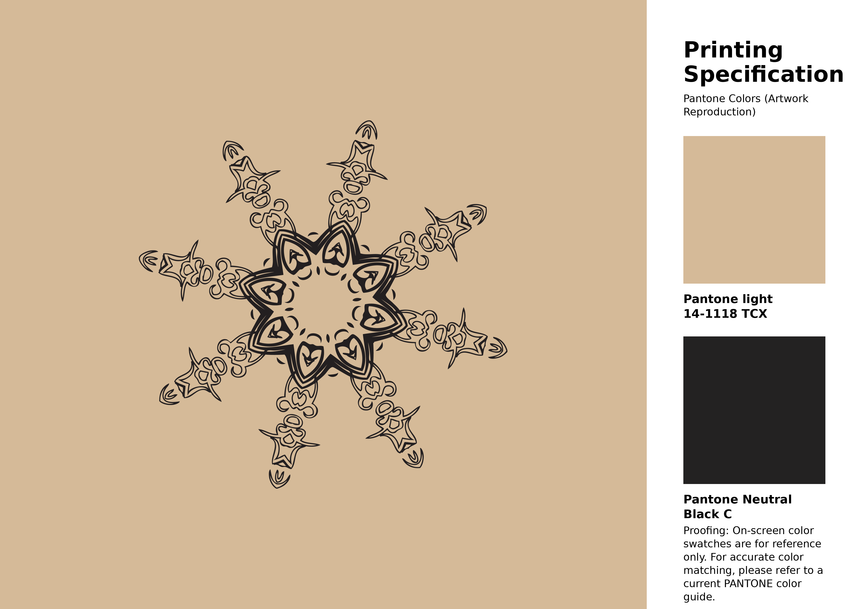
#d5ba98 Pantone 14-1118 Tcx Beige Color | Hex color Code #d5ba98 Artwork Image (PNG)
Download Artwork (PNG)#d5ba98 Pantone 14-1118 Tcx Beige Color | Hex color Code #d5ba98 Artwork Vector (PDF)
Download Artwork (PDF)#d5ba98 Pantone 14-1118 Tcx Beige Color | Hex color Code #d5ba98 Artwork Vector (SVG)
Download Artwork (SVG)
#d5ba98 Pantone 14-1118 Tcx Beige Color | Hex color Code #d5ba98 Pantone Swatch Artwork
Download Artwork Swatch
#d5ba98 Pantone 14-1118 Tcx Beige Color | Hex color Code #d5ba98 Gradient Artwork (PNG)
Download Gradient (PNG)#d5ba98 Pantone 14-1118 Tcx Beige Color | Hex color Code #d5ba98 Gradient Artwork (SVG)
Download Gradient (SVG)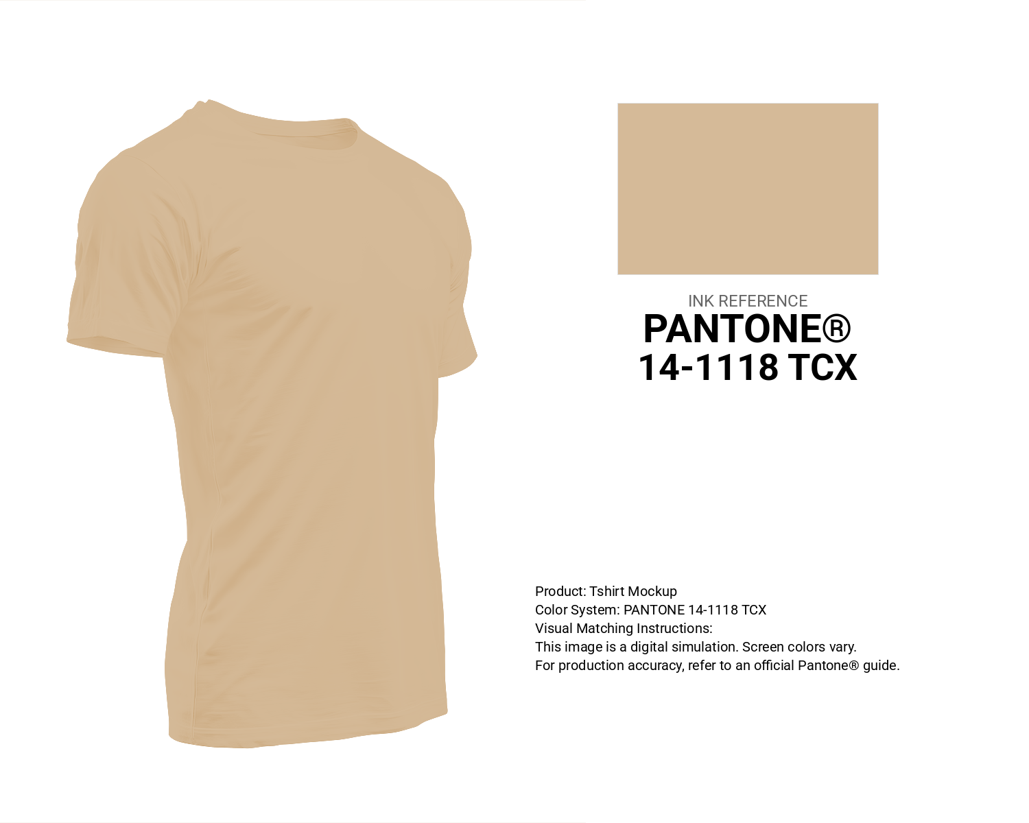
#d5ba98 Pantone 14-1118 Tcx Beige Color | Hex color Code #d5ba98 T-Shirt Mockup
Download T-Shirt Mockup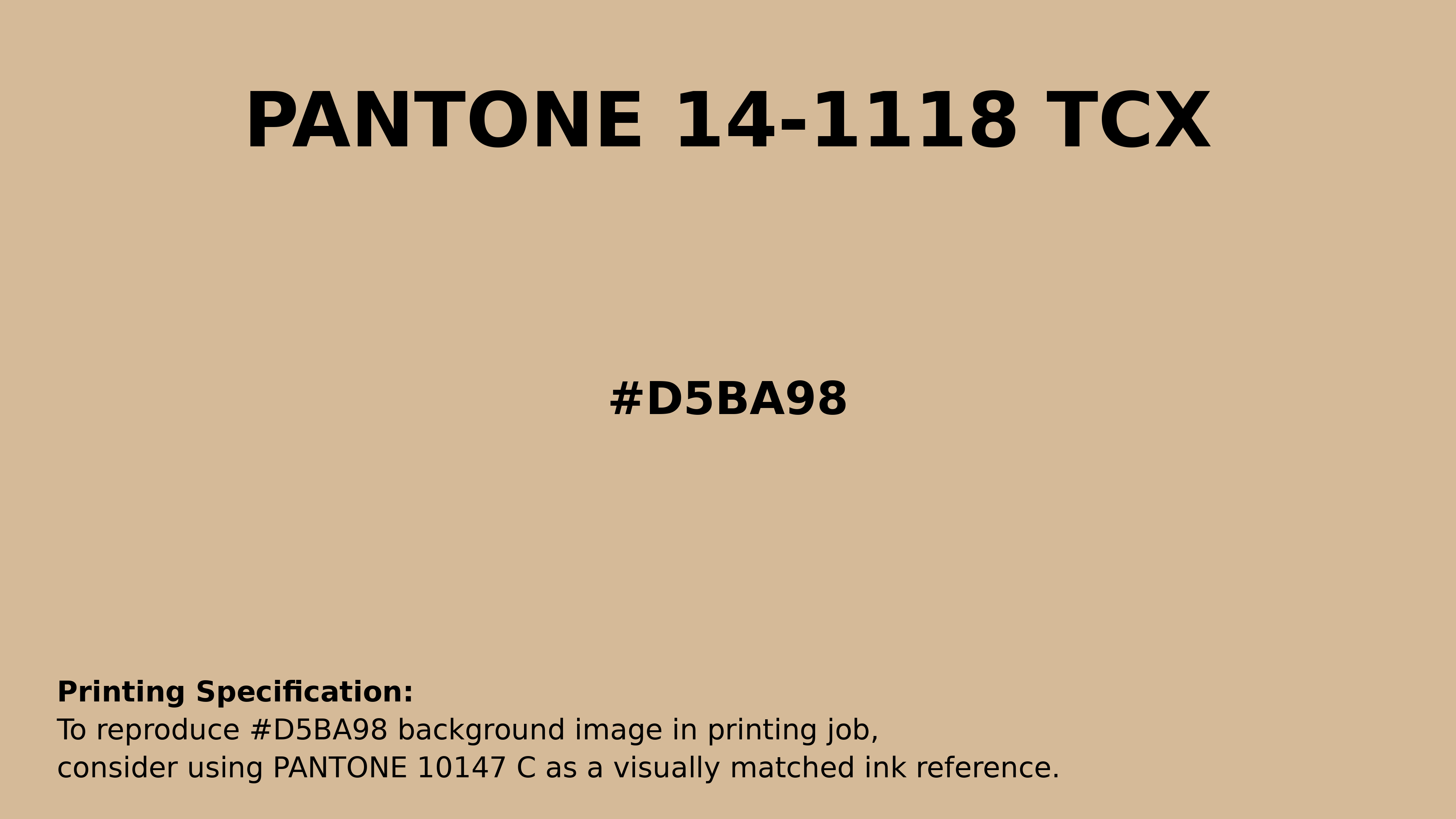
#d5ba98 Pantone 14-1118 Tcx Beige Color | Hex color Code #d5ba98 Printing Artwork Pantone Reference
Download Pantone Printing ReferenceRelated Color Palettes
- Wheat and Light Pink •
- Crimson and Hot Pink •
- Deep Pink and Tomato •
- Pink Salmon •
- Deep Pink and Black •
- Sweet Pink •
- Mandys Pink •
- Pink Lace •
- Pink •
- Deep Pink and Hot Pink •
- Dim Gray and Light Pink •
- Brown and Hot Pink •
- Deep Pink and Dim Gray •
- Deep Pink and Dark Sea Green •
- Light Pink and Antique White
Color Palette Collection

26 Pastel Color Schemes
26 color palettes with 130 colors.

35 Light Blue Color Palette
35 color palettes with 175 colors.

38 Purple Color Schemes
38 color palettes with 190 colors.
ERGO
1 color palettes with 5 colors.