#D1CCBD Color
Your all-in-one color resource. Download hex background images, Adobe swatches (ASE), PDF color sheets, and SVG files. Explore palettes, harmonies, accessibility, conversions, and professional exports — designed for designers, developers, and color perfectionists.
#D1CCBD evokes a feeling of gentle nostalgia and quiet warmth. The muted, slightly greyish beige-pink suggests a faded rose, the soft light of dawn, or perhaps dried wildflowers. It's a color that feels both comforting and slightly melancholic, hinting at memories and gentle past experiences. It reminds one of autumn leaves, aged parchment, or the soft light filtering through a dusty window. The mood is calm, contemplative, and subtly romantic. In design, it would work well in creating a space that feels cozy, inviting, and slightly vintage; it could be used in interior design to promote feelings of relaxation and peace, perhaps in a bedroom or reading nook. There's a sense of understated elegance and timeless beauty, avoiding any jarring or overly bold statements. The color lacks strong cultural symbolism, allowing it to work across various design styles. Visually matched named color: Dusty Rose Dawn.
PANTONE 7534 C
Choose Color
Selected Color
Recent Colors
Color Details
Similar Ink Alternatives for #D1CCBD color Alternative print inks for reproducing #D1CCBD background image with a similar visual appearance.
Disclaimer: The visually matched ink reference is an independent approximation intended as a guide only. Please be advised that this pantone colors is only intended as a guide, Actual colours will depend on screen calibration variances. The print ink suggestions provided are independent visual approximations and are not affiliated with or endorsed by Pantone LLC. For official color specifications, conversion factors, and comprehensive color system information, please visit Pantone Connect. Official Pantone products can be purchased at pantone.com.
Color Previews for #000000 See how this color looks as a background or as text.
Complete Guide to Your Color Laboratory
Everything you need to know about this professional color toolkit.
Use the Color Picker at the top to select any color. All modules below update instantly.
Workflow: Pick a color → Explore palettes & data → Download what you need (PDF, Image, or Adobe ASE).
Color Details — Your color in all formats: HEX, RGB, RGBA, HSL, HSLA, HSV, CMYK, CIELab, Hunter-Lab, XYZ, Yxy, YUV. One-click copy.
Color Psychology — Emotional impact, cultural meanings, physiological effects, branding applications, and historical significance.
Named Colors — Find official color names (HTML/CSS, Pantone) that match your selection with similarity percentages.
Light & Dark Shades
80-step gradient from black to white. Perfect for button states and component systems.
Tints
Color mixed with white → lighter, pastel variations for backgrounds and disabled states.
Monochromatic — 11 curated tints/shades from one color. Production-ready for design systems.
- Complementary — Opposite on wheel (180°). High contrast.
- Analogous — Neighbors (±30°). Harmonious flow.
- Triadic — Three colors (120° apart). Vibrant, balanced.
- Split-Complementary — Base + two near-complements. Softer contrast.
- Tetradic/Square — Four colors. Complex, maximum variety.
- Neutral — Desaturated versions. Subtle, sophisticated.
15 Professional Variations — Monochromatic, Analogous, Complementary, Warm/Cool/Earth Tones, Pastel, Vibrant, High Contrast, and more.
Color Infusion — 10 palettes showing your color morphing into each major hue. Find bridge colors.
Similar Colors — 60+ colors generated via CIELAB Delta E matching. Unexpected harmonious combinations.
18 Ready-to-Use Gradients — Complementary, Analogous, Triadic, Tint/Shade progressions, and more.
Downloads: PNG (2560×1440), CSS (production-ready code), SVG (scalable vector).
WCAG Contrast Checker — Tests your color against white, black, and custom colors for AA (4.5:1) and AAA (7:1) compliance. Large text thresholds included.
Harmony & Accessibility Guide — Tests against 10 canonical hues. Shows which pairs are both beautiful AND WCAG-compliant for text.
PNG/JPG — High-res images for presentations and mood boards.
PDF — Print-ready reports for clients and teams.
Adobe ASE — Direct import to Photoshop, Illustrator, InDesign, XD.
CSS/SVG — Gradients only. Production-ready code and vectors.
Color Science: Industry-standard conversions (HSL, CIELAB, CMYK, XYZ). WCAG 2.1 luminance formula. Delta E (ΔE76) for perceptual matching.
Direct Links: Share colors via icolorpalette.com/color/ff5733 or icolorpalette.com/color/red
Issues? Refresh the page, wait for rendering, try another browser, or check console (F12) for errors.
Printing Guide for #d1ccbd Background Image
Use PANTONE 7534 C as a visually matched ink reference when printing this background image.
To print the #d1ccbd background image from our site, consider using PANTONE 7534 C as a visually matched ink reference.
Download the background image, then provide this reference code to your print vendor to help achieve accurate color reproduction.
The visually matched ink reference for the #d1ccbd background image is PANTONE 7534 C.
This color is commonly described as Dusty Rose Dawn.
#D1CCBD evokes a feeling of gentle nostalgia and quiet warmth. The muted, slightly greyish beige-pink suggests a faded rose, the soft light of dawn, or perhaps dried wildflowers. It's a color that feels both comforting and slightly melancholic, hinting at memories and gentle past experiences. It reminds one of autumn leaves, aged parchment, or the soft light filtering through a dusty window. The mood is calm, contemplative, and subtly romantic. In design, it would work well in creating a space that feels cozy, inviting, and slightly vintage; it could be used in interior design to promote feelings of relaxation and peace, perhaps in a bedroom or reading nook. There's a sense of understated elegance and timeless beauty, avoiding any jarring or overly bold statements. The color lacks strong cultural symbolism, allowing it to work across various design styles.
We provide PANTONE 7534 C as a visually matched ink reference to help you reproduce the #d1ccbd background image accurately in professional printing.
This reference code helps print vendors achieve consistent color output across different printing equipment and materials.
After downloading the #d1ccbd background image from our site:
- Include the visually matched ink reference PANTONE 7534 C in your print order notes
- Inform your print vendor that this is your target color reference
- Request a proof print to verify the Dusty Rose Dawn color appearance before full production
The #d1ccbd background image with PANTONE 7534 C as visually matched ink reference can be used for:
- Posters, banners, and backdrops
- Business cards, brochures, and flyers
- Packaging, labels, and stickers
- Signage and promotional materials
This is an independent visual approximation.
While PANTONE 7534 C closely matches the #d1ccbd background image color, variations may exist between screen display and printed output.
We recommend requesting a proof print to verify the final appearance.
#D1CCBD evokes a feeling of gentle nostalgia and quiet warmth. The muted, slightly greyish beige-pink suggests a faded rose, the soft light of dawn, or perhaps dried wildflowers. It's a color that feels both comforting and slightly melancholic, hinting at memories and gentle past experiences. It reminds one of autumn leaves, aged parchment, or the soft light filtering through a dusty window. The mood is calm, contemplative, and subtly romantic. In design, it would work well in creating a space that feels cozy, inviting, and slightly vintage; it could be used in interior design to promote feelings of relaxation and peace, perhaps in a bedroom or reading nook. There's a sense of understated elegance and timeless beauty, avoiding any jarring or overly bold statements. The color lacks strong cultural symbolism, allowing it to work across various design styles.
Understanding these associations helps ensure the #d1ccbd background image aligns with your intended message and brand impact.
Important Information
The visually matched ink reference is an independent approximation intended as a guide only.
Actual printed colors may vary depending on screen calibration, substrate material, ink type, and printing equipment used.
For official color specifications and certified color standards, visit Pantone Connect.
Official color guides and swatch books can be purchased from pantone.com.
Pantone 7534 C Color: Neutral Gray | #D1CCBD
Introduction:
Neutral Gray is a cool gray color with a hex code of #D1CCBD. It is a versatile color that can be described as a balanced blend of gray and beige, creating a subdued and understated aesthetic.
Historical Significance:
Key moments in history: Neutral Gray has been prominently used in various historical moments, particularly in the realm of fashion and design. From classic black and white photography to minimalist design movements, Neutral Gray has played a significant role in creating timeless and sophisticated visuals.
Symbolism and Meaning:
Symbolism in various cultures: Neutral Gray typically symbolizes elegance, professionalism, and neutrality. In Western cultures, it is often associated with practicality and a timeless sense of style. In Eastern cultures, it represents harmony and balance.
Neutral Gray in Fashion:
Impact on styles and trends: Neutral Gray is frequently used in fashion to create minimalist and sophisticated looks. It is a versatile color that can be easily paired with other colors, making it a popular choice for designers and fashion enthusiasts.
Neutral Gray in Graphic Design:
Significance in design aesthetics: Neutral Gray is widely used in graphic design to create contrast and balance. Its subtle and understated nature allows other colors and elements to stand out, making it an essential component in branding and visual communication.
Color Combinations:
Potential color combinations: Neutral Gray can be combined with a wide range of colors to create various visual effects. Some popular combinations include Neutral Gray with pastel shades for a soft and calming palette, or Neutral Gray with bold and vibrant colors for a modern and energetic look.
Nature’s Palette:
Natural occurrences: Neutral Gray can be seen in various natural elements such as the bark of trees, pebbles, and certain animal fur. It blends seamlessly with the natural environment, creating a sense of harmony and tranquility.
Artistic Representations:
Usage in various forms of art: Neutral Gray has been used by artists to create monochromatic and minimalist artworks. Its neutral and balanced quality allows artists to highlight texture, form, and composition without the distraction of vibrant colors.
Movies and Cinematic Landscapes:
Scenes that set the tone or mood: Neutral Gray is often used in movies to create a sense of sophistication, mystery, or melancholy. It is commonly seen in film noir and psychological thriller genres where the subdued color palette enhances the atmospheric visuals.
Products and Commercial Appeal:
Popular products and brands: Neutral Gray is frequently used by luxury brands to convey a sense of elegance and high-quality craftsmanship. It is commonly seen in fashion accessories, home decor, and premium consumer goods.
National Symbols and Significance:
Cultural significance: In certain cultures, Neutral Gray may hold special significance as it represents tradition, heritage, and understated elegance. It may be associated with important national symbols or traditional ceremonies.
The Psychological and Emotional Impact:
Influence on emotions and perceptions: Neutral Gray has a calming and soothing effect on the mind. It is often associated with feelings of stability, reliability, and neutrality. It can evoke a sense of balance and clarity.
Conclusion:
Neutral Gray, with its timeless appeal and versatile nature, has been an integral part of various creative industries. From fashion to graphic design, it has proven to be a reliable color choice that can enhance visual aesthetics and evoke desired emotions. Its historical significance and cultural symbolism make it a color that is here to stay.
Pantone 7534 C Color | Hex color Code #d1ccbd Image & Artwork
Download high-quality assets for your projects.

#d1ccbd Color Schemes
Download Color Schemes
#d1ccbd Color Shades
Download Color Shades
Pantone 7534 C Color | Hex color Code #d1ccbd Solid Color Background
Download Solid Color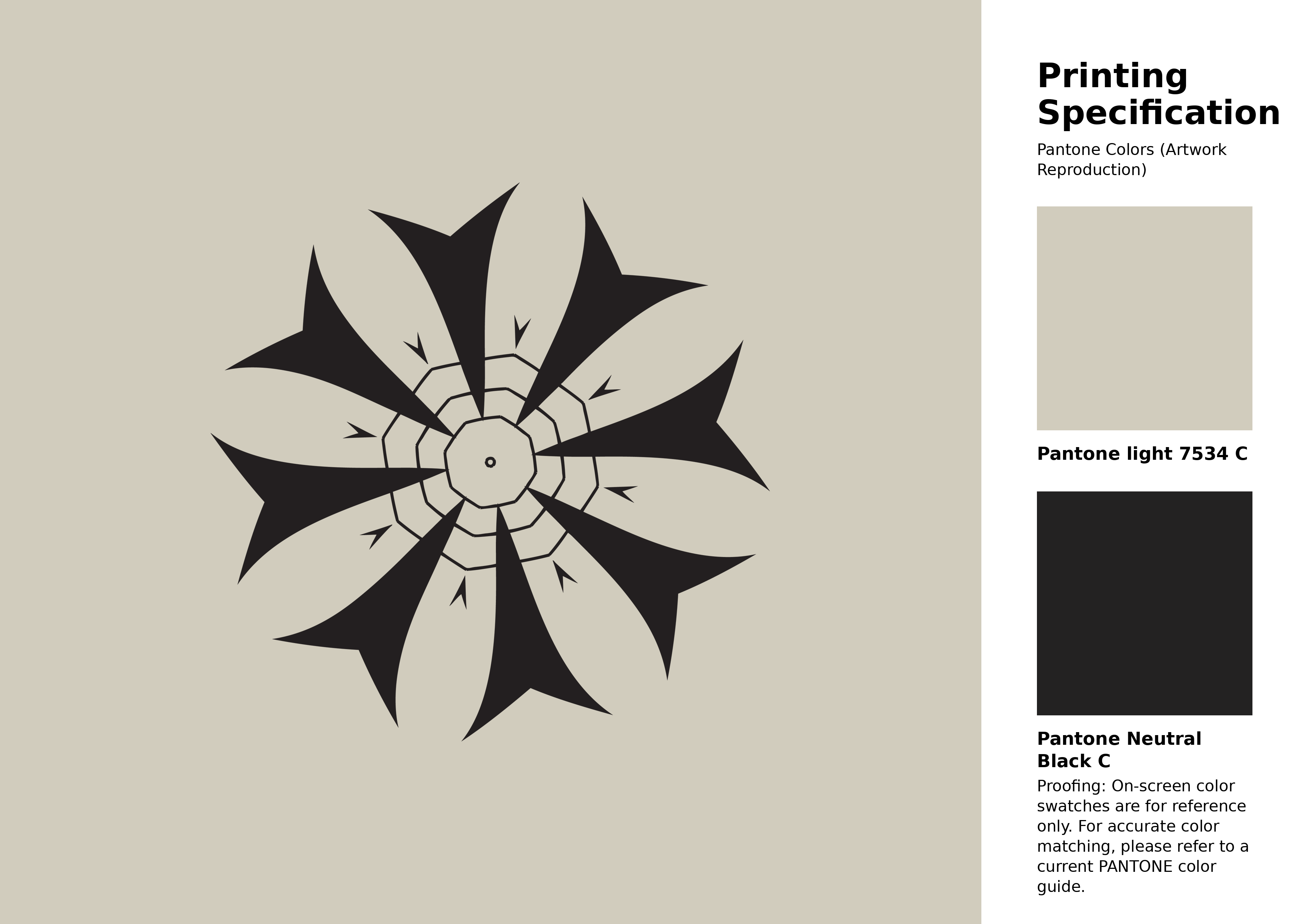
#d1ccbd Pantone 7534 C Color | Hex color Code #d1ccbd Artwork Image (PNG)
Download Artwork (PNG)#d1ccbd Pantone 7534 C Color | Hex color Code #d1ccbd Artwork Vector (PDF)
Download Artwork (PDF)#d1ccbd Pantone 7534 C Color | Hex color Code #d1ccbd Artwork Vector (SVG)
Download Artwork (SVG)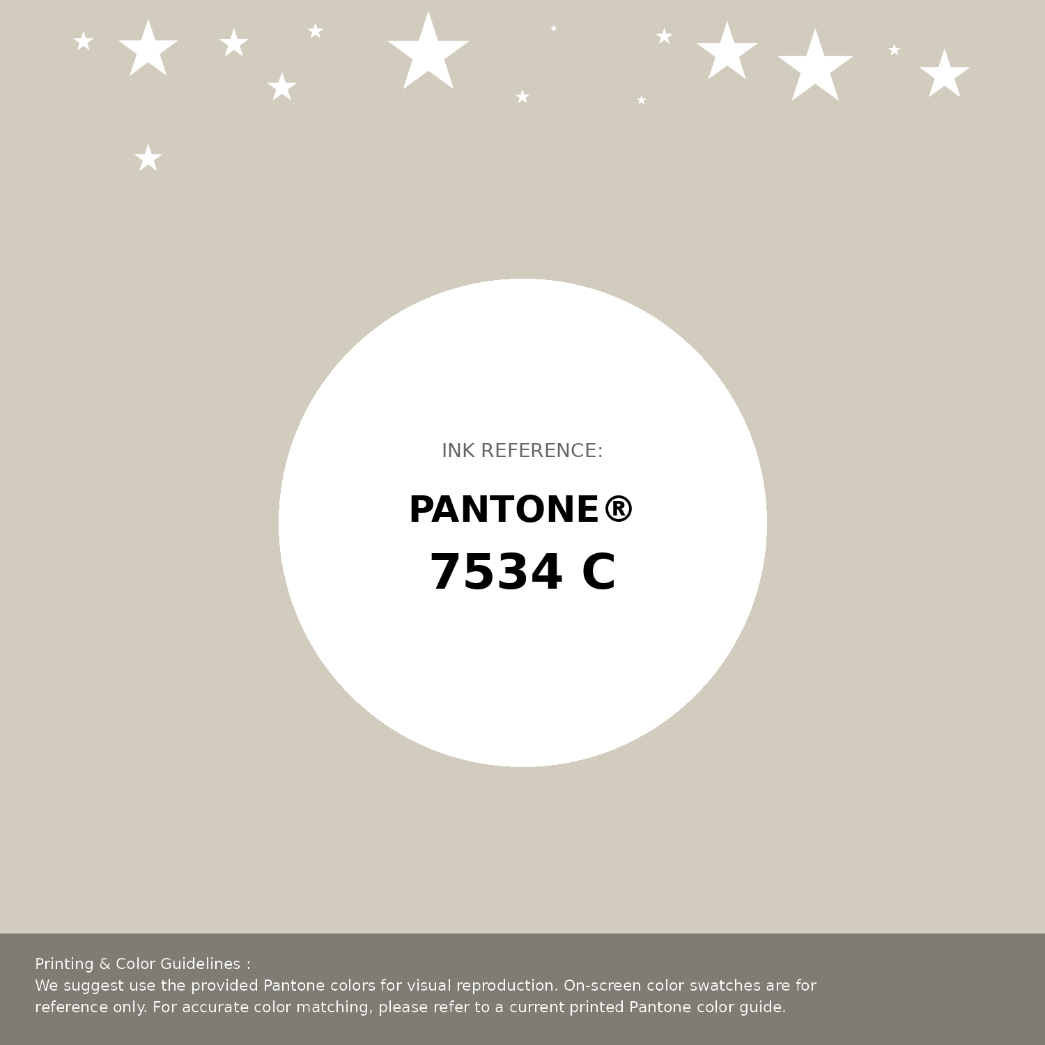
#d1ccbd Pantone 7534 C Color | Hex color Code #d1ccbd Pantone Swatch Artwork
Download Artwork Swatch
#d1ccbd Pantone 7534 C Color | Hex color Code #d1ccbd Gradient Artwork (PNG)
Download Gradient (PNG)#d1ccbd Pantone 7534 C Color | Hex color Code #d1ccbd Gradient Artwork (SVG)
Download Gradient (SVG)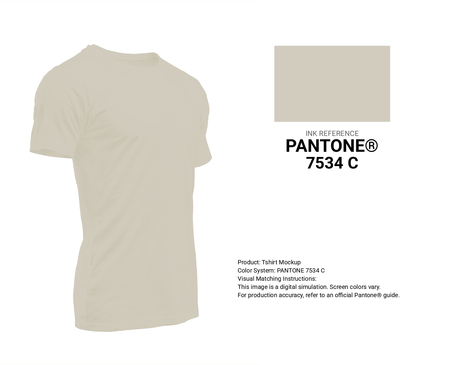
#d1ccbd Pantone 7534 C Color | Hex color Code #d1ccbd T-Shirt Mockup
Download T-Shirt Mockup
#d1ccbd Pantone 7534 C Color | Hex color Code #d1ccbd Printing Artwork Pantone Reference
Download Pantone Printing ReferenceRelated Color Palettes
- Light Pink and Tan •
- Deep Pink and Dark Slate Gray •
- Oriental Pink •
- Hot Pink and Dark Slate Gray •
- Light Pink and Wheat •
- Pink Swan •
- Deep Pink and Crimson •
- Pink Flare •
- Deep Pink and Deep Pink •
- Deep Pink and Hot Pink •
- Beige and Light Pink •
- Beige and Deep Pink •
- Cannon Pink •
- Tan and Light Pink •
- Dim Gray and Hot Pink
Color Palette Collection
34 Yellow Color Schemes
34 color palettes with 170 colors.

89 Blue Color Palettes
89 color palettes with 445 colors.

50 Beige Color Palettes
50 color palettes with 250 colors.

27 Pink Color Combinations
27 color palettes with 135 colors.