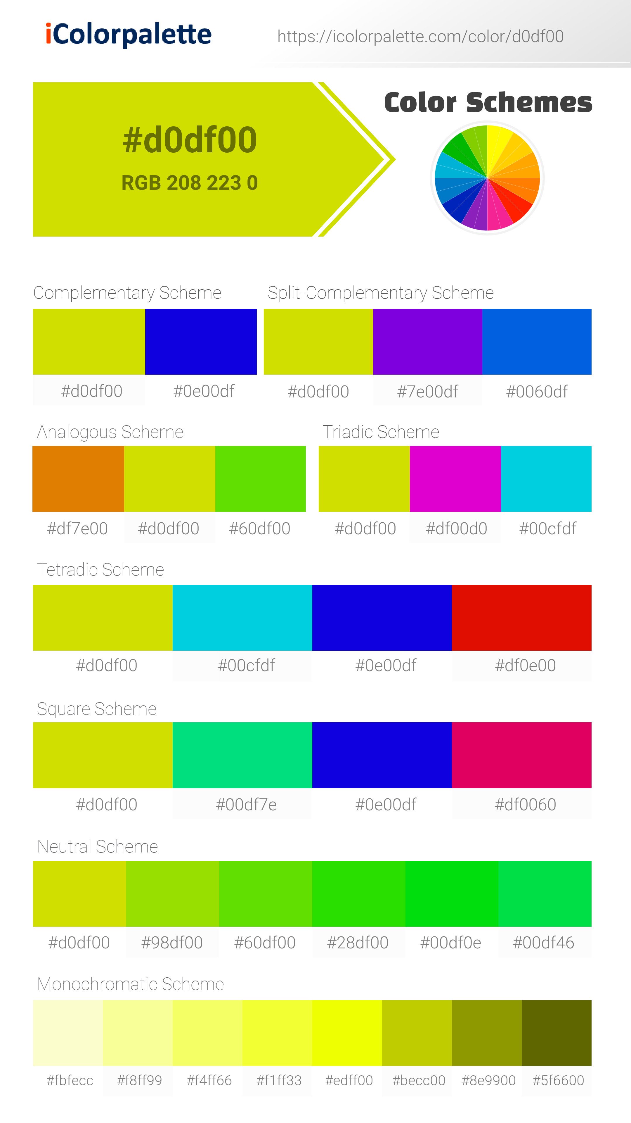
#D0DF00 Color
Your all-in-one color resource. Download hex background images, Adobe swatches (ASE), PDF color sheets, and SVG files. Explore palettes, harmonies, accessibility, conversions, and professional exports — designed for designers, developers, and color perfectionists.
This vibrant yellow-green, reminiscent of early spring growth, radiates energy and optimism. It evokes feelings of joy, vitality, and the promise of new beginnings, like a field bursting with life under a warm sun. The color's association with fresh foliage and blooming flowers creates a sense of renewal and growth. The mood is cheerful and uplifting, suggesting a vibrant, healthy atmosphere. In design, it would be well-suited for spaces intended to stimulate creativity, productivity, or a sense of well-being, such as kitchens, playrooms, or health-focused environments. Symbolically, it might represent youth, hope, and the power of nature. Visually matched named color: Golden Meadow Sun.
PANTONE 389 C
Choose Color
Selected Color
Recent Colors
Color Details
Similar Ink Alternatives for #D0DF00 color Alternative print inks for reproducing #D0DF00 background image with a similar visual appearance.
Disclaimer: The visually matched ink reference is an independent approximation intended as a guide only. Please be advised that this pantone colors is only intended as a guide, Actual colours will depend on screen calibration variances. The print ink suggestions provided are independent visual approximations and are not affiliated with or endorsed by Pantone LLC. For official color specifications, conversion factors, and comprehensive color system information, please visit Pantone Connect. Official Pantone products can be purchased at pantone.com.
Color Previews for #000000 See how this color looks as a background or as text.
Complete Guide to Your Color Laboratory
Everything you need to know about this professional color toolkit.
Use the Color Picker at the top to select any color. All modules below update instantly.
Workflow: Pick a color → Explore palettes & data → Download what you need (PDF, Image, or Adobe ASE).
Color Details — Your color in all formats: HEX, RGB, RGBA, HSL, HSLA, HSV, CMYK, CIELab, Hunter-Lab, XYZ, Yxy, YUV. One-click copy.
Color Psychology — Emotional impact, cultural meanings, physiological effects, branding applications, and historical significance.
Named Colors — Find official color names (HTML/CSS, Pantone) that match your selection with similarity percentages.
Light & Dark Shades
80-step gradient from black to white. Perfect for button states and component systems.
Tints
Color mixed with white → lighter, pastel variations for backgrounds and disabled states.
Monochromatic — 11 curated tints/shades from one color. Production-ready for design systems.
- Complementary — Opposite on wheel (180°). High contrast.
- Analogous — Neighbors (±30°). Harmonious flow.
- Triadic — Three colors (120° apart). Vibrant, balanced.
- Split-Complementary — Base + two near-complements. Softer contrast.
- Tetradic/Square — Four colors. Complex, maximum variety.
- Neutral — Desaturated versions. Subtle, sophisticated.
15 Professional Variations — Monochromatic, Analogous, Complementary, Warm/Cool/Earth Tones, Pastel, Vibrant, High Contrast, and more.
Color Infusion — 10 palettes showing your color morphing into each major hue. Find bridge colors.
Similar Colors — 60+ colors generated via CIELAB Delta E matching. Unexpected harmonious combinations.
18 Ready-to-Use Gradients — Complementary, Analogous, Triadic, Tint/Shade progressions, and more.
Downloads: PNG (2560×1440), CSS (production-ready code), SVG (scalable vector).
WCAG Contrast Checker — Tests your color against white, black, and custom colors for AA (4.5:1) and AAA (7:1) compliance. Large text thresholds included.
Harmony & Accessibility Guide — Tests against 10 canonical hues. Shows which pairs are both beautiful AND WCAG-compliant for text.
PNG/JPG — High-res images for presentations and mood boards.
PDF — Print-ready reports for clients and teams.
Adobe ASE — Direct import to Photoshop, Illustrator, InDesign, XD.
CSS/SVG — Gradients only. Production-ready code and vectors.
Color Science: Industry-standard conversions (HSL, CIELAB, CMYK, XYZ). WCAG 2.1 luminance formula. Delta E (ΔE76) for perceptual matching.
Direct Links: Share colors via icolorpalette.com/color/ff5733 or icolorpalette.com/color/red
Issues? Refresh the page, wait for rendering, try another browser, or check console (F12) for errors.
Printing Guide for #d0df00 Background Image
Use PANTONE 389 C as a visually matched ink reference when printing this background image.
To print the #d0df00 background image from our site, consider using PANTONE 389 C as a visually matched ink reference.
Download the background image, then provide this reference code to your print vendor to help achieve accurate color reproduction.
The visually matched ink reference for the #d0df00 background image is PANTONE 389 C.
This color is commonly described as Golden Meadow Sun.
This vibrant yellow-green, reminiscent of early spring growth, radiates energy and optimism. It evokes feelings of joy, vitality, and the promise of new beginnings, like a field bursting with life under a warm sun. The color's association with fresh foliage and blooming flowers creates a sense of renewal and growth. The mood is cheerful and uplifting, suggesting a vibrant, healthy atmosphere. In design, it would be well-suited for spaces intended to stimulate creativity, productivity, or a sense of well-being, such as kitchens, playrooms, or health-focused environments. Symbolically, it might represent youth, hope, and the power of nature.
We provide PANTONE 389 C as a visually matched ink reference to help you reproduce the #d0df00 background image accurately in professional printing.
This reference code helps print vendors achieve consistent color output across different printing equipment and materials.
After downloading the #d0df00 background image from our site:
- Include the visually matched ink reference PANTONE 389 C in your print order notes
- Inform your print vendor that this is your target color reference
- Request a proof print to verify the Golden Meadow Sun color appearance before full production
The #d0df00 background image with PANTONE 389 C as visually matched ink reference can be used for:
- Posters, banners, and backdrops
- Business cards, brochures, and flyers
- Packaging, labels, and stickers
- Signage and promotional materials
This is an independent visual approximation.
While PANTONE 389 C closely matches the #d0df00 background image color, variations may exist between screen display and printed output.
We recommend requesting a proof print to verify the final appearance.
This vibrant yellow-green, reminiscent of early spring growth, radiates energy and optimism. It evokes feelings of joy, vitality, and the promise of new beginnings, like a field bursting with life under a warm sun. The color's association with fresh foliage and blooming flowers creates a sense of renewal and growth. The mood is cheerful and uplifting, suggesting a vibrant, healthy atmosphere. In design, it would be well-suited for spaces intended to stimulate creativity, productivity, or a sense of well-being, such as kitchens, playrooms, or health-focused environments. Symbolically, it might represent youth, hope, and the power of nature.
Understanding these associations helps ensure the #d0df00 background image aligns with your intended message and brand impact.
Important Information
The visually matched ink reference is an independent approximation intended as a guide only.
Actual printed colors may vary depending on screen calibration, substrate material, ink type, and printing equipment used.
For official color specifications and certified color standards, visit Pantone Connect.
Official color guides and swatch books can be purchased from pantone.com.
Pantone 389 C Color: Vivid Lime Green | #D0DF00
Introduction:
Vivid Lime Green (Pantone 389 C) is a bright and vibrant shade of green that exudes energy and freshness. Its bold and lively appearance makes it eye-catching and attention-grabbing.
Historical Significance:
Key moments in history: Vivid Lime Green has been prominently used in the fashion industry in the 1960s and 1970s, representing the optimism and vitality of that era. It also gained popularity in the 1990s as a color associated with environmental awareness and eco-friendly movements.
Symbolism and Meaning:
Symbolism and Meaning: Vivid Lime Green symbolizes growth, renewal, and abundance. It is often associated with nature, freshness, and vitality. In some cultures, it is also considered a color of luck and prosperity.
Pantone 389 C Color in Fashion:
Pantone 389 C Color in Fashion: Vivid Lime Green is a popular choice in fashion, especially during spring and summer seasons. It is often used in clothing, accessories, and footwear to add a vibrant and energetic touch to outfits.
Pantone 389 C Color in Graphic Design:
Pantone 389 C Color in Graphic Design: In graphic design, Vivid Lime Green is commonly used to grab attention and create a sense of vibrancy. It is often employed in logos, advertisements, and packaging to evoke a feeling of freshness and energy.
[repeat for more graphic design content]Color Combinations:
Color Combinations: Vivid Lime Green pairs well with other bright and bold colors, such as hot pink, electric blue, and sunny yellow. It can also be balanced with neutrals like white or gray for a more subdued look.
Nature’s Palette:
Nature’s Palette: Vivid Lime Green can be found in various natural elements such as vibrant green foliage, luscious grass, and certain types of flowers like lime green orchids or lilies.
Artistic Representations:
Artistic Representations: Vivid Lime Green has been used in numerous art forms, including paintings, sculptures, and digital art. Artists often incorporate it to create energetic and dynamic pieces.
Movies and Cinematic Landscapes:
Movies and Cinematic Landscapes: Vivid Lime Green is often used in movies and cinematic scenes to create a lively and vibrant atmosphere. It can be seen in scenes that depict nature, excitement, or fantasy worlds.
Products and Commercial Appeal:
Products and Commercial Appeal: Many products and brands utilize Vivid Lime Green in their branding to evoke a sense of energy, freshness, and modernity. It is commonly found in sports equipment, energy drinks, and eco-friendly products.
National Symbols and Significance:
National Symbols and Significance: Vivid Lime Green is not specifically tied to any national symbols or cultural significance.
The Psychological and Emotional Impact:
The Psychological and Emotional Impact: Vivid Lime Green can evoke feelings of joy, excitement, and optimism. It is believed to boost energy and stimulate creativity.
Conclusion:
Vivid Lime Green (Pantone 389 C) is a color that symbolizes growth, vitality, and freshness. It has a historical significance in fashion and has been used in various art forms. With its energetic and vibrant appeal, Vivid Lime Green is widely used in graphic design and commercial products. Its psychological impact includes feelings of joy and excitement. Overall, Vivid Lime Green is a versatile and lively color that continues to captivate and inspire.
Pantone 389 C Color | Hex color Code #d0df00 Image & Artwork
Download high-quality assets for your projects.
#d0df00 Color Schemes
Download Color Schemes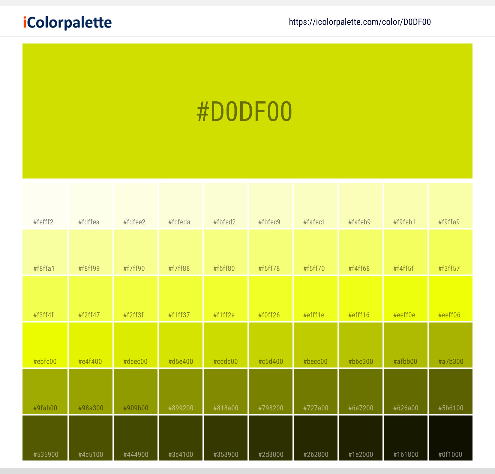
#d0df00 Color Shades
Download Color Shades
Pantone 389 C Color | Hex color Code #d0df00 Solid Color Background
Download Solid Color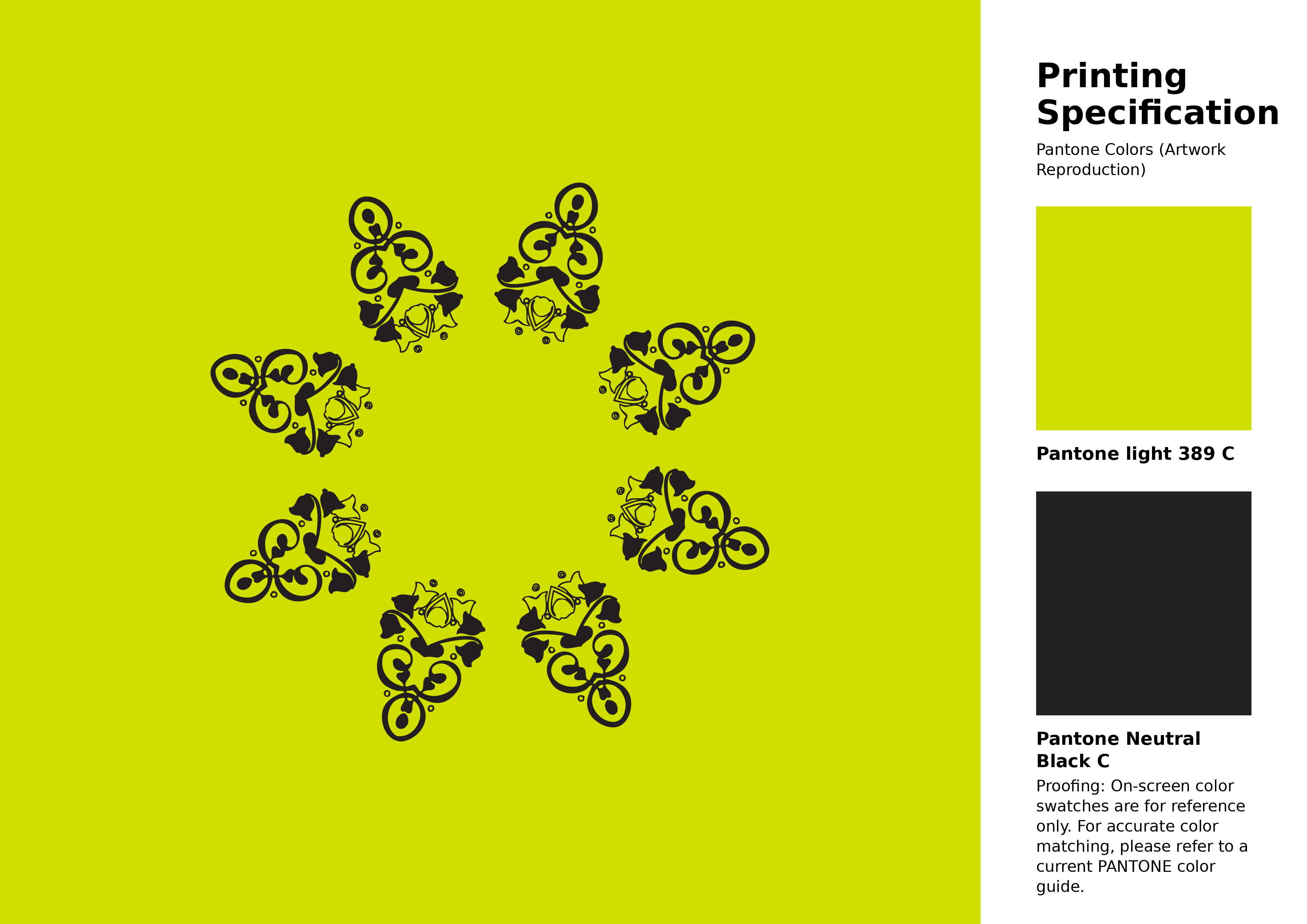
#d0df00 Pantone 389 C Color | Hex color Code #d0df00 Artwork Image (PNG)
Download Artwork (PNG)#d0df00 Pantone 389 C Color | Hex color Code #d0df00 Artwork Vector (PDF)
Download Artwork (PDF)#d0df00 Pantone 389 C Color | Hex color Code #d0df00 Artwork Vector (SVG)
Download Artwork (SVG)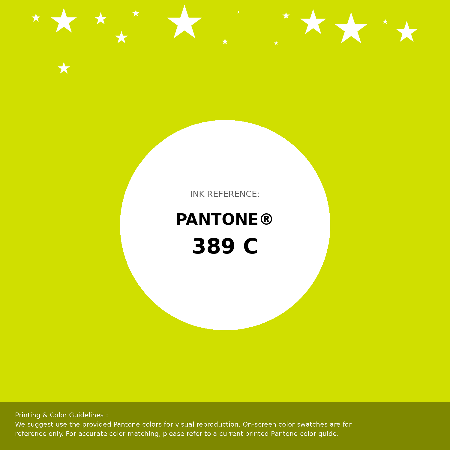
#d0df00 Pantone 389 C Color | Hex color Code #d0df00 Pantone Swatch Artwork
Download Artwork Swatch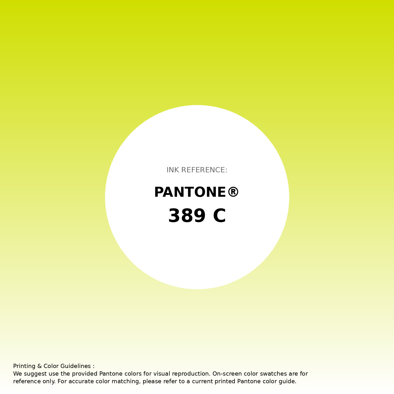
#d0df00 Pantone 389 C Color | Hex color Code #d0df00 Gradient Artwork (PNG)
Download Gradient (PNG)#d0df00 Pantone 389 C Color | Hex color Code #d0df00 Gradient Artwork (SVG)
Download Gradient (SVG)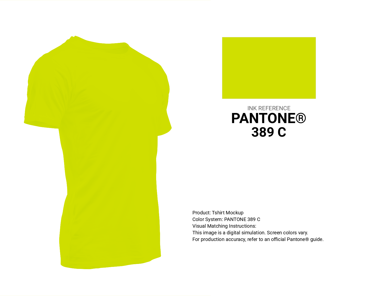
#d0df00 Pantone 389 C Color | Hex color Code #d0df00 T-Shirt Mockup
Download T-Shirt Mockup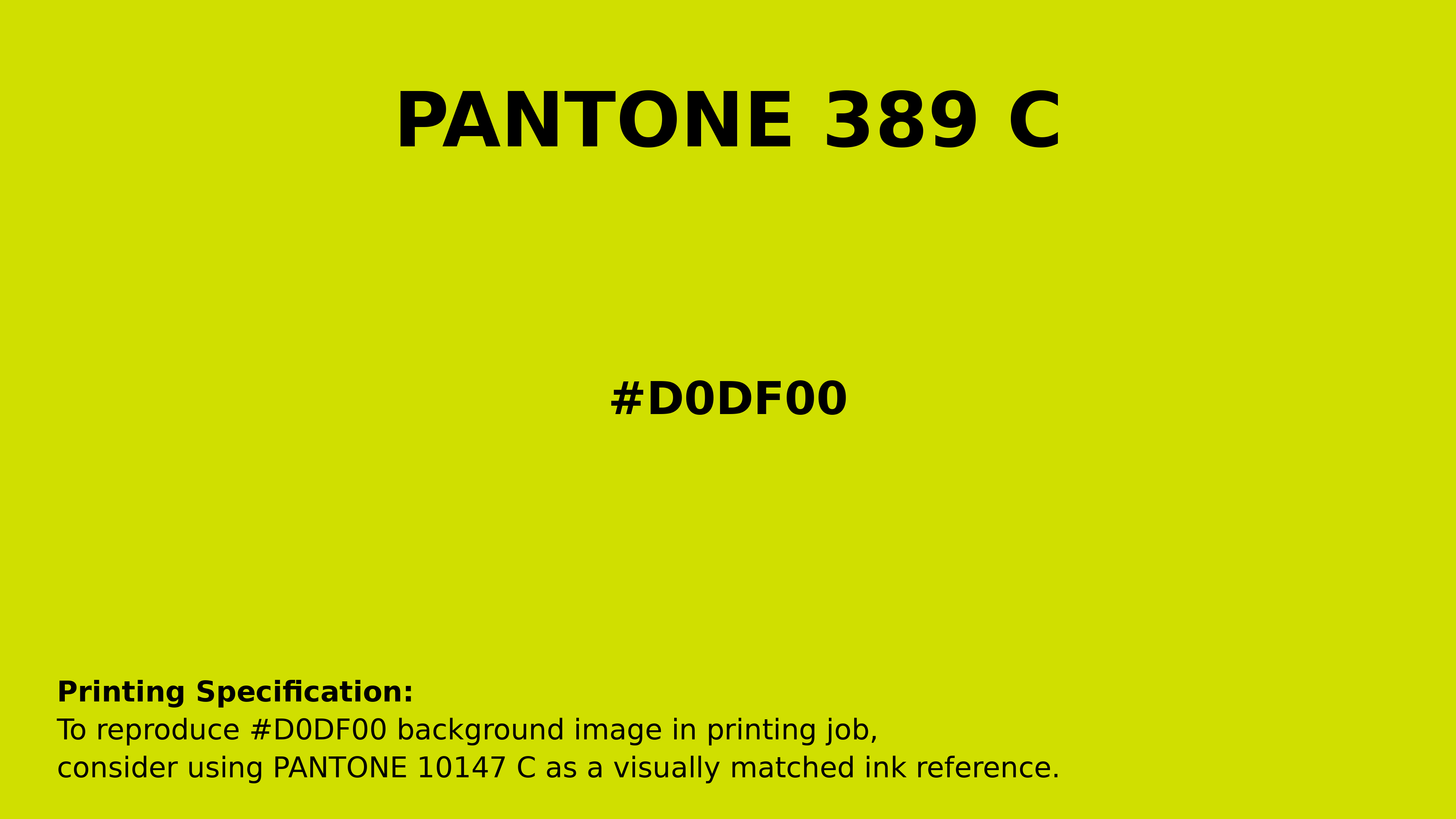
#d0df00 Pantone 389 C Color | Hex color Code #d0df00 Printing Artwork Pantone Reference
Download Pantone Printing ReferenceRelated Color Palettes
- Sea Green and Yellow Green •
- Tan and Light GoldenrodYellow •
- Light GoldenrodYellow and Rosy Brown •
- Dark Cyan and Yellow Green •
- Yellow Green and Sienna •
- Silver and Yellow Green •
- Yellow Green •
- Brown and Yellow Green •
- Black and Light GoldenrodYellow •
- Yellow Green and Slate Gray •
- Gold and Yellow Green •
- Light GoldenrodYellow and Wheat •
- Yellow Green and Light Green •
- Beige and Light GoldenrodYellow •
- Yellow Metal and Woodland
Color Palette Collection

81 Pink color palettes
81 color palettes with 405 colors.

36 Orange shades Color Palette Collection
36 color palettes with 180 colors.

500+ Popular Color Palette Collection
501 color palettes with 2505 colors.
46 Flower Inspired Color Schemes
46 color palettes with 230 colors.