#CDC6BD Color
Your all-in-one color resource. Download hex background images, Adobe swatches (ASE), PDF color sheets, and SVG files. Explore palettes, harmonies, accessibility, conversions, and professional exports — designed for designers, developers, and color perfectionists.
A gentle, muted beige with subtle grey undertones, #CDC6BD evokes a sense of quietude and understated elegance. It feels soft and comforting, like worn linen or the muted light of a cloudy day. This color whispers of simplicity, of a return to basics, and of a refuge from the noise of the world. It reminds one of sun-bleached driftwood, the mellow hues of autumn leaves, or the hushed tones of an old library. It creates an atmosphere of calm, serenity, and timelessness, perfect for a bedroom or a reading nook. In design, it can serve as a neutral backdrop, allowing other colors to pop, or be used to create a sophisticated, minimalist space. It's a color of gentle strength and enduring beauty. Visually matched named color: Dusty Linen.
PANTONE 13-0000 TCX
Choose Color
Selected Color
Recent Colors
Color Details
Similar Ink Alternatives for #CDC6BD color Alternative print inks for reproducing #CDC6BD background image with a similar visual appearance.
Disclaimer: The visually matched ink reference is an independent approximation intended as a guide only. Please be advised that this pantone colors is only intended as a guide, Actual colours will depend on screen calibration variances. The print ink suggestions provided are independent visual approximations and are not affiliated with or endorsed by Pantone LLC. For official color specifications, conversion factors, and comprehensive color system information, please visit Pantone Connect. Official Pantone products can be purchased at pantone.com.
Color Previews for #000000 See how this color looks as a background or as text.
Complete Guide to Your Color Laboratory
Everything you need to know about this professional color toolkit.
Use the Color Picker at the top to select any color. All modules below update instantly.
Workflow: Pick a color → Explore palettes & data → Download what you need (PDF, Image, or Adobe ASE).
Color Details — Your color in all formats: HEX, RGB, RGBA, HSL, HSLA, HSV, CMYK, CIELab, Hunter-Lab, XYZ, Yxy, YUV. One-click copy.
Color Psychology — Emotional impact, cultural meanings, physiological effects, branding applications, and historical significance.
Named Colors — Find official color names (HTML/CSS, Pantone) that match your selection with similarity percentages.
Light & Dark Shades
80-step gradient from black to white. Perfect for button states and component systems.
Tints
Color mixed with white → lighter, pastel variations for backgrounds and disabled states.
Monochromatic — 11 curated tints/shades from one color. Production-ready for design systems.
- Complementary — Opposite on wheel (180°). High contrast.
- Analogous — Neighbors (±30°). Harmonious flow.
- Triadic — Three colors (120° apart). Vibrant, balanced.
- Split-Complementary — Base + two near-complements. Softer contrast.
- Tetradic/Square — Four colors. Complex, maximum variety.
- Neutral — Desaturated versions. Subtle, sophisticated.
15 Professional Variations — Monochromatic, Analogous, Complementary, Warm/Cool/Earth Tones, Pastel, Vibrant, High Contrast, and more.
Color Infusion — 10 palettes showing your color morphing into each major hue. Find bridge colors.
Similar Colors — 60+ colors generated via CIELAB Delta E matching. Unexpected harmonious combinations.
18 Ready-to-Use Gradients — Complementary, Analogous, Triadic, Tint/Shade progressions, and more.
Downloads: PNG (2560×1440), CSS (production-ready code), SVG (scalable vector).
WCAG Contrast Checker — Tests your color against white, black, and custom colors for AA (4.5:1) and AAA (7:1) compliance. Large text thresholds included.
Harmony & Accessibility Guide — Tests against 10 canonical hues. Shows which pairs are both beautiful AND WCAG-compliant for text.
PNG/JPG — High-res images for presentations and mood boards.
PDF — Print-ready reports for clients and teams.
Adobe ASE — Direct import to Photoshop, Illustrator, InDesign, XD.
CSS/SVG — Gradients only. Production-ready code and vectors.
Color Science: Industry-standard conversions (HSL, CIELAB, CMYK, XYZ). WCAG 2.1 luminance formula. Delta E (ΔE76) for perceptual matching.
Direct Links: Share colors via icolorpalette.com/color/ff5733 or icolorpalette.com/color/red
Issues? Refresh the page, wait for rendering, try another browser, or check console (F12) for errors.
Printing Guide for #cdc6bd Background Image
Use PANTONE 13-0000 TCX as a visually matched ink reference when printing this background image.
To print the #cdc6bd background image from our site, consider using PANTONE 13-0000 TCX as a visually matched ink reference.
Download the background image, then provide this reference code to your print vendor to help achieve accurate color reproduction.
The visually matched ink reference for the #cdc6bd background image is PANTONE 13-0000 TCX.
This color is commonly described as Dusty Linen.
A gentle, muted beige with subtle grey undertones, #CDC6BD evokes a sense of quietude and understated elegance. It feels soft and comforting, like worn linen or the muted light of a cloudy day. This color whispers of simplicity, of a return to basics, and of a refuge from the noise of the world. It reminds one of sun-bleached driftwood, the mellow hues of autumn leaves, or the hushed tones of an old library. It creates an atmosphere of calm, serenity, and timelessness, perfect for a bedroom or a reading nook. In design, it can serve as a neutral backdrop, allowing other colors to pop, or be used to create a sophisticated, minimalist space. It's a color of gentle strength and enduring beauty.
We provide PANTONE 13-0000 TCX as a visually matched ink reference to help you reproduce the #cdc6bd background image accurately in professional printing.
This reference code helps print vendors achieve consistent color output across different printing equipment and materials.
After downloading the #cdc6bd background image from our site:
- Include the visually matched ink reference PANTONE 13-0000 TCX in your print order notes
- Inform your print vendor that this is your target color reference
- Request a proof print to verify the Dusty Linen color appearance before full production
The #cdc6bd background image with PANTONE 13-0000 TCX as visually matched ink reference can be used for:
- Posters, banners, and backdrops
- Business cards, brochures, and flyers
- Packaging, labels, and stickers
- Signage and promotional materials
This is an independent visual approximation.
While PANTONE 13-0000 TCX closely matches the #cdc6bd background image color, variations may exist between screen display and printed output.
We recommend requesting a proof print to verify the final appearance.
A gentle, muted beige with subtle grey undertones, #CDC6BD evokes a sense of quietude and understated elegance. It feels soft and comforting, like worn linen or the muted light of a cloudy day. This color whispers of simplicity, of a return to basics, and of a refuge from the noise of the world. It reminds one of sun-bleached driftwood, the mellow hues of autumn leaves, or the hushed tones of an old library. It creates an atmosphere of calm, serenity, and timelessness, perfect for a bedroom or a reading nook. In design, it can serve as a neutral backdrop, allowing other colors to pop, or be used to create a sophisticated, minimalist space. It's a color of gentle strength and enduring beauty.
Understanding these associations helps ensure the #cdc6bd background image aligns with your intended message and brand impact.
Important Information
The visually matched ink reference is an independent approximation intended as a guide only.
Actual printed colors may vary depending on screen calibration, substrate material, ink type, and printing equipment used.
For official color specifications and certified color standards, visit Pantone Connect.
Official color guides and swatch books can be purchased from pantone.com.
Moonbeam Color: Serenity and Calmness | #CDC6BD
Introduction:
Moonbeam Color is a soft, neutral shade that exudes tranquility and serenity. Its subtle off-white hue gives a sense of calmness and peacefulness, making it a versatile choice for various visual applications.
Historical Significance:
Early Influence: Moonbeam Color was first prominently used in interior design during the early 20th century, reflecting the shift towards more minimalist and serene spaces. Its association with simplicity and tranquility made it a popular choice in modernist movements.
Contemporary Usage: In recent years, Moonbeam Color has regained popularity in both interior design and fashion, symbolizing a desire for peacefulness and mindfulness in a fast-paced world.
Symbolism and Meaning:
Calmness and Serenity: Moonbeam Color typically symbolizes a serene and tranquil atmosphere. It is associated with peace, purity, and simplicity in various cultures and contexts.
Moonbeam Color in Fashion:
Influence on Fashion: Moonbeam Color has made its mark in the fashion world as a versatile neutral shade. It is often used as a base color or in monochromatic outfits, creating a sense of elegance and sophistication.
Moonbeam Color in Graphic Design:
Design Aesthetics: Moonbeam Color plays a significant role in design aesthetics, adding a subtle touch of softness and serenity. It is often used in branding to evoke a sense of calmness and trustworthiness.
Color Combinations:
Harmonious Combinations: Moonbeam Color pairs well with various shades, such as light blues, pale pinks, and muted earth tones. These combinations create harmonious and soothing color palettes.
Nature’s Palette:
Natural Inspirations: Moonbeam Color can be found in the soft hues of early morning skies, delicate flower petals, and gentle sand dunes. Its presence in nature adds an organic and calming touch to landscapes.
Artistic Representations:
Incorporation in Art: Moonbeam Color has been utilized in various forms of art to convey a sense of tranquility and simplicity. It is often seen in minimalistic paintings and sculptures.
Movies and Cinematic Landscapes:
Setting the Mood: Moonbeam Color is frequently used in movies and cinematic scenes that aim to create a serene or calming ambiance. It helps to establish a peaceful atmosphere and evoke emotions of tranquility.
Products and Commercial Appeal:
Branding and Product Association: Moonbeam Color is often associated with products and brands that emphasize simplicity, elegance, and a calming atmosphere. It is commonly used in cosmetic packaging, home decor, and wellness products.
National Symbols and Significance:
National and Cultural Connections: Moonbeam Color does not hold any specific national or cultural significance, but its association with calmness and purity can align with the values of various cultures regarding peace and tranquility.
The Psychological and Emotional Impact:
Psychological Influence: Moonbeam Color has a soothing and relaxing effect on emotions. It promotes feelings of tranquility, calmness, and stability.
Conclusion:
Moonbeam Color, with its serene and calm nature, holds historical relevance and timeless appeal. Its versatility in both fashion and design creates elegant and peaceful visual experiences. Its use in various forms of art, movies, and commercial products further accentuates its influence and significance. Overall, Moonbeam Color continues to captivate with its gentle and tranquil essence.
Pantone 13-0000 Tcx Moonbeam Color | Hex color Code #cdc6bd Image & Artwork
Download high-quality assets for your projects.

#cdc6bd Color Schemes
Download Color Schemes
#cdc6bd Color Shades
Download Color Shades
Pantone 13-0000 Tcx Moonbeam Color | Hex color Code #cdc6bd Solid Color Background
Download Solid Color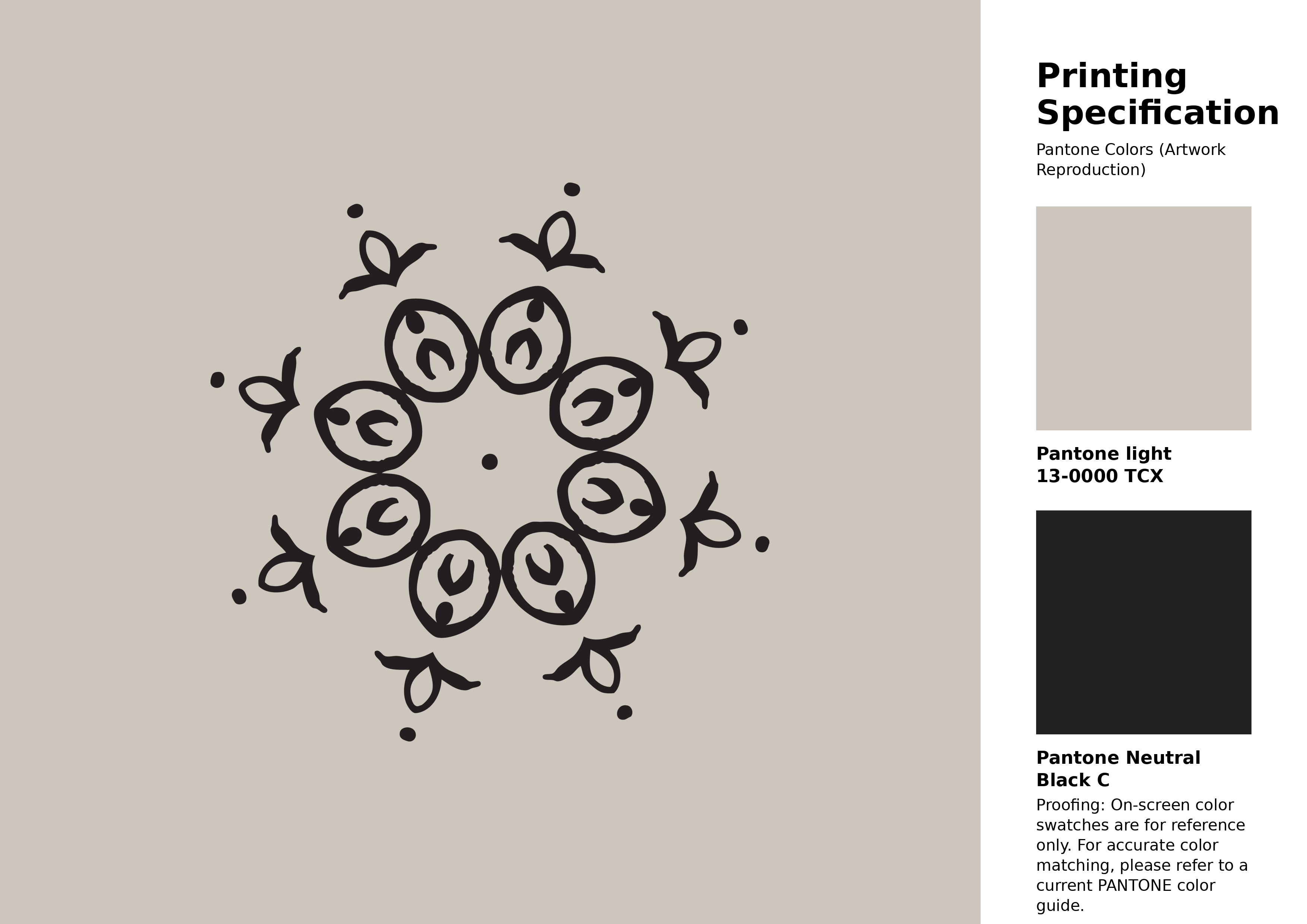
#cdc6bd Pantone 13-0000 Tcx Moonbeam Color | Hex color Code #cdc6bd Artwork Image (PNG)
Download Artwork (PNG)#cdc6bd Pantone 13-0000 Tcx Moonbeam Color | Hex color Code #cdc6bd Artwork Vector (PDF)
Download Artwork (PDF)#cdc6bd Pantone 13-0000 Tcx Moonbeam Color | Hex color Code #cdc6bd Artwork Vector (SVG)
Download Artwork (SVG)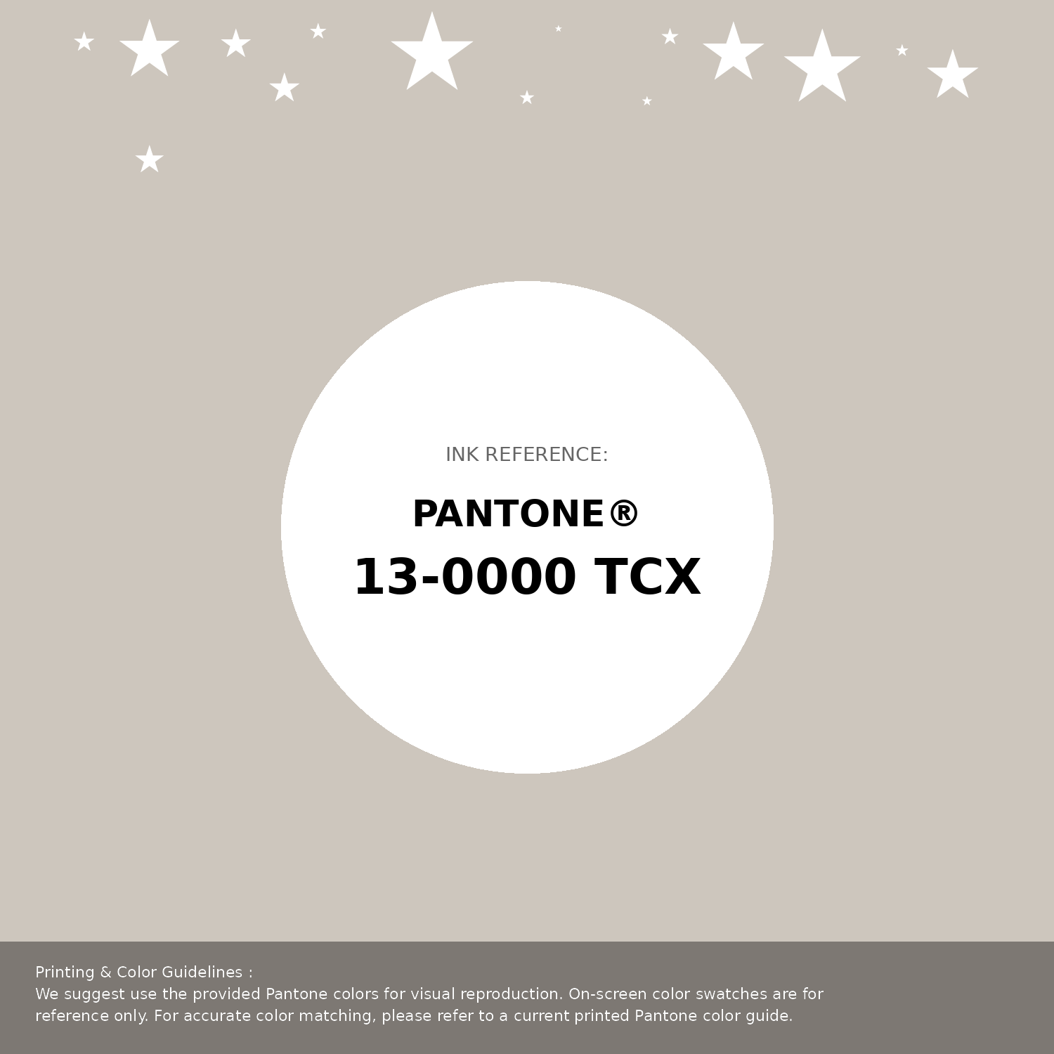
#cdc6bd Pantone 13-0000 Tcx Moonbeam Color | Hex color Code #cdc6bd Pantone Swatch Artwork
Download Artwork Swatch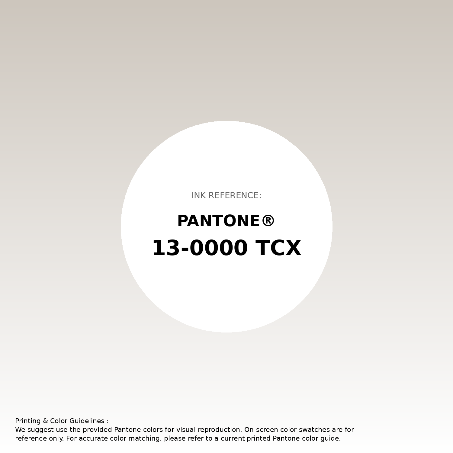
#cdc6bd Pantone 13-0000 Tcx Moonbeam Color | Hex color Code #cdc6bd Gradient Artwork (PNG)
Download Gradient (PNG)#cdc6bd Pantone 13-0000 Tcx Moonbeam Color | Hex color Code #cdc6bd Gradient Artwork (SVG)
Download Gradient (SVG)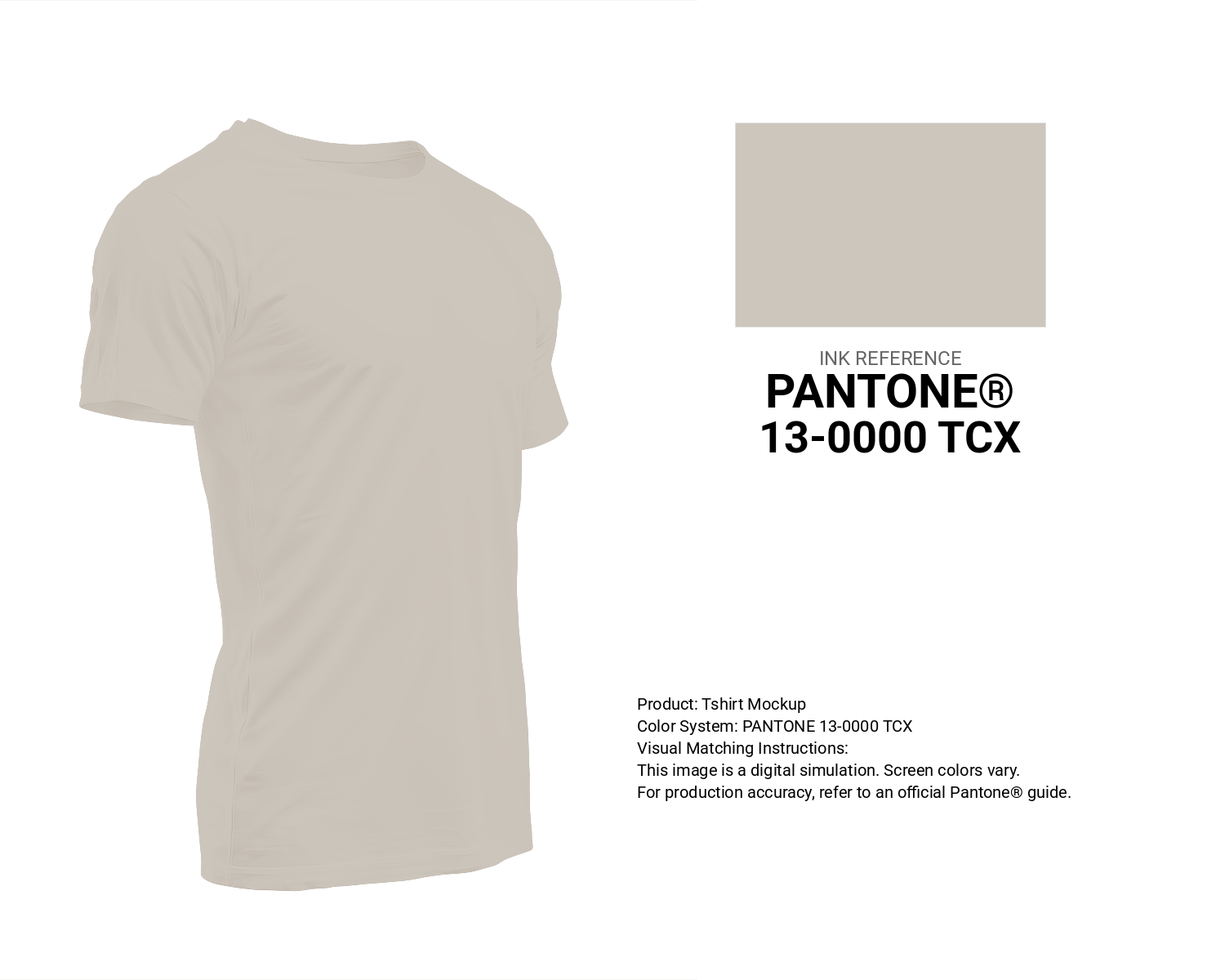
#cdc6bd Pantone 13-0000 Tcx Moonbeam Color | Hex color Code #cdc6bd T-Shirt Mockup
Download T-Shirt Mockup
#cdc6bd Pantone 13-0000 Tcx Moonbeam Color | Hex color Code #cdc6bd Printing Artwork Pantone Reference
Download Pantone Printing Reference
Moonbeam - #cdc6bd Color Name
Download Color NameRelated Color Palettes
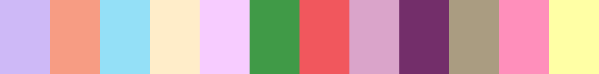
- Light Pink and Antique White •
- Pink •
- Hot Pink and Deep Pink •
- Dim Gray and Light Pink •
- Beige and Deep Pink •
- Midnight Blue and Deep Pink •
- Deep Pink and Medium Violet Red •
- Deep Pink and Dark Slate Gray •
- Crimson and Deep Pink •
- Dark Slate Gray and Deep Pink •
- Light Coral and Light Pink •
- Deep Pink and Dark Slate Blue •
- Tomato and Deep Pink •
- Cavern Pink •
- Rosy Brown and Light Pink
Color Palette Collection

16 Brown Color Palettes
16 color palettes with 80 colors.

42 Green Color Schemes
42 color palettes with 210 colors.
Light color Palettes
9 color palettes with 45 colors.

25 Blue Color Palettes
25 color palettes with 125 colors.